0/X
Articles on the topic of A/B Testing:
How to Run Effective A/B Tests with Optimization Tools
A/B Testing for UX: How to Improve User Experience
15 Best Free A/B Testing Tools in 2025
How to Use Website Heatmaps for Effective A/B Testing Decisions
How to Run A/B Testing on a Website
14 The Best A/B Testing Tools
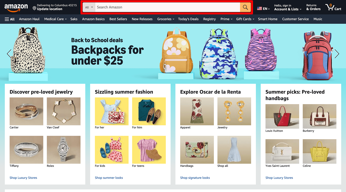
🚀 Service Website — Homepage A/B Test
-
Hero Headline Text
 When to test: CTR on hero CTA drops below target.
Why: Current headline may not show a clear benefit.
Variation idea: Swap “Welcome to Our Service” for “Get More Leads in 30 Days.”
Goal: Increase clicks on the main button.
Test type: Element swap
How to implement: Update headline copy in CMS, publish, then track CTA clicks in analytics for one week. -
A/B Test Hero Image vs. Video
 When to test: The bounce rate is above 60%.
Why: Video can hold attention longer than a static image.
Variation idea: Replace the hero image with a 10-second looping demo video.
Goal: Raise average time on page by 15%.
Test type: Element swap
How to implement: Export lightweight MP4/WebM, embed with autoplay + mute, compare bounce rate after seven days. -
Primary CTA Button Text
 When to test: Main CTA click rate is low (<5%).
Why: “Learn More” feels generic.
Variation idea: Change text to “Start Your Free Audit.”
Goal: Boost CTA clicks by 20%.
Test type: Element swap
How to implement: Edit button label in template, push live, and set goal in Plerdy UX & Usability Testing to watch uplift. -
A/B Test CTA Button Color
 When to test: CTA blends into page design (low visibility).
Why: Higher-contrast color stands out.
Variation idea: Switch from blue to bright orange.
Goal: Improve click-through by 10%.
Test type: Element swap
How to implement: Change CSS class color, clear cache, and track CTR delta via event tagging. -
A/B Test Navigation Menu Order
 When to test: Few visits to Services page.
Why: Important link is too far right.
Variation idea: Move “Services” to first position.
Goal: Increase Services pageviews by 25%.
Test type: Element swap
How to implement: Re-order menu items in CMS nav manager and watch heatmap click distribution. -
Testimonials Section
 When to test: Visitors hesitate before submitting the form.
Why: Social proof builds trust.
Variation idea: Add star-rating visuals under each quote.
Goal: Lift form submissions by 15%.
Test type: Element swap
How to implement: Embed SVG star icons next to testimonial names; validate with form-submit event comparison. -
Trust Badges (Logos, Awards)
 When to test: Low quote requests.
Why: Badges reassure credibility.
Variation idea: Insert “ISO-Certified” and “SSL-Secured” icons near the CTA.
Goal: Increase quote requests by 12%.
Test type: Element swap
How to implement: Upload badge PNGs, position beside CTA with flexbox, then monitor quote-start conversions. -
A/B Test Chat Widget Presence
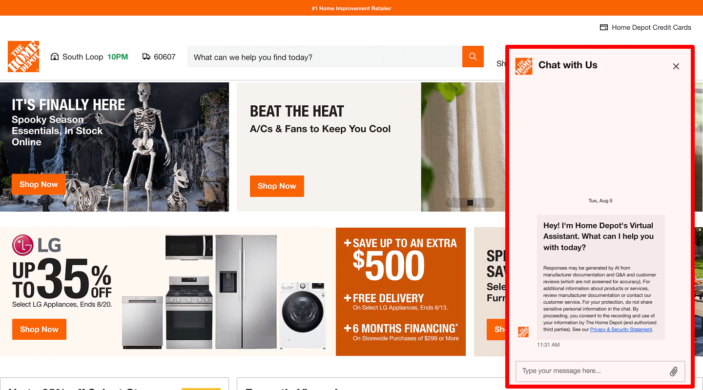 When to test: High exit rate with no interaction.
Why: Live chat can answer questions in real time.
Variation idea: Add a persistent chat bubble at bottom right.
Goal: Track chat opens and messages sent.
Test type: Element swap
How to implement: Install chat script, enable auto-open after 10s, and tag chat-open events. -
Benefits in the Site Header
 When to test: Visitors scroll past hero section without engaging.
Why: Clear benefit statements can immediately show value and hook users.
Variation idea: Add a bullet list under the headline, e.g. “✔ Faster results, ✔ 24/7 support, ✔ 30-day guarantee.”
Goal: Increase clicks on primary CTA by 12%.
Test type: Element swap
How to implement: Insert short- benefits list below H1; verify CTA click uplift via Plerdy funnels.
-
AIDA Model for Banners
 When to test: Low response to homepage banners.
Why: Structuring by Attention–Interest–Desire–Action guides users step by step.
Variation idea: Attention: bold question “Want 2× traffic?”
Interest: proof “Our clients saw 50% more visits”
Desire: emotional benefit “Grow sales, not stress”
Action: CTA “Start Free Trial”
Goal: Boost banner CTA clicks by 15%.
Test type: Element swap
How to implement: Redesign banner in Figma, export, update hero slot, and set click event goal.
📄 Service Website — Service Page A/B Test
-
A/B Test Page Title Wording
 When to test: Low time on service page.
Why: Title may not reflect user intent.
Variation idea: Change from “Our Service” to “Grow Your Sales with Our SEO.”
Goal: Improve scroll depth by 20%.
Test type: Element swap
How to implement: Update H1 in template, purge CDN, track scroll depth with Plerdy heatmap. -
Service Description Length
 When to test: High scroll but low form fills.
Why: Too much text can overwhelm readers.
Variation idea: Shorten description by 30% and add bullet highlights.
Goal: Increase form submissions by 10%.
Test type: Element swap
How to implement: Trim the copy, add a- of benefits, and compare the form-submit rate year over year.
-
Price Display Style (Per Hour vs. Per Project)
 When to test: Pricing page visits are high, but inquiries low.
Why: Users prefer clear, project-based costs.
Variation idea: Swap “$80/hr” label for “$3,000/project.”
Goal: Boost inquiry clicks by 15%.
Test type: Element swap
How to implement: Edit pricing table, highlight total project cost, monitor click-to-contact ratio. -
Feature List Format (Icons vs. Plain Text)
 When to test: Low engagement with features.
Why: Icons draw the eye and aid skimming.
Variation idea: Add custom icons beside each feature line.
Goal: Increase time on service page by 10%.
Test type: Element swap
How to implement: Design SVG icons, inline them in list, measure time-on-page via analytics. -
Benefit Highlights (Bullet vs. Paragraph)
 When to test: Readers skip to bottom quickly.
Why: Bullets are easier to scan.
Variation idea: Convert paragraphs into three key bullet points.
Goal: Improve scroll depth to contact section by 20%.
Test type: Element swap
How to implement: Re-format copy into bullets, observe heatmap scroll depth improvements. -
Inquiry Form Placement
 When to test: Visitors scroll far but don’t submit.
Why: Form may be too low on the page.
Variation idea: Move form to top right, next to intro text.
Goal: Increase form opens by 25%.
Test type: Element swap
How to implement: Relocate the form block in the template and A/B test via a redirect split. -
A/B Test Video Demo vs. Image
 When to test: High pageviews, low conversions.
Why: Video can explain value better than an image.
Variation idea: Replace static image with 60-second demo video.
Goal: Increase form submissions by 12%.
Test type: Element swap
How to implement: Produce concise screencast, embed via
💲 Service Website — Pricing Page A/B Test
-
Plan Layout (Table vs. Cards)
 When to test: Users compare plans but few pick one.
Why: Card format can focus attention on each plan.
Variation idea: Change table rows into separate card panels.
Goal: Boost “Select Plan” clicks by 15%.
Test type: Element swap
How to implement: Use CSS grid with individual plan cards and monitor button clicks. -
“Recommended” Highlight on One Plan
 When to test: No clear favorite plan choice.
Why: Highlight guides decision-making.
Variation idea: Add a “Most Popular” badge on middle plan.
Goal: Increase mid-tier plan selections by 20%.
Test type: Element swap
How to implement: Add badge overlay SVG and measure plan-select split. -
Monthly vs. Annual Toggle
 When to test: Low yearly sign-ups.
Why: Users may not see savings on annual billing.
Variation idea: Default toggle to “Yearly (Save 20%).”
Goal: Improve annual plan sign-ups by 10%.
Test type: Element swap
How to implement: Set default radio to Yearly, highlight savings text, and track billing period choice. -
A/B Test Price Font Size
 When to test: Users overlook the prices.
Why: Larger font draws focus to cost/value.
Variation idea: Increase price font by 30%.
Goal: Boost plan click rates by 8%.
Test type: Element swap
How to implement: Update CSS font-size variable, purge cache, evaluate click-through trend.
👥 Service Website — About Page A/B Test
-
Team Photo vs. No Photo
 When to test: Low engagement/time on the About page.
Why: Faces build human connection.
Variation idea: Add a team group photo at top.
Goal: Increase time on About by 20%.
Test type: Element swap
How to implement: Shoot informal group photo, compress to WebP, place beneath H1, and measure Avg. time on page. -
Story Text vs. Bullet Points
 When to test: Visitors skim but exit quickly.
Why: Bullets improve readability.
Variation idea: Convert the narrative paragraph into five bullet-point achievements.
Goal: Improve scroll depth by 15%.
Test type: Element swap
How to implement: Rewrite story as concise bullet list; watch scroll events in analytics. -
Client Logo Strip vs. List
 When to test: Low trust signals.
Why: Logos are more visual and credible.
Variation idea: Show a horizontal carousel of client logos.
Goal: Increase click-through to case studies by 10%.
Test type: Element swap
How to implement: Build a Slick carousel, link each logo to case study, track outbound clicks. -
Mission Statement Phrasing
 When to test: Visitors don’t click “Learn More” links.
Why: Mission may sound generic.
Variation idea: Rewrite to “We Help You Double Traffic in 6 Months.”
Goal: Boost “Learn More” clicks by 12%.
Test type: Element swap
How to implement: Update copy, bold KPI phrase, add link tracking to “Learn More”.
📞 Service Website — Contact Page A/B Test
-
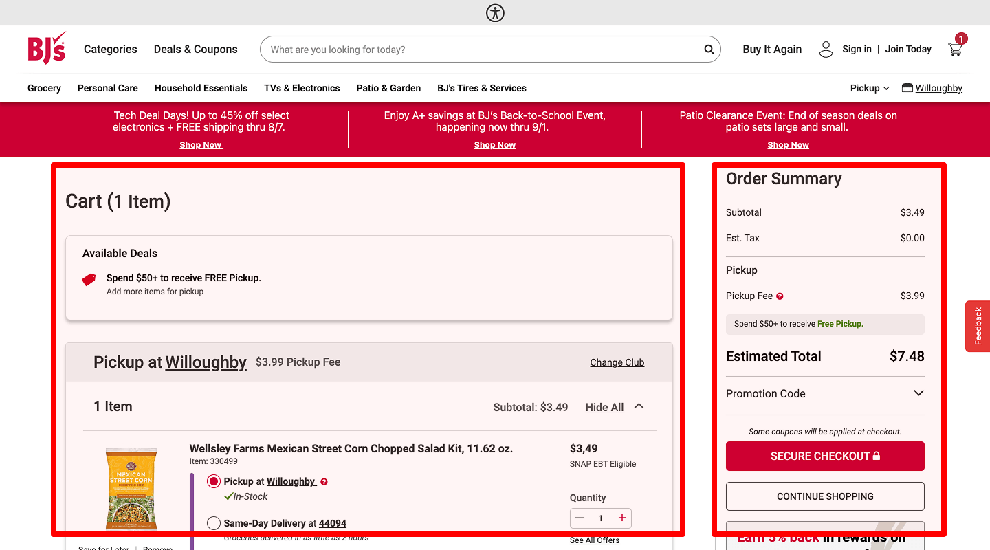
A/B Test Number of Form Fields
 When to test: High form abandonment.
Why: Fewer fields reduce friction.
Variation idea: Remove non-essential fields and leave only name, email, message.
Goal: Increase completed submissions by 20%.
Test type: Element swap
How to implement: Hide optional inputs via A/B variant, collect submission counts. -
Field Labels vs. Placeholders
 When to test: Users report confusion on form.
Why: Persistent labels avoid hidden context.
Variation idea: Add labels above the fields instead of placeholders.
Goal: Reduce form errors by 15%.
Test type: Element swap
How to implement: Convert placeholder text to -
A/B Test Submit Button Text
 When to test: Low clicks on submit.
Why: Generic “Submit” lacks motivation.
Variation idea: Change to “Get My Free Quote.”
Goal: Increase clicks by 18%.
Test type: Element swap
How to implement: Update button label, add tracking, evaluate click-to-submit ratio. -
Map Embed vs. Plain Address
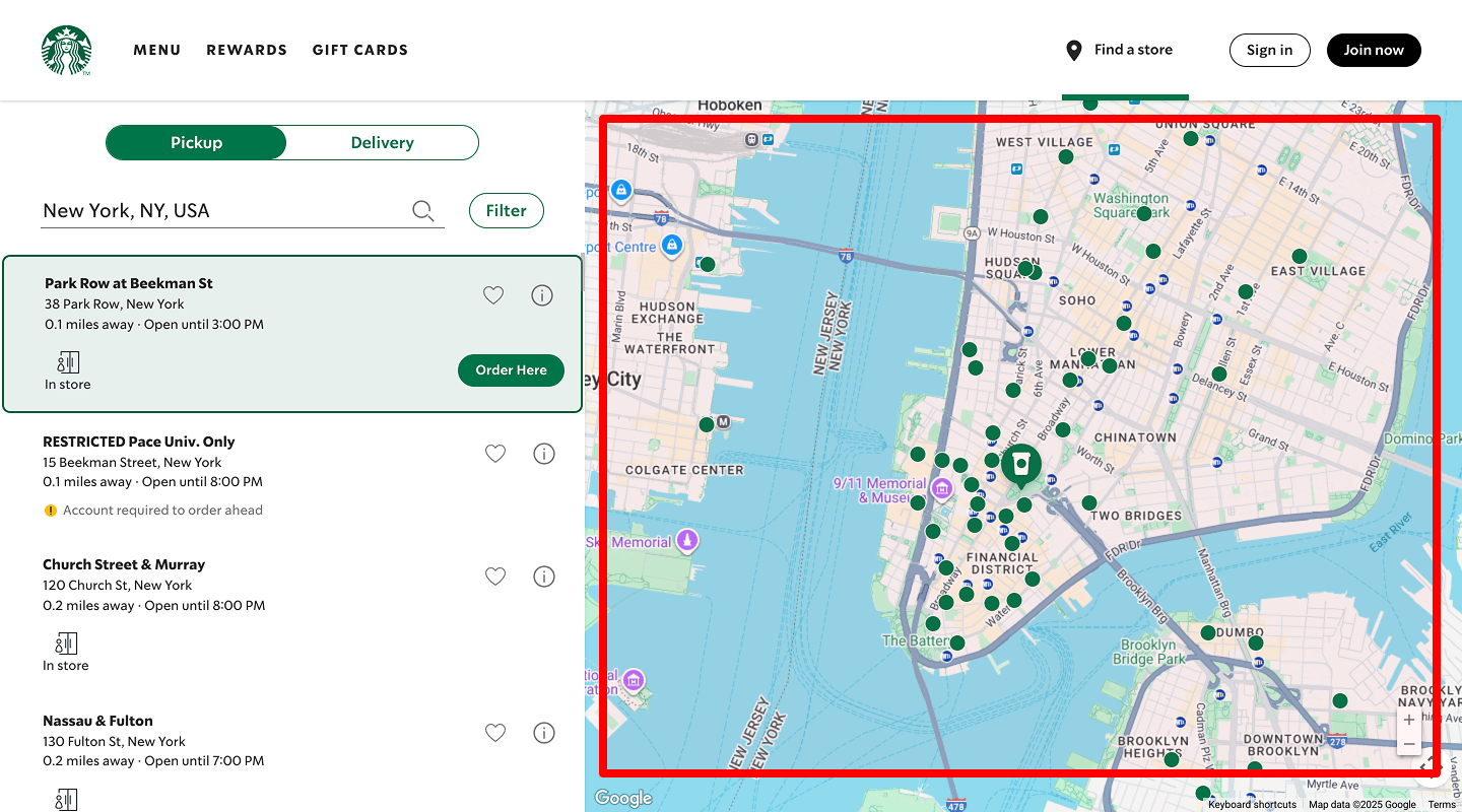 When to test: Few on-site visits or local inquiries.
Why: Interactive map shows exact location.
Variation idea: Replace the plain-text address with an embedded Google Maps map.
Goal: Increase map interactions by 25%.
Test type: Element swap
How to implement: Use iframe Google Maps embed, add link to directions, monitor map click events.
📰 Service Website — Blog / Resources Page A/B Test
-
A/B Test Post Grid vs. List Layout
 When to test: Low click-through on posts.
Why: Grid highlights more articles at once.
Variation idea: Switch from vertical list to 2-column grid.
Goal: Increase clicks to articles by 15%.
Test type: Element swap
How to implement: Apply CSS grid to blog index, then compare article click numbers. -
Excerpt Length
 When to test: Readers skip content without reading excerpt.
Why: Too short doesn’t inform; too long overwhelms.
Variation idea: Test 25-word vs. 50-word excerpts.
Goal: Improve post link clicks by 12%.
Test type: Element swap
How to implement: Adjust excerpt length setting in CMS and evaluate CTR. -
A/B Test “Read More” Link Style
 When to test: Low link recognition.
Why: Button can feel more clickable than text link.
Variation idea: Change “Read more” text link to a styled button.
Goal: Increase click-through by 10%.
Test type: Element swap
How to implement: Replace the anchor with a -
Sidebar Position (Left vs. Right)
 When to test: Low engagement with sidebar widgets.
Why: Eye path may favor right-hand sidebar.
Variation idea: Move sidebar from left to right side.
Goal: Improve clicks on sidebar elements by 15%.
Test type: Element swap
How to implement: Swap
❓ Service Website — FAQ Page A/B Test
-
Collapsible FAQs vs. Full List
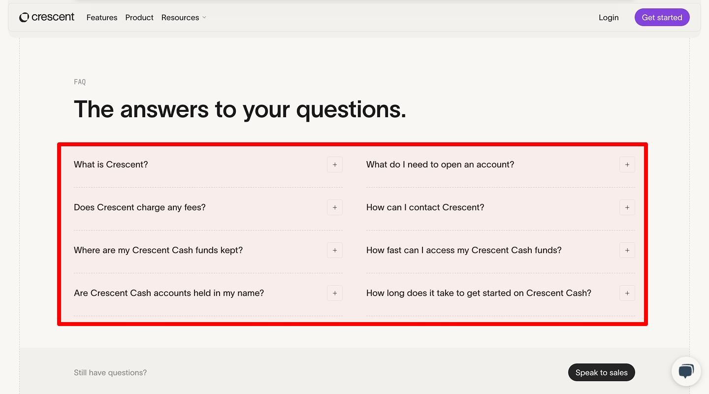 When to test: High bounce on FAQ.
Why: Collapsible hides content; full list may show value at once.
Variation idea: Expand all answers by default rather than hide them.
Goal: Increase scroll depth by 20%.
Test type: Element swap
How to implement: Remove accordion collapse class; measure scroll depth via heatmap. -
FAQ Search Box Presence
 When to test: Users can’t find answers quickly.
Why: Search speeds up question lookup.
Variation idea: Add a simple search field at top of FAQ.
Goal: Track FAQ search usage events.
Test type: Element swap
How to implement: Enable an inline Algolia search, log search submissions.
🐞 Service Website — 404 Page A/B Test
-
Search Box vs. Suggested Links
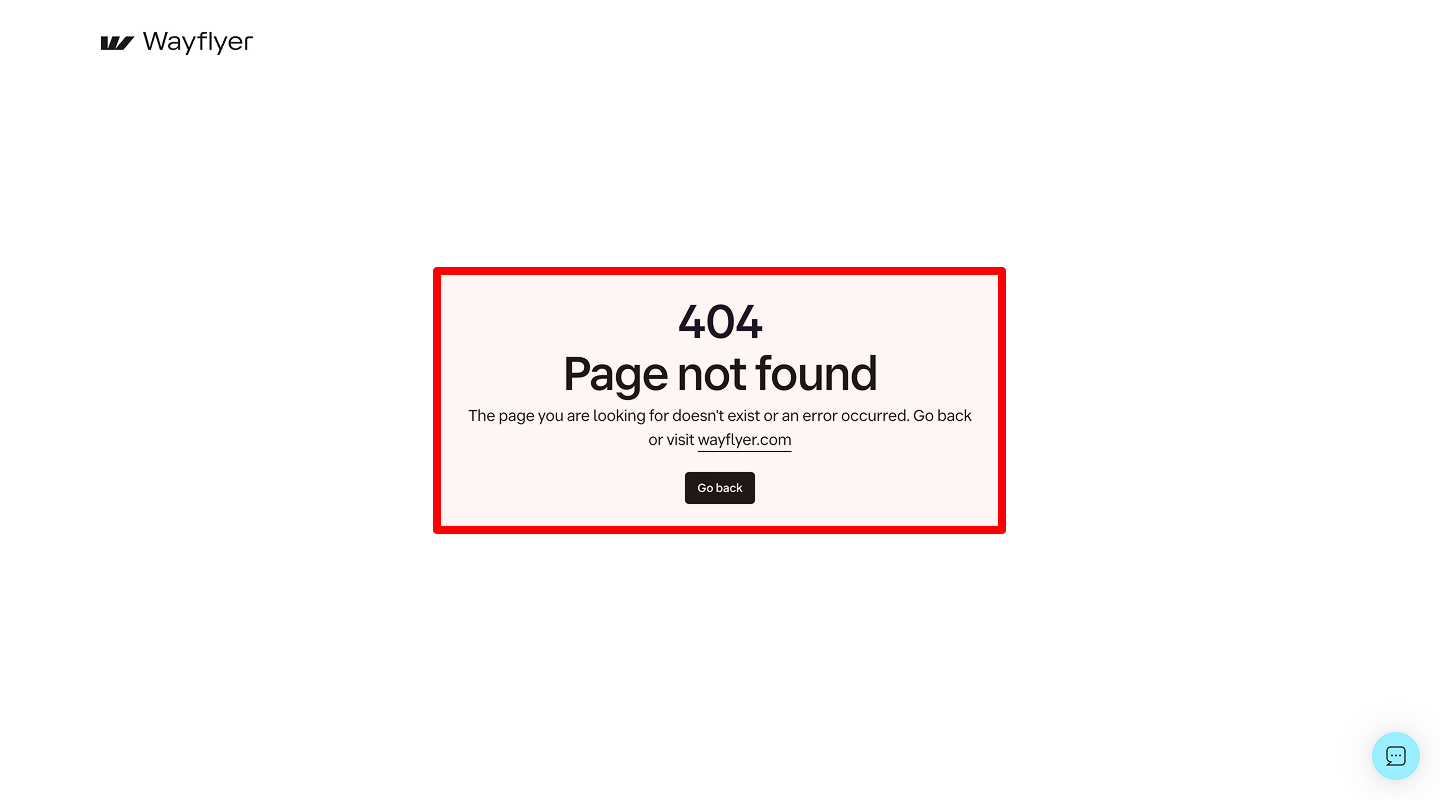 When to test: Many visitors hit 404 and leave.
Why: Search helps them find content.
Variation idea: Replace plain “Not found” text with a search input.
Goal: Record search attempts from 404.
Test type: Element swap
How to implement: Embed site search component, track search_from_404 event. -
A/B Test “Return Home” Button Text
 When to test: Low clicks on home link.
Why: Clearer text encourages action.
Variation idea: Change “Home” to “Take Me Home.”
Goal: Increase home button clicks by 25%.
Test type: Element swap
How to implement: Update link label, style as button, measure click events.
🛒 E-commerce Website — Homepage A/B Test
-
Static Banner vs. Image Carousel
 When to test: Hero click-rate under 5%.
Why: Carousel shows multiple offers.
Variation idea: Swap static hero for 3-slide product carousel.
Goal: Boost banner clicks by 15%.
Test type: Element swap
How to implement: Implement slick.js carousel, lazy-load images, track slide click events. -
Test Hero Image vs. Video
 When to test: Homepage bounce rate exceeds 50%.
Why: Video can capture attention and convey product use faster than a static image.
Variation idea: Replace the static hero image with a 10-second autoplay muted video showing the product in action.
Goal: Increase time on homepage by 20%.
Test type: Element swap
How to implement: Encode video in WebM/MP4, set preload=metadata, autoplay & mute attributes, compare bounce rate. -
Vertical vs. Horizontal Banner
 When to test: Click-through on the main promo banner is below 5%.
Why: Different banner orientation can change visual flow and make CTAs more or less noticeable.
Variation idea: Swap the current horizontal banner at page top for a tall vertical banner on the left side of hero section.
Goal: Boost banner CTA clicks by 15%.
Test type: Element swap
How to implement: Replace banner HTML, add media queries, check CTA click lift. -
A/B Test The AIDA Model For Banners
 When to test: Users view the banner but rarely click.
Why: Following Attention–Interest–Desire–Action guides visitors step by step.
Variation idea: Attention: headline “Want 2× Your Sales?”
Interest: subtext “Our tool doubled revenue for 50+ shops”
Desire: benefit “More profit, less work”
Action: button “Start Free Trial”
Goal: Increase banner CTA clicks by 18%.
Test type: Element swap
How to implement: Redesign banner copy & CTA, schedule split-test and track click delta. -
Featured Products Section vs. Category List
 When to test: Few product pageviews from homepage.
Why: Direct product picks drive visits faster.
Variation idea: Replace the category text list with a grid of four top-sellers.
Goal: Increase product pageviews by 20%.
Test type: Element swap
How to implement: Add “Featured” product module pulling best-sellers, track product-page clicks. -
Hero CTA Text
 When to test: Low clicks on promo button.
Why: Specific offer feels urgent.
Variation idea: Change “Shop Now” to “Save 20% Today.”
Goal: Improve CTA click-through by 12%.
Test type: Element swap
How to implement: Update button label, A/B test and compare click-through. -
Benefits in the Header of the Site
 When to test: Visitors scroll past hero without clicking.
Why: Clearly stated benefits help users instantly see value and prompt action.
Variation idea: Add a short inline benefit bar, e.g. “✔ Free shipping ✔ 30-day returns ✔ 24/7 support.”
Goal: Raise clicks on any homepage CTA by 12%.
Test type: Element swap
How to implement: Insert a benefit bar under the header, use flex display, watch CTA clicks. -
Navigation Menu vs. Mega-Menu
 When to test: Users can’t find subcategories.
Why: Mega-menu exposes deeper links.
Variation idea: Switch top nav to hover-activated mega-menu.
Goal: Increase clicks to category pages by 18%.
Test type: Element swap
How to implement: Implement mega-menu plugin, measure category click counts. -
A/B Test Search Bar Placement
 When to test: Low search usage.
Why: Users need easy access to search.
Variation idea: Move search box from header corner to top-center.
Goal: Grow search initiations by 25%.
Test type: Element swap
How to implement: Re-locate search input via header template, record search event counts.
🗂️ E-commerce Website — Category Page A/B Test
-
Grid Columns (3 vs. 4)
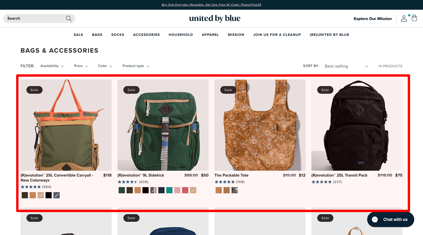 When to test: Category page CTR is low.
Why: Fewer columns show larger images.
Variation idea: Test 4-column grid versus 3-column grid.
Goal: Increase clicks on products by 15%.
Test type: Element swap
How to implement: Add CSS class for 4-col, run split-test, compare product-click rate. -
Product Image Size (Small vs. Large)
 When to test: Quick scroll past images.
Why: Bigger images can grab attention.
Variation idea: Enlarge product images by 20%.
Goal: Boost product pageviews by 12%.
Test type: Element swap
How to implement: Increase thumbnail size in CSS, regenerate images, track pageview increase. -
Filter Panel (Sidebar vs. Top)
 When to test: Users rarely apply filters.
Why: Top filters are more visible.
Variation idea: Move filters from left sidebar to above product grid.
Goal: Increase filter interactions by 20%.
Test type: Element swap
How to implement: Re-structure template, track filter-applied events. -
Default Sort Order (Popularity vs. Price)
 When to test: Lower sales of higher-margin items.
Why: Sorting by price can highlight margin-rich products.
Variation idea: Default sort to “Highest Price First” instead of “Popularity.”
Goal: Improve average order value.
Test type: Element swap
How to implement: Set default sort param, monitor AOV shifts. -
“Add to Cart” vs. “View Details” Button
 When to test: Users click details but not add to cart.
Why: Direct add speeds checkout.
Variation idea: Replace “View Details” with “Add to Cart” on hover.
Goal: Increase add-to-cart clicks by 15%.
Test type: Element swap
How to implement: Add inline “Add” button overlay, capture add_to_cart events.
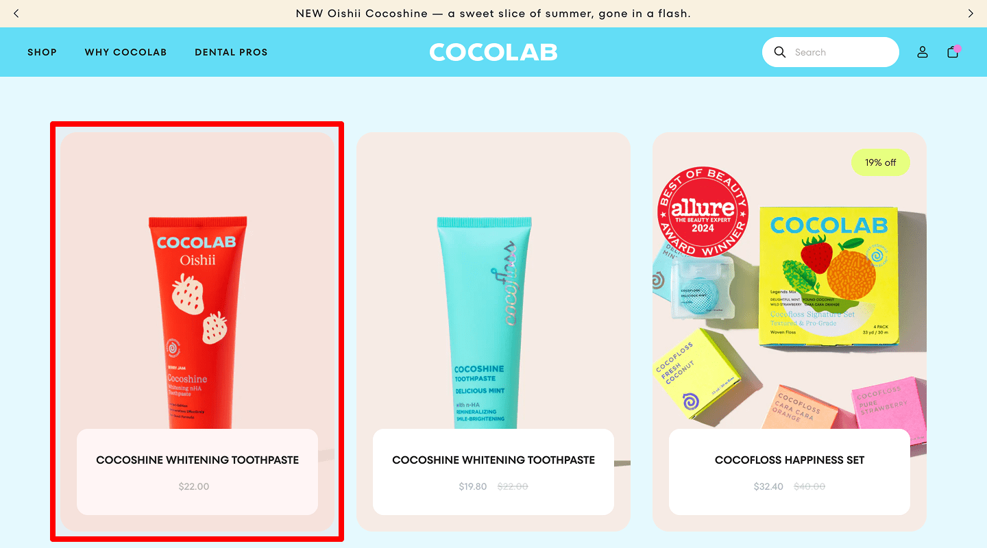
📦 E-commerce Website — Product Page A/B Test
-
Image Gallery Style (Thumbnails vs. Slider)
 When to test: Users don’t view all images.
Why: Slider can guide through all shots.
Variation idea: Swap static thumbnails for a clickable image slider.
Goal: Increase image interactions by 25%.
Test type: Element swap
How to implement: Integrate slider library, lazy-load images, measure image_view events. -
A/B Test Price Color (Red vs. Black)
 When to test: Low “Add to Cart” after price view.
Why: Highlighted color draws eye to price.
Variation idea: Change price text from black to red.
Goal: Boost add-to-cart rate by 10%.
Test type: Element swap
How to implement: Update CSS color variable, watch add_to_cart conversions. -
Discount Badge Design
 When to test: Discounted items underperform.
Why: More prominent badge catches sale shoppers.
Variation idea: Swap small corner badge for large top-banner badge.
Goal: Increase clicks on sale items by 20%.
Test type: Element swap
How to implement: Add large badge overlay, test click-through on sale products. -
A/B Test CTA Button Text
 When to test: Low add-to-cart clicks.
Why: “Buy Now” feels more urgent than “Add to Cart.”
Variation idea: Change text to “Buy Now.”
Goal: Improve add-to-cart events by 12%.
Test type: Element swap
How to implement: Edit button label, evaluate add_to_cart ratio. -
CTA Button Size
 When to test: Button seems too small to click.
Why: Larger targets improve interaction.
Variation idea: Increase button height and width by 25%.
Goal: Boost clicks by 10%.
Test type: Element swap
How to implement: Increase padding & font size, re-test click events. -
Description Format (Tabs vs. Inline)
 When to test: Low scroll depth in description.
Why: Inline text forces reading.
Variation idea: Replace tabbed interface with full inline description.
Goal: Increase time on page by 15%.
Test type: Element swap
How to implement: Remove tabs, place full description below gallery, measure scroll & time. -
Review Section Position
 When to test: Few review reads.
Why: Reviews build trust when seen early.
Variation idea: Move reviews above long description.
Goal: Increase review interactions by 20%.
Test type: Element swap
How to implement: Re-order DOM placing reviews higher, compare review_view events. -
Stock Level Text
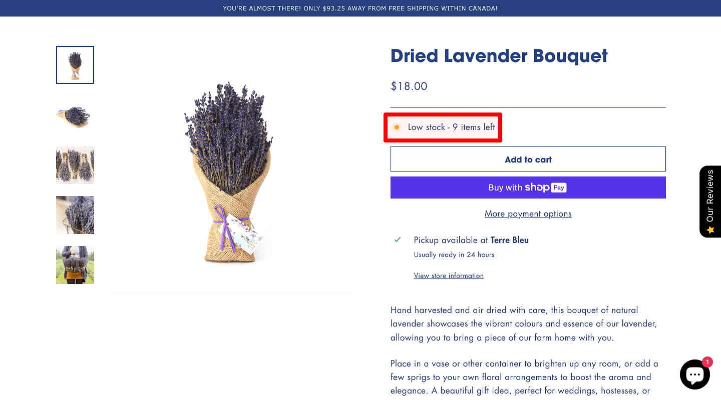 When to test: Users abandon items due to uncertainty.
Why: Clear stock info drives urgency.
Variation idea: Show “Only 3 left!” in red under price.
Goal: Raise add-to-cart clicks by 15%.
Test type: Element swap
How to implement: Use dynamic stock text, measure add_to_cart counts. -
Trust Badges (Secure Payment Icons)
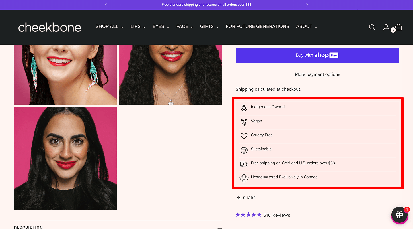 When to test: Cart abandon at checkout start.
Why: Payment badges reassure safety.
Variation idea: Add PayPal, Visa, and Mastercard icons near the CTA.
Goal: Reduce checkout drop-off by 10%.
Test type: Element swap
How to implement: Insert badge sprites, observe checkout_start rate.
🛍️ E-commerce Website — Cart Page A/B Test
-
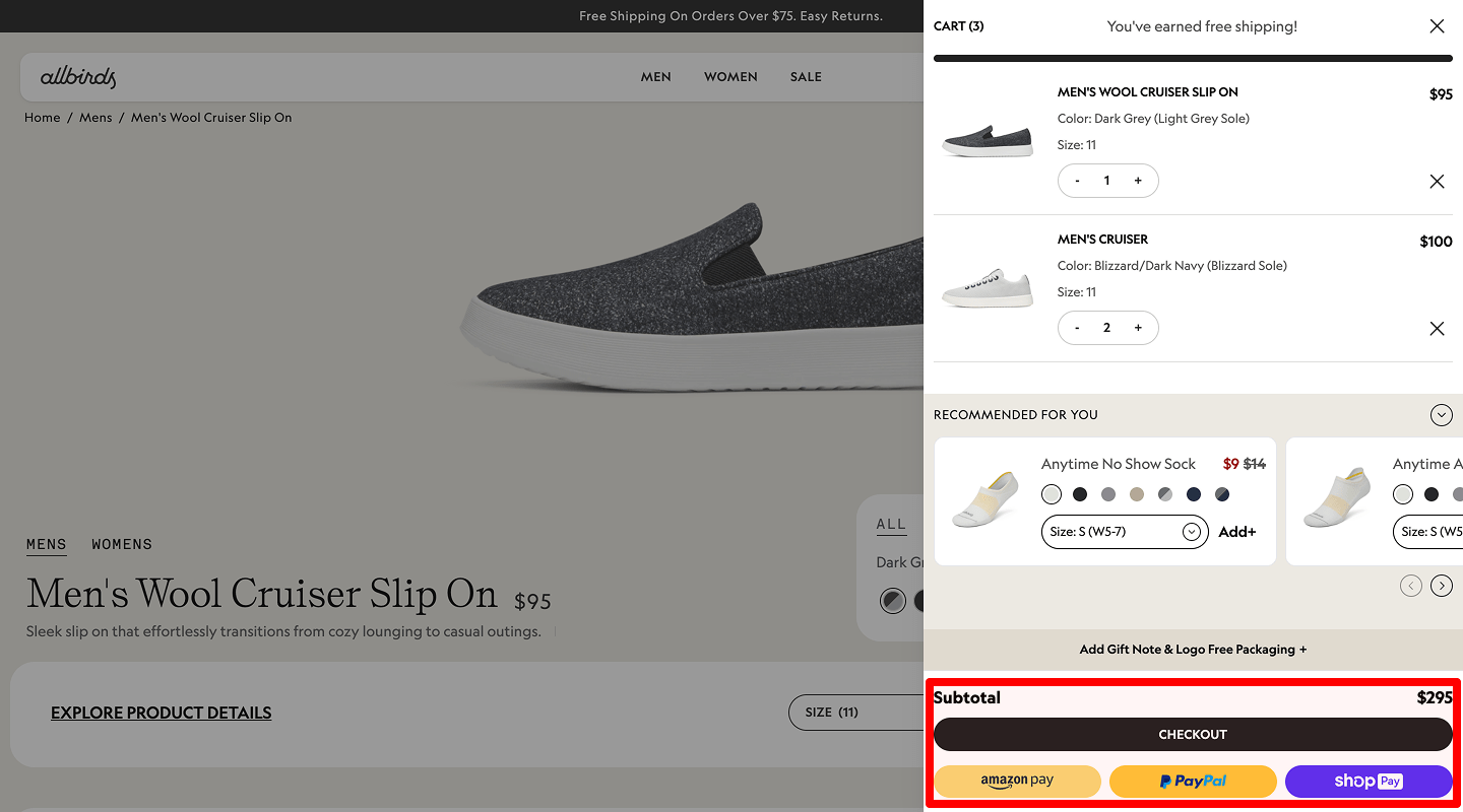
Cart Summary Position (Top vs. Side)
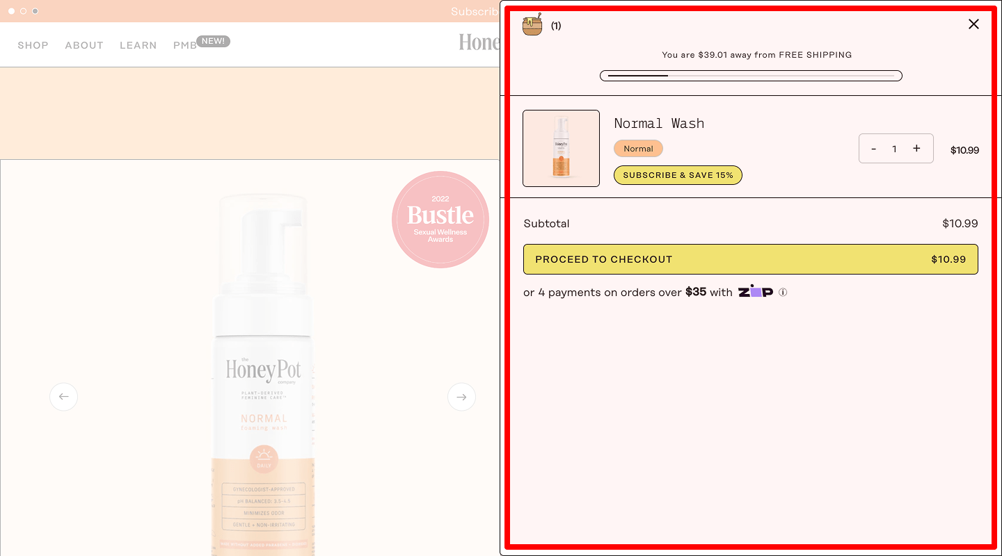 When to test: High abandonment on cart page.
Why: Prominent summary improves clarity.
Variation idea: Move totals from bottom to fixed right sidebar.
Goal: Reduce abandonment rate by 8%.
Test type: Element swap
How to implement: Make cart totals sticky via CSS, log abandon events before vs. after. -
Coupon Field Placement (Above vs. Below Total)
 When to test: Low coupon usage.
Why: Visible field encourages code entry.
Variation idea: Place coupon input above order total.
Goal: Increase coupon redemptions by 20%.
Test type: Element swap
How to implement: Re-order coupon element, track coupon_apply events. -
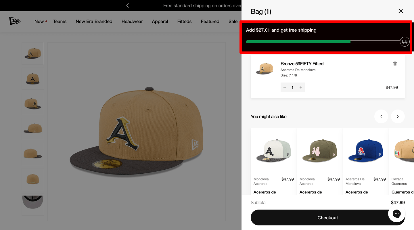
Recommended Products Block
 When to test: Low order value.
Why: Suggestions boost cross-sell.
Variation idea: Add a “You May Also Like” carousel below the cart.
Goal: Increase add-ons by 10%.
Test type: Element swap
How to implement: Embed product-recommendations widget; track add_to_cart from carousel. -
A/B Test Checkout Button Text
 When to test: Few proceed to checkout.
Why: “Proceed to Payment” feels more precise than “Checkout.”
Variation idea: Change to “Proceed to Payment.”
Goal: Improve checkout starts by 15%.
Test type: Element swap
How to implement: Update CTA label, compare click-to-checkout ratio.
💳 E-commerce Website — Checkout Page A/B Test
-
One-Page vs. Multi-Step Form
 When to test: Step drop-off >30%.
Why: Single page reduces navigation friction.
Variation idea: Combine shipping and payment into one scrollable page.
Goal: Increase completed checkouts by 10%.
Test type: Redirect test
How to implement: Switch to one-page template; track completion vs. baseline. -
Guest Checkout vs. Account Login Prompt
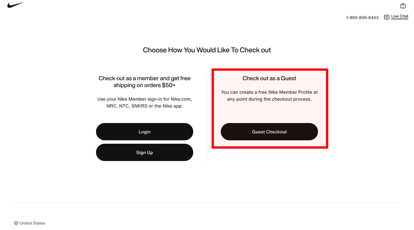 When to test: High abandon at login step.
Why: Forced login adds friction.
Variation idea: Show guest checkout option prominently above login.
Goal: Improve checkout starts by 15%.
Test type: Element swap
How to implement: Re-order login/guest blocks; observe start_checkout events. -
Progress Bar Visibility
 When to test: Users unsure of steps left.
Why: Progress indicator reduces anxiety.
Variation idea: Add top-bar showing “Step 2 of 3.”
Goal: Reduce drop-off by 8%.
Test type: Element swap
How to implement: Insert progress UI, measure funnel abandonment. -
Payment Icon Style vs. Text
 When to test: Payment trust low, drop-off at final page.
Why: Recognizable logos reassure.
Variation idea: Swap plain text for Visa/PayPal icons.
Goal: Increase completed payments by 10%.
Test type: Element swap
How to implement: Add SVG logos near the CTA; monitor purchase_complete. -
Form Field Layout (Two-Column vs. One-Column)
 When to test: Slow form completion.
Why: Single column reduces eye movement.
Variation idea: Change the fields to a full-width single column.
Goal: Speed up completion time by 15%.
Test type: Element swap
How to implement: Change CSS grid to 1-col; track time_to_order.
🎉 E-commerce Website — Thank You Page A/B Test
-
A/B Test Upsell Offer Section
 When to test: No post-purchase add-on buys.
Why: Timely offers boost AOV.
Variation idea: Insert “Add this item” carousel below thank-you.
Goal: Track upsell clicks and purchases.
Test type: Element swap
How to implement: Embed upsell carousel, log upsell_purchase events. -
Social Share Buttons
 When to test: Low referral traffic.
Why: Sharing spreads brand reach.
Variation idea: Add Facebook/Twitter share buttons with simple icons.
Goal: Count shares and referral visits.
Test type: Element swap
How to implement: Use share API, capture share_click events. -
Email Subscription Prompt
 When to test: Few newsletter sign-ups.
Why: Thank-you moments yield high opt-in rates.
Variation idea: Add “Join our newsletter for 10% off next time.” field.
Goal: Increase email sign-ups by 20%.
Test type: Element swap
How to implement: Embed signup form, track subscribe events.
🔍 E-commerce Website — Search Results Page A/B Test
-
Grid vs. List Layout
 When to test: Low clicks from search results.
Why: Some users prefer list detail over grid thumbnails.
Variation idea: Swap 3-column grid for vertical list view.
Goal: Improve clicks on results by 15%.
Test type: Element swap
How to implement: Offer a toggle view, record click_through events. -
“No Results” Message Wording
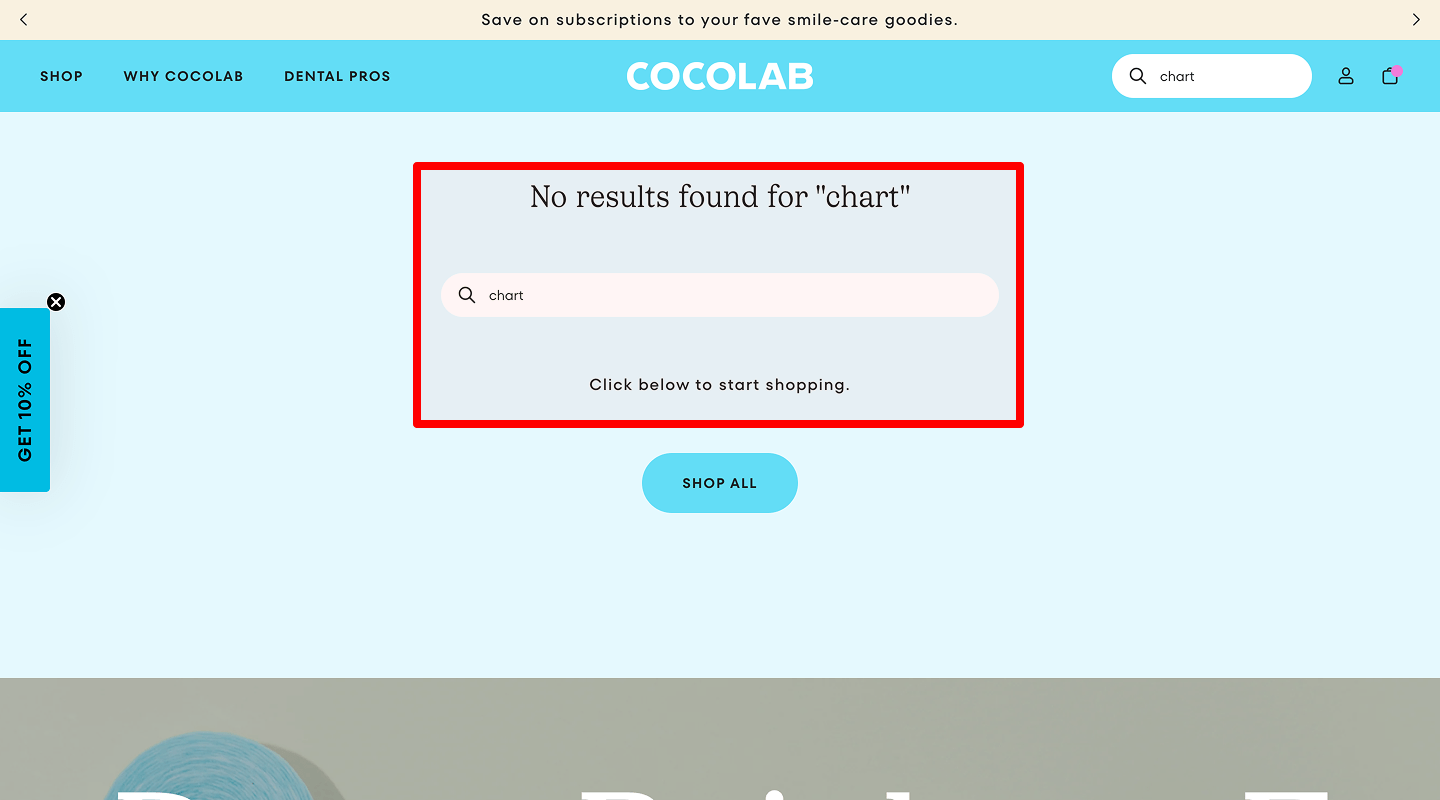 When to test: Users see no results often.
Why: Clear guidance reduces drop-off.
Variation idea: Change “No results found” to “Try different keywords or browse categories.”
Goal: Track searches after no-result.
Test type: Element swap
How to implement: Update message copy; watch follow-up_search events. -
A/B Test Filter Panel Presence
 When to test: Users give up after search.
Why: Filters refine results to match user needs.
Variation idea: Add filter controls above results.
Goal: Increase filter usage events by 20%.
Test type: Element swap
How to implement: Show filter bar, capture filter_apply events.
🔑 E-commerce Website — Login / Registration Page A/B Test
-
Form Position (Center vs. Side)
 When to test: Low login success or slow form completion.
Why: Centered forms focus attention.
Variation idea: Move form from left column to page center.
Goal: Increase successful submits by 12%.
Test type: Element swap
How to implement: Update CSS layout; track login_success events. -
Field Labels vs. Placeholders in Login/Registration
 When to test: Users report entry errors.
Why: Persistent labels avoid confusion.
Variation idea: Show labels above fields instead of inside placeholders.
Goal: Reduce login/register errors by 15%.
Test type: Element swap
How to implement: Convert placeholders to -
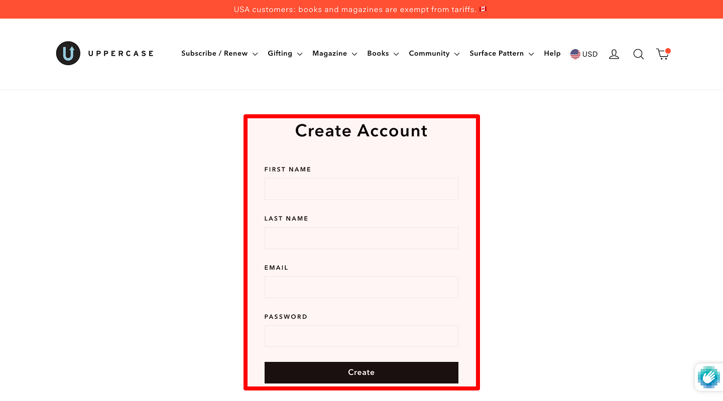
Button Text (“Log In” vs. “Sign In”)
 When to test: Few registrations vs. logins.
Why: “Create Account” may feel more inviting than “Register.”
Variation idea: Change “Register” to “Create My Account.”
Goal: Raise new sign-ups by 10%.
Test type: Element swap
How to implement: Update button copy; compare sign_up events.