
If your site gets traffic but conversions stay flat, you probably do not need more random ideas. You need a clearer diagnosis. A CRO website audit helps you find where people hesitate, what slows decisions down, and which fixes are actually worth testing. Instead of guessing why visitors bounce or why leads stall, you build a practical list of issues you can review, prioritize, and improve.
This guide is for marketers, product teams, eCommerce managers, founders, and SaaS growth teams that want a conversion rate optimization audit they can really use. A practical CRO audit should show where users lose momentum, which pages create friction, and how to turn those findings into changes that improve real business results. You will learn how to run a website conversion audit step by step: define your real conversion goals, validate analytics, segment traffic, map funnel leaks, review UX friction, strengthen trust, and turn findings into a testing plan.
You will also get a practical CRO audit checklist, examples for eCommerce and SaaS, and FAQ answers for the long-tail questions people actually search when they want to know how to do a CRO audit without wasting weeks. If you have been searching for a website conversion audit, a conversion audit, or even a free CRO audit framework to adapt internally, this guide is built to give you a clear starting point.
Quick Note From The Trenches: Most conversion problems are not one dramatic failure. They are a stack of small frictions: one vague headline, one slow image, one extra form field, one mobile CTA that is awkward to tap, one missing trust cue near the decision point. A CRO audit is how you find that stack before you spend more money sending traffic into it.
What Is A CRO Website Audit?
A CRO website audit is a structured review of how your website turns visitors into customers, leads, trials, or demos. In practice, teams may also describe the same process as a website conversion audit, a conversion rate optimization audit, or a conversion rate optimisation audit, depending on the market they work in. A good conversion rate optimization audit combines analytics, funnel analysis, UX review, behavior data, and prioritization so you can identify why people drop off and what to fix first. In plain English: a website conversion audit shows you where momentum breaks and how to improve it with evidence instead of opinion.
Why A CRO Audit Matters Before You Buy More Traffic
Many teams try to solve weak conversion rates by buying more clicks, launching more campaigns, or rewriting ads. Sometimes traffic really is the issue. But often the real problem lives on the site: confusing messaging, unclear next steps, slow pages, hidden costs, weak proof, or forms that feel heavier than they should. A CRO audit matters because it helps you fix the experience before you pay to amplify friction. A strong conversion optimization audit helps you stop treating weak conversion performance like a traffic problem when the real issue is page clarity, trust, or flow friction.
That is especially true in eCommerce and SaaS. In eCommerce, small issues around product pages, shipping clarity, and checkout can quietly reduce revenue. In SaaS, unclear value proposition, weak pricing-page structure, and poor lead forms can make good traffic look low-intent. A strong CRO audit process helps you separate traffic problems from conversion problems. That is one reason a CRO website audit often creates more value than another round of ad spend or another landing page rewrite based on instinct.
1) Start With Real Conversion Goals And Micro-Conversions

What To Check
Before you touch UX, copy, or testing, define what success means in operational terms. A conversion rate optimization audit needs a clear target, not a vague goal like “more revenue.” The same rule applies whether you call it a CRO audit, a website conversion audit, or a broader conversion optimisation audit: if the primary goal is fuzzy, the audit will be fuzzy too.
- Primary conversion: purchase, request demo, start trial, book a call, submit lead form.
- Micro-conversions: add to cart, visit pricing, click “compare plans,” reach key scroll depth, start checkout, use site search, watch onboarding video, open live chat.
- Lead quality signals: company size, use case, work email, selected plan, urgency, demo qualification fields.
Also review whether your current reporting mixes different definitions of success. I often see marketing counting any form submit, sales counting only qualified leads, and product focusing on trial creation. That creates three different stories and one messy audit.
Why It Matters
If your primary conversion is a purchase, your website conversion audit should focus hard on product pages, cart, checkout, shipping, payment, and mobile friction. If your primary conversion is a demo request, the audit should focus more on value prop clarity, trust, proof, and form design. Without a defined goal, your audit becomes technically correct and commercially weak.
How To Fix It
Write a simple internal conversion definition. One paragraph is enough.
- eCommerce example: “Primary conversion = completed purchase. Micro-conversions = add to cart, begin checkout, choose shipping, payment success. Audit priority = product pages, cart, checkout, mobile speed.”
- SaaS example: “Primary conversion = demo request from ICP. Micro-conversions = pricing visit, case study view, comparison click, form start, form submit. Audit priority = homepage, product pages, pricing page, demo form flow.”
Then choose 5–10 micro-conversions that reflect genuine buying intent. If newsletter signup is easy to trigger but rarely leads to revenue, do not let it dominate the audit.
2) Make Analytics Tell The Truth (GA4, Events, Attribution)

What To Check
This part is not glamorous, but it decides whether your CRO website audit is useful or fictional. Many failed CRO audits are really measurement problems in disguise, because broken tracking can make a healthy funnel look weak or make a weak funnel look healthy.
- Is GA4 installed once, not twice?
- Do key events fire correctly: purchase, generate_lead, sign_up, begin_checkout?
- Are event names and parameters consistent across page types?
- Are UTMs, cross-domain journeys, and payment redirects tracked correctly?
- Are internal traffic, QA sessions, bots, and staging visits filtered out?
You also need to connect conversions to the page or step where they happened. If you cannot see which landing pages and funnel stages influence outcomes, prioritization becomes guesswork.
Why It Matters
A conversion audit is only as strong as the measurement under it. If “add_to_cart” fires on the wrong action, or payment redirects break attribution, your funnel will tell the wrong story. Teams then optimize the wrong pages, blame the wrong traffic source, and lose time.
How To Fix It
- Build a short event map: list key funnel events and where each should fire.
- Test real journeys: run 5–10 sessions across desktop and mobile and check whether events fire once, in order, at the right step.
- Sanity-check counts: compare GA4 conversions with backend data for several days.
eCommerce example: If purchase counts are too high, the purchase event may be firing on thank-you page reload instead of real order confirmation.
SaaS example: If generate_lead is high but qualified leads are weak, add clearer funnel stages such as form_started, form_completed, and qualified_lead so your reporting reflects reality.
For GA4 basics and event guidance, Google’s documentation is still the most reliable starting point: GA4 developer guides.
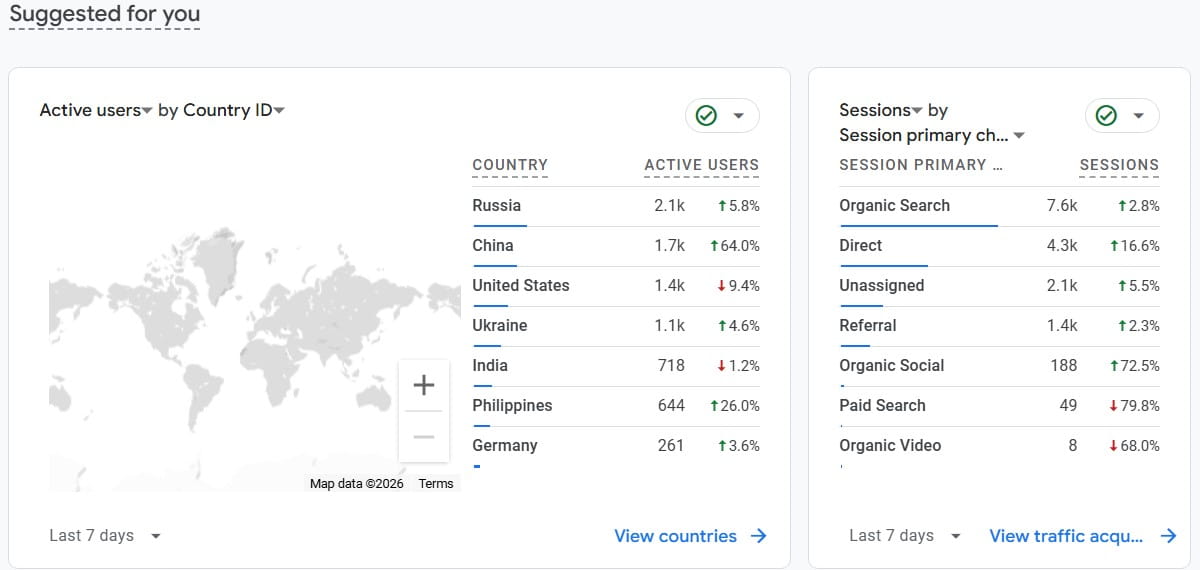
3) Segment The Audit By Device, Channel, And Intent
What To Check
A CRO audit checklist done in aggregate can hide the real leak. Segment early.
- Device: desktop, mobile, tablet.
- Channel: paid search, paid social, organic, email, referral, direct.
- Landing page intent: blog, category, product, pricing, comparison, feature page.
- New vs returning users: returning visitors usually behave differently and notice friction faster.
Why It Matters
Different users come with different expectations. A paid social visitor needs faster clarity. An organic visitor from a high-intent search often wants details, proof, and comparison. If you blend them together, you flatten the pattern and end up fixing symptoms instead of causes.
How To Fix It
Choose 3–5 high-impact segments and run the main audit steps for each.
- eCommerce example: Mobile paid social traffic to product pages needs strong image loading, visible trust cues, and a simple add-to-cart path.
- SaaS example: Organic desktop traffic to pricing pages needs clear plan structure, proof, integration visibility, and low-friction CTA paths.
If you are using Plerdy, this is where the workflow gets more practical. You can filter heatmaps and session recordings by page, device, and source instead of mixing every visitor into one blurry conclusion.
4) Map Funnels And Find The Exact Drop-Off Points
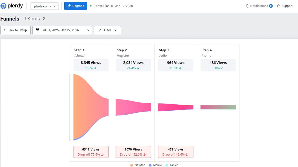
What To Check
Funnels are the backbone of a website conversion audit. If your team wants a conversion audit that leads to action, funnel mapping is usually where the most valuable answers start to appear. Do not stop at “homepage to purchase.” Break your conversion flow into useful steps.
- Landing page view
- Product view or pricing view
- Add to cart, start trial, or form start
- Begin checkout or create account
- Shipping, payment, confirmation for eCommerce
- Form completion or calendar booking for SaaS
Then identify where drop-off is unusually high. Not every drop-off is a problem. The real question is why one step performs worse than it should.
Why It Matters
This is where a cro audit process becomes concrete. Funnels translate “our site is not converting” into specific problems such as “people drop after shipping cost appears” or “people start the demo form but quit when we ask for a work email.” That is actionable.
How To Fix It
- Compare segment by segment: mobile vs desktop, paid vs organic, new vs returning.
- Look for step-specific friction: hidden costs, unclear fields, weak error messages, forced account creation, confusing CTA language.
- Validate with qualitative data: recordings, chat logs, support tickets, on-site search, heatmaps.
eCommerce example: If drop-off spikes at shipping, check whether delivery costs appear too late, whether shipping speed is vague, or whether the free-shipping threshold is invisible.
SaaS example: If form starts are high but submissions are low, review field count, field clarity, validation rules, and mobile form usability.
For deep funnel thinking and UX patterns, Baymard’s research is a strong reference point for checkout behavior: Baymard Institute research.
5) Remove UX Friction That Quietly Kills Momentum

What To Check
UX friction is usually not one dramatic design failure. It is a pile of small effort taxes.
- Navigation: can users find what they need in under 10 seconds?
- Information scent: do links, labels, and buttons match the destination?
- Forms: field count, labels, errors, autofill support, visible progress.
- Cognitive load: too many options, too much text, weak hierarchy.
- Interruptions: popups, sticky bars, or overlays that block intent too early.
Why It Matters
Conversion is fragile. People arrive with partial attention. When the page makes them search, decode, hesitate, or repeat actions, many do not consciously reject the offer. They just drift away. That is why UX review is a core part of any conversion rate optimization audit. It is also why a conversion rate optimisation audit should never be reduced to analytics screenshots alone, because friction lives in the real experience, not just in reports.
How To Fix It
- eCommerce example: Simplify filters, make required choices obvious, and show key shopping answers near the product decision.
- SaaS example: Remove overlap between product, features, and solutions pages so users can move faster toward pricing, proof, and the main CTA.
If you use popups, time them carefully. A well-triggered popup can support intent. A page-load popup often creates friction before trust exists. If you want more control here, learn about Plerdy popups.
For UX research principles and common friction patterns, Nielsen Norman Group is a reliable source: Nielsen Norman Group.
6) Check Speed And Core Web Vitals With Conversion In Mind
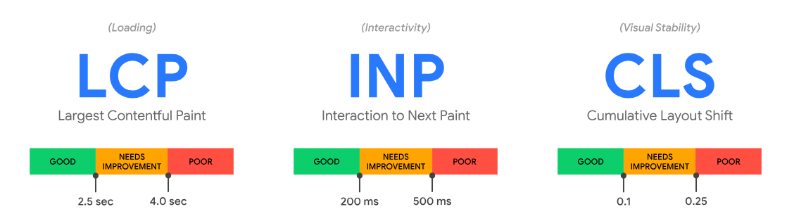
What To Check
Speed work should support conversions, not become a vanity report.
- LCP: Is the main page content visible quickly on important landing pages?
- INP: Do taps and clicks feel responsive, especially on mobile?
- CLS: Does the layout shift while people try to read or act?
- Field data: Are real users having a slower experience than lab tools suggest?
Why It Matters
Slow pages damage trust and momentum. Layout shifts cause misclicks. Interaction lag makes forms feel broken. When the traffic is paid, those problems become paid leaks. A cro website audit should always connect performance to decision quality.
How To Fix It
- Prioritize above-the-fold assets: compress key images, reduce heavy hero elements, and load the important part of the page first.
- Prevent layout shifts: reserve space for images, banners, widgets, and fonts.
- Review third-party scripts: chat, reviews, trackers, and testing tools can create real weight.
eCommerce example: A category page with dozens of thumbnails should not force every image to load at full size immediately.
SaaS example: A landing page does not need a huge autoplay video to communicate value. Clear messaging usually converts better than decorative motion.
For official guidance on site performance in the context of search and user experience, Google Search Central is the right reference: Page experience documentation.
7) Fix Above-The-Fold Messaging And Value Prop Clarity

What To Check
- Is the headline concrete, or abstract?
- Can a new visitor answer: What is this? Who is it for? Why should I care?
- Does the primary CTA match readiness: buy, start trial, request demo, compare plans?
- Do visuals support the message instead of distracting from it?
Why It Matters
People do not read websites in a calm, linear way. They interrogate them. Above the fold is where your page either resolves confusion or rewards it with a bounce. That is why headline clarity belongs inside every serious website conversion audit checklist.
How To Fix It
- Promise: What outcome do you help people achieve?
- Mechanism: How do you do it in plain language?
- Proof cue: What suggests this is real and trustworthy?
- CTA: What is the next best action for this stage of intent?
eCommerce example: “Premium Quality For Everyday Life” sounds polished but says almost nothing. A concrete benefit is stronger.
SaaS example: A feature dump like “dashboards, workflows, insights” is weaker than an outcome-led statement that explains the business benefit in one breath.
One easy internal test: show the hero for five seconds, hide it, then ask what the product is and who it is for. If people guess wrong, your page is too vague.
8) Audit Trust Signals, Proof, And Risk Reversal

What To Check
- Social proof: reviews, testimonials, case studies, logos.
- Policies: shipping, returns, privacy, warranty, cancellation.
- Security cues: payment methods, SSL, compliance claims.
- Guarantees: anything that reduces perceived risk.
- Contactability: support channels that look real and accessible.
Why It Matters
Conversions happen when motivation is stronger than doubt. Doubt often does not show up as a metric. It shows up as hesitation, repeated scrolling, policy checking, or tab switching. Trust elements are not decoration. They are decision support.
How To Fix It
Place trust where doubt appears.
- eCommerce example: Add returns and shipping clarity near the purchase action, not hidden in the footer.
- SaaS example: Add security, compliance, onboarding, or cancellation clarity near pricing and form CTAs.
Also remove “negative proof”: broken links, stale screenshots, outdated years, inconsistent pricing, weak support expectations, or badges that look fake.
9) Do A Mobile-First UX Pass (Not A Desktop Copy)

What To Check
- Thumb reach: are key actions easy to reach?
- Tap targets: are buttons and links easy to tap accurately?
- Sticky elements: helpful or obstructive?
- Form input: correct keyboards, autofill, spacing, error visibility?
- Content density: do paragraphs become walls on small screens?
Why It Matters
Mobile users are often distracted, impatient, and less forgiving. Many brands blame “low mobile intent” when the real issue is weak mobile UX. That is why every cro audit checklist should include a true mobile-first pass, not a desktop review shrunk to a phone. This becomes even more important in an ecommerce CRO audit, where small mobile frustrations around galleries, selectors, sticky bars, and checkout fields can quietly reduce revenue.
How To Fix It
- Simplify the first screen: one clear message, one clear CTA, one trust cue.
- Use sticky CTAs carefully: helpful on some pages, harmful on others.
- Reduce form friction: fewer fields, clear labels, visible progress, better spacing.
eCommerce example: Make selectors large and obvious. A tiny size selector near add-to-cart creates dead clicks and confusion.
SaaS example: Avoid forcing mobile users to compare plans in a wide horizontal table. Convert the same information into a more vertical reading experience.
10) Use Behavior Data: Heatmaps And Session Recordings

What To Check
Analytics tells you what happened. Behavior tools help explain why it happened.
- Rage clicks: repeated clicks on inactive elements.
- Dead zones: important content nobody sees or interacts with.
- Scroll drop-offs: where attention fades.
- Form hesitation: pauses, corrections, repeated errors.
- Navigation loops: repeated back-and-forth between pages.
Why It Matters
This is where a cro website audit becomes human. You stop debating abstract opinions and start watching real visitors misunderstand your page, miss key answers, or get stuck in obvious friction.
How To Fix It
Review a few high-impact pages with intent in mind. Plerdy can help you combine heatmaps, session recordings, and basic funnel analysis so you can connect interaction patterns to drop-off points faster.
- eCommerce example: If users click a product image expecting zoom but nothing happens, that is an easy friction fix.
- SaaS example: If users leave pricing to search for integrations or setup details, your pricing page is missing decision support.
11) Prioritize With A Scoring Model (Quick Wins Vs. Big Bets)

What To Check
By this point, a conversion rate optimization audit often produces 20–60 findings. Without prioritization, the audit turns into a nice document and a weak operating plan.
I usually use a simple variation of ICE or PIE:
- Impact: how much could this change move conversions?
- Confidence: how strong is the evidence behind the issue?
- Effort: how complex is implementation and QA?
Why It Matters
Prioritization turns analysis into action. It also protects the team from chasing redesign fantasies when the evidence supports smaller, faster fixes first.
How To Fix It
Score each finding from 1 to 5 for Impact, Confidence, and Effort. Then group the work.
Lightweight Prioritization View (Example)
- Quick Wins (High Confidence, Low Effort)
- Product page: Make image gallery clickable and add zoom (Impact 3 / Confidence 5 / Effort 2)
- Checkout: Show shipping costs earlier and add free-shipping threshold message (Impact 4 / Confidence 4 / Effort 2)
- SaaS pricing: Add integrations block and security link near CTA (Impact 3 / Confidence 4 / Effort 2)
- Medium Bets (Good Upside, Moderate Effort)
- Landing page: Rewrite hero messaging and restructure proof section (Impact 4 / Confidence 3 / Effort 3)
- Forms: Reduce fields and improve mobile spacing and errors (Impact 3 / Confidence 4 / Effort 3)
- Big Bets (High Effort, Needs Validation)
- Navigation overhaul: Simplify information architecture to reduce loops (Impact 5 / Confidence 2 / Effort 5)
- Checkout redesign: One-page checkout or alternate payment flow (Impact 5 / Confidence 3 / Effort 5)
The goal is not perfect math. The goal is visible trade-offs and better decisions.
12) Build An Experimentation And Validation Plan
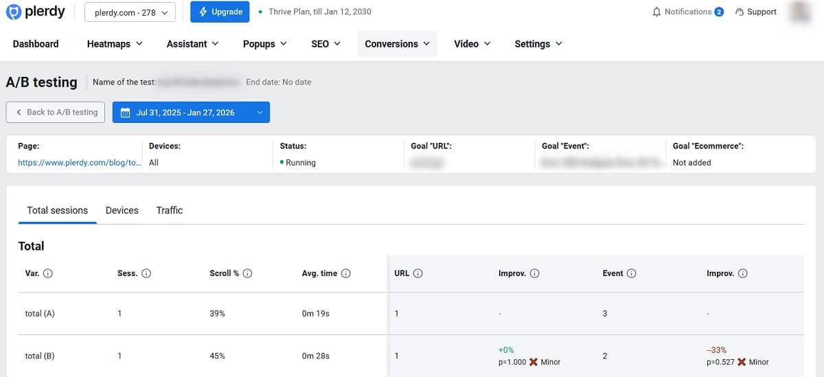
What To Check
Your validation plan should include:
- Hypothesis: what changes, for whom, and why it should help.
- Primary metric: the main conversion you defined in Step 1.
- Guardrails: lead quality, refund rate, support tickets, bounce, downstream friction.
- QA plan: device, browser, payment, form, and edge-case testing.
- Sample size caution: do not declare victory too early.
Why It Matters
This is where a website conversion audit becomes a repeatable system. You stop trying to guess better and start learning faster without breaking the business.
How To Fix It
- Start with obvious fixes: remove clear bugs and low-risk friction without forcing an experiment for every minor issue.
- Test meaningful changes: value prop shifts, page structure, CTA strategy, pricing presentation, and trust placement.
- Use guardrails: more conversions should not mean weaker customers or more post-conversion pain.
- Run tests long enough: include real traffic variation and avoid early stopping.
eCommerce example: Testing earlier shipping clarity is often safer and faster than testing a full checkout redesign.
SaaS example: If you shorten a demo form, track both volume and lead quality so you do not celebrate noise.
For deeper guidance on running trustworthy experiments, A/B testing concepts can help you structure the next phase.
When To Run A CRO Audit
You do not need to wait for a crisis to run a CRO website audit. In practice, the best moments are:
- before increasing paid media budgets
- after a redesign or major page restructure
- when conversion rate drops suddenly
- when traffic rises but revenue or lead quality does not
- before testing large pricing, checkout, or form changes
- quarterly for high-value pages and core funnels
If your funnel drives serious revenue, a regular conversion rate optimization audit is not extra work. It is basic operating hygiene.
Tools You Need For A CRO Website Audit
You do not need twenty tools to run a strong website conversion audit, but you do need the right categories. Some teams start with a free CRO audit template or spreadsheet, but the real value comes from combining analytics, behavior data, and prioritization in one consistent review process.
- Analytics: to measure traffic, events, and conversion steps.
- Funnel and event tracking: to identify exact drop-off points.
- Heatmaps: to see interaction hotspots and ignored areas.
- Session recordings: to watch hesitation, confusion, and friction.
- Form analytics: to see where users abandon or fail.
- Testing tools: to validate changes that could help or hurt.
If you want one practical workflow instead of stitching several disconnected tools together, Plerdy can help with heatmaps, session recordings, event analysis, funnels, popups, and testing support in one place. For teams comparing plerdy cro tools with separate point solutions, the biggest advantage is seeing behavior, friction, and funnel signals in one workflow instead of across disconnected tabs.
Common CRO Audit Mistakes
Even smart teams weaken a CRO audit process in predictable ways. The most common mistakes are:
- running the audit without one clear primary conversion
- trusting messy analytics or duplicated events
- reviewing the site only in aggregate without segmentation
- focusing on opinions instead of behavior evidence
- creating a huge findings list without prioritization
- treating the audit as a one-time project instead of a repeated workflow
The strongest audits are not the longest. They are the clearest, most evidence-based, and easiest to act on. That is true for single-page reviews, full CRO audits, and any conversion optimization audit meant to support real prioritization instead of just producing a long document.
Mini-Case: What A CRO Audit Often Uncovers
Here is a pattern I have seen many times in both eCommerce and SaaS. The team thinks the problem is traffic quality. Paid spend is high, conversion rate is weak, and everyone wants a new campaign, new creative, or a new landing page.
Then the CRO website audit starts.
Before: Funnel data shows decent product-page or pricing-page engagement, but a sharp drop later in the flow. Session recordings show hesitation, repeated scrolling, and exits around checkout or form submission. Heatmaps show clicks on answers that are too hidden. On mobile, the flow feels cramped, noisy, and harder than it should.
What We Changed:
- Moved shipping costs and delivery details earlier in the eCommerce flow.
- Made returns and trust information more visible near the decision point.
- Simplified mobile form spacing, labels, and error handling.
- Reduced visual emphasis on distracting coupon or low-priority fields.
- Added one strong trust cue near payment or submission.
After: The funnel does not become perfect overnight, but the biggest leak becomes smaller. The team stops blaming “bad traffic” for everything because the behavior evidence is clearer. And once that happens, the next experiments become obvious.
That is what a real conversion audit should do: reduce noise, expose the sharpest friction, and create a focused path to improvement.
What Your CRO Audit Deliverable Should Include
If you are building a formal report from this work, your final deliverable should include:
- a clear conversion definition
- audited pages and segments
- funnel findings with drop-off points
- behavior evidence from heatmaps, recordings, and forms
- UX and messaging issues by page
- trust and speed risks
- a scored priority list
- quick wins and test hypotheses
- owners, QA notes, and next steps
This makes the CRO audit checklist operational instead of theoretical. If you work with international teams, it is also useful to label the final document clearly, since stakeholders may search for it internally as a conversion rate optimization audit, conversion rate optimisation audit, or website conversion optimisation audit.
CRO Audit Checklist (Copy/Paste)
- Define the primary conversion goal and 5–10 meaningful micro-conversions
- Validate GA4 and event tracking: no duplicate tags, correct funnel events
- Check attribution basics: UTMs, cross-domain flows, payment redirects
- Segment the audit by device, channel, and landing page intent
- Build 1–2 core funnels and identify the biggest drop-off points
- Review UX friction in navigation, forms, hierarchy, and interruptions
- Check speed and Core Web Vitals on high-impact pages
- Audit headline clarity, value proposition, and CTA alignment
- Verify trust signals, policies, proof, and risk-reversal elements
- Run a mobile-first UX pass for tap targets, sticky elements, and forms
- Review heatmaps and session recordings for hesitation, rage clicks, and dead zones
- Score findings by Impact, Confidence, and Effort
- Create a validation plan with hypotheses, metrics, guardrails, and QA
FAQ
What Is A CRO Website Audit?
A CRO website audit is a structured review of how well your site turns visitors into leads, customers, trials, or other target actions. It combines analytics, funnel review, UX analysis, and behavior evidence such as heatmaps or session recordings to show where people drop off and what should be improved first.
How Do You Do A CRO Audit Step By Step?
A strong CRO audit usually starts with defining your main conversion and micro-conversions, then validating analytics and events, segmenting traffic, mapping funnels, reviewing UX friction, checking speed and trust signals, analyzing behavior data, prioritizing issues, and building an experimentation plan.
What Should A CRO Audit Checklist Include?
A solid CRO audit checklist should include conversion goals, micro-conversions, analytics validation, attribution checks, segmentation, funnel analysis, UX review, mobile review, Core Web Vitals, trust signals, behavior insights from heatmaps or recordings, prioritization, and a testing plan.
When Should You Run A Conversion Rate Optimization Audit?
You should run a conversion rate optimization audit before scaling paid traffic, after a redesign, when conversion rate drops, when traffic grows without matching revenue or lead quality, and regularly on your highest-value pages and funnels.
What Tools Do You Need For A Website Conversion Audit?
At minimum, you need analytics, event tracking, and funnel visibility. Heatmaps, session recordings, form analysis, and testing tools make the audit more useful because they help explain why users hesitate and which fixes are most likely to improve conversions.
What Is The Difference Between A CRO Audit And A UX Audit?
A UX audit focuses on usability and experience quality. A CRO audit includes UX, but it is anchored to conversion goals, drop-off points, and measurable business outcomes. In practice, CRO turns UX findings into prioritized changes tied to revenue, leads, or other target actions.
What Is The Difference Between A CRO Audit And A Website Conversion Audit?
In most cases, there is very little difference. A CRO audit and a website conversion audit usually describe the same process: reviewing data, UX, funnels, trust signals, and friction points to improve conversion performance. The main difference is often just wording.
Can You Start With A Free CRO Audit Process?
Yes. Many teams begin with a free CRO audit checklist, a spreadsheet, or a simple internal template. What matters most is not the format but whether the audit includes reliable analytics, behavior evidence, prioritization, and a clear plan for testing or implementation.
Conclusion
A CRO website audit is not a one-time document you save in a folder and forget. It is a practical system for turning fuzzy frustration into a focused action plan. You define the real conversion, validate tracking, segment the right visitors, map drop-offs, review friction, strengthen trust, and then prioritize what deserves fixing or testing first.
If you want the simplest next move, start with one high-traffic page and one core funnel. Run this CRO audit checklist on that narrow scope before you expand to the whole site. You will usually learn more from one focused pass than from a shallow review of everything.
And if you want to speed up the “why” side of the audit, tools like Plerdy can help you combine heatmaps, session recordings, funnels, event insights, and on-site popups without turning your process into a spreadsheet marathon.
Next Step: Choose your primary conversion goal, define the funnel steps behind it, and run the first audit pass this week. Then implement two quick wins and write one testable hypothesis. That is how a real conversion rate optimization audit starts moving revenue instead of just producing notes.