🏠 Website Homepage Conversion Rate Checklist
-
Hero Section
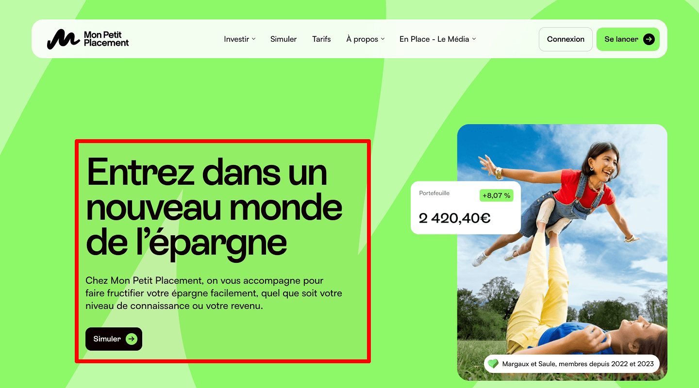
Idea & Why: A prominent headline plus sub-headline that speaks directly to your visitor’s main need. This immediately grabs attention and shows value.
Example: Big bold text: “Grow Your Leads by 50% in 30 Days” over a clean background image.
-
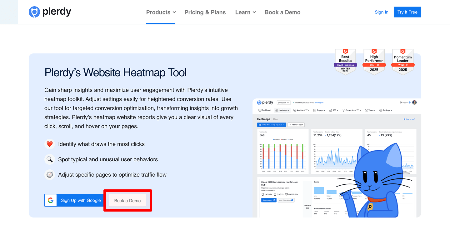
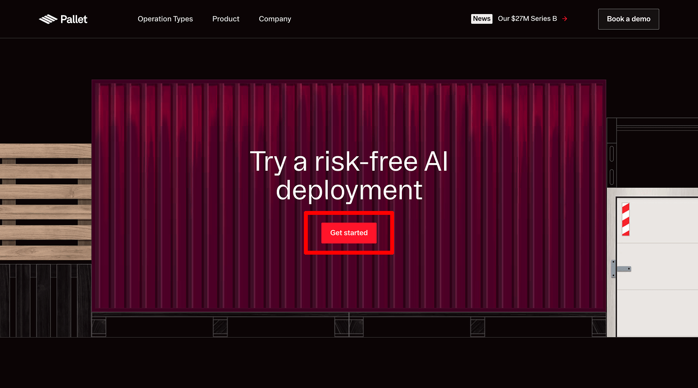
Main CTA Button
Idea & Why: Place a brightly colored “Get Your Free Audit” button above the fold. Clear action drives clicks.
Example: A large green button with arrow icon, centered under the headline.
-
Benefit Highlights
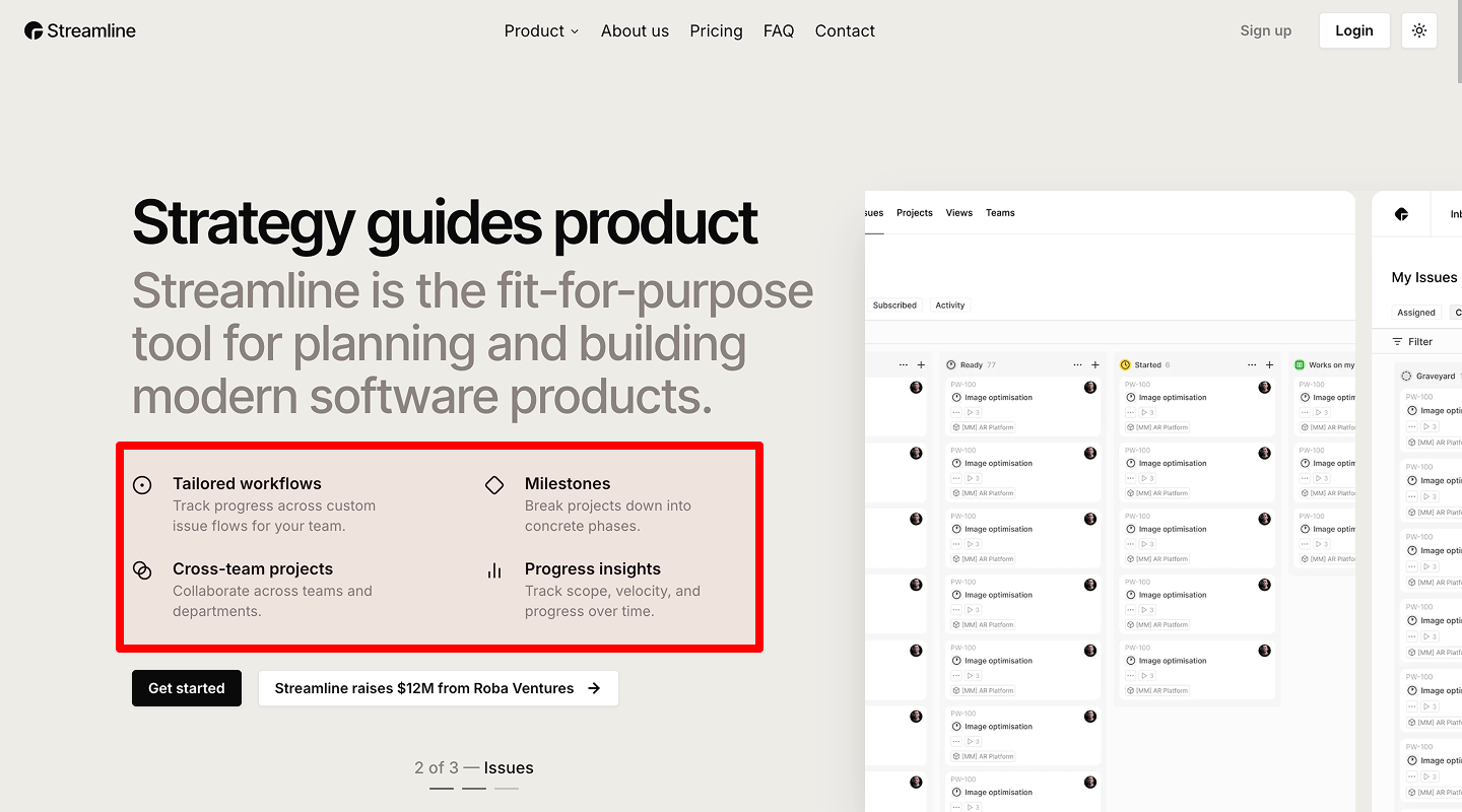
Idea & Why: 3–5 short bullet points of key benefits (e.g. “24/7 Support,” “No Setup Fees”). Quickly shows value.
Example: Icons + text: a clock icon with “Fast Turnaround,” a shield with “Secure Data.”
-
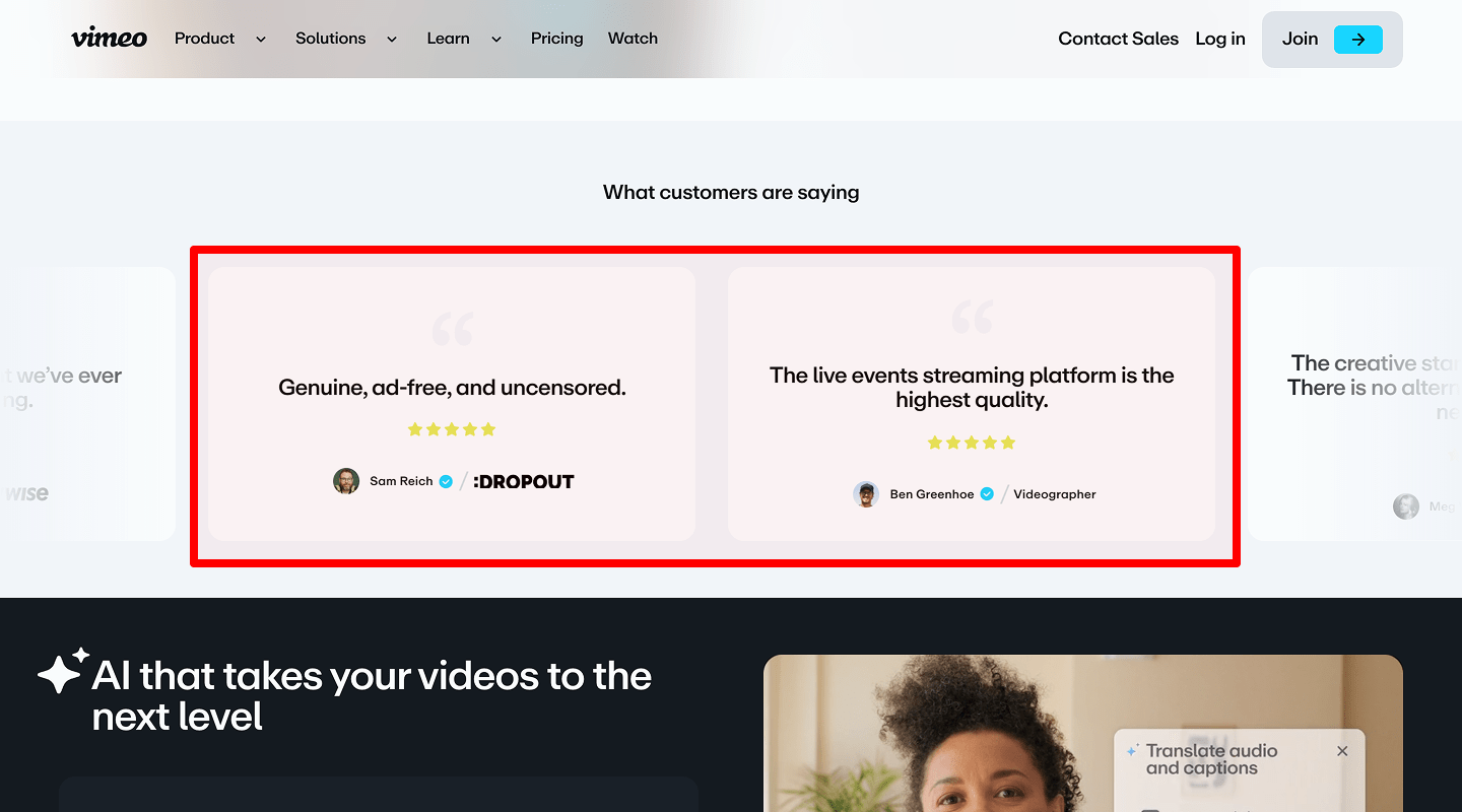
Social Proof Snippet
Idea & Why: Show a rotating testimonial with client photo and quote. Builds trust.
Example: “Plerdy’s audit boosted our sales 40%” – Jane D., Marketing Manager.
-
Trust Badges
Idea & Why: Logos of security certifications or partner brands. Reassures visitors and reduces friction.
Example: Small icons: “GDPR Compliant,” “ISO 27001 Certified.”
-
Simplified Navigation
Idea & Why: Limit top menu to 5 items (Home, Services, Pricing, About, Contact). A lean menu keeps focus.
Example: Clean horizontal bar with just text links.
🛠️ Website Services Page Conversion Rate Checklist
-
Detailed Service Descriptions
Idea & Why: For each service, include a short paragraph, solution bullets, and outcome metrics. Helps prospects understand exactly what they get.
Example: “SEO Audit – Identify hidden issues, fix technical errors, boost organic traffic by 30%.”
-
Secondary CTA Buttons
Idea & Why: After each service block, add “Learn More” or “Get Quote” buttons. Multiple CTAs keep action opportunities close by.
Example: Small blue button under each description.
-
Service Comparison Table
Idea & Why: Side-by-side feature table for Basic vs. Premium plans. Eases choice and highlights higher-value plans.
Example: Table with checkmarks showing which features each plan includes.
-
Case Study Preview
Idea & Why: Insert a one-sentence teaser plus “View Case Study” link under each service. Demonstrates real results.
Example: “See how we increased WidgetCo’s conversion by 45% →”
-
Pricing Teaser
Idea & Why: Below each service summary, show starting price (e.g. “From $499”). Anchors value and reduces sticker shock.
Example: Text in bold: “Starting at $499.”
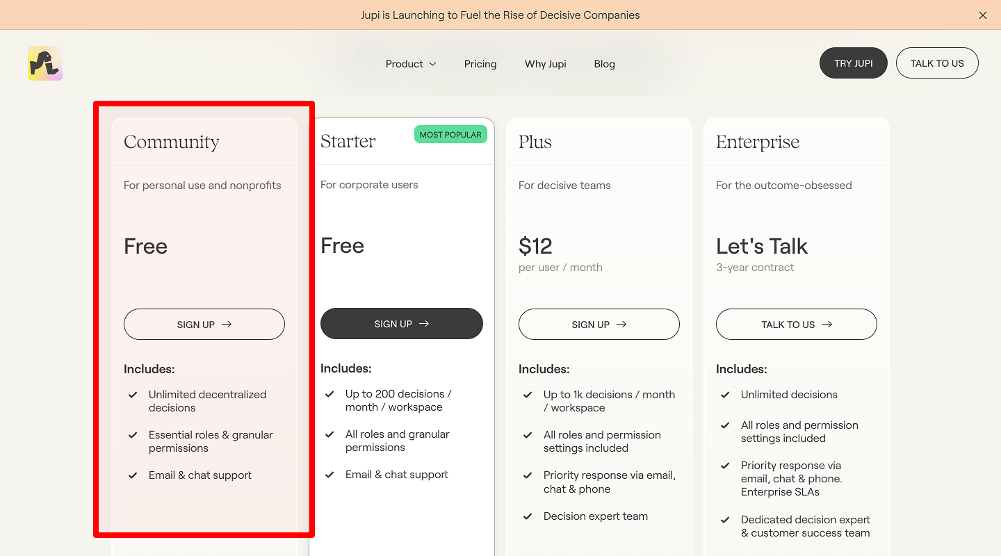
💲 Website Pricing Page Conversion Rate Checklist
-
Clear Pricing Table
Idea & Why: Show tiered plans in a grid with features and prices. Makes decision fast and transparent.
Example: Three columns: Basic $499/mo, Pro $999/mo, Elite $1,499/mo.
-
Promotion or Discount Banner
Idea & Why: Highlight limited-time offer (e.g. “20% off first 3 months”). Creates urgency.
Example: Bright yellow banner at top reading “Summer Sale – Ends August 31.”
-
Money-Back Guarantee
Idea & Why: “30-day money-back” statement reduces risk and increases trust.
Example: Small badge under pricing: “30-Day Money-Back Guarantee.”
-
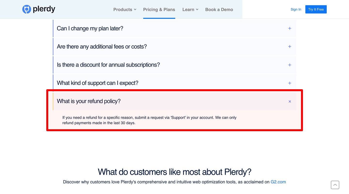
FAQs About Pricing
Idea & Why: Answer common questions (billing cycle, cancellation). Prevents objections.
Example: Accordion list under table with Q/A.
-
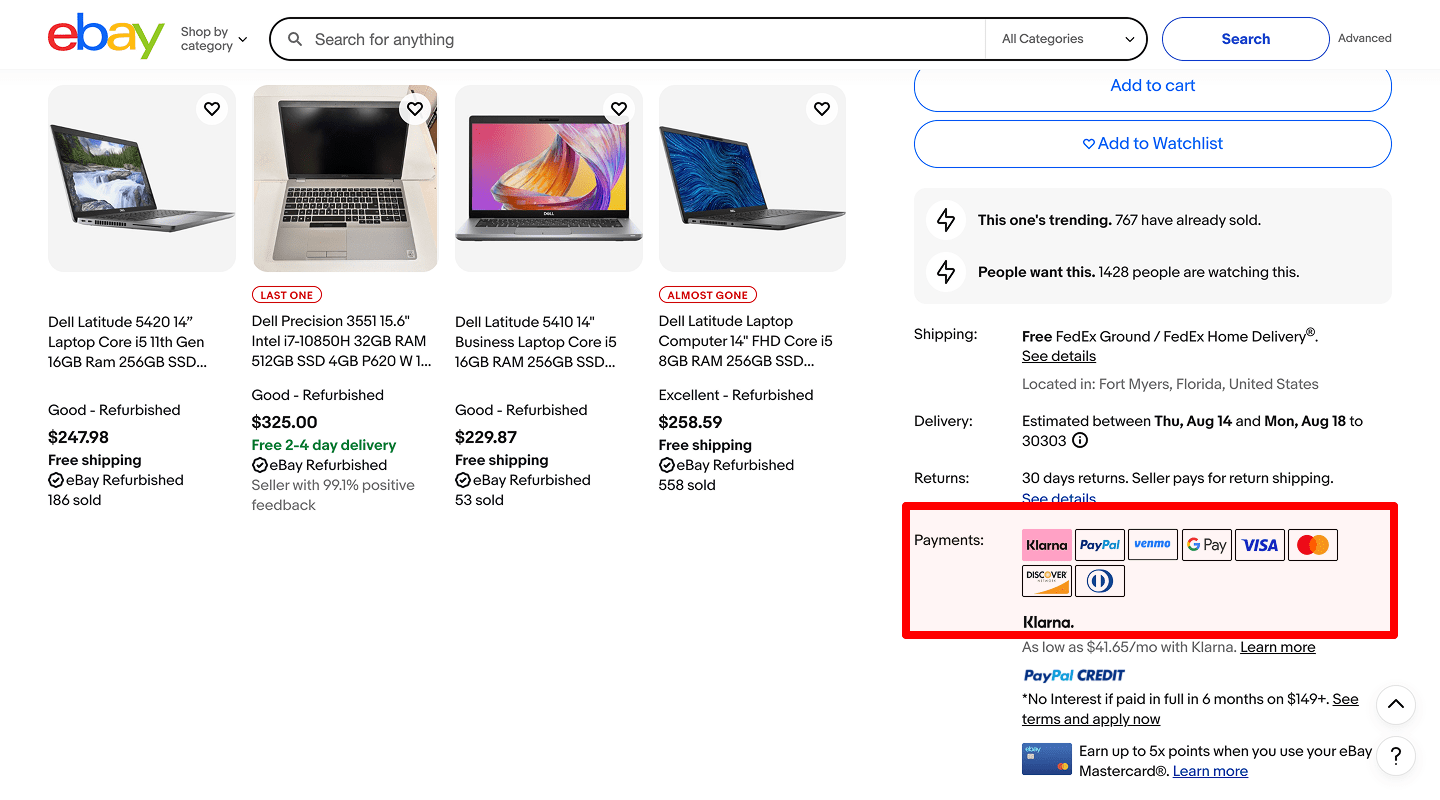
Accepted Payment Logos
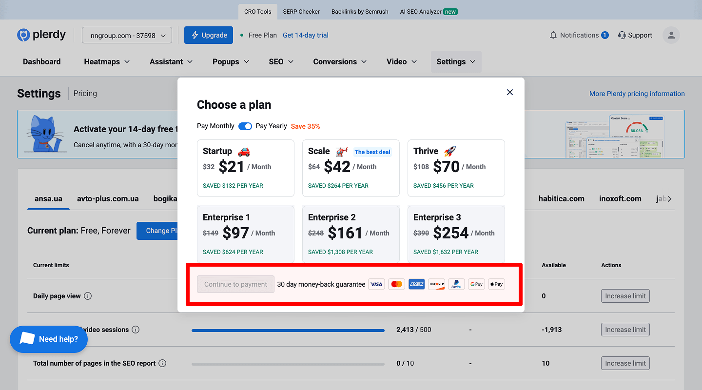
Idea & Why: Show credit card and PayPal icons. Reassures visitors that you support familiar methods.
Example: Visa, MasterCard, AmEx, PayPal small icons.
👥 Website About Us Page Conversion Rate Checklist
-
Team Photos & Bios
Idea & Why: Human faces build rapport and credibility.
Example: Circular headshots with name + one-line role description.
-
Company Story Section
Idea & Why: A short timeline of milestones. Engages emotionally.
Example: “2018: Founded. 2020: 100 clients served.”
-
Trust Badges / Awards
Idea & Why: Display industry awards, certifications. Reinforces expertise.
Example: “Inc. 5000 Fastest Growing” badge.
-
Mission & Values Statement
Idea & Why: Shows purpose and aligns with prospect’s principles.
Example: “We believe in transparent marketing.”
⭐ Website Testimonials / Reviews Conversion Rate Checklist
-
Client Quotes with Photo
Idea & Why: Authentic testimonials lower skepticism.
Example: Photo + “Their strategy doubled our leads.”
-
Video Testimonial Block
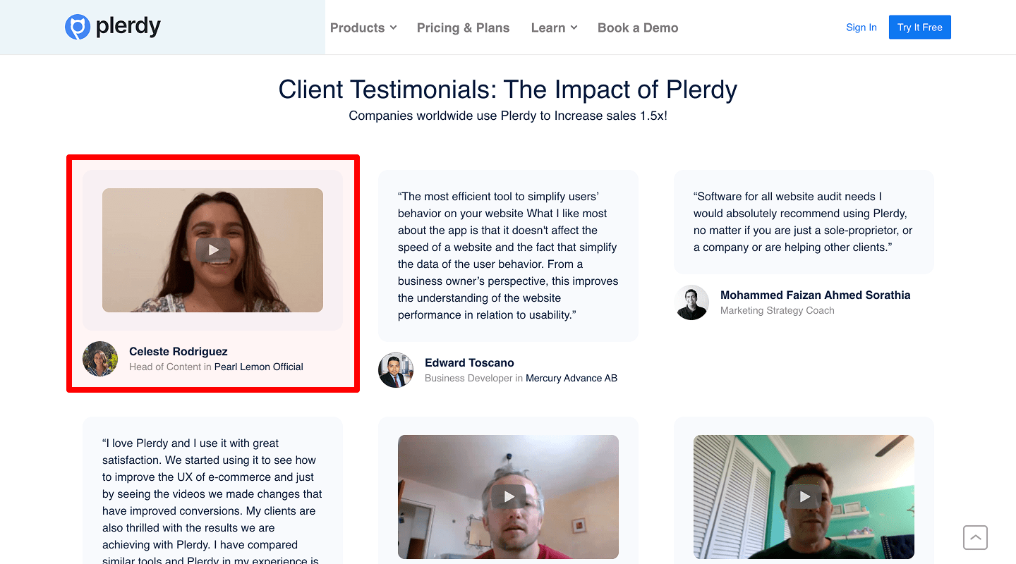
Idea & Why: Video adds credibility and engagement.
Example: Playable 30-sec clip with client interview.
-
Logo Carousel
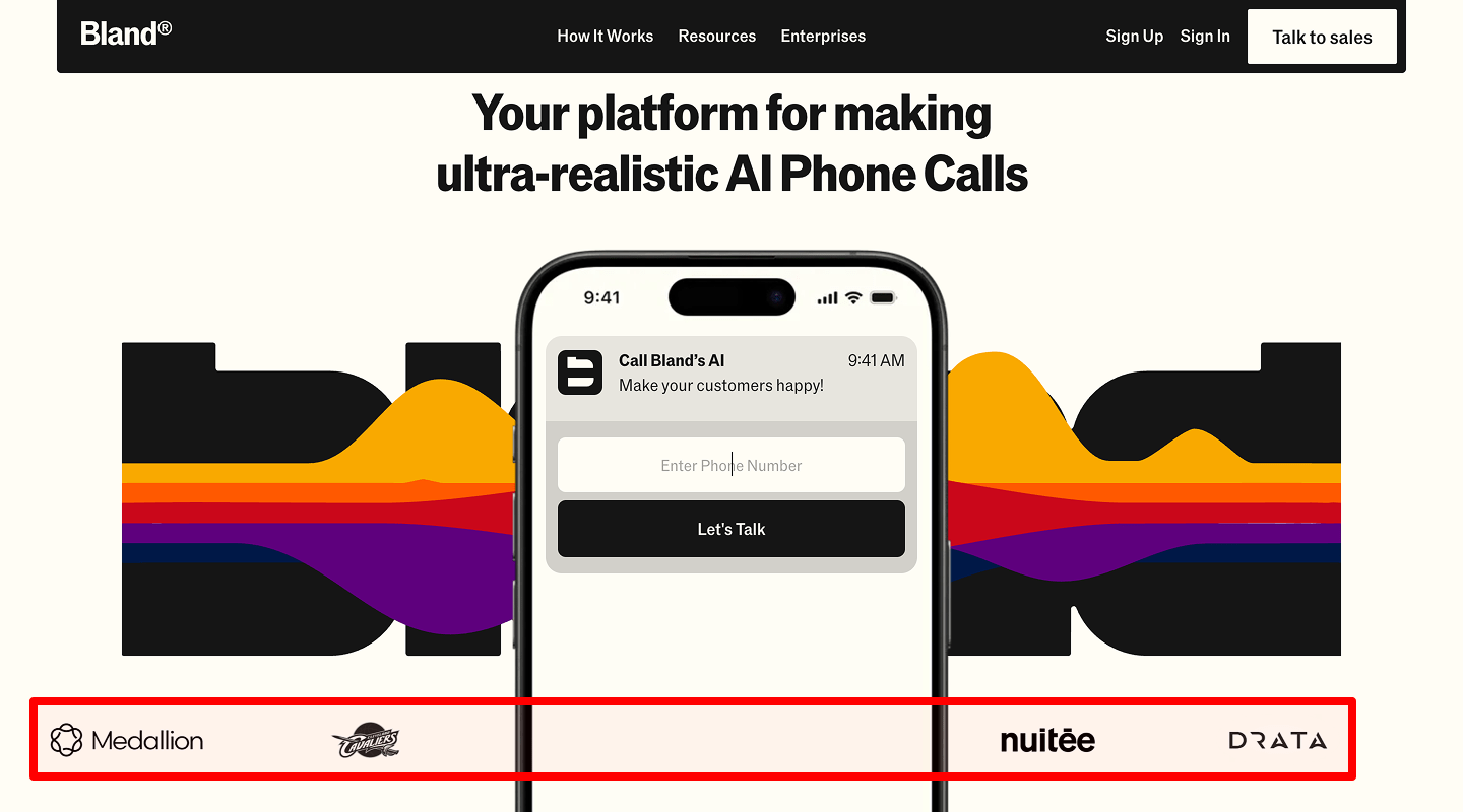
Idea & Why: Show logos of top clients in a sliding row. Quick trust signals.
Example: Auto-scrolling row of 10 client logos.
📈 Website Case Studies Page Conversion Rate Checklist
-
Full Case Study Format
Idea & Why: Title, challenge, solution, results, CTA. Demonstrates process and outcome.
Example: “How XYZ Corp grew revenue 80% – Read the full story”
-
Results & Metrics Highlights
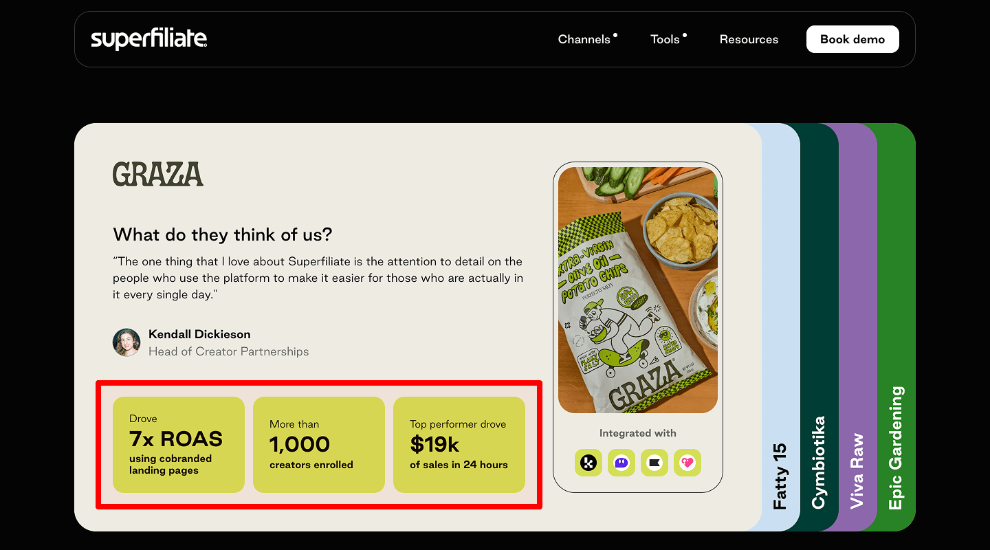
Idea & Why: Show key numbers in big font (e.g. “+80% traffic”). Draws the eye to success.
Example: Large “+80% Traffic” in colored box.
-
Contact CTA
Idea & Why: After each study, “Contact us to replicate this result.” Funnels leads.
Example: Button: “Let’s Talk About Your Growth.”
📞 Website Contact Page Conversion Rate Checklist
-
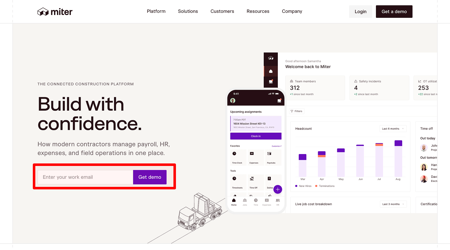
Simple Contact Form
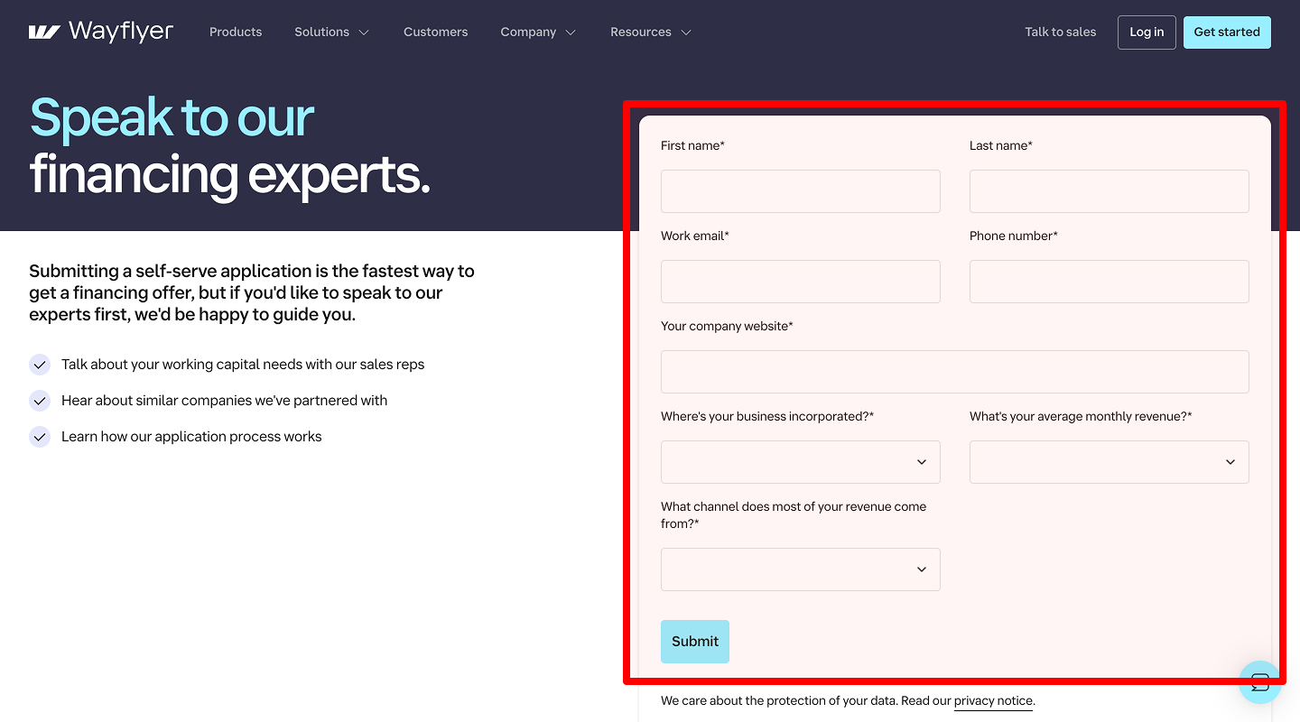
Idea & Why: Only ask for name, email, message. Short forms increase submissions.
Example: Three-field form with clear labels.
-
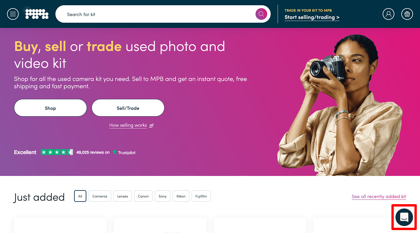
Live Chat Widget
Idea & Why: Real-time help answers questions, reduces drop-off.
Example: Chat bubble in bottom right corner.
-
Phone Number & Email
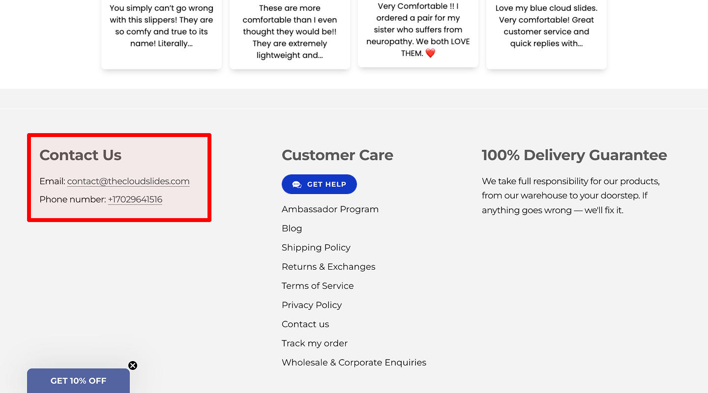
Idea & Why: Multiple contact methods build trust.
Example: Text at top: “Call us: +1-800-123-4567.”
-
Map / Office Location
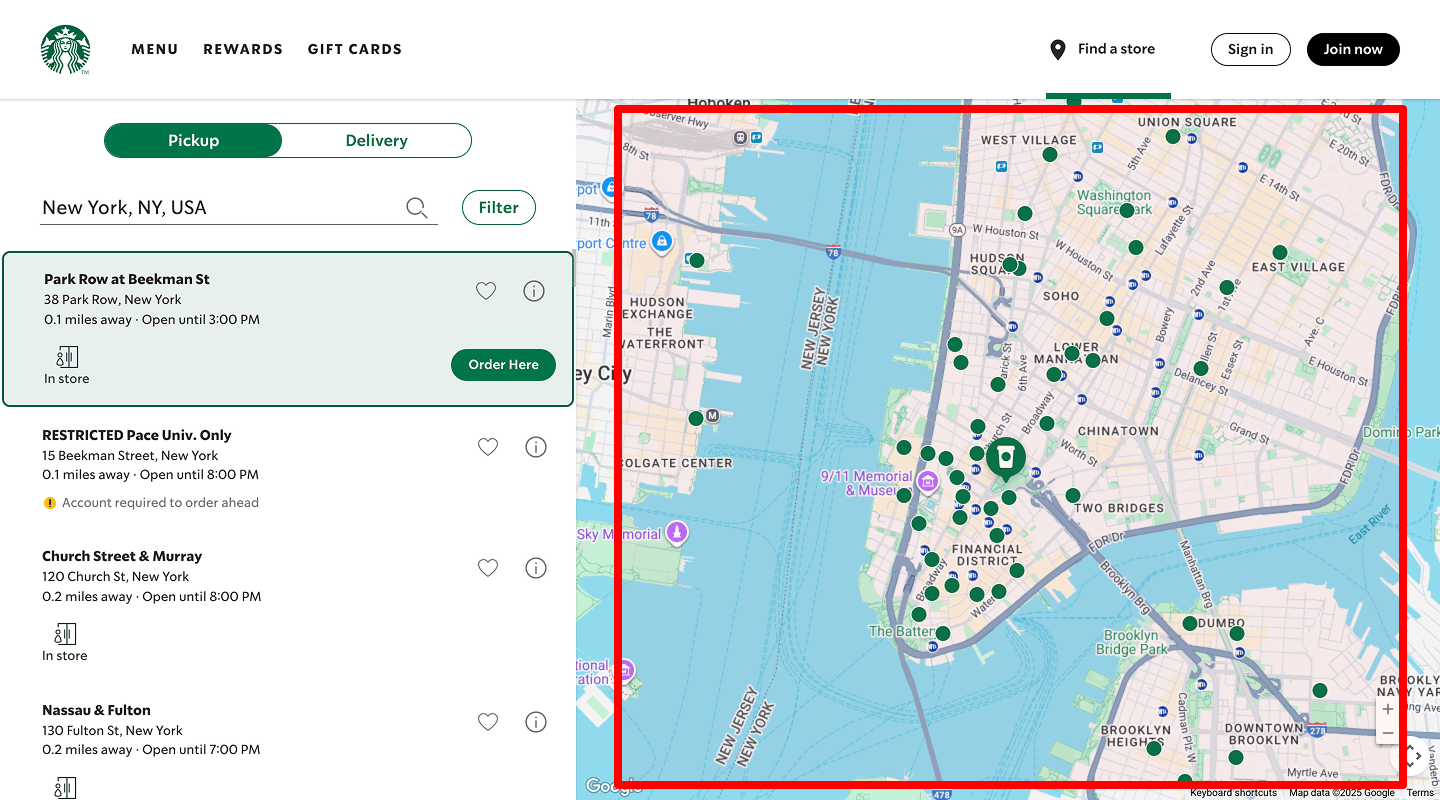
Idea & Why: If you serve local clients, map shows legitimacy.
Example: Embedded Google Map under form.
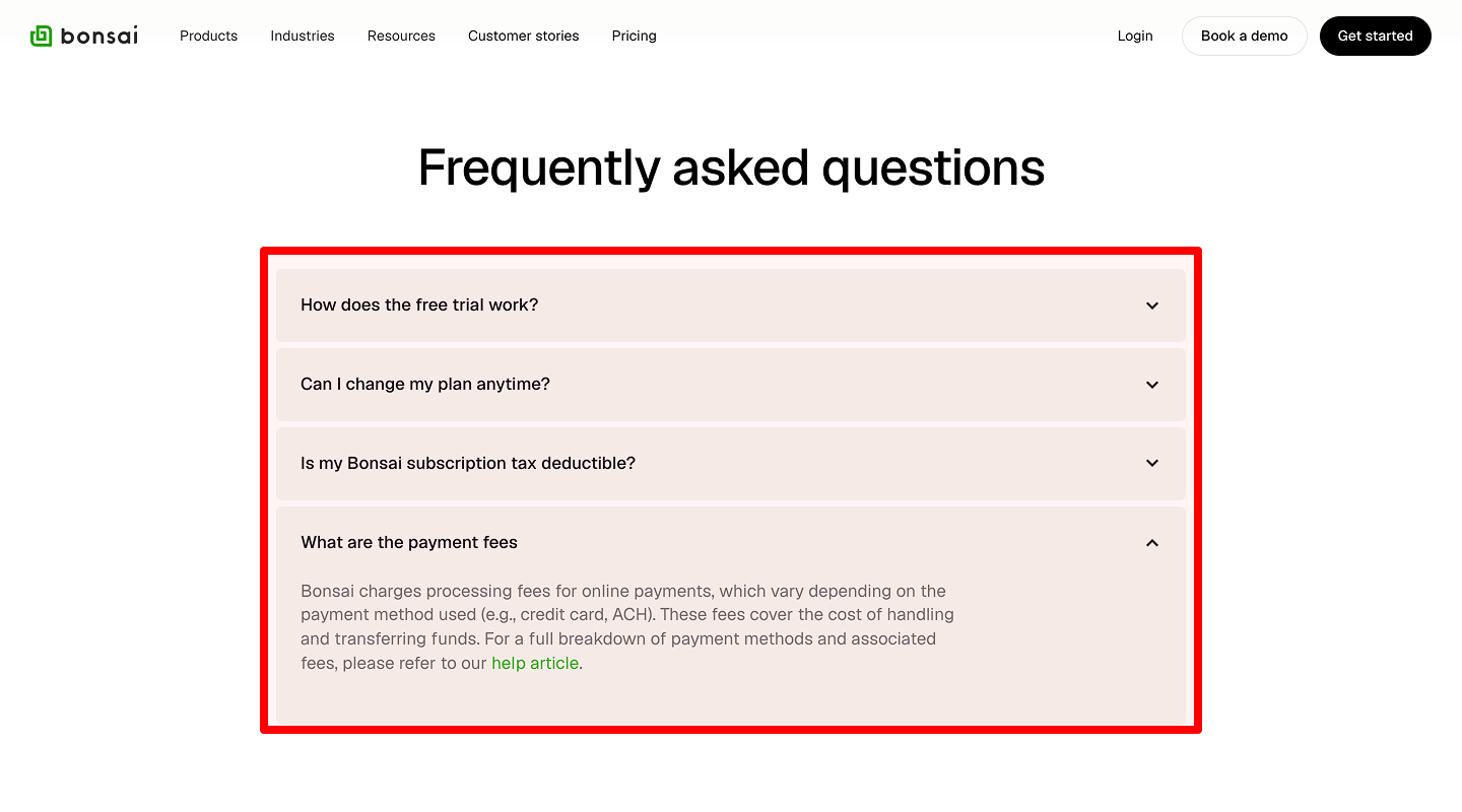
❓ Website FAQ Page Conversion Rate Checklist
-
Accordion-Style Q&A
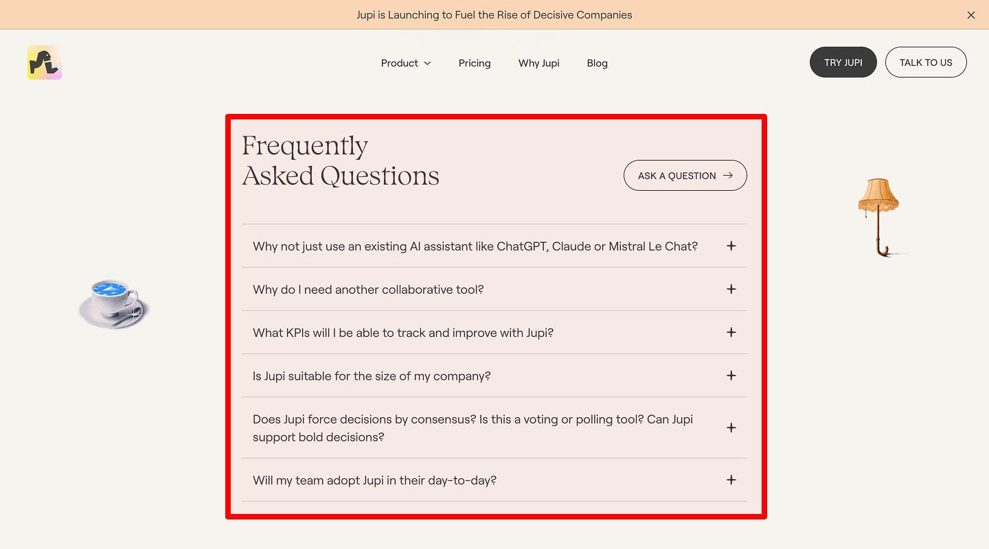
Idea & Why: Collapsible answers keep page tidy and easy to scan.
Example: Plus/minus toggles next to each question.
-
Links to Related Services

Idea & Why: Drives visitors back to service pages for more info.
Example: Under each answer: “Learn more about our SEO Audit →”
-
Bottom CTA
Idea & Why: After FAQs, add a “Still have questions? Contact us” button.
Example: Large button: “Get in Touch.”
📰 Blog / Resources Page Conversion Rate Checklist
-
Recent Posts List
Idea & Why: Show latest 5 posts with thumbnail + title. Keeps content fresh and engages.
Example: Grid of article cards.
-
Newsletter Signup Form
Idea & Why: Captures leads with promise of weekly tips.
Example: Small inline form: “Subscribe for free tips.”
-
Related Services Links
Idea & Why: Suggest services based on article topic.
Example: “Need help with SEO? Check our Service Page.”
🧭 Website Global Header Conversion Rate Checklist
-
Clickable Logo
Idea & Why: Always brings the visitor home; it’s expected behavior.
Example: Logo image top-left that links to homepage.
-
Main Navigation Menu
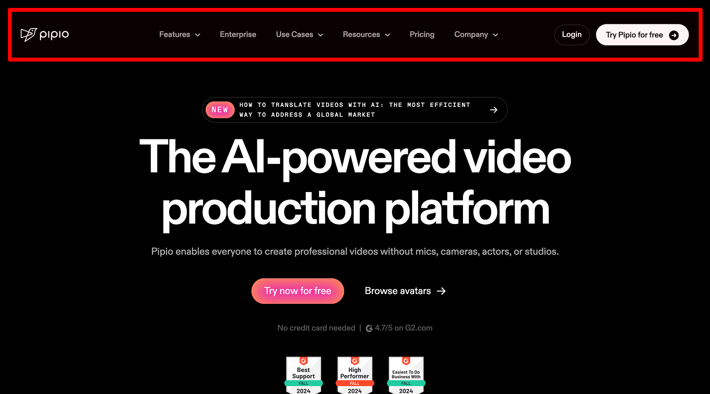
Idea & Why: Clear paths to core pages; reduces confusion.
Example: Text links spaced evenly: Home | Services | Pricing | About | Contact.
-
Contact Button

Idea & Why: A standout “Get a Quote” in header keeps CTA visible site-wide.
Example: Orange button at right of menu.
🔗 Website Global Footer Conversion Rate Checklist
-
Quick Links
Idea & Why: Secondary navigation for site map and SEO.
Example: Column of links: Privacy, Terms, Blog, Careers.
-
Social Media Icons
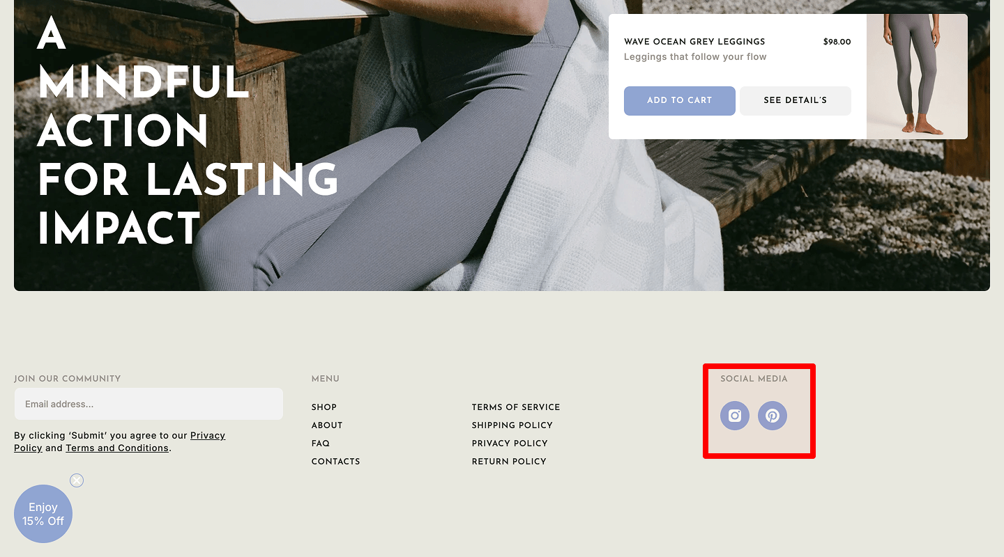
Idea & Why: Builds community and trust.
Example: Small icons: LinkedIn, Twitter, Facebook.
-
Newsletter Signup
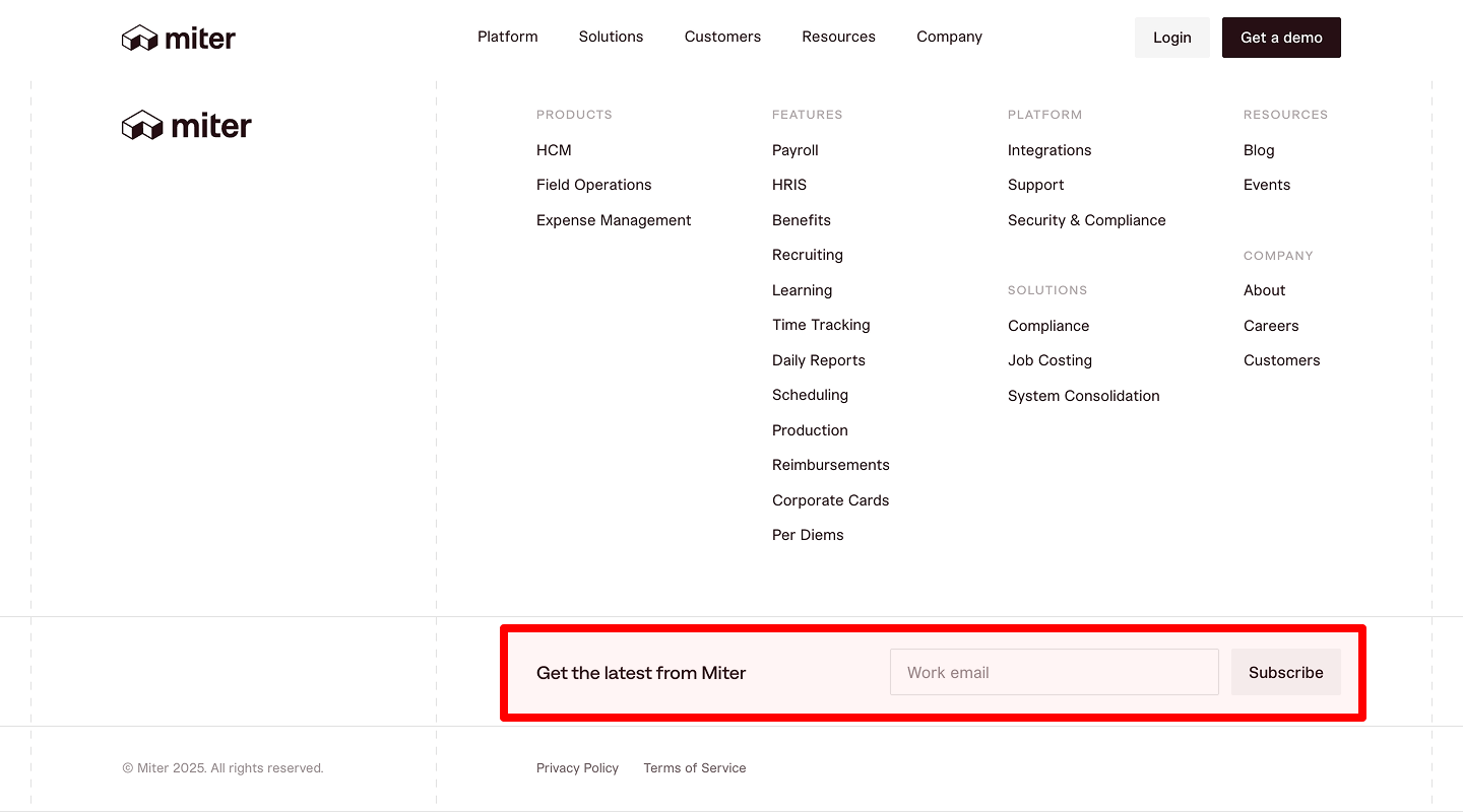
Idea & Why: Additional lead capture at page bottom.
Example: Input + “Subscribe” button.
-
Legal Links
Idea & Why: Shows compliance and transparency.
Example: “Privacy Policy,” “Terms of Service.”
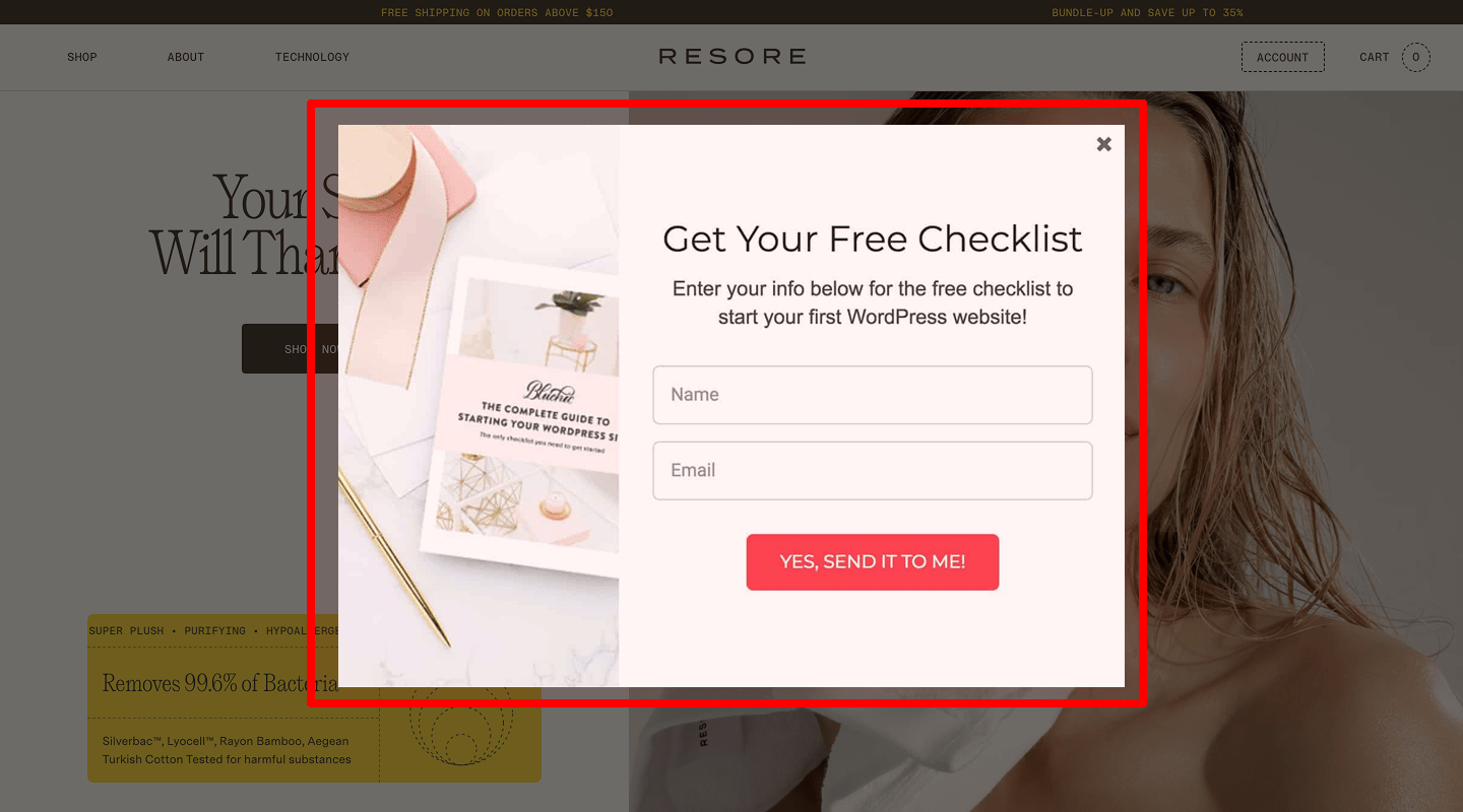
🔔 Website Pop-ups & Overlays Conversion Rate Checklist
-
Exit-Intent Popup
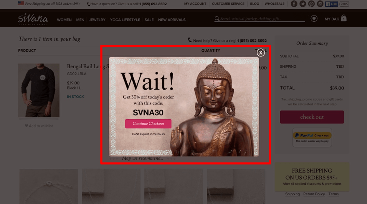
Idea & Why: When cursor leaves page, show “Wait—get 10% off!” Captures abandoning visitors.
Example: Lightbox with discount code.
-
Time-Based Discount Popup
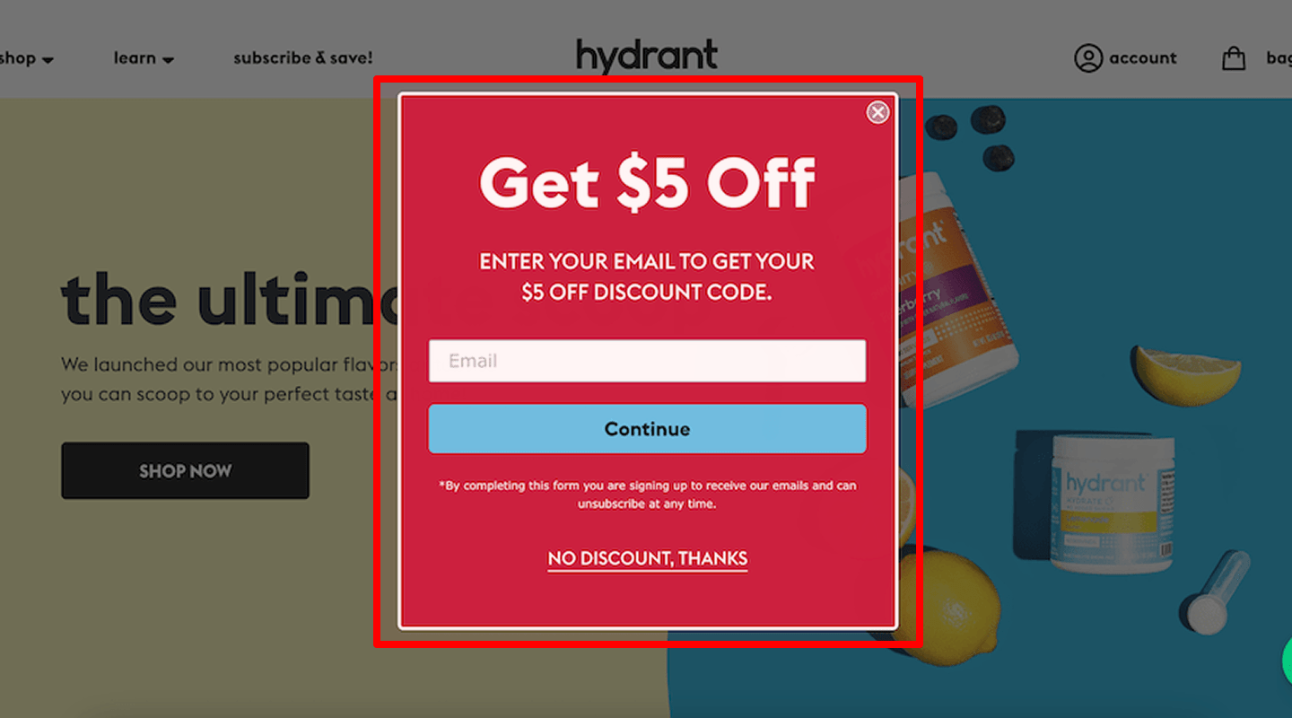
Idea & Why: After 30 seconds, offer a special deal. Creates urgency.
Example: Banner overlay: “20% off if you sign up now.”
-
Scroll-Triggered Lead Magnet
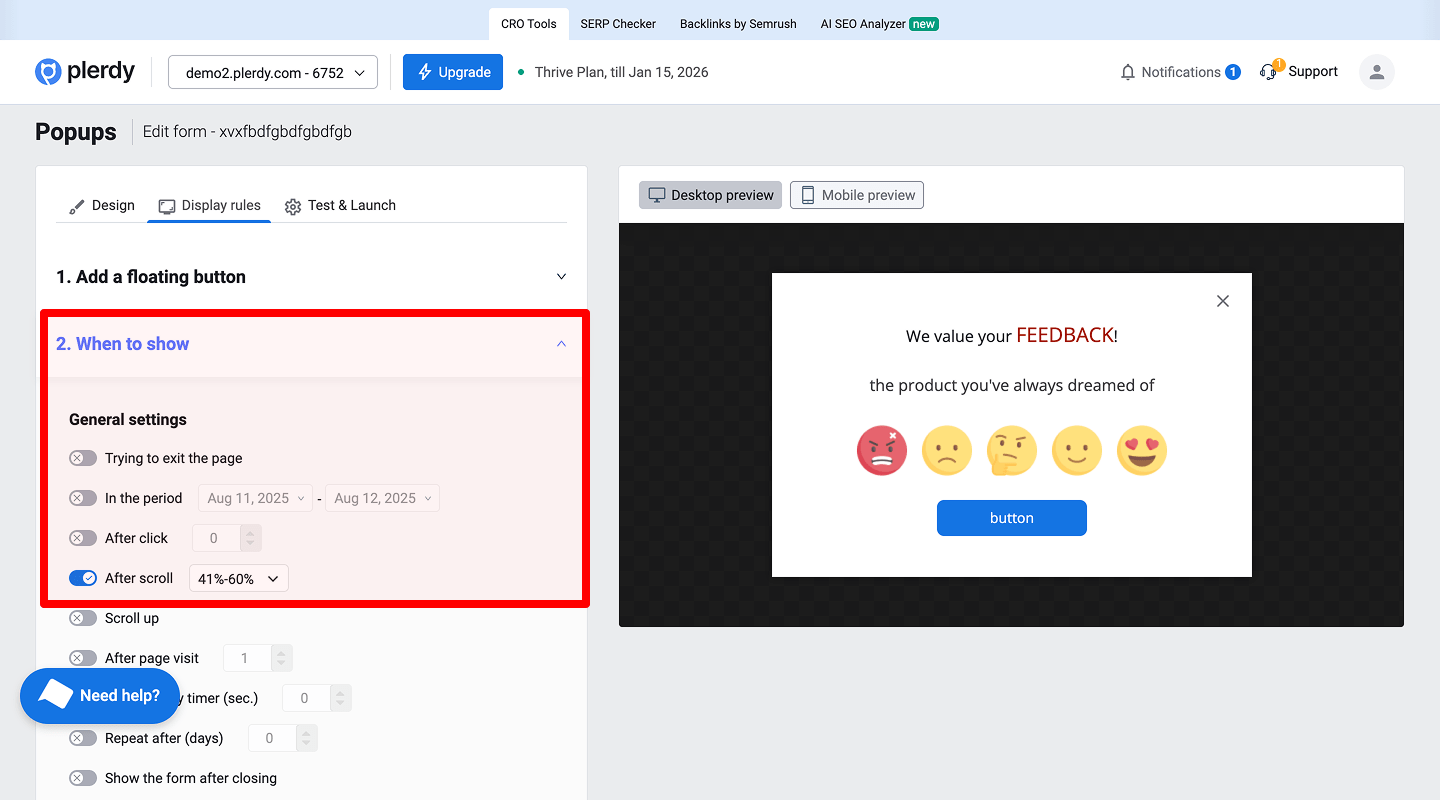
Idea & Why: At 50% scroll, suggest free ebook download. Engages interested readers.
Example: Slide-in box on right offering PDF guide.
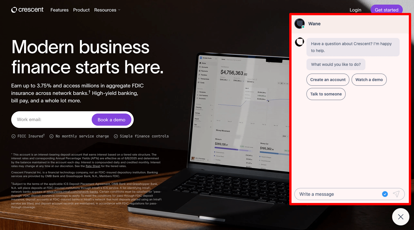
🤖 Website Live Chat / Chatbot Conversion Rate Checklist
-
Persistent Chat Icon
Idea & Why: Always available help reduces friction.
Example: Floating bubble: “Chat with us.”
-
Automated Greeting
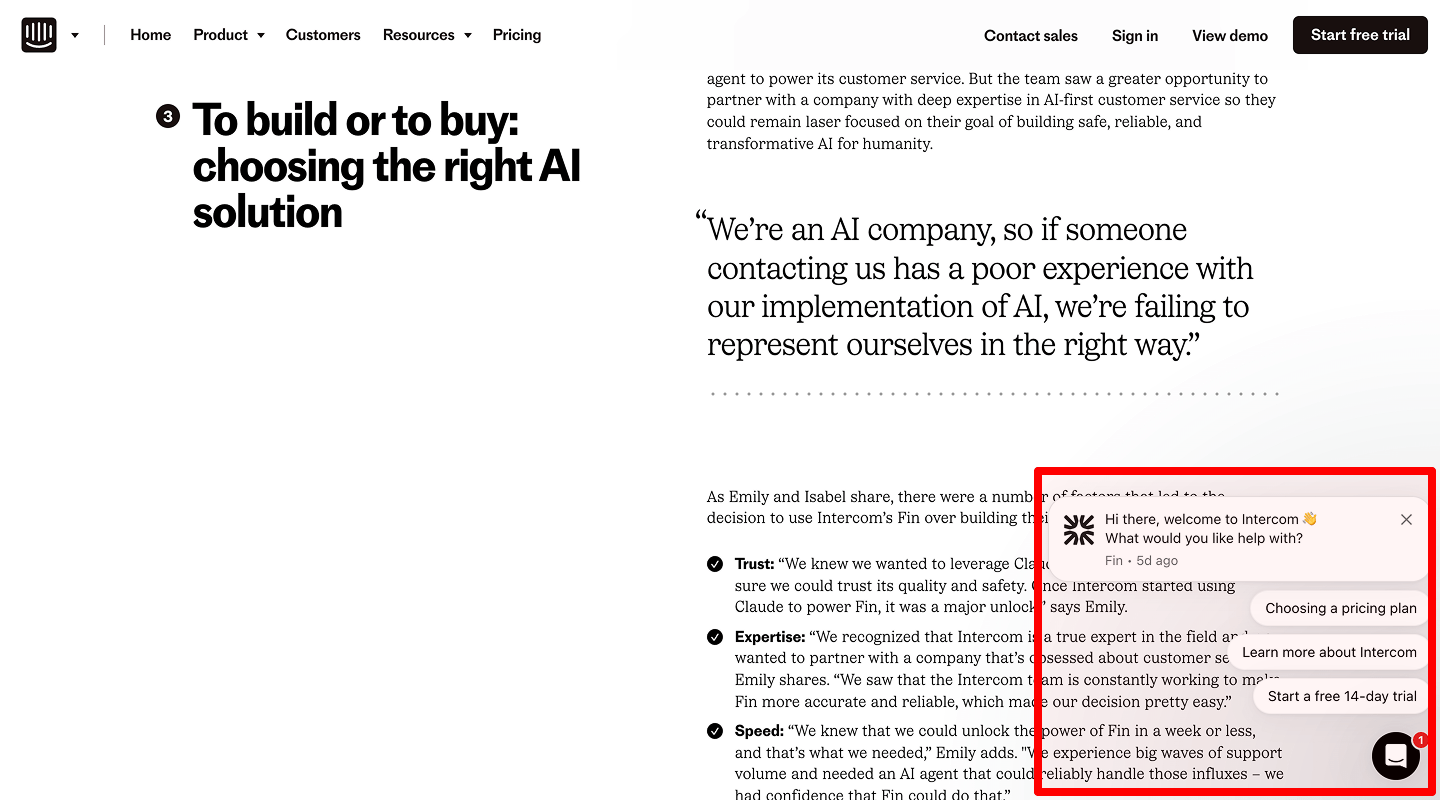
Idea & Why: “Hi there! Can I help you find something?” invites conversation.
Example: Chat window opens with greeting after 10 seconds.
🧲 Website Lead Magnets / Downloadables Conversion Rate Checklist
-
Free PDF Guide Form
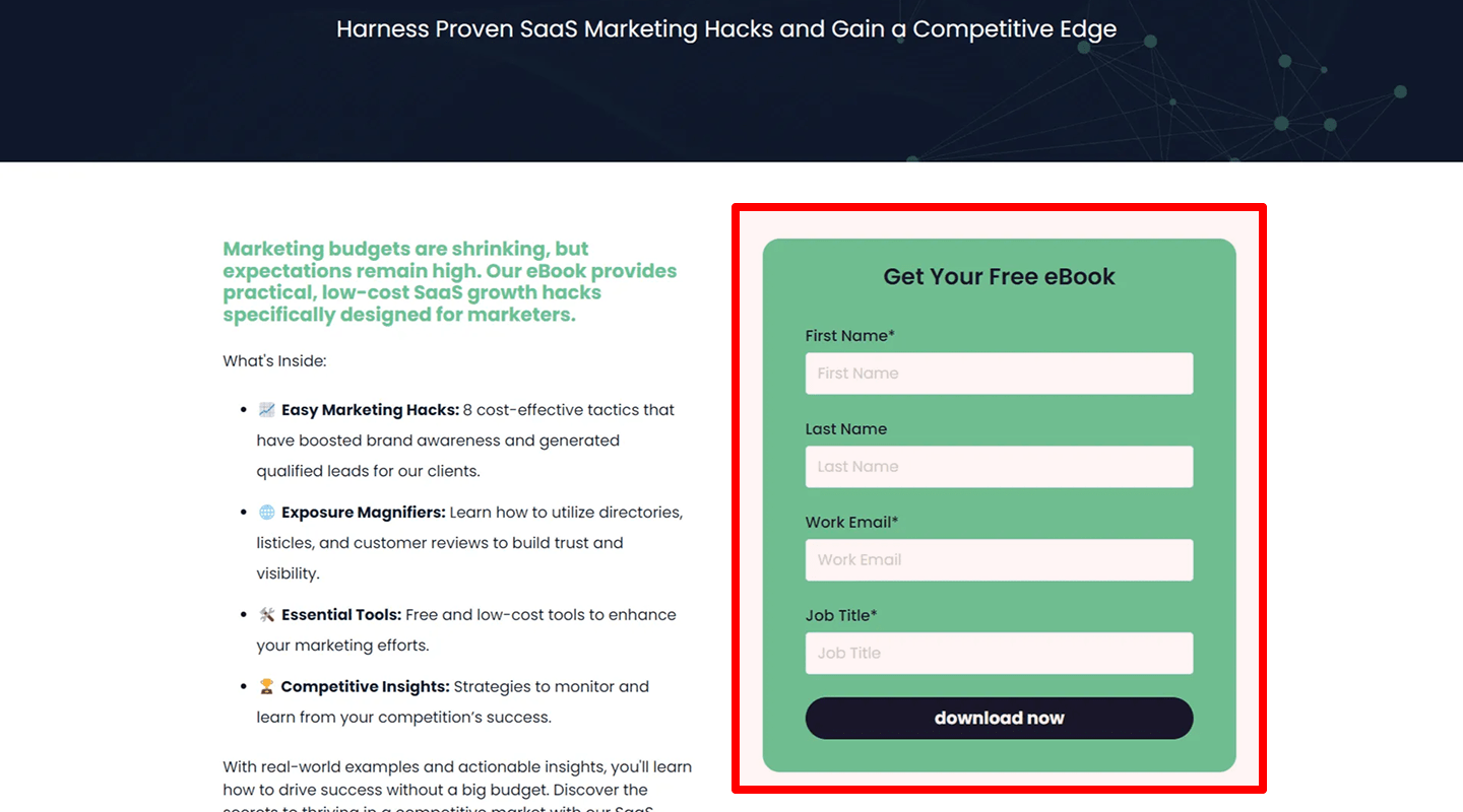
Idea & Why: Offer “Top 10 SEO Tips” in exchange for email. Generates leads.
Example: Inline form with “Download Now” button.
-
Checklist Download Popup
Idea & Why: On Services Page, pop-in prompt to download detailed checklist. Adds value.
Example: “Get our Complete Website Audit Checklist” form.
📝 Website Forms & UX Improvements Conversion Rate Checklist
-
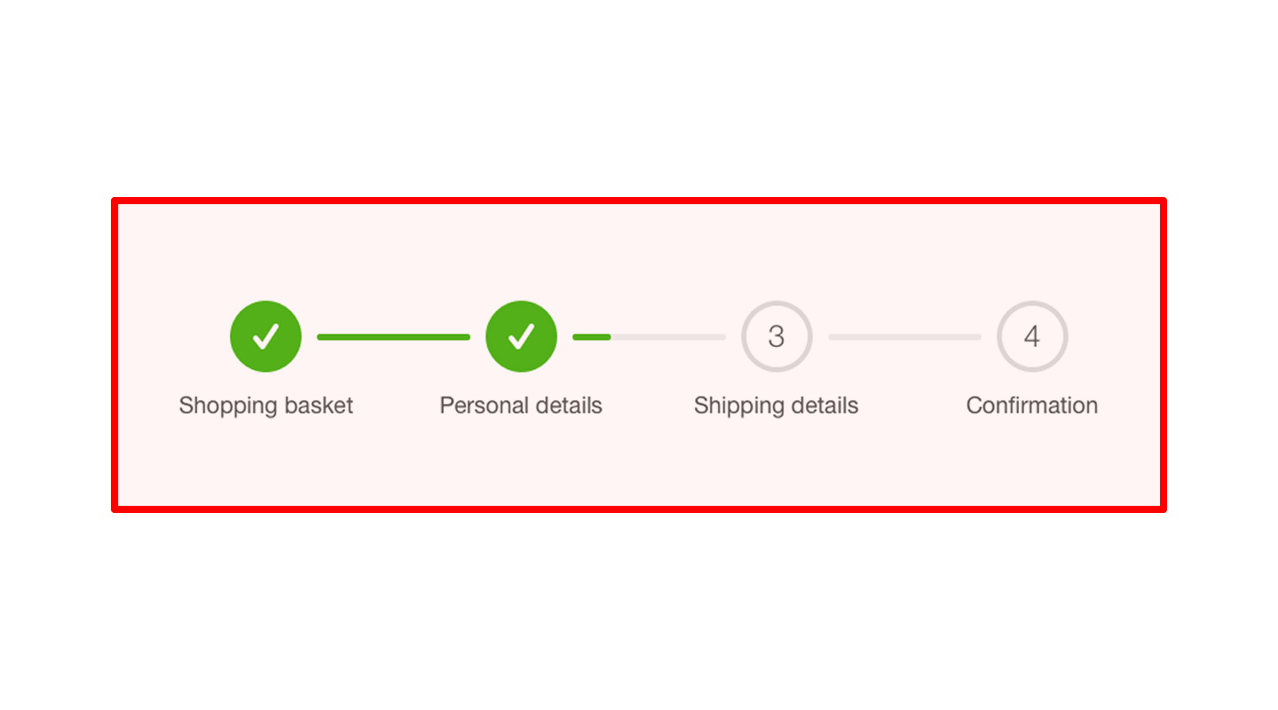
Multi-Step Form Design
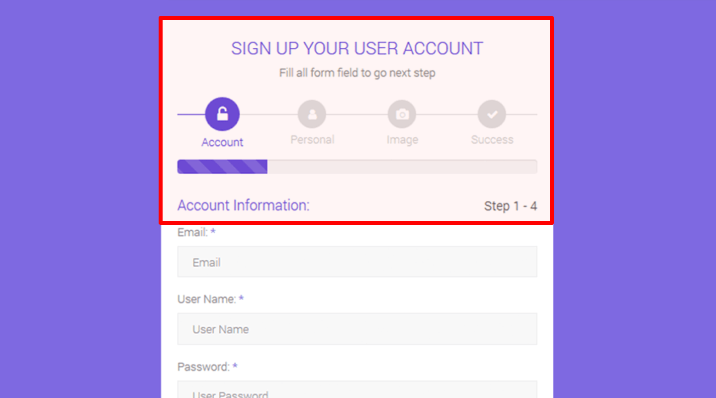
Idea & Why: Breaking long forms into steps reduces abandonment.
Example: Step 1: Contact info; Step 2: Project details; Progress bar at top.
-
Autofill Common Fields
Idea & Why: Browser autofill speeds up completion.
Example: Name and email fields accept autofill suggestions.
-
Inline Form Validation
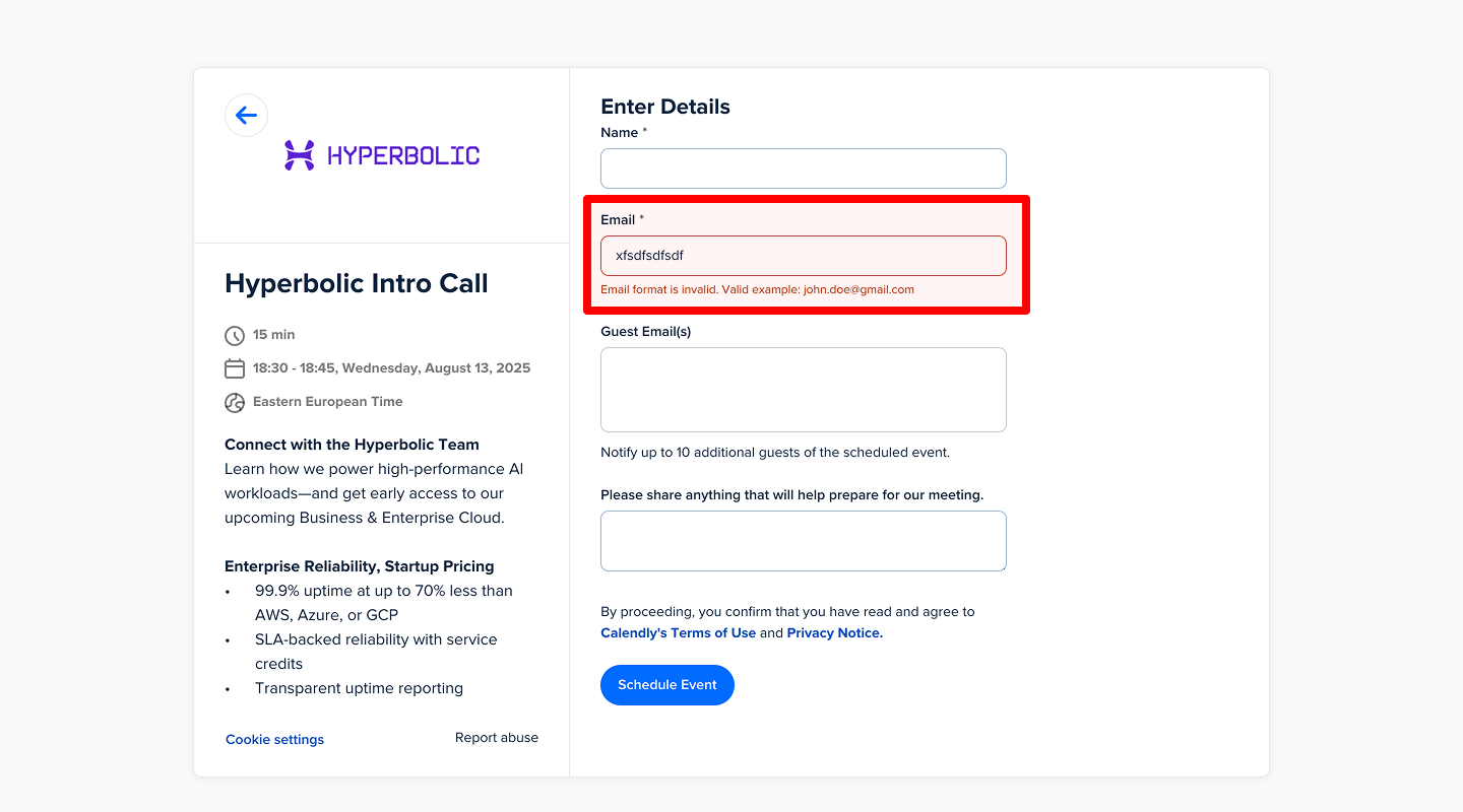
Idea & Why: Immediate error messages avoid frustration.
Example: “Please enter a valid email” shown under field on blur.
🔒 Website Trust Signals & Security Conversion Rate Checklist
-
SSL Padlock Icon
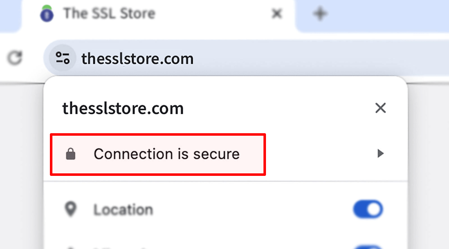
Idea & Why: Browser security indicator reminds visitors the site is safe.
Example: HTTPS with padlock in URL bar (depends on certificate).
-
Payment Security Badges
Idea & Why: “Powered by Stripe” or “PCI Compliant” logos reassure during checkout.
Example: Small badge near payment form.
-
Privacy Policy Link
Idea & Why: Easy access to policy builds trust in data handling.
Example: Footer link “Privacy Policy.”
🎨 Website Visual & UX Elements Conversion Rate Checklist
-
High-Quality Images/Icons
Idea & Why: Professional visuals create positive first impression.
Example: Custom icons for each feature.
-
Progress Indicators
Idea & Why: When loading or during form steps, show spinner or bar. Keeps users patient.
Example: Thin progress bar at top of page.
-
Mobile-Friendly Layout
Idea & Why: Responsive design ensures all elements display well on phones.
Example: Hamburger menu replacing full nav on small screens.
⚡ Website Performance & Speed Conversion Rate Checklist
-
Page Load Time Indicator
Idea & Why: Use tools (e.g., small widget) to monitor load speed. Faster pages convert better.
Example: Developer tool snippet in footer (not visible to users).
-
Lazy-Loading Images
Idea & Why: Delay offscreen images until scrolling. Speeds up initial load.
Example: loading="lazy" attribute on <img> tags.