🖥️ Hero Section (Above the Fold)
-
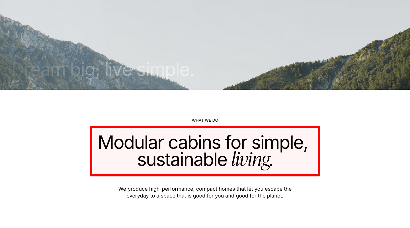
Clear headline with core value proposition
Check: One short headline that says what you offer and the main benefit.
Why: Users decide in 3–5 seconds to stay or leave.
How to check: Read it aloud. Is it clear to a new visitor? Track bounce on this section with a scroll map.
How to implement: Use “Get [result] without [pain] in [time].” Example: “Grow sales without code in 7 days.” Tools: Figma (draft), Plerdy Heatmap/Scroll map (attention), GA4 (bounce/time on page). Treat this as a core step in your landing page checklist to keep the page message tight.
-
Supporting subheadline
Check: One line that explains how it works or who it’s for.
Why: Adds clarity and trust.
How to check: Ask a teammate to repeat your offer after reading.
How to implement: “For [audience], we [method] to get [outcome].” Keep under 16–20 words. Add it as a quick win in your landing page checklist so the page explains value fast.
-
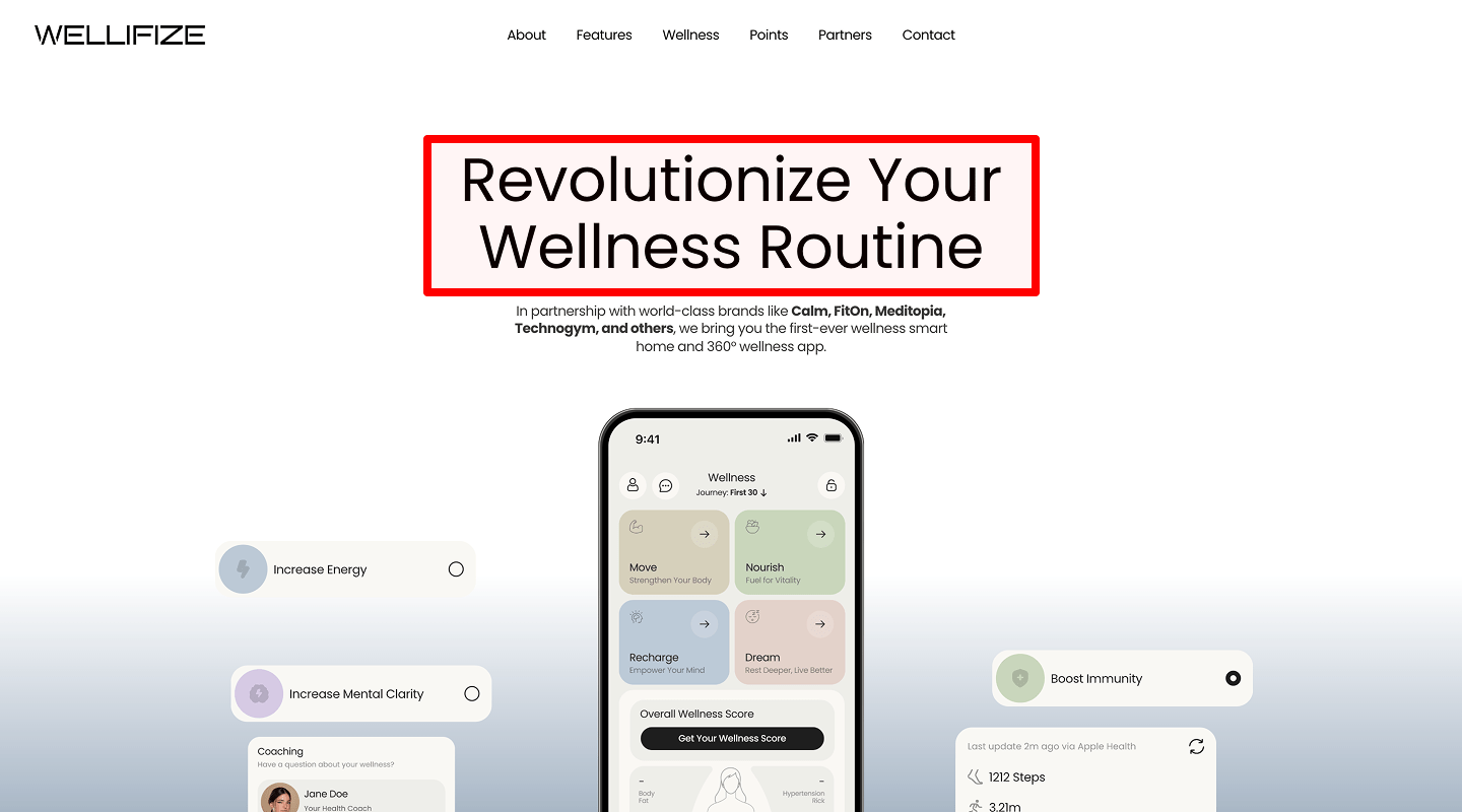
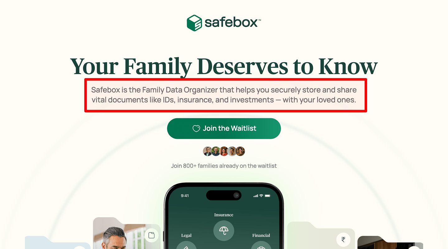
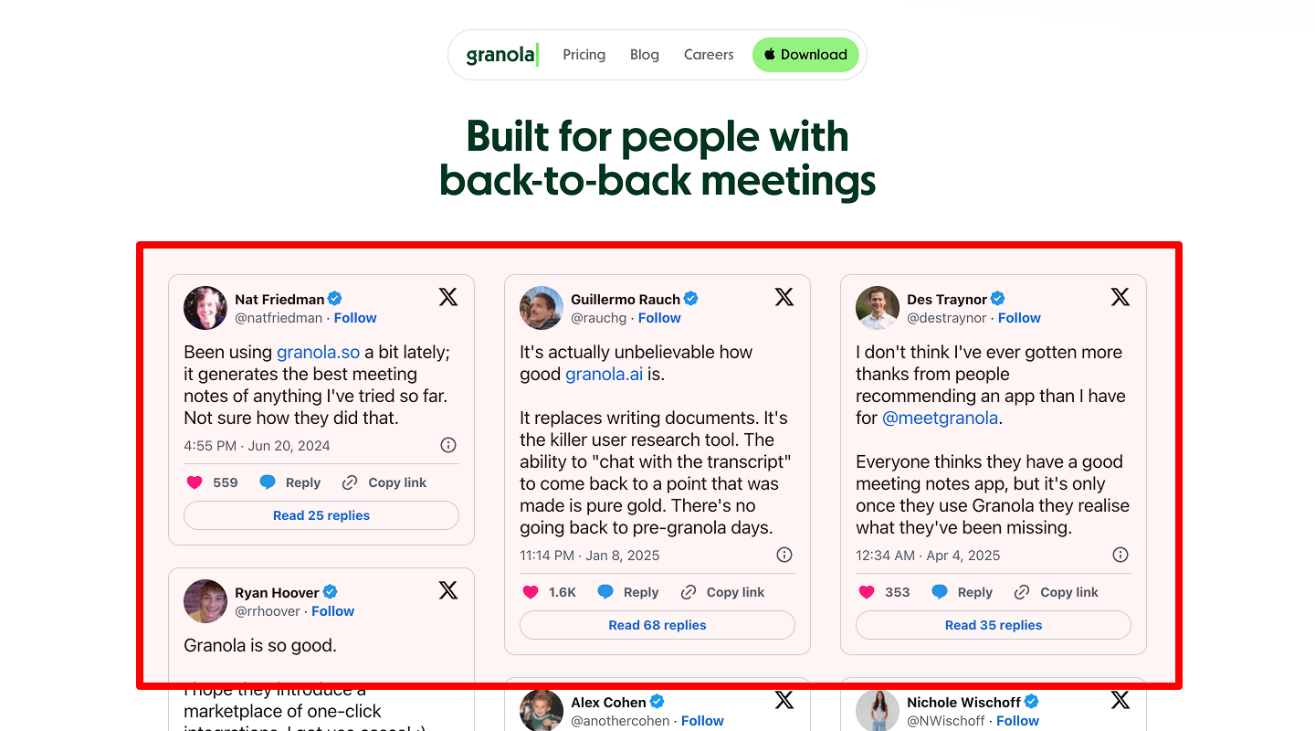
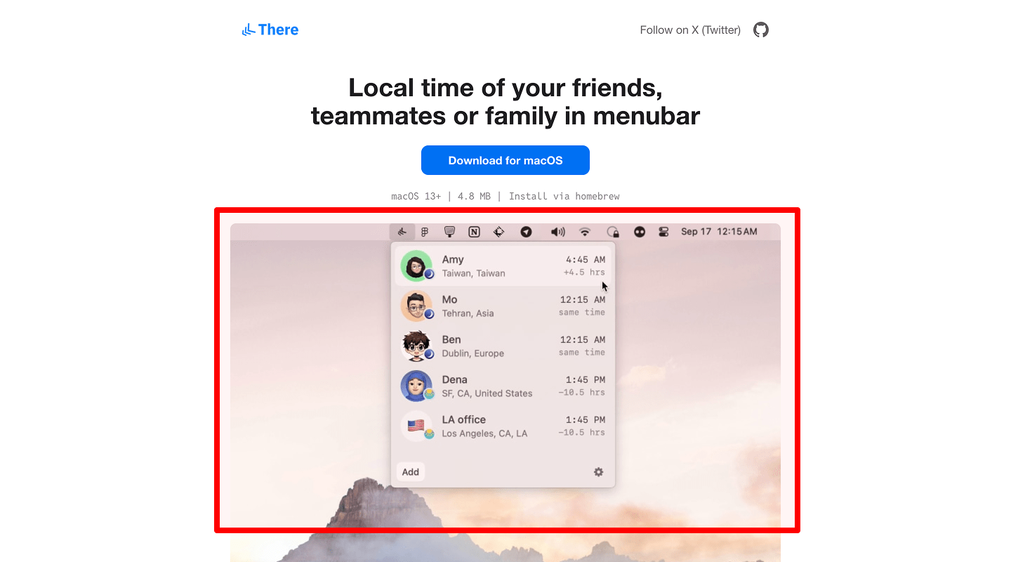
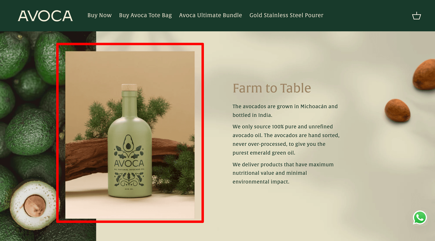
Visual (photo, video, product, or people)
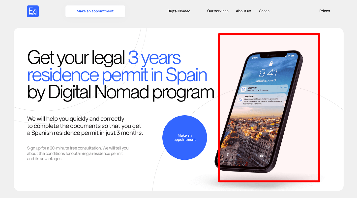
Check: One focused image or short silent autoplay video; no busy collage.
Why: Visuals show value fast and reduce cognitive load.
How to check: Compare scroll depth with and without the visual. Check LCP load.
How to implement: Use real product UI mockups or a customer photo. Compress (WebP/AVIF). Add alt text. Tools: Squoosh, Lighthouse (LCP), Plerdy Session Replay (see if media distracts). Mark this media choice in the landing page checklist to protect page speed and clarity.
-
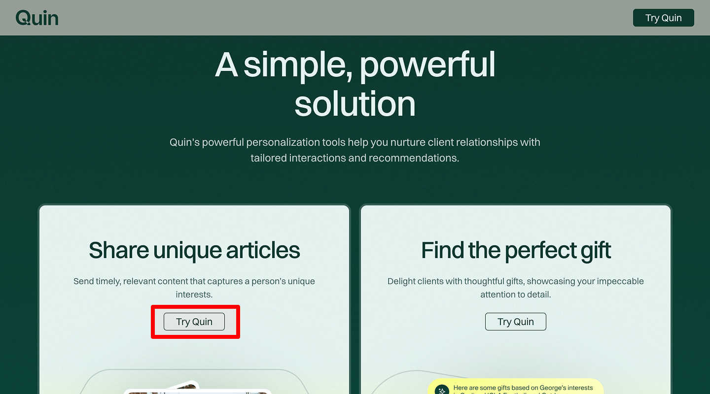
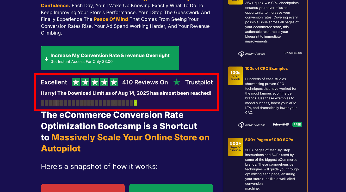
Primary CTA (button or form)
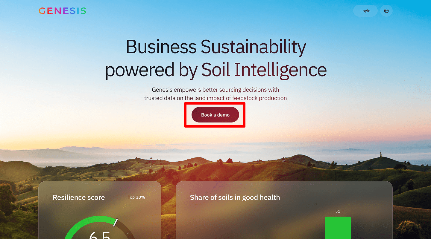
Check: One main CTA above the fold (not two).
Why: Clear next step increases clicks.
How to check: Heatmap on button; click rate on CTA vs. page views.
How to implement: Action text (“Start free trial,” “Get demo”). Contrast color, 44px min height, aria-label. Connect to form/checkout. Tools: Plerdy Heatmap, GA4 event, Tag Manager. Keep this CTA rule in your landing page checklist so the page drives one action.
-
Quick trust triggers (social proof, guarantee/free trial, 1-line
benefits)
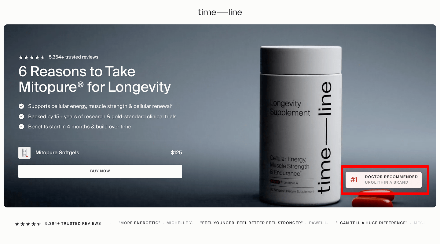
Check: Add 1–2 small trust elements near CTA.
Why: Reduces risk right away.
How to check: A/B copy test or compare conversion week over week.
How to implement: Show “4.8/5 from 1,200+ users,” “14-day free trial,” “No credit card.” Logos 5–8 max. Tools: VWO/Optimizely (copy tests), Plerdy (clicks). Add trust cues as a standard item in the landing page checklist to stabilize the page conversion rate.
🎯 Benefits (Value Proposition)
-
3–5 main benefits with icons
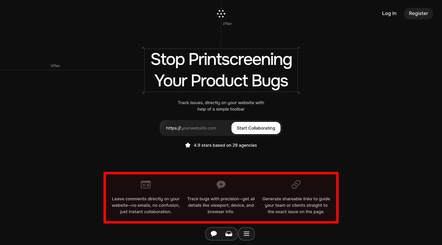
Check: Short benefit lines, not features.
Why: Users buy outcomes, not specs.
How to check: Read each line—does it say “what you get” not “what we have”?
How to implement: “Save hours each week,” “Cut support tickets by 30%.” Simple line icons. Tools: Figma, Noun Project. Log these benefit lines in the landing page checklist so the page sells outcomes, not features.
-
Before/after comparisons
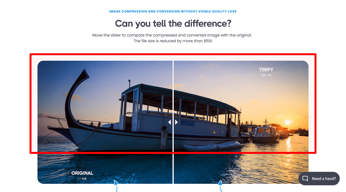
Check: One simple table or two images.
Why: Makes progress visible.
How to check: Time on section and scroll stops.
How to implement: “Before: manual reports. After: 1-click dashboard.” Keep 3–5 rows. Add this comparison block to your landing page checklist to help the page show progress fast.
-
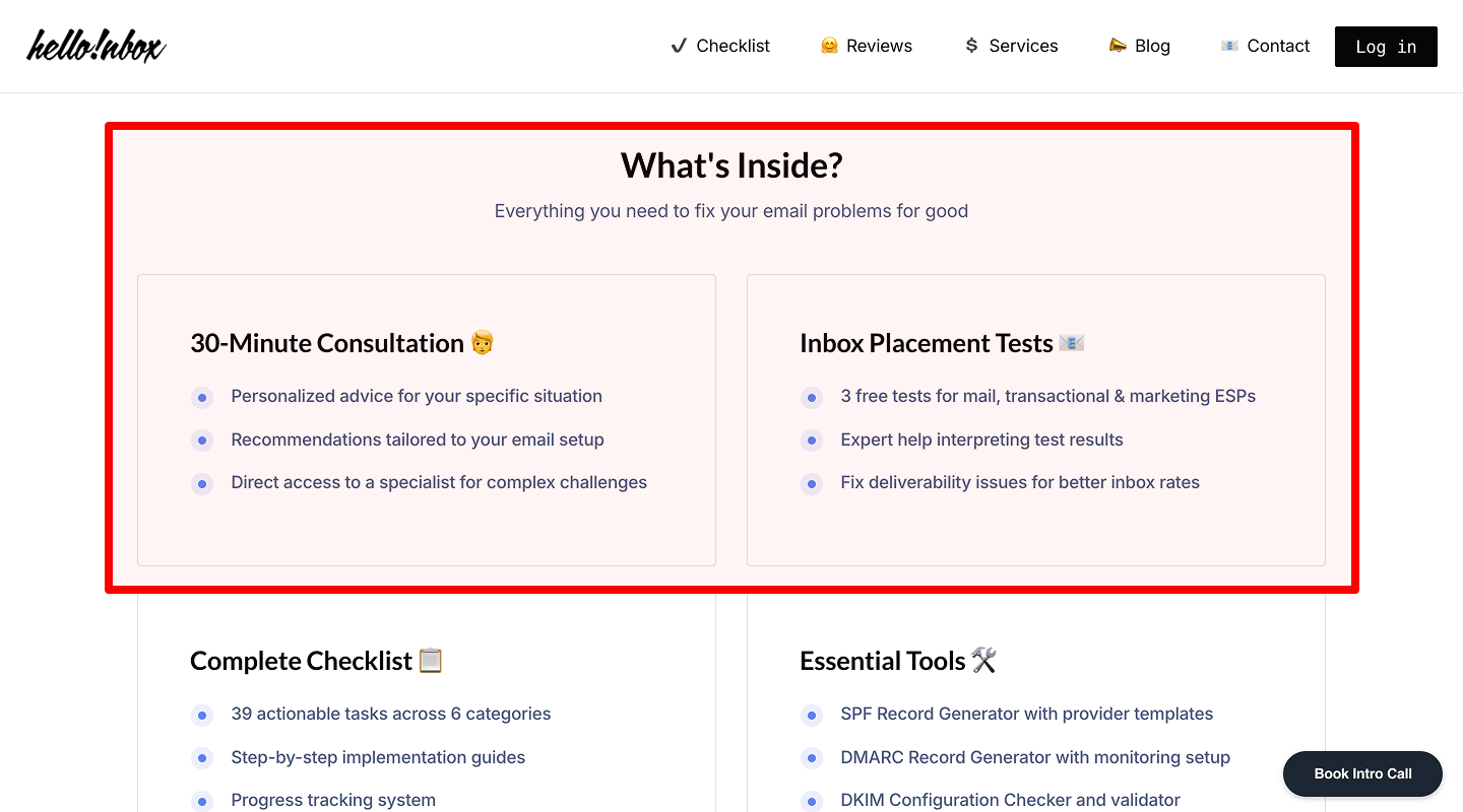
Numbers and facts for stronger impact
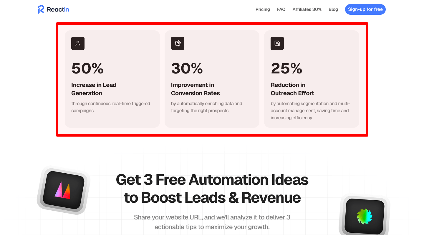
Check: Use concrete metrics.
Why: Numbers build credibility.
How to check: Verify sources; add footnote if needed.
How to implement: “+47% conversion in 30 days (retail client).” Include this proof step in the landing page checklist so the page earns trust with data.
-
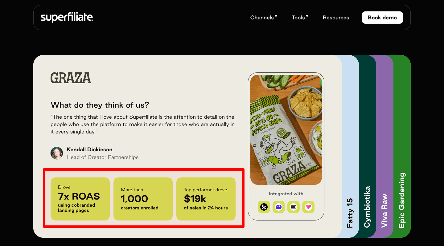
Short testimonials for validation
Check: One-sentence quotes tied to a benefit.
Why: Proof from others removes doubt.
How to check: Clicks near quote vs. control; scroll stop.
How to implement: “Cut our ad spend by 20% while sales grew,” — Name, Role, Company. Add small headshot. Capture this as a routine item in your landing page checklist to keep the page credible.
⚙️ How It Works
-
3–4 simple steps with icons/illustrations
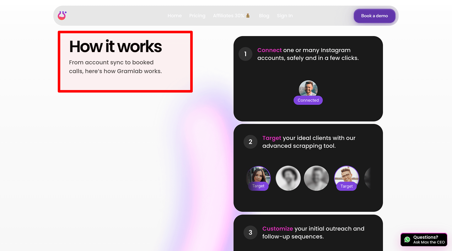
Check: Steps are clear and linear.
Why: Users want to see effort and time.
How to check: 5-second test: can someone repeat the steps?
How to implement: “1) Sign up 2) Connect 3) Launch 4) Measure.” One icon per step. Record this flow in the landing page checklist so the page explains effort clearly.
-
Short explainer video or animation
Check: 30–60 seconds, captions, no sound needed.
Why: Faster understanding.
How to check: Video play rate and completion.
How to implement: MP4/WebM, lightweight, poster image, captions file (VTT). Note this media rule in the landing page checklist to keep the page fast and accessible.
-
Simple language, no jargon
Check: Grade 6–8 reading level.
Why: Wider audience understands.
How to check: Run text through a readability checker.
How to implement: Replace buzzwords with everyday words. Add this wording rule to your landing page checklist so the page stays readable.
-
Secondary CTA after process explanation
Check: CTA repeats after the steps.
Why: Users act when they understand.
How to check: CTR on second CTA block.
How to implement: “See it in action,” “Get demo.”
👥 Social Proof (Testimonials & Case Studies)
-
Testimonials from multiple sources (text, video, audio)
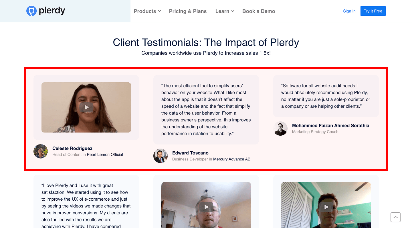
Check: Mix formats, keep real voice.
Why: Different users trust different formats.
How to check: Engagement per format.
How to implement: Embed video quote, short text quotes, audio snippet. Track this placement in the landing page checklist so the page mixes proof types.
-
Photos and client details
Check: Name, title, company, headshot/logo.
Why: Specific details increase trust.
How to check: Time on block and hover events.
How to implement: Ask permission; compress images. Add this ID detail step to the landing page checklist so the page looks authentic.
-
Client/partner logos
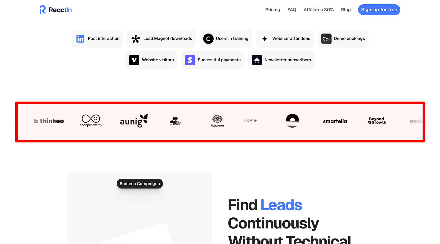
Check: 6–12 logos, same style (mono).
Why: Fast credibility scan.
How to check: Heatmap on logo belt.
How to implement: Show well-known brands first. Include this logo belt in your landing page checklist to boost page credibility at a glance.
-
Case studies with measurable results
Check: 2–3 cases with numbers.
Why: Proof at depth.
How to check: Click-through to case page; read time.
How to implement: “+32% conversion in 6 weeks for SaaS X.” Add CTA “Read full story.” Register this block in the landing page checklist so the page provides deep proof.
⚖️ Product/Service Details & Comparisons
-
Photos/videos from different angles and use cases
Check: Media shows key scenarios.
Why: Fewer questions → more conversions.
How to check: Replay sessions to see sticking points.
How to implement: 3–6 images, short screen capture, captions. Note this media set in the landing page checklist to keep the page answering key use cases.
-
Competitor comparisons
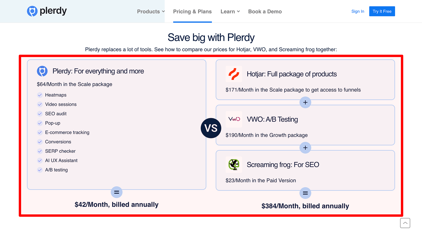
Check: Honest table with 5–7 rows.
Why: Users compare anyway.
How to check: Clicks and time on table.
How to implement: Highlight your strengths; avoid bashing. Add “Why choose us?” Put this table in the landing page checklist so the page handles comparisons on-site.
-
Additional features or bonuses
Check: List add-ons, templates, onboarding.
Why: Increases perceived value.
How to check: CTR on “What’s included.”
How to implement: Small checklist with green ticks. Store this add-ons list in your landing page checklist to raise page perceived value.
-
Technical specs (if relevant)
Check: Only what buyers need.
Why: Avoid overload but answer key questions.
How to check: Support tickets/topics from chat.
How to implement: Collapsible specs section. Keep this as a conditional item in the landing page checklist so the page avoids overload.
-
Interactive elements (e.g., 360° view)
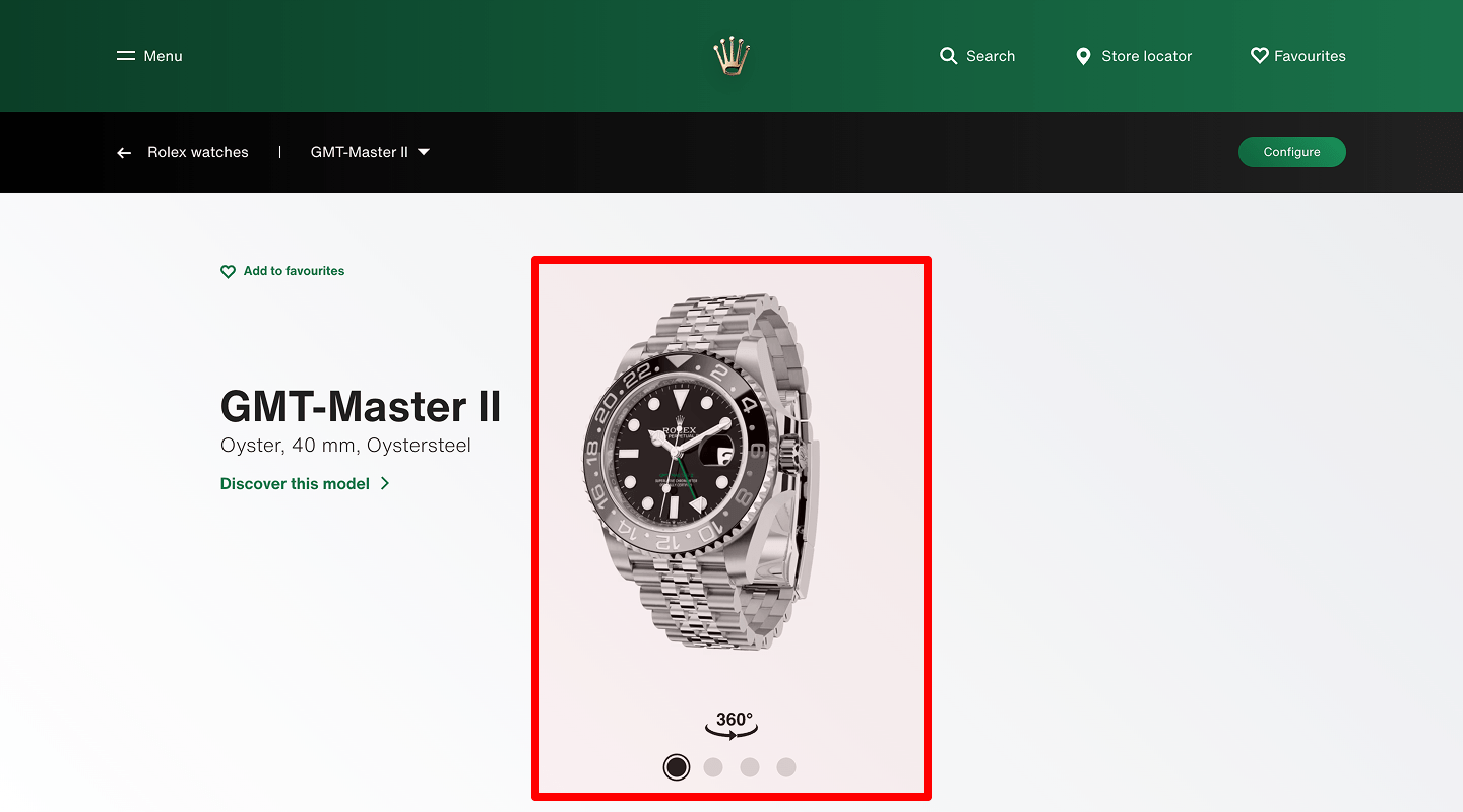
Check: One interactive demo only if it helps.
Why: Increases engagement, but watch speed.
How to check: Load time, interaction rate.
How to implement: Lazy-load, fallback image. Add this control to the landing page checklist so the page stays quick even with interactivity.
🛡️ Guarantees & Security
-
Policies in clear, simple language
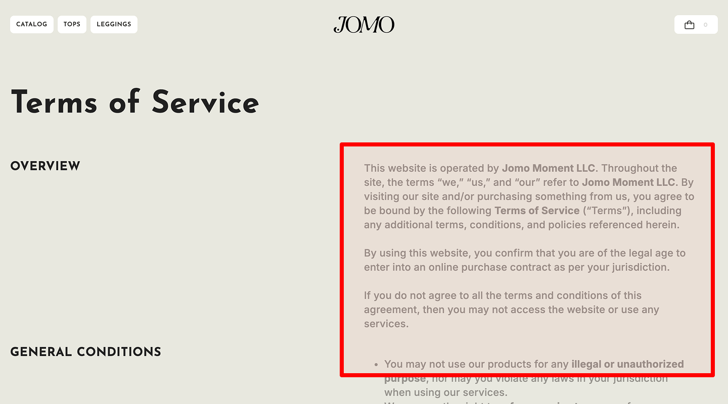
Check: Plain text, short sentences.
Why: Reduces fear.
How to check: Readability score; support chats.
How to implement: Link to policy near CTA. Make this link a standard in the landing page checklist so the page reduces buying friction.
-
Return policy
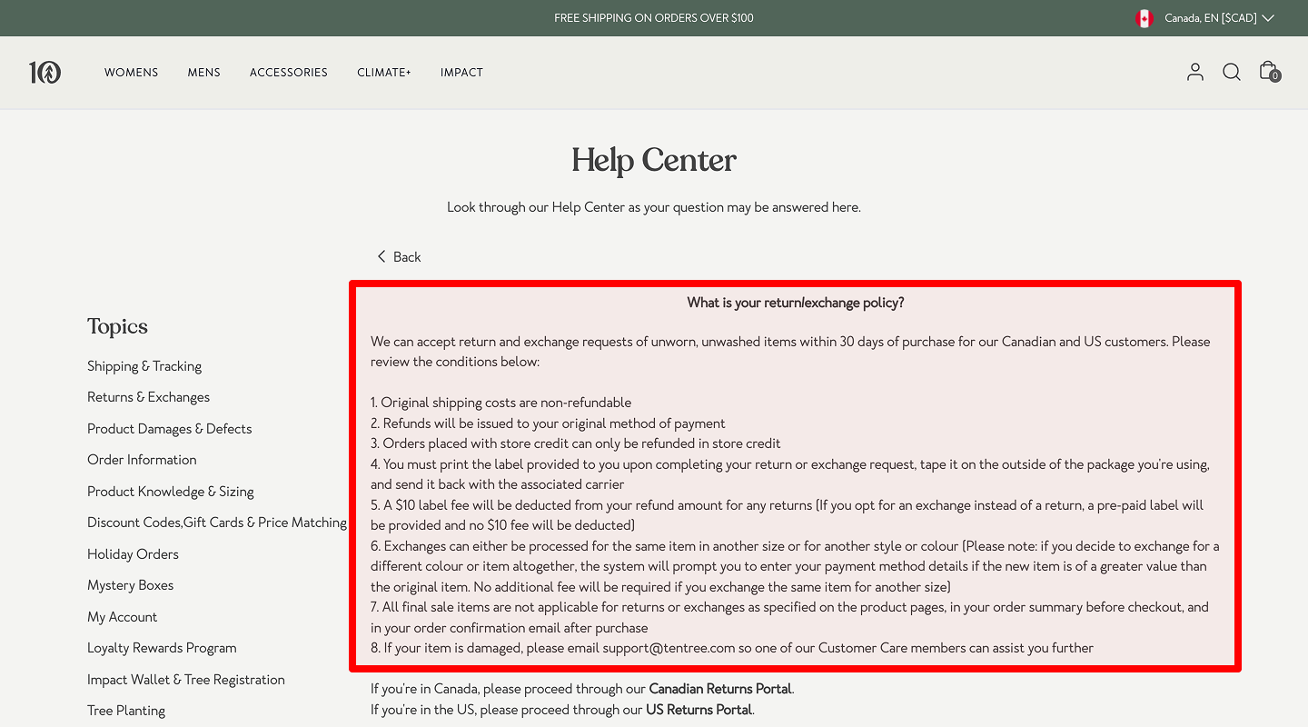
Check: Show time window and process.
Why: Lowers risk feeling.
How to check: Pre-sales questions trend.
How to implement: “30-day money-back. No questions.” Add this promise to the landing page checklist so the page feels risk-free.
-
Secure payment badges
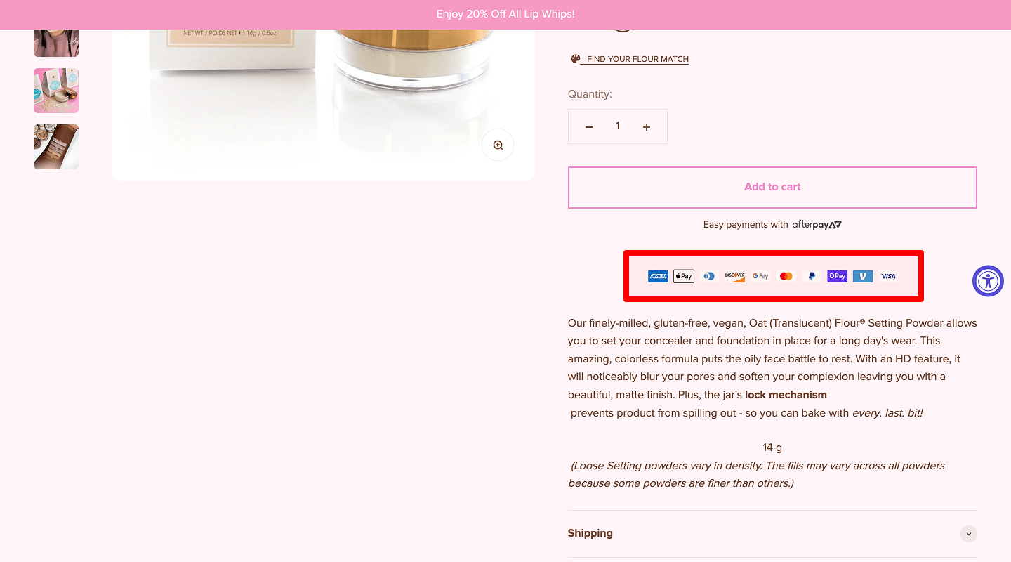
Check: Show accepted cards, SSL, trust seals.
Why: Trust for checkout.
How to check: Drop-off at payment step.
How to implement: SSL lock, PCI mention, badges near form. Track this trust UI in the landing page checklist so the page reassures at checkout.
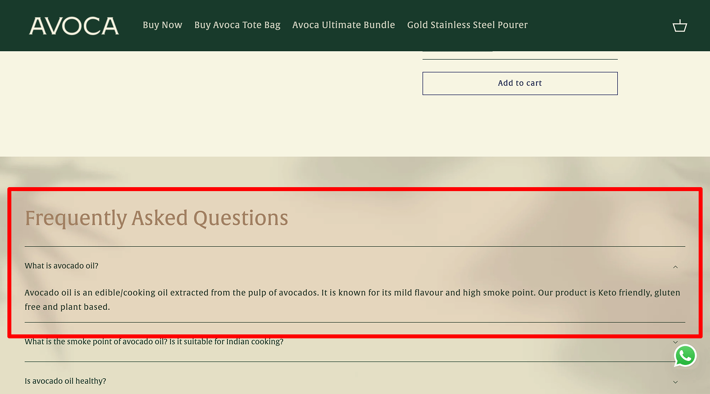
❓ FAQ
-
5–7 common questions with concise answers
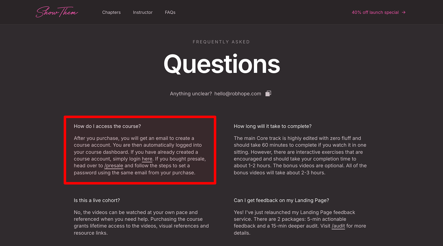
Check: Cover price, setup time, cancellation, support.
Why: Objection handling.
How to check: Review sales calls, chat logs.
How to implement: 2–3 sentence answers each. Include this Q&A step in your landing page checklist so the page handles objections inline.
-
Accordion format with FAQ schema
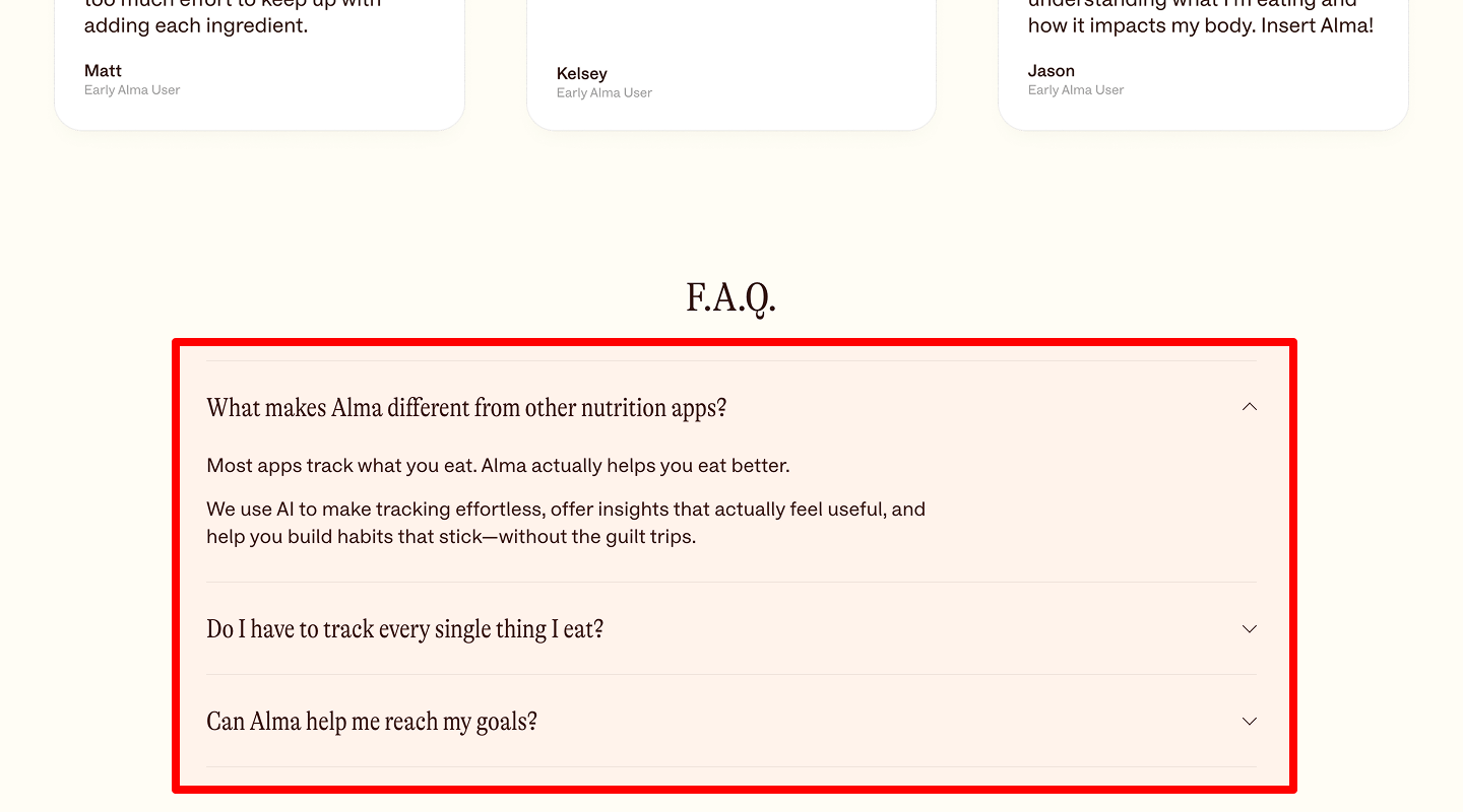
Check: Collapse/expand to keep page short.
Why: Better scan and speed.
How to check: Clicks per question, open rate.
How to implement: Native accordion; add FAQ schema (FAQPage) for rich results. List this as SEO hygiene in the landing page checklist so the page earns richer snippets.
🏷️ Promotions / Limited-Time Offers
-
Countdown timer (real, server-based)
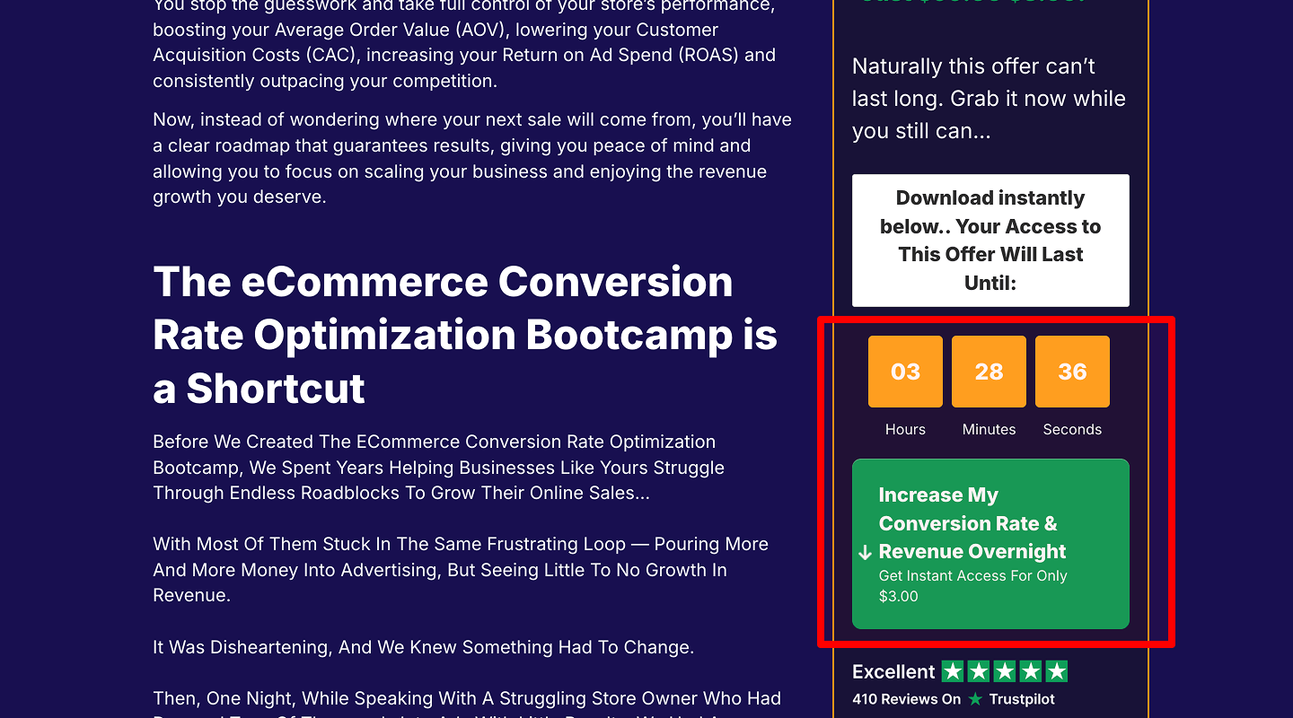
Check: Honest, tied to a real event.
Why: Urgency boosts action.
How to check: Conversion during promo vs. baseline.
How to implement: Server-based end time; stop at zero. Add this urgency control to the landing page checklist so the page runs honest promos.
-
Limited quantity/time badge near CTA
Check: Small badge near CTA.
Why: Scarcity nudges decision.
How to check: CTR change with/without badge.
How to implement: “Ends Sunday,” “Only 20 codes left.” Include this microcopy in your landing page checklist so the page nudges action ethically.
-
Discount or bonus details
Check: Clear value and conditions.
Why: Avoid mistrust.
How to check: Support questions drop.
How to implement: “Save 20% on first month,” “Bonus setup call.” Capture this offer clarity in the landing page checklist so the page avoids confusion.
📖 Brand Story
-
Core company values
Check: 3 short values linked to user gains.
Why: Emotional trust.
How to check: Time on section.
How to implement: “Simple, honest, helpful.” Log this brand note in the landing page checklist so the page connects emotionally.
-
“Why we do this” text
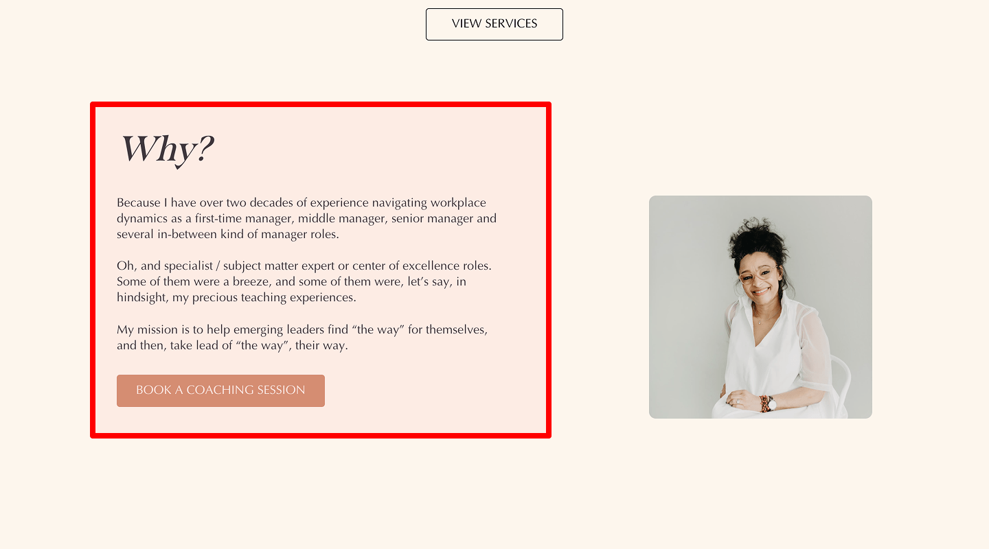
Check: One short paragraph.
Why: Human touch increases conversions.
How to check: Scroll depth around story.
How to implement: Founder note with small photo. Record this block in the landing page checklist so the page feels human.
-
Behind-the-scenes visuals
Check: Real team/product photos.
Why: Authenticity.
How to check: Engagement on carousel.
How to implement: Compress images; add alt. Keep this media hygiene in the landing page checklist so the page stays authentic and fast.
-
Key milestones
Check: Timeline with 4–6 points.
Why: Shows progress and stability.
How to check: Clicks, hover events.
How to implement: “Launched 2021 → 10k users 2024.” Add this timeline to the landing page checklist so the page shows stability.
💰 Pricing Plans / Packages
-
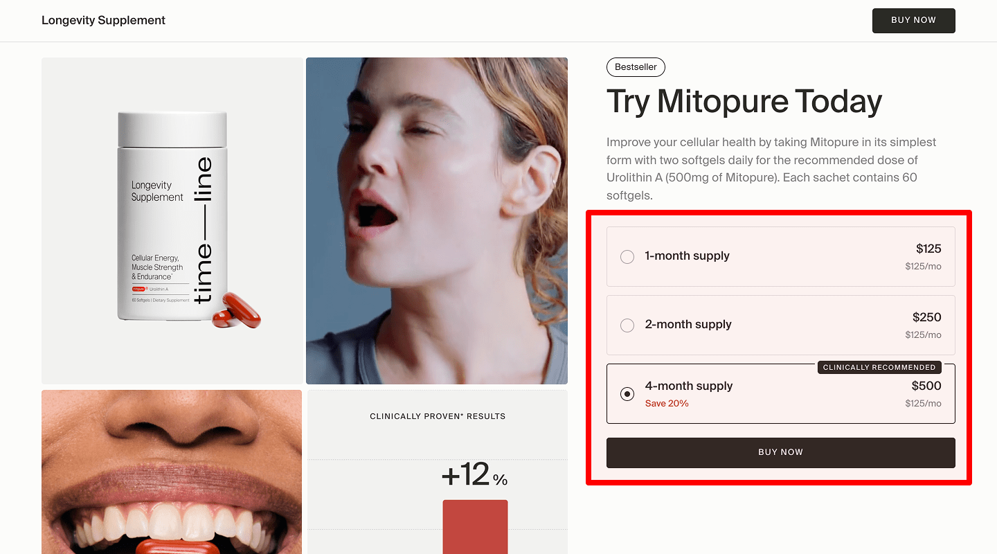
Plan comparison table/cards
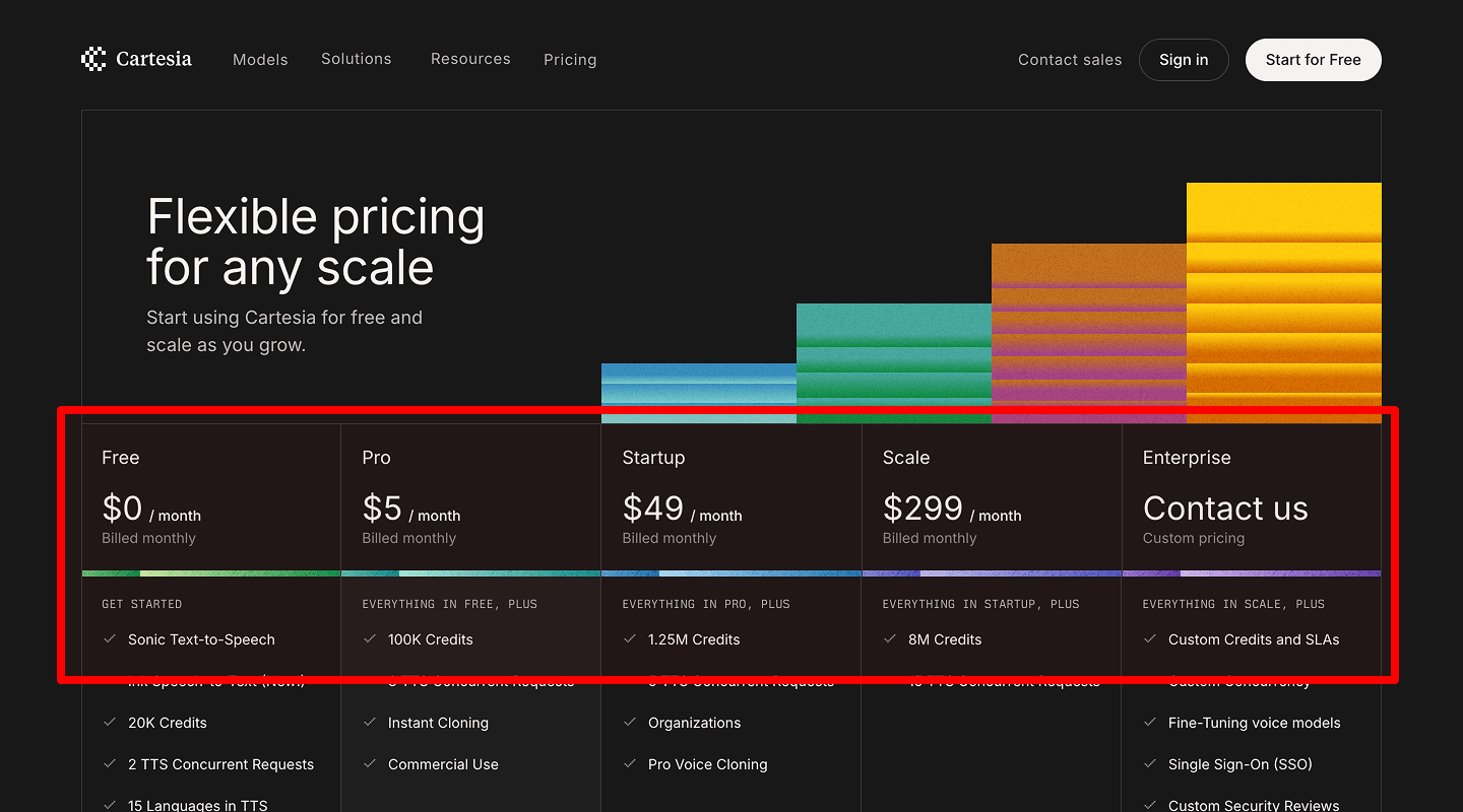
Check: 3 plans max (Good/Better/Best).
Why: Too many choices kill action.
How to check: Plan selection rate.
How to implement: One key difference per row; monthly vs yearly toggle. Add this pricing pattern to the landing page checklist so the page avoids choice overload.
-
Highlighted recommended plan
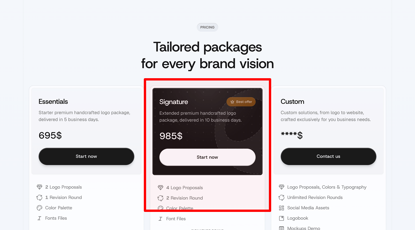
Check: Visual highlight on the best plan.
Why: Guides decision.
How to check: CTR on highlighted card.
How to implement: “Most popular” label, small badge. Note this visual cue in the landing page checklist so the page guides selection.
-
Short FAQ below pricing
Check: Answer price worries right there.
Why: Keeps user on page.
How to check: Reduce clicks to top FAQ.
How to implement: 3–4 short Q&As (billing, cancel, upgrades). Include this under-pricing item in the landing page checklist so the page keeps users in flow.
-
Order buttons (desktop & sticky on mobile)
Check: Buttons on each card, sticky on mobile.
Why: Fast action from any plan.
How to check: Heatmaps, click depth.
How to implement: “Choose Starter,” “Start Free Trial.” Add this button rule to the landing page checklist so the page enables instant action.
⬇️ Footer
-
Contact info
Check: Email, phone (if any), business address or legal entity.
Why: Trust and support.
How to check: Clicks on contact; track mailto/tel events.
How to implement: Structured data (Organization), clickable phone/email. Store this contact step in the landing page checklist so the page signals legitimacy.
-
Social media links
Check: Only active channels.
Why: Proof of life and community.
How to check: Outbound click tracking.
How to implement: Open in new tab; add rel="noopener". Add this link policy to the landing page checklist so the page preserves session and security.
-
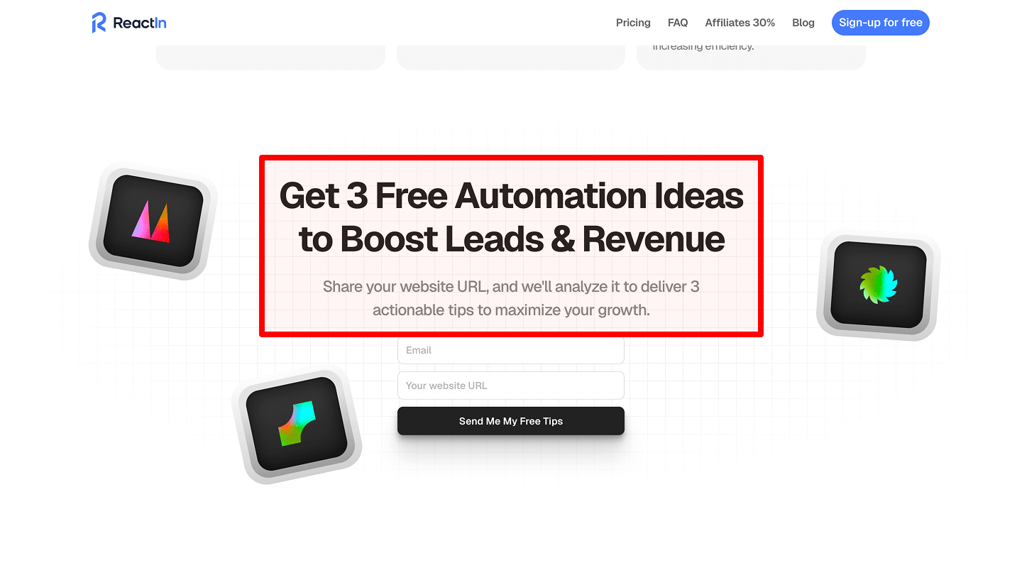
Newsletter subscription option
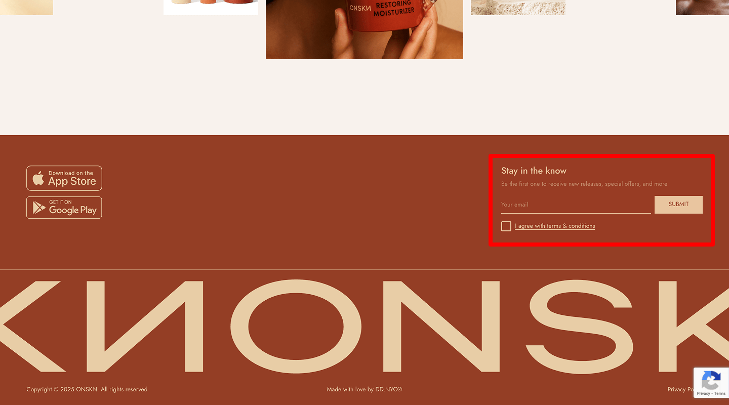
Check: Simple one-field form.
Why: Lead capture for colder visitors.
How to check: Form submit rate; error rate.
How to implement: Double opt-in, clear consent text. Keep this capture rule in your landing page checklist so the page converts colder traffic.
-
Legal info (privacy, terms)
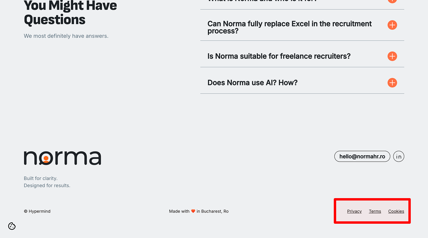
Check: Visible links, cookie notice if needed.
Why: Compliance and trust.
How to check: Pages exist and open; last updated date.
How to implement: Plain-language pages; link from footer. Include this compliance step in the landing page checklist so the page builds long-term trust.