
Version 3.21 — what’s new: native in-browser checks, faster heatmap rendering, improved Attention Budget accuracy, and faster UX Advice reports. Update or install the Plerdy, Chrome extension to get the new workflow right inside your browser.
You asked for sharper, faster UX checks right inside the browser. We shipped. This update turns your quick “hmm, what’s going on here?” moments into clear steps you can run during coffee breaks. No heavy setup, no long tutorials — just press the buttons and get insights. Install or update the Plerdy, Chrome extension and you’ll see the improvements immediately.
P.S. Top brands start here: Plerdy A/B testing is free — create an account and launch your first test to quickly validate your hypotheses. Run experiments on real traffic to see what actually moves the conversion needle.
1. Desktop ↔ Mobile toggle for instant heatmap validation
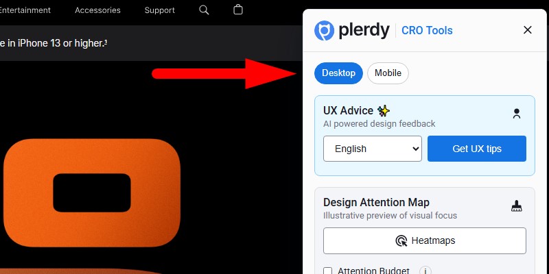
Switch between desktop and mobile views in one tap and scan the page with Plerdy’s predictive heatmaps. This is perfect when a button performs fine on desktop but disappears in mobile clutter. Jump to mobile, re-run the visual map, and confirm where attention and clicks should land. You can compare header, hero, and checkout areas in seconds, then decide what to move, shrink, or boost.
Pro tip: do a fast “above-the-fold” audit. If the primary action doesn’t glow on the heatmap at first screen, the layout needs help — spacing, contrast, or order of blocks.
2. UX Advice — smarter analysis, more languages, 2 free reports
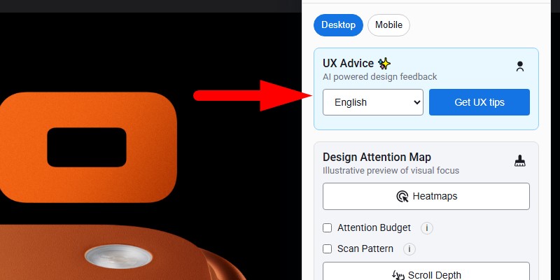
The AI-powered UX Advice got a brain upgrade and a language boost. Now it reads the page smarter, understands structure better, and returns a compact report with design and usability tips. You can test two reports for free — push the main button, wait a moment, and open the suggestions. The tool points to friction, clarity problems, confusing CTAs, weak hierarchy, and missing trust anchors.
Change the report language if your team collaborates in different markets. Then pass the link around and mark items to fix. Quick wins first: move the key CTA up, make headline stronger, remove noisy elements hurting scannability.
3. Attention Budget — “Where does the eyeball energy go?”
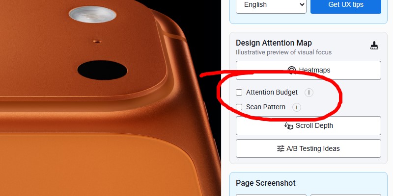
This view estimates attention inside the current viewport and paints it on top of your page. Warm areas show higher focus; strong CTAs get a clear outline. It’s a fast way to see if your main action actually dominates the scene or gets lost near banners and carousels.
Use it in two modes:
- On your pages to judge visibility of the primary action.
- On competitor pages to learn their visual priorities and steal good patterns (ethically, of course).
How to squeeze value (one list, keep it handy):
- Check the hero section and confirm the call to action stands out at first glance.
- Validate secondary buttons so they don’t compete with the main one; less noise, more conversion.
- Test a few header versions; a lighter variant often frees space for the CTA.
- Compare two product pages quickly and pick the one with stronger focus on the offer.
- Run it before and after a tweak to prove the attention shift without a full A/B run.
4. Scan Pattern — F, Z, Layer-cake, or Spotted
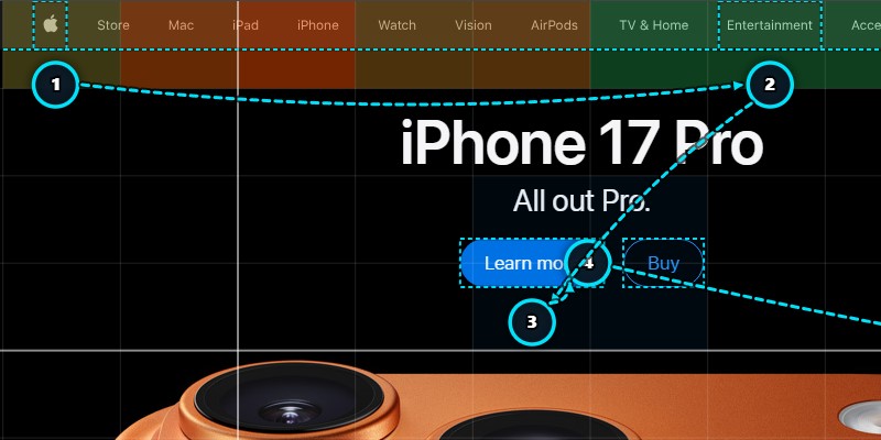
Readers don’t always move in a straight line. This tool detects the dominant scanning path on the page — F-pattern for text-heavy layouts, Z-pattern for landing blocks, Layer-cake for sectioned content, and Spotted when eyes jump between visual magnets.
Why this matters: when headings, navigation, and CTAs sit along the detected path, people reach the next step faster. When they fight the path, bounce grows.
Quick playbook:
- F-pattern: push headings, summary lines, and action buttons to the top-left zones of sections. Keep paragraphs short, and make the first words strong.
- Z-pattern: align headline → visual → benefit line → CTA along the diagonal flow. Keep the bottom-right area powerful; that’s your money spot.
- Layer-cake: each block needs a clear title and one action. Avoid double CTAs in one slice.
- Spotted: big visuals and badges pull attention; use them to anchor trust (reviews, guarantee) near the action button.
Run the pattern check on a competitor page too. You’ll see how their layout nudges attention. Copy the good moves, avoid the messy ones.
Fast workflow to try today
Open any target page. Toggle mobile. Fire the heatmap. If the main action doesn’t pop, flip on Attention Budget for confirmation. Then run a UX Advice report to get short, readable fixes. Finish with Scan Pattern to align headlines and CTAs with the actual reading path. This feels efficient because it is — zero context switching, everything inside the browser. Pro tip: keep the Plerdy, Chrome extension updated so these steps are immediate and smooth.
Final thoughts
This release is about speed and confidence. You switch view, see attention, read short advice, and re-check the scan path — all in minutes. Use the two free UX Advice reports to test the flow on a real page. If the attention map shows heat in the wrong corner, move the action. If the scan path skips your value prop, reshape the hero. Small edits, steady wins.
Now go tune that page. Your conversion will thank you — and if you haven’t yet, grab the Plerdy, Chrome extension to make all checks one click away.