You open your site on your laptop. It looks fine.
Buttons. Modern font. Clean layout. No obvious errors.
Then you check revenue. Weirdly flat.
Ads are running. Clicks are coming. The team says, “The site is nice.”
And yet… something is quietly leaking money.
Here’s the uncomfortable truth: “Nice” is not the same as “converts.”
Friction doesn’t announce itself. It hides inside scrolls, taps, hesitations, and exits.
This article is a fast, practical way to find the leak today—before you touch another campaign.
The “Nice Website” Trap (Why Founders Miss The Leak)
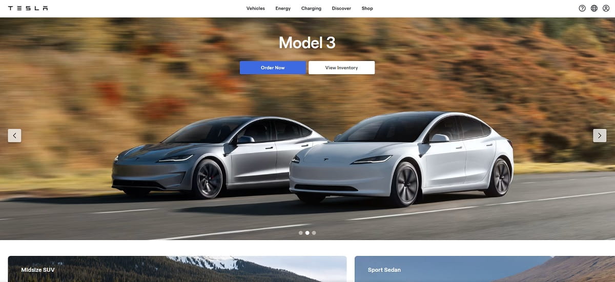
A nice-looking site is dangerous because it feels “done.” It looks like progress. It photographs well. It gets compliments in Slack.
But revenue doesn’t care about compliments. Outcomes only.
Founders miss leaks because the signals are subtle:
- No obvious bugs: The site loads, pages render, checkout works. So you assume it’s fine.
- Pretty UI creates false confidence: Clean spacing can hide unclear messaging and weak hierarchy.
- Analytics feels “normal”: Sessions are up, bounce rate is “okay,” time on page isn’t awful. Meanwhile, intent is dying above the fold.
- You blame the campaign first: “Maybe the targeting is off.” Sometimes true. Often not.
- Your team is too close: Everyone knows the product already, so the site reads clearer than it actually is to cold traffic.
Quick story I’ve seen too many times: a founder ships a beautiful redesign, launches ads, and sales don’t move. They assume the offer is the issue, so they discount. Traffic gets cheaper, margins get worse, and the real problem stays untouched: the page never told people what to do in the first five seconds.
The Silent Revenue Killers That Don’t Look Like Bugs

These aren’t “broken” things. They’re quiet things. And they cost real money.
- Unclear offer above the fold: Headline sounds smart but says nothing. Visitors can’t answer “what is this?” instantly.
- Fake clarity: Buzzwords like “next-gen,” “all-in-one,” “seamless,” “innovative.” If your hero section is a poem, you’re donating money to the ad platforms.
- CTA competition: Three primary buttons, two promos, a “Book a demo,” and a newsletter. Nobody knows what matters.
- Scroll cemetery: Your proof (pricing, outcomes, testimonials) is buried so deep that most people never see it.
- Mobile tap pain: Tiny links, cramped menus, buttons too close together. People mis-tap and bounce.
- Slow perceived speed: Page technically loads, but it feels heavy. Big images, late layout shifts, delayed text. Users leave before the story starts.
- Distracting promo collage: Carousels, badges, popups, sticky bars, and banners all fighting for attention.
- Trust gaps: No clear guarantees, vague shipping/returns, missing customer proof, unclear security signals at checkout.
- Form friction: Too many fields, confusing labels, weak error handling, “phone number required” for no reason.
- Cart surprises: Shipping appears late, taxes surprise, coupon field screams “you’re paying too much,” or delivery dates are unclear.
- Navigation as a maze: Menu labels make sense internally, not externally. People bounce from confusion, not disinterest.
- Mismatch between ad promise and landing reality: The ad is specific, the page is generic. You paid for intent and delivered ambiguity.
A 5-Minute Founder Audit (Do This Before You Touch Ads)
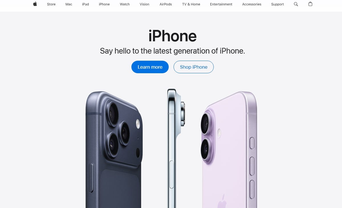
This is the fastest “are we leaking money?” check I’d run if I had five minutes and a founder staring at me.
- Open your landing page on mobile.Don’t pinch-zoom. Don’t “try.” Just read it like a tired person on a small screen. If the offer isn’t obvious in five seconds, that’s a leak.
- Answer three questions using only the first screen.What is this? Who is it for? What do I do next? If any answer is fuzzy, your “nice” design is hiding confusion.
- Find your first strong proof block.Testimonial with a result, a clear metric, a recognizable use case, a guarantee, a comparison, a demo snippet—something that reduces doubt. If proof starts after a long story, that’s a leak.
- Scan for distraction density.Count how many different actions you’re asking for above the fold. If it’s more than one primary action, simplify.
- Check the “tap path” to purchase or lead.On mobile: can you reach pricing, product details, and checkout/contact in two taps without hunting?
- Do one reality check with behavior.Don’t rely on vibes. Watch a few real sessions and see where people hesitate, rage click, or abandon.
Slack script (for your team): “Before we change ads, everyone watch 10 session recordings on mobile. Drop 3 timestamps where users hesitate, mis-tap, or bounce. No opinions—only moments.”
Slack script (for a quick decision): “If users with the right intent still fail to reach pricing or checkout, we fix landing friction first. If they bounce instantly with no engagement, we revisit targeting and promise.”
Is It The Campaign Or The Landing Page? Stop Guessing
Founders burn weeks arguing about “traffic quality” versus “site issues.” You don’t need a debate. You need a decision tree.
If The Traffic Quality Is Wrong (Campaign Problem Signals)
- Very low engagement across the board: People bounce fast without scrolling or clicking.
- Mismatch in intent: You promised one thing in the ad, delivered another on the page.
- Weird geo/device mix: Traffic doesn’t match your customer reality (for example, lots of accidental mobile traffic when your offer converts on desktop).
- High click volume, no meaningful actions: Lots of visits, almost no add-to-cart, pricing views, demo starts, or form progress.
In this case, fix targeting, creative, and promise alignment. Your landing page might still be imperfect, but the first issue is “wrong people.”
If The Intent Is Right But Behavior Is Bad (Landing Page Friction Signals)
- Scrolling without acting: People read, wander, then leave. That’s confusion or doubt.
- Clicks on non-clickable elements: People try to interact with things that aren’t interactive. That’s a UI expectation mismatch.
- Rage clicks and dead clicks: Repeated tapping on buttons/areas that don’t respond the way users expect.
- Drop-offs at the same section: A specific block causes exits—pricing explanation, shipping, form step, or trust section.
- Cart or form abandonment with effort invested: If someone started and still quit, something spooked them.
This is where “nice” quietly kills revenue. The audience is fine. The page is the problem.
Show Me The Leak In One Minute (Plerdy Business Mode + Lost Revenue Report)
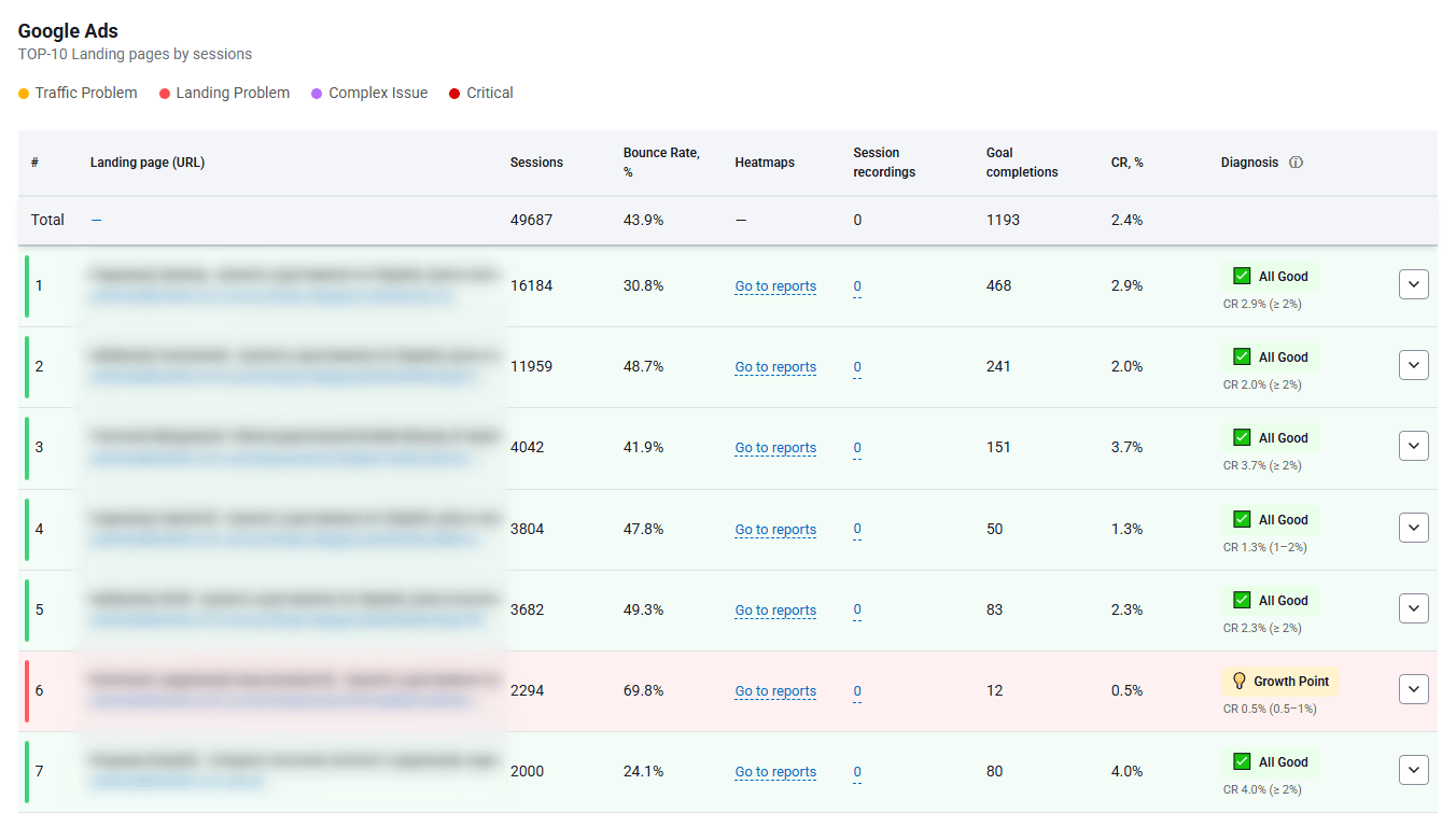
Founders don’t need another dashboard. You need a fast diagnostic that answers a real question:
Where exactly is money leaking—campaign or landing page?
That’s the job of the Plerdy Lost Revenue Report.
It helps you see where users drop, where potential revenue disappears, and which pages are quietly wasting paid traffic.
Pair it with Business Mode, and you get a founder-friendly workflow:
- Find the pages tied to paid traffic that underperform.
- Spot the biggest drop-off points without digging through ten reports.
- Separate “campaign issue” from “page friction” using behavior signals.
The point is speed. One minute to stop guessing where the leak is coming from.
What To Do Next (Fast Checklist)
- Pick one paid landing page with meaningful spend.
- Use the Lost Revenue Report to identify the biggest leakage point.
- Decide: is it traffic quality or landing friction?
- If it’s landing friction, go to proof mode next: heatmaps + recordings.
- Fix one high-impact block (hero clarity, CTA hierarchy, trust, form friction) before changing ads.
Proof, Not Opinions (Plerdy Expert Mode: Heatmaps + Session Recordings)
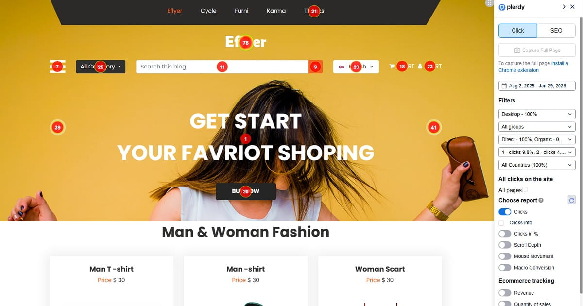
Design reviews create opinions. Opinions create meetings. Meetings create… nothing.
Behavior creates proof.
With Heatmaps, you can see what people actually click, ignore, and obsess over.
- Click maps show what looks clickable, what gets attention, and what gets ignored.
- Scroll depth shows where attention dies. Your best content might be living in the graveyard.
- Hover and interaction patterns reveal hesitation and confusion on desktop.
Then you validate the “why” with Session Recordings.
This is where the quiet leak becomes obvious: the long pause on the hero, the back-and-forth between pricing and features, the repeated taps on a tiny button, the abandoned form after a confusing field.
And you can go deeper without turning this into a feature festival:
- Funnels to see where users drop in multi-step paths.
- Event tracking to measure meaningful actions (pricing view, add-to-cart, checkout start).
- Form analytics to find which field causes abandonment.
If someone on your team says, “I think users like this layout,” ask for evidence. Then pull up the recordings.
Fixes That Move Revenue (Not Just UI)

Below are fixes I’ve watched move conversion rates because they attack friction, not aesthetics.
1) Hero Looks Beautiful, But Says Nothing
Symptom: Users scroll, hesitate, or bounce without clicking.
Cause: The headline describes you, not the outcome. Or it’s too abstract to understand fast.
Fix: Rewrite the hero into plain language: outcome + audience + timeframe or mechanism. Add one primary CTA.
Proof method: Use heatmaps to confirm the CTA gets clicks and scroll depth improves after the hero.
2) Too Many CTAs Compete Above The Fold
Symptom: Clicks spread across multiple buttons; key action is underused.
Cause: You’re trying to satisfy everyone at once (demo, pricing, newsletter, learn more).
Fix: Choose one primary CTA and demote the rest. Make the primary CTA visually dominant and repeated later.
Proof method: Use click maps to confirm the primary CTA takes a larger share of clicks.
3) Proof Is Buried Too Deep
Symptom: People don’t reach testimonials, pricing explanation, guarantees, or comparisons.
Cause: The page spends too long “warming up” the visitor.
Fix: Move one strong proof element into the first two scrolls: results-based testimonial, guarantee, short case snippet, or trust badges with context.
Proof method: Use scroll depth to see more users reach proof blocks, then confirm in recordings that doubt moments reduce.
4) Mobile Feels Clickable, But Isn’t
Symptom: Rage clicks, dead clicks, repeated taps, accidental taps on wrong elements.
Cause: Tap targets are too small, spacing is tight, or UI suggests interactivity where none exists.
Fix: Increase button size, add spacing, simplify sticky elements, remove deceptive “card” styling if it’s not clickable.
Proof method: Watch session recordings filtered to mobile and look for a drop in rage clicks.
5) Pricing Creates Confusion Instead Of Confidence
Symptom: Users bounce around pricing, features, and FAQ, then leave.
Cause: Pricing lacks context: who each plan is for, what’s included, what the outcome is.
Fix: Add “best for” labels, simplify plan differences, clarify what happens after purchase/demo, and show one clear recommendation.
Proof method: Use funnels and event tracking to see increased progression from pricing view to checkout/demo start.
6) Forms Ask For Too Much Too Soon
Symptom: High form starts, low completions.
Cause: You require unnecessary fields, or the form feels risky (phone required, unclear privacy, unclear next step).
Fix: Cut fields. Explain what happens after submission. Add privacy reassurance in one sentence.
Proof method: Use form analytics to identify the abandonment field, then confirm improvement after removal.
7) Checkout Has Late Surprises
Symptom: Add-to-cart happens, checkout starts, then abandonment spikes.
Cause: Shipping/taxes appear late, delivery expectations are unclear, or payment options disappoint.
Fix: Add shipping clarity earlier, show delivery range, surface payment options sooner, remove friction steps.
Proof method: Use funnels to see whether checkout completion improves at the same step that used to drop.
8) The Page Tells A Story, But Doesn’t Direct Action
Symptom: Long scroll sessions, low conversion actions.
Cause: You built content, not a path. The visitor is reading but not deciding.
Fix: Add decision points: repeat CTA after proof blocks, add “who this is for” and “who it’s not for,” add one clear next step.
Proof method: Use click maps to verify CTA clicks rise at the new decision points.
Founder Checklist (Save This)
- Hero clarity test: In five seconds, can a stranger explain what you sell and who it’s for?
- One primary CTA above the fold (everything else is secondary).
- Proof in the first two scrolls (result-based testimonial, guarantee, or concrete metric).
- No buzzword paragraphs that could fit any company.
- Mobile tap targets are large and spaced. No “pixel hunting.”
- Scroll depth check: Does your key content live where people actually reach?
- Pricing context: “Best for” labels and simple plan differences.
- Form friction check: Cut fields, clarify next step, add privacy reassurance.
- Trust clarity: Shipping, returns, guarantees, and support are easy to find.
- Checkout transparency: No late surprises on cost or delivery.
- Ad-to-page match: The landing page repeats the ad promise in plain language.
- Behavior proof: Watch real sessions weekly, not only when revenue drops.
- Stop arguing in meetings: Use heatmaps and recordings to decide.
- Fix one leak at a time: One page, one bottleneck, one measurable change.
Your website doesn’t need to be “nicer.” It needs to be clearer. Lower-friction. More decisive.
Design is not the goal. Outcomes are.
Run the 1-minute check with the Plerdy Lost Revenue Report in Business Mode, find the leak, then validate it with Heatmaps and Session Recordings.
If you do that, your “nice” website can finally start acting like a revenue machine.
