
You turn on ads. The clicks show up. The dashboard looks alive.
And then… nothing.
No sales spike. No “cha-ching.” Just a quiet little leak that turns your ad budget into expensive site visits.
You didn’t buy traffic. You rented attention.
Most stores don’t have a traffic problem. They have a “momentum” problem.
And momentum dies fast when trust, clarity, or effort-reward breaks.
Here’s a scene I’ve seen too many times: a founder sells a clean-looking product (great photos, decent price, solid reviews). Ads promise “Free shipping + delivery in 2–4 days.” The landing page looks fine. The product page looks fine. The checkout looks fine.
But people still leave.
Why? A tiny chain of frictions.
Shipping is “free” only after a threshold you can’t see until checkout. The size guide opens in a slow pop-up that covers the add-to-cart button on mobile. The first trust signal is buried below five screens of lifestyle photos. And the payment options are missing the one method their audience actually uses.
Nothing is “broken.”
Everything is slightly harder than it needs to be. That’s enough.
This is the job: find the exact point where the experience loses the customer’s confidence or energy.
And you can do it without guessing.
Here’s how to spot the exact reason they leave — today.
The Four Reasons People Leave (And How To Recognize Each In 30 Seconds)

They Don’t Trust You Yet
On mobile, trust isn’t a “feeling.” It’s a checklist the brain runs in half a second.
If your store looks like it could disappear tomorrow, people treat “Add to cart” like a risky decision.
Common trigger: a shipping or returns policy that’s vague until late, plus a footer full of empty promises.
- Check if shipping costs and delivery times are visible before checkout.
- Check if returns are clear, specific, and easy to find.
- Check if your contact options feel real (not just a form).
- Check if product reviews look credible on mobile (not buried, not tiny).
- Check if payment methods match your audience’s expectations.
They Don’t Understand The Offer Fast Enough
People don’t read. They scan. And your first screen is your only real chance to say: “This is for you.”
If the headline is cute but unclear, or the hero image is beautiful but confusing, users can’t connect the ad promise to the page reality.
Common trigger: the ad says “Solve X,” but the page starts with brand story and vibes.
- Check if the first screen answers: what is this, for who, and why now.
- Check if the main benefit is visible without scrolling.
- Check if your primary CTA is obvious and not competing with five others.
- Check if price and key constraints are clear (subscription, bundles, minimums).
They Hit Hidden Effort (Work) Too Early
Effort kills momentum. Especially “surprise effort.”
If a user has to hunt for sizing, decode variant names, or fill in information before they feel confident, they bounce. Not because they’re lazy. Because the reward isn’t earned yet.
Common trigger: “Choose your option” before you’ve explained what the options mean.
- Check how many taps it takes to find sizing, materials, or compatibility.
- Check if the size guide opens fast and works on mobile.
- Check if variants are understandable (not “Model A / Model B”).
- Check if add-to-cart is blocked by popups, chat widgets, or sticky bars.
- Check if you force account creation too early.
They Get Distracted Or Overwhelmed
Some stores don’t leak because they lack information.
They leak because they have too much of it, in the wrong order, with too many interruptions.
Popups, banners, sticky promos, spinning carousels, chat bubbles, “10% off” overlays. Every element is trying to help. Together, they create noise.
Common trigger: the user tries to focus, and the page keeps grabbing their sleeve.
- Check how many competing CTAs appear on the first two screens.
- Check if popups trigger before the user shows intent.
- Check if the product page has a clean reading path (benefit → proof → details).
- Check if promo messaging is consistent (not three different offers).
Traffic Problem Or Page Problem? Stop Guessing
When sales are low, teams argue about the wrong thing.
Marketing says: “We need better targeting.”
Product says: “The site is fine.”
Founder says: “Maybe people just don’t want it.”
Most of the time, the truth is simpler.
Either the campaign brings the wrong intent, or the page fails to convert the right intent.
Different fixes. Different outcomes.
- If ad click-through is healthy but people leave in the first few seconds → fix landing clarity and trust signals.
- If people browse products but don’t add to cart → fix product page decision support (sizing, proof, friction).
- If add-to-cart is fine but checkout start is low → fix cart/checkout continuity and surprise costs.
- If checkout start is fine but purchase is low → fix payment options, errors, forced steps, and confidence gaps.
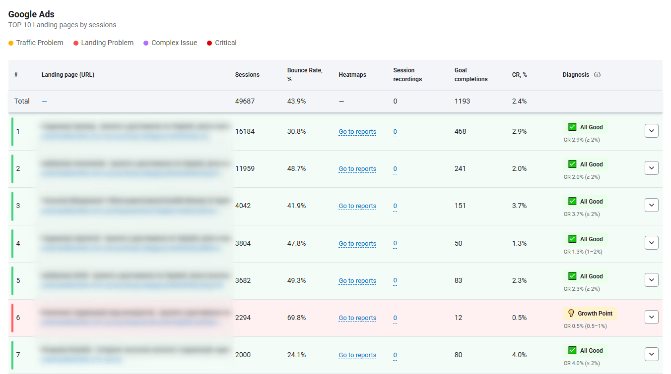
- If everything looks “normal” but revenue is weak → segment by device, channel, and landing page. The leak is hiding in a slice.
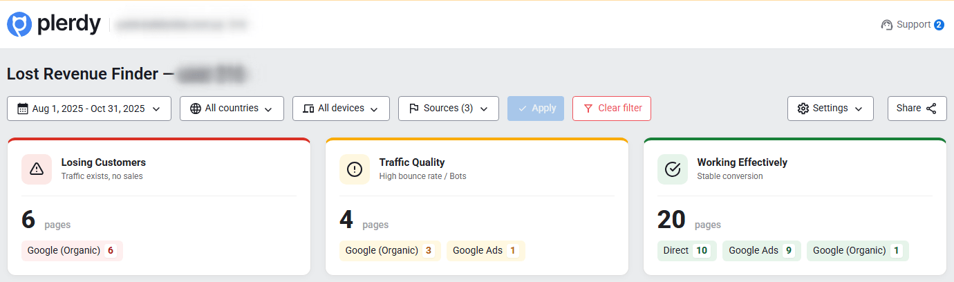
This is exactly what a fast diagnosis should reveal: where people drop off and which pages leak revenue.
That’s why Plerdy Lost Revenue Report exists: to stop the debating and show you where to look first.
The 1-Minute Diagnosis With Plerdy Business Mode (Lost Revenue Report)
Business Mode is for speed.
You’re not trying to “analyze everything.” You’re trying to find the leak.
Here’s the mini walkthrough:
- Open Business Mode and run the Lost Revenue Report for the timeframe you care about (start with the last 7–14 days).
- Look at where users drop off across key steps: landing → product view → add to cart → checkout start → purchase.
- Identify the pages that get traffic but don’t move people forward (high visits, low progress).
- Spot mismatch patterns by channel (ads vs organic vs email). The leak often belongs to one source.
- Create a short list of “leak pages” to investigate deeper.
What the report highlights in plain terms:
- Drop-off points that correlate with lost revenue potential.
- Underperforming pages that consume attention but don’t convert.
- Funnel steps where momentum collapses.
- Places where the ad budget is burning without return.
How to interpret the outcomes:
- Pattern A: campaigns mismatch intent (ad promise vs landing reality). People arrive curious, then realize it’s not what they expected.
- Pattern B: landing page fails the “5-second clarity test.” The offer is there, but not obvious, not fast, not confident.
- Pattern C: product page friction (info gaps, trust gaps, decision paralysis). Users hover, scroll, open tabs, then disappear.
- Pattern D: checkout friction (surprises, forced account, payment issues). Users were ready, then something made it feel risky or annoying.
End result: you now have a shortlist.
Next you need proof of behavior.
Operator note: The biggest mistake is “fixing the homepage” because it feels important. Fix the leak page that the report points to. That’s where money actually leaves.
Move From Guessing To Proof With Expert Mode (Heatmaps + Session Videos)

Expert Mode is where you confirm reality.
Not opinions. Not “we think.”
Behavior.
Heatmaps: What People Try To Click (And What They Ignore)
Heatmaps show you the silent conversation users are having with your page.
Where they tap. What they miss. What they think is clickable.
This is where you catch dead clicks and false affordances fast with Plerdy heatmaps.
- Dead clicks on images, icons, or headings that look like buttons.
- High attention on irrelevant elements (badges, carousels) while the CTA gets ignored.
- Rage tapping on non-interactive UI, especially on mobile.
Operator note: If people click your hero image more than your CTA, your page is asking them to admire, not buy.
Scroll Depth: Where The Story Dies
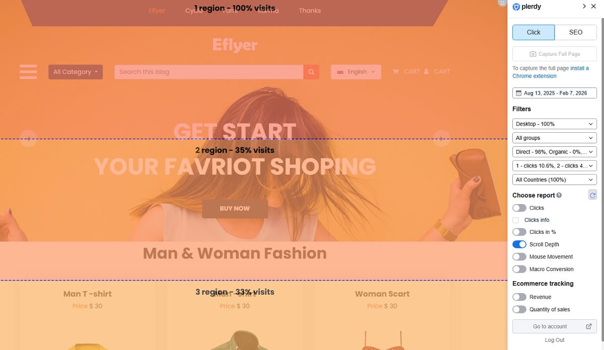
Scroll depth tells you where your narrative loses people.
You can have great content and still lose sales if the order is wrong.
Most stores bury the one thing that would have closed the sale: sizing clarity, shipping clarity, or proof.
- Users never reach reviews because they’re too far down.
- Key info (shipping, returns, sizing) appears after the drop-off point.
- The page front-loads lifestyle photos and delays decision support.
Session Videos: The Moment They Rage-Click Or Hesitate
Session recordings show the decision friction you can’t see in analytics.
This is where you watch the “almost purchase” die in real time with Plerdy session recordings.
Look for the moment they stop moving forward and start orbiting.
- Back-and-forth between photos and size guide, trying to reduce risk.
- Repeated opening of shipping info or returns, looking for certainty.
- Cursor chaos, rapid scrolling, and tapping that signals confusion.
Funnels/Events: Which Step Bleeds The Most Money
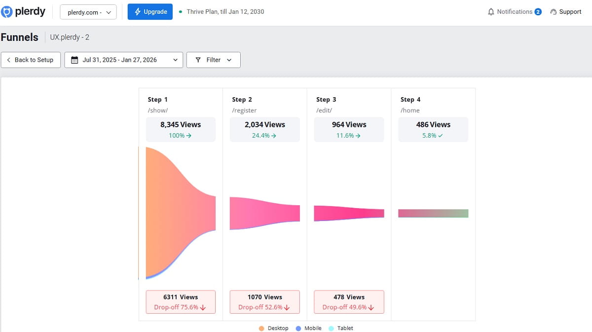
Funnels and events turn behavior into a map you can prioritize.
You don’t need ten changes. You need the one change that unblocks the biggest leak.
Use Plerdy funnels to focus on the step that matters.
- A specific checkout step with unusually high exits.
- A form error pattern that blocks completion on mobile.
- A payment method gap where users stall and leave.
Operator note: Don’t watch 50 recordings. Watch 10 from the leak page and look for repeating moments. Repetition is your truth.
Fixes You Can Ship Today (Without A Redesign)
You don’t need a rebrand. You need momentum.
Here are fixes I’ve seen move revenue without touching the design system.
Above-The-Fold Fixes (Clarity + Trust)
- Rewrite the headline to match the ad promise in plain language.
- Add one specific benefit and one specific constraint (delivery time, fit, compatibility).
- Put shipping and returns micro-summary near the CTA.
- Show real proof early (review count, user photos, guarantees you actually honor).
- Reduce competing CTAs to one primary action.
- Remove or delay popups until intent is shown (scroll, time on page, add-to-cart).
- Make contact options visible and real (email, chat hours, response promise).
- Show payment method icons that match your buyers.
Product Page Fixes (Decision Support)
- Move sizing, materials, and care info above the fold on mobile.
- Make the size guide fast, readable, and not a UI trap.
- Rename variants so they explain themselves (not “A/B/C”).
- Add a “what’s included” section for bundles and kits.
- Answer the top 5 objections directly (fit, delivery, returns, durability, compatibility).
- Turn reviews into decision helpers (filter by size, use case, pain point).
- Replace vague claims with specific proof (warranty terms, materials, test results you can show).
- Make the CTA sticky on mobile if the page is long.
- Remove distractions near add-to-cart (extra banners, unrelated promos).
Checkout Fixes (Remove Surprise + Reduce Steps)
- Show full cost early (shipping, taxes, thresholds) before the final step.
- Allow guest checkout by default.
- Reduce form fields to the minimum required for fulfillment.
- Autofill and validate fields gently (especially on mobile).
- Offer the payment methods your audience expects.
- Remove surprise upsells that interrupt completion.
- Add clear delivery estimate and returns reminder in checkout.
- Handle errors with human language, not codes or vague warnings.
Micro-copy swap #1
Before: “Shipping calculated at checkout.”
After: “Shipping: free over $X. Otherwise from $Y. Delivered in 2–4 days.”
Micro-copy swap #2
Before: “Select an option.”
After: “Choose your size (runs slightly small). View size guide.”
The “Stop Burning Ad Budget” Mini Script (For Founders)
Team, we’re not debating opinions today.
We’re finding the leak.
Business Mode first, Expert Mode second.
Step one: run the Lost Revenue Report and pick the top two leak pages.
Step two: confirm behavior with heatmaps and session videos on those pages.
Step three: ship one fix that removes the biggest friction we can prove.
Step four: measure add-to-cart, checkout start, and purchase for that page only.
If it moves, we keep going. If it doesn’t, we don’t “redesign.” We diagnose again.
What To Measure Next Week (So You Know It Worked)

You don’t need a 40-metric dashboard. You need signals that tell you if momentum improved.
- Bounce / engaged sessions on the leak landing pages.
- Add-to-cart rate by device (mobile is usually the truth).
- Checkout start rate after add-to-cart.
- Purchase rate and payment failures.
- Scroll depth to the key proof blocks (reviews, shipping, sizing).
- CTA clicks and dead clicks on non-clickable elements.
- Form errors and drop-offs on specific checkout steps.
Run short cycles.
Diagnose → fix → validate.
And keep it clean: one meaningful change at a time, tied to one leak page. Otherwise, you’ll “feel busy” and learn nothing.
Conclusion
Clicks don’t fail. Experiences fail.
People leave when trust breaks, clarity slows, effort spikes, or the page overwhelms them.
The fastest way to stop the leak is to stop guessing where it is.
Use the Plerdy Lost Revenue Report for a 1-minute diagnosis in Business Mode, then use Expert Mode for proof with heatmaps, session recordings, and funnels.
Find the leak page. Fix the friction. Validate the lift. Repeat.