
The “I Paid For Clicks” Moment. You check your ad dashboard. Spend is up. Sessions look healthy. Then you open your store analytics and feel that quiet punch: traffic is moving, but sales aren’t. It’s not always your price. It’s not always your product. A lot of the time, it’s the experience. The page makes people think, hunt, and interpret.
Complexity is a luxury you haven’t earned.
Here’s how it shows up in real life:
- People tap around, then vanish.
- They scroll like they’re looking for a hidden door.
- They hesitate, re-read, and second-guess.
- They land from an ad and can’t tell what you sell in five seconds.
Adidas can afford a brand-first layout that makes browsing feel like entertainment because demand carries the user through the mess.
You can’t, so treat every extra step like a fee you’re charging your buyer and remove it today.
Why Big Brands Can Be Messy And You Can’t
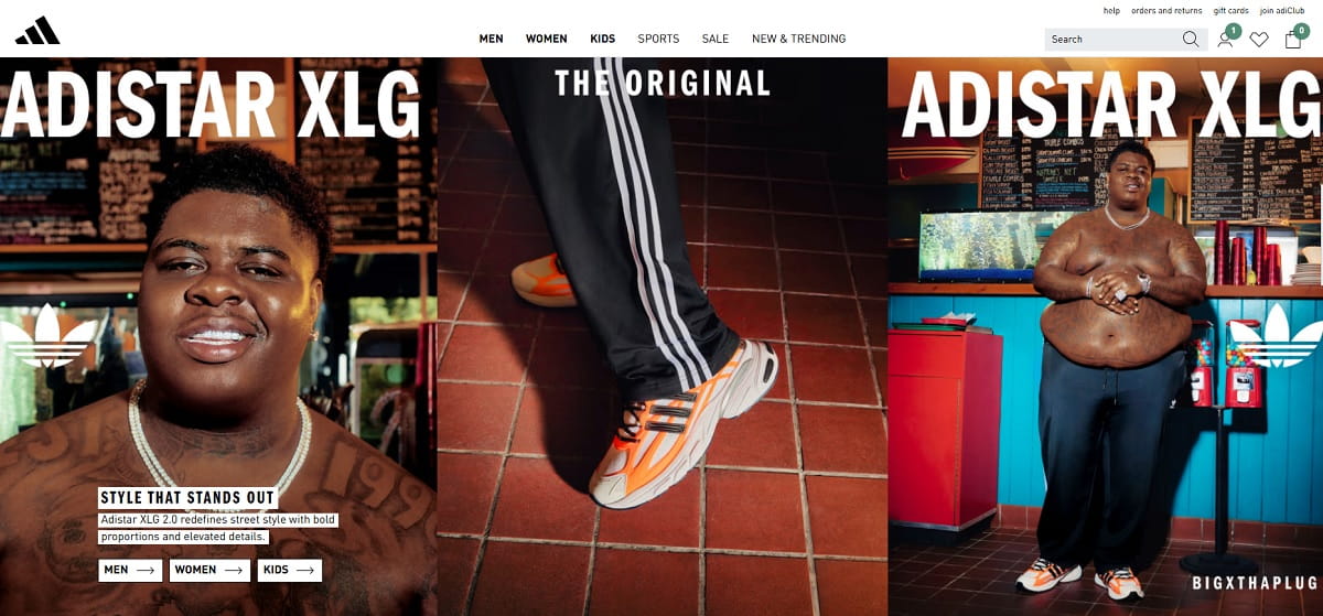
Big brands operate on brand demand. People arrive already motivated. They’ve seen the logo for years. They’ve watched the campaigns. They know the product category before the page even loads. When the homepage turns into a magazine-cover homepage, it can still “work” because the visitor is in browse-mode vs buy-mode.
You’re playing a different game. Most of your visitors are first-timers from ads. They didn’t wake up thinking about you. They clicked because the ad promised something specific, and now they want proof fast. On mobile, they’re doing this with a thumb, a short attention span, and a thousand distractions. Scroll fatigue is real. So is thumb reach: if your primary action is tiny, low-contrast, or stuck in a corner, you’re asking for extra effort.
Adidas can run a campaign-heavy hero and still get sales because repeat buyers will push through friction out of familiarity.
You need to earn trust and clarity immediately, which means your homepage must behave like a helpful guide, not a brand theater stage.
The “Work To Buy” Checklist
If even a few of these are true, you’re turning paid clicks into unpaid confusion:
- Your main offer is not visible without scrolling on mobile.
- You have 3+ competing CTAs above the fold (and none is clearly the “main” one).
- Your hero headline is clever, not clear (a slogan instead of a promise).
- You hide pricing, shipping, or delivery basics behind extra taps.
- Category labels sound creative but don’t match how people search.
- Promo banners fight each other (two discounts, three deadlines, zero certainty).
- Your best sellers are buried below brand storytelling and lifestyle blocks.
- Search is doing the job your homepage should do.
- Key trust signals are missing above the fold (returns, support, guarantees, reviews).
- The first scroll is all visuals and no decision point.
- Your navigation has too many options for a first-time visitor to choose confidently.
- Mobile tap targets are small, crowded, or too close together.
- Buttons blend into the design (style-first shopping, action-second).
- Your page loads heavy, and the first meaningful content arrives late.
The 5-Second Clarity Test
This is the simplest way to find homepage confusion without tools, meetings, or a full redesign.
How to run it: open your homepage on a phone, set a 5-second timer, then close it. Now answer three questions from memory:
- What do you sell?
- Who is it for?
- What should I do next?
If you can’t answer in one clean sentence each, your visitor can’t either.
A Script You Can Send Today
Send this to a friend or teammate who hasn’t seen your site recently:
Can you do a 5-second test for me? Open this page on your phone, look for 5 seconds, then close it. Tell me: (1) what you think we sell, (2) who it’s for, (3) what you’d click next, and (4) what felt confusing. Be brutally honest.
Pass criteria: they describe your offer accurately, point to a single next step, and don’t ask “wait, what is this?”
Fail criteria: they summarize your vibe, not your product; they mention “lots going on”; or they pick a random link because nothing feels clearly correct.
Common Homepage Friction Patterns

Too Many Choices Above The Fold
The pattern: multiple promos, multiple product paths, multiple CTAs, plus a menu that looks like a sitemap.
Why it kills conversions: decision fatigue hits fast, especially on mobile. When everything looks equally important, nothing feels safe to choose. People stall. Stalling becomes leaving.
A fast fix: choose one primary CTA for first-time visitors (shop best sellers, start with quiz, view bundles). Demote everything else into the next scroll or navigation. Make the “main” action unmissable and thumb-friendly.
Visual Noise That Hides The Offer
The pattern: big imagery, layered design, lots of motion, and copy that reads like a poster, not a promise.
Why it kills conversions: people don’t process “pretty” as “clear.” If the brain has to decode what you sell, it assumes risk. Risk feels like work. Work feels like “I’ll do this later,” which is the polite version of “no.”
A fast fix: rewrite the hero to a plain-language promise, add one supporting proof line, and place a single CTA button with strong contrast. Keep the visuals, but make them support clarity instead of competing with it.
Navigation That Becomes A Maze
The pattern: too many top-level categories, dropdowns that expand forever, and labels that mean something internally but not to buyers.
Why it kills conversions: the moment a visitor feels lost, they stop believing your site will be easy to buy from. On mobile, maze navigation is worse because the screen is small and the thumb can’t comfortably reach everything without effort.
A fast fix: reduce to 5–7 top-level items, rename categories using customer language, and add one “Start Here” path (best sellers, bundles, gifts, new arrivals) that matches common intent.
Endless Scrolling With No Decision Point
The pattern: long blocks of content with no clear moment to act: story, mission, lifestyle photos, testimonials, then more story.
Why it kills conversions: scroll fatigue. People start strong, then their attention gets thin. If you never present a decision point, you’re training them to consume, not buy.
A fast fix: place action modules every 1–2 scrolls: best sellers grid, bundles, limited offer, review highlights, trust block, and a repeated CTA. Don’t wait until the bottom to ask for commitment.
Paid Traffic Reality Check
Ads create a promise. Your homepage must confirm that promise fast. When it doesn’t, your bounce rate isn’t a “traffic quality” issue. It’s a clarity issue.
Three common mismatches that burn budget:
- Ad copy vs page: the ad says “Free Shipping Over $50,” but the landing experience opens with brand story and hides shipping details.
- Audience intent vs content: the ad targets “busy parents,” but the first screen is generic lifestyle imagery and vague benefits.
- Promo vs pricing: the ad pushes “20% off today,” but the page shows full price until a small banner loads or a code is found.
If you run ads, do this first:
- Match your hero headline to the exact ad promise in plain English.
- Put the primary CTA in the first screen on mobile (no scrolling required).
- Place the top three objections (shipping, returns, trust) near the CTA, not in the footer.
- Send each ad group to the closest intent page (not always the homepage).
- Review the first 10 seconds of sessions from paid traffic before you “optimize” the ads.
Plerdy: Find The Leak In 1 Minute
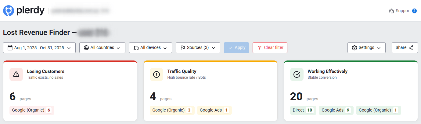
You don’t need another debate about “design.” You need proof: where people get stuck, what it costs, and what to fix first.
Plerdy Lost Revenue Report helps you see where money is leaking in plain language: which pages waste ad clicks, where visitors stop scrolling, where they tap and nothing happens (dead clicks), and where the landing message doesn’t match the intent that brought them. It’s the fastest path from “something feels off” to “here’s the leak.”
Plerdy Business Mode is the owner-friendly view: what’s broken, what it likely costs (as an estimate), and the first fixes that should move the needle. No rabbit holes. No analytics archaeology.
Plerdy Expert Mode is where you confirm root causes: heatmaps to see what gets attention, scroll depth to see where interest drops, and session recordings to catch hesitation, rage clicks, missed CTAs, and form abandonment. This is where you stop guessing.
Here’s a realistic before → after example to make it concrete: if your paid landing page gets 10,000 visits a month and converts at 1.2%, moving it to 1.5% doesn’t sound dramatic, but it can mean 30 more orders. If your average order is $60, that’s $1,800 a month. Not a miracle. Just less friction.
Mini walkthrough you can follow:
- Open Plerdy and start with the Lost Revenue Report.
- Filter by pages that receive paid traffic (landing pages, homepage, key categories).
- Spot the “leak signals”: high exits, sharp scroll drop-offs, and unusual click clusters on non-clickable elements.
- Switch to Business Mode to get the owner summary: what hurts most and what to fix first.
- Pick one priority page and open the heatmap to see what people actually engage with.
- Check scroll depth to find the point where attention collapses (often earlier than you think).
- Watch 10–15 session recordings from paid traffic to catch real friction: hesitation, back-and-forth taps, missed CTAs, or rage clicks.
- Write down the top 3 blockers in plain language (example: “people can’t see the offer,” “CTA is hidden,” “pricing is unclear”).
- Make one-day fixes and publish them (headline/CTA/trust block/navigation simplification).
- Re-check the same report after a few days to see if the leak signals improved.
Tools don’t fix sites—decisions do. Plerdy just makes the right decision obvious, faster, and less emotional.
A Simple Homepage Blueprint For Small Businesses
This isn’t about trends. It’s about layout logic that reduces work.
Think in one sentence: Make the first screen answer the buyer’s top questions, then give them a safe next click.
What must be visible above the fold on mobile:
- A clear promise (what you sell and why it matters).
- A primary CTA that’s easy to tap with a thumb.
- One proof element (reviews, results, trust badge, or a short credibility line).
- One risk reducer (shipping, returns, guarantee, support response time).
- A fast path for intent (best sellers, bundles, shop by problem).
Two microcopy examples you can steal:
- For an ecommerce product brand
Headline: “Skincare That Works In 14 Days, Not 14 Weeks.”
Subheadline: “Simple routine. Clear instructions. Free shipping over $50 and easy returns.” - For a service business
Headline: “Bookkeeping For Founders Who Hate Spreadsheets.”
Subheadline: “Fixed monthly pricing, weekly updates, and a 15-minute setup call to start.”
Notice what’s missing: brand theater. No vague mission paragraphs. No style-first shopping energy. Just clarity that lets people move.
Closing: Clarity Is Kindness
You don’t need a “cool” homepage. You need a homepage that makes buying feel obvious. The best version of your brand isn’t the one that looks like a campaign deck. It’s the one that respects the visitor’s time, thumb reach, and fragile attention span.
There are trade-offs, sure. Sometimes you’ll want to showcase the vibe. Sometimes you’ll want to tell the story. But if you’re paying for clicks, your first job is to remove work, not add it.
Clarity is kindness. Make buying easy.
If you want to see where money leaks first, start with Plerdy’s Lost Revenue Report and let the data tell you what to fix before you spend another dollar.