
You pay for the click. The visitor lands. And your homepage greets them with a beautiful photo, three product tiles, and a headline that could mean literally anything.
They don’t “bounce” because they hate you. They leave because they can’t answer a basic question fast enough: What is this, and what am I supposed to do?
That is how ad budget burns quietly. Not with a bang. With confusion.
Why Apple Can Be Vague And You Can’t
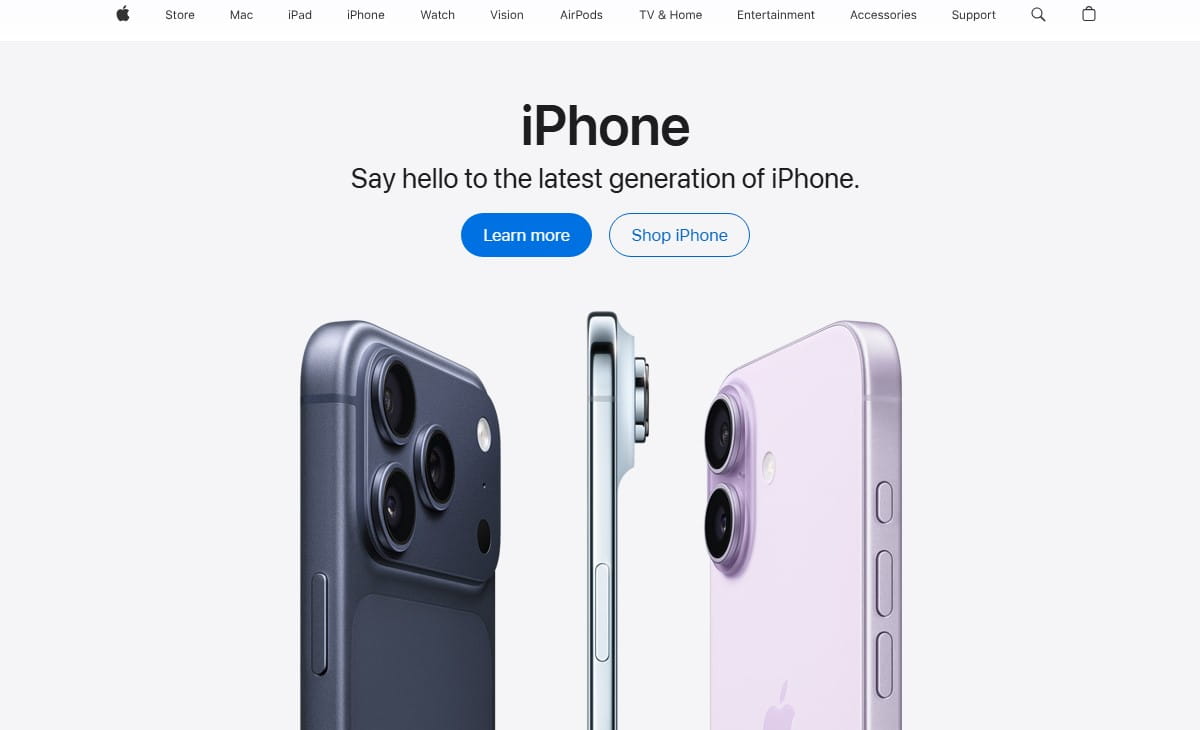
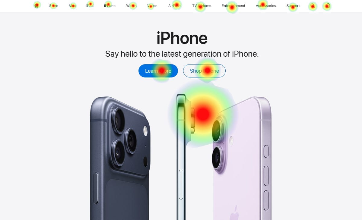
Apple can look like a billboard. A giant image. Minimal text. Clean blocks. Almost no explanation.
And it works because the trust is already there. People arrive with context. They know the product category. They know the brand story. They’ve seen the reviews, the stores, the friends’ devices. The homepage is just a stage, not a pitch.
Most businesses don’t have that luxury. If you run ads, you’re often paying for cold attention. Your visitor isn’t loyal yet. They’re slightly skeptical. They’re scanning for risk.
So while Apple-style homepage blocks can look “premium,” they can be lethal for a smaller brand: beautiful product tiles, minimal text, brand trust doing the heavy lifting.
Your homepage has to do a different job.
You must sell clarity first. Not cleverness. Not vibes. Clarity.
The 5-Second Homepage Test
If a visitor lands from ads and can’t answer these in 5 seconds, you’re leaking money:
- What do you sell?
- Who is it for?
- Why should I trust you?
- What should I do next?
This is not a branding philosophy debate. It’s a cashflow problem.
Uncertainty feels like risk. Risk feels expensive. So people back away.
Do This Now: The 90-Second Clarity Checklist
- Open your homepage on mobile and scroll zero times. Can you explain your offer out loud?
- Cover your logo with your thumb. Does the headline still make sense?
- Find the primary CTA. Is there only one “main next step” on the first screen?
- Count choices in the header. If it feels like a menu, your visitor feels like they need homework.
- Look for proof above the fold: reviews, numbers, clients, guarantees, shipping, returns. Is anything visible?
“If I have to scroll to understand you, I assume you’re hiding something.”
The Most Expensive Homepage Mistakes (That Look ‘Premium’)

I’ve seen these on polished sites with great design… and terrible performance. They don’t look like mistakes. They look like “taste.” That’s why they’re expensive.
1) The Hero Headline That Says Nothing
Example: “Elevate Your Everyday.” “Built For Modern Living.” “Performance Meets Style.”
Cool. Also meaningless. A visitor can’t map that to a product, a price range, or a result. They hesitate, then leave.
2) The Slider Nobody Uses
It’s always three slides. The first is “Welcome.” The second is “Sale.” The third is “Our Story.”
On mobile, it becomes a moving banner that pushes your CTA lower. People don’t wait for slide two. They don’t even notice it changed.
3) Four Competing CTAs On The First Screen
“Shop Now,” “Learn More,” “Watch Video,” “Get Started.”
When everything is a next step, nothing is. Cognitive load spikes. The brain chooses the safest action: exit.
4) Product Tiles With No Decision Help
Apple can show shiny tiles because people already know the difference between models.
Your visitor doesn’t. If you show eight categories with zero guidance, you’re asking them to do mental work they didn’t consent to.
5) Trust Signals Buried Like An Afterthought
I’ll see “Free returns” and “2-year warranty” hidden in a tiny footer. Or the reviews exist, but only on product pages.
For ad traffic, proof belongs early. Confused visitors look for safety. If they don’t find it fast, they assume it doesn’t exist.
6) Shipping And Pricing Ambiguity
A tiny detail that kills conversions: shipping info tucked behind an icon, or pricing that only appears after multiple clicks.
People don’t mind paying. They mind surprises.
7) Mobile First Screen That Pushes The CTA Below The Fold
Big image, big logo, big menu, big announcement bar… and now the button is somewhere near the bottom of the screen.
Your visitor paid attention for half a second. Don’t make them scroll to find the next step.
8) Ad Traffic Message Mismatch
This one burns money the fastest. Your ad promises “Same-Day Shipping For Custom Phone Cases,” and your homepage opens with “Handcrafted Accessories For Life.”
Even if you do sell phone cases, the visitor feels bait-and-switch. They don’t argue. They just leave.
How To Fix Homepage Clarity Without A Full Redesign
You don’t need a new theme. You need a clearer first screen and a calmer path forward.
Here’s the order I’d fix it in, because sequence matters.
1) Write A Plain-English Headline
Say what you sell and for whom. Keep it unromantic.
Before: “Designed For Better Living.”
After: “Natural Skincare For Sensitive Skin That Reacts To Everything.”
2) Add A Subhead That Explains The Outcome
One sentence. No poetry. What changes for the customer?
Example: “Reduce redness and irritation in 7 days with fragrance-free formulas made for reactive skin.”
3) Put Proof Where Fear Lives
Proof doesn’t belong “later.” It belongs near the first decision.
Use a tight cluster: review average, number of customers, a recognizable client type, a guarantee, or a simple “Ships in 24 hours / 30-day returns.”
4) Choose One Primary CTA
Pick the next step that matches your business model:
- If you have a hero product: “Shop The Best Seller.”
- If you have many options: “Find Your Match” (quiz) or “Shop By Need.”
- If you sell services: “Get A Quote” or “Book A Call.”
5) Reduce Navigation Choices For Ad Traffic
Do you really need 10 links up top for a first-time visitor?
A tiny observed pattern: I often see “Blog” sitting next to “Shop” in the main header. The blog is great. It’s also an escape hatch.
6) Build A Simple “How It Works” Section
Three steps. Short lines. No wall of text. You’re lowering uncertainty friction.
7) Add One “For Who” Block To Pre-Qualify
One of the most useful clarity sections is a blunt filter:
- Great for: “busy parents,” “new store owners,” “teams under 20,” “sensitive skin,” “pet owners with allergies.”
- Not for: “people who want the cheapest option,” “anyone who needs delivery tomorrow,” “enterprise procurement.”
Counterintuitive benefit: saying who it’s not for often increases trust.
Audit note I’ve written more times than I can count: “Looks premium. Sells nothing.”
Prove The Leak In 1 Minute With Plerdy Lost Revenue Finder
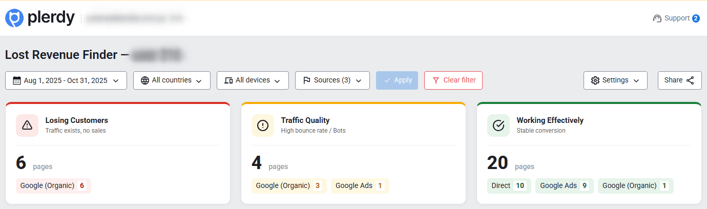
If you’re guessing where the problem is, you’ll waste weeks “improving design” while the leak stays open.
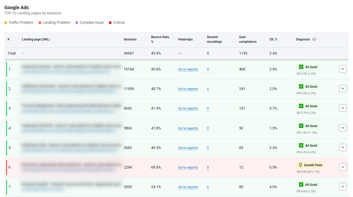
That’s why I like the Plerdy Lost Revenue Finder report as a starting point. It’s the fastest way to see where money stops flowing, and a 1-minute analysis to spot where ad budget is burning.
Here’s the realistic flow:
You open the report, and it points at a leak on the homepage step. Something like: a sharp drop after landing, weak progression into product views, or an odd gap between clicks and meaningful actions.
Now you have a direction. Not a theory.
Two Analysis Paths: Business Mode Vs Expert Mode
1) Business Mode: Diagnose whether the problem is campaigns/traffic quality vs landing pages.
- Is the traffic the wrong audience?
- Is the offer mismatched to intent?
- Is the message match broken (ad promise vs homepage reality)?
- Are you paying for curiosity clicks that were never buyers?
Sometimes the homepage is fine. The ad is the liar. Business Mode helps you stop blaming the site for a targeting problem.
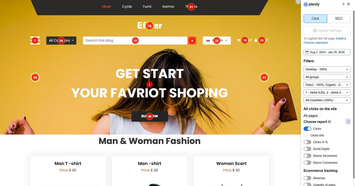
2) Expert Mode: Deeper UX diagnosis using heatmaps + session videos + related Plerdy tools.
- Heatmaps and session videos to see behavior, not opinions.
- Click maps to confirm what people try to interact with.
- Scroll depth to see if key sections are never reached.
- Form analytics, funnels, and events to find where momentum dies.
The point is simple: you connect the leak to an observable reason, then fix the clarity problem instead of repainting the house.
Expert Mode: Heatmaps And Session Videos That Explain The ‘Why’
Numbers tell you where the leak is. Behavior tells you why it’s happening.
In Expert Mode, here’s what I look for when homepage clarity is the issue:
- Rage clicks: repeated taps on a non-clickable element, usually a product image tile or a “feature” block that looks interactive.
- Dead clicks: people clicking text that isn’t linked, like a category name that feels like it should open something.
- Scroll drop-offs: the story starts at the top, but the proof lives far below. Most visitors never meet the proof.
- CTA blindness: the button exists, but it blends into the design, or it competes with three other buttons.
- Navigation pinball: users bounce between menus because the page didn’t give them a confident next step.
One tiny detail I’ve seen repeatedly: a “trusted by” strip exists, but it’s placed under a giant lifestyle image, so on mobile it becomes a fourth scroll. That’s where trust goes to die.
Another: the homepage opens with an announcement bar, then a promo bar, then a cookie banner. Your headline becomes the fourth thing they see. By then, attention is gone.
When you see this on sessions, it’s almost relieving. Because now the fix is obvious.
You tighten the headline. You move proof up. You pick one CTA. You remove the fake-interactive blocks. And suddenly your “premium” site starts acting like a sales page again.
A Simple Weekly Routine To Stop Burning Ad Budget
You don’t need a quarterly redesign cycle. You need a weekly habit that catches leaks before they become “normal.”
This routine takes 20–30 minutes. Put it on your calendar like you would payroll.
- Start with the Plerdy Lost Revenue Finder report. Identify the biggest drop-off path this week.
- Pick one landing page (often the homepage). Focus beats frantic fixing.
- Watch 5 short session videos from ad traffic. Look for confusion moments: hesitation, menu looping, dead clicks.
- Check heatmaps and scroll depth. Confirm whether your CTA and proof are actually being seen.
- Make one clarity improvement. Rewrite the headline, simplify the CTA, move a trust block up, reduce header links.
- Validate with a quick comparison next week. Did progression improve? Did exits decrease? Did the “next step” become more common?
Small changes compound. Clarity compounds faster than design polish.
Conclusion: Clarity Pays, Clever Kills
Apple can be vague because trust does the work.
You’re paying for attention. You don’t have time for visitors to decode your homepage like a puzzle.
Make the offer obvious. Make the next step simple. Put proof where fear lives.
If you want to stop guessing and prove where the money stops flowing, start with the Plerdy Lost Revenue Finder. One minute to spot the leak is cheaper than another month of burned ad budget.