
Many small business website mistakes do not look dramatic at first. But they quietly waste your ad budget every day. You pay for clicks, bring people to a landing page, and expect movement. Instead, visitors hesitate, scroll, get confused, and leave without converting.
That is why this problem is usually not just about ads. In many cases, the campaign is doing its job. The real leak sits on the website itself: slow pages, unclear headlines, weak CTA copy, trust gaps, bloated forms, or mobile friction that makes the next step feel harder than it should.
I’ve audited a lot of small business websites, and the pattern is repetitive. Ads can be good enough. Traffic can be relevant enough. But the landing page still underperforms because the page does not confirm intent or make action feel easy. And when that happens, you cannot outspend the problem. You just lose money faster.
This is not a “rebuild your whole website” lecture. It is a practical guide to 12 small business website mistakes that waste ad budget, hurt conversions, and weaken landing page performance. You will also see a fast way to find the biggest leak using Plerdy’s Lost Revenue Report, then verify the fix with Expert Mode using heatmaps, session recordings, scroll depth, funnels, and event tracking.
Paid traffic does not fix a broken landing page. It just exposes it faster.
Who This Guide Is For
This guide is for small business owners, marketers, and lean teams running Google Ads, Meta ads, or other paid traffic campaigns who are getting clicks but weak conversion results. It is especially useful if you already suspect your landing page, website UX, or checkout flow is draining performance after the click.
What Are The Most Common Small Business Website Mistakes?
The most common small business website mistakes are not always technical disasters. More often, they are friction points that slowly kill conversions: slow load speed, weak CTA clarity, message mismatch between ad and landing page, too many navigation choices, poor mobile usability, trust gaps near the buying moment, long forms, and checkout steps that feel annoying or risky. Each issue may look small on its own, but together they turn paid traffic into wasted budget. If your website gets visitors but too few next-step actions, there is usually a leak in the page experience, not just in the campaign setup.
Why Your Ad Budget Leaks On The Website, Not In The Ads
Think of paid traffic like water pressure. Ads push people onto a page. If the page has cracks, the pressure does not create sales. It creates waste.
There are two big buckets behind most losses.
Intent mismatch means the ad promise does not match what the landing page delivers. People arrive curious, then realize they are in the wrong place.
Page friction means the offer is relevant, but the experience makes buying feel annoying, risky, or confusing, especially on mobile.
Three quick signs you are leaking budget, even if your ads look “fine”:
- You see clicks, but no meaningful actions such as add to cart, form starts, or checkout progression.
- People interact in weird places like rage clicks on images, fake buttons, or non-clickable elements.
- Mobile traffic bounces hard because the page is heavy, cramped, slow, or the CTA is buried too far down.
Why Landing Page Mistakes Waste Ad Budget
Ads create the first promise. The landing page has to confirm that promise immediately. If the ad says “Free Consultation Today” and the page opens with a vague slogan, you lose momentum. If the ad sells urgency but the page feels cluttered, slow, or untrustworthy, visitors hesitate before they ever reach the real offer.
This is why landing page mistakes waste ad budget so aggressively. You already paid to earn attention. The page’s job is to convert that attention into the next action. When the landing page is confusing, generic, or full of friction, even decent traffic stops moving.
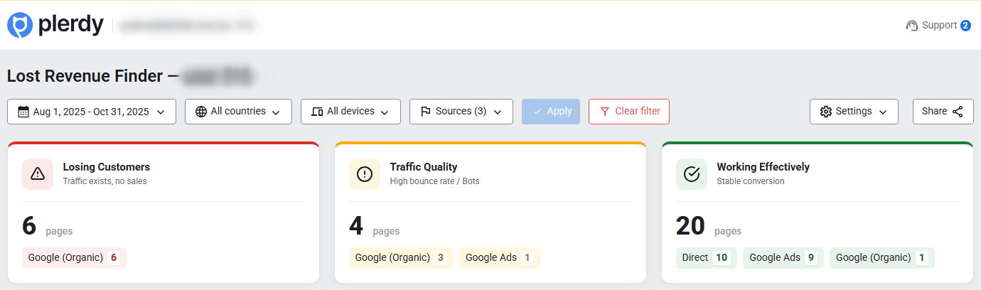
The 1-Minute Check: Find The Leak With Plerdy Lost Revenue Report
If you are busy, start with Plerdy Lost Revenue Report in Business Mode. This is the fast “show me where money stops moving” view. It is not the deep diagnosis layer. It is the shortcut that helps you find the biggest conversion leak without guessing.
Business Mode answers the owner question: “Where does the funnel stop behaving like a funnel?” It highlights problem pages and problem steps, so you do not waste time arguing about opinions, vanity metrics, or random ad tweaks.
You can share it with your team here: Plerdy Lost Revenue Report.
- Open Plerdy and go to Lost Revenue Report.
- Switch to Business Mode for a fast overview.
- Select the date range that matches your ad push. Last 7 to 14 days is often enough to spot patterns.
- Filter to the landing pages you are actively buying traffic to.
- Scan for the biggest money-stop point: a page with strong entrances but weak movement to the next step.
- Click into the worst page or step and identify the top leak signal, such as drop-off, low click-through, or form abandonment.
- Flag that page for Expert Mode verification before changing anything.
What to look at first:
- The top landing page by paid entrances with weak next-step progression.
- The step where users hesitate such as product to cart, cart to checkout, or form start to submit.
- Device split. If mobile massively underperforms, the issue is often UX friction, not bad traffic.
- Pages with high interaction but low progress, which usually signals confusion or dead clicks.
- One leak you can fix fast before chasing five smaller issues at once.
Then move to Expert Mode: heatmaps, session recordings, scroll depth, funnels, events, and form analysis. That is where you learn why the leak happens, not just where it happens.
Quick links for your team: Plerdy Heatmaps and Plerdy Session Recordings.
12 Website Mistakes That Waste Your Ad Budget
1) Slow Pages That Punish Mobile Visitors
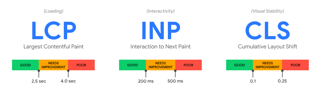
What it looks like: The page loads eventually, but the first screen feels frozen, images pop in too late, and the layout jumps around. On mobile, the CTA appears after the user’s patience is already gone.
Why it burns money: You pay for the click, then lose the visitor before the page earns a real chance. Slow load speed is one of the most expensive small business website mistakes because it hurts paid traffic before users even process the offer.
Fix in under 30 minutes: Compress hero images, remove unnecessary sliders, and cut third-party scripts from the landing page. If you cannot remove them, delay them.
How to verify in Plerdy: In Business Mode, check whether paid entrances drop sharply on that page. In Expert Mode, use scroll depth and session recordings to see users leave before the first meaningful section appears.
2) Ad And Landing Page Message Mismatch

What it looks like: The ad promises “Free Shipping Today,” but the landing page opens with a vague brand slogan. Or the ad says “Book A Demo,” and the page pushes “Start A Free Trial” with no explanation.
Why it burns money: You paid to capture intent, then failed to confirm it. Visitors feel tricked, uncertain, or simply lost.
Fix in under 30 minutes: Rewrite the hero headline so it matches the ad promise as closely as possible, and add one clear line answering, “What exactly is this?”
How to verify in Plerdy: Business Mode will often show strong entrances with weak progression. Expert Mode heatmaps reveal low clicks on the primary CTA because the page never anchored the visitor properly.
3) Weak CTA Copy On Landing Pages

What it looks like: Buttons say “Submit,” “Learn More,” or “Get Started” without explaining what happens next. On ecommerce pages, the add-to-cart button blends in like decoration.
Why it burns money: Paid traffic is impatient. If the next step feels vague, visitors hesitate instead of moving.
Fix in under 30 minutes: Make the CTA specific: “Get My Quote,” “See Pricing,” “Book A 15-Min Call,” or “Add To Cart.” Add a short micro-line under it, such as “Takes 30 seconds.”
How to verify in Plerdy: In Expert Mode heatmaps, check whether clicks cluster on non-CTA elements. In session recordings, watch for the classic pattern: hover, scroll, pause, back.
4) Dead Clicks And Fake Interactive Elements

What it looks like: People click product photos, pricing cards, icons, and headers because they look clickable. Nothing happens. They click again. Then they give up.
Why it burns money: Dead clicks make the page feel broken. Even when the site technically works, the user experience feels unreliable.
Fix in under 30 minutes: Make obvious visual elements clickable, or redesign them so they stop pretending to be interactive. Add hover states only when something really responds.
How to verify in Plerdy: Expert Mode heatmaps show high clicks on dead zones. Session recordings expose repeated taps, frustration, and exit. Business Mode often flags these pages as progression bottlenecks.
5) Trust Gaps Near The Decision Point

What it looks like: A decent product page with no clear shipping or returns details, no social proof, and pricing that feels suspiciously incomplete. Or a service page with no examples, process, proof, or outcomes.
Why it burns money: Ads create curiosity. Trust creates action. Without trust, paid traffic behaves like window-shopping.
Fix in under 30 minutes: Add a tight trust block near the CTA: shipping and returns summary, guarantees, review snippets, client proof, or a plain-language explanation of what happens after booking.
How to verify in Plerdy: Expert Mode scroll depth shows whether users even reach trust content. Heatmaps show whether people click shipping, returns, reviews, or FAQ links, and whether those links are easy to find.
6) Forms That Feel Like Homework
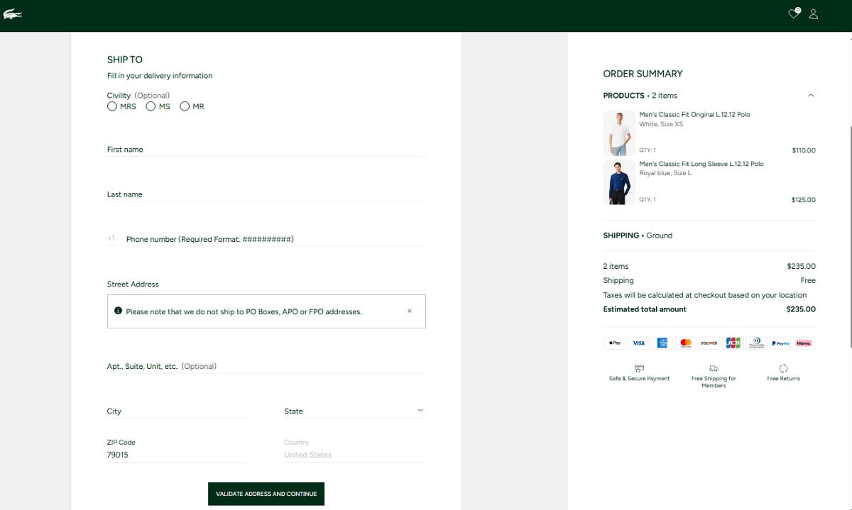
What it looks like: A lead form asks for phone, company size, budget, and too much context too early. On mobile, fields feel tiny, errors are unclear, and the keyboard covers the next step.
Why it burns money: You paid for a motivated visitor, then made the act of contacting you feel like work.
Fix in under 30 minutes: Reduce the form to the minimum required fields. Move extra qualification questions to step two or a follow-up email.
How to verify in Plerdy: Use Plerdy form analysis and events to identify where users abandon. Session recordings reveal the exact failure point: confusion, field friction, validation errors, or frustration.
7) Checkout Friction That Kills Purchase Intent
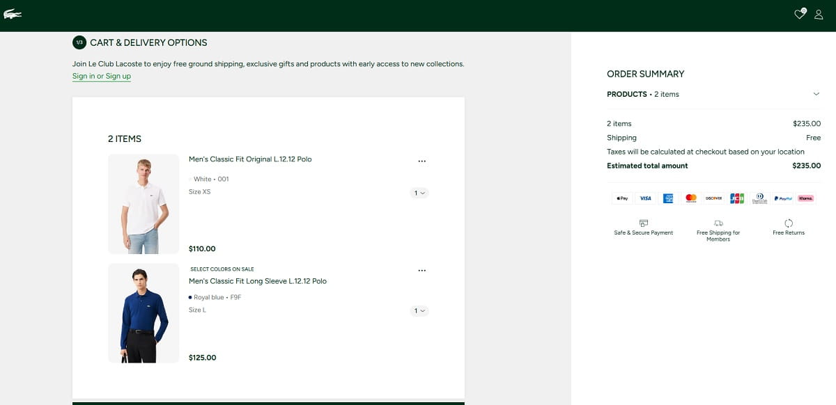
What it looks like: Forced account creation, surprise shipping costs, too many steps, or a checkout that feels chaotic on mobile. The “Place Order” button sits below a wall of friction.
Why it burns money: Ecommerce traffic is expensive, and checkout is where the page either converts intent or destroys it.
Fix in under 30 minutes: Enable guest checkout, reduce unnecessary steps, surface total cost earlier, and keep key payment actions visible on mobile.
How to verify in Plerdy: Business Mode highlights checkout step drop-off. Expert Mode funnels show where users leave. Session recordings expose hesitation, backtracking, and error loops.
8) Popups That Block Intent Instead Of Supporting It

What it looks like: A popup appears the second someone lands, before they understand what you sell. On mobile, it takes over the screen and the close button feels hidden.
Why it burns money: You paid for intent, then interrupted that intent before the visitor could process the offer.
Fix in under 30 minutes: Delay popups, use better timing, align the popup offer with page intent, and make the close action obvious.
How to verify in Plerdy: Expert Mode session recordings show rage closes and instant exits. Heatmaps often reveal concentrated clicks around the close area instead of the actual offer.
9) Confusing Landing Page Navigation

What it looks like: The landing page includes a full website menu, multiple competing CTAs, side routes, and unrelated offers. Visitors bounce between sections instead of moving toward one clear next step.
Why it burns money: Paid traffic needs direction. Too many options create hesitation instead of action.
Fix in under 30 minutes: Simplify landing page navigation for paid campaigns. Keep one primary goal, one dominant CTA, and remove links that do not support the conversion path.
How to verify in Plerdy: Heatmaps show scattered clicks across menu items and distractions. Funnels confirm the weak progression from landing page to next step.
10) Landing Page Hero Sections That Kill Conversions
What it looks like: A large image, a vague tagline, and no fast answer to “What is this?” The CTA is soft, the value is fuzzy, and the first meaningful information starts too far down.
Why it burns money: You paid to borrow attention for a few seconds. If the hero wastes those seconds, the landing page loses before the real selling even starts.
Fix in under 30 minutes: Replace the vague tagline with a clear value statement. Add one proof point, such as review count, delivery time, guarantee, or outcome. Make the CTA visible without scrolling.
How to verify in Plerdy: Use scroll depth to see whether visitors even reach the stronger content lower on the page. In session recordings, watch for quick scrolls, no clicks, and exits.
11) Hidden Costs Revealed Too Late

What it looks like: Pricing feels unclear, shipping only appears at checkout, or extra fees show up too late. On service sites, “pricing after consultation” can also create distrust if the offer is not clearly premium.
Why it burns money: Surprise costs destroy trust fast. Visitors feel trapped instead of served.
Fix in under 30 minutes: Be upfront about shipping ranges, estimated totals, fees, or starting prices. If you cannot show exact numbers, explain the pricing logic clearly.
How to verify in Plerdy: Business Mode often shows drop-off at cart or checkout. Expert Mode session recordings capture the moment users see totals, hesitate, and leave.
12) Measurement Blindness

What it looks like: You track pageviews and maybe purchases, but not micro-actions like CTA clicks, form starts, field errors, scroll depth, or where users hesitate. Consent limits can also reduce visibility, which makes the signals you do track even more important.
Why it burns money: If you cannot see where money stops flowing, you will fix the wrong thing and waste time optimizing noise.
Fix in under 30 minutes: Set up meaningful events for your real conversion path: CTA clicks, add to cart, form start and submit, and checkout step progression. Keep the set small enough that you will actually use it.
How to verify in Plerdy: Use Business Mode to spot the biggest leak, then Expert Mode events, funnels, heatmaps, and session recordings to validate whether users now move forward more cleanly.
Campaign Problems Vs Landing Page Problems: How To Tell In 10 Minutes
You do not want to fix the page if the campaign is attracting the wrong intent. And you do not want to rewrite ads if the page is the real problem. This quick split works well in practice.
- If visitors leave fast with almost no interaction and the message is vague, it is usually a landing page problem.
- If visitors engage but do not move forward, it is usually a page friction problem involving CTA clarity, trust, forms, or checkout.
- If one keyword or ad set performs much worse than others on the same page, it is often a campaign intent mismatch.
- If the same campaign performs very differently by device, especially with weak mobile results, it is usually mobile UX, not traffic quality.
- If conversions exist but feel inconsistent, check for leaks on specific pages or steps first.
Quick example: you run ads for “same-day delivery” and send visitors to a generic category page. In Plerdy Business Mode, that page shows strong entrances but weak progression. In Expert Mode, heatmaps show clicks on shipping information because people are hunting for proof, while session recordings show them leaving after failing to find it quickly. That is not mainly an ad problem. That is a landing page promise problem.
Quick Fix Plan: What To Do This Week
You do not need a full redesign. You need a short operating loop: find the leak, understand why it happens, ship the fix, and prove the improvement.
- Day 1: Find the biggest leak in Business Mode.
Open Plerdy Lost Revenue Report and identify the single most expensive drop-off point for paid traffic. Pick one page or step. Not three. One. - Day 2: Prove why it happens in Expert Mode.
Review heatmaps, session recordings, scroll depth, and funnels. Look for the obvious friction: dead clicks, buried CTA, trust gaps, long forms, or checkout confusion. - Day 3: Ship the fastest high-impact fix.
Match the headline to the ad, clarify the CTA, remove a blocking popup, simplify a form, add shipping clarity, or fix fake interactive elements. - Day 4–5: Validate with events and behavior.
Use events and funnels to confirm users are reaching the next step more often. Watch session recordings to make sure the confusion loop has improved. - Day 6–7: Retest and expand.
If the fix works, apply the same principle to the next leak. If not, adjust again based on what behavior data shows, not on guesses.
If your team needs a related reference, you can also share a practical audit resource like this: CRO audit checklist.
Conclusion: Stop Paying For Clicks You Cannot Convert
When a small business wastes ad budget, it is rarely because ads simply “do not work.” More often, paid traffic hits a website or landing page that loads slowly, hides the next step, creates friction, or quietly breaks trust.
Start with the 1-minute check in Plerdy Lost Revenue Report using Business Mode. Find the biggest leak first. Then switch to Expert Mode to understand why it happens through heatmaps, session recordings, scroll depth, funnels, events, and form analysis.
Fix one issue, prove the result, and only then move to the next leak. That is how you stop wasting ad budget on clicks your website was never ready to convert.
FAQ
What Website Mistakes Waste Ad Budget The Most?
The most expensive website mistakes are usually slow load speed, message mismatch between ad and landing page, weak CTA clarity, poor mobile UX, trust gaps, long forms, checkout friction, and confusing navigation. These issues reduce conversions after you already paid for the click.
Can A Landing Page Ruin A Good Ad Campaign?
Yes. A strong ad can still fail if the landing page is slow, unclear, or does not match the offer promised in the ad. Paid traffic can expose page problems very quickly because visitors arrive with intent and expect a smooth next step.
Why Do Small Business Websites Get Clicks But No Conversions?
This usually happens when the campaign brings qualified traffic but the website creates friction after the click. Common reasons include vague headlines, weak CTA copy, poor mobile design, lack of trust signals, long forms, or hidden costs revealed too late.
How Can I Tell If The Problem Is The Ad Or The Landing Page?
If users bounce with almost no interaction, the landing page message or experience is often the issue. If users engage but do not move to the next step, the problem is usually page friction. If one traffic source or keyword underperforms badly on the same page, intent mismatch in the campaign may be the real cause.
What Should I Fix First On A Small Business Landing Page?
Fix the biggest leak first, not the most interesting one. Start with the page or funnel step that gets the most paid traffic and shows the weakest progression. In many cases, the fastest wins come from improving page speed, matching the ad message, clarifying the CTA, simplifying forms, or reducing checkout friction.