
Business card websites have fallen into oblivion. Now, companies tell about their story and achievements on their About Us pages. This is the most important page in terms of branding. An About us page is like a virtual office that a customer will definitely want to visit. To make it really effective, it may be helpful to gain inspiration from successful solutions of leading brands. This list isn’t complete, and the websites aren’t positioned in a rating. All pages in this article equally deserve the first prize for their high-quality design, well-thought navigation, and relevant content.
Bravour
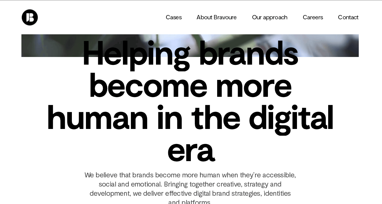
Let us introduce you to the Dutch clear, reserved, and eternal. They rely on minimum animation, maximum contrast, large-high-quality photos and fonts. Everything has the same style, from the greeting to the contact details. Users also learn about the company’s expertise and its customers and can even chat with the employees. This example, such as a page About us, really encourages communication.
ACHTUNG!
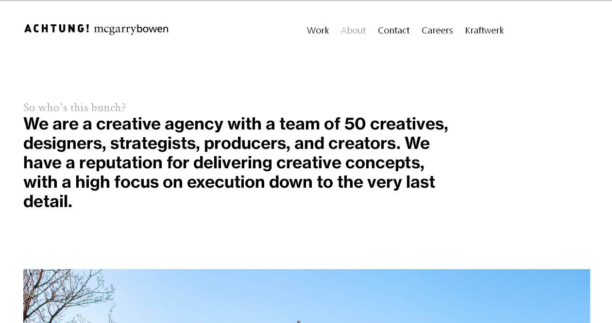
Attention! Here is how the Dutch creative approach manifests itself in flat. Large typography presents the company at the entrance. Below are photos about their beloved Amsterdam and office complemented with infographics, information about awards, and area of activities. For example, there is a classical contact section at the bottom of the page and a sweet joke.
Pentagram
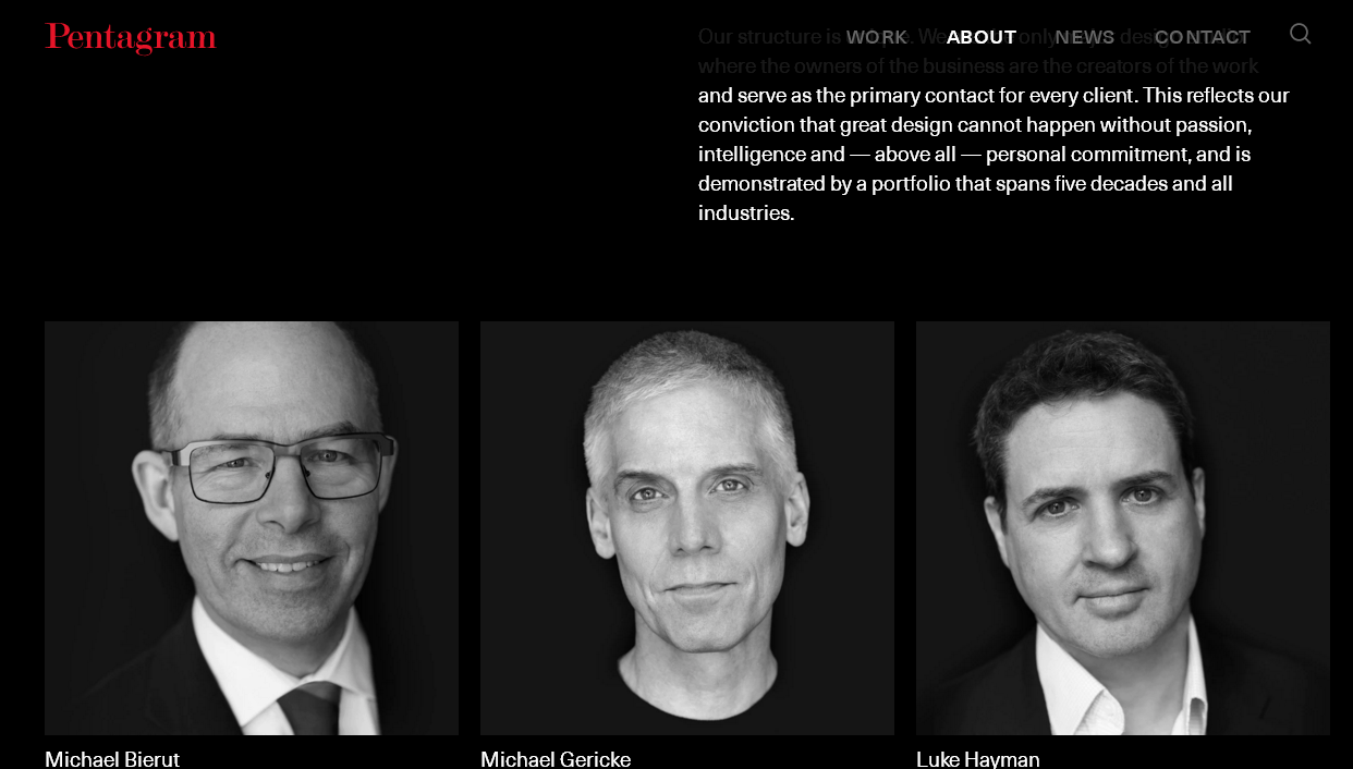
This company page belongs to the world’s largest design studio. Despite its simple and modest design, you definitely won’t say that this shoemaker’s children go barefoot. These guys know what they do. A small introduction at the beginning reveals the importance of personal commitment in this studio. It’s absolutely unique since its art directors personally create websites for Pentagram’s customers. The remaining space is filled with photos of this superhero team. Everything is very simple and clear but stylish and perennial at the same time. This page doesn’t need to be updated every year. It also doesn’t need animation. This example looks modern regardless.
House Industries
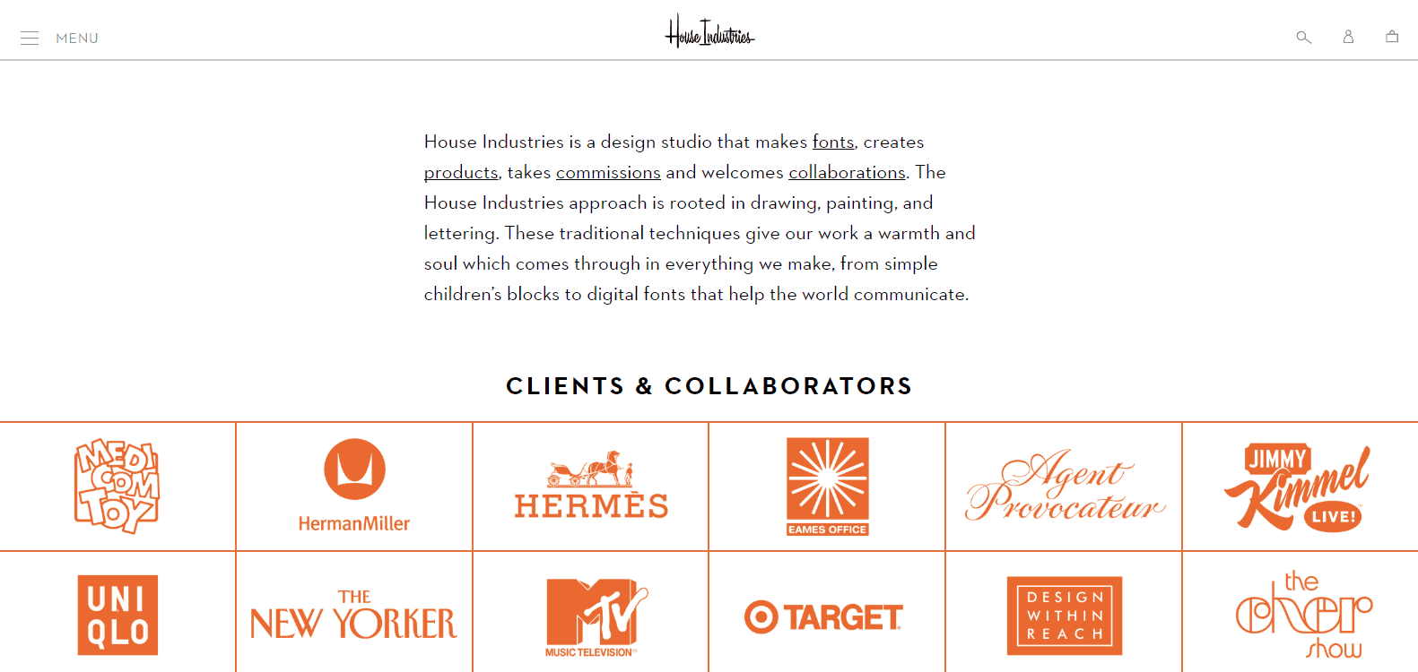
The About Us page is really nice and succinct. It tells visitors everything they need to know about this design studio. They choose orange, black, and white as their main colors and seamlessly combine them. The page includes general information about the studio, the logos of its customers, and links to the press releases about House Industries. They surprise users with nicely drawn portraits of their customers and their testimonials. This is an unusual solution that makes House Industries special. This example shows how the studio admires its partners.
Simple as Milk
For its About Us page, this branding and design company uses nice photos, large fonts, and a lot of humor. The page includes photos of team members with funny titles, such as Gameboy Girl, Ink Collector, Just Handsome, etc. This is an awesome way to attract customers and show them that this team is really creative and brave.
Media Monks
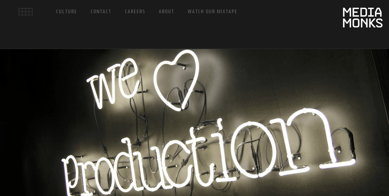
These Dutch IT lovers emphasize how they love creating websites and applications in every detail of their About Us page. After an eloquent image, a user sees brief information about the company and a button to learn more about the mixtape of these MediaMonks. For example, below there are high-quality photos of their central office, infographics, and statistics telling about the company’s achievements.
MetaDesign
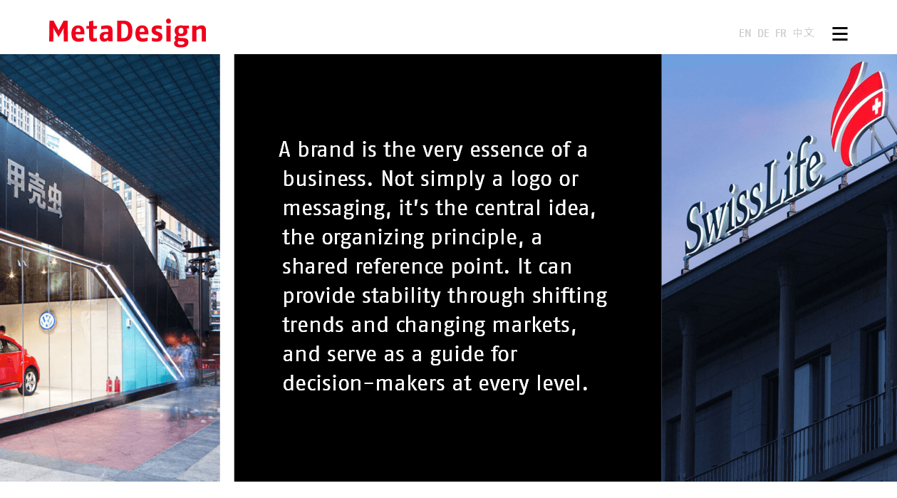
Here is an About Us page of another world-renowned design studio. They use a lot of contrast. With the combination of red, white, and black, large typography, slider, video, infographics, and cards – the page has absolutely everything to convert a visitor into a customer. Information about their projects, top customers, offices in different locations and fun facts about the company (for example, the longest Meta beard or the number of espresso machines, etc.) makes the page more casual.
Fidesio
This is an amazing semi-flat in its best. You must admit that the French really know how to sell elegantly. Users will see a lot of animation, stylish graphics, great typography, and classic dynamic design! The information is succinct and concentrated. Only the relevant things are included, for example as awards, useful facts, customers and (as always) contacts.
Alfa Bank
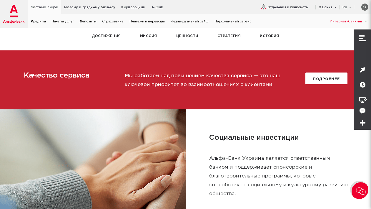
The About Us page of Alfa-Bank has a contrasting design and a bunch of visuals, cards, and target buttons that don’t sell products directly but increase user trust in the bank. Right on this page, customers, for example, can download different forms, learn about the board of directors, shareholders, and find contact details and the location of the main offices.
5emegauche
The French designers, programmers, and marketers from 5emegauche have decided to stay laconic. It’s always better to tell a story with live vivid videos, parallax effects, and large titles highlighting how the organization works. Creative and brave-hearted, that’s how they wanted to present themselves to the world. And let’s admit, they have managed to do that.
SPIN
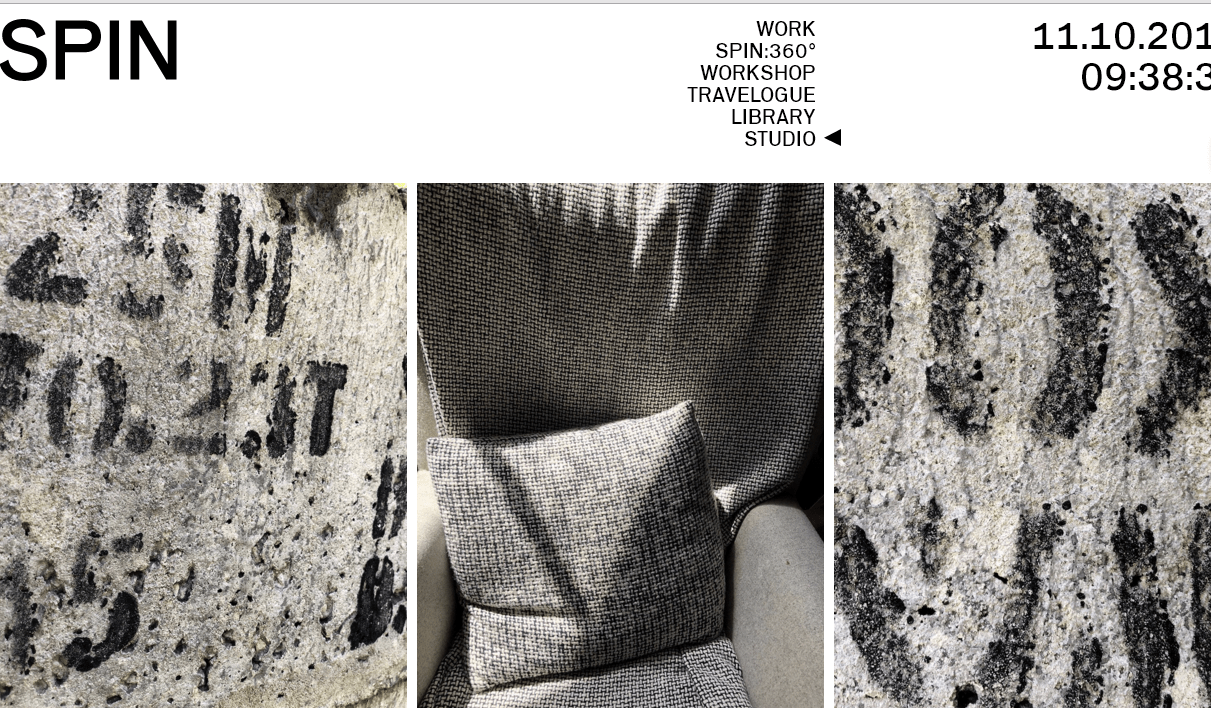
A very unusual About Us page of a very unusual design studio. The abstract visualization is the first thing that attracts attention. Textures, grass, books, flowers, leaves, everything looks like separate elements of a movie united only with the same style. Below the pictures, there is detailed information about the company and a few of its customers. Everything is very simple and artistic at the same time. You feel like you are visiting an exhibition of modern art. Websites with infographics and brand story videos on About Us pages are a common example, whereas Spin’s solution is rare.
Bershka
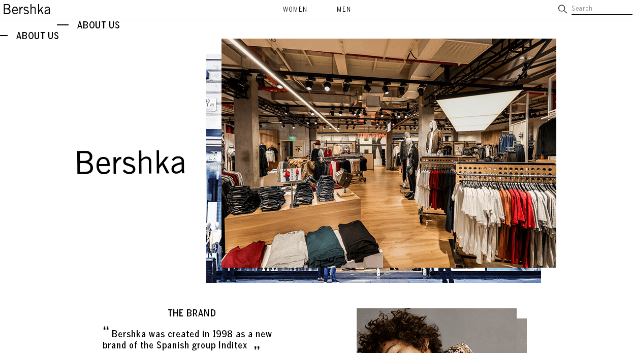
A fashion brand should conquer the world with a fashionable About Us page. The designers’ approach combined animation with a stylish effect of overlapping photos, asymmetrical inscriptions, and information blocks. Yet this is not the only reason why this page example is truly remarkable. It includes numerous links and lead forms. Users can ask questions, subscribe to a newsletter, and look for suitable job openings. Another advantage of the page is a full list of locations. Just find the closest one, go there, and make a purchase.
Alphabet Design
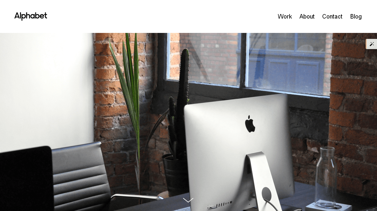
This resource is a good example of how flat design can remain modern and generate conversion in 2018. The About Us page of this design studio doesn’t have animation or, for example, dynamic elements. Instead, users enjoy text, high-quality photos, strict static infographics, and a well-thought-out structure of the content solely. Yet everything looks nice, relevant, and businesslike. For example, the page presents information about the company, its experts, approach to work, and operating principles. The cherry on the top of the conversion path is the offer to check their projects.
Roshen
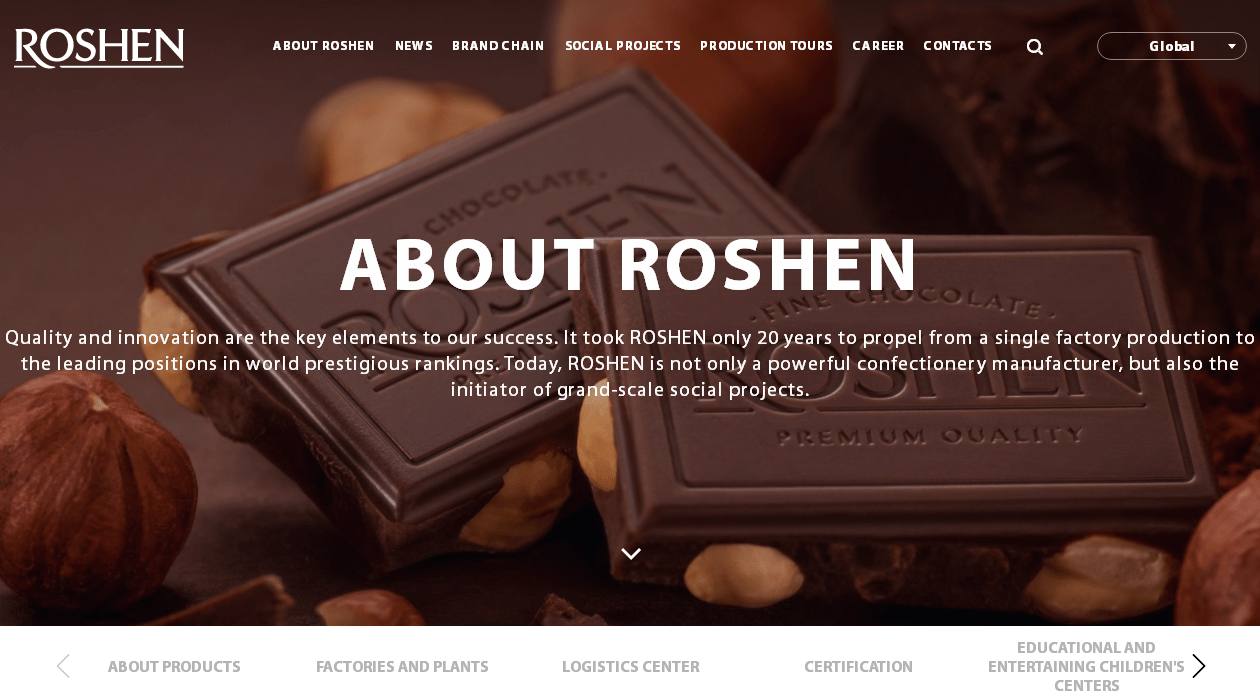
The About Us page of the Roshen factory is a very effective example in terms of sales. It has easy navigation, a juicy background picture, and infographics describing the benefits of products and services. They also added a video about the factory, a map with exporting countries, photos of their shops, and other trust-building information.
Franklyn
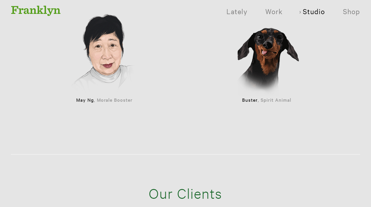
Here you will come across hand-drawn pictures of team members, a list of customers’ brands, such as Disney, The New York Times, Google, Converse, and other giants, and even a spirit animal called Buster. This is a unique but simultaneously selling solution the design studio Franklyn has chosen for their About Us page. A brief text introducing the company is complemented with unique drawn portraits of the key team members and Buster, customers’ logos, and contact details. At first glance, it may seem like this information is incomplete, but it’s absolutely enough, for example, to win over a potential customer.
Shoptiques
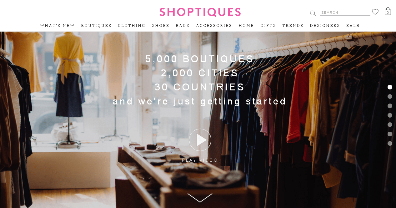
Semi-flat design and well-thought-out details are characteristic features of the Shoptiques marketplace. At the top of the page, visitors can watch a video that will literally take them to a real fashion boutique and tell the story of this company. Below is the Who We Are section with more details about Shoptiques, including their mission, approach, and concept of work. The first block of the page informs users why this company is so great. The advantages have animated infographics. There is also information, for example, about the founder, media partners, and team. Everything is very simple, logical, and convincing.
Dragon Rouge
The “Red Dragon” pleases its visitors with probably the most stylish and creative design of an About Us page. Animated fonts, large typography, unusual illustrations, cards. It looks like they have used the best minimalism example. In addition to a brief and succinct introduction, the page also contains detailed information about their team and offices in different countries. It’s very hard to resist the inscription: “Like what you see? Looking for more? Call us, we’d love to talk. LET’S TALK”.
Nike
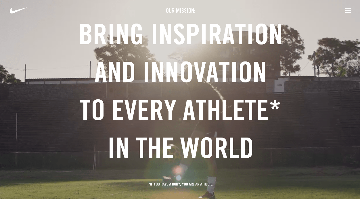
It would be a lie to say Nike’s About Us page surprises with its novelty. They remain true to themselves. The designers certainly cared about adding some great content and promoting sales with this page. For example, the first screen of the landing page presents the company’s mission with a background autoplay video. Below, users will find well-visualized and structured information about the brand, innovations, team, community and relevant resources.
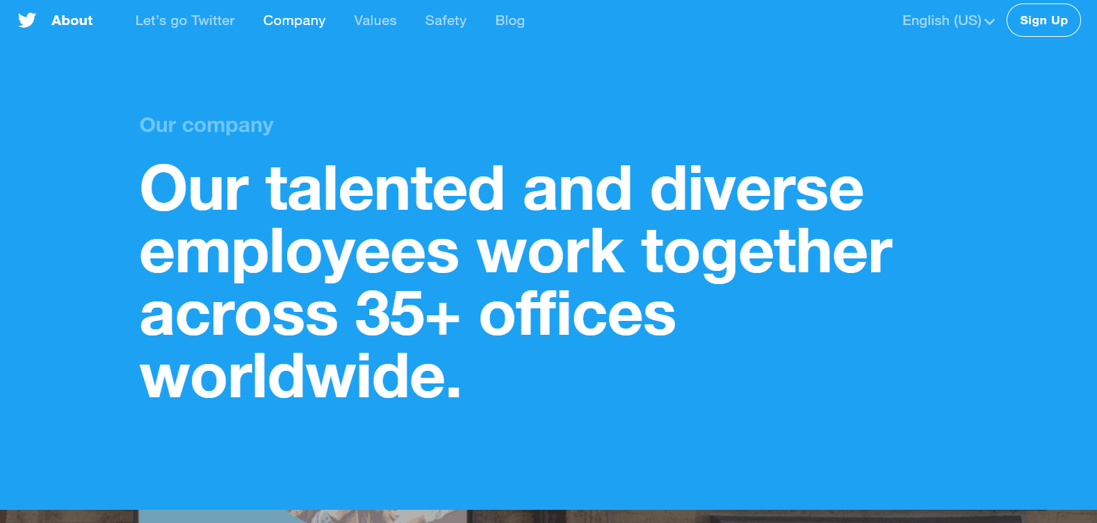
Who hasn’t heard of this social network? Twitter has become one of the most popular platforms for thought-sharing and building influence online. Their About Us page supports the brand’s style, and almost all elements are done in the famous blue-white color scheme. A simple and elegant design is supplemented with the photos of Twitter teams around the world and the links to their corporate accounts. Users can check the life of the team members in France, Canada, Asia, and many other locations. Isn’t that example great?
Landor
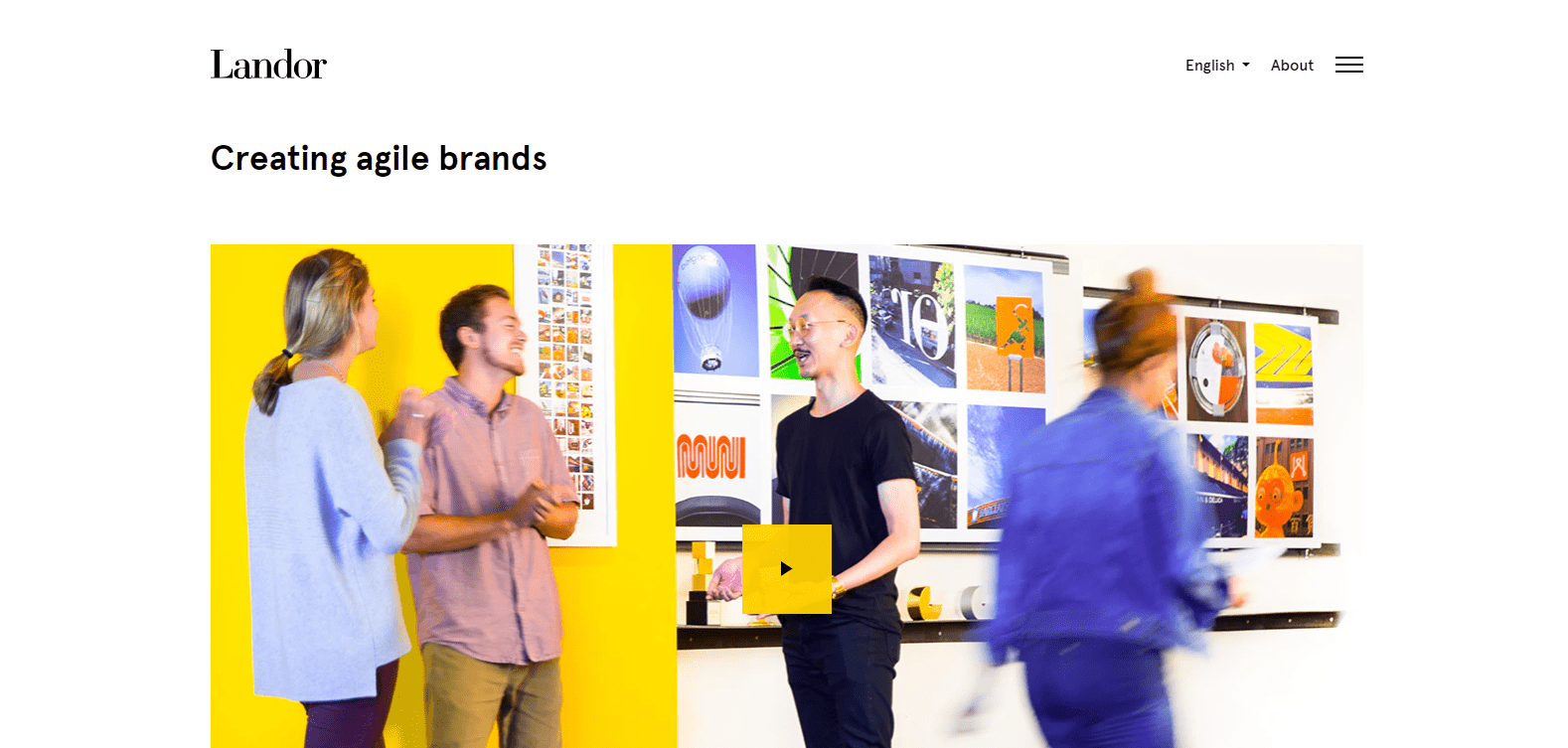
This is a US brand consulting company with a long and outstanding history. They know they are cool and aren’t afraid to tell about that. Their corporate page uses large simple typography on a white background and supports it with yellow details that make the page more lively and stylish. A visitor is invited to learn more about the company with a high-quality video describing its key advantages. Below, there are What We Do, Clients, Awards, and Our Story sections. By the way, the list of customers looks really impressive.
Appetite Creative Solutions
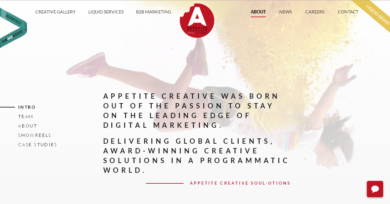
Let’s take a look at the About Us page of the award-winning Spanish digital experts. It wins customers over with the What We Do and What We Don’t blocks, bright showreels, stories, and case studies. The block with a team is absolutely gorgeous! It’s unique due to the drawn portraits of the team members and the unusual use of animation and different styles of pictures (for example, anime, pop art, etc.). At the end of the conversion, the path is a button at the bottom of the screen saying, “Got a project? Let’s talk!.” Indeed, after looking at these creative solutions, any user may come up with an idea for a project.
APARTICULA
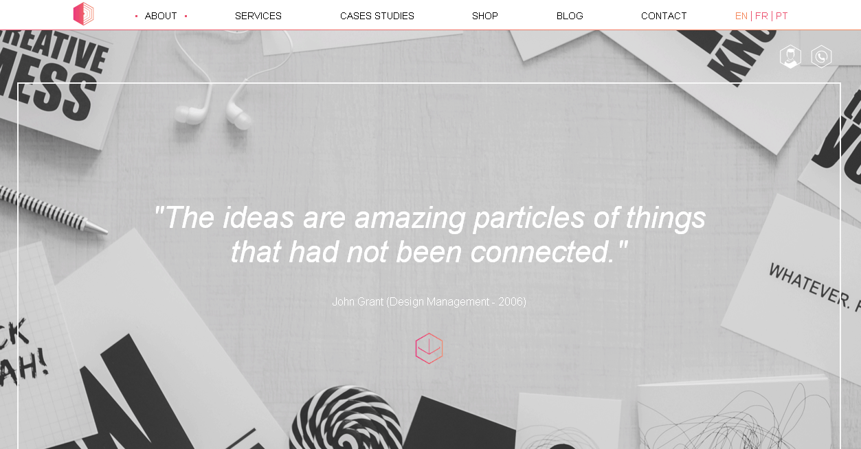
This is an extremely stylish and creative page of the representatives of the Paris digital industry. Everything is so balanced and elaborated here. A lot of free space, geometric shapes, high-quality images, quotes…every element seamlessly highlights the information about the company and its principles. At the bottom of the page, a Contact Us button is used to promote conversion.
There are really numerous examples of excellent corporate pages, but creating this list, we aimed to show how certain pages focus on sales whereas others focus on a brand image.
There are large brands for which it’s enough to add their story and infographics in the About Us section without trying to win users with buttons and lead forms. There are also local companies that prefer to use landing pages to the full.
The main thing is to understand your company’s position and whether it is necessary to add a conversion element in your case.