0/X
Articles on the topic of usability:
13 Best Usability Testing Tools
How to Improve Website Usability with Plerdy’s UX Tools
Website Usability Audit and Analytics
Website Usability Testing
Heatmaps and Usability: Optimizing Your Website for Better UX
Why Usability Matters: Enhancing User Experience with Plerdy
💣 General recommendations for usability
-
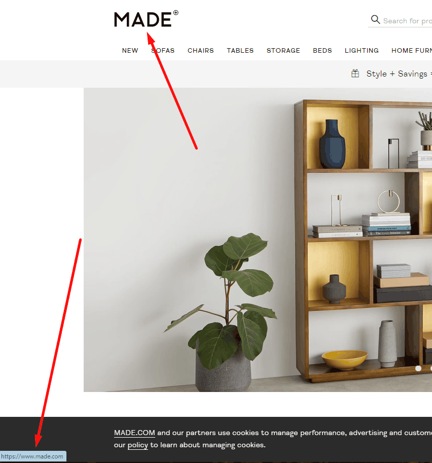
Slogan describing the website next to the logo
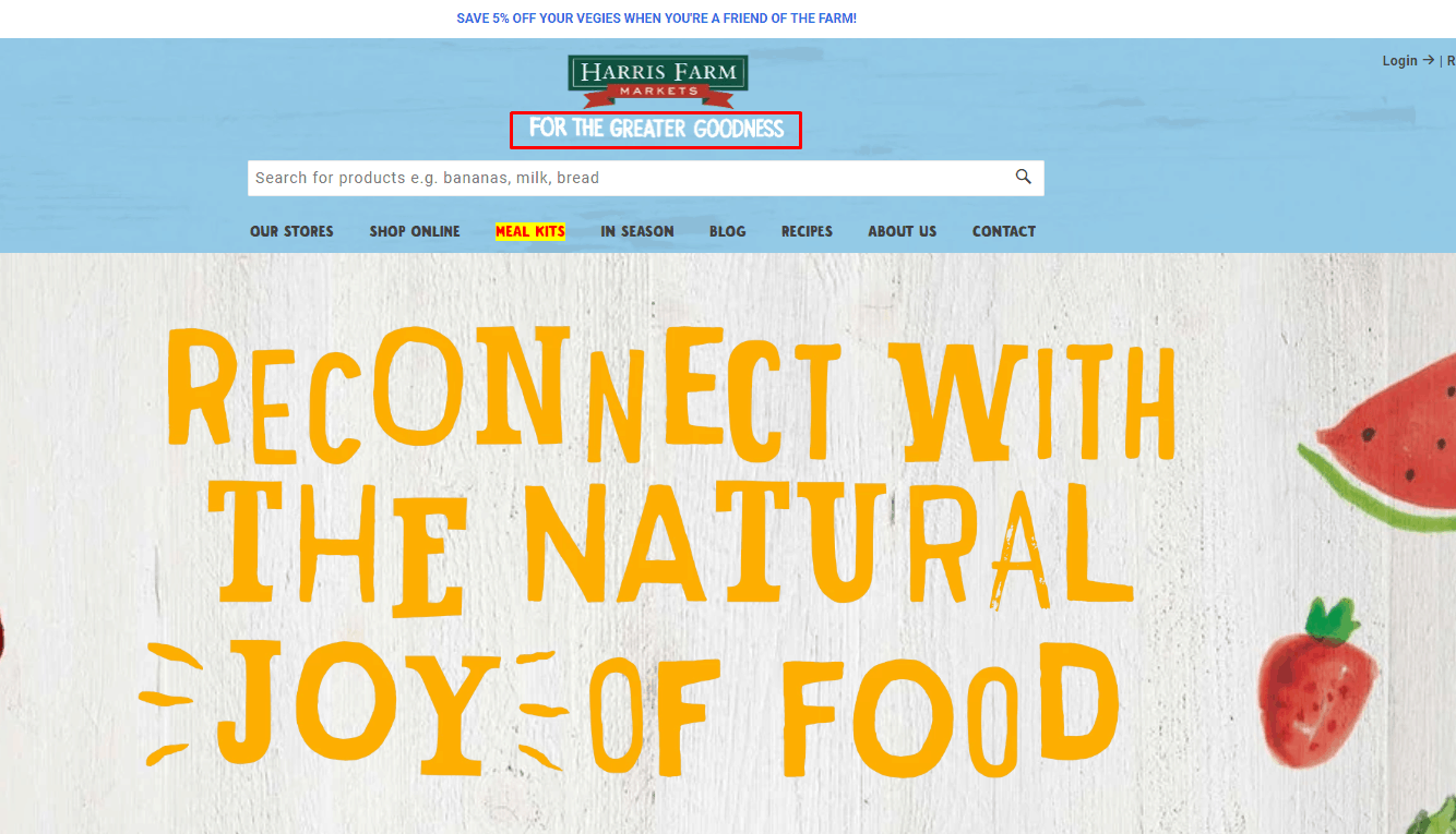 Usability testing proves that the logo should briefly inform the user about the content and topics of the eCommerce website, thereby enhancing the user experience. Include a concise tagline in your UX website checklist to verify brand clarity within 3 seconds.
 -
Quality marks and Certifications
 Usability testing shows that for good UX, the website should display any available quality certificates. Add trust badges verification to your website user experience checklist to reinforce credibility and reduce purchase anxiety.
 -
Information about the eCommerce website and the history of the brand
 According to usability testing, this information is required to improve the confidence factor and user experience. Document company story coverage in a usability testing checklist to ensure visitors quickly build trust.
 -
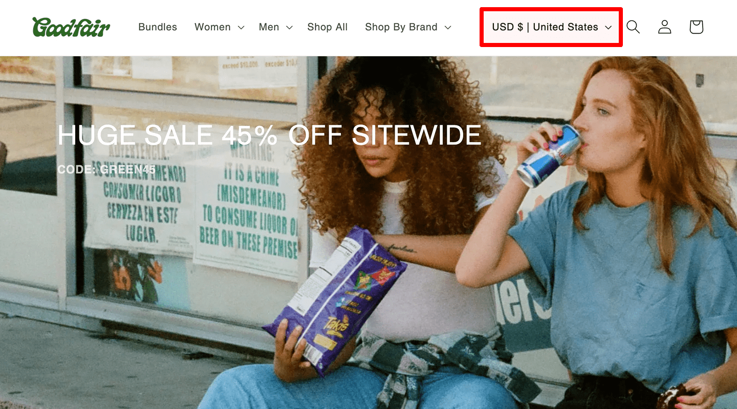
Geo-targeting
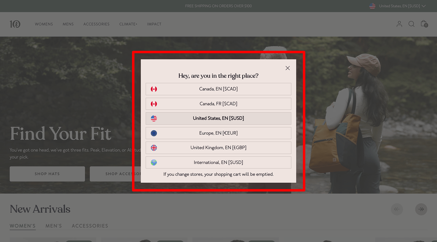 An eCommerce website must be optimized for geo-targeting: information must be presented in the appropriate language (or offer a language selection). In addition, the data must be presented in the usual metric system. Confirm locale, currency, and units during website usability testing to avoid confusion for international audiences.
 -
Choosing a language on the website
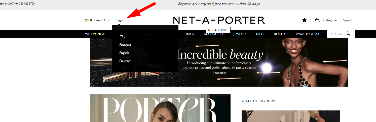 If the website involves several languages, then the language selection must be in a conspicuous place (in the header). Make language switcher prominence a standard item in your usability checklist to keep global navigation obvious.
 -
Intuitive icons
 Use icons selectively—only where they add clear meaning or speed recognition (e.g., common actions, status, navigation). Always pair icons with visible text labels; don’t rely on icons alone. Keep icons recognizable and consistent (style/size/spacing), ensure sufficient contrast and accessible names (aria-label/alt), and remove any that add noise or ambiguity.
 -
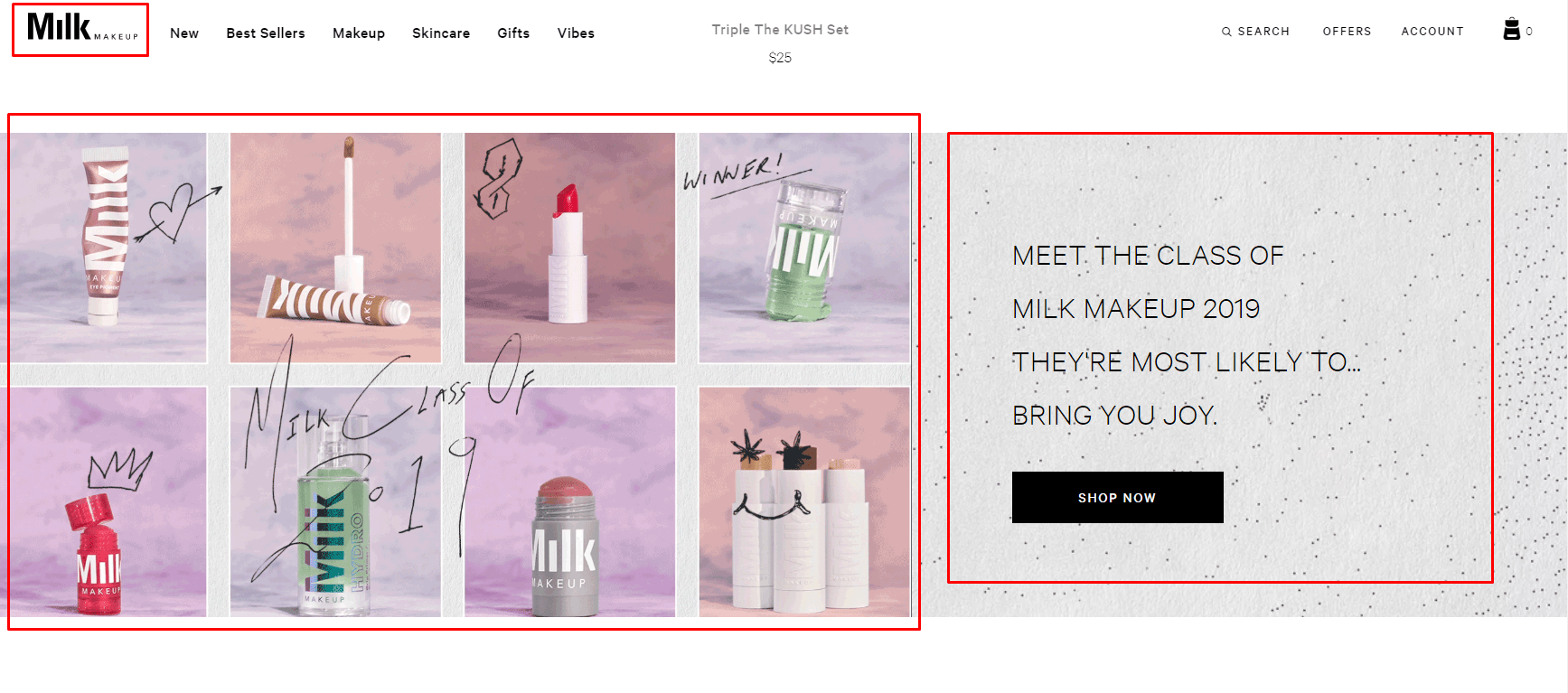
eCommerce Website Interface Uniformity
 Usability testing indicates that a website's layout, including the header, footer, and main menu, should remain consistent across all pages, with possible exceptions for the cart and checkout pages. Navigation consistency should be explicitly tracked in the user experience testing checklist for every template and breakpoint.
 -
Uniqueness and Clarity of the eCommerce Website Design
 When entering the website, the user should understand the website’s purpose within 3 seconds: the slogan and the images in the header, page title, etc. First-impression messaging must be part of the website usability testing checklist to reduce bounce and orient users fast.
 -
Ease of interaction with eCommerce website logo
 The website logo should be clickable and lead to the homepage, but it shouldn't reload the page if the user is already there. Add a home-link behavior check to the web usability testing checklist to ensure predictable navigation on all devices.
 -
Unique favicon
 The website's favicon should align with the logo for easy recognition. Usability testing shows a distinctive favicon makes it quicker to locate the site among multiple open browser tabs. Favicon presence and contrast belong on a UX testing checklist, especially for mobile tabs and PWAs.
 -
Clear terminology
 Menu items, buttons, and links should not use obscure terms or language. Maintain a controlled vocabulary in the website UX checklist to keep labels consistent across sections.
 -
Ability to see a company representative
 Include an "About Us" page on the website, featuring detailed information about your company. Audit rich 'About' content with a website usability audit checklist to support credibility and reduce risk perception. This should encompass interior and exterior photos of the office, images of staff engaging with clients, and insights into the production or work processes.
 -
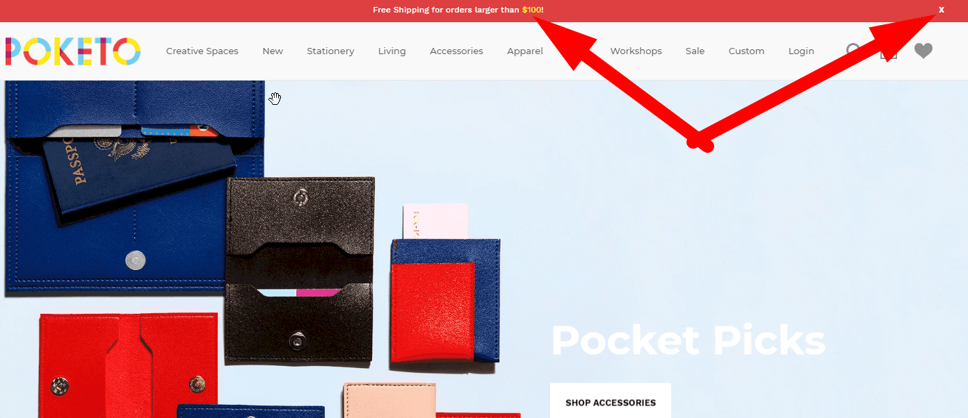
No autoplay / non-intrusive UX
 Media, such as music or video, should not autoplay on the website. Autoplay suppression should appear on your website usability analysis checklist to protect focus and user control. Usability testing reveals that unsolicited media playback can annoy visitors, prompting them to leave the site, negatively affecting user experience. If you use autoplay for any reason, make sure the stop/pause button is in a prominent place. If your website uses pop-up windows, they must also have a visible close button that actually closes the pop-up and does not navigate to another page. Otherwise, the visitor will waste time searching for how to close it and may just close your entire website tab.
 -
User-friendly design
 The design of an eCommerce website should create as few difficulties as possible. Include scenario simplification in your usability check website process to minimize cognitive load and errors. The visitor should only need to complete the necessary steps: a. all actions that can be automated are done programmatically (for example, pre-filling the delivery address based on the user's location); b. the action queries of the visitor and choices change dynamically depending on the parameters of the product, the visitor data, etc. for example, if a dress is only available in one color, the user is not forced to choose a color.
 -
Explanation for Deactivated Items
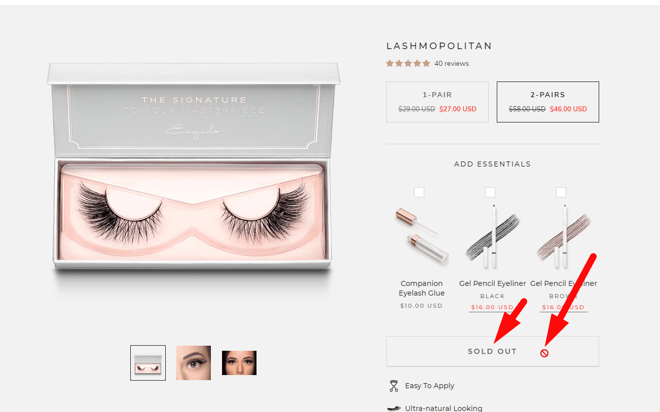 When you hover over an inactive button or link, a brief explanation should appear explaining why the button or link is inactive.
 -
Honest buttons
 The standard functionality of any button is to launch an action, not go to another page unless the button clearly suggests this.
 -
User-friendly buttons
 A button is clickable, not the text on it. You can also make a small space close to it clickable (but not if another button is located next to it).
 -
Thought-out delete buttons and clean forms
 Buttons that cancel actions or clear entered data are placed far enough from the Send/Confirm buttons and styled differently. This is necessary so that the visitor does not click on them by mistake.
 -
Standardization of interaction
- In running text, keep links underlined by default—don’t rely on color alone.
- Ensure contrast: ≥4.5:1 against background; if you remove the underline, also ≥3:1 vs surrounding text.
- Provide clear hover, focus (:focus-visible), active, and visited states; don’t remove the focus outline.
- Use semantic elements:
<a>for navigation,<button>for actions; keep styles consistent so users can tell them apart. - Make targets easy to hit (≈ 44×44 px on touch).
- Differentiating visited links is optional and context-dependent (e.g., long articles); it doesn’t have to be purple.
-
Clear and relevant H1
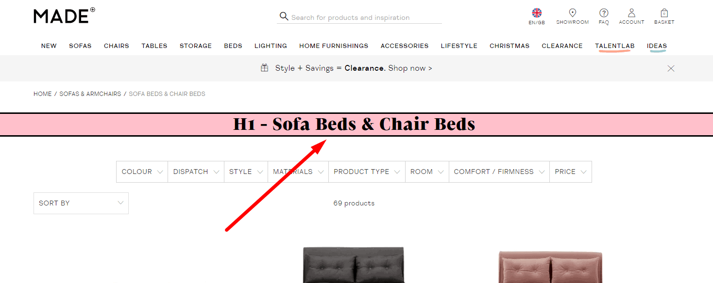 According to usability testing, all pages of an eCommerce website should include a heading that is entirely consistent with its content for good UX. This should be an H1, not just the browser tab title, because when many tabs are open, the tab title may not be visible.
-
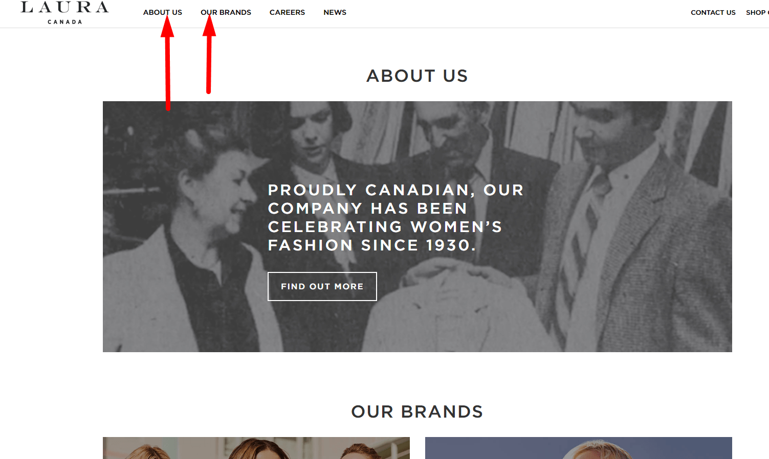
Standardization
 Following usability testing, the names of menu items should be familiar to the visitor (“don't make me think”) — for example, “Contacts,” “About Us,” “Shipping,” and so on, without unnecessary creativity. This provides a good UX. Menu wording parity is essential for checklist usability across teams and languages.
-
Convenient On-Site Search
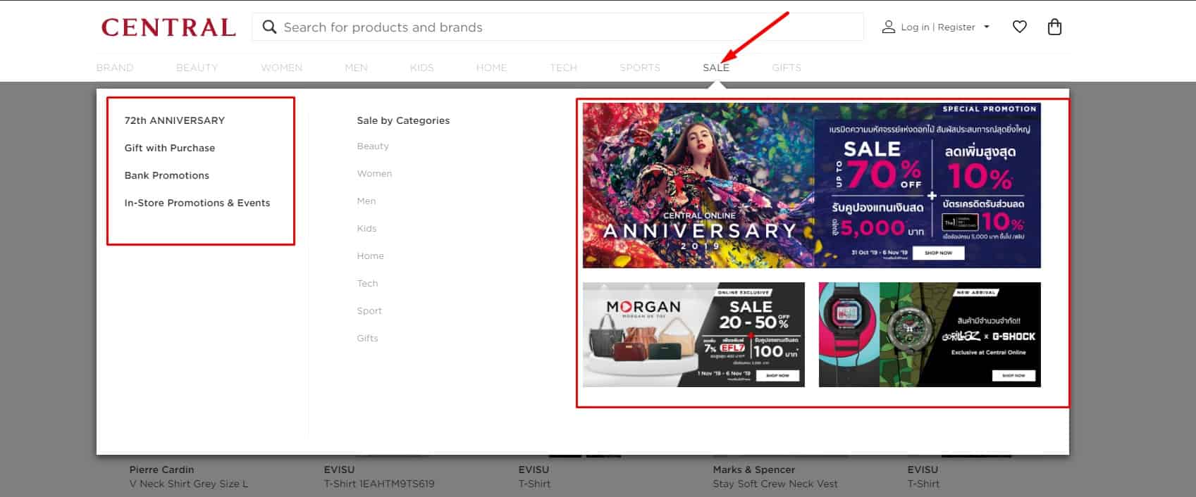
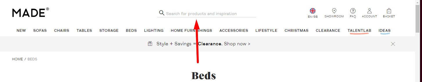 Usability testing proves that the design of the website must be familiar. For example, the search box should be in a conspicuous place – the top left or top center of the page. This provides good UX. Search discoverability should be scored in a website usability evaluation checklist to ensure findability and task completion.
-
Ability To Quickly And Easily Interact
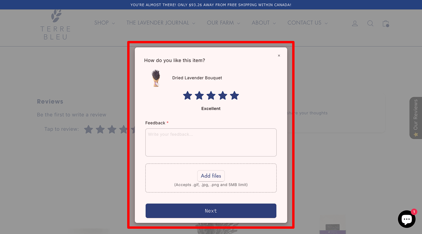 According to usability testing for better UX, a commercial website must let users leave feedback (reviews/comments) on products, services, or articles without requiring registration. In addition, the text should be saved if the user enters the captcha incorrectly before sending or accidentally closes the page.
-
Sign-In Using Social Networks
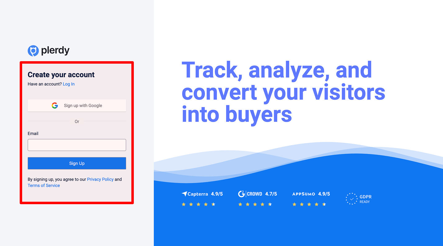 Some users will not register with a full form, but they will sign in if you offer social login.
-
Spam protection
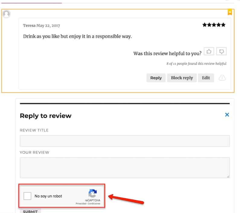 Protect the site against automated and manual spam (captcha, moderator pre- or post-review, checking external links in comments, etc.). Otherwise, comment sections can turn into a cesspool where visitors can't find useful information.
-
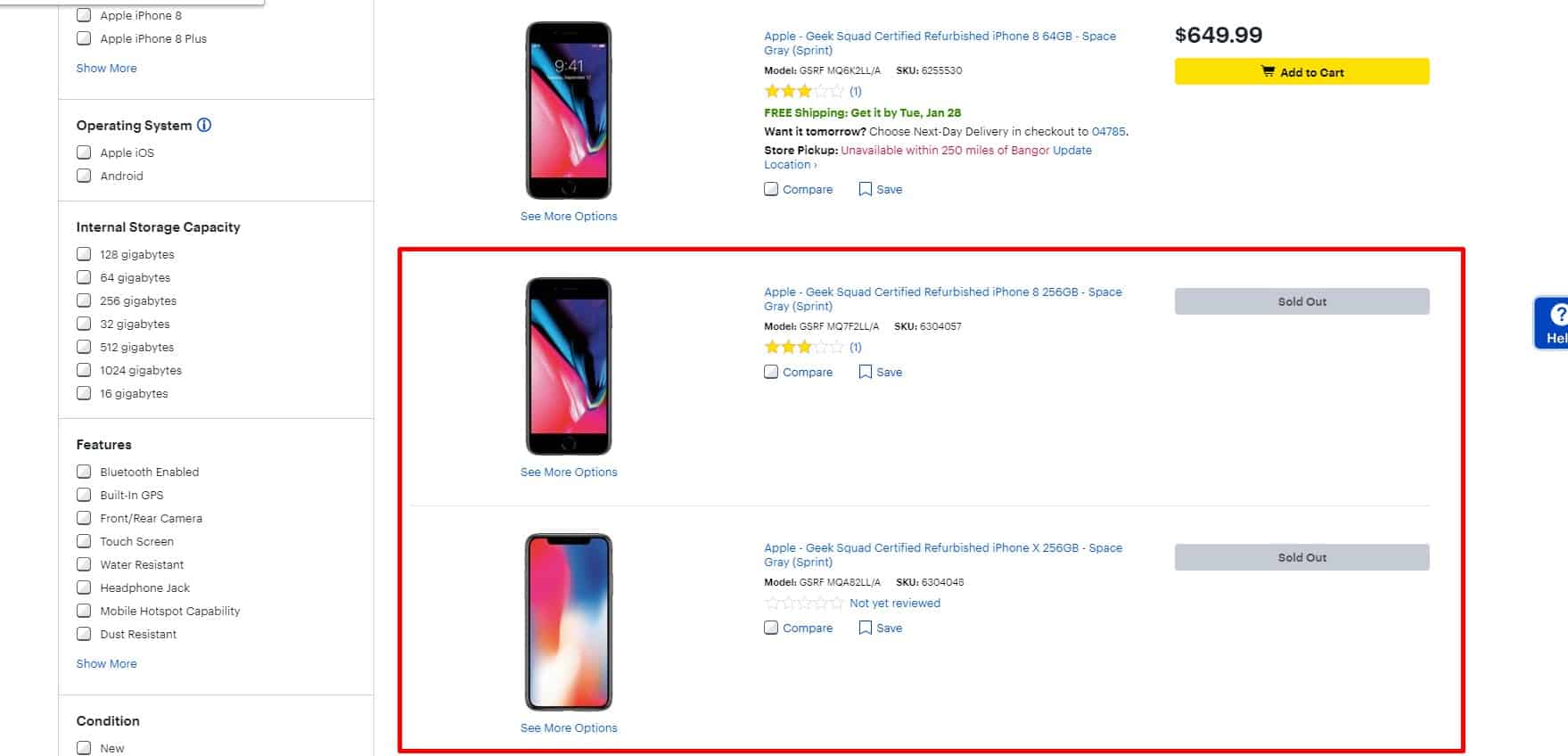
No empty sections in the website design
For a good UX, if there are currently no products in the category, it is temporarily hidden.
-
Noticeable Apply button
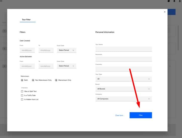 This is relevant when you use a delayed filter that applies only after the visitor has selected all needed parameters.
 -
Privacy policy
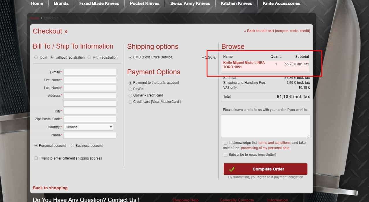
 The client should see that all personal data entered during checkout and payment is protected (icons of the applied security technologies, relevant explanations to the fields). At the same time, the process should not become intrusive or slow, so the user experience is not damaged. Include data-protection notices review in your usability testing audit checklist for compliance and transparency.
-
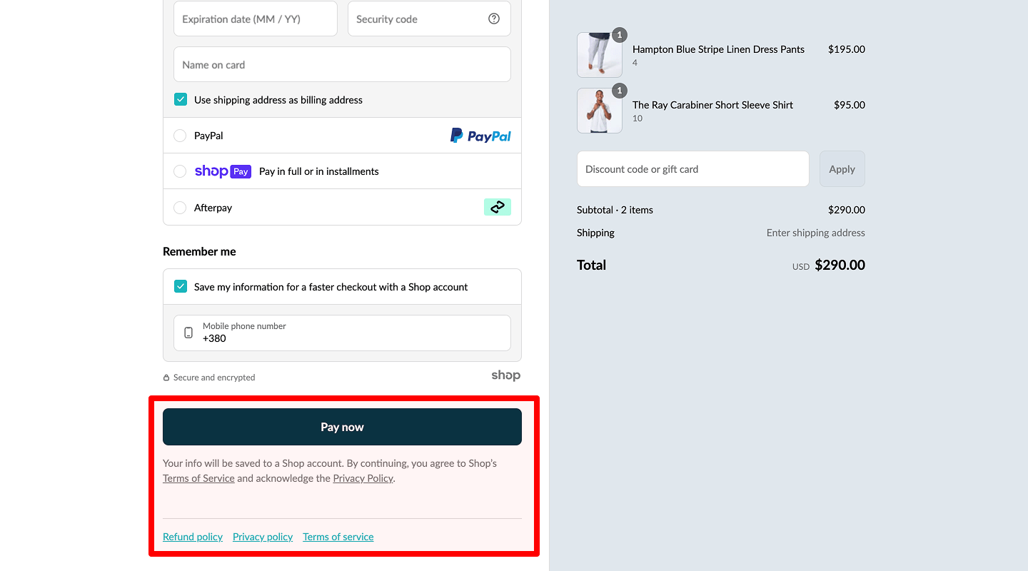
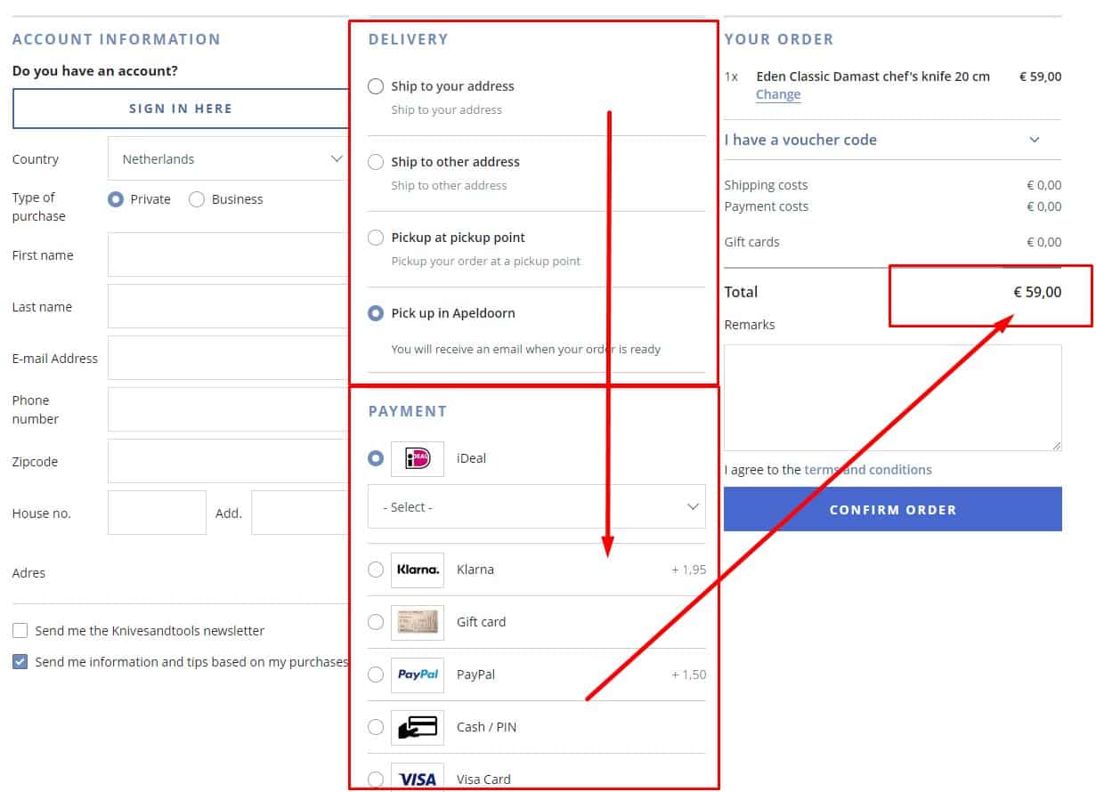
Process payments in the same tab with inline guidance
 Avoid opening the payment provider in a new tab—it breaks context, triggers popup blockers, and can disrupt 3-D Secure flows. Keep users in the original tab: embed hosted fields or use a same-tab redirect with a clear return URL to your confirmation page. Provide concise inline instructions (what happens next, accepted methods, fees), show a progress indicator, and keep a lightweight order summary visible. After payment, display a confirmation and an explicit “Back to store / View order” link; on failure, show the error in place and allow quick retry or method change. Only open a new tab when the user explicitly requests it (e.g., print receipt or view terms).
-
No points in title and content
- Body text: Use standard punctuation (periods, commas, etc.).
- Headings (H1/H2): Do not end with a period; use a question mark only if it’s a real question. Avoid exclamation points and ellipses (unless your style guide explicitly permits them).
-
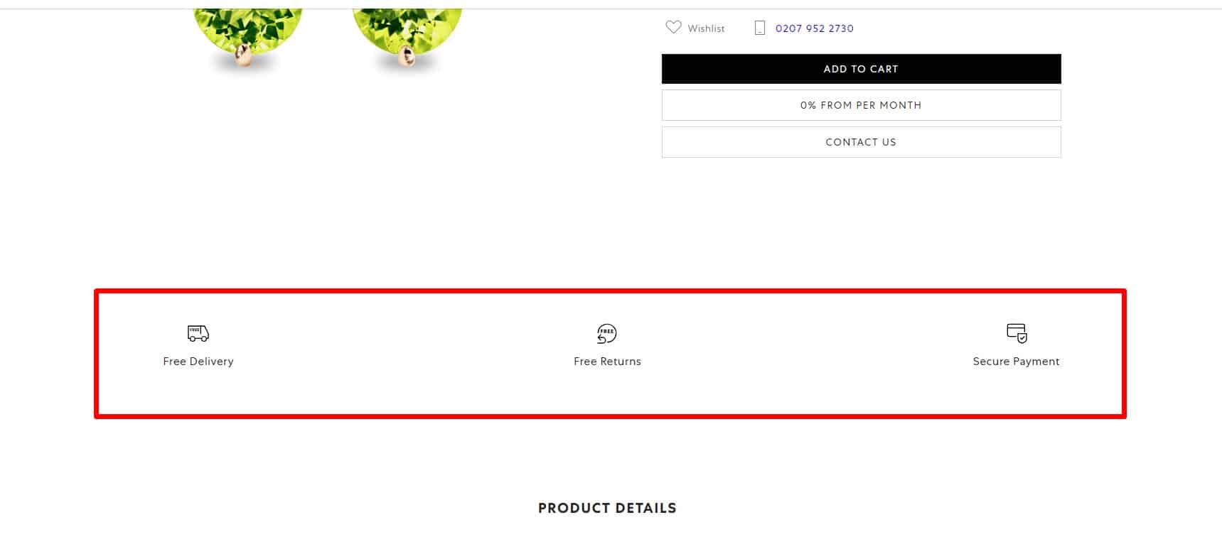
Image Quality
 All images on the website are high quality, clear, and free of defects or third-party watermarks. This contributes to a good user experience on the website. Image resolution, compression, and CDN delivery must be part of a website usability checklist to maintain speed and clarity.
-
Reason For Using Images
 All images should be informative, not just decorative, and should not ‘overcolor’ the website.
⚙️ Check the usability of the product page
-
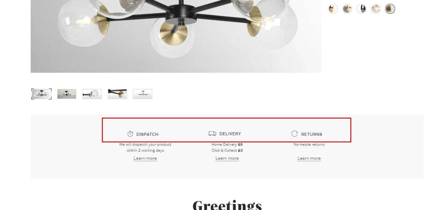
Delivery information
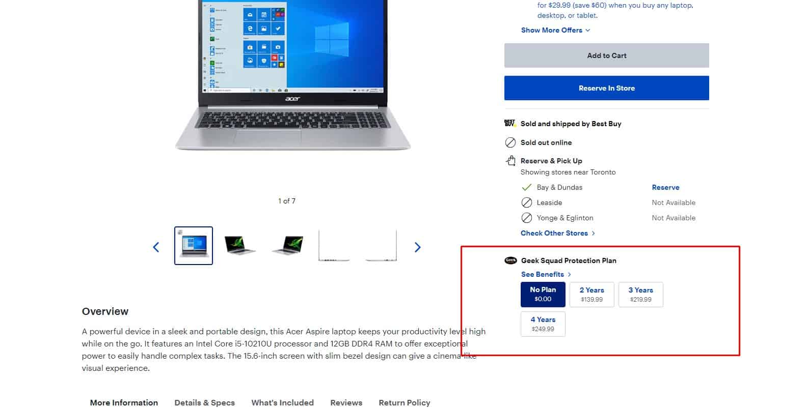
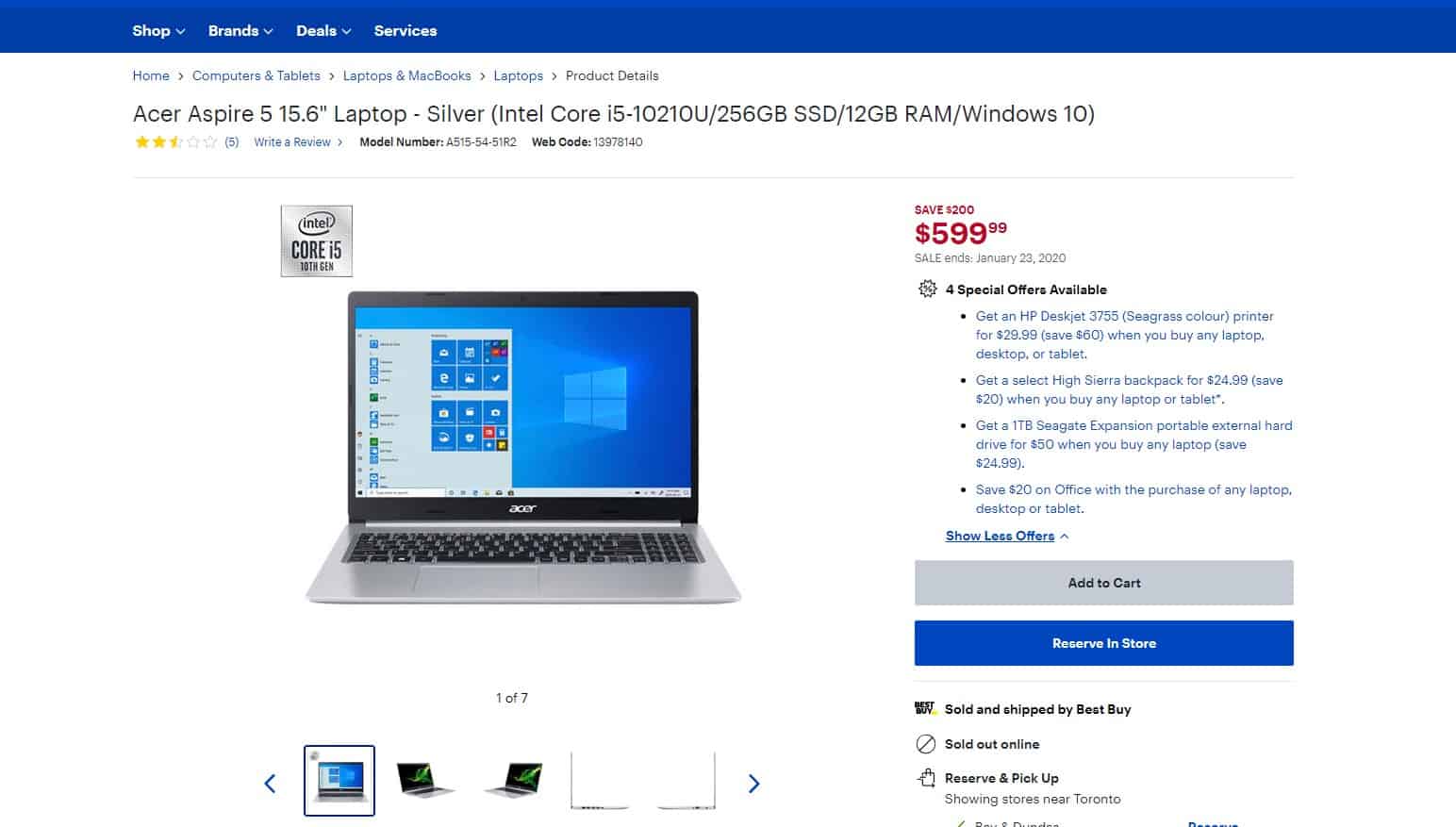
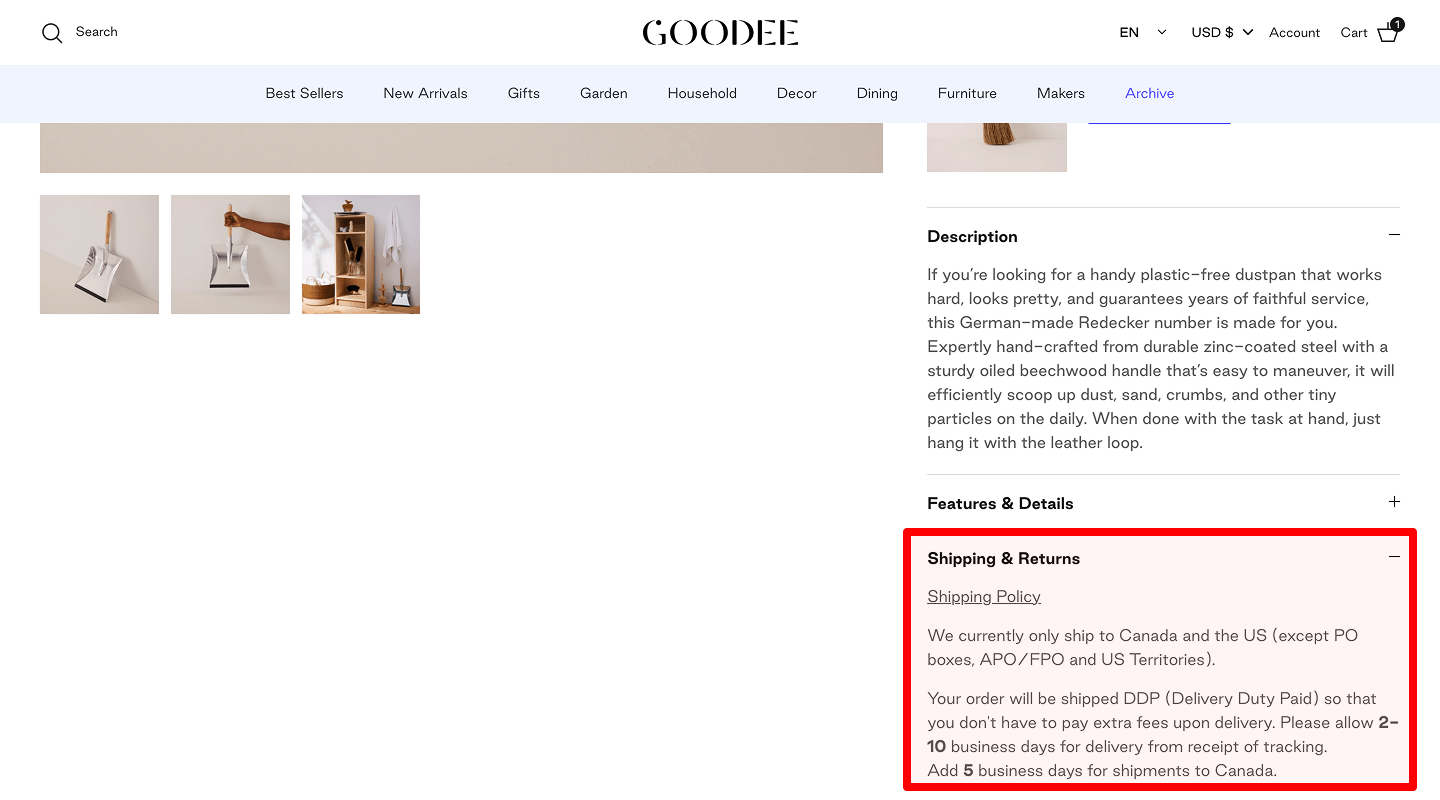 A detailed and precise description of delivery terms and conditions, which can be immediately found on the website, will help the buyer understand that the chosen product will be delivered at a specific time and for a specific price. This greatly enhances the user experience, especially when the goods are shipped only after prepayment.
 -
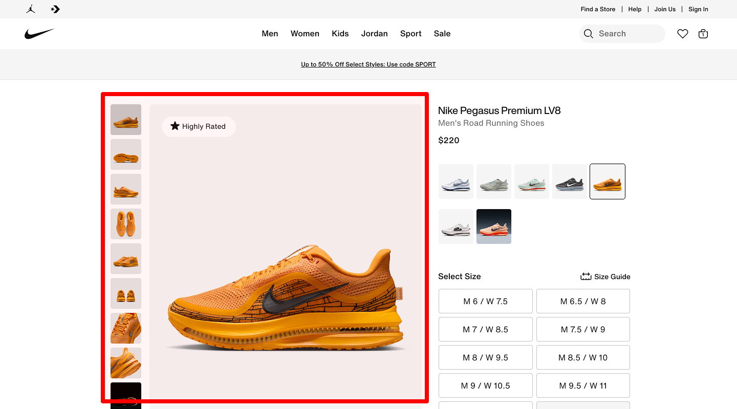
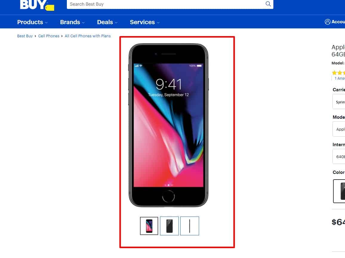
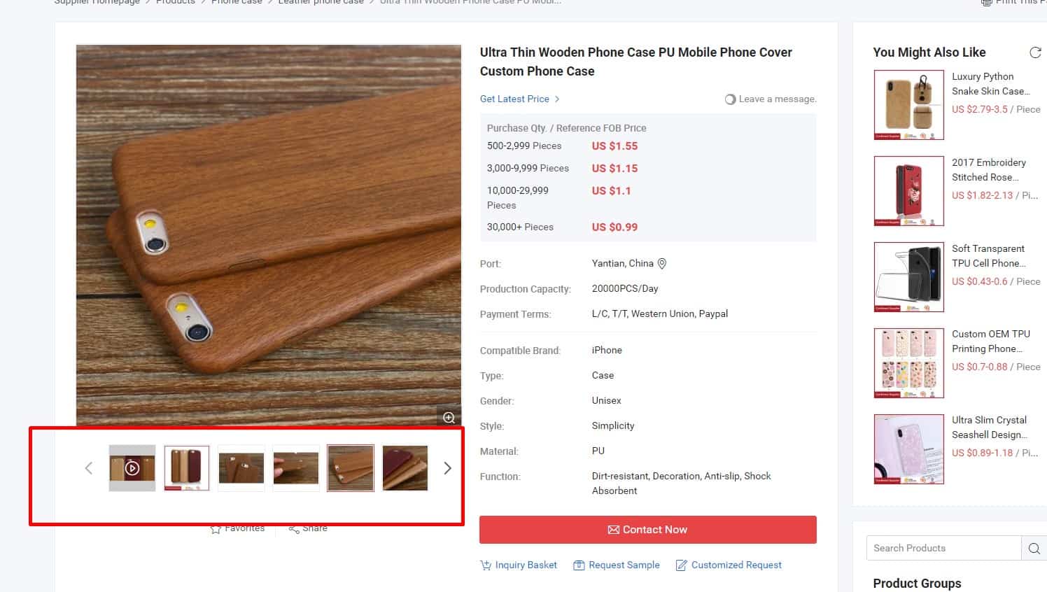
Photo Zoom
 Using the zoom function for photos improves product perception and UX according to usability testing.
 -
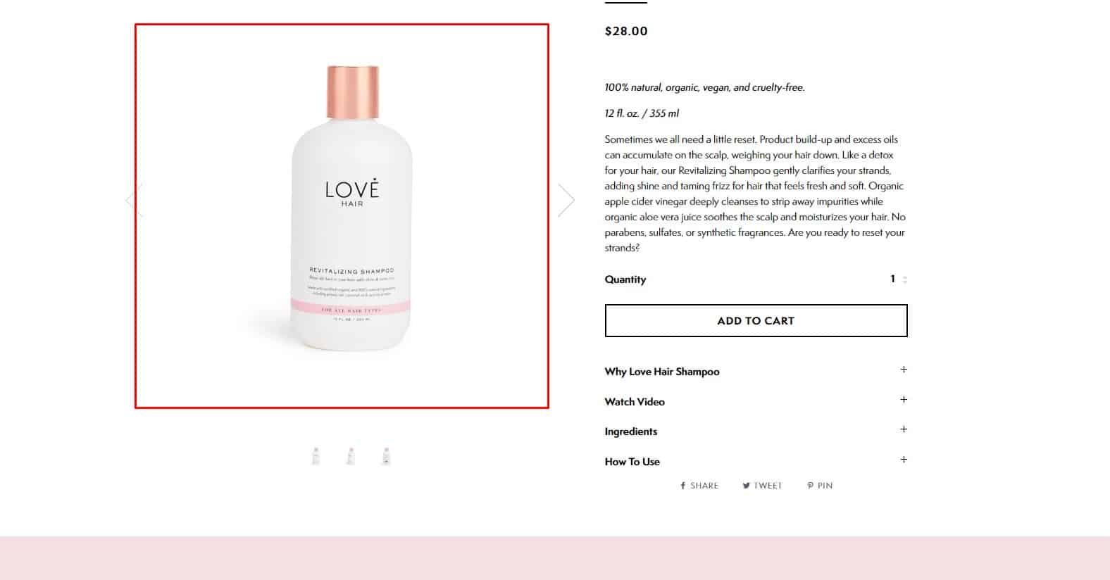
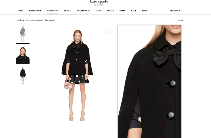
Product Image Gallery
 The product page should include an image gallery.
 -
Return information on the product page for a better user experience
 According to consumer law, the user has the right to return the goods within 14 days after purchase. Indicate this on the product page. This positively affects the user experience and increases conversion.
 -
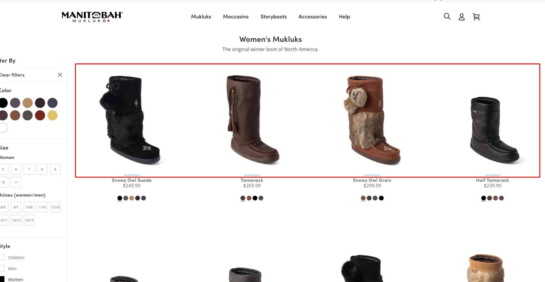
Optimal Number Of Items Per Page
- Base it on viewport and card density (mobile shows fewer than desktop).
- Keep pages fast (e.g., lazy-load images; guard Core Web Vitals).
- Provide clear pagination or Load more; optionally let users change items per page.
-
Ease of presentation
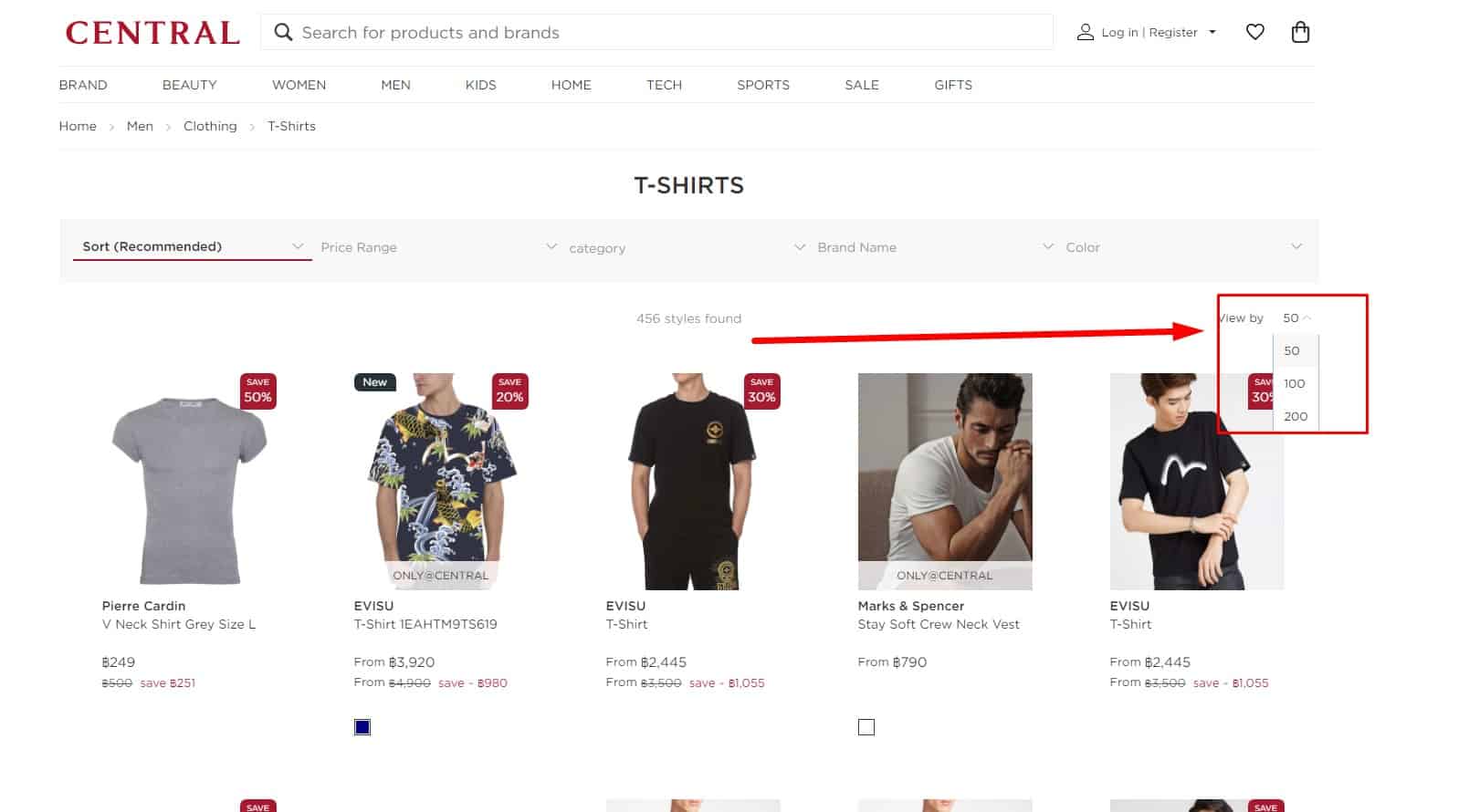 The design of an eCommerce website should allow the user to change the number of displayed items on the page or show all items on one page. The category page should suggest a choice of presentation: advanced (showcase, table, tiles), optimal (list), and minimum (price list). The advanced option works for users who want to see as much information as possible about the product directly on the catalog page. The minimum option works for visitors who are interested in price and availability. The optimal is an average option. This contributes to a good user experience.
-
Focus on the real situation
 If a visitor can look for the same product in different categories, the website should display that product in all relevant categories. For example, visitors often confuse the terms "access point" and "wifi router", so you can put the same model in both categories.
-
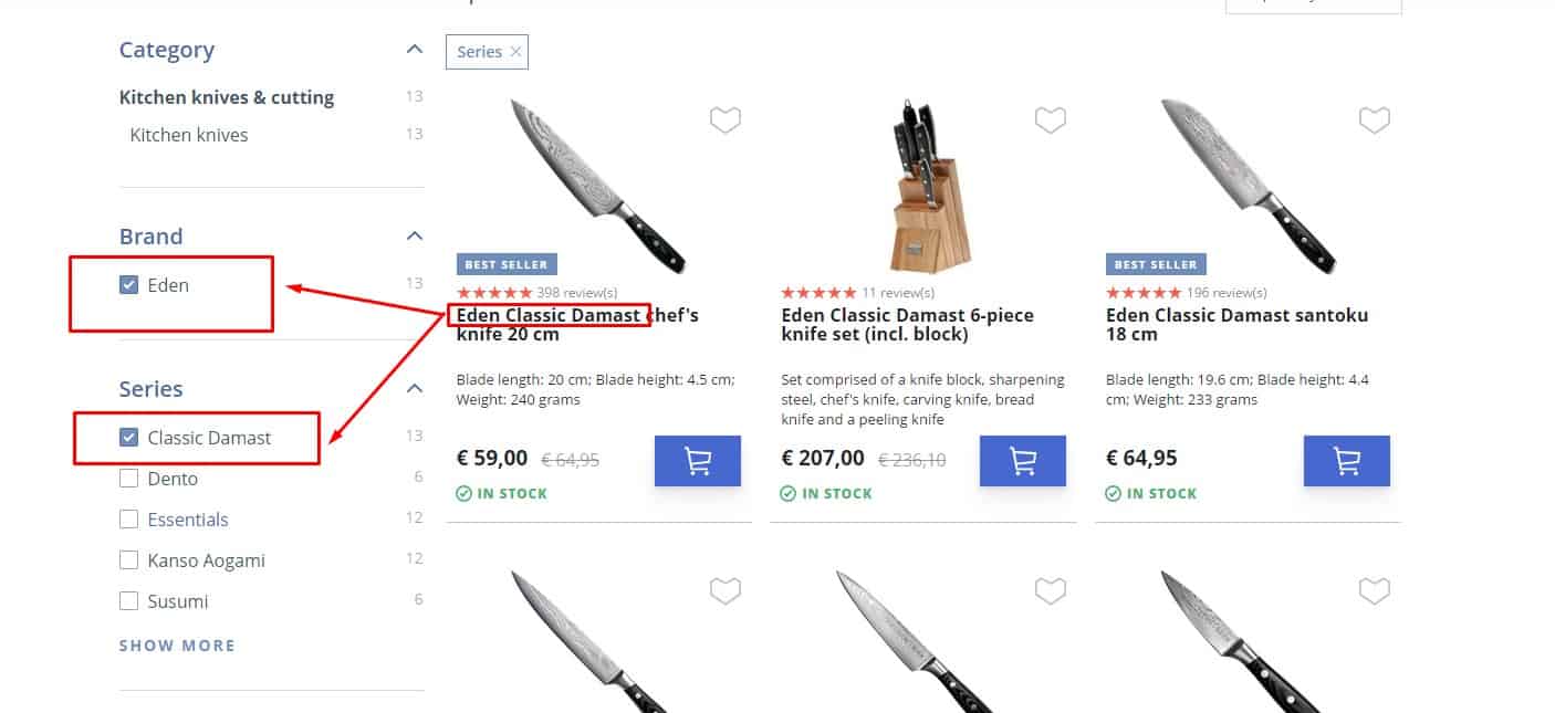
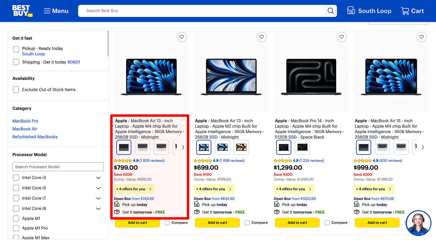
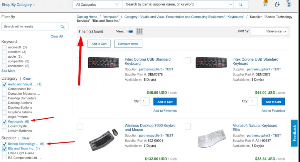
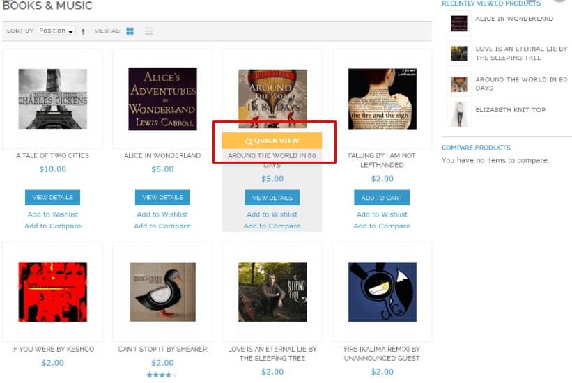
Full product information
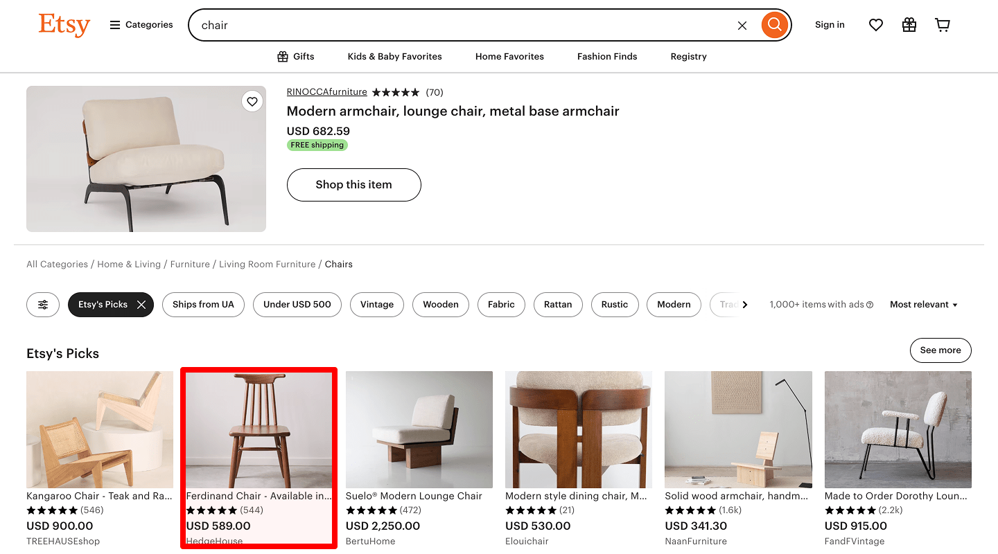
 According to the results of usability testing, each product on the catalog page of an eCommerce website should contain the following information:
- photo;
- name;
- price;
- a label such as 'Promo,' 'Sale,' 'New,' 'Bestseller,' etc., if it applies;
- buy button.
-
An extended list of characteristics
 Optional: the category page can also show key characteristics in a pop-up on hover, or expand them on click (e.g. 'Show more'). You can provide this functionality for the extended presentation of goods in the catalog (showcase).
-
Actual Stock Quantity
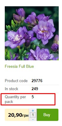 Optional: the category page shows the exact or approximate quantity of the product in stock.
 -
Noticeable price tag
 For good UX, the price should be noticeable — large, high-contrast, or otherwise highlighted.
 -
Currency indication
 If the website accepts multiple currencies, for good UX, the currency switcher must be placed in a visible location (for example, in the header) and on the category page.
-
If No Price Is Shown, Explain Why
 If the price is not indicated, then you must explain why the price is missing ("The product is discontinued," "Unknown price") or tell the user to contact a manager for pricing. In this case, the Manager's contacts or a link to them are indicated.
-
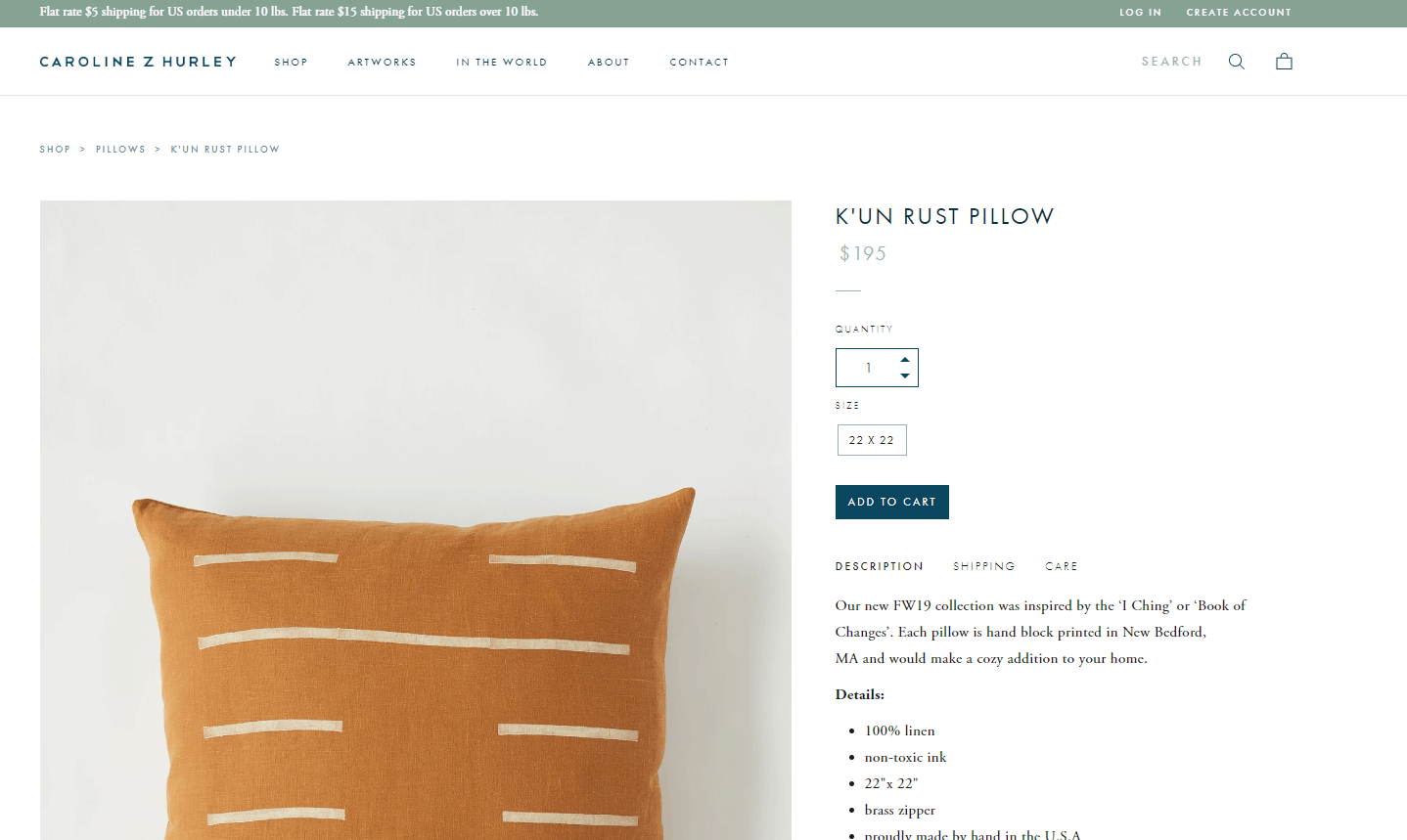
Different angles
 An eCommerce website should provide several product photos on the product pages, from different angles, so the user can see design details (if it's hardware), stitching and fit (if it's clothing), etc. Thus, it provides a good user experience.
-
Examples of application/usage/serving
 In some cases, it makes sense to post a photo of the product in use, work, interior, etc.
-
Unboxing / Inspection Video
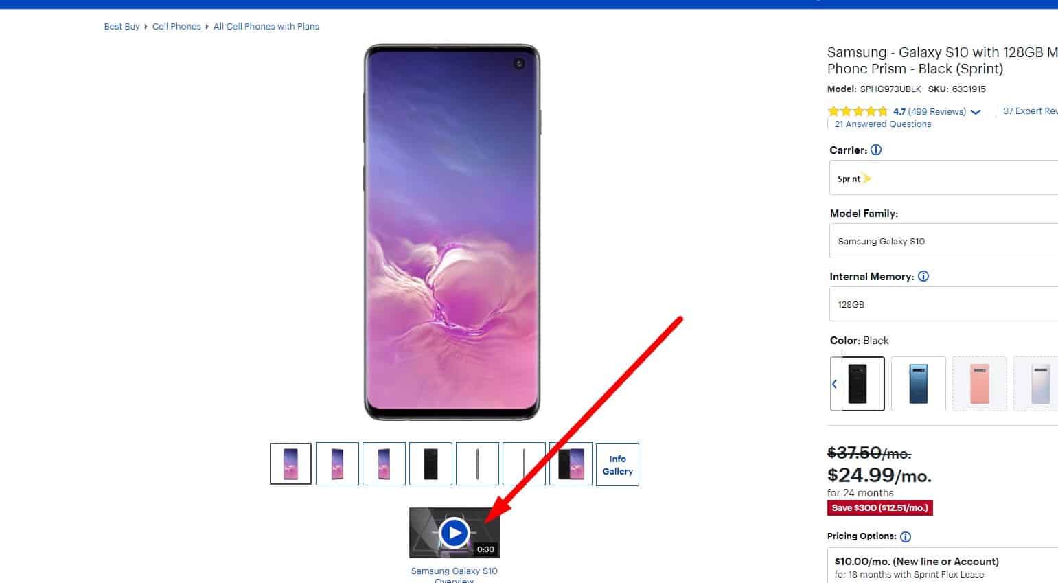 A detailed video is recommended; high resolution is desirable.
 -
Consistent Characteristics
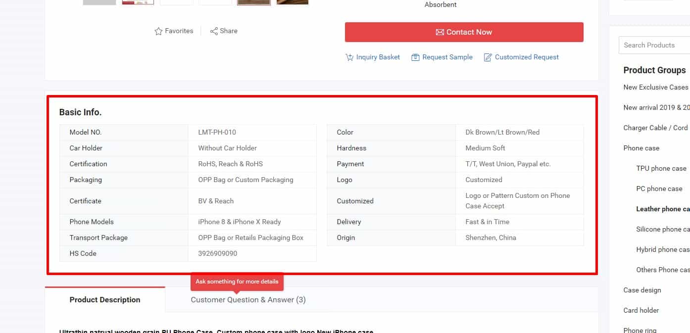 According to usability testing results, the same features in different products should be named and displayed consistently — same terms, same units, same measurement system. This helps users compare models and improves UX.
-
Tooltips For Non-Obvious Terms
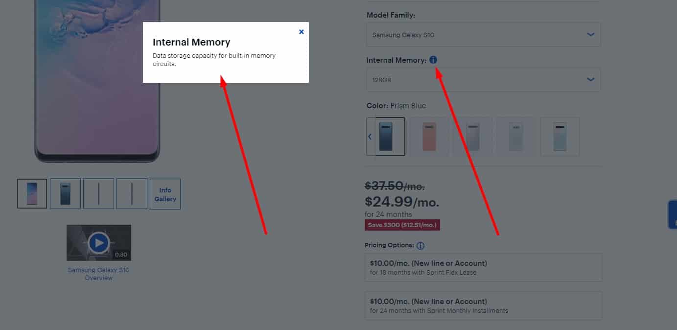 When the user hovers or clicks the info icon, a tooltip or pop-up should explain the term.
-
Information about the warranty period for the product
 The eCommerce website should include clear information about the product warranty and return policy.
-
Information about the item package
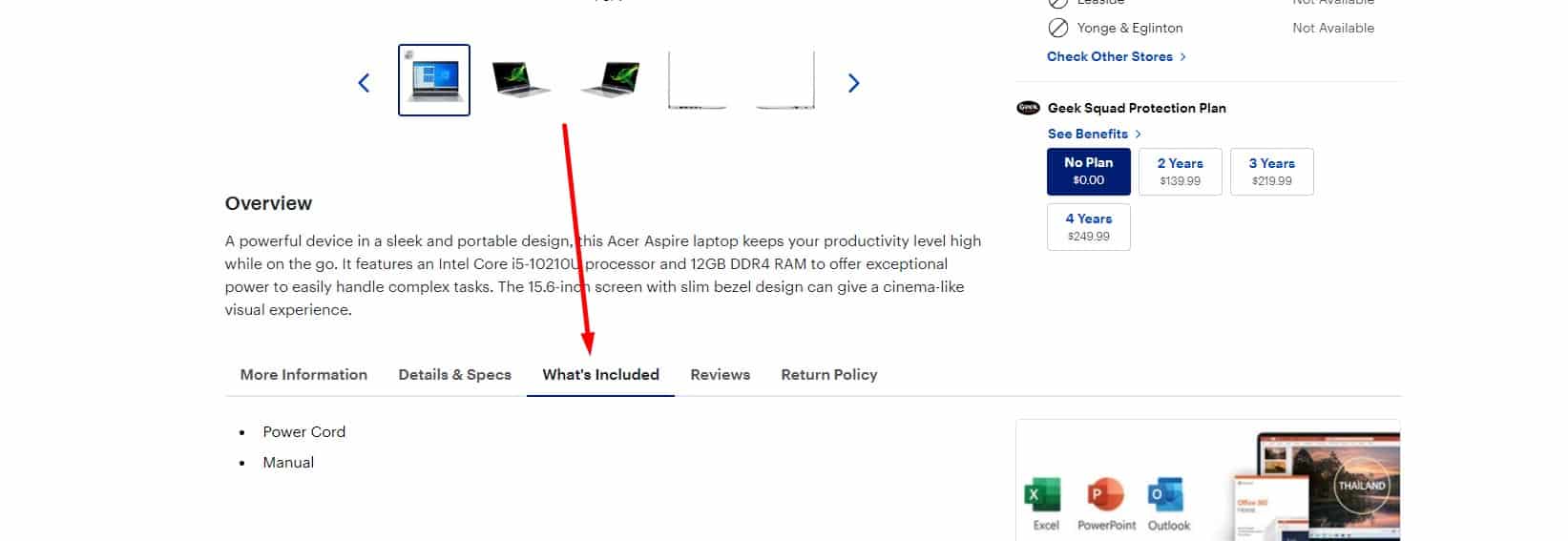 Usability testing shows that for good UX, you must list everything included in the standard package.
-
Information On Country Of Manufacture
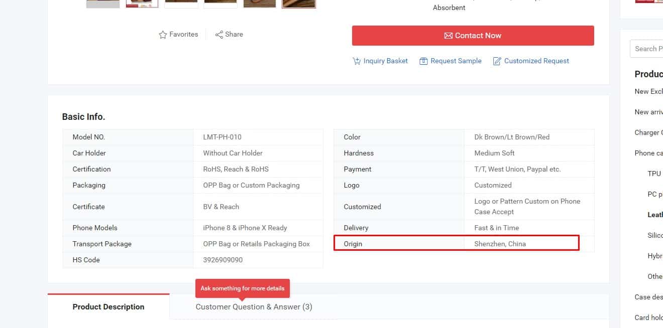 This is optional.
 -
Important data only
 According to usability testing results, the product page must not include ads or other distractions that pull attention away from the product.
-
Additional information
 For good UX, the product page should include a clear and useful product description: reviews, social proof (where relevant), and a product rating that can be submitted with one click.
-
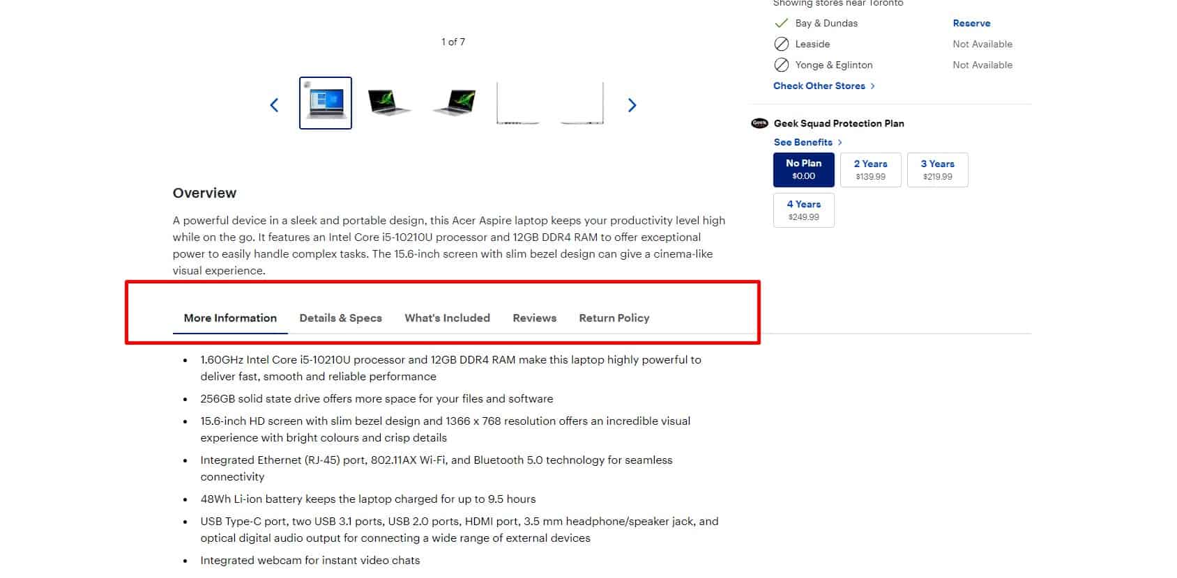
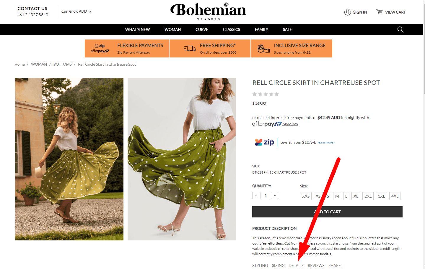
Viewing blocks of information
The product description, specifications, reviews, and other information are placed horizontally on the page, in tabs, so that the visitor does not have to scroll down the page.
-
Similar suggestions
 If the product is discontinued or not available, the website should offer links to alternatives. This provides good UX.
 -
Uniform image galleries
 Preview and main images should follow a consistent style across all product pages. Preview image sizes in category listings should also be consistent across all categories.
 -
Ability to scale photos
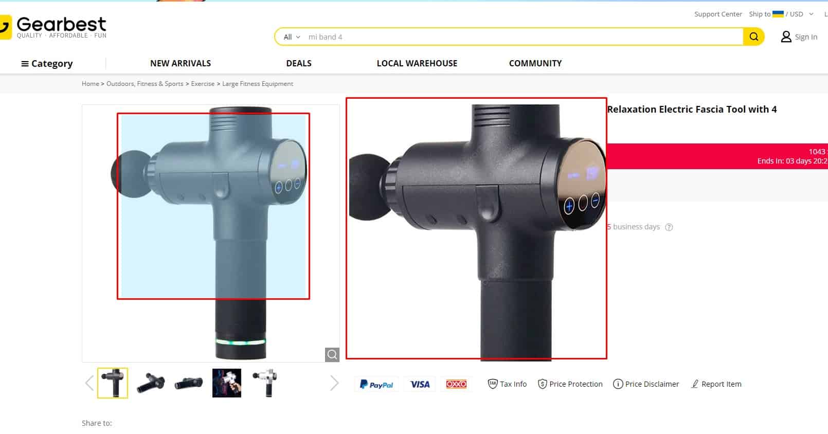 The user can view each of the product's photos in high resolution (for example, by clicking on the preview) to see all the details. You can also offer an on-hover zoom / magnifier. This is especially true for images with delicate details - screenshots, etc.
-
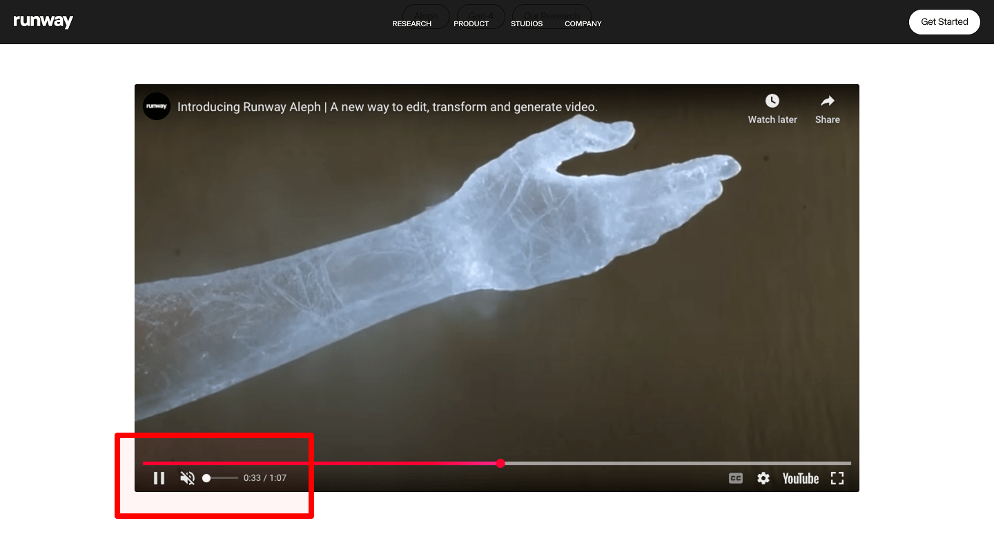
Accessible Video Player Controls
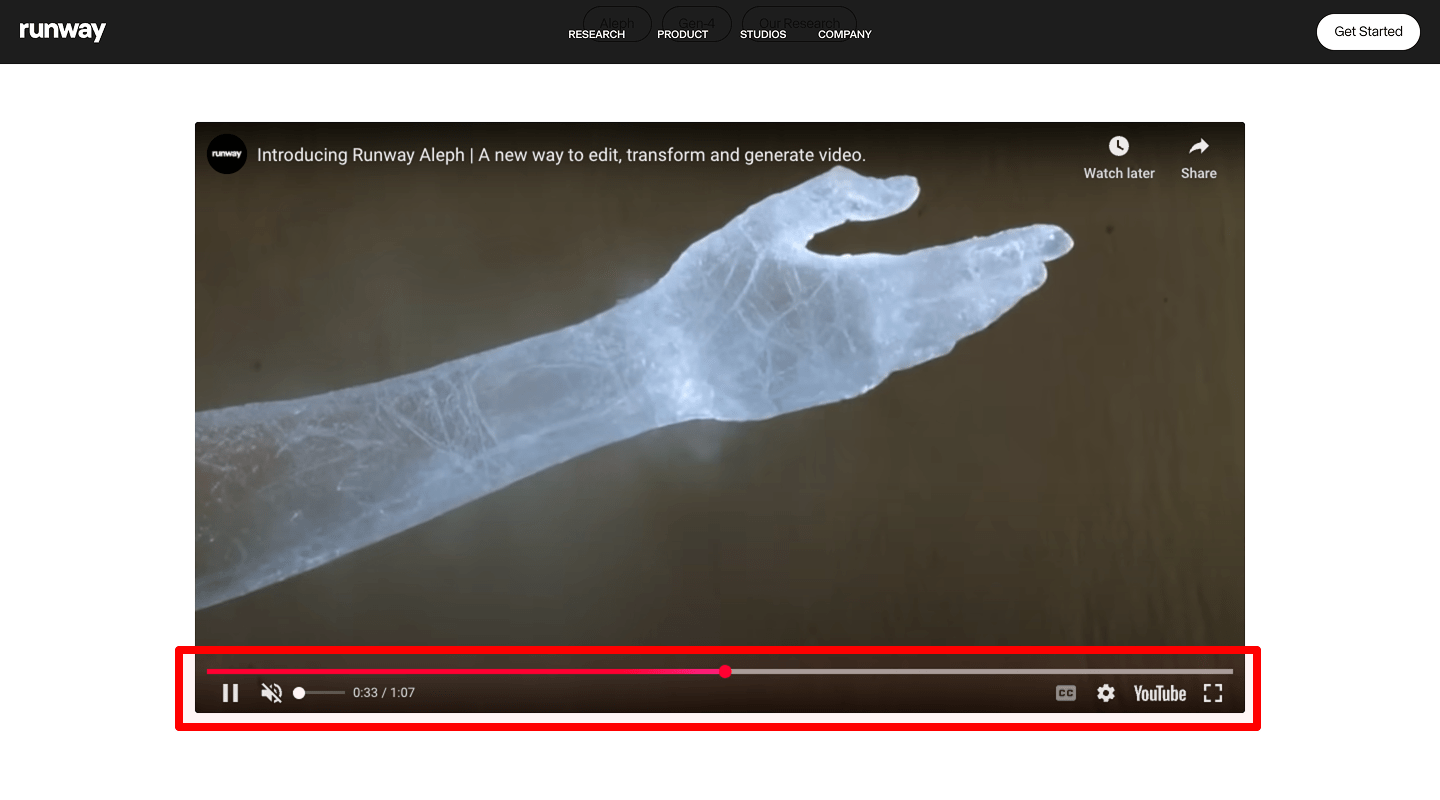
Include playback controls (resize, volume/mute, pause/play) and:
- Captions/Subtitles (CC); let users toggle and choose language.
- A transcript on the page or via download link.
- Full keyboard control (Tab/Shift+Tab, Space/Enter, Arrow keys), visible focus, and accessible labels (
aria-label) for all controls.
🗂 Product filtering is an important influence on usability
-
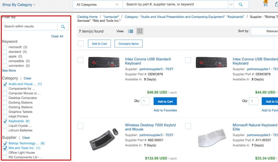
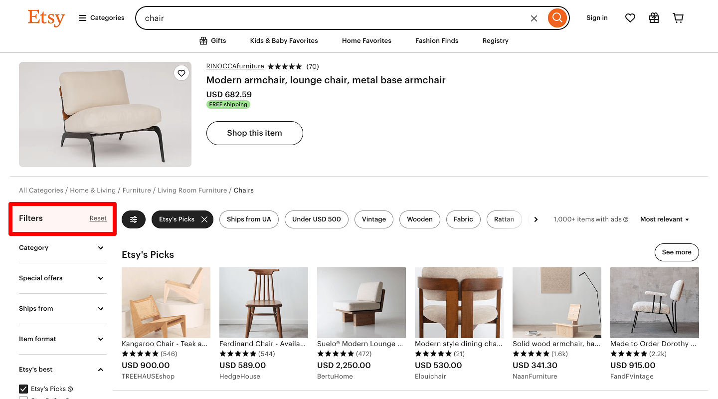
Advanced filter
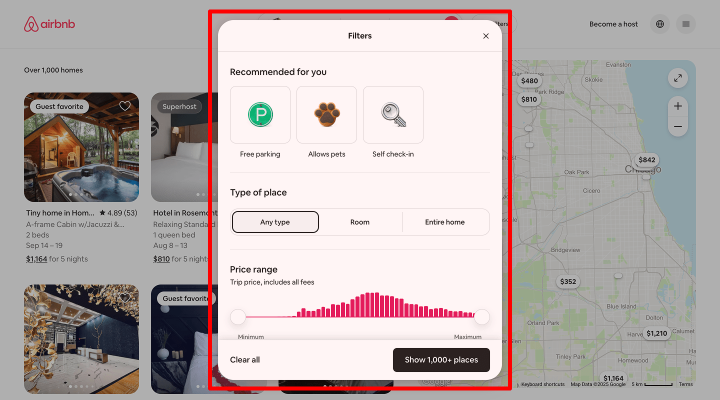 If your users choose a service point not only by location but also by criteria like opening hours, service range, or whether you work with businesses or individuals, the website must support filtering by those criteria.
-
Delayed filter
 If the site reloads and applies the filter after every single click, UX suffers because the visitor must wait for the page to load after each step. It's better to let them pick all filters first and then apply them together.
 -
The minimum time to synchronize dependent filters
Synchronization starts without reloading the page. If this requires some time, a message or a progress bar informing the user is displayed.
-
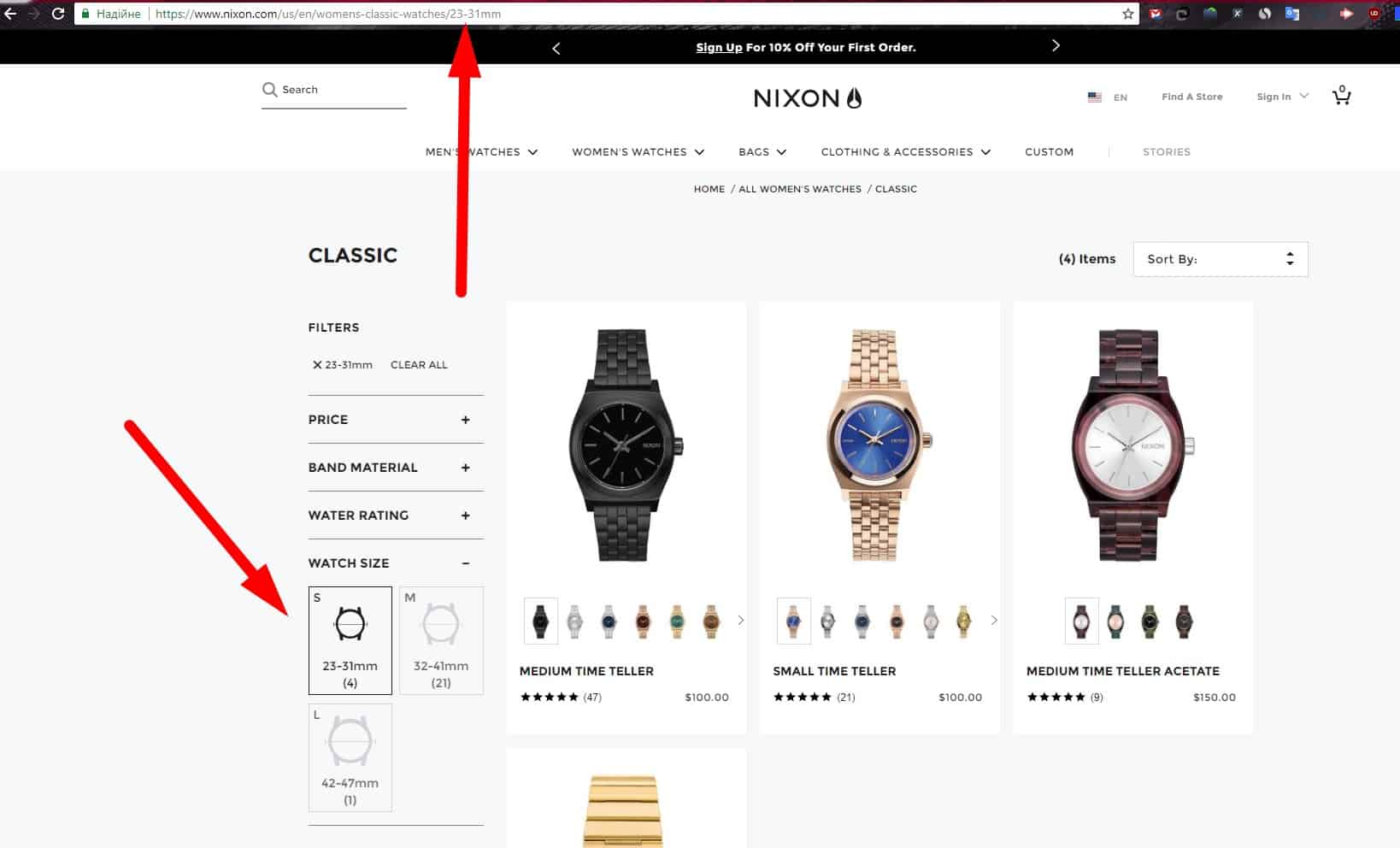
Only The Most Useful Filter Options
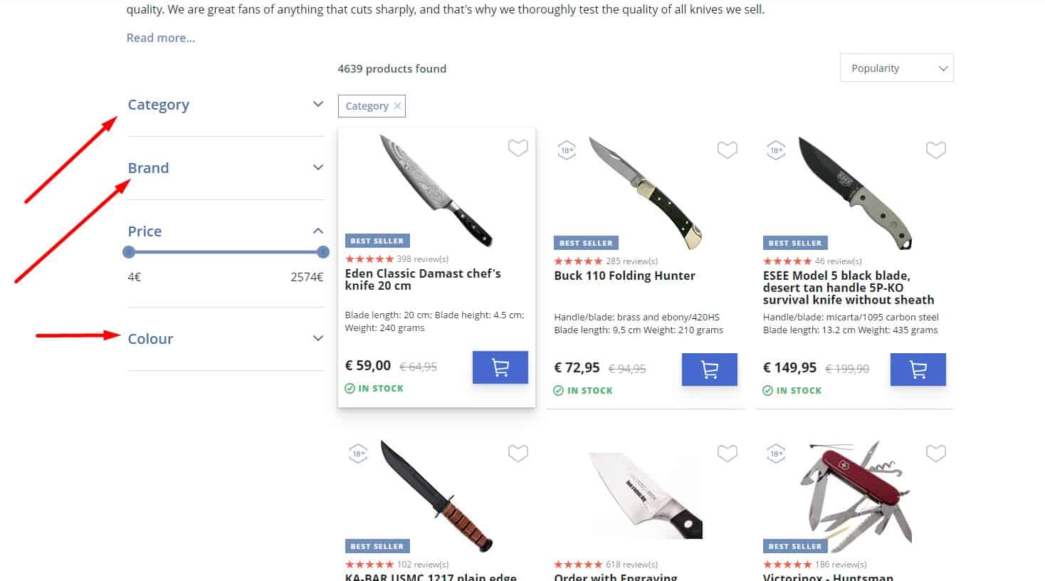 For good UX, the filter is not overloaded with choices. Options should be standardized, and if there are too many choices, group them into ranges instead of listing every single value.
-
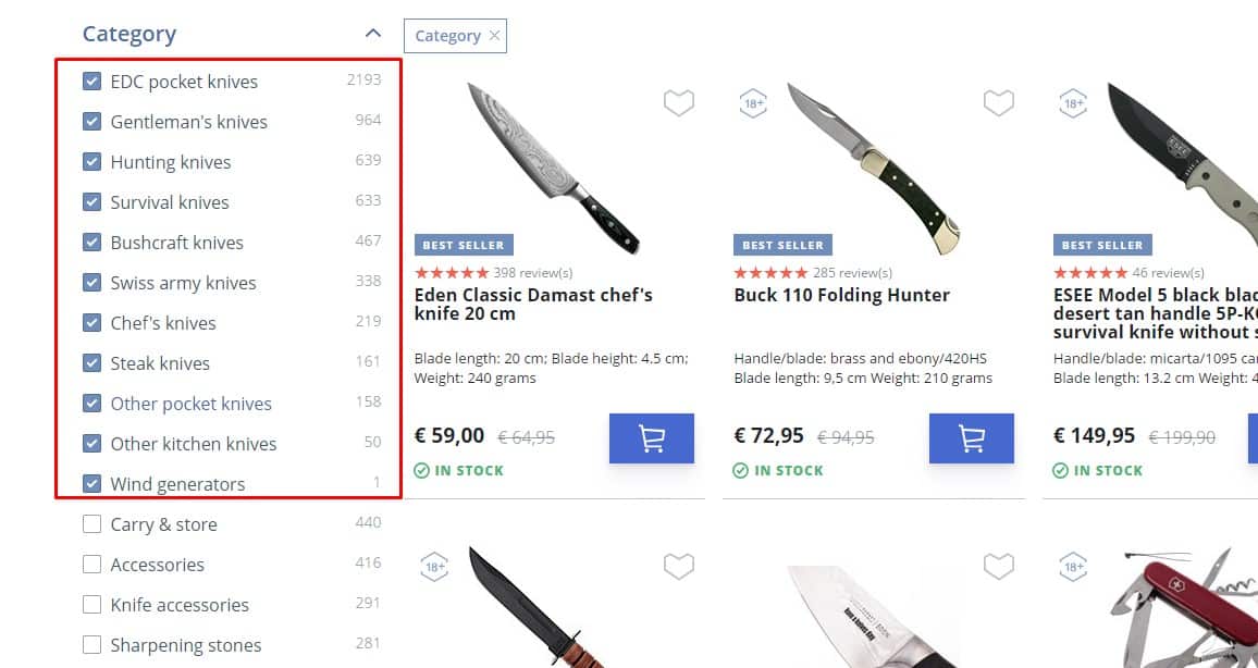
The number of filtered items
 Each filter option should display how many matching items it will return. The same message can be used as a button/link to use the filter.
 -
Ready URL for results
 The page URL should update as filters are applied so the visitor can share or bookmark the exact results.
 -
Quick filter cleaning
 For good UX, after resetting the filter, the catalog page returns to the initial state.
-
Clarity
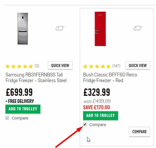 The user can see that a product is added to the comparison. For example, animation of the movement of goods to contrast can show the visitor where he can see the final comparison. It is proved to be good for UX.
-
Dynamic
 The link text changes after a product is added to comparison so that the visitor sees which products he has already selected for comparison. In addition, the ability to add a product to the comparison is available both on the catalog pages and on the product page, and you can remove the product from the comparison in the catalog. There should also be a quick way to remove a product from the comparison list.
-
Visibility
 For good UX, the link to the comparison list should be clearly visible (for example, near the cart).
-
Adaptability
 The product comparison page layout should work with multiple products across different browsers and screen sizes. If the limit is exceeded, don't add more products; instead, show a clear message to the visitor.
-
Focus on popular products
 Products in categories are sorted so that the most popular, best-selling products, products with high ratings, are placed first. This helps the user make a choice when he does not know precisely what he needs and prefers to focus on the choice of the majority. And the goods discontinued are at the very end of the list of goods in the category. This improves UX.
-
Custom sorting
 If needed, the website should provide sorting that fits the target audience and product type. Standard options include:
- from cheap to expensive;
- from expensive to cheap;
- alphabetically;
- by rating;
- the availability of discounts;
- availability in stock.
-
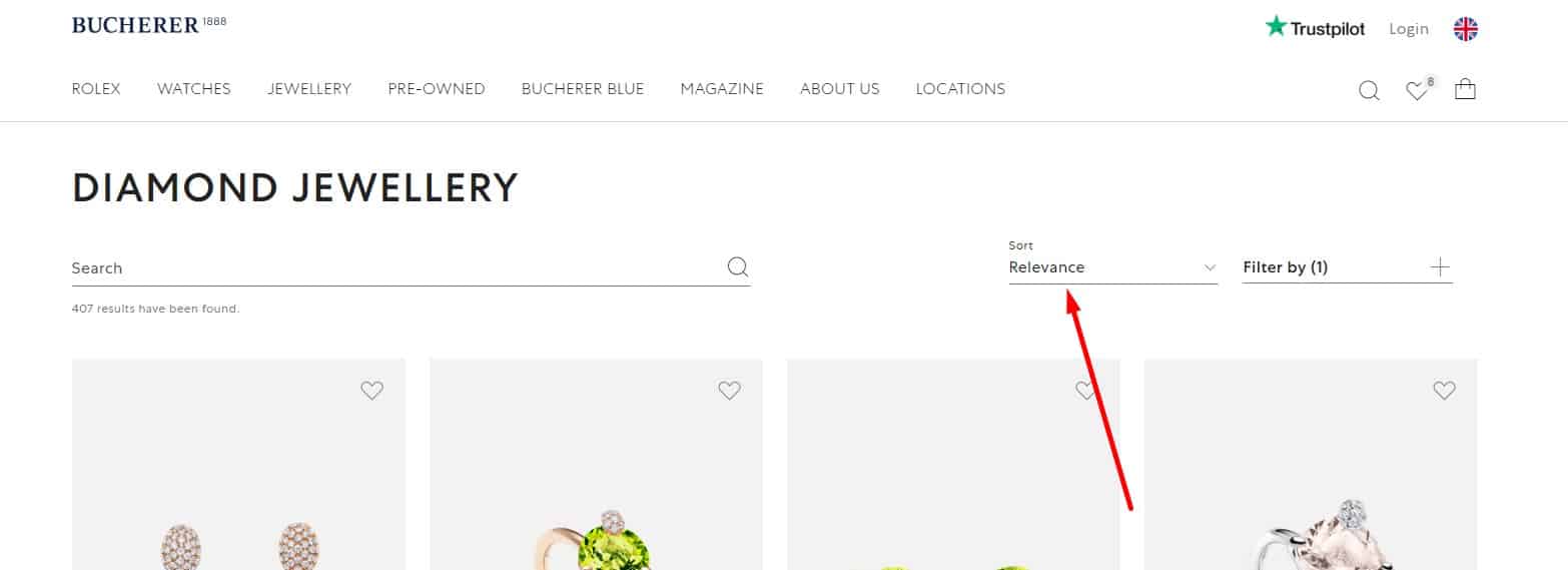
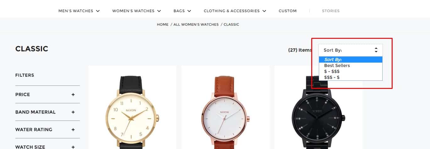
Display Active Filters
 For good UX, the user should clearly see which sorting or filtering criteria are currently active. Thus, the sorting field contains the corresponding value next to the arrow or triangle field, indicating sorting from larger to smaller or from smaller to larger.
💻 User registration
-
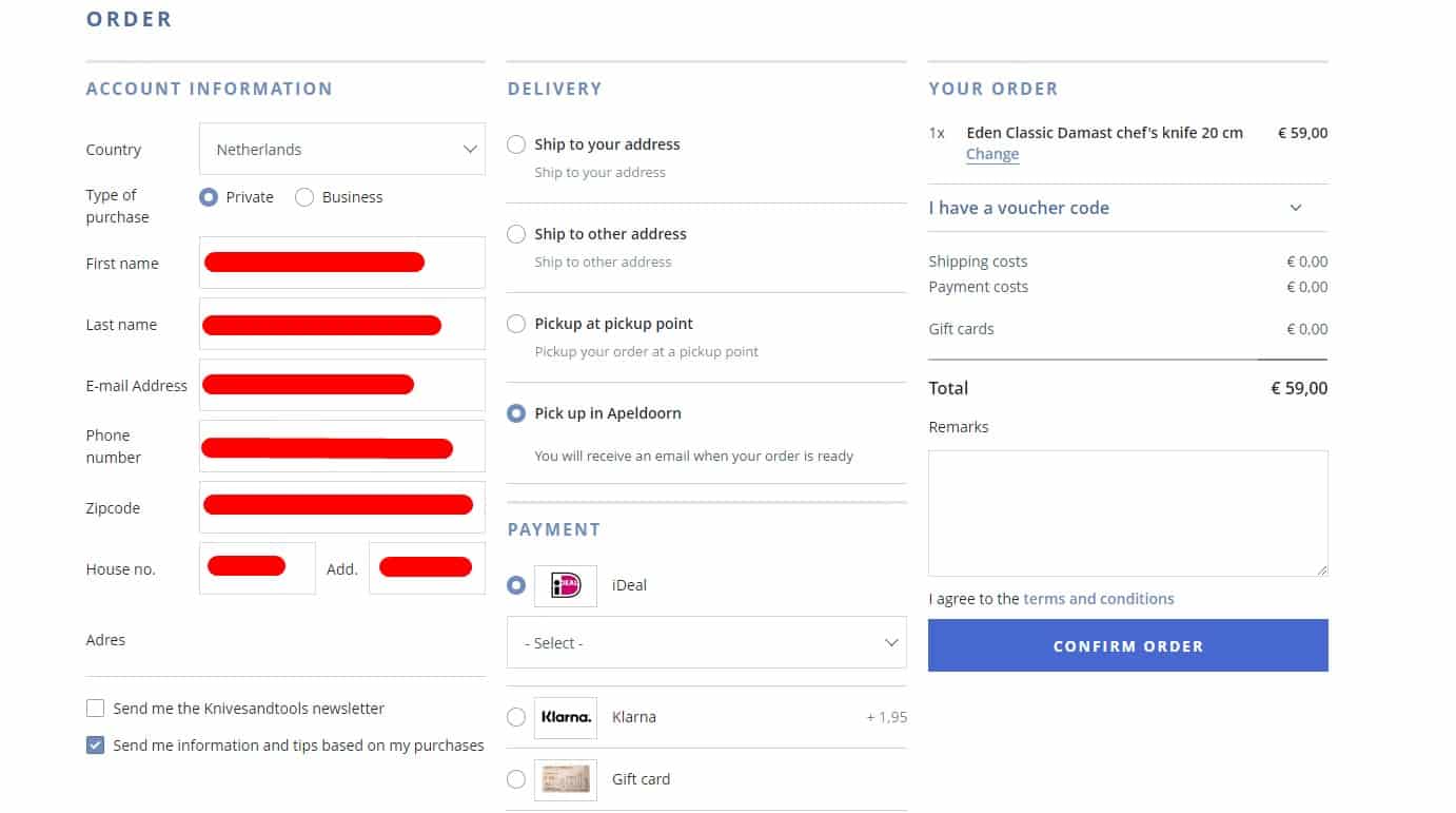
Minimum of fields
 When registering or placing an order, the number of required fields must be minimal: name and a contact (email and/or phone). Each additional required field must include an explanation of why that data is needed. If there are many fields in the registration form, they should be visually grouped and have titles.
-
Clear Marking Of Required Fields
 Required fields should be marked in a familiar way (for example, with an asterisk).
 -
The ability to see the password when entering
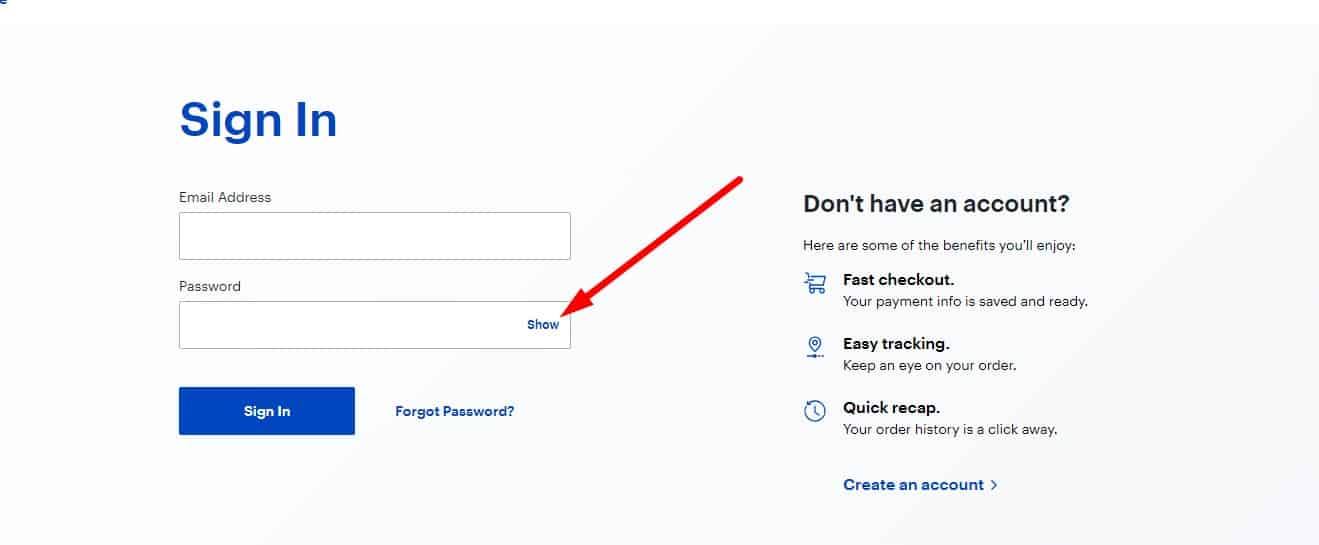 This is especially useful on mobile devices (where typos are common), but it also helps on desktop.
-
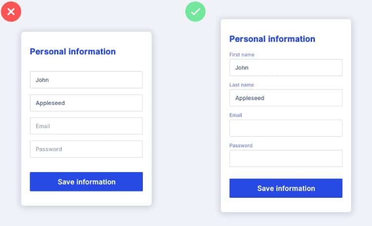
Single-Column Forms
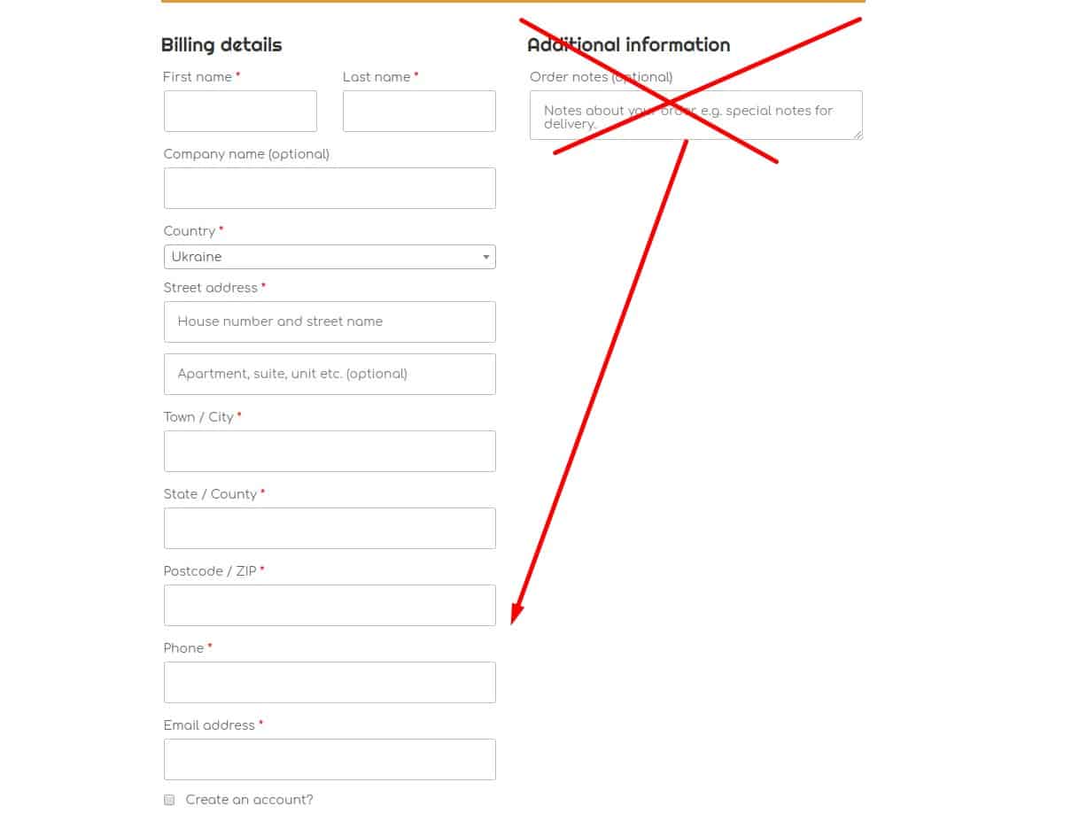 Users often miss fields in a second column.
 -
Easy form filling
 On the registration or checkout page, the user should see only the form they need to complete. If you show multiple form variants on the same screen, users may not understand the difference and may try to fill all of them. Users should be able to move between form fields with either the mouse or the Tab key. When the form opens, the cursor should auto-focus on the first field, and the active field should be visually highlighted.
-
Use Help Text And Autocomplete
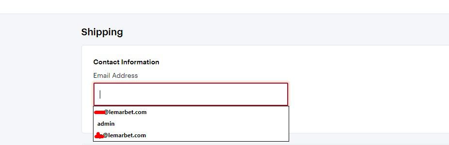 To improve UX, provide short inline instructions for each field. Also allow browser autofill.
 -
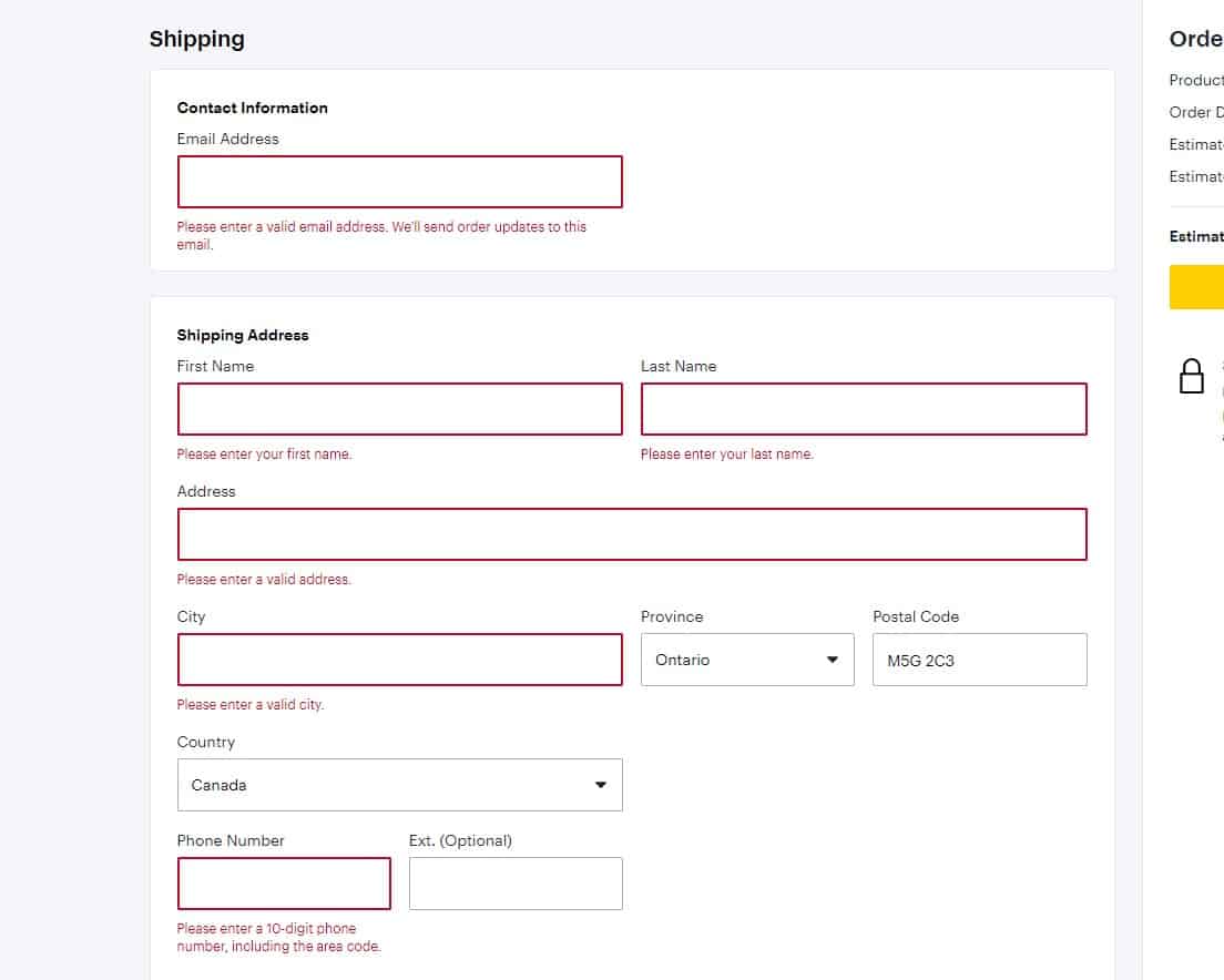
Simple validation of input data
 The website should show the correct input format (for example, date of birth, email address, phone number).
-
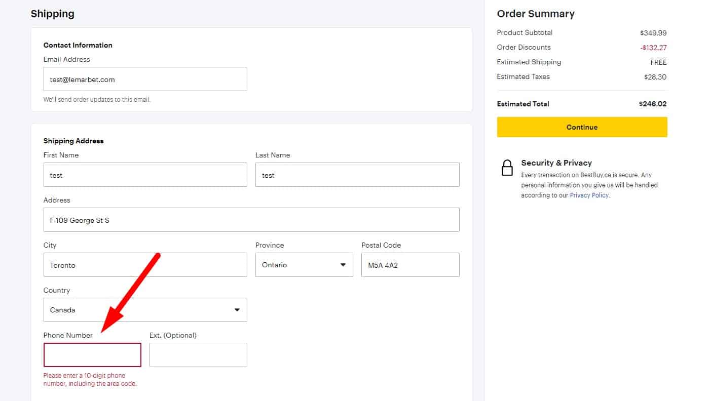
Help when entering the phone number
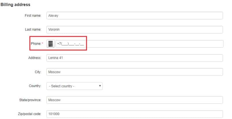 The form should actively help the user enter their phone number (country code, formatting hint, etc.).
-
Instant check
 Each field should be validated instantly without reloading the page.
-
Positive Feedback
Correctly filled fields should be highlighted (for example, in green).
-
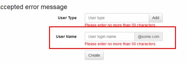
Error notification
If the visitor made a mistake in entering data, he receives a notification about which field he made a mistake in (this field is also highlighted in color), why this could happen, how to fix it. The notification is located next to the error field, directly on the page, not in a separate popup window that forces the user to click 'OK'.
-
No Data Loss On Error
 If one field is incorrect, all correct fields must stay filled. Instead, the data entered by the visitor is remembered, so if registration or checkout is interrupted, the user doesn't have to re-enter everything.
-
Convenient information correction
 In registering or placing an order, the visitor can always go back one step and correct the data.
-
Incentive To Sign Up
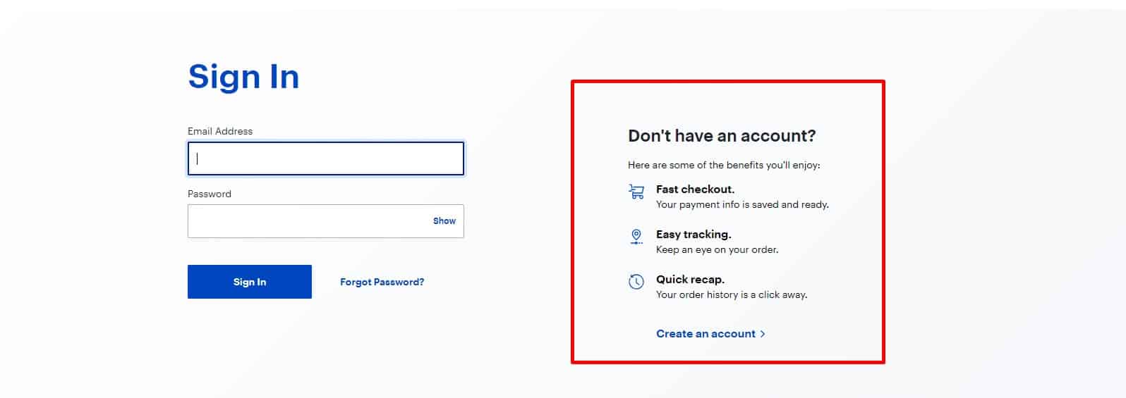 It gives the user some benefits, and information about this should be placed next to the registration button.
 -
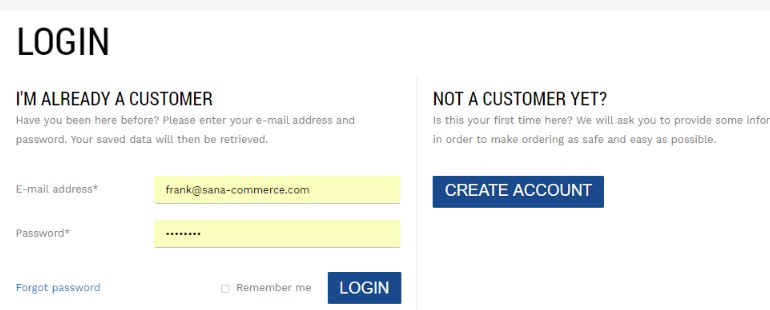
Minimum fields
 We use email as the default username to reduce friction and avoid duplicate accounts and remove the "login" field.
-
Registration process simplification
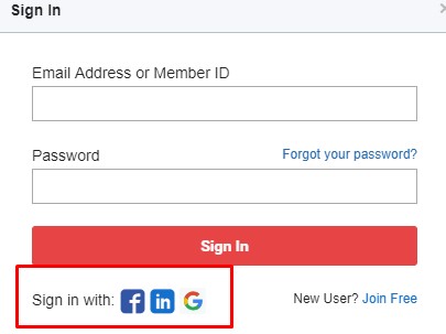 In addition to the standard registration, the user is offered authorization via social networks. It is proved to be good for UX.
 -
Newsletter Subscription
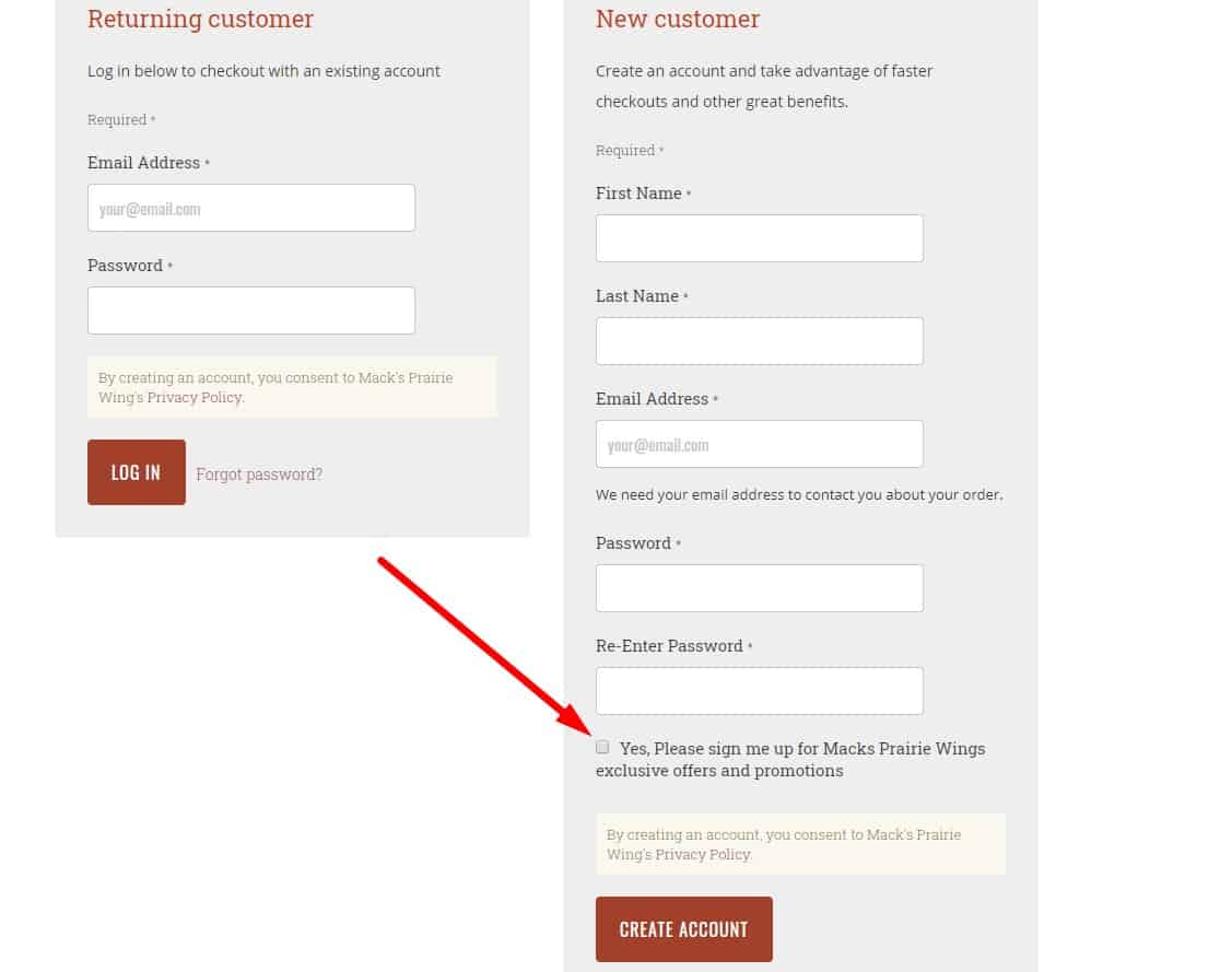 When registering, the visitor has the opportunity to refuse to receive the newsletter - uncheck the appropriate box. Or, which is more respectful to the client, he can check the box and subscribe to the newsletter.
 -
Background registration
It is offered automatically. The client does not need to fill out anything for it: the data from the order (name, email) is used, and the password is generated automatically.
-
Registration confirmation
After registration is completed, the visitor receives a letter with registration data. This also applies to “background” registration.
💸 Usability analysis of the buying process
-
Payment Options
 Informing the user about the possibility of credit card payments improves the user experience.
 -
Choice of currency
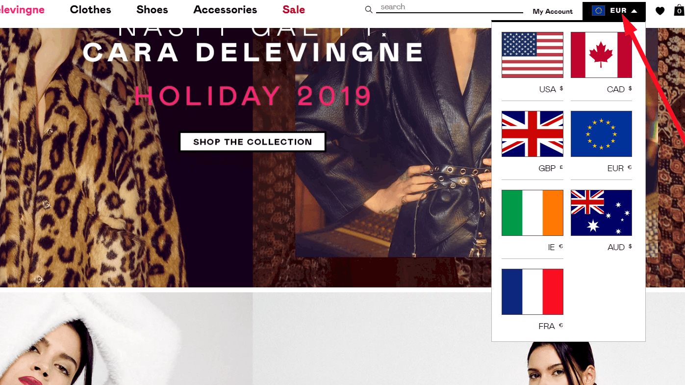 Usability testing shows that if the company provides sales in different currencies, it is necessary to indicate this on the website.
 -
The standard algorithm of sending to trash
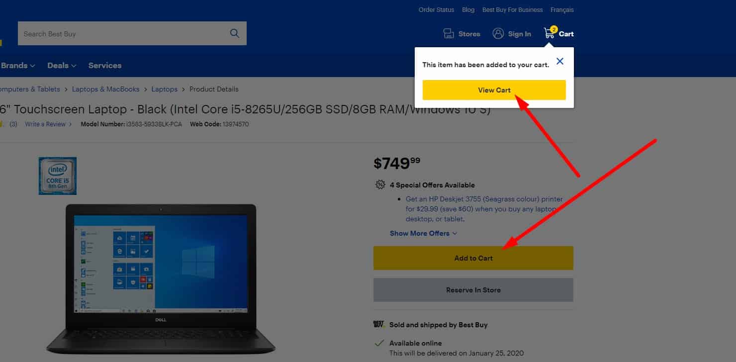 When adding an item to the cart:
- the user receives a pop-up notification about adding the product to the basket;
- the user sees an animation showing the product moving into the cart (which also helps them notice where the cart is located);
- the cart icon should update to show item count and total.
-
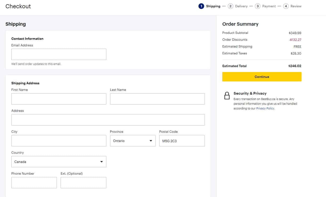
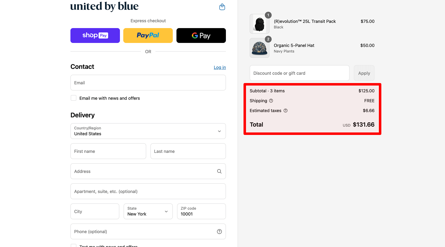
Order Summary Visibility During Checkout
Use a collapsible order summary instead of a constantly visible list—especially on mobile.
- Desktop: a lightweight sidebar summary is fine.
- Mobile: show a sticky subtotal bar with item count + “View order” that opens a drawer.
- In the drawer: editable line items (qty/remove), prices, shipping/tax estimates, promo code; updates in real time.
- Keep it light (small thumbnails), remember open/closed state, and never block form fields.
- Accessibility: focus return on close, Esc to dismiss, focus trap, proper labels (aria-labelledby/aria-describedby), full keyboard support.
Optionally add delivery estimate/returns note and trust badges near the primary CTA.
-
Minimum actions
 If the user is registered, then the address, name, telephone, and other information fill out the order form automatically so that the client does not waste time on that again. In this case, the visitor can always return to the previous stages of placing an order and then continue without entering the data again.
-
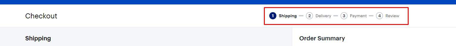
Clarity
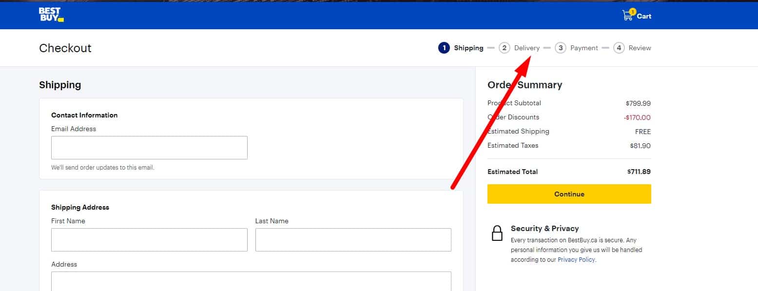 Usability testing proves that in cases where the order is made in several stages, it should be obvious to the user how many stages are left.
 -
Ability to order with our without registration
Suppose the user started entering data without registration but then decided to register – no need to force him to enter it all over again. Instead, entered data is stored, including phone, city of delivery, and pulled up to the appropriate field after registration.
-
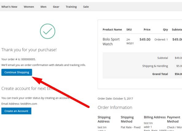
Order confirmation
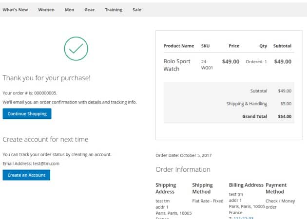 After the completion of the order, the user sees thank you page and explanations for further action on both parts.
 -
Personal account
 If the user is registered, all orders, including completed, are stored in his account, and he can view them at any time. This improves UX.
-
Dynamic modules of purchase
 If the website design involves payment and delivery options, payment options should vary depending on the chosen delivery method. For example, if pickup is selected, there's no need to offer a cash-on-delivery option. Thoughtless actions adversely affect UX.
-
Proof of payment
 If the payment was successful, the visitor receives a message and a link to return to the website.
 -
Minimum of actions
 Usability testing shows that the delivery data for the registered user must be saved so there was no need to re-enter it during the next purchase. This has a positive effect on UX.
 -
Calculate the delivery cost
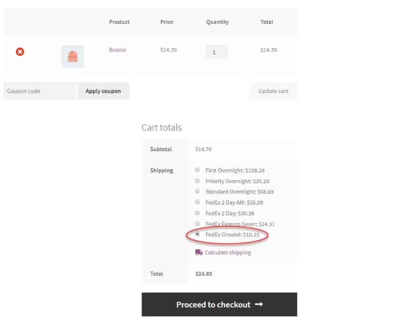 If the website doesn't provide such, connect the link to the calculator on the carrier's website.
 -
Automatic calculation of the delivery cost
 It is included in the total amount of the order.
⚡ Performance / Core Web Vitals
-
Core metrics targets
 Meet CWV: LCP < 2.5s, INP < 200ms, CLS < 0.1. Track both field (RUM) and lab data per template, device, and region to spot regressions early.
 -
Images: responsive & modern
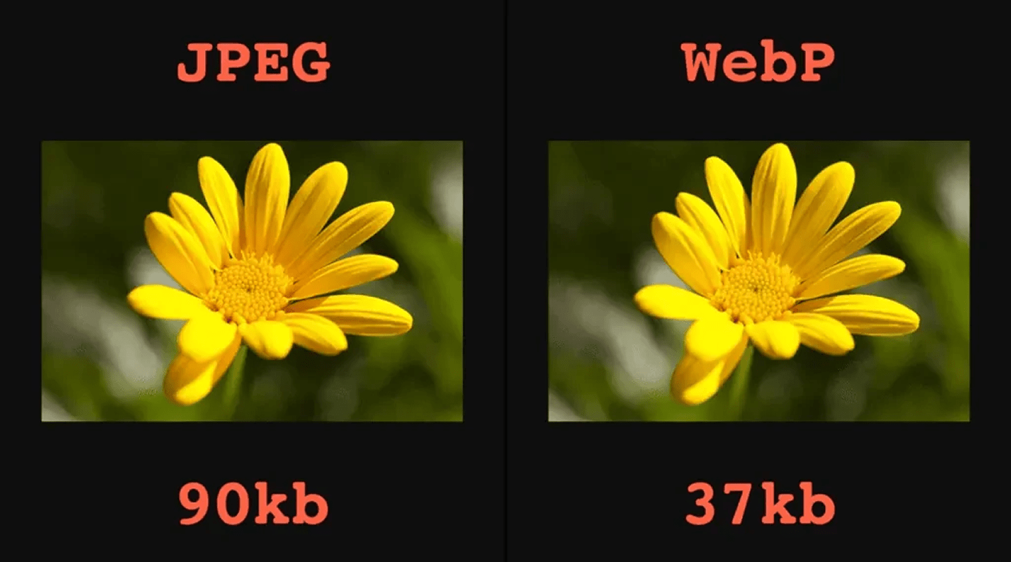 Use
Use srcset/sizes, AVIF/WebP, and proper compression. Addloading="lazy"; setwidth/heightoraspect-ratioto prevent CLS. Use placeholders (LQIP/blur/SVG) for perceived speed. -
Fonts fast & stable
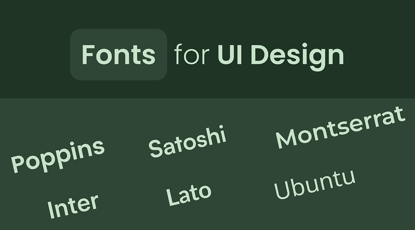 Subset and preload critical fonts, use
 font-display: swap, and preconnect to font hosts. Limit variants and provide safe fallbacks to reduce FOIT/FOUT and layout shifts. -
JavaScript diet
 Code-split and tree-shake; defer/async non-critical scripts. Reduce bundle size and hydration cost; consider islands/SSR. Remove unused polyfills and dead libraries.
 -
CSS: critical first
 Inline critical CSS for above-the-fold; lazy-load non-critical. Purge unused styles and minimize render-blocking resources; avoid huge global files for small widgets.
 -
Caching & CDN
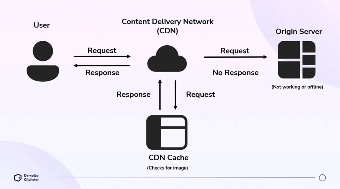 Set strong cache headers; cache immutable assets long-term. Use CDN edge and versioned filenames for cache busting. Consider a Service Worker for offline/instant repeat views.
 -
Network hints & protocols
 Use
Use preconnect/dns-prefetchto critical domains;preloadkey assets (fonts/hero media). Enable HTTP/2 or HTTP/3 and Brotli compression on text assets. -
Fast TTFB
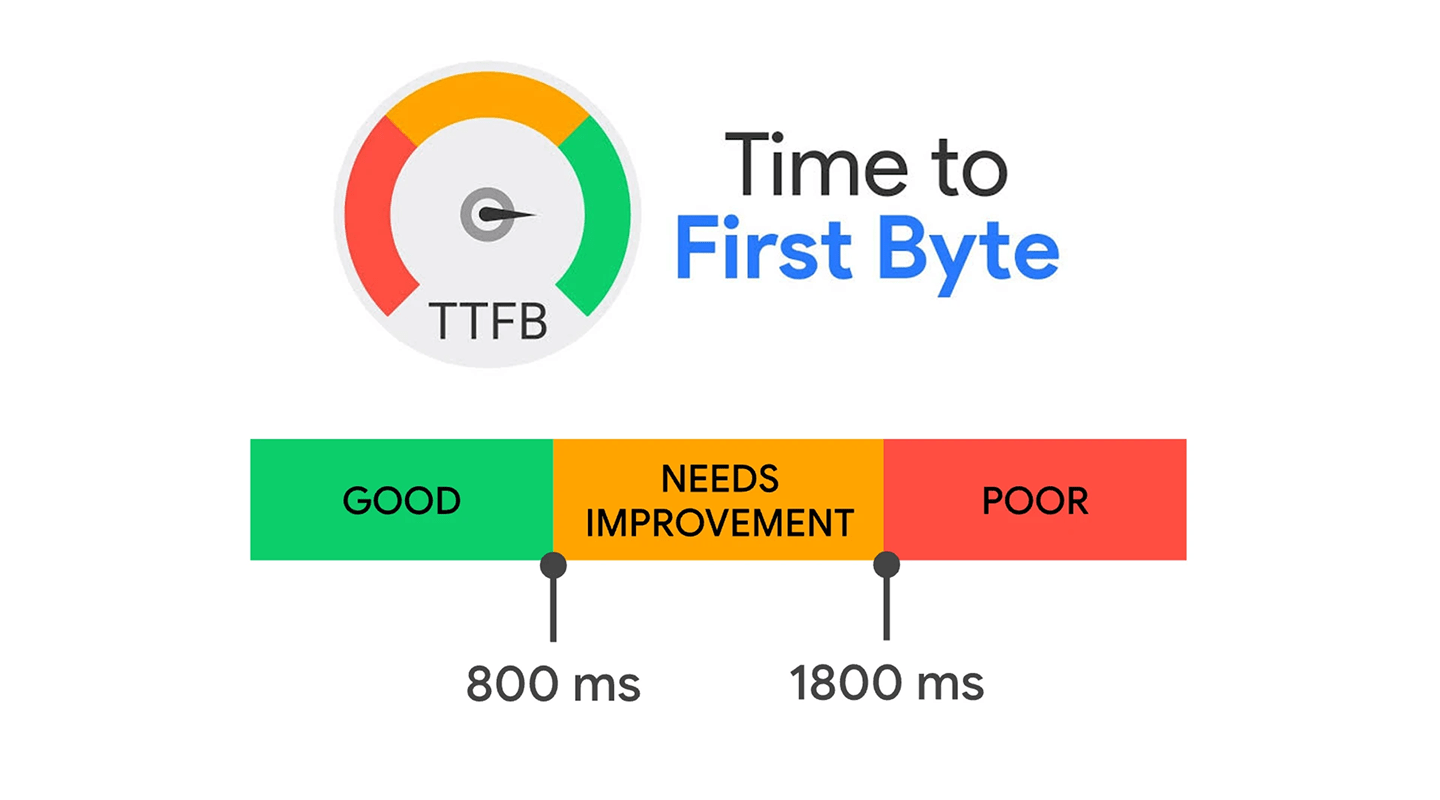 Optimize server/DB and queries, use SSR/edge rendering, and stream responses. Reduce cold-start latency and keep keep-alive settings tuned for throughput.
 -
Third-party control
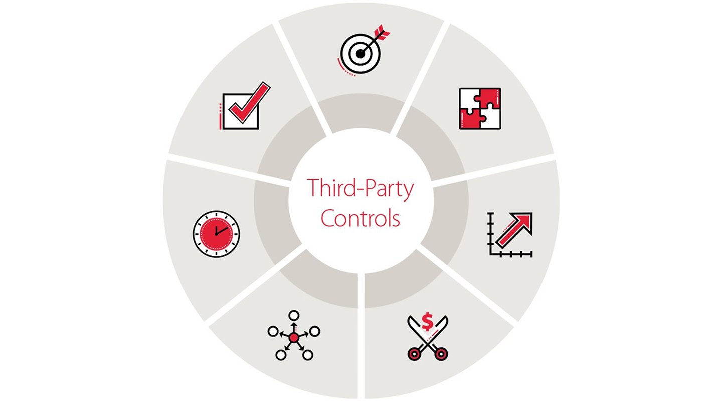 Audit tags regularly; load after consent, with async/defer. Set performance budgets and lazy-load non-essential widgets. Remove unused trackers and duplicate pixels.
 -
Render stability (no CLS)
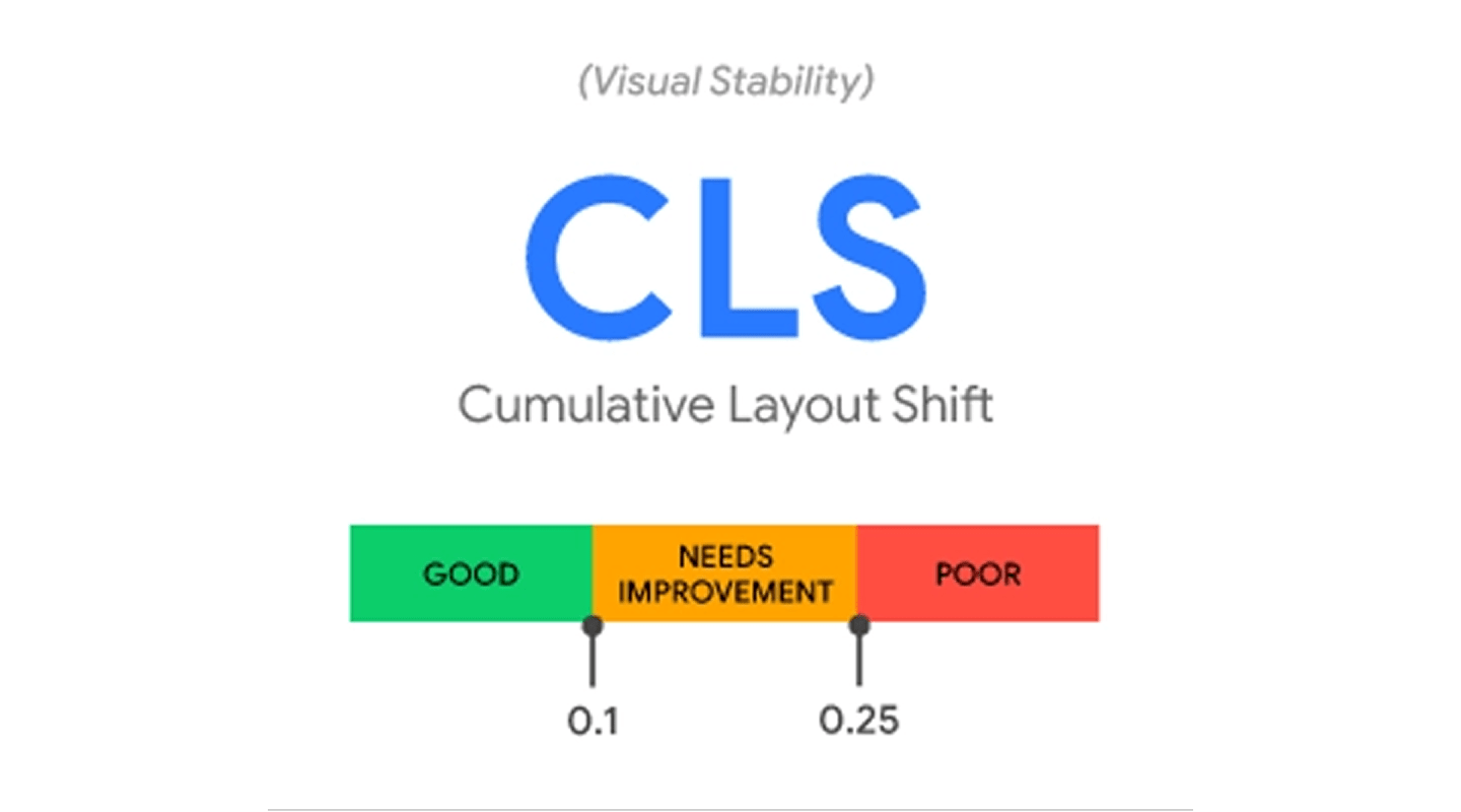 Reserve space for ads/embeds with fixed boxes or
 aspect-ratio; avoid inserting content above the fold after load. Don’t swap fonts or images late without size hints. -
Interaction readiness
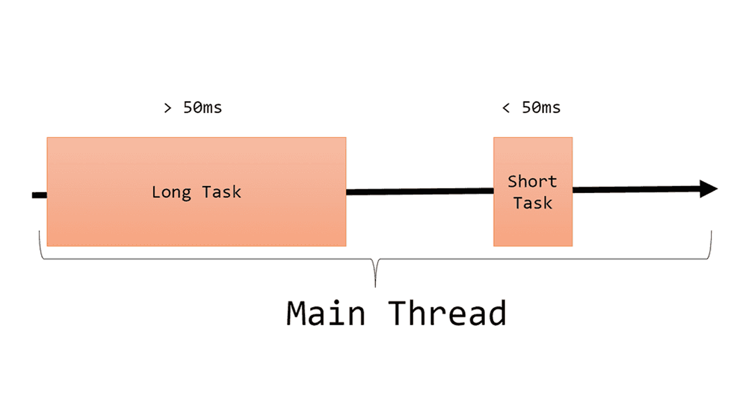 Avoid long tasks (>50ms); break work into chunks and yield to the main thread. Offload heavy computation to Web Workers and schedule non-critical work with
 requestIdleCallback. -
Measure & guardrail
 Set up RUM for CWV, alerts, and budgets. Run Lighthouse/WebPageTest in CI; track performance per template and per region, and block deploys on budget violations.
📈 Additional elements that affect sales
-
Sales block on the website
 Usability tests show that a sales block enhances conversion rates and user experience on eCommerce sites.
 -
Promotions on the website
 According to usability testing, showing active promotions on an eCommerce website improves conversion rate and increases add-on purchases, which improves UX.
 -
Post-purchase review incentive functionality
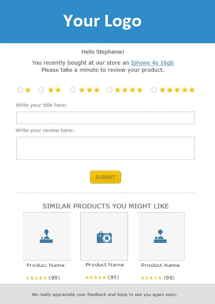 Post-purchase reviews improve engagement with the audience and provide additional product information from real users.
 -
Warranty
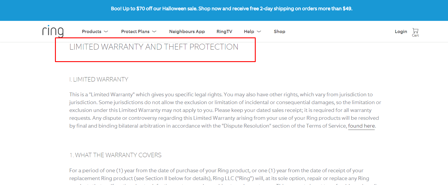 Offering a warranty enhances trust and user experience.
 -
Section “Recently Viewed” on the website
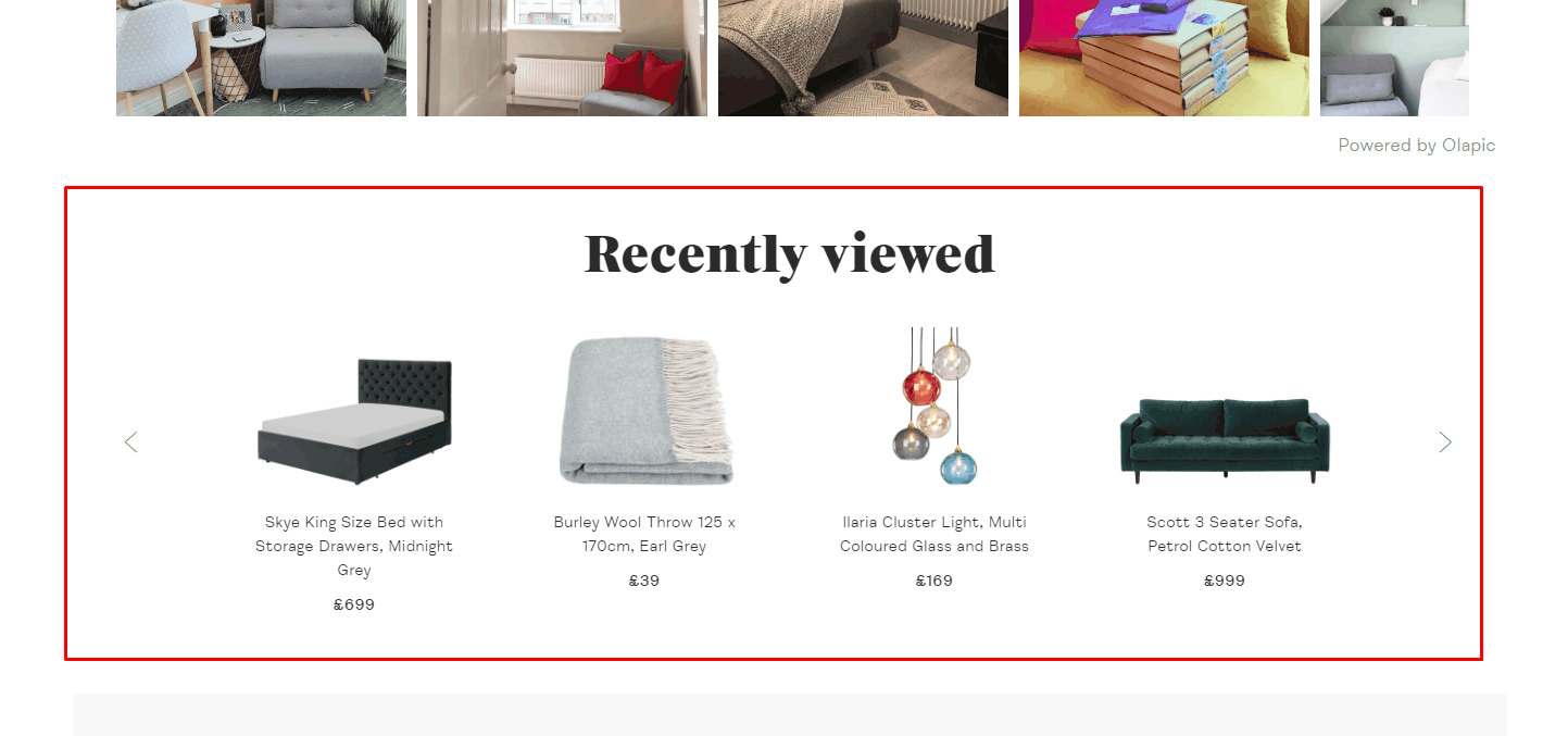 According to the usability testing results, it should be available on any page of the website, so the user could easily find previously viewed products.
-
The ability to make a quick order
 The website should offer a 'buy in 1 click' / 'request a callback' option. According to usability testing, it is good for UX.
 -
Interesting offers
 To optimize user experience, include categories like 'Sale,' 'Promotions,' 'New,' and 'Popular' in the eCommerce catalog.
-
Additional categories provided in the website design
 The categories of an eCommerce website should include links to popular goods that don't have their own category. For example, the routers' category refers to "Routers for home," "Routers Wi-Fi," Routers TP-Link," etc.
-
Label with interesting offers
 If the product comes at a discount or is included in the categories of "New”, "Top Sales," then the product image must have a corresponding label icon.
-
Ease of calculation of the cost of delivery
 We can help with that if the product characteristics include information about its weight and dimensions, ideally about the size of the package.
-
Information about delivery and payment
 Usability testing proves that the website must contain methods of delivery, estimated cost, terms, or references to the relevant section for a good user experience.
-
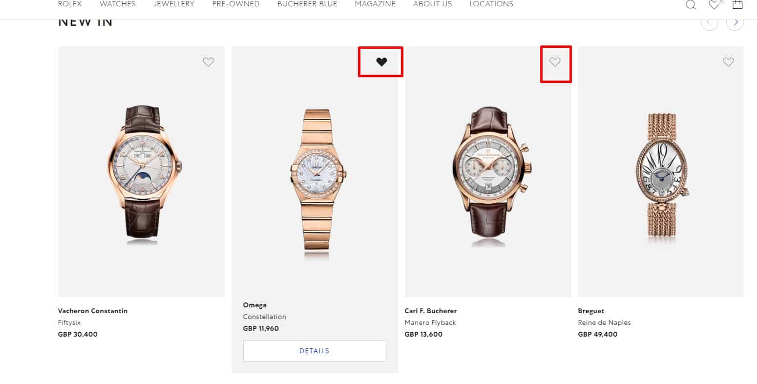
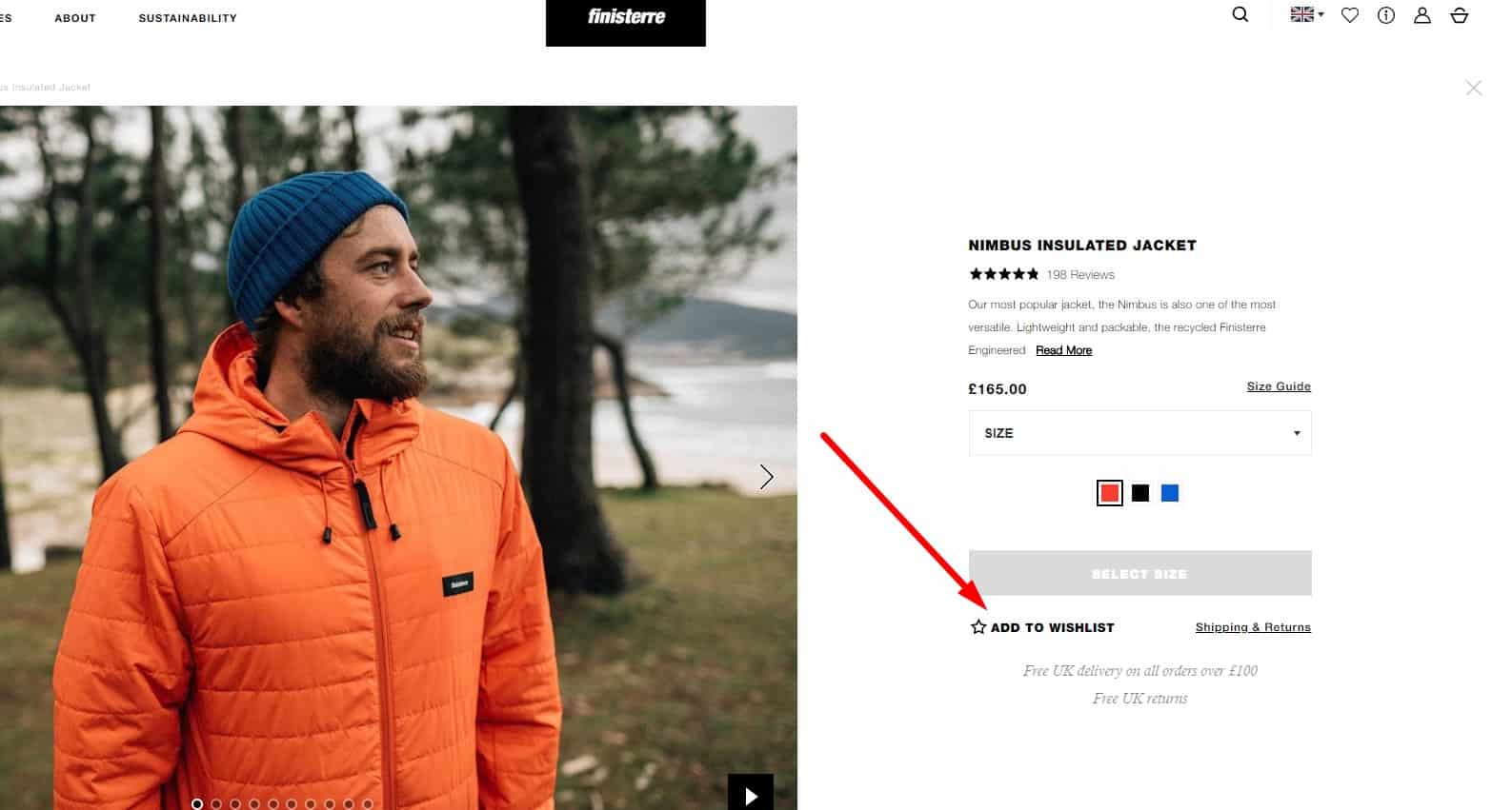
Wish list
 This is an option.
 -
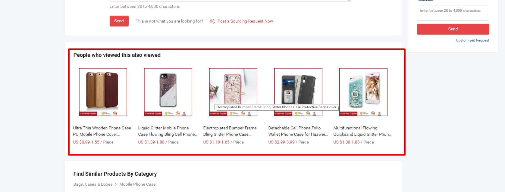
Related products
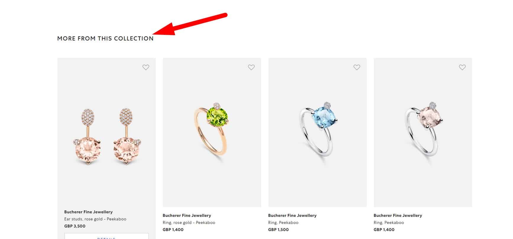 If the product has accessories, nozzles, components that can be purchased separately, they are displayed in the "Related products" or "Frequently bought together."
-
No contrivedness!
"Related products" and "Similar goods" blocks must contain actually related goods, not randomly selected.
🚀 The first touch of a potential customer
-
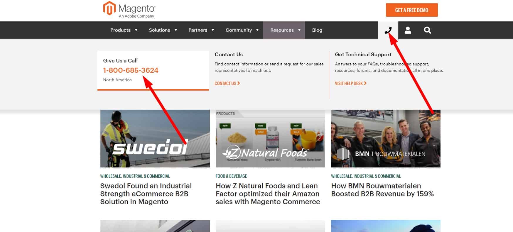
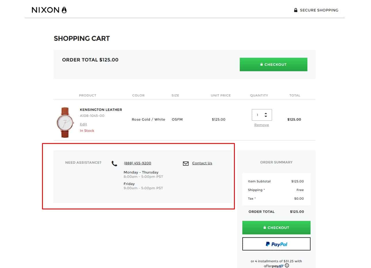
Display a toll-free number
 According to usability testing, a phone number starting at (e.g., 800) increases call conversions. In addition, calling such a number is free for the client, which means that potential buyers are more likely to use it instead of paid numbers.
 -
FAQ
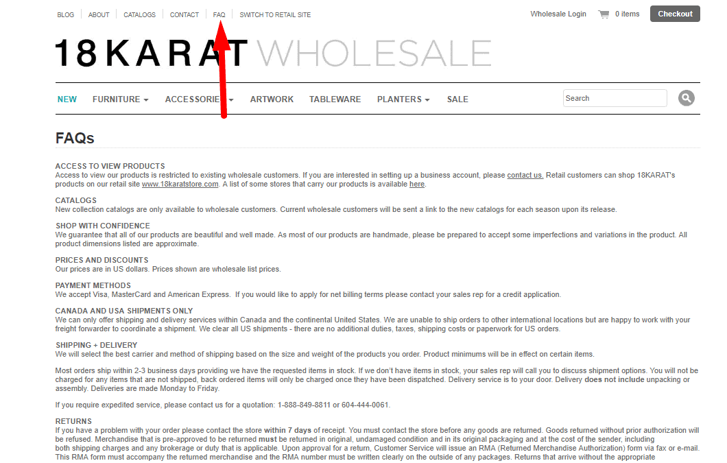 Helps users find answers to common questions.
 -
Minimum Contacts
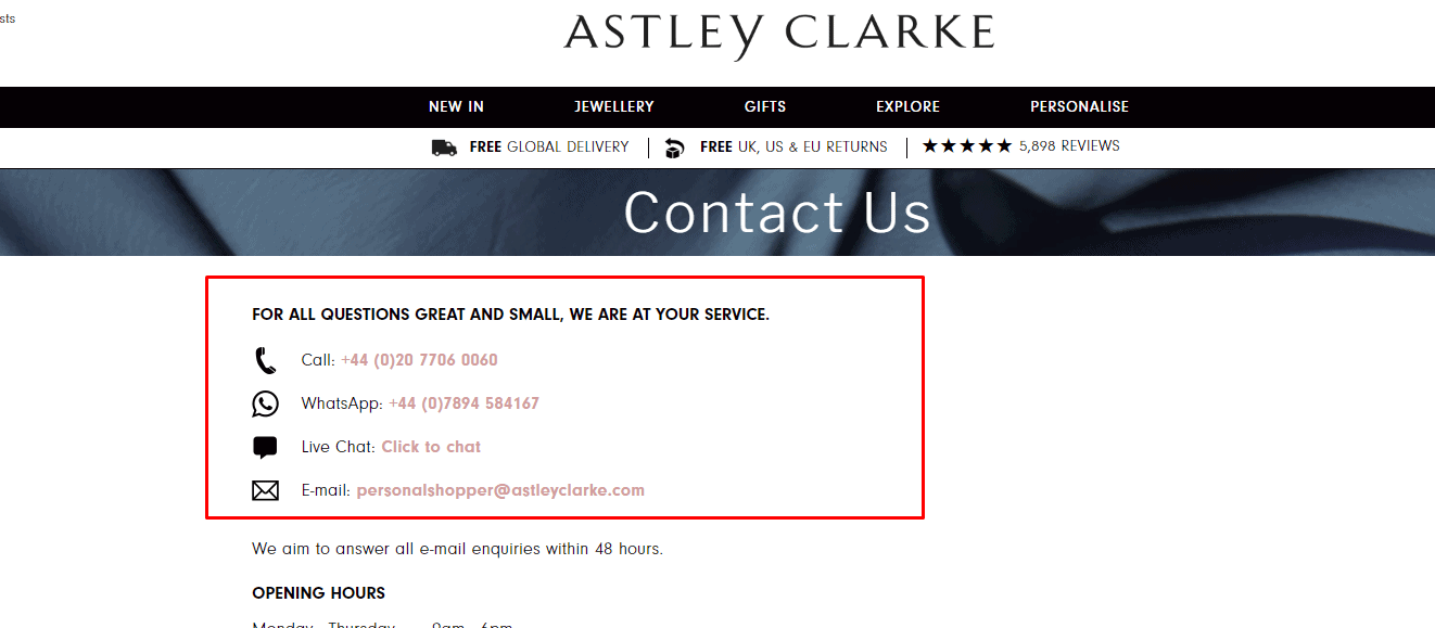 Too many contact options may prevent a visitor from making this choice at all. This negatively affects UX.
 -
Pinning contacts
 Website design provides for the same positioning of primary contacts on all pages. This is good for UX.
 -
Feedback form
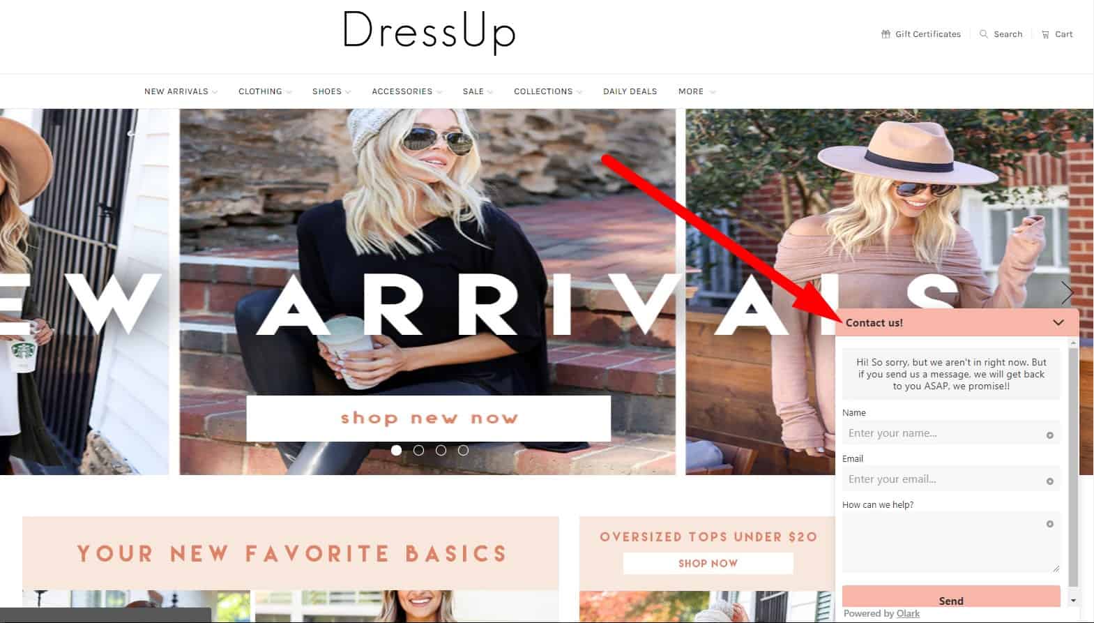 Replacement with the "Contact the Director" form is possible. That won't affect UX.
-
Separate display of contacts for each point
 If you have multiple offices, the website's design must provide information for each of them (use tabs, script loading after you select office from the list, etc.). Nobody wants to scroll through a huge list of addresses on a page (not all users are advanced enough to use Ctrl F).
-
Point selection from both the list and the map
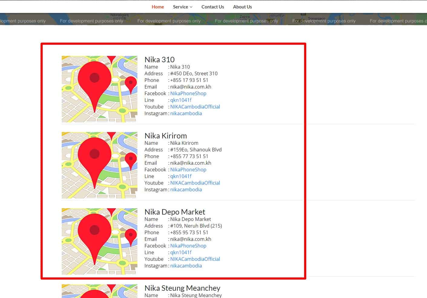 An interactive map is especially helpful for visitors in an unfamiliar city who don't know which locations are closest to them.
-
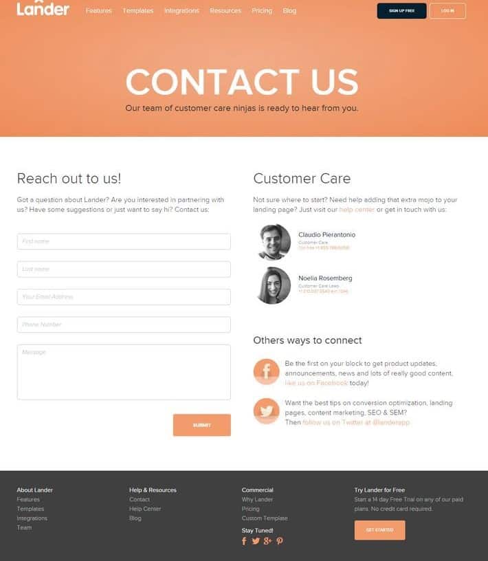
Feedback Form Standardization
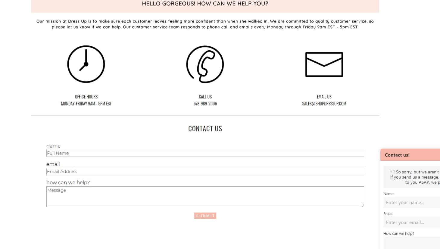 Ensure the contact page layout is intuitive, making feedback forms for questions, complaints, or orders easily accessible.
-
Ease of use
For good UX, the feedback form is available without registration. The visitor is only required to leave his contact information (email, phone). The message's text is not lost if the visitor has incorrectly entered the captcha or accidentally closed the page.
-
Long Messages
 The form allows the visitor to leave a detailed message. When you enter a large text, the form design allows looking at all the entered text quickly – for example, a scrollbar appears on the right to scroll. It is proved to be good for UX.
-
Feedback
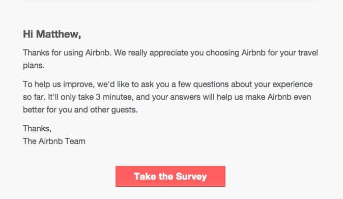 After sending a message, the visitor receives an email stating that his message was received. The email must include information about approximate response time. For example, if the visitor left his contact phone – he gets a text message on his mobile.
-
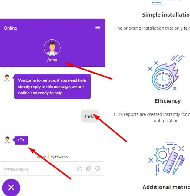
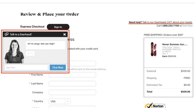
Accessible location of consultant icon on the eCommerce website
 It is located in the obvious area of the website for better UX. However, it does not cover the content either on desktop or mobile devices, does not interfere with the visitor's interaction.
-
Available 24 hours a day
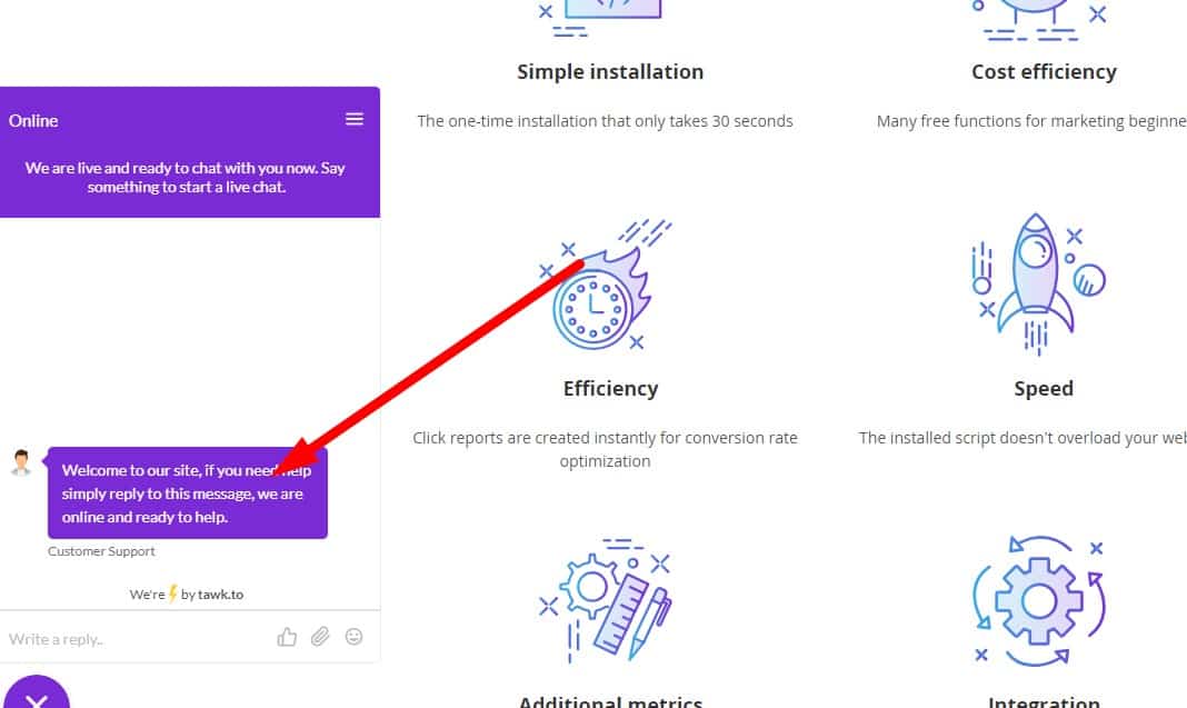 Usability testing shows that for good user experience the website must provide the opportunity to contact their support both in working hours and after hours. Chat must be provided for that purpose.
 -
Response Timeout Information
For good UX, online consultant (chat support) informs the visitor about approximate response time.
-
Feedback if no operator
 When sending a message, if the operator is offline, the visitor is suggested to leave his contact (email, social network, number of the messenger) so the company could contact him during working hours.
 -
Real employee
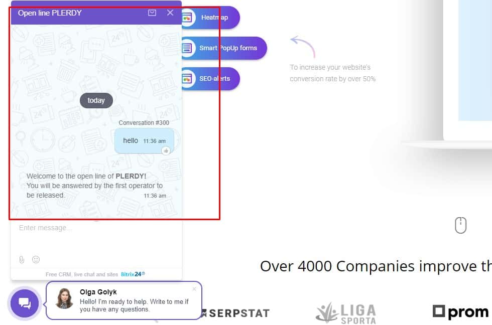 In chat support, the visitor sees a real photo of the operator (not the standard image from the image Bank or the company logo), his name. Scripts (automatic responses) of the online consultant are well thought to avoid any awkward answers, unpleasant experience of communicating with the bot, etc.
 -
Instant interaction with managers
 The basket provides an opportunity to contact managers and get help if something is unclear during the purchase.
 -
Quick help
 Based on the results of usability testing, the client is offered assistance in placing the order at all stages:
- title chat support/online consultant changes its caption, for example, "Need help with placing an order?";
- Obvious location of the Manager's contacts and offer to call/contact for help.
-
Help when error
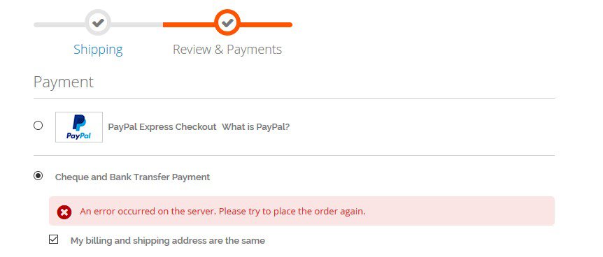 If an error occurred during payment, a possible reason for the failure is indicated, and a retry is offered.
🧱 Website structure as part of usability
-
The standard layout of the key elements
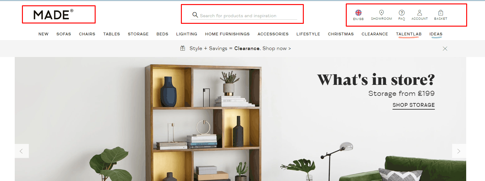 Usability testing shows that all of the standard elements should be at the usual places (the principle of "don't make me think"): a. company logo in the upper left, b. contacts – top right, c. the search bar at the top left or top center.
 -
Tuning F Scanning Patterns
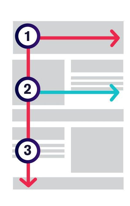 Our gaze slides from left to right therefore the most significant content must be placed on the left.
 -
Compliance with the F-scan pattern
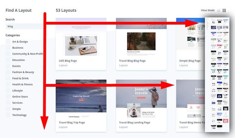 A more advanced level is the location of the most important elements (USP, search bar, contacts, article headings) on the page in the letter F. This is how the user's view slides, according to usability testing. The most prominent place in the upper left corner.
 -
Thoughtful arrangement of blocks on an eCommerce website
 We place them on the first screen so that the visitor sees that there is also something interesting below. In this case, the visitor will scroll down the page. If, for example, you place an empty strip along the edge of the first screen, the visitor will decide that there is nothing below.
 -
No wide horizontal scrolls
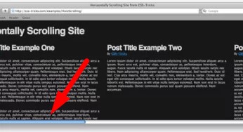 According to usability testing, they can be perceived as a barrier and the user will not scroll through the website page.
 -
Clickable breadcrumbs
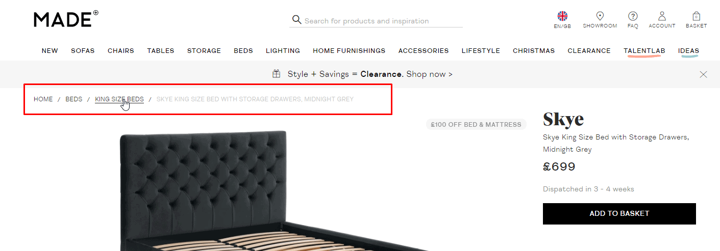 They help the visitor to understand which subsection of the site he is in and how to go to the higher sections in one click.
-
Well-thought-out internal link network
To ensure a good user experience, all the pages of your website should have links to other pages – none of them should be "dead-end."
-
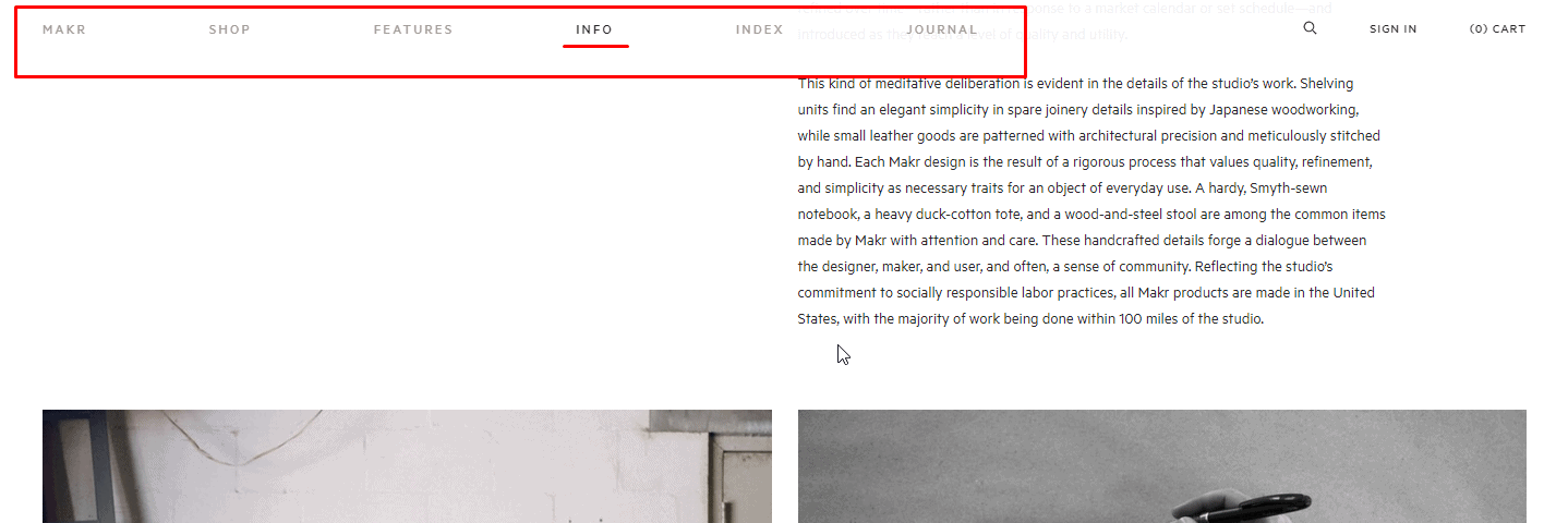
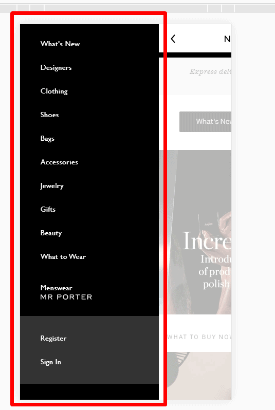
End-to-end website menu
 For good UX, the main menu of an eCommerce website should include contacts, delivery, and payment, product catalog, services, or other main sections. So the visitor could find the basic required information. in 2 seconds.
 -
Main Menu Availability
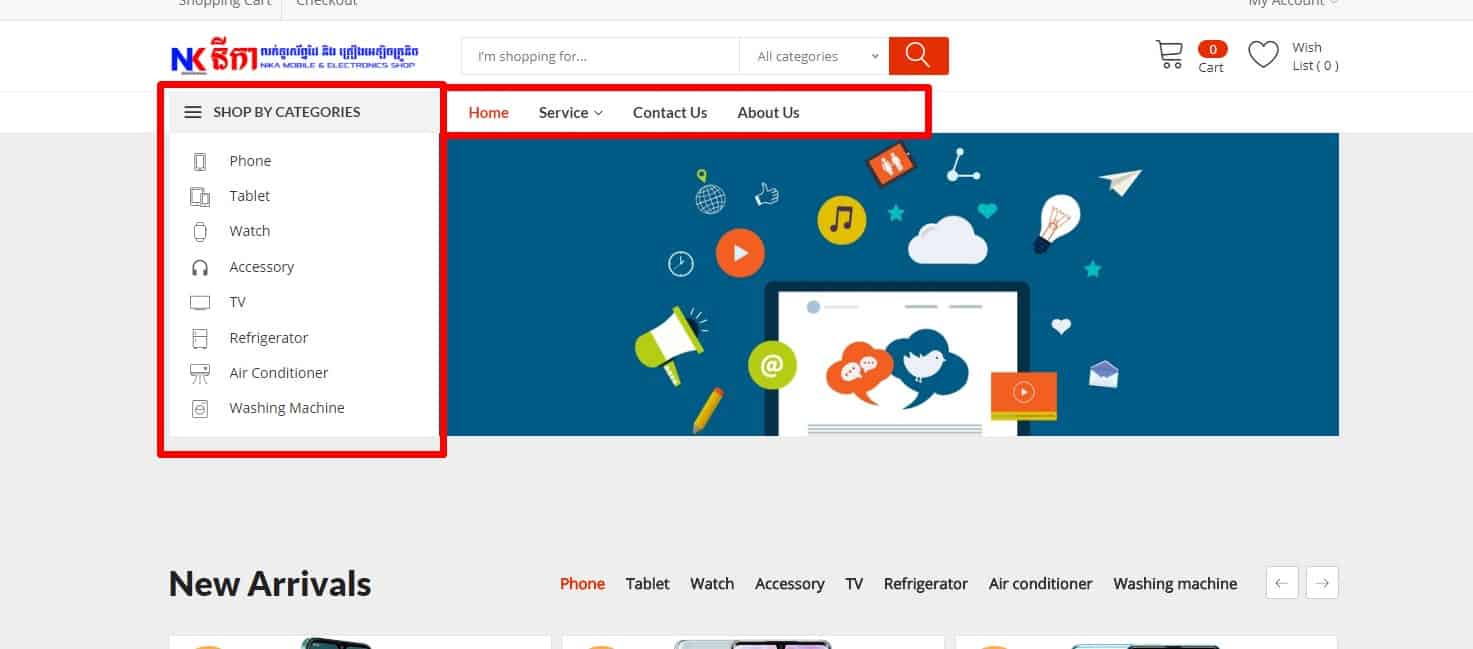 Usability testing proves that the main menu of an eCommerce website must be in the header or just below it and duplicated in the footer.
-
Highlight the item on the website where the user is right now
 This item must always be highlighted and disabled (not to reload the page when clicked).
-
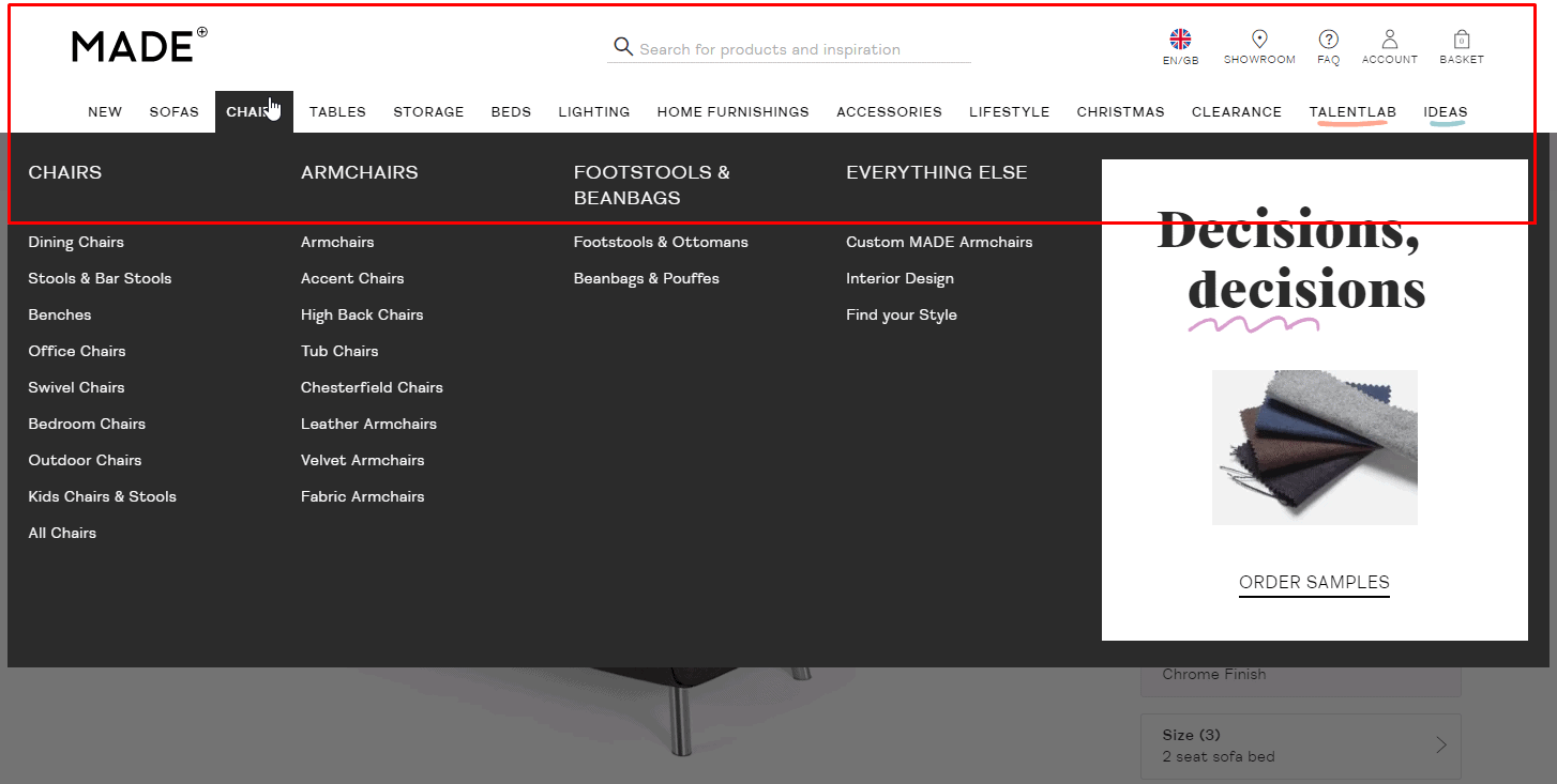
User-friendly main menu of the eCommerce website
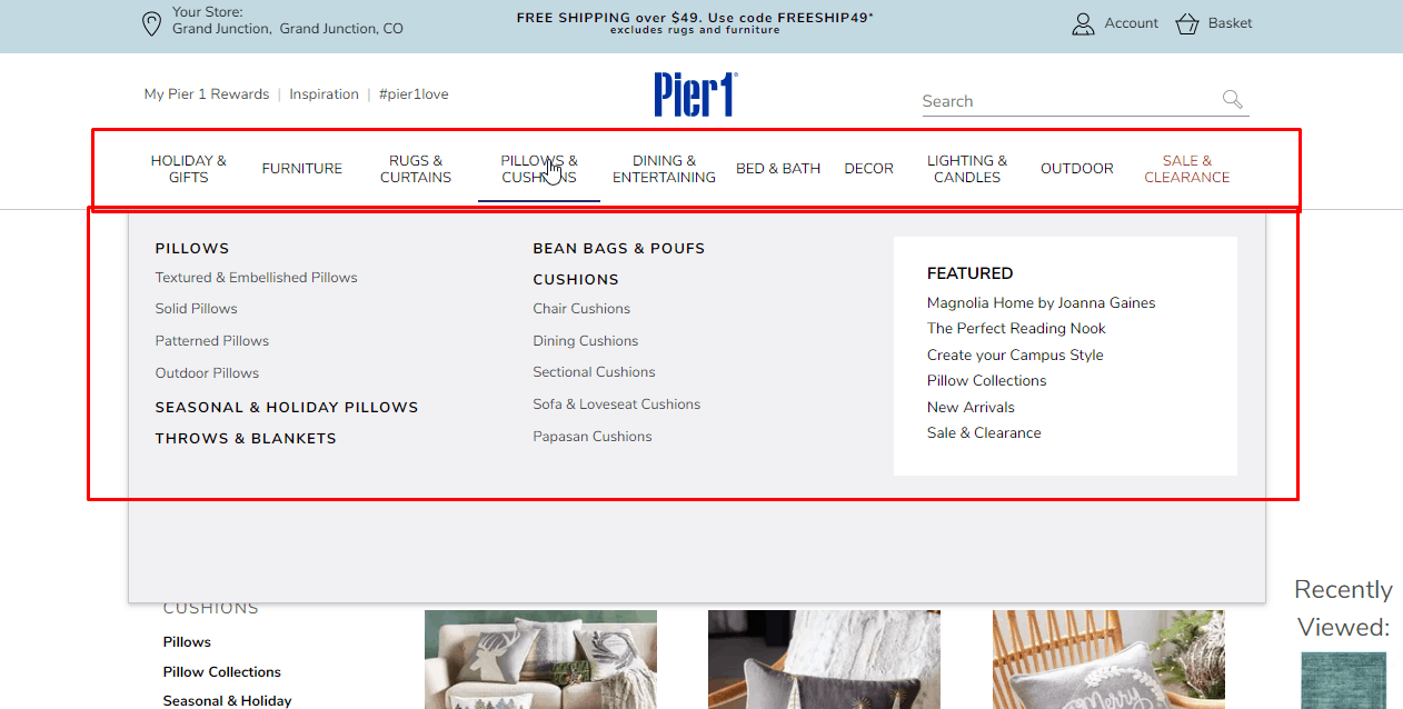 According to usability testing, the main menu of an eCommerce website should have no more than 2 sublevels. This provides a good user experience.
 -
Visibility sublevels
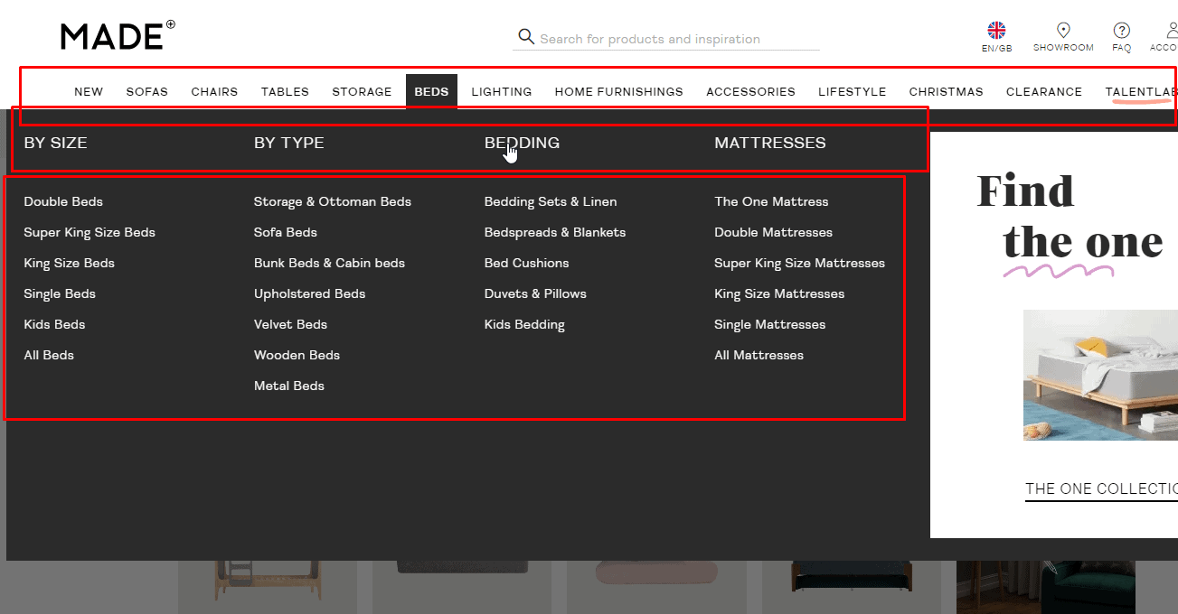 The design of the menu items that have sub-levels must differ from other items.
 -
Lists and tables
Characteristics that can be presented in a list or table should be formatted in this way.
-
Visual hierarchy of headings
For example, using the font-size: heading 1 level is larger than running 2 levels, the heading of the last level is larger and/or fatter than the main text.
-
Categorization of articles according to topic
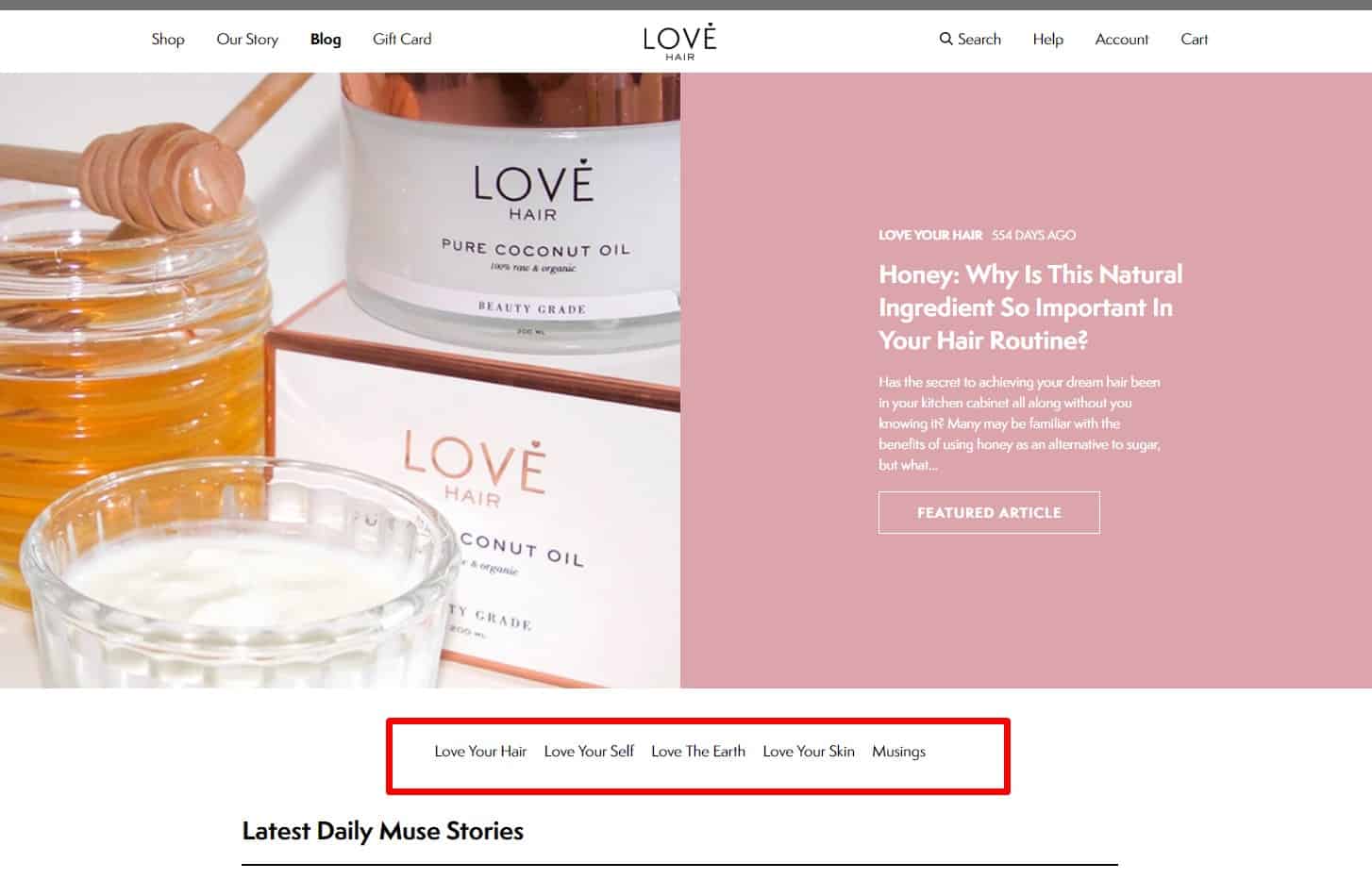 Blog articles have categories that help the visitor find content on this topic. It is proved to be good for UX.
 -
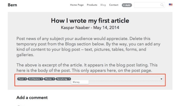
Placing thematic tags
 Blog articles have tags that help the visitor find content on this topic.
 -
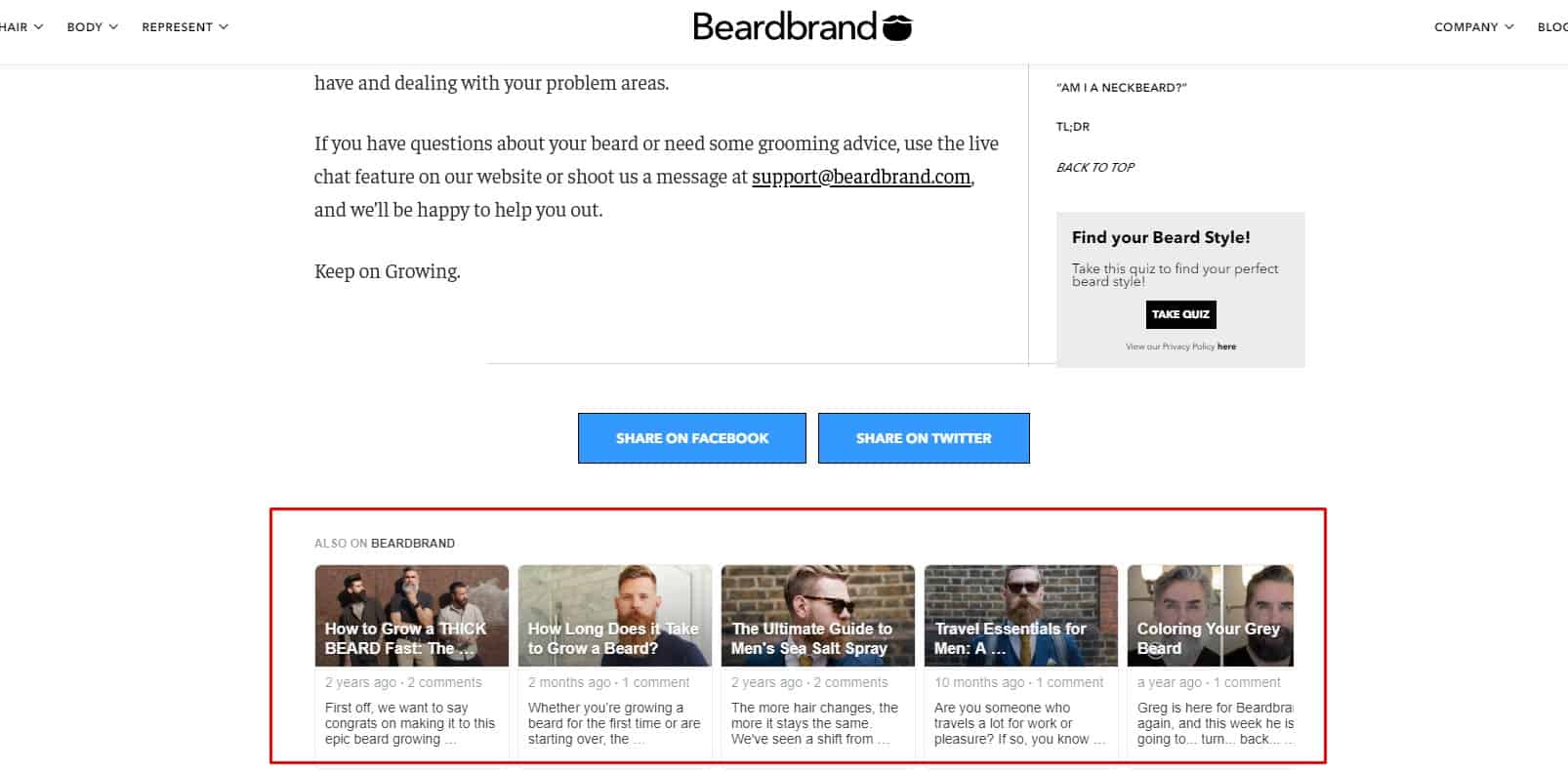
Block on the website with links to articles
 For good UX, pages of products and product categories should have links to useful materials that will help the client choose goods.
-
Block on the website with links to the products
 If an article mentions a product or service available on the website, it should include a direct link to that item. In this case, the client does not have to spend time searching it.
 -
Use "see also"
 If the article covers other topics, an article covering this topic in more detail must be linked.
🗝 Other usability design tips
-
Well-designed functionality of the 404 error page
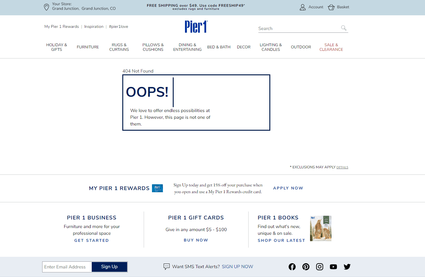 Ensure your website features a detailed 404 error page that explains the error and offers navigation aids like links to main sections, a search bar, and contact details including phone, instant messenger, and email.
 -
Moderation
 Usability tests recommend minimal use of bright colors, large colorful text, and animations in website design to enhance user experience.
 -
Considering the features of color perception when creating a website design
 Choose button and field colors based on common perceptions: red often suggests error, while gray can imply inactivity.
-
Minimize or completely avoid using JS in website design.
Flash is minimally or not used at all.
-
No accumulation of elements
Balance website elements and blocks with empty spaces to prevent cluttered design.
-
The optimal size of clickable elements
 Include adequately sized buttons, links, and banners in your design, ensuring they're large enough for easy clicking without being unnecessarily oversized.
💡 Call to action is not an integral part of usability
-
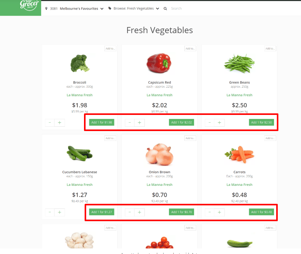
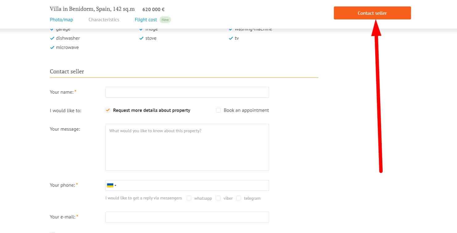
Quick access to the CTA buttons on the website
 The opportunity to buy a product/order a service/order a call back is on every page of an eCommerce website.
 -
High converting CTA
 The call-to-action design on the pages must be visually noticeable and obvious: the buttons are large and signed, links are highlighted.
-
High converting main CTA
 The main call to action on each page of an eCommerce website (the Buy button, the button for moving to the next stage of placing an order, etc.) is always brighter than the others and is user-friendly. This greatly enhances the user experience on the website.
 -
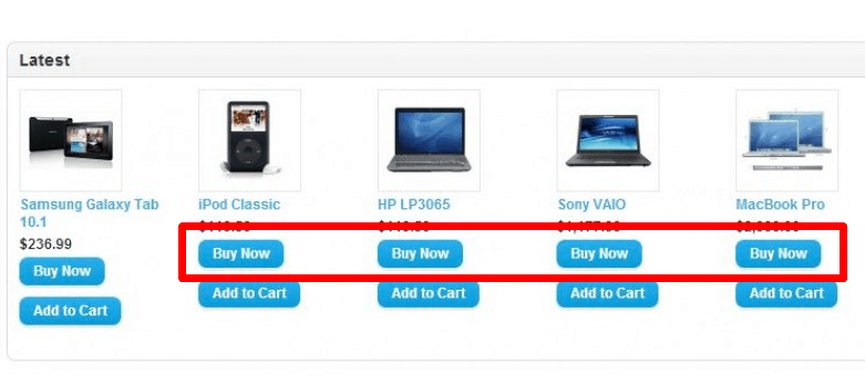
Clear, unambiguous CTA on an eCommerce website
 Button text should clearly indicate the action it triggers, ideally using an infinitive verb like 'buy', 'order', 'download', or 'register'. Ensure it's specific and unambiguous:
- Continue (What does it mean? What will happen when the button is pressed?);
- "Back" (Where to? The user may no longer remember what was on the previous page);
- "Continue," "Finish," and so on."
-
Noticeable CTA button
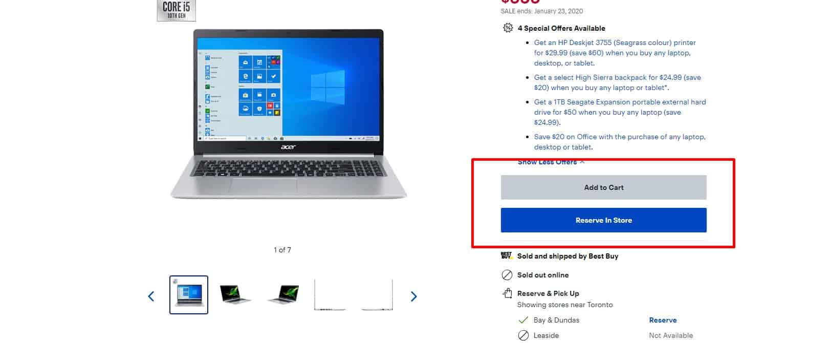 For a good user experience, the design of the call-to-action button ("Buy," "Order," "Call me back") must contrast the primary colors of the website, be large and clickable, located on the first screen.
-
Dynamic CTA button
 Optional: call-to-action button is floating, remains in view when scrolling the page. The call-to-action button changes its color and shape when hovering, and when clicked, the user sees that he pushed the button.
📝 Usability analysis of content
-
Readable text
 If SEO-optimized, a balance between ease of texts, consistency of content, and optimization is preserved.
 -
Short text
There is no "water," lengthy introductions, unnecessary information overloaded with offers. This has a positive effect on UX.
-
Focus on the target audience
The text uses simple, familiar phrases and clear words to the target audience.
-
Simple numbers
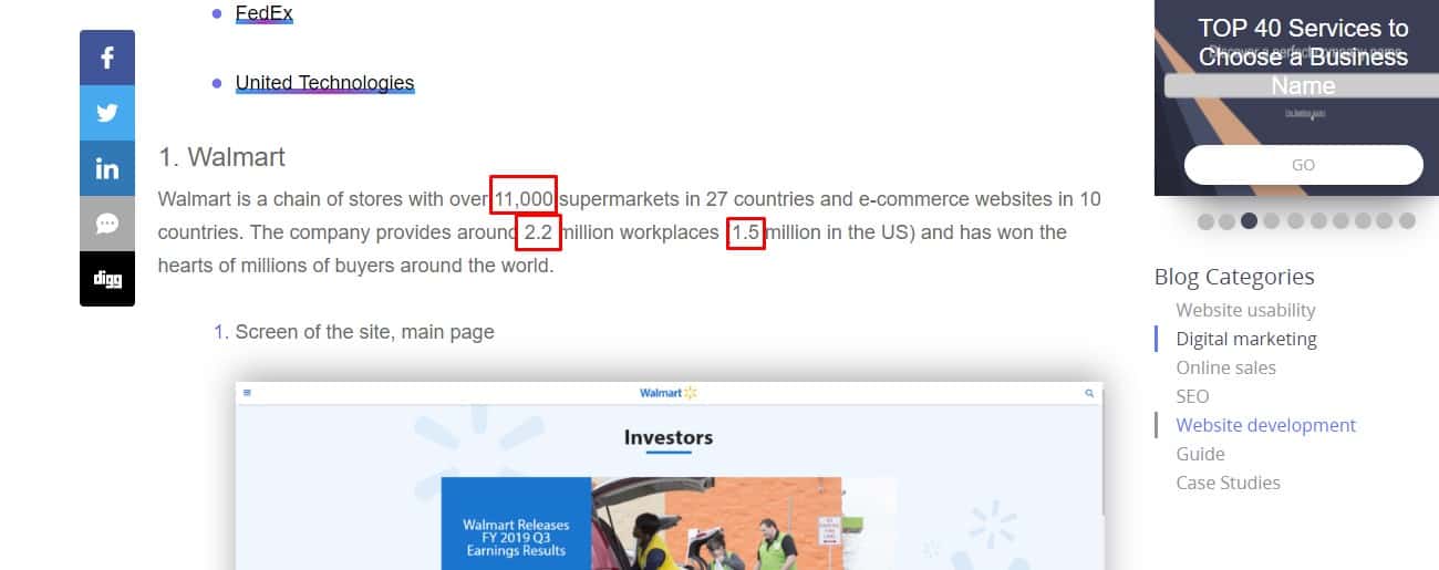 They are represented by figures instead of words to facilitate perception of the text. The digits in the numbers are separated by spaces (example: 1 560 000).
-
Monotone fonts
 All of the pages use uniform fonts. Same font for elements (headers, etc) of one level.
 -
Colors standardization
The design and style of the website require special attention: the font color and background color must be combined. The font and the background match for a comfortable perception and reading. Preferably dark font on a light background. The color of the links is not used for plain text.
-
Optimal typographic unit size
 The main text on the website uses a large font size to comfortable reading it. There are several opinions, but now the standard for plain text is 12 to 18 pixels, the larger font is the modern trend. Consider that different types of fonts may look differently in various sizes.
-
Font choice
 When scaling the page in the browser, the font preserves its readability.
 -
Informative content
 It makes it clear what the block of text is about. Even with a quick look at the text, the subheadings give the visitor information about the article's key points (product descriptions, news).
.
It makes it clear what the block of text is about. Even with a quick look at the text, the subheadings give the visitor information about the article's key points (product descriptions, news).
.
🌐 A well-designed website is important for usability
-
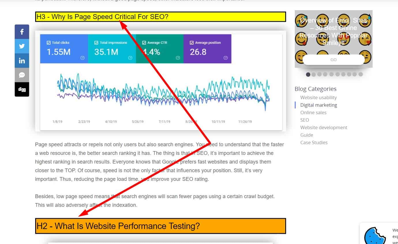
Page speed site
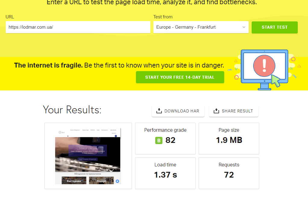 Studies show that approximately 75% of users close pages that load for more than 4 seconds. About 50% of users expect a page to load in less than 2 seconds. In addition, search engines also take into account the page load speed setting.
 -
Responsive Web design
 On July 1, 2018, a website ranking mechanism was launched based on the Mobile-first design principle. This is an entirely new search algorithm from Google. In addition, the page design automatically adjusts to the resolution of the user's device. This eliminates the need to develop a new gadget on sale strategy.
 -
Usability testing for each device
 A convenient design for mobile devices is not always good for the desktop version. For example, a hidden main menu, which is expanded by a button in the upper left corner: on the desktop, it forces the user to make an extra click.
 -
Hide unwanted scroll bars
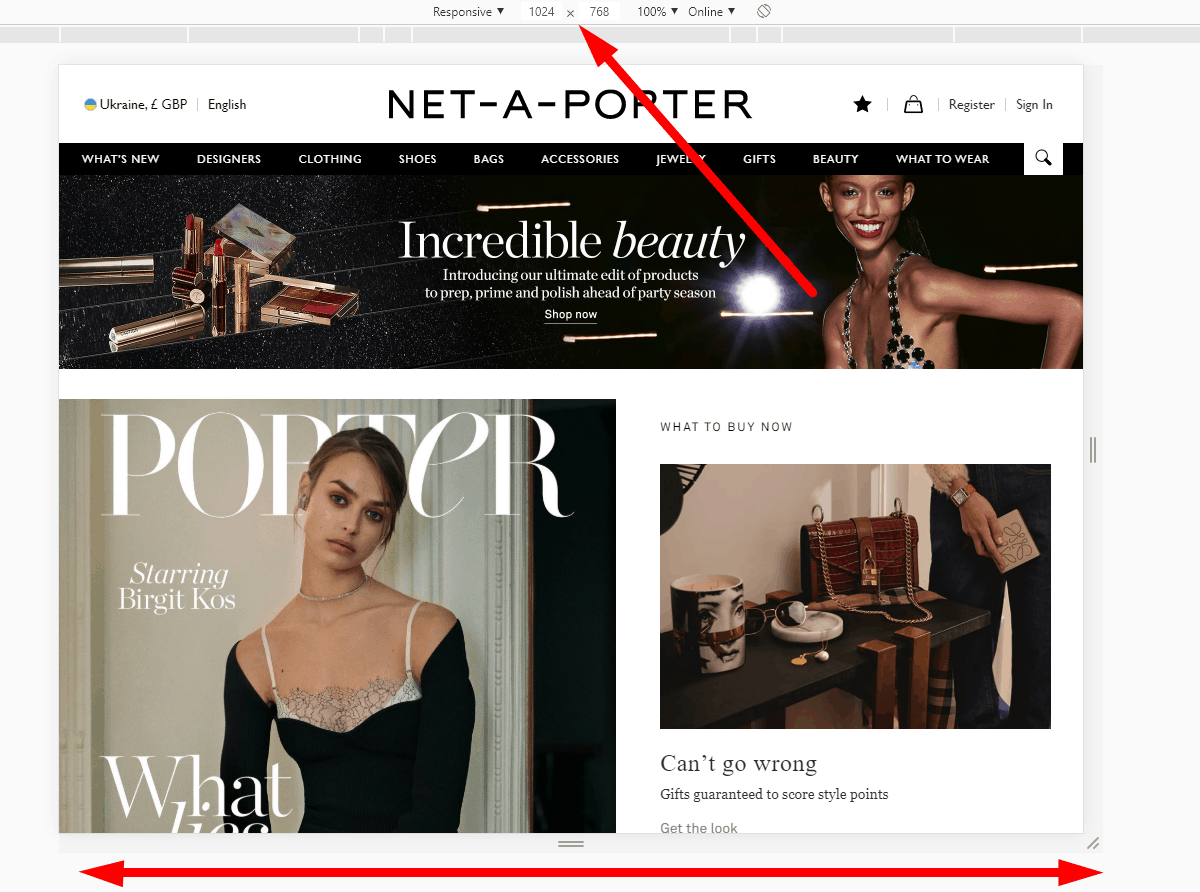 At a resolution of 1024 × 768 in all standard browsers, the horizontal scroll bar does not appear on the website.
 -
eCommerce Website Map
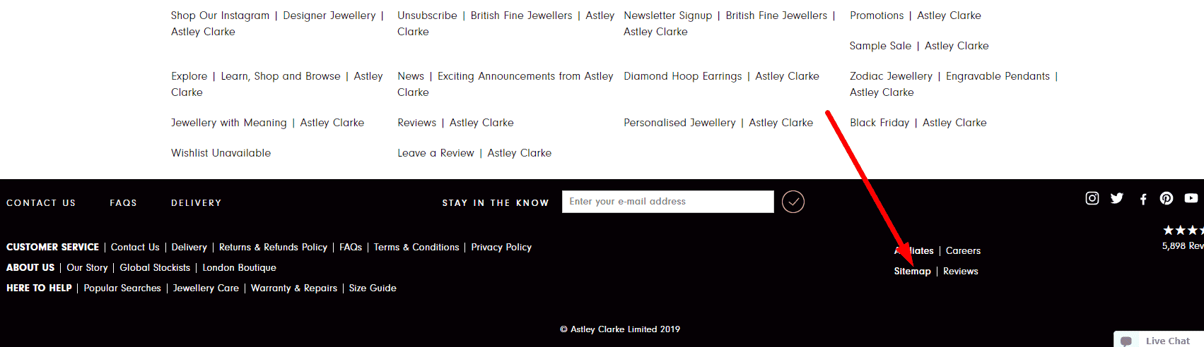 The website must have a pass-through link to the website map (the optimal location is in the footer).
 -
Fast scrolling
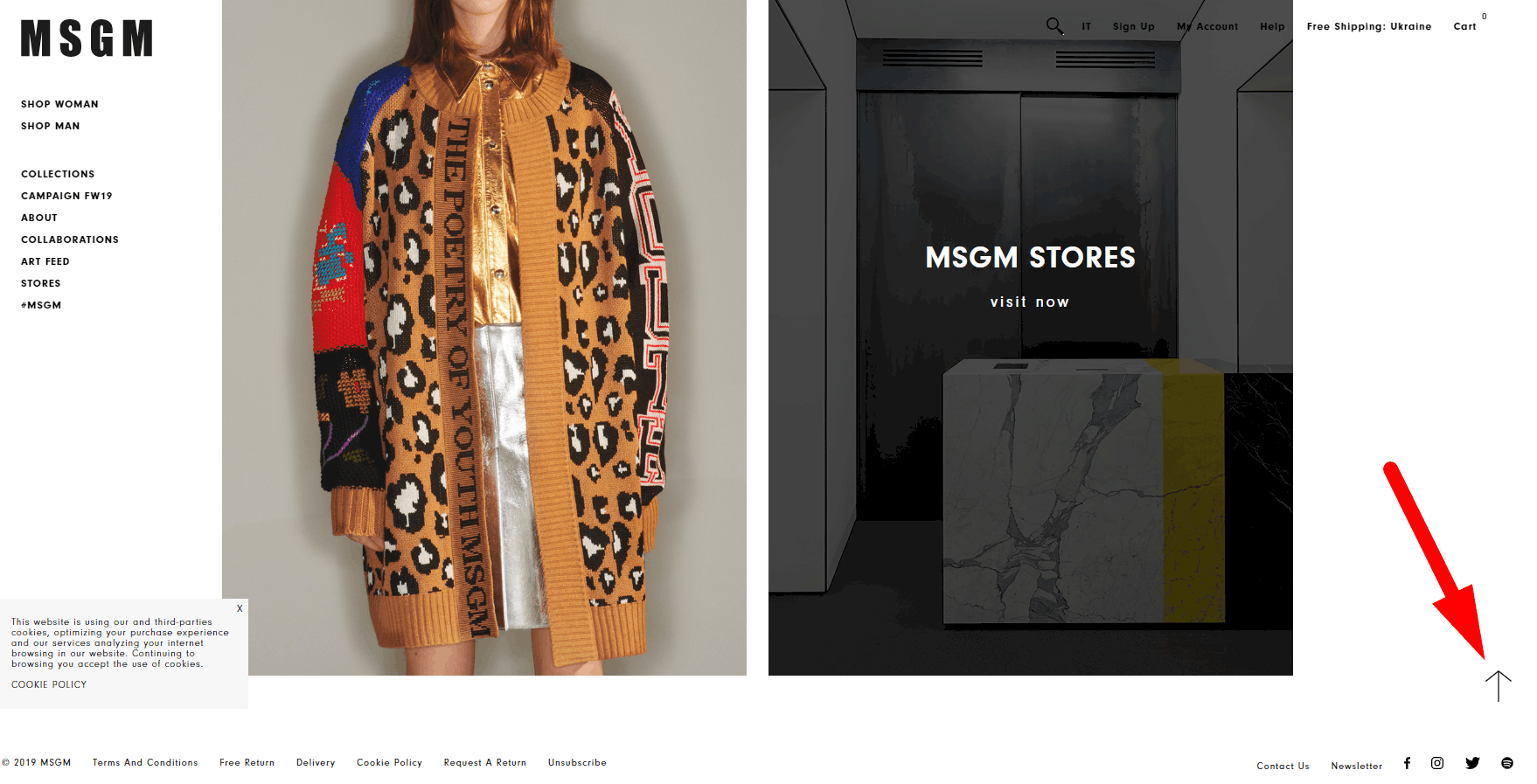 The design of long pages that take up several screens should provide a floating Back to Top button, which throws the user to the first screen.
 -
Setting the cursor under “clickable / non-clickable”
 When hovering over clickable elements, the arrow icon changes to the hand icon. When hovering over non-clickable elements - the icon does not change. This contributes to the user experience.
 -
Deactivate redundant items
Links and buttons that are currently unavailable to the user must be inactive. However, do not hide them - this will confuse the visitor and adversely affect UX.
-
Text format
Usability testing proves that all the contacts on the website, including the header, are text, not pictures, so that the visitor can copy them for good UX.
-
No copy protection
On eCommerce websites, ensure contact details can be copied even if other content has copy protection.
🗑 Analysis of the basket in the online store
-
Notification that the product is already in the basket
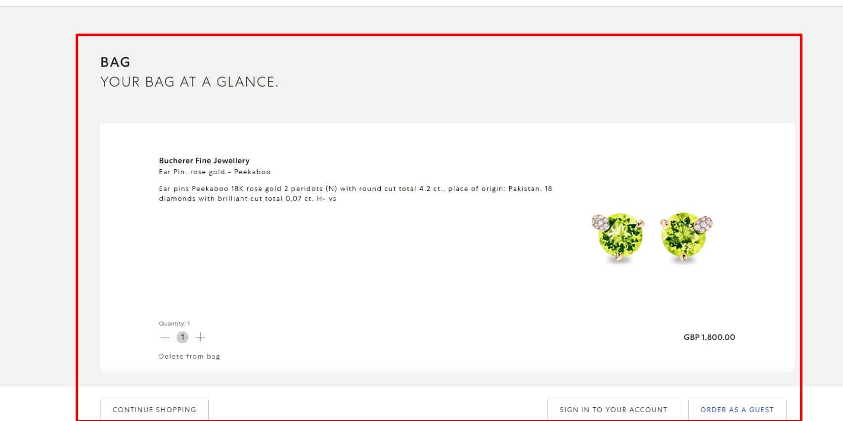 After adding items to the basket, the design of the "Buy" button must change - the color and the inscription (e.g., "Product already in the basket" or "Buy more"), or information that the product is added to the basket must appear next to it. The goal is that the buyer could see that the product is already added to the basket and at the same time had the opportunity to add one or several units. This provides good UX.
-
Easy transition to checkout
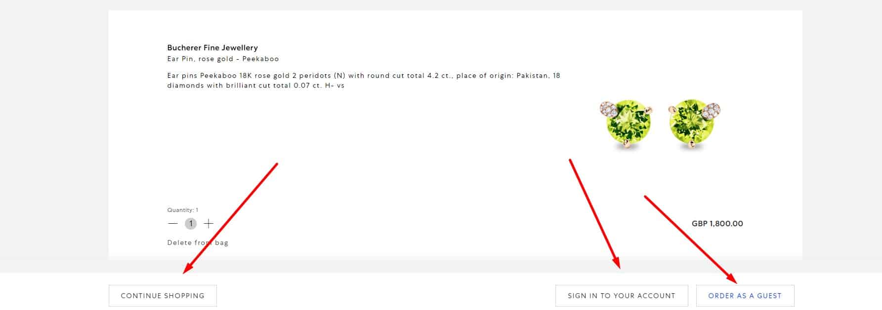 Option 1: after adding a product to the basket, a window pops up with two buttons (links): "Go to checkout" and "Continue shopping." This saves the user's time and provides a good user experience.
-
No extra information
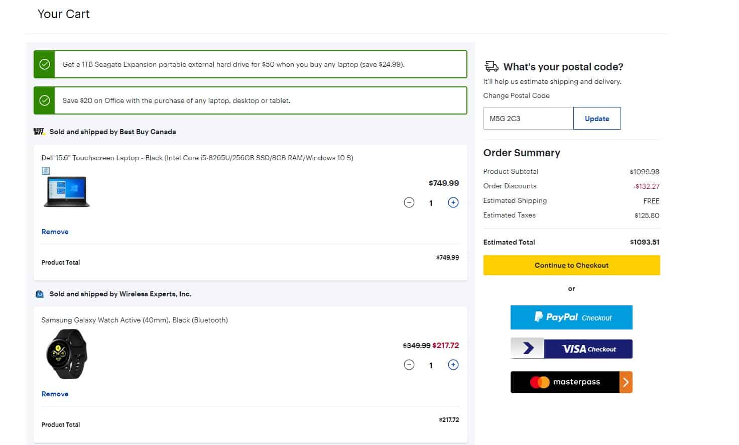 According to usability testing and to improve UX, the basket should not contain distracting elements:
- catalog, shop windows;
- advertising, animation;
- news or links to blog articles.
-
Full information on the order
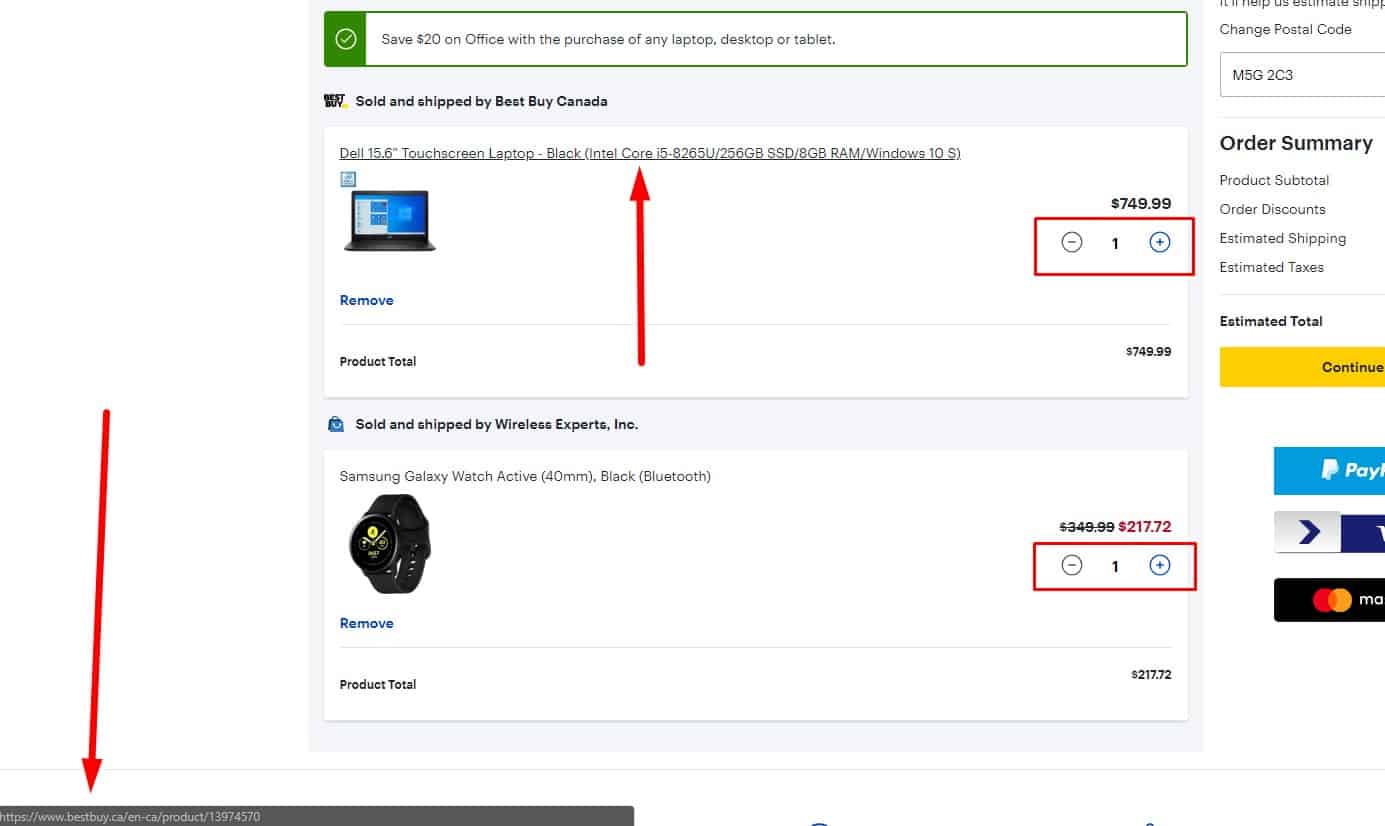 "Based on the results of usability testing, the shopping basket shows::
- a large image of products that the user understood what it is
- the name of the goods;
- optional – brief description of the goods;
- the number of items of each item;
- the total amount of the goods;
- the total amount including delivery (optional).""
-
Click-through rate of the items
The image and product name is clickable to improve UX and lead to the product page.
-
Easy wholesale purchasing
When you add a product to the basket the user can immediately select the number of added products rather than clicking the " buy " button several times. This provides a good user experience.
-
Easy operation in the basket
"
- Basket allows you to increase or decrease the quantity of the item and remove an item;
- When you remove the item from your cart page is not reloaded, but the order total is automatically recalculated;
- The visitor has the opportunity to add other goods at any stage of your order, with already filled fields are not cleared. This contributes to a good UX.
-
Easy trash empty
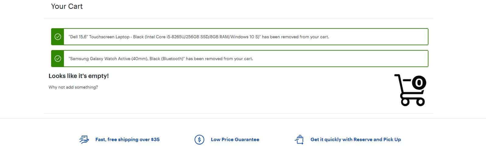 "
"- After removing all items from the basket, the user is notified that the basket is empty. This provides a good UX;
- After the completion of processing of the goods, the basket is emptied.
🔎 Search on the website
-
Search on the eCommerce website
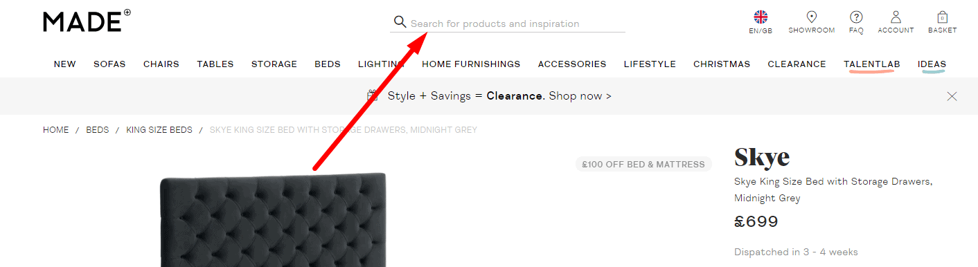 The website's design should include the Search bar but don't shift the navigation tasks. The search bar on an eCommerce website does not solve navigation problems. According to usability testing, users prefer to search for products on their own using sections and filters and only then use the search bar.
-
Single search field
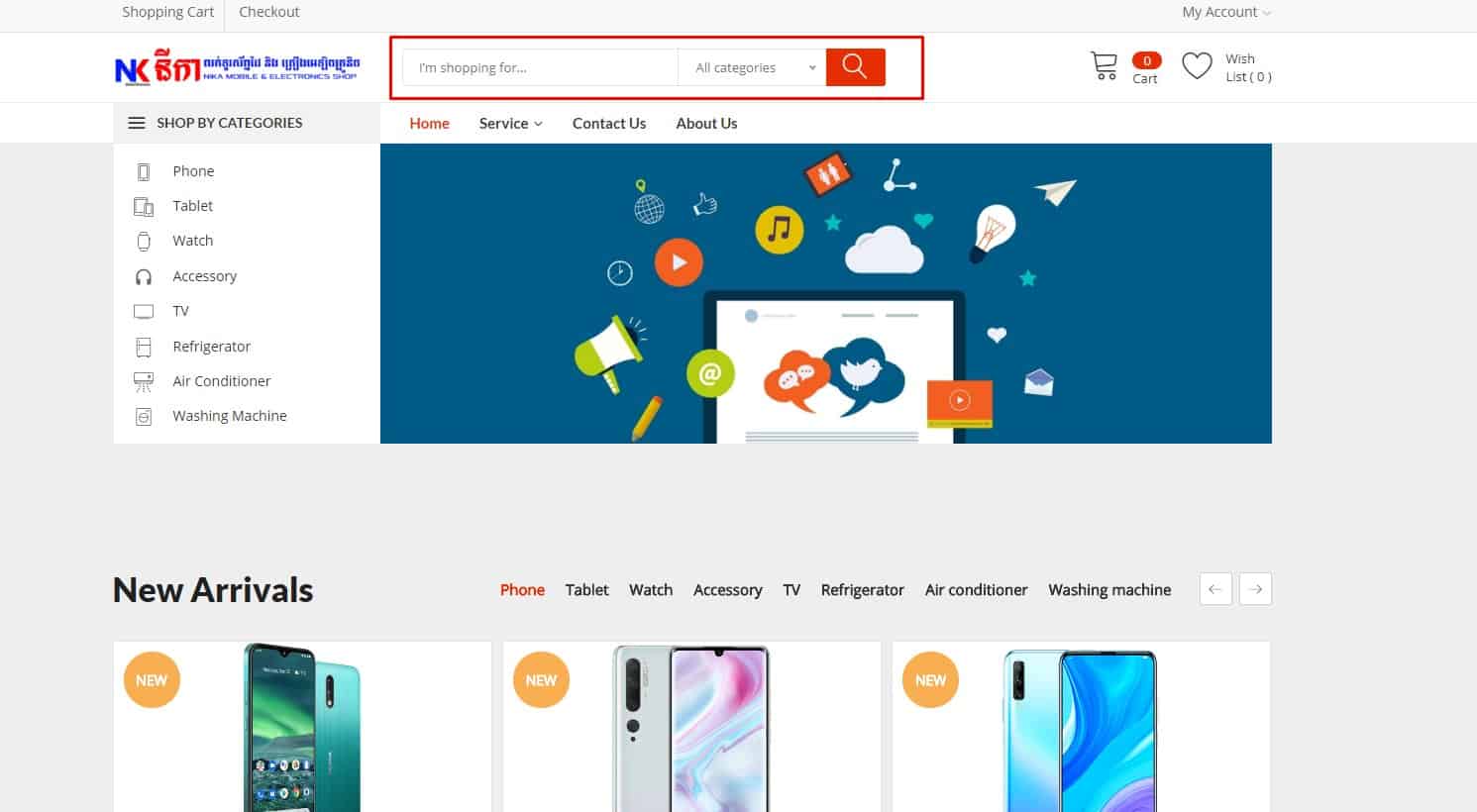 Don't make users think: "Why the second? Which one is more important?" and stuck at this moment. Usability testing shows that it is wrong for UX.
-
Convenient search interaction
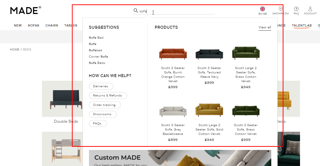 The search is started by pressing the button next to the query input field or Enter key. Automatic correction of types in user,” requests, spelling errors, incorrect keyboard layout (or corrections are offered). Search results are selected, including synonyms. Although the visual length of the search field is at least 30 characters, the actual length of the request is not limited. Simple editing of the request is provided (without going somewhere and additional clicks).
-
Using Live Search
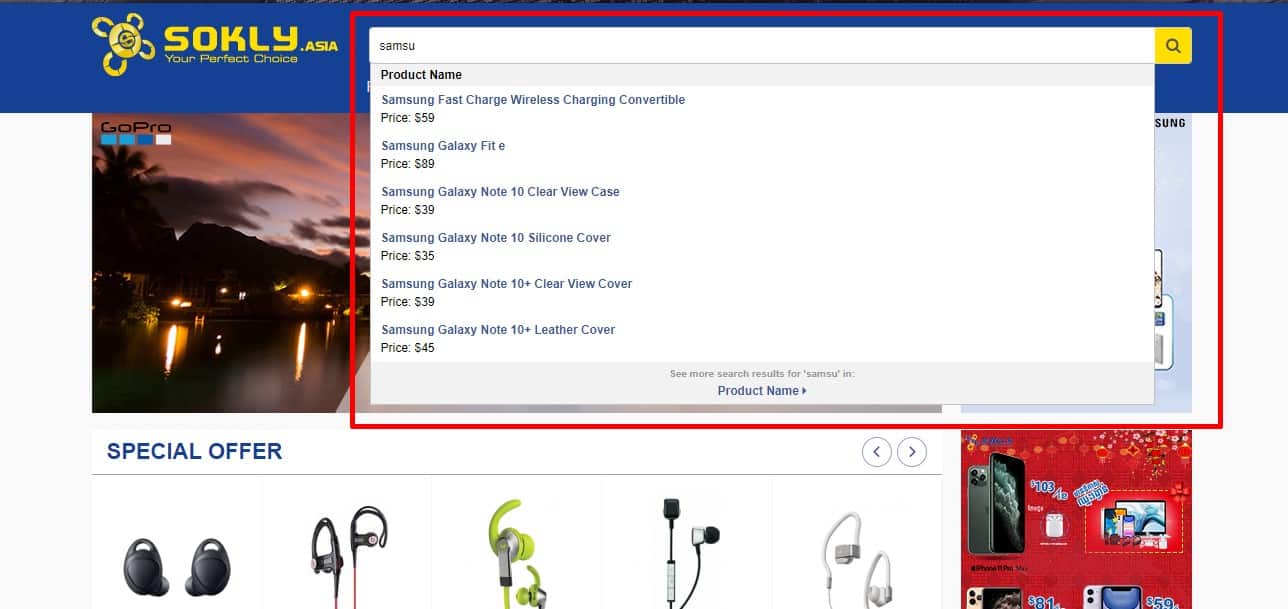 Usability testing shows that when the user types the query in the search field, a relevant list of results must be displayed—the list changes as the user types. If a live search does not find suitable options when completing a query, the list is not cleared, and the last relevant values remain.
-
Detailed Search Results
"According to usability testing, for good user experience, the visitor should see:
- number of results found;
- sorting of search results (with the ability to change this sorting);
- basic brief information about each product/article found.
-
Help with no results
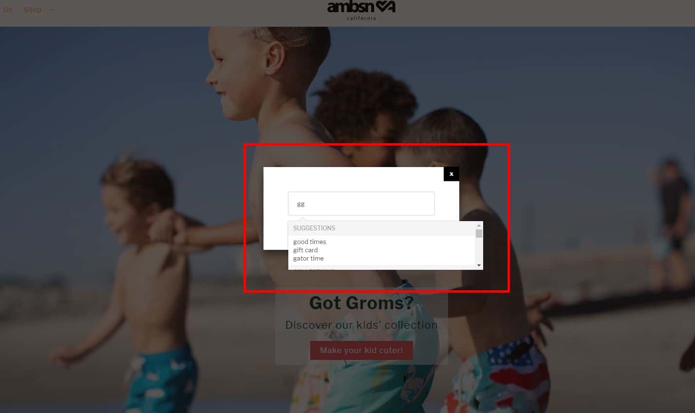 If nothing is found, for good UX, we do not show the visitor "No results were found according to your request" page, instead:
- the client is offered several options for products or sections of the site closest to his request, where, perhaps, there is what he is looking for;
- the client is advised how to edit the request so that it is more relevant;
- optional: it is suggested to use the advanced search.
-
Advanced Search (optional)
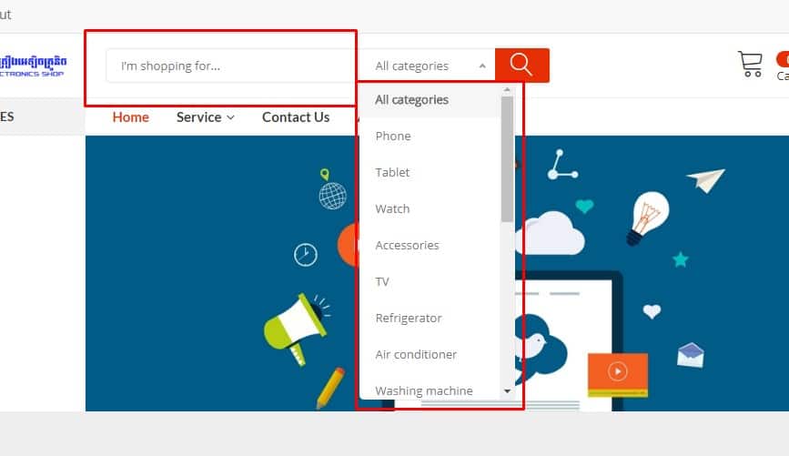 eCommerce websites should offer advanced search options, allowing users to refine their searches with multiple criteria.
📃 Internal linking on the website
-
Honest Links
 The standard functionality of a regular link is to go to another page or open another page in a new tab but not launch any action.
-
Noticeable differences in “special” links on an eCommerce website
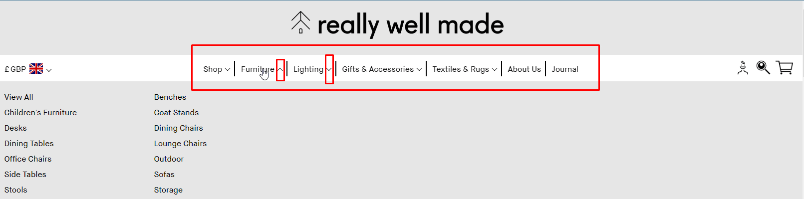 If the link involves the unfolding, but not the transition to another page/reloading the existing one, it must be dotted underlined. Add a triangle icon next to it. The download link must be different from regular links. It should include the word "download,” file size, and format.
 -
Anchor or human-friendly link
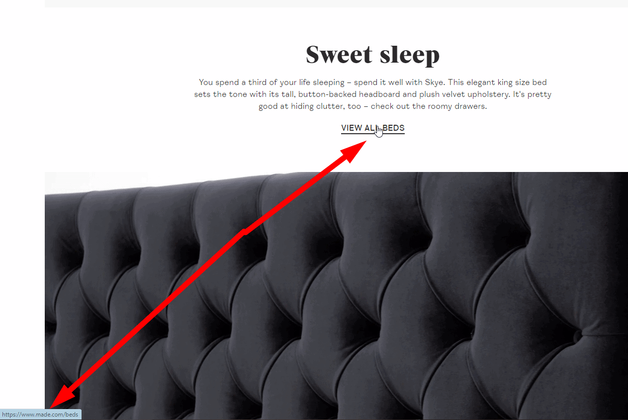 Link text must clearly state where it leads (name of the article, product) so the user knows precisely what it opens. This contributes to a better user experience on your website.
-
User-friendly links
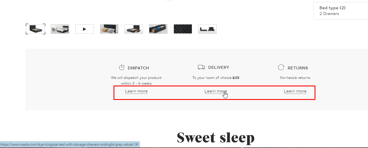 The link text must be long enough that the visitor could easily click on it (for example, a link with the anchor "here" is no good).
 -
Return button on the website
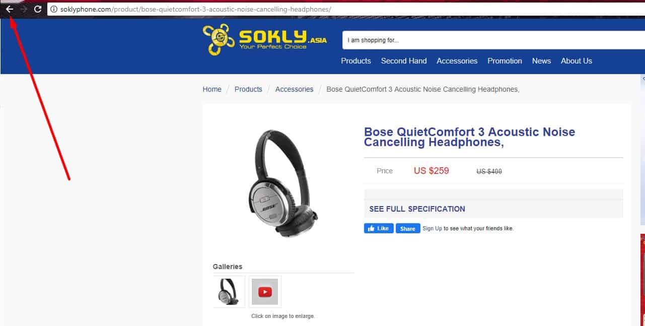 Browser's button "Back" should work on all pages of the eCommerce website. Item 38 b tells us there must be no such button on the website. However, the browser has it to interact with it correctly: to return the user to the previously viewed page, saving all custom settings, sorting, or filtering. This contributes to the user experience.
♿ Accessibility (WCAG 2.2)
-
Color & contrast
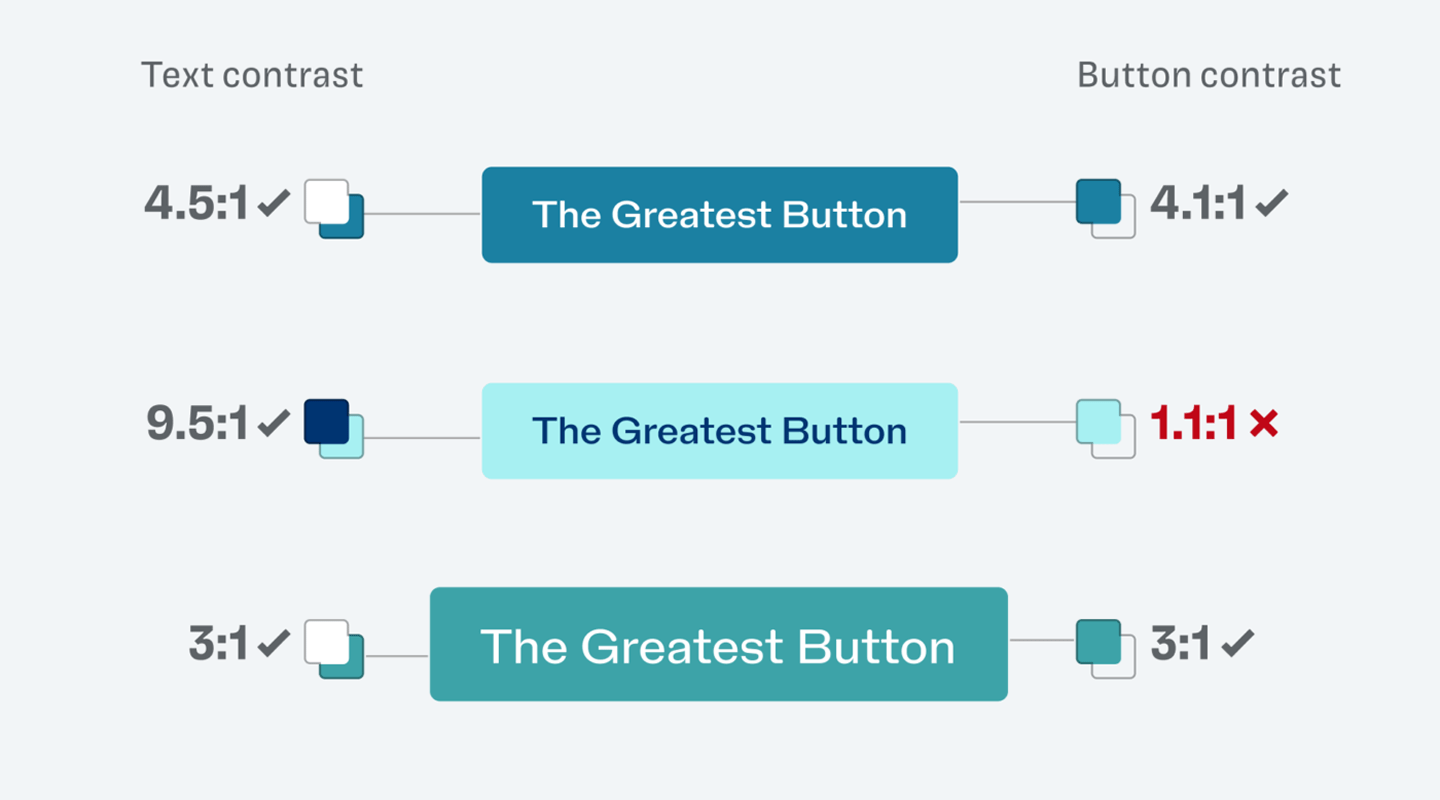 Text contrast must be ≥4.5:1 (normal) or ≥3:1 (large ≥18pt/14pt bold). Don’t rely on color alone for meaning—add an underline/icon/text. Ensure link contrast vs surrounding text and keep a visible hover/focus style in both light and dark themes.
 -
Keyboard operability
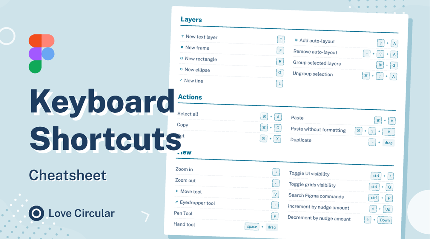 All interactive controls work with Tab/Shift+Tab/Enter/Space (plus arrows/Esc where relevant). Keep logical tab order, avoid traps, and manage focus when opening/closing dialogs and off-canvas panels (send focus in, return it to trigger).
 -
Focus visible & not obscured (2.2)
 Provide a strong, consistent focus style (outline/offset). Ensure it isn’t hidden under sticky headers/popups; use
 scroll-margin-topfor anchored targets and:focus-visiblefor keyboard-only rings. -
Target size (2.2)
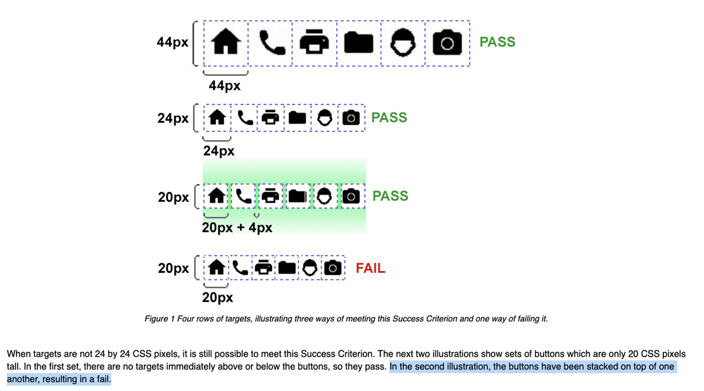 Make interactive targets comfortably tappable (≈ 24×24 CSS px minimum) or provide equivalent spacing. Avoid crowded touch areas and ensure adequate hit area for icons, toggles, and form controls.
 -
Semantics & labels
 Use native elements (
<button>for actions,<a>for navigation). Associate<label>with inputs; provide accessible names (aria-label/aria-labelledby) where needed. Don’t override roles needlessly. -
Alt text & media alternatives
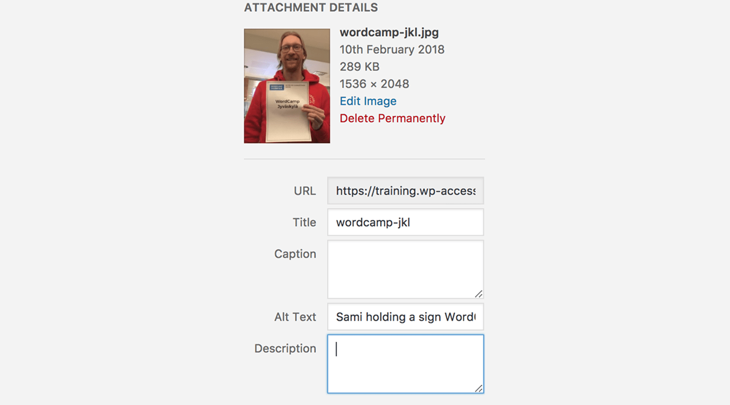 Informative images have useful
 alt; decorative images use emptyalt="". Provide captions/subtitles for video and an on-page transcript for audio/video content. -
Forms: errors & help
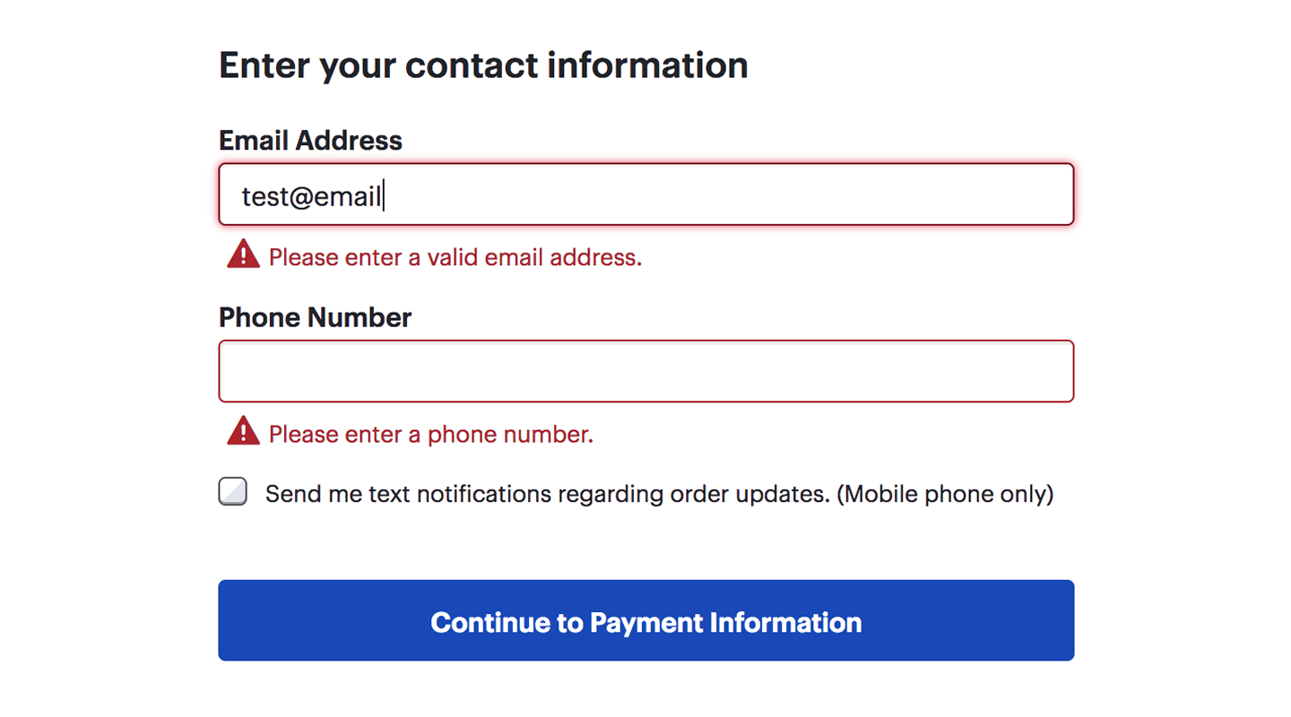 Place inline errors near fields and programmatically link them (
aria-describedby). Announce updates viaaria-live. Mark required fields clearly; useautocompletefor input purpose (name, email, address). -
Motion & animation preferences
 Respect
 prefers-reduced-motion; offer controls to pause/stop/hide moving content. Avoid parallax and auto-playing media by default, especially on mobile and when motion may distract from tasks. -
Skip links & landmarks
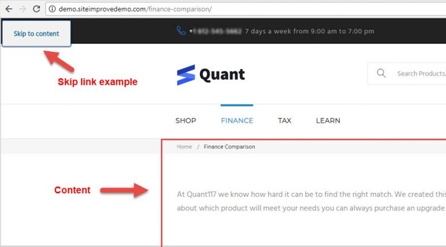 Provide a visible “Skip to content” link. Use semantic landmarks (
<header>,<nav>,<main>,<footer>) and keep a logical heading hierarchy across templates. -
Language & direction
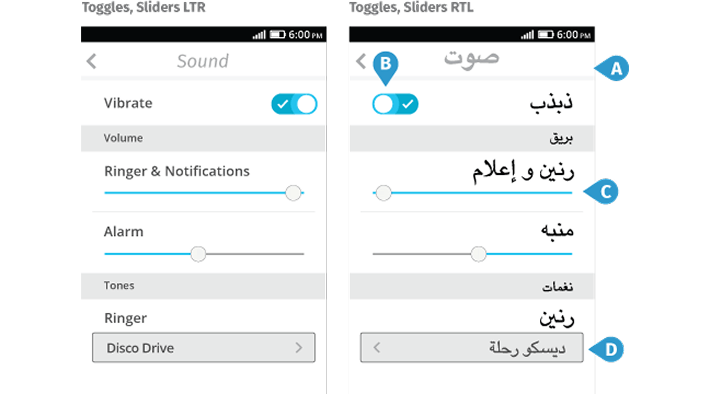 Set page language (
<html lang="…">). Support RTL withdir="rtl"and logical CSS properties; don’t mix LTR/RTL without isolation (e.g.,<bdi>,diron spans). -
Authentication & redundant entry (2.2)
 Allow password managers/biometrics; avoid cognitive tests. Don’t ask users to re-enter info you already have—prefill where possible and let users copy/paste one-time codes easily.
 -
Dragging & gesture alternatives (2.2)
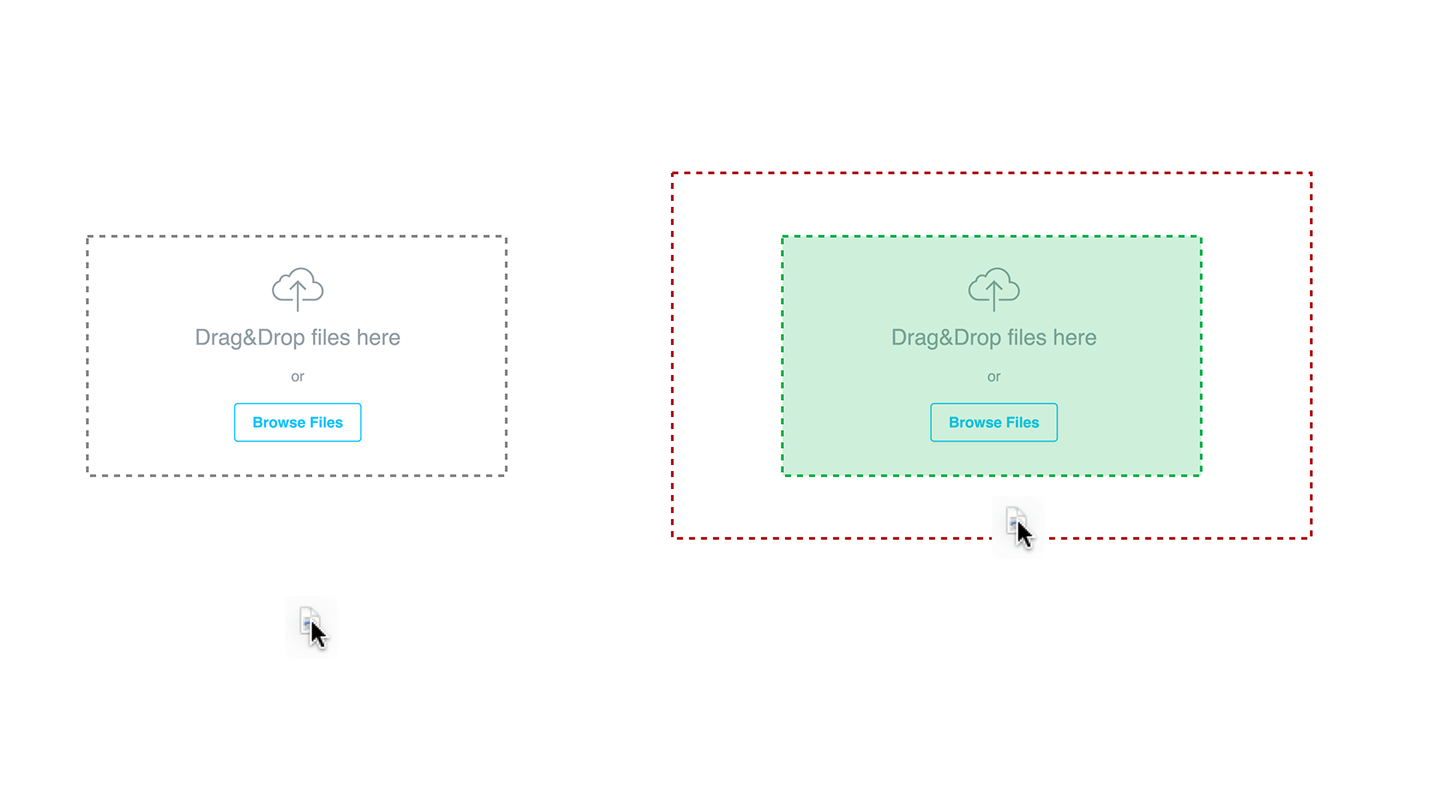 Provide non-drag options for drag-and-drop (buttons/menus) and support mouse, touch, and keyboard equally (e.g., space/enter to pick up, arrows to move, enter to drop).