
When Yves Saint Laurent said that Marrakech taught him color, he meant that he had discovered the strength of its psychological effect. Colors create certain feelings, set a mood, and change lives. They have a similarly strong impact on website visitors. Branding and design use color to form the unconscious attitude of the target audience to a company, its products, or services, influence purchase decisions, and sometimes make visitors click certain buttons.
Is color really that important?
Color doesn’t define the level of conversion. It doesn’t sell directly, neither can it find you, new customers. However, it helps to create the necessary impression and turn a random visitor into a regular customer:
- 93 % of users make a purchase decision based on the look of a product and website. 70% won’t buy if they don’t like the color. The success of a brand is 80% dependent on the properly selected color scheme of its web resource.
- You have just 8 seconds to capture the user’s attention, so only a properly chosen color can help you win the modern marketing battle.
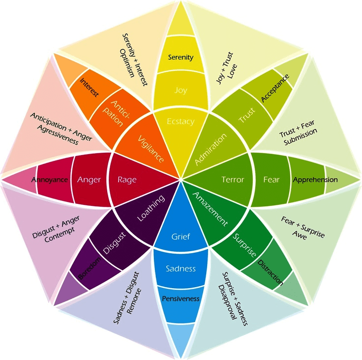
There is Plutchik’s color wheel that should help designers to select the right color combinations. However, it doesn’t fully represent the possibilities of the impact colors have. You shouldn’t take any color scheme as the ultimate truth while choosing the optimum website design. As a study, color psychology is only emerging. Hence, if you adhere to the general results of studies, you may never find the keys to the target audience’s heart. Not all orange buttons are as effective as some reports say. And red isn’t always the symbol of aggression, blood, and violence.
Website tasks and the message of a brand
The best option for a particular psychological effect is defined through testing and considering the tasks of a website and the type of target audience.
Website tasks
What are you going to promote? The brand colors of Coca-Cola are very unlikely to generate high conversion and become recognizable among the customers of a bank, medical center, or pharmaceutical company.
Red is a great option for the food industry, service sector, entertainment, technology, transport, and agriculture. The brands that increased sales using this color: McDonald’s, Coca-Cola, Avis, Colgate, Lay’s, Nike, Virgin Group, Red Bull, Time, KFC.
Light blue suits almost all fields except for those related to food, transport, and clothing. It’s universal (even color blind can see it) but not quite appropriate for websites dedicated to household products and services. The brands that increased sales using this color: Oral-B, Twitter, Facebook, LinkedIn, Ford, PayPal.
Green is perfect for financial, energy, and food sectors. It effectively sells household appliances and services. Surprisingly, green doesn’t work for health care, transport, logistics, and food service. The brands that increased sales using this color: Subway, Whole Foods, Animal Planet.
Black is a very strong, powerful, and dominating color. It easily steals the show, so you should use it in design with the same caution as red, orange or gold. Have you ever noticed that leading fashion houses, such as Versace, Dior, Chanel, Yves Saint Laurent, use a lot of black in their branding? This color is associated with high style, eternity, and everything that becomes less fashionable over time. Yet, such venerable brands that dictate the global trends in design and clothing can allow themselves to use lots of black on their websites.
Purple is a mysterious, powerful, and majestic guy. That’s why it is used in the branding of beauty websites. This color has the strongest associations with beauty and health. It isn’t suitable for the energy and agriculture sectors, neither is it good to promote clothing, cars, airplanes, household goods and services.
Yellow is the color of joy, action, intellect, and self-perfection. Hertz, Shell, National Geographic…this is not an exhaustive list of renowned brands which have chosen yellow as their symbolic color. Yes, this color is optimum for the energy sector, food industry, and household. Nevertheless, there are exceptions. For instance, a car manufacturer, Ferrari, has a yellow-dominated logo.
Target Audience
Men prefer black, green, and blue. They are fine with white and silver. Men are more conservative and less loyal to bright, saturated colors. They don’t like purple, red, and brown.
Women, conversely, like both bright and delicate colors. You probably wouldn’t fascinate them by a website in gray, pale yellow, orange, and brown shades.
The younger potential customers are, the higher the chances are that they will like a website in vibrant orange, yellow, red, and pink colors. The youth adores green, white, and blue.
Consequently, the older the target audience is, the calmer colors you should choose. Adults perceive silver, green, blue, intense purple, and black as trustworthy and less aggressive. They like the classic combination of black and white, yet the youth is okay with such an option. Well, it has become classic for a reason.
Generous, Standart, Limited
What can customers afford? Financial possibilities of the target audience affect the perception or rejection of one or another color in every particular case. For example, generous and impulsive buyers like everything bright and eye-catching (red, blue, and even black). Average buyers feel related to pink and sky-blue shades, whereas people with low budgets and conservative views prefer mixed blue-green shades.
Color associations
Branding is about sending a message, implicit information, to the target audience through colors. What associations are provoked by blue? Think about the most common products that use this color…Social media, blogs, buttons. Yes, blue means trust. The trust is so huge that you are not even afraid to disclose a part of life. Blue is associated with reliability, power, and home. Isn’t that a reason why we are practically living in social media? Every color has an impact on the subconscious, but how?
- Black. Elegant, elite, exquisite, eternal, strong. Martial arts masters have belts of different colors, but everyone knows only about black. It symbolizes an ultimate skill, infinite perfection that people should strive for. The target audience will have similar associations when they see black. It’s powerful and elite. With black, you can easily stress the luxury status of products. Yet don’t forget that black attracts a lot of attention and must be used carefully.
- Red. Fiery, bloody, aggressive, juicy, life-affirming. This is the color of strong motivation effective for buttons and important notes. At the same time, it often repels with its brightness and hurts the eye. Red is more attention-getting than any other color, but it symbolizes danger (Does everyone remember three colors of traffic lights?) It provokes a strong desire to live, fight, act and is tiring at the same time. Reading stimulates appetite.
- Green. The color of nature, natural harmony, prosperity, and money. There is nothing as peaceful and alive as a green leaf. Green facilitates perception, calms, and relaxes. That’s why it is widely used in designing financial, technological, and culinary web portals.
- Blue. This color is believed to be the most universal. It’s neutral in terms of perception and provokes feelings of reliability and stability. Pure honesty, productivity, and professionalism are about blue.
- Orange. Cheerful, creative, unpredictable, but at the same time very aggressive (like red). Orange is believed to be one of the most irritating colors in a palette. It should be used very carefully. Note that finding a color pair to orange is a tough task. In rest cases, it behaves very unpredictably.
- Yellow. The color of warmth, comfort, light, and joy. It causes positive emotions and fills people with energy. This is a great option for a food brand, event agency, or energy provider. However, in this case, the rule of traffic lights works. Yellow is the sign of a warning and the symbol of the press with a very dubious reputation.
According to the research results, orange, red, and green are optimum choices for buttons. Nevertheless, the most winning combinations are green on a white background, white on green, red, and black on orange. Black is very effective in design since it attracts lots of users’ attention. Yellow, the color of the sun, helps to increase conversion. Additionally, it is recommended to refuse from green and blue for target buttons. These colors relax users and demotivate them.
As for the perfect color formula, you can use the principle of three components: 60% – an unsaturated main color, 30% – a secondary color, and 10% – the most intense color for target action buttons and CTA elements.
Colors can be selected with the help of the color wheel (which is difficult and takes a lot of time), the color chart, or using color blocks on Dribbble (a fast and more convenient option).