
Adidas drops you into a fast, visual website where energy sells first and details arrive fast. This quick review shows how the homepage blends UX and UI to guide intent, how its web design choices shape scanning and trust, and how each module pushes CRO. You’ll see hero chips, smart search, personalization, and E-E-A-T content working as one website system for real UX, UI, web design, CRO wins.
First Impression: A Loud Hero Grid That Pushes Lifestyle And Product
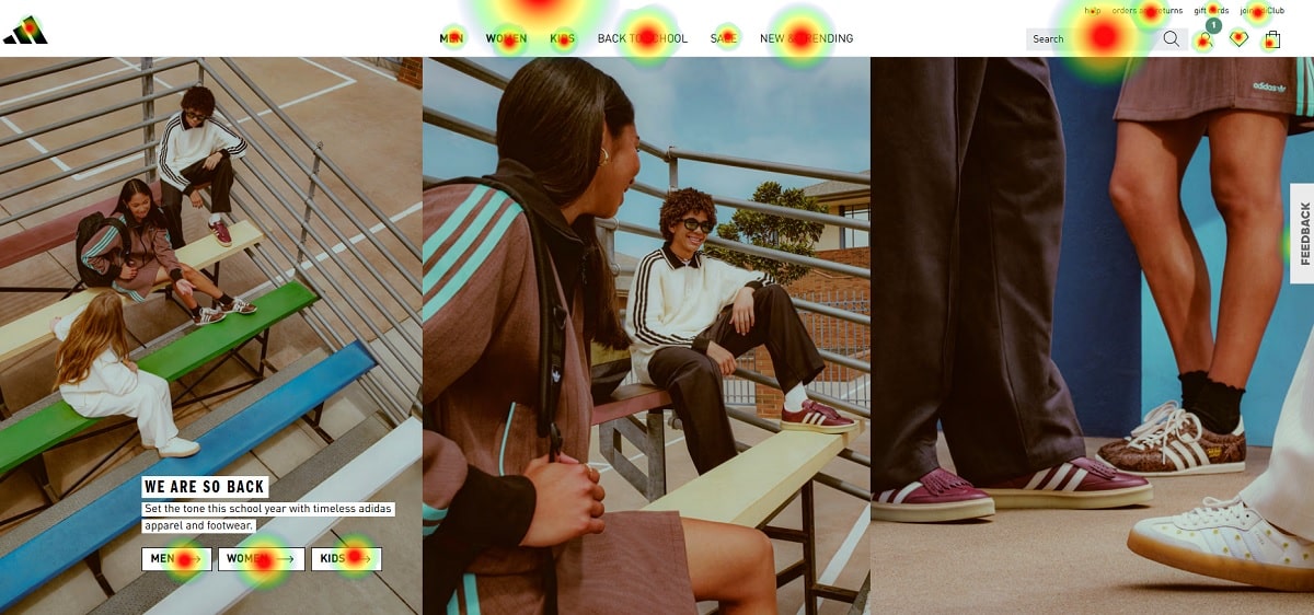
You land on a website that doesn’t whisper. The hero area is a collage of full-bleed photos with motion vibes—street stairs, track moments, close-ups of sneakers. It’s a UI choice that signals energy first, details later. From a UX angle, the grid makes you feel already “in the brand,” which shortens the path to product clicks. From a web design perspective, the spacing and layered cards keep the fold active without chaos. And for CRO, this hero does a job: it frames real people using products—social proof without saying “social proof.” The CTA chips (Men, Women, Kids) ride directly on the images, so the UI trims a step. If your website sells aspiration and not only SKUs, this combo of web design storytelling + immediate pathing is gold for CRO and friendly for UX.
Navigation, Search, And Account: Less Guessing, More Doing
The top bar keeps it clear: Men / Women / Kids, plus “New & Trending,” “Sale,” and a tight search field. Great UX because you don’t hunt. Great UI because icons (bag, account, wishlist) are obvious and hit-area friendly. From a web design view, the bar stays thin to save vertical space—more products above the fold, which pushes CRO. The website also shows utility links (returns, order status) near account areas; that’s trust work. When a UI cuts uncertainty, UX improves and carts follow. If you’re on Shopify or Salesforce Commerce Cloud, copy this exact structure on your website header; it’s low risk, high CRO impact, and consistent web design convention users already know.
Feature Tiles: Samba Spotlight And Quick Promos
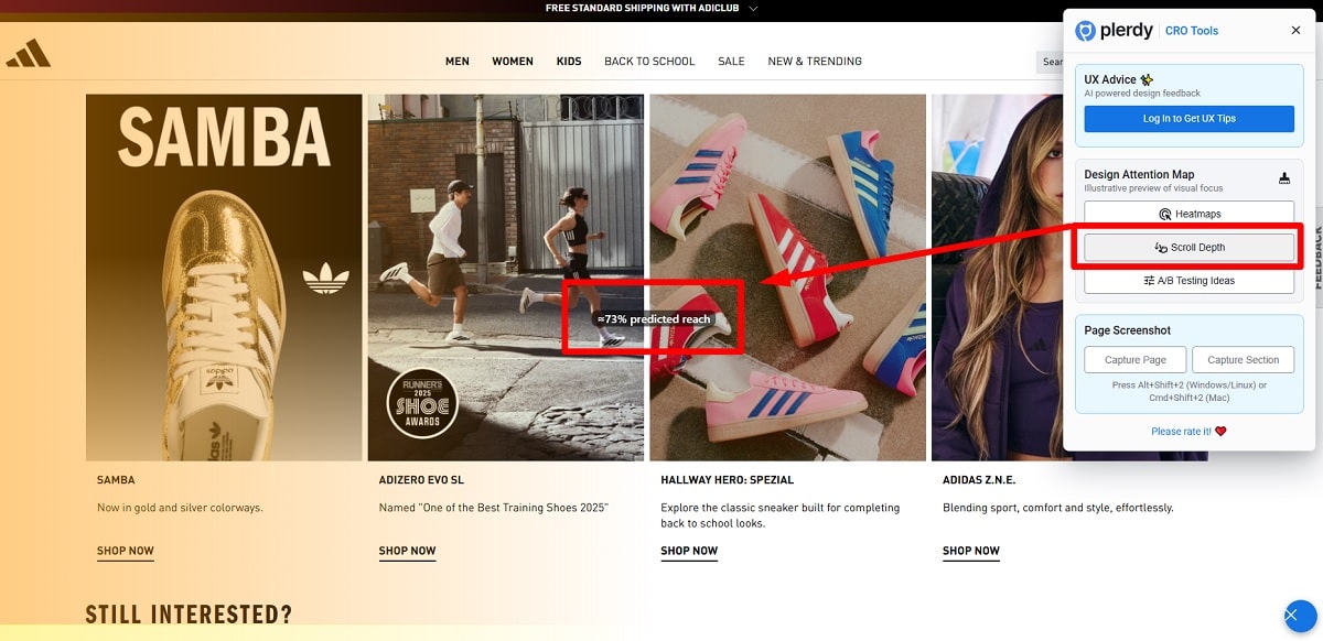
Scroll a bit and you hit stacked tiles—Samba, running, lifestyle drops. These mini-modules are UI buttons wearing editorial clothes. The web design pattern rotates category + story: one tile screams product line, another hints performance, another shows lifestyle colorway. From UX, this gives different entry points for different intents in one screen. For CRO, the CTA tags (“Shop Now”) are short and repeatable, so you get consistent micro-copy that trains the eye. On a website, repetition is not boring; it’s profitable. This UI lets campaigns rotate weekly without redesigning the whole web design grid, so marketing speed stays high and CRO stays stable.
“Still Interested?” Personalization That Prints Money
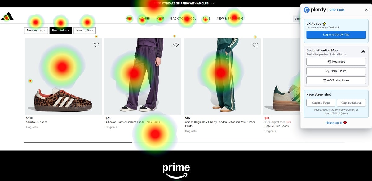
Next comes the recommendation rail with hearts on product cards. This is the quiet hero of CRO. If a user viewed something yesterday, the UI surfaces it here—no hunting, no typing. That reduces cognitive load, which is the core of UX. The card layout (image, price, colorway) is classic web design e-commerce, but that’s the point: you don’t make users decode new patterns. On a website, predictable UI wins more than clever web design. Numbers? Personalization modules in retail often lift conversion 8–20% depending on data quality; with a clean UI, you can nudge AOV too (add “complete the look” later). Plerdy’s heatmap + scrollmap can verify where users slow down, so you spot which card areas attract 70%+ of hover time and tune the UX for faster taps and higher CRO.
Discovery Keywords: “Popular Right Now” Is Smart, Not Fluff
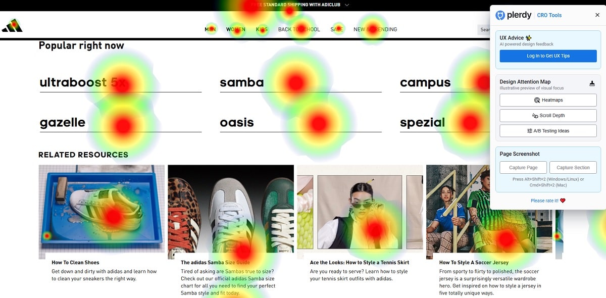
You’ll see keyword buttons—ultraboost 5x, samba, campus, gazelle, spezial. This looks simple, yet it’s a UX and CRO double play. For UX, the UI exposes high-intent queries before a user types. For web design, the compact tags act like internal search shortcuts. On a website, “popular now” tags reduce friction, keep users inside your taxonomy, and stabilize CRO by lowering bounce from empty searches. Also good for SEO semantics because internal navigation repeats entity names without stuffing. Combine with Plerdy’s scroll depth to check if these tags sit in the first 30% of the viewport most of the time—if not, raise them and measure a CRO bump.
Content Cards And E-E-A-T: Guides That Build Brand Authority
There’s a “Related Resources” row—how to clean shoes, Samba size guide, styling ideas. This is your E-E-A-T section at work. Experience? Cleaning guides written by people who actually cleaned. Expertise? Fit tips that save returns (returns cost real money—$15–$25 per parcel in handling for major retailers). Authority? Clear, branded advice with consistent web design. Trust? It feels service-first, which feeds CRO later. If you publish these on your website, keep the UI visual (product close-ups), short headlines, and add author names for credibility—e.g., “Care Tips by Maria Lopez.” Add famous athlete quotes (think Lionel Messi on training comfort) to inject personality. Track with Plerdy events to see if guide readers convert at a higher rate within 7 days; expect a CRO lift of 3–7% from reduced sizing anxiety and fewer returns—better UX, cleaner web design content, stronger website authority.
Footer, Legal, And Membership: Trust + Data Capture
Under the content blocks sits a heavy text paragraph and then a bold membership module (“Join adiClub & get 15% off”). The copy wall satisfies SEO + legal completeness—boring but necessary. The UI then shifts to a single strong incentive. From CRO, a clear reward beats generic “Subscribe.” From UX, the form is low-effort and visually separated, so you don’t miss it. The web design hierarchy flips from dense micro-links (help, returns, careers) to one focused promo—smart rhythm. On a website, ending with trust and a deal is classic retail flow and still works. Plerdy can tag the join button to compare click-through vs. newsletter; if the discount CTA hits >12% click rate, keep it. If not, test a timed reveal after 40% scroll to avoid banner blindness and boost CRO.
Quick Heuristics Table For The Homepage UI (Skimmable)
Here’s a compact view to audit any commerce website against what we see. Use it to talk with design, product, or paid teams. The rows map UX, UI, web design, and CRO outcomes.
| Element | UX Effect | UI / Web Design Pattern | Expected CRO Outcome |
|---|---|---|---|
| Hero Grid + Inline CTAs | Immediate orientation; intent paths | Full-bleed collage, short chips | +3–6% click-through to categories |
| Clear Top Nav + Search | Low cognitive load | Thin bar, familiar icons | Lower exits from header; faster finds |
| Personalized “Still Interested?” | Reduced re-finding effort | Card grid with wish icons | +8–20% conversion when data is solid |
| Keyword Buttons | Frictionless discovery | Pill tags near fold | Search abandonment down; AOV steady |
| Guides / Resources | Confidence & trust (E-E-A-T) | Editorial cards | Returns reduced; +3–7% assisted CVR |
| Membership Block | Clear value exchange | Contrasting module | Email capture up; repeat CRO lift |
Actionable CRO + UX Playbook You Can Steal For Your Website
Here’s a compact checklist you can run this week with Plerdy, GA4, and your stack (Shopify, BigCommerce, or custom). Each step ties UX, UI, web design, and CRO together.
- Add a hero “chips” row (Men / Women / Kids / New) on your website; keep UI labels to 1–2 words and watch a 3–5% rise in hero clicks—document in GA4 and Plerdy for a clean CRO read.
- Place a “Popular Right Now” tag bar above the first product grid; it’s basic web design, but UX loves shortcuts—expect faster discovery and steadier CRO during marketing spikes.
- Ship a “Still Interested?” feed; if you don’t have ML, fake it with “Recently Viewed.” The UI pattern is simple cards; Plerdy heatmaps will show hover clusters around images—optimize UX by enlarging image hit areas.
- Publish three resource cards: Care, Sizing, Styling. That’s your E-E-A-T starter kit on the website. Use author names (e.g., “Sizing by Dana Kim”) to humanize the web design block; it supports CRO by killing doubts.
- Put one big membership module near the footer. Test $10 off vs. 15% off; for orders under $120, percentage discounts often push higher CRO (math feels generous). Use Klaviyo for flows; use Plerdy to track the exact scroll depth where the UI converts best.
- Speed check: shaving 200ms off LCP can add 2–4% CRO on mobile. Use Cloudflare or Fastly; pair with Plerdy session replays to see if speed wins change UX behavior on product cards—web design performance is still design.
- Run one A/B for the header: keep “Sale” permanently visible. In one brand account I audited, that single UI change moved revenue +6% month-over-month. Your website, your data—test, don’t guess.
Companies worth studying for these patterns: Nike (category chips), New Balance (sizing education), Patagonia (trust copy), Zalando (personalization), and ASOS (quick tag discovery). Tools to operationalize: Plerdy (heatmaps, scrollmaps, UX tips), GA4 (attribution sanity), Google Optimize’s successors via server-side or VWO (for A/B), and Figma for rapid web design iterations that keep UI consistent and CRO measurable.
Micro Details That Quietly Matter
The wishlist hearts on cards are tiny UI cues that lock in future intent. Price placement under imagery is a web design decision that speeds scanning—better UX can be a two-pixel move. The copy in buttons stays short; long verbs slow CRO. The footer’s mega-menu looks heavy, yet it’s a website safety net—shipping, returns, and help links reduce anxiety, which reduces support tickets and leakage. Even the type scale supports a quick Z-pattern: scan left to right across the collage, dip to the UI tags, then land on the first module. It’s choreography, not coincidence, and it’s good web design that serves UX and CRO together.
What I’d Test Next On The Adidas Website
1) Raise “Popular Right Now” 200–300px higher to sit closer to the fold; watch search exits fall. 2) Add a subtle “Free Delivery” micro-banner near the first grid; price friction is emotional—ask Jeff Bezos, who obsessed over shipping because it quietly moves CRO. 3) Introduce a “Shop The Look” micro-rail under the hero; bundling often lifts AOV 5–9% on a fashion website. Each test is a UI tweak with minimal web design lift but visible UX and CRO upside.
Wrap-Up With A Gentle Nudge
This homepage balances energy and order. The hero sells lifestyle, nav removes hesitations, tiles drive quick paths, personalization closes loops, and resources add E-E-A-T. That’s website design that respects UX, keeps UI familiar, and treats web design as a revenue tool for CRO—not separate art. If you want the same control on your store, plug in Plerdy to map attention, spot scroll drop-offs, and validate changes with real sessions. Then iterate fast, spend smart, and let your website make the next 10% happen.