
Knowing user engagement on your mobile site is not only good but also vital in the always changing field of digital marketing. Here Mobile Heat Map Analysis comes in handy, providing a clear graphic depiction of user interaction with your website. Using this study can help you identify busy sections and see where your material really grabs interest or fails. Accept this tool to maximize your website, improve user experience, and eventually drive your SEO results skyward. All set to turn your website statistics into useful knowledge? Let’s explore Mobile HeatMap Analysis’s universe thoroughly.
What is Mobile HeatMap Analysis?
A breakthrough technology called Mobile HeatMap Analysis graphically records where users click, scroll, and tap on your mobile website. This great SEO method clarifies which areas of your website draw more visitors and interaction. Examining these heat maps will help you find places needing work and materials your audience will find appealing. It’s all about improving usability, layout of your website, and making sure your material exactly matches user expectations. Why then should one wait? Start immediately improving the user experience of your website and increasing your SEO efforts by using Mobile HeatMap Analysis!
Why You Need to Analyze Mobile HeatMap?
Anyone hoping to improve the performance and SEO of their website must first examine Mobile Heat Maps. Knowing where visitors are most engaged helps you to arrange your most crucial material—articles, goods, or calls to action—such that it will be more visible and interactive. This study improves content placement to increase user engagement and conversion rates in addition to helping your website layout be more traffic flow friendly. Use Mobile HeatMap Analysis to guarantee your audience may interactively experience your site in addition to seeing it. Let’s maximize your mobile presence in its whole!
Mobile HeatMap Analysis with Plerdy
Using the developer tools offered in browsers will help you to properly examine the behavior of your visitors on mobile devices. These instructions will enable you to replicate mobile viewing and examine several user behavior criteria.
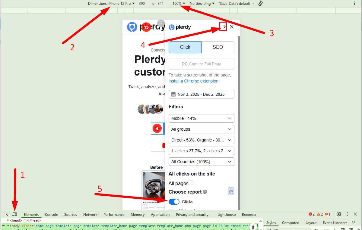
Steps for Mobile HeatMap Analysis Windows/Linux Users:
- Open the report and ensure that the Plerdy menu panel appears on the screen.
- Press F12 to open the developer tools (for example, in the Chrome browser).
- Activate adaptive design mode by pressing Ctrl + Shift + M.
- In the emulation window, select a device model to see how your site looks on different mobile devices.
- Select a 100% scale.
- Refresh the page by pressing F5 and wait for it to fully load.
- Choose the appropriate period and activate the heat map switch.
- You can minimize the menu panel to analyze clicks.
- Clicks are dynamically displayed on site elements, so select the desired element and wait for 1-2 seconds.
Steps for Mobile HeatMap Analysis MacBook Users:
- Open the report and ensure that the Plerdy menu panel appears on the screen.
- Open the developer tools using Command + Option + I (for example, in the Chrome browser).
- Turn on adaptive design mode by pressing Command + Shift + M.
- Select the necessary device model in the emulation window.
- Select a 100% scale.
- Reload the page using Command + R and wait for it to load.
- Choose the appropriate period and activate the heat map switch.
- You can minimize the menu panel to analyze clicks.
- Clicks are dynamically displayed on site elements, so select the desired element and wait for 1-2 seconds.
Remember, regular analysis of user behavior will help you optimize your site to provide a better experience for your visitors.
Finally
Remember as we close that Mobile HeatMap Analysis aims to understand why people interact the way they do rather than only where they click. Anyone hoping to improve the user experience and SEO of their website will find great value in this realization. Focusing on the hotspots and enhancing the cold areas can help you produce a more interesting, simple, and powerful mobile site. So, start making wise decisions based on analysis of your Mobile Heatmaps immediately that result in better content, more visitors, and more conversions. All set to see your website as seen by your users? Start your Mobile Heat Map study right now.