
Ever had a website with traffic but zero conversions? Like, people come, look, and leave. No clicks. No sales. Nothing. Super annoying, right?
That’s why conversion rate optimization (CRO) is big deal. You no need more visitors. You need better website. You fix your site, and boom – higher rate, more people do what you want.
CRO is like giving your website small tweaks — not huge redesign. Just better buttons, shorter forms, nicer flow.
I try many things: A/B testing, Plerdy popups, funny CTAs. Sometimes stupid idea works best.
These are proven conversion optimization techniques you can apply even without coding or big redesign. This guide show 8 techniques that help you:
- improve website conversion without new ads
- get more from same traffic
- make your CRO feel like magic (but real one)
Let’s do this. You ready to make your website not suck?
Understand Your Current Conversion Landscape

If your website not giving you results, don’t panic. Maybe problem not in traffic. Maybe your conversion rate is just low. That’s why you need to understand how your website is working now before you do any optimization.
I did this mistake too — I jump to change things fast. But CRO don’t work that way. First step is look at your current data. You can’t skip the core conversion optimization steps like tracking, testing, and adjusting. What’s your real conversion rate? What pages bring something? What pages just eat space?
How to Calculate Your Conversion Rate
You go to your tools. Could be Google Analytics. Could be Plerdy. You check your visitors. You check how many people do action you want. Like sign up, or buy, or click your button.
Then you use simple thing: how many conversions, how many people visit, what’s the rate.
You take number of conversions, divide it by number of visitors, and multiply by 100.
Something like:
(Conversions ÷ Visitors) × 100 = Conversion Rate
More conversions = better rate = happy website.
But if rate is bad, don’t cry. That just mean you got work to do. And it’s fine. CRO is not magic. It’s fixing small things on your website that stop people from taking action. You do the math, you get your rate, you write it somewhere, and you don’t guess anymore.
Website without tracking conversion is blind. You need eyes. You need numbers. You need to see where things go bad.
Identifying Your Conversion Goals
Now. What do you want people to do on your website? That’s your conversion goal. It must be clear. Don’t try everything in same time.
You want people to:
- buy something
- book a call
- download your free thing
- click “Try now”
- fill your form
That’s your CRO target. Without this, your optimization is useless.
You choose one goal per page. Homepage can sell. Blog can offer lead magnet. Product page can push “Add to cart.” Each place on your website needs own conversion goal.
I always write down three types:
- Big conversions (sales, leads)
- Small conversions (clicks, views)
- Behavior tracking (scroll, exit, stuck)
With CRO tools like Plerdy, you see how people act. Where they stop. What they ignore. You fix one thing, your conversion rate can jump like crazy.
Don’t guess. Watch. Learn. Then optimize. That’s how CRO helps your website make money, not just look nice.
Use A/B Testing the Right Way
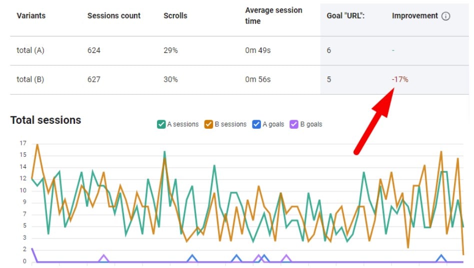
Some people think they optimize website when they just move button 5px left and pray. CRO don’t work this way. You want real conversion rate change? You need to test, but test smart. Not random. Not fast. You check what work, and keep it. What don’t work — delete and forget forever.
Your website already have visitors. Why you not test what they click? What they ignore? Don’t wait for miracle. Use A/B testing as tool to fix low conversion and bad rate with brain, not with guessing.
What to Test (Beyond Headlines)
Changing headline won’t save your CRO if rest of page is trash. Go deeper. Your website have so many parts. Test different parts. Weird parts. Fun parts.
Here are some wild A/B test ideas that worked better than expected:
- Put trust badges on bottom, and testimonials on top
- Move pricing table before feature list
- Replace CTA button with short sentence and hyperlink
- Show countdown timer only after scroll 60%
- Remove product images from first fold and show benefit text first
I did test where I just switch two blocks on homepage. Result? 40% higher conversion rate in two days. One friend test replacing video with GIF — crazy jump in signups.
Don’t be scared to test stupid stuff. CRO is messy. But if you don’t test, your website stay stuck. Every optimization starts from bold idea. Following conversion rate optimization best practices helps avoid wasting traffic on low-performing pages. Then you see if it helps your conversion rate or kills it.
Tools and Tactics to Run Smarter Tests
You don’t need big team or big brain to test smart. You need tool and one goal. That’s enough.
Best tools for simple A/B testing:
- Plerdy – shows heatmaps and run tests easy
- VWO – for more serious CRO teams
- Optimizely – expensive but flexible
- Convert – very detailed tool
- Google Analytics 4 + manual version – if you broke
One tactic: always let test run enough. Not two days. Give it full traffic. Let your website breathe. Let conversion rate show real data.
Another tip: test only one thing per time. You test too many things? You know nothing in the end. Keep focus. Your CRO strategy must be one step per time, or you go in circle. That’s why following conversion rate optimisation best practices is key when designing high-intent pages.
A/B testing not sexy. But it change numbers. That’s how you get better website. Better conversion. Better life.
CRO Tools to Streamline Your Optimization Process
Plerdy: All-in-One Heatmaps, Popups, SEO

When I used Plerdy for the first time, I didn’t expect much. I just wanted to know where people click. But after one week — boom. I saw which parts of my website no one touched. My CTA button was in dead zone. That’s how I found problem and fixed it. And guess what? My conversion rate got 1.3% higher. No ads. No redesign. Just smart CRO.
Plerdy is not only heatmaps. You get:
- popups that don’t kill your user’s soul
- smart forms that collect emails without pain
- SEO checker to find page issues fast
- event tracking with no dev crying
- visual reports that show what work and what not
All in one place. Easy. Even my cat can use it. (Ok maybe not cat, but you get me.)
Plerdy Chrome Extension: SEO on the Fly
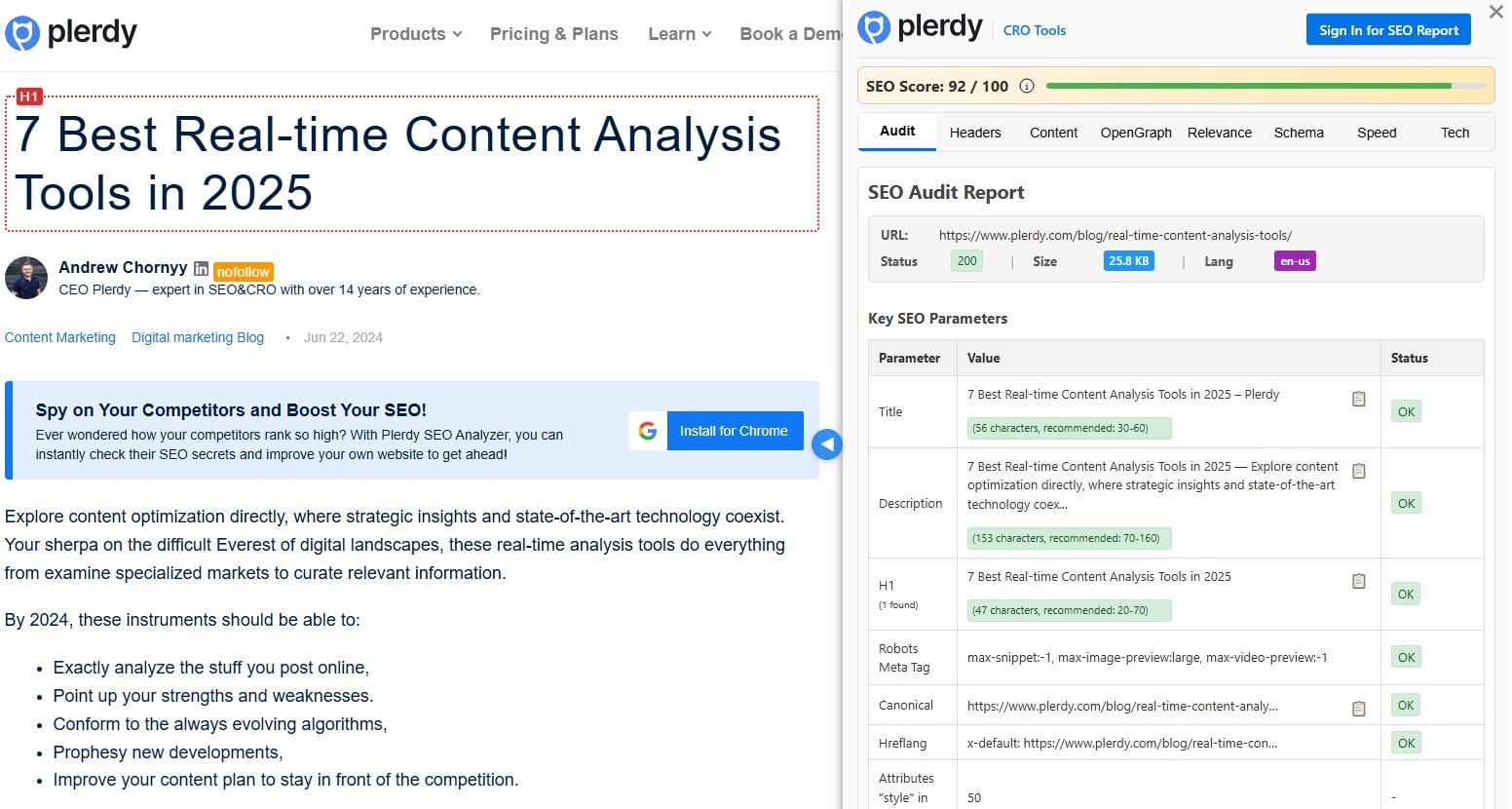
This thing saves time. I open website, click icon — boom, SEO data. Title too long? Meta description missing? Broken links? You see it in 3 seconds. I use it daily now. Not only for my projects — even for clients. It’s free. Fast. No sign up. You just install and go.
And yeah, you can see how that connects with conversion too. Bad SEO = no visitors. No visitors = no optimization. No optimization = zero conversion rate. It’s all one game.
Other Tools: Hotjar, Optimizely, VWO
I also tested Hotjar — their session recordings help me see how users move like lost kids. Optimizely? Too pricey for me. VWO? Nice if you have big company. But honestly, for small teams or solo work, I stick to Plerdy.
You don’t need 10 CRO tools. One is enough, if it works. My website didn’t change much on design. But conversion rate? Oh boy. Numbers don’t lie.
Optimize High-Intent Pages First

Not all pages on your website deserve your time. Some of them are just there. Pretty. But useless. If you want better conversion, start where it matters. Where people already thinking to act. That’s your gold. That’s where CRO works best. You don’t optimize dead pages. You optimize pages with fire.
I made this mistake before. Optimized blog post with 12 views. What I got? Zero rate change. Then I moved to product page — same traffic, better layout, +3% conversion. That’s CRO done right. That’s optimization with brain.
Where to Start: Pages That Actually Convert
Look at your website. Where is intent? Not noise. Not random visits. Real intent.
These are pages that usually give best conversion rate:
- product details
- pricing table
- sign-up flow
- checkout
- “get demo” section
E-commerce? Product page is war zone. One wrong move, and conversion rate dies. You hide reviews? You slow images? They leave.
SaaS? Pricing is heart. People don’t scroll forever. If plan makes no sense, they close tab. I tested one SaaS site where just moving FAQ below pricing increased trial signups 2.1%. That’s pure CRO.
Don’t waste time on homepage. Go where action is.
Design Elements That Matter
You want pages that convert? Then make them usable. Usable = fast + clear + smooth. You don’t need perfect art. You need clarity.
Here’s stuff that kills or saves conversion:
- Layout: Flow must guide eye. Step by step. No zig-zag.
- CTA placement: No. Forget CTA. Talk about info blocks. Keep action near context.
- Color contrast: Don’t let people squint. Bold matters.
- Visual hierarchy: One main idea per section. Don’t shout five at once.
- Mobile: People scroll with thumb. You test that or guess?
Good layout decisions are part of conversion rate best practices that keep users engaged. On one store, layout was reversed — reviews above title, spec below price. Rate was 0.6%. Fixed order, rate went 2.3%. Same traffic. New money.
CRO is not magic. It’s picking right page and cutting noise. You already have what works. You just optimize it better. That’s how websites grow. That’s how you win.
Craft Text-Based CTAs That Don’t Look Like Ads
You build a website. Add banners. Big buttons. Shiny colors. You expect higher conversion, better rate, more leads. What you get? Silence. That’s not optimization — that’s wishful thinking.
Problem is not your offer. Problem is how it look. Visitors ignore banner-style CTAs. It’s called banner blindness. People visit your website, but skip all your “BUY NOW” boxes. They came with intent — and left with nothing. Your conversion rate dies quietly.
I’ve done this mistake. Optimized banners for weeks. Zero improvement. Then I wrote one small sentence after product features. No button. Just text. Boom — conversion jumped 4.1%. That’s what smart CRO looks like.
Don’t shout. Speak.
Why Banner CTAs Fail (and What Works Instead)
Banners look fake. Too shiny. Too perfect. Visitors trained to avoid them. You can test design all day — but your conversion optimization fails if brain skips CTA.
Now check these examples. All worked better than banners:
- H3: Still comparing SEO tools? → See how Plerdy boosts your traffic
- H4: Not sure what plan fits? → Explore pricing with examples
- Inline: Want better results without more traffic? → Try real CRO audit
These CTAs feel human. No pressure. They work inside content. That’s how you raise conversion rate without redesign. One line can change behavior more than ten banners.
Your website doesn’t need more elements. It needs better conversion writing. It needs clear message in right spot. A little text, one good link — that’s real optimization.
Good CRO doesn’t scream. It guides. No tricks. Just understanding where visitors are — and offering next step.
Test text. Kill banners. Grow rate. That’s how smart websites win.
Reduce Friction in Forms and Checkouts
You can drive traffic to your website all day, but if your forms suck — no conversion. You don’t fix low rate with more ads. You fix the damn friction. Every extra click kills your optimization. Every useless field destroys your CRO. And you know it.
I see this every week. Beautiful website. Cool product. But checkout form asks for fax number. Seriously? It’s 2025. You want better conversion rate? Then stop annoying your users with junk forms. That’s the first step in real conversion optimization.
You want clean path. You want fast action. CRO means no bullshit.
Minimize Input Fatigue
People hate typing. Even more on mobile. Every useless input kills mood. Kills rate. And yeah — kills your website revenue.
Remove these fields unless 100% needed:
- Phone number (unless you’re gonna call)
- Company name (nobody wants to write that)
- “Confirm email” (just no)
- Street 2 (what even is this?)
- Zip if your system auto-fills
You can test step-by-step forms too. Split checkout into short flows. Add progress bar. Show only one group of fields per step. Less overwhelm = better conversion.
Also try conditional logic. Don’t show payment stuff until shipping is picked. Don’t ask country if it’s already in the browser geo. These things change the whole flow and boost optimization.
Every useless click is death for CRO. Fix the form, save the conversion.
Build Trust With Microcopy and Validation
Your website can look cool, but one dumb error kills the trust. You know that red message: “Form incomplete.” Okay, but why incomplete?
Use smart validation. Say what went wrong — and how to fix. Put message near the field. Keep it human.
Also, write small helper text. That microcopy? Huge for conversion. Say things like: “We don’t spam” or “Card won’t be charged now.” This changes emotion. User relaxes. Form feels safer. Safer form = better rate.
Small words matter. CRO is not about tricks. It’s about making the journey smooth. And your optimization depends on it.
You want better rate? Fix the forms. Not just look pretty — make them feel easy. Clean forms are part of basic conversion best practices every marketer should follow. That’s where conversion lives.
Re-Engage Users With Retargeting and Exit-Intent
You work hard to bring people on your website. But then boom — they vanish. No click, no signup, no conversion. Rate stays flat, your CRO suffers, and traffic feels wasted. But don’t panic. You can still re-capture them. You just need smart triggers and better timing.
Forget about shouting banners. Real optimization is quiet. You remind, not attack. You trigger action at the right second. That’s how you bring back users and turn bounces into real conversion wins.
Behavior-Based Retargeting That Works
Not all visitors are same. Someone read whole blog. Someone scroll 80%. Someone added to cart and ran away. So stop using same popup or ad for all. That’s lazy. Your CRO deserves more.
Trigger based on:
- Cart abandon (classic, but still strong)
- Content read (if user finish article, offer checklist)
- Scroll depth (hit 75%? time for CTA)
I once changed message from “Need help?” to “Still unsure about plan?” for SaaS tool. That small change in retargeting boosted website conversion rate a lot. Why? Because message hit real thought. That’s real optimization. Not guess — strategy.
Also, tools like Plerdy and ConvertBox let you run these triggers easy. No dev pain. Just logic and action. CRO done right.
Exit-Intent Popups Without Annoying Users
Most exit popups feel like screaming kid in mall. You want to leave — and it grabs your leg. Annoying. Bad for website. Worse for rate.
But exit popups can work. If they feel natural. If they fit mood.
I had one case where simple text — “Before you go, want 10% off?” — beat fancy design. Why? Because message was soft. User didn’t feel trapped. They felt seen. And that’s what changes rate.
Test clean designs. Use delay. Wait 4–5 seconds after intent. Don’t block whole screen. Let popup breathe. That makes conversion smoother.
Conversion, CRO, rate — all better when website feels human. And retargeting is your second chance. Don’t waste it.
Leverage Video and Social Proof to Build Trust
People land on your website, scroll a bit, and boom—they leave. No conversion, no action, just gone. Why? They don’t trust you. Not yet. And trust is what turns visits into real conversion. You can’t boost conversion rate on your website without some human stuff. That’s where video and social proof jump in. It’s not only about CRO numbers. It’s about feeling safe to click. You want conversion? You need emotion + proof = optimization.
CRO is not only form testing. It’s also: “Do I believe this website?” You gotta optimize trust the same as layout. If people trust what they see, the conversion goes up. It’s not magic. It’s just better CRO thinking.
Use Video to Guide the Decision
You add video, but not for fun. You want it to push rate. Help people understand faster. That’s part of CRO too—speeding up decisions. Put short video near pricing or on homepage. Show product, talk simple. Real face, real voice. Don’t do Hollywood—do honesty. That’s what makes website feel alive. You optimize not pixels, but trust.
Video is CRO tool. Yes, video = conversion boost. Especially when user is not sure. One video near call-to-action can move your conversion rate from 1% to much better. Not always huge jump, but it helps every website. And with tools like Loom, Wistia, or Plerdy’s popup videos—you can make video part of optimization fast.
Use Reviews Strategically, Not Randomly
Don’t just throw reviews on your website and hope. CRO needs smart moves. You want to trigger action. So where to place reviews for best conversion?
- Near CTA button—when user must decide
- Scroll-triggered—when user pauses
- Inside email—right before test or trial link
That’s how you raise conversion rate without redesigning everything. Real review in right spot is better than ten in footer. It’s part of CRO strategy. If your website looks great but nobody believes it—no optimization will save it.
Social proof + video = emotional CRO. And yeah, it’s not fancy trick—it’s smart website optimization. You want more conversion? Then show more truth.
Conclusion
You don’t need more traffic to grow your business. You need better pages, smarter changes, and clean website optimization. Every small thing—form, CTA, headline—can raise your conversion rate. It’s not about guessing. It’s about testing, checking what works, and doing it again.
CRO is not fast, but it brings long-term wins. You won’t see results in one night, but after a few smart tweaks, your website will start to convert much better.
So stop waiting. Start testing. The fastest wins often come from applying website conversion best practices that focus on user flow and clarity. Your next growth jump is already hiding in plain sight. Go find it.