
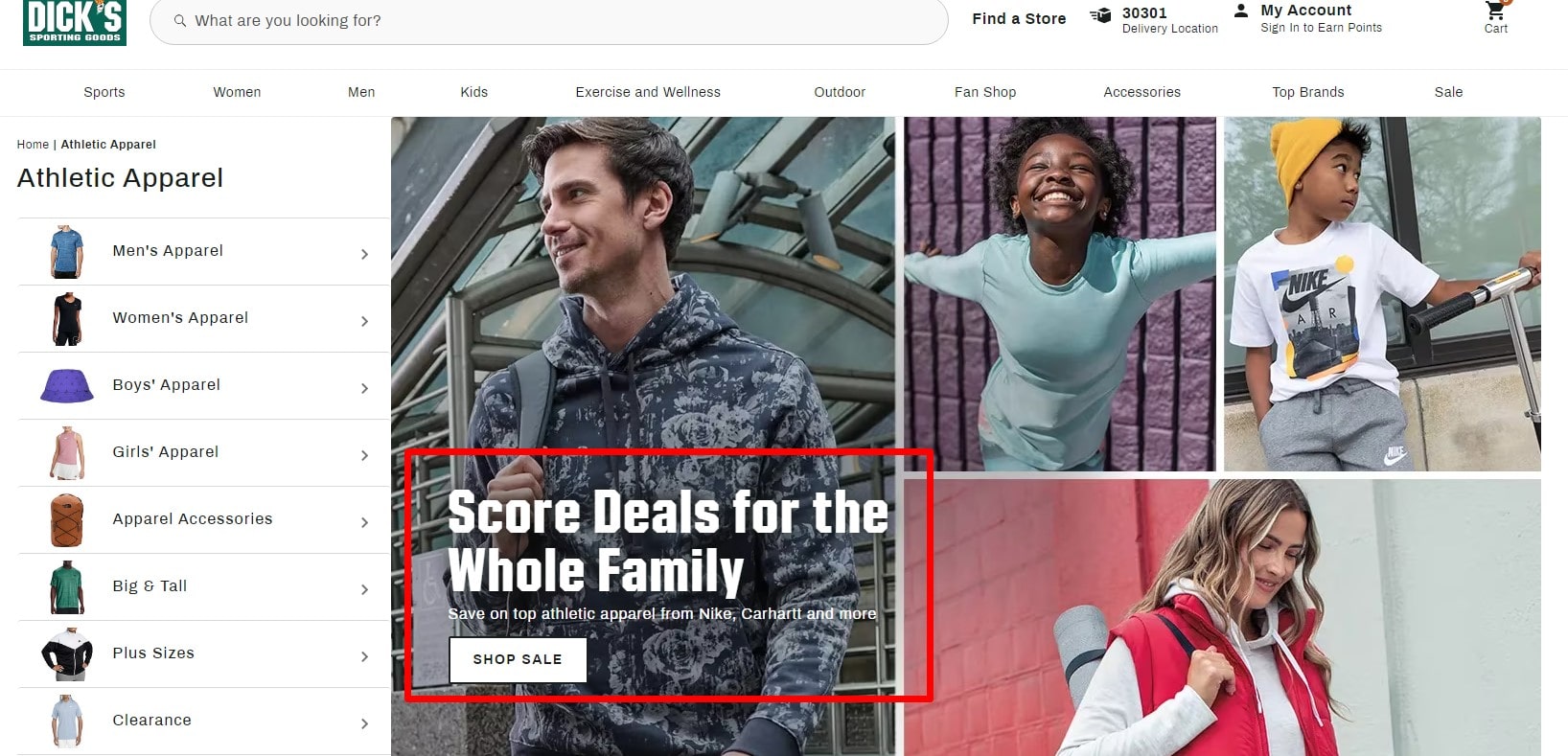
Harness the power of compelling communication with a strategically placed call to action (CTA). Imagine a product page without a ‘Buy Now’ button or an email without a ‘Sign Up’ link – void of purpose, right? ? That’s where CTAs kick in – they are the true champions of persuasion and catalysts for conversions. Key elements include:
- Clear language ?
- Prominent placement ?
- Appealing design ?
CTA function across various industries, from a ‘Donate Now’ button on a non-profit’s website to a ‘Join Us’ link in a tech startup’s recruitment email. However, crafting an effective call to action isn’t simply a job done. A CTA becomes powerful when integrated with user experience (UX) and conversion rate optimization (CRO) tools, like Plerdy, that provide data-driven insights. So, get the Plerdy tool today and bolster your calls to action to fuel meaningful engagement and encourage decisive action!
What is a Call to Action (CTA)?

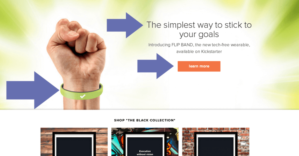
A call to action (CTA) is your business’s tipping point, the fulcrum where browsing pivots to engagement. This small but potent tool tells visitors, readers, or viewers what you want them to do next — it prompts them to take action. Imagine the sheer potential of a ‘Subscribe Now’ button on a blogger’s page or the power of a ‘Get Started’ link in a fitness app. CTAs are not just confined to ‘Buy’ or ‘Subscribe’; they’re vibrant and versatile.
Here are some key attributes:
- Concise yet impactful language.
- A design that pops.
- Positioning that’s hard to overlook.
The function of a CTA is universal, transcending all niches. For instance, an e-learning platform might use a ‘Start Learning’ CTA, while an e-commerce site might go for ‘Add to Cart.’
But let’s not get complacent – a compelling CTA isn’t an endpoint but a launchpad. Infusing it with data-driven insights from user experience (UX) and conversion rate optimization (CRO) tools gives it the edge to stand out. That’s where Plerdy steps in, a robust tool for CRO & UX, empowering you with actionable insights to optimize your CTA.
So, don’t settle for just any action – drive the action that counts. Elevate your digital discourse with meticulously crafted CTAs and watch the ripple effect on your engagement and conversions.
Why Should You Use Calls to Action (CTA)?

Calls to action (CTAs) form the bridge between a passive browse and an active engagement, a shift that underpins the commercial success of any online endeavor. They can light the path for your audience, directing them where to go next while nudging them to become active participants rather than silent observers.
In a world flooded with content, CTAs serve as your guideposts. Imagine a travel blog with a ‘Book Your Trip’ call to action or a music streaming site urging you to ‘Listen Now’ — they facilitate action and drive engagement.
CTA play vital roles:
- Channeling user flow — they help in navigating the website.
- Increasing user engagement — encouraging users to interact with the content.
- Driving conversions — turning passive visitors into active customers or subscribers.
Plerdy, a powerful CRO and UX tool, can help you uncover the most effective CTAs, thereby maximizing your return on investment. By leveraging Plerdy’s insights, you can craft calls to action that resonate with your audience and drive action.
In essence, CTA are your digital catalysts, stirring interest and compelling your audience to act. Don’t let potential customers get lost in the labyrinth of your content. Craft engaging CTAs, leverage tools like Plerdy, and ignite action that positively impacts your bottom line.
How to Write a CTA?
Crafting an effective call to action (CTA) is an art form that merges persuasive language with strategic positioning and design. A strong CTA propels your audience towards the action you desire, whether it’s downloading an eBook, signing up for a webinar, or purchasing a product.
Let’s delve into how you can nail your CTAs:
- Stir emotion: Language that evokes emotion encourages action. For instance, a fitness app might use a ‘Get Fit Today’ call to action, while an online store might opt for ‘Grab Your Dream Dress Now’.
- Leverage FOMO (Fear of Missing Out): Limited-time offers or exclusive deals spark urgency. ‘Get 50% Off – Only Today!’ is a compelling example.
- Be crystal clear: Ambiguity can be a roadblock. Your audience should understand exactly what happens when they click your CTA. ‘Download Your Free Guide Now’ is unmistakably clear.
- Employ actionable language: Use strong command verbs to start your CTA. ‘Join’, ‘Discover’, ‘Start’, ‘Try’, ‘Learn’ are a few good examples.
A tool like Plerdy can offer deep insights into what works for your specific audience, helping you fine-tune your CTAs for maximum impact. After all, a well-written call to action can ramp up your engagement and conversions, acting as the linchpin for your online success.
Remember, CTA don’t fit all. Experiment, analyze, and iterate to determine what spurs your audience to action. So, start creating those power-packed calls to action and get ready to see the magic unfold!
Where to Place a CTA?

A CTA button consists of a title on a colorful background. To highlight the button, adjust its text, size, color, and shadow. This is the most popular form of a call to action since buttons can be placed anywhere on a website and customized to look matching and relevant.
An average click-through rate for CTA equals to 3,29%. If you make CTAs credible and interesting to users, the clickability will be even higher.
But first of all, let’s clarify what types of CTA exist and where to place them.
Category Page
This page should succinctly show the key benefits of every product – discounts, special offers, an interest-free loan, etc.
Product Card
On this page, it’s important to add product descriptions, technical specifications, reviews, and information on availability. Make sure the information is really useful for potential buyers. If the product is discounted, add a countdown timer to indicate when the special offer ends.
Lead Generation Forms

It’s a vital element to attract new customers. Offer website visitors a discount on their first purchase, asking them to provide certain data instead.
You need to convey to visitors that they will benefit from completing the form and using the offer. Otherwise, conversion will be quite low.
Blog Articles
The average bounce rate for blogs and information websites is 50%. This means that half of the visitors that have landed on the article will close the website without going to the rest of the pages.
Surveys and Other Forms
The majority of forms end with call to action. Whether users provide information about the delivery and payment methods, subscribe to the website, or leave feedback, they click a CTA button to confirm the provided information at the end of each form.
It’s important to place the button right under the fields to be filled in. Otherwise, the user may miss it and leave the site at the important stage of the sales funnel.
6 Tips to Create Effective Call to Action
Remember to improve CTAs constantly. The understanding of the key rules will help you to make CTA on a website more effective. Here are the main of them:
1. Brevity and Clearness
To produce good results, a call to action must be short and understandable to customers. Creating the text for CTAs, keep in mind the following tips:
- Trigger words like a gift, free, and get increase the conversion of a CTA.
- Explain to customers what will happen when they react to the call to action. Instead of the trite “Send,” use a more clear button title. For example, Get a trial version, Subscribe to a newsletter, or check the price.
- Be original. Almost every online store uses the “Order,” “Buy,” and “Learn more” buttons. If this is appropriate for sphere, create more unusual CTA, like I want, Add to my cart, Reserve.
2. Urgency
Compare these two CTA:
- Get a free checklist on how to create email newsletters.
- Only two days left! Hurry to get a free checklist on how to create email newsletters.
There are high chances that the second CTA will be more effective since the visitors will understand that in 2 days, they won’t be able to use it. In the first case, they realize that they can get the checklist anytime they need it.
Never deceive users when you create a time-limited offer. If you use a CTA of the second type or place a countdown timer, terminate the offer when the specified period ends.
3. A limited Number of Words
The excessive use of text often leads to conversion decrease. Users don’t want to waste time reading and leaving the website even though the offer might be interesting.
Writing the text for CTA buttons, don’t use more than five words. At the same time, consider that it must include only 1-2 words if the button is small.
The audience must be informed of deviations. For example, sometimes, call to action buttons have 6-7 words. Nevertheless, this is only relevant to large buttons that are usually used on landings.
4. Buttons Against Links
In most cases, buttons are much more effective than links. At least because they are visually more appealing. But sometimes links generate better results (first of all, in blog articles and email newsletters).
Don’t rush and test different design options of CTA to choose the most effective one.
5. Optimum Location
We all read the information on web pages based on the same pattern: from the top left corner to the bottom right. We first want to check the general information by opening a new website page, so the top left corner is a bad place to add a call to action.
If the page doesn’t contain much content, the center is a good place to add the CTA.
6. Contrast Colors

Contrast colors make CTA more appealing and easy to notice. To pick the right combinations, select the opposite colors from the color wheel like this one.
How to Analyze the Effectiveness of a CTA?
Every website is unique in its way, so it’s impossible to guarantee that adhering to all rules of CTA creation, you will get a high conversion rate. You should continuously monitor the effectiveness of a CTA.
There are two main tools for this:
- Google Analytics. This is the most popular service for web analytics. Set clicks on CTA buttons as goals to learn how effective CTAs are.
- Plerdy. A dedicated service for click analysis. It lets you see all user clicks on the website elements (including pop-ups) made during the reporting period. Also, the Plerdy service compiles click reports which can help you to see problematic elements are correct them.
Conclusion
We’ve trekked through the dynamic landscape of call to action (CTA), unfurling its many facets. We’ve recognized the power of CTAs and how they propel a prospect’s journey, painting a clearer picture of your brand’s offerings. From the simple ‘Sign Up’ to the persuasive ‘Get Your Free eBook Today’, CTAs are your business’s compass, directing customers towards meaningful engagement and interaction.⚡
Whether you’re in ecommerce, content marketing, social media, or any other industry – tailoring your CTA to your audience can help skyrocket your conversions. It’s about sparking emotion, generating urgency, and providing clear, actionable steps.⚡
Here’s a quick recap of what we’ve covered:
- Understanding CTA
- The necessity of CTA
- Crafting powerful CTA
We also discussed tools like Plerdy, integral in refining your CTAs and improving your website’s user experience and conversion rate optimization (CRO). So, ready to bring your A-game to your CTA strategy⚡
Remember, the world of CTAs is ripe with experimentation. Play around with different phrases, positions, and designs. Track, analyze, and adjust as needed. Because in the ever-evolving digital marketing arena, those that adapt thrive.
Let’s step into the future of marketing together, armed with the power of effective CTAs! ?