
Let’s be real: pretty doesn’t pay. In 2025 you win with behavior-first UX, not decoration. Your product needs momentum, not mascara. A shiny hero? Cute. Conversions zero. I’ll show 12 UX moves you can run this week—fast changes, no giant redesign. Each move pushes the product forward on the page, especially for E-Commerce where seconds kill wallets. Think Shopify or Amazon, not museum posters. We watch the page, we guide action, we cut fluff. I’ll use Plerdy UX & Usability Testing, plus small nods to Figma and Notion—practical, human, E-Commerce-ready.
Move 1: Value-First Headline And One Primary CTA
When It Works
Your UX must push the product now, not tomorrow. On a page where E-Commerce brains scan in 3 seconds, a clear promise wins. UX says “what it is,” product says “why care,” page says “do this.” E-Commerce clicks follow.
Anatomy (Headline → Subline → CTA)
- Headline: value first — UX promise for the product on this page
- Subline: short proof or outcome for E-Commerce users
- CTA: one verb, one route; matches UX task and product benefit
- Optional badge: trial or guarantee near CTA on the page
Metrics To Watch
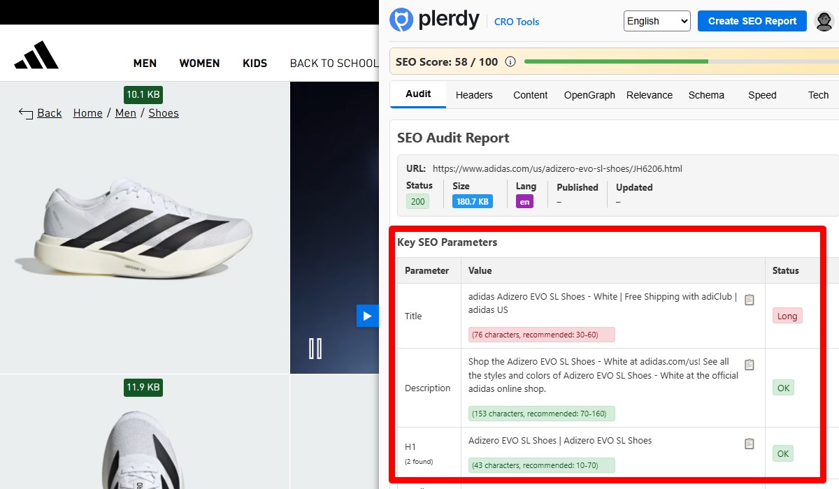
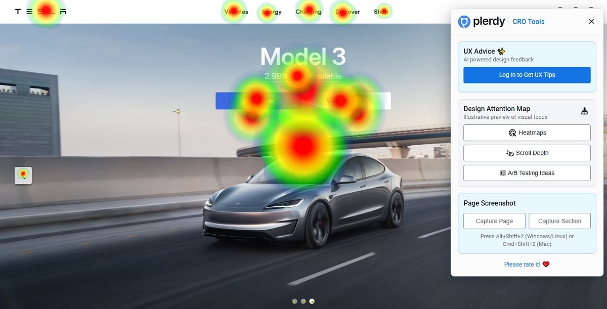
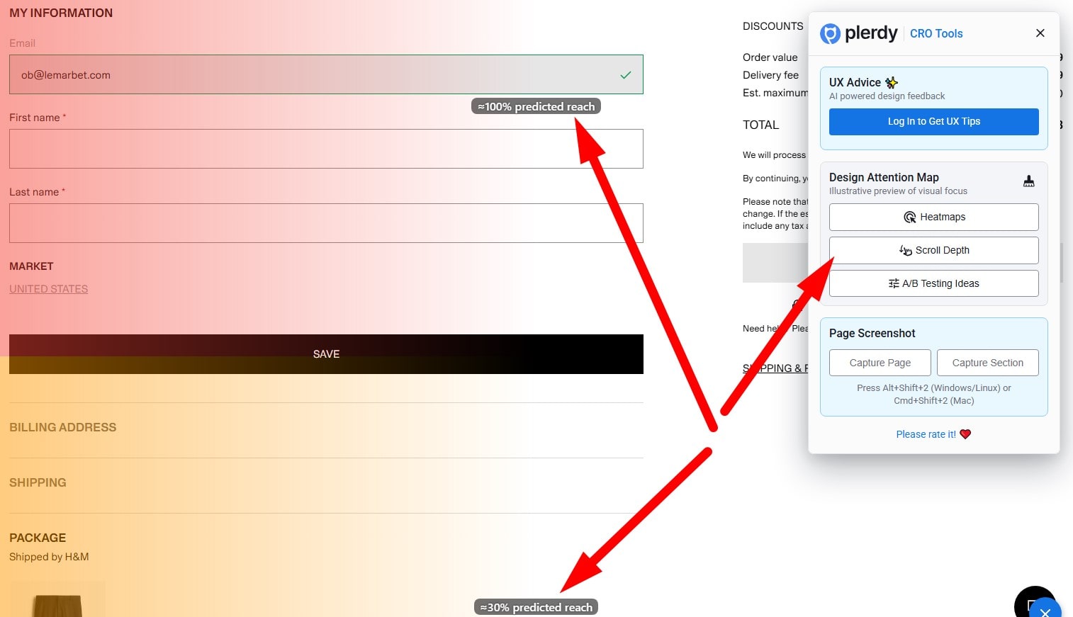
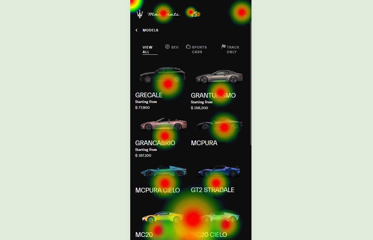
Use Plerdy UX & Usability Testing: AI heat to the headline and CTA; scroll depth to see % who view CTA in first 600–800 px. E-Commerce teams target +10–15% CTR. Plerdy SEO Analyzer: check H1 and button labels match UX intent and product message on the page.
Move 2: Problem–Solution Split Above The Fold
Problem Clarity
Your UX must say the pain in plain words. On the page, spell the obstacle and the cost. For E-Commerce, be blunt: the product wastes time, money, or sanity. No poetry—pressure, then relief.
Solution Snapshot
- What: UX answer shown on the page, one screen, one action.
- For whom: the E-Commerce buyer or the product admin—no guessing.
- Result: faster setup, fewer clicks, cleaner product flow on the page.
Proof Nearby
Place proof right beside the solution and CTA. On the page: rating, quick stat, tiny logos—Shopify, Notion, Amazon. Plerdy tracks it: UX heat should flow problem → solution → CTA; scroll depth confirms proof is seen.
Move 3: Micro-Demo Instead Of Promo
What To Show In 5–8 s
Give me action, not hype. UX shows the core step, the product solves one pain, the page removes doubt. For E-Commerce, demo checkout or sizing. Fast hands. Zero fluff. Real clicks.
Controls And Accessibility
- Captions on the page: UX text that explains the product motion for E-Commerce users.
- Pause/Replay button: control stays near the product, not hidden.
- High contrast: the page keeps UI readable; UX wins over glossy frames.
Conversion Hook
End the micro-demo with one crisp CTA. The page pushes “Try,” the product answers “what next,” and E-Commerce brains obey. Track in Plerdy UX & Usability Testing: heat on “Play/Try,” scroll depth reaching the demo; aim +8–12% CTR.
Move 4: Social Proof Before Push
Pick The Right Proof
- Logos from real E-Commerce brands on the page
- One-liner testimonial about the product outcome
- Star rating or short score near UX copy
- Tiny case blurb with a concrete win
Placement With CTA
Put proof next to the CTA, not in a museum down the page. Your UX should carry the eye: proof → action. For E-Commerce this calms risk fast. The product feels safe, the page feels honest, and the hand moves to the button. No drama, just momentum.
Trust Metrics
Show numbers that matter: % adoption, refund rate, delivery time. Track with Plerdy: scroll depth ≥60% see proof before the click; AI heat confirms attention stays on rating while the UX still points to CTA. Product trust up, E-Commerce bounce down.
Move 5: Navigation That Reduces Effort
- Main sections clear, no fluff
- Search visible on every page
- Breadcrumbs show path, not poetry
- Footer anchors to real tasks
Essential Paths Only
Trim the menu to jobs. UX should guide the hand, not parade features. On an E-Commerce page, surface the product routes customers use weekly: Shop, Cart, Support, Returns. Fewer doors, faster brains.
Visible Search And Breadcrumbs
Search must stare at me. Breadcrumbs tell me where the product keeps me on the page and how to jump back. In E-Commerce this saves rage. UX earns trust because I never feel trapped.
Mobile First Nav
Big tap targets, short labels, zero hover fantasy. UX prioritizes thumb flow; the product keeps important routes sticky. The page should scroll clean, not wobble.
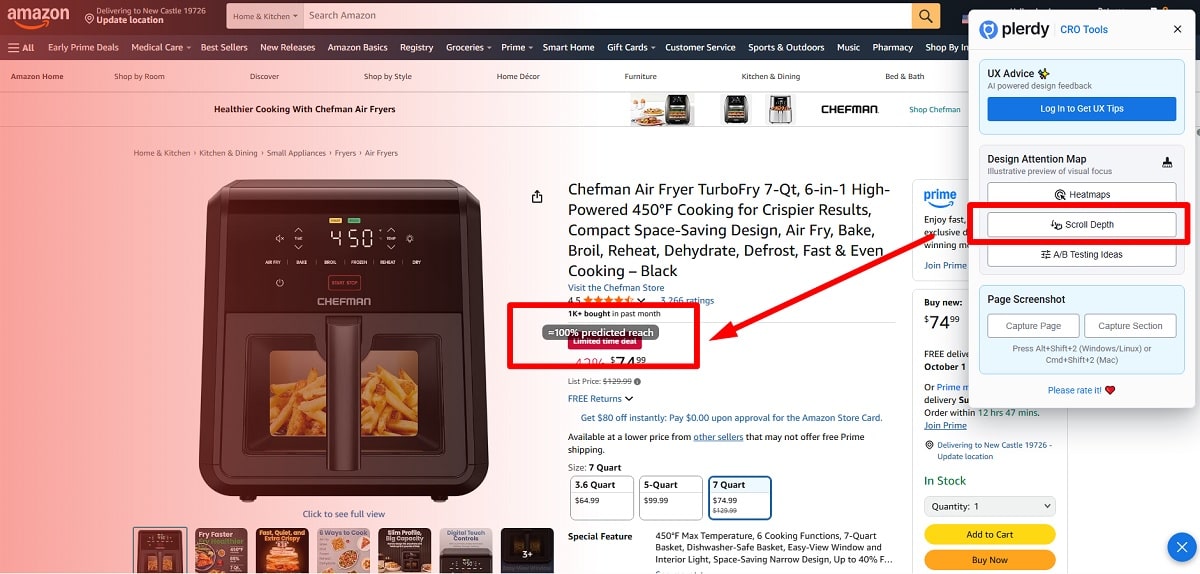
Plerdy check: in UX & Usability Testing, 5–7 menu items should capture ≥80% clicks; scroll depth confirms users actually see search on the page.
Move 6: One Intent Per Screen
Detect Mixed Intent
You feel it when UX fights itself. On the page one message says “learn,” another whispers “buy.” The product hesitates; the E-Commerce brain stalls. Scan UX clicks: scattered hotspots = confusion. One screen, one job.
Screen Refactor
- Remove secondary CTAs that steal action on the page
- Sharpen copy so UX explains one task for the product
- Split flows: research screen vs. E-Commerce checkout screen
Measure Cannibalization Drop
After refactor, UX heat should tighten around the main CTA; the page stops leaking attention. Track with Plerdy UX & Usability Testing. Expect +10–15% CTR in E-Commerce tests. Optionally verify headline–CTA match using Plerdy SEO Analyzer so the product promise equals the action.
Move 7: Outcome Metric Bar (“Proof Bar”)
Which Metrics Convince
Show numbers that punch. UX needs proof, not poetry. On the page, display product outcomes E-Commerce cares about: conversion %, delivery speed, refund rate, setup time. Two digits beat adjectives. Courage beats fluff.
Design The Bar
- 1–3 metrics, clear units — UX reads fast on the page
- Trusted source (Shopify data, Stripe dashboard) — product feels real
- Place next to CTA — E-Commerce eye lands, action fires
Before/After Impact
Ship the bar, then measure. UX focus tightens, product doubt drops, page CTR moves +5–10%. Track with Plerdy UX & Usability Testing: scroll depth shows the bar before click; heat confirms they read the numbers in E-Commerce flow.
Move 8: Forms That Don’t Fight
Min Fields, Max Clarity
Your UX should feel friendly, not police. On the page ask only what the product truly needs now: email, name, payment later. In E-Commerce this cuts drop-offs fast. Two fields beat six. Short labels. No mystery.
Helpful Errors
Errors must help, not shame. UX says what broke, the page shows where, the product offers fix. “Card expired, use new one” beats red wall. In E-Commerce tests I saw −20% abandon when copy was human. Add tiny examples: “mm/yy”.
Friction Killers
- Autocomplete for address on the page
- Input masks for phone; UX prevents chaos
- Inline-tips near fields; product explains in place
- One-screen checkout for E-Commerce flows
Plerdy watch: heatmaps show stop zones; catch rage-clicks around errors and tips, then patch.
Move 9: Mobile Thumb Zone And Target Size
- Size: tap targets ≥44 px; UX respects human thumbs.
- Spacing: 12–16 px around buttons so the page breathes.
- Priority: sticky bottom bar for the main product action in E-Commerce.
Targets ≥44 px
Big targets save rage. UX meets anatomy: thumb hits once, not twice. On the page your product button must sit in the thumb zone, not top corners. In E-Commerce this trims fat taps and keeps flow clean.
Spacing And Sticky Bars
Room to move. UX needs gutters; the product needs air. Keep the sticky bar low, never covering content. The page shows one clear route. In E-Commerce, that bar anchors action without hijacking vision.
Gesture Hygiene
No hidden hovers. UX supports swipes back, pull-to-close, clear exit. The product should avoid surprise modals that trap the page. E-Commerce buyers hate traps.
Plerdy check: mobile heatmaps = zero miss-taps; verify the sticky bar doesn’t block content and attention heat stays on the primary action.
Move 10: Microcopy That Reduces Anxiety
Say The Risk Out Loud
Say the risk, not poetry.
- “No card” for trial (UX calm).
- “Cancel anytime” reduces E-Commerce fear.
- “2-minute signup” tells product speed.
Page honest, UX human, E-Commerce trust grows. Right now.
Short Benefit + Action Verb
Write one benefit + verb. UX says outcome, product promises action, page points next step. Example: “Save fees — Start free.” For E-Commerce use shipping and returns. Microcopy moves; UX clear, product sharp, page simple.
Placement Next To CTA
Place microcopy next to CTA. UX guides eyes, product reduces doubt, page removes friction. For E-Commerce this line drives +5–10% clicks. Check Plerdy heat and scroll depth to confirm visibility.
Move 11: Media With A Job

Explain, Don’t Decorate
Your UX must make the product clearer, not prettier. On the page the video or image explains one step. E-Commerce shoppers are busy; show payoff, not vibes. UX teaches, product proves, page pushes action.
Alt And Captions That Sell
- What I will see on the page, for this UX moment, with this product.
- For whom: the E-Commerce buyer or the product admin, no guessing.
- Result: faster setup, fewer clicks; page confidence grows.
Don’t Steal Focus From CTA
Keep media secondary. UX points to the CTA; product evidence sits nearby; page keeps eyes steady. For E-Commerce this means more taps on “Add to cart.” Check Plerdy UX & Usability Testing: heat shouldn’t drown in gallery; scroll depth must reach captions.
Move 12: Speed-Feeling > Pure Speed
- Useful content first on the page
- Defer decoration; ship core flows
- Clear states: loading, empty, error
Prioritize Useful Islands
Make UX show value in second one. Put the main product action at the top of the page; hide art. For E-Commerce, show price, stock, delivery window now. UX pushes action, product proves worth, page feels fast.
Skeletons Without Lies
Use skeletons only when UX reveals real product parts fast. On the page, load copy, buttons, and critical E-Commerce blocks first—no fake grey boxes. Promise less, show more. UX gains trust; product feels responsive; page calms down.
Time To First Action (TTFA)
Measure TTFA. UX should get a tap in <3s; product must confirm input without drama; the page keeps motion. In E-Commerce aim −20% drop in exits. Check Plerdy: early UX heat on useful areas; scroll minimal before first action.
Conclusion
Behavior beats pretty. If you run 3–4 moves in one sprint, you’ll see motion. Watch UX, fix UX, then watch again. Your product needs momentum, not makeup. On the page, every pixel must push a task. In E-Commerce, seconds are money. Pick Move 1, plus two more, and run observe → micro-fix → observe. Set a 7-day timer and ship. UX gets sharper, product gets trust, page gets clicks. E-Commerce teams report +8–15% gains. Do it. Then check results in Plerdy and repeat.