
You build design fast, then ship. But wait — do a pre-mortem. In UX, we imagine the worst before launch: the trick pop-up, the hidden fee, the tiny opt-out. Dark patterns feel smart today, but they kill trust and later conversion. Not cool.
Think like a user, not a hero. Ask: if Amazon, Apple, or Shopify did this design, would the user smile or rage-quit? In real UX work, we test the “bad path” early, not after the PR fire. Small time now, big save later.
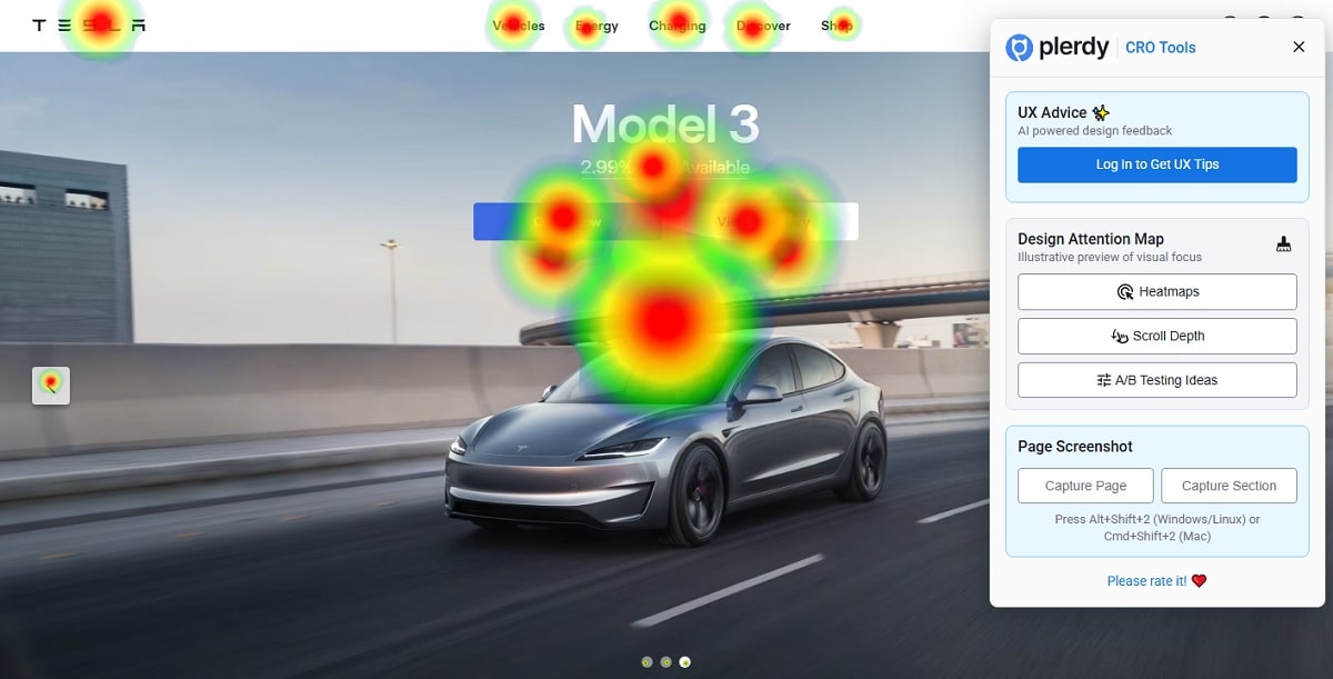
Here I’ll use Plerdy UX & Usability Testing (AI prediction heat map, scroll depth) to spot risky screens, and Plerdy SEO Analyzer to check technical trust. Clean design, honest UX, happier user.
The Black-Mirror Mindset: Think “Worst Case” Without Drama

Why Pre-Mortems Beat Post-Mortems
Pre-mortems keep your team calm. You test failure before launch, not after a Twitter storm. In design and UX, this means mapping the dumb mistakes that damage trust. My past projects saved 2–3 weeks of rework and cut PR risk ~30% because we spotted shady flows early. At Amazon or Netflix, fast rollback beats apology posts. A pre-mortem turns design talk into decisions, and keeps the user on your side when things get weird.
From “Happy Path” to “Oh-No Path”
Shift from the happy path to the oh-no path. You’re still doing design, just with darker glasses. In UX terms, probe where a user feels pushed, tricked, or trapped. Ask these four questions:
- Where does the user lose control in this flow?
- Which design element creates pressure or fear?
- What would a blunt friend say about this UX step?
- If this shipped at Apple or Shopify, would support tickets jump 20%?
Write the answers, kill the traps, keep your design honest and your UX human.
Dark Patterns 2025: Quick Map, Real Trouble, Red Lines
The New Offenders
You do design, I do design, but 2025 brings new traps for UX and every user. AI personalization can push too hard, “confirmshaming” still bites, and ghost opt-ins keep sneaking in. I see this in real products from big names—checkout flows at Amazon clones, subscription walls that copy Apple polish, and pop-ups that chase you across TikTok-style feeds. When design bullies the user, metrics jump first, complaints jump next.
Top 5 patterns I flag in UX now:
- AI-nudges that steer a user to the pricey tier, too smart, too fast.
- Ghost opt-ins: pre-checked boxes that follow your scroll.
- Confirmshaming: “No, I hate saving money” type microcopy.
- Coercive A/B: Variant B hides cancel, Variant A shows it.
- Dark timing: free trial ends at 02:00, email lands at 02:05.
Note for later: save screenshots or short videos of each pattern in your internal ethics log. Tomorrow you forget; next quarter legal asks.
Legal vs. Ethical
“Legal” is not safe. A design can pass terms and still burn UX trust. I saw a team cut support cost 18% by removing one ghost opt-in, even though counsel said it was fine. Users are smart; they feel pressure in two taps. When user trust drops, churn grows. PR crisis can erase a quarter of growth. Even Shopify-theme stores face this: one sneaky modal, refund rate +12%. Your rule: design for consent, not confusion. Keep language plain. Show price, show cancel, no maze. Ethical UX protects the brand today—and future revenue tomorrow.
Pre-Mortem Workshop: Scenarios, Roles, Artifacts

Cast the Villains
Run a 90-minute room with clear roles. You own the design, another person owns UX notes, and one tough friend plays “devil’s advocate.” That person pushes where a user feels cornered. A facilitator keeps time; a scribe logs decisions. Borrow patterns from Netflix incident reviews or Atlassian runbooks. Goal: fast tension, zero drama, honest user impact. Design stays calm; UX gets real; user wins.
Scripts that Hurt
Run three stress scripts where design and UX often fail, and measure how a user feels control.
- Subscription: auto-renew terms hidden; push at checkout; measure support tickets +15%.
- Checkout: surprise fee on the final step; track bounce +8% and refund trend.
- Cancellation: maze path; count time-to-exit and rage clicks.
Do a quick screen of Above-the-Fold with Plerdy UX & Usability Testing (AI prediction heat map, scroll depth) to spot manipulative CTA or copy before real traffic.
Evidence Pack
Keep artifacts or the memory dies. Save annotated screenshots, short Loom videos, and heat map snapshots showing where a user stalls. Add quotes from user tests (even 5 sessions change minds). Maintain a risk log with timestamp, owner, fix, and metric to watch. For extra hygiene, store baseline numbers from GA4 or Mixpanel. Next sprint, compare. Design grows up; UX stays human; user trusts you.
Heuristic Checklist vs Dark Patterns: 15-Minute Run
Copy Pressure Test
Quick pass before ship. Catch where design pushes too hard and hurts UX, especially for a new user. I run Plerdy SEO Analyzer to spot tiny fonts and weak contrast on headers.
- “Only today”, “Last chance”, “Don’t be poor” tone — remove the drama
- Fees hidden in footnotes — pull them into the main design block
- Font under 14–16px for key terms — bump it; error rate drops ~12%
- Star-ratings without source — add proof (G2, Capterra) or delete
- Countdown timers on non-scarce items — convert to neutral copy
Control & Reversal
You design flows; the UX must respect control. A user needs exit, price, consent, and undo in one screen.
- Clear cancel on web and mobile; compare to Netflix account flow
- Full price near CTA; mirror Amazon’s “order total” pattern
- One toggle for emails/ads; consent stored and visible
- Refund terms in plain words; support tickets fall ~15%
- Back button returns state, not resets the cart
Visibility & Flow
Great design shows options, not hides them. Good UX keeps the user calm above the fold. Test scroll behavior with Plerdy UX & Usability Testing (scroll depth).
- Critical CTA and price in the first viewport (no treasure hunt)
- Secondary actions visible (Save, Later, Compare) — not gray on gray
- Warnings and limits near the control, not in a separate FAQ
- Sticky review of fees during checkout, Shopify-style
- If users scroll >70% to find cancel, redesign the section
“Ethical” A/B Tests: Measure Impact Without Tricks
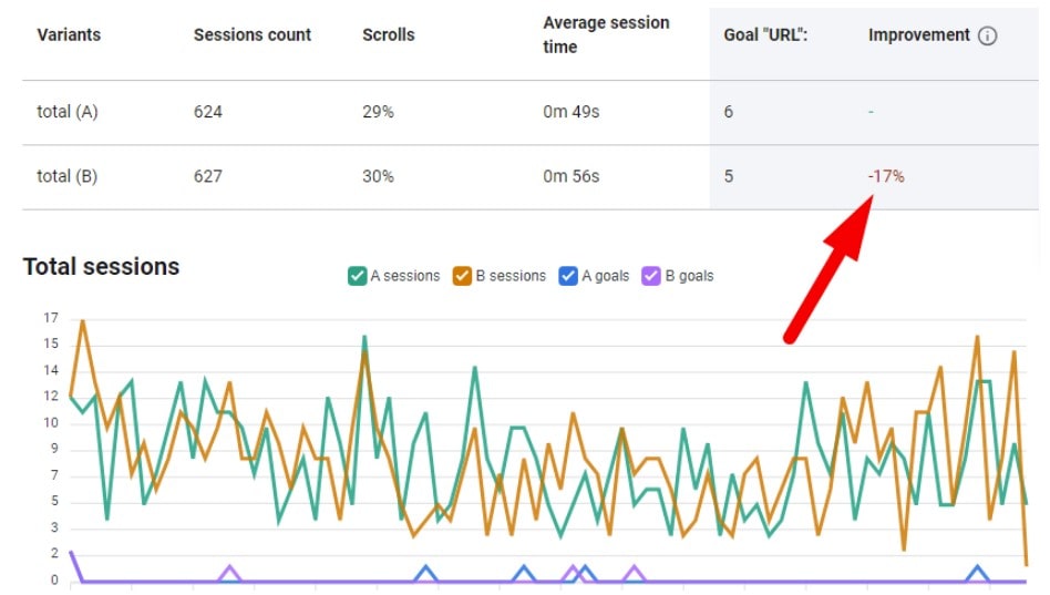
Define Success Beyond CTR
CTR alone is noisy. Your design and UX need richer signals that respect the user. Track:
- Unsubscribe rate after first email wave (target −15%).
- Complaint tickets per 1,000 sessions (aim steady or down).
- Refund/chargeback ratio during test window.
- NPS or quick CSAT (“Would you trust this flow again?”).
- Return visits in 14 days for the same user cohort.
These metrics tell a cleaner story. If design pushes, UX suffers, and the user disappears. When Trust > Hype, revenue stays.
Guardrails & Exclusions
Set rules before launch. Freeze copy windows, run one test per funnel stage, stop early if churn jumps +5%. Exclude vulnerable groups: students on trial, seniors with assistive tech, regions with strict consent laws. Keep parity on price and cancel access across variants. At Shopify or Netflix scale, this discipline saves teams from drama. Good design should not corner a user; good UX should not hide exits. Document all changes and keep audit notes for legal.
Before running traffic, sanity-check variants: Plerdy SEO Analyzer for technical health (no broken headings, no contrast fails), and Plerdy UX & Usability Testing to predict attention shifts between A and B.
Playbook for “Sensitive” Flows: Subscribe, Price, Unsubscribe
Subscription Entry
Make the entry clean. Your design must show the trio in one view: price, trial, cancel. UX stays honest, the user feels control, and churn calms down. I’ve seen support emails drop ~12% after we did this at a small Shopify brand.
- Clear “$ / month”, no asterisks, no drama
- Trial length + what happens after day X (autorenew on/off)
- Cancel path in the same screen, not hidden in Help
- Short FAQs under the CTA, one scroll max
Pricing Page
If your design hides numbers, UX dies and the user runs. Test the fold. Use Plerdy UX & Usability Testing (AI prediction heat map + scroll) to verify the price does not “sink.”
- Tier cards with honest “total cost today”
- Annual vs monthly toggle near the CTA, not in header
- Feature table with 3–5 rows, not a novel
- Social proof with source (G2, Trustpilot), target +5–8% CVR
Unsubscribe UX
A good design lets a user leave with dignity. Ethical UX reduces rage and refunds. Use Plerdy SEO Analyzer to catch hidden headings or bad semantics that mask options.
- One-click “Unsubscribe”, then confirm — no labyrinth
- Keep benefits summary, but no guilt copy
- Email preferences separate from account delete
- Post-exit survey under 20 seconds; completion rate ≥60%
Incident-Ready: Document, Escalate, Learn
The Ethics Log
You need a steady system, not blame. Keep one page per case so your design, UX, and user story stay clear. Aim to cut repeat issues by 25% in two sprints. Add short proof: screenshots or mini-videos; drop in Plerdy heat map frames if helpful. Structure it this way:
- Pattern: name the dark move in the flow
- Impact: who it harms, where in design/UX
- Metrics: churn, tickets, refund %, NPS
- Fix: owner + deadline + risk level
- Date: when found, when shipped
Comms Kit
When something breaks trust, move fast and stay human. Prep two templates: internal and public. Internal explains the decision path so design learns, UX adjusts, and the user hears one voice. Public message is plain words: what happened, what changed, how to prevent repeat. Keep a 24-hour SLA for first update, then weekly. Add numbers: support down −18% after fix, cancel friction −12%. Save assets and links so the next incident takes half the time.
Conclusion
Pre-mortem is not a stunt; it’s daily hygiene for product teams. You protect design before launch, you protect UX during traffic, you protect the user after. Pick one sensitive flow today—pricing, subscribe, or cancel. Run the checklist, ship an ethical A/B, log results in the Ethics Log. Keep it boring, keep it consistent. User trust grows; churn falls.
I use Plerdy UX & Usability Testing and Plerdy SEO Analyzer as a fast chain of checks, not ads. At Amazon, Shopify, or your tiny SaaS, the rule stays same: design honest, design clear, design calm. UX stays human. The user stays. The user returns. That’s the win.