
Content and functionality are highlighted when excess is removed from minimalist website design. By 2025, this method will have developed to combine user experience and aesthetics with ease. Websites these days are canvases on which simplicity is expressed in neat lines and uncluttered areas. These three are particularly noteworthy examples:
- Using simple designs, e-commerce platforms highlight products without drawing attention.
- Plenty of white space in personal portfolios helps to highlight professional accomplishments.
- With their simple layout, tech blogs concentrate visitors on their articles and insights.
Every industry uses simple design to efficiently transmit information, improving appeal and usability. With your website design, aim for this degree of clarity and simplicity. Not sure where to begin. Analyse user behavior with Plerdy’s tool; this is crucial for increasing conversion rates and improving UX designs. Explore minimalist design and let the real personality of your website to show.
Minimalist website design is what?
Carefully considered yet understated, minimalist website design highlights essential information and functionality while removing all extraneous components. The idea behind minimalist design is less is more. The company “What is Minimalist Website Design?” supports this method and turns average websites into amazing displays of grace and simplicity. Here’s how they accomplish it:
- Strict concentration on necessary characteristics
- Natural navigation that improves user experience
- Harmony in visuals achieved by negative space
With this method, users can easily locate what they need on the website and it doesn’t create visual clutter. Through the integration of minimalist design components, this agency guarantees that every website functions as a smooth, useful, and visually appealing platform. Using few components to maximize effect, “What is Minimalist Website Design?” creates websites that are not only viewed but remembered in a digital age of limited attention.
4 Minimalist Website Design Examples
We will explore some amazing minimalist website designs in this blog article that, by simplicity and ingenuity, really grab attention. The Plerdy crew also created a movie whereby we dissected four of the finest specimens. Let’s start to encourage each other!
RouserLab: Unleashing Bubbles with Purpose
Though its website is simple in design, RouserLab packs a punch with an interactive bubble that rises as you scroll. It injects a whimsical touch without overwhelming the design. The pop of the bubble makes a lasting effect. Though we lack heat map data on it, just consider how consumers would interact with that enjoyable interface—that is the kind of design you cannot overlook. This is a perfect illustration of how one creative element may improve a basic design and captivate users.
Amanda Braga: Color Transitions that Grab Attention
Amanda Braga’s website is striking right away with a strong scrolling motion that alters the backdrop color as you descend the page. The crossed-out menu challenges accepted menu designs and adds an artistic element. Although we can not find a click map analysis here, user involvement would be interesting to note, particularly considering how the scrolling interaction may affect navigation. This design shows simplicity does not equal compromising originality; rather, it may be visually striking without being overpowering.
The Year of Greta: A Timeline That Spins
Perfect for creative workers, the Year of Greta’s website design presents a different approach on portfolio layouts. Dividing the site by months and years, it spins naturally as you browse to provide a dynamic element while yet being neat and orderly. Though no click map is presented, it’s clear to see how users interact with this brilliant design, quickly investigating several areas. This sample shows how dynamic and interesting minimalist websites may be without sacrificing their simple look.
Mirra Health: Geometry in Simplicity
With a distinctive logo placement, Mirra Health’s website has a simple design emphasizing on clean lines and geometrical forms. Its simplicity by itself distinguishes it without showy effects. Although a click map is not given, it would be fascinating to observe how this improved design guides user attention. The design provides consumers with a visually harmonic experience by showing that occasionally the quietest elements make the most powerful statements.
List of 10 Best Minimalist Website Design Examples
Looking through the “10 Minimalist Website Design Examples” is like breathing in fresh air; each website pares down to its core, allowing the content to come through clearly. These examples demonstrate how a minimalist style can improve the design of a website and demonstrate that, occasionally, less really is more. It’s obvious that becoming a minimalist involves honing the things you decide to keep as well as eliminating things.
Wendy Ju
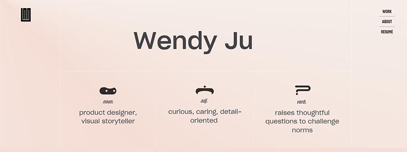
The website of Wendy Ju is a shining illustration of digital minimalist design, skillfully integrating practicality with elegant simplicity. The minimalist web design characteristics of usability and visual tranquilly are highlighted in the website’s simple, uncluttered style. A restrained color scheme that highlights the site’s commitment to minimalism welcomes visitors. The website stays away from overuse of graphics and concentrates on the most important aspects of content display and navigation.
Principal features of the website consist of:
- An easy-to-use user interface improves the experience of the visitor.
- Mouseover-activating subtle animations offer the ideal degree of interaction without being overly sensory.
- Typography that is carefully chosen to enhance the general minimalism concept.
Less is more is the minimalist tenet that guides this design approach. All the components of a website have a function. Such a design not only makes the user experience easier but also captures the artistic and professional values of the designer. The website serves as a digital canvas on which Wendy Ju demonstrates her skill at using the ideas of minimal design to produce powerful, intuitive digital spaces. The website, which demonstrates how few elements can have a tremendous impact, should be included in any discussion of the best minimalist design examples of 2025.
See more at the original site: Wendy Ju.
Firescript

Clean lines and usefulness are combined in Firescript’s simple website. Emphasizing simplicity and efficacy without compromising style, the homepage highlights the company’s main offerings. Using this strategy improves user experience and draws attention to the brand’s knowledge of digital transformation techniques.
Important components of the design comprise:
- A colour palette of monotone highlights the minimalist atmosphere.
- Easy-to-read, bold, clean typeface.
- Whitespace-based approach to attention and openness.
The website’s design demonstrates Firescript’s dedication to effective yet understated design by carefully arranging the pages to lead users through the offered services. Client endorsements are presented simply and succinctly, demonstrating the company’s success in line with the general minimalist style.
The minimalist idea that less is frequently more is followed by this design philosophy, which makes sure that every element of the website has a purpose. Firescript’s website is a shining example of how minimal design may result in maximum efficiency by concentrating on the most important aspects. It is a topic of conversation while discussing the best minimalist websites of 2025.
Visit the original site to see more: Firescript.
illo
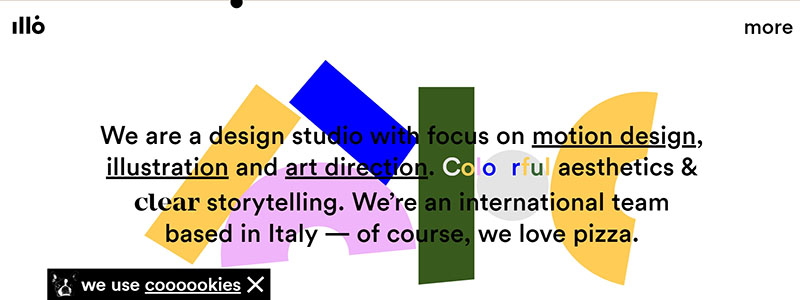
Illo’s website is the pinnacle of minimalist design; its simple, interesting layout draws in users right away. Everything on the page is obviously well chosen to provide a smooth experience that accentuates Illo’s artistic ability from the time you visit.
Important aspects of Illo’s simple website design consist of:
- Strong contrasts in a simple, effective color scheme to highlight key information.
- Adding whitespace improves readability and draws the reader’s eye to important components.
- Cleaner, simpler navigation makes sure people can find what they need without being sidetracked.
This design ethos is clear all over the website, stressing usefulness without compromising visual beauty. Vibrant, striking images that pop out against the simple backdrop of every project on Illo’s website demonstrate that minimalist design can be powerful and dynamic.
Illo’s website is visually appealing and encourages user engagement, therefore minimalist website design can maximize impact. For our study of the best minimalist designs in 2025, Illo’s website is therefore an ideal example.
Explore the original website to see this minimalist design: Visit Illo.
Donut

With its clean style and focused information, Donut’s website is minimalist. The homepage is marked by a gentle, peach-colored background that softly frames a centrally featured, playful donut graphic, symbolizing the brand’s friendly and approachable nature. The minimal text and spacious layout effectively communicate the main message without overwhelming the visitor.
Key elements of the design include:
- A concise, clear headline that instantly communicates the current status of the service.
- A single, prominent call-to-action button, “Log In,” stands out against the soft background for easy navigation.
- Minimal navigation options that reduce cognitive load and enhance user engagement.
The website’s basic design avoids clutter and emphasizes vital aspects, making the user experience easy. This approach not only enhances the website’s aesthetic appeal but also ensures that the message is delivered without distraction.
Donut’s website shows how minimalism can make a website distinctive and user-friendly. This makes it a great case study for our overview of minimalist website designs in 2025.
Explore the original website for more insights: Visit Donut.
Green Peas For Breakfast
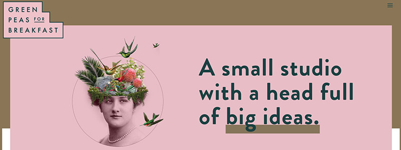
Green Peas For Breakfast has an elegant, well-organized style combined with vivid images in a minimalist website design. The well-organized display and the deliberate use of space surrounding things, which successfully directs the user’s attention, are what define minimalism on this website rather than the lack of color or detail.
Important aspects of the design comprise:
- A standard grid design that provides a tidy overview of the studio’s output by arranging project thumbnails.
- Every project tile uses a strong picture together with a succinct title to make sure the design is the main attraction without being overly wordy.
- The site’s subdued pink backdrop gives a constant, fine vibrancy that improves the appearance without taking away from the substance.
The website’s easy navigation emphasizes graphic portfolios over lengthy descriptions. By cutting out superfluous components and emphasizing the important, this method streamlines the user experience and is consistent with minimalist ideas.
Particulars include:
- Text is used sparingly so that the images take front stage.
- A color scheme that unifies the many parts without effort.
- Universally compatible responsive design components.
The website of Green Peas For Breakfast illustrates how creativity and color can improve straightforward design. It would be perfect to include in a 2025 article listing the best minimalist websites.
For a closer look at how they effectively use minimal design elements to create a visually engaging experience, visit their site: Green Peas For Breakfast.
Dragonfruit Media
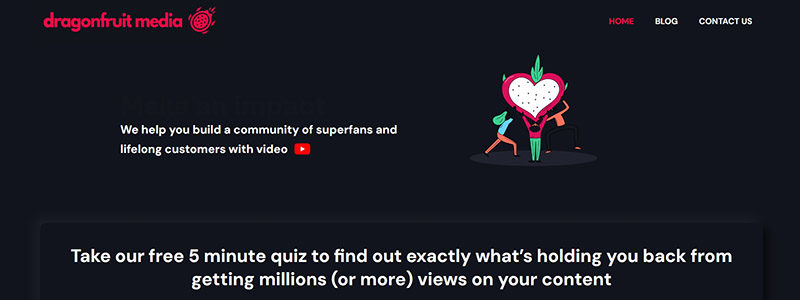
Website of Dragonfruit Media demonstrates how powerful simple design can be. A strong declaration on expanding audiences and the need of creating a community through video content on the site draws in visitors right away. This direct method emphasizes main ideas without superfluous detail and is a characteristic of minimalist design.
Important features of the website design consist of:
- An effective use of space in a tidy design that lets every element breathe improves readability.
- A constant color scheme that highlights important elements like the call-to-action buttons by fusing vivid, interesting images with dark backgrounds.
- Simple navigation that guarantees a smooth user experience by guiding users across the page naturally.
The homepage’s scant text emphasises the site’s visual style. Its message is conveyed by means of interesting images and succinct copy. This approach maintains the design simple and focused while making the material easily absorbed.
Highlights of the understated design of Dragonfruit Media include:
- Concentration on visual material to convey the services and message of the company.
- The main quiz call-to-action being repeated on the website serves to further emphasize the interactive engagement objective.
- Simple menu choices that guarantee easy site navigation while enhancing the minimalist look.
The website of Dragonfruit Media is a remarkable contribution to any conversation on minimalist design since it perfectly captures the ideas of the style. To better understand their approach, visit their site directly at Dragonfruit Media.
Ramotion
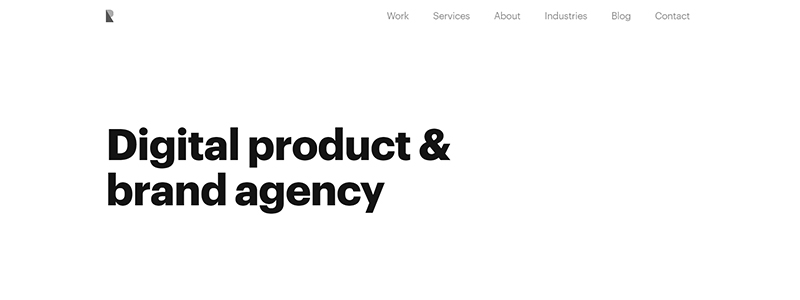
A minimalist design philosophy emphasizing utility and clarity is best shown by the Ramotion website. Showcasing the agency’s experience as a digital product and brand agency is made easy with this. The design makes use of a simple, ordered layout to highlight the company’s achievements and products without overpowering the user with visuals or too much information.
What distinguishes their understated design is this:
- Bold lettering combined with a monochromatic color scheme guarantees information that is both visually appealing and easily absorbed.
- Their service and success story information is logically arranged into sections, each with succinct headlines and bullet points that succinctly sum up their value offers.
- Without taking over the page, prominent logos of well-known clients offer visual evidence of their achievement and industry credibility.
Important characteristics consist on:
- Simple navigation that moves visitors fluidly between the site’s many parts.
- The emphasis is maintained on the material and functionality by using few ornamental components.
- Effective spatial use that respects the ideas of minimalist design to prevent visual overload and improve user experience.
This website is a potent illustration of how a simple design can produce a polished and professional online presence. Ramotion’s brand is strengthened as sophisticated and focused by the deliberate layout and simplicity, which facilitate easy navigation.
For details, see their website at Ramotion.
My Experience
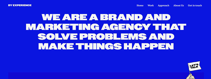
One excellent example of minimalist website design emphasizing impactful, simple message through a simplified look is the website for the brand and marketing agency “By Experience.” The website’s strong, logical color scheme—which is mostly blue—effectively emphasizes its main points and calls attention to its main services and successful case studies.
Major components of the site’s understated design consist of:
- A headline that sums up the agency’s mission and area of competence succinctly.
- Straightforward sans-serif typeface that improves reading and goes well with the minimalist style.
- Whitespace is used purposefully to support the site’s minimalist appearance and let each part and its content stand out.
The subsequent demonstrate this modest approach:
- The well arranged presentation of services include proposition design, creative marketing, and brand strategy, each with brief descriptions that don’t overwhelm the reader.
- Simplified graphics and personalized symbols are examples of visual components that pique curiosity and help people quickly grasp the services provided.
- A simple design that makes it easy for guests to move from one area to the next and guarantees easy navigation.
In a collection of minimalist website designs for 2025, the “By Experience” website compellingly presents its portfolio and service offers by reducing distractions. This design approach not only exemplifies their expertise but also shows how few components may have a significant influence on user interaction and perception of the brand.
To see how “By Experience” integrates these principles into their digital presence, visit their site directly: By Experience.
Meiwen See
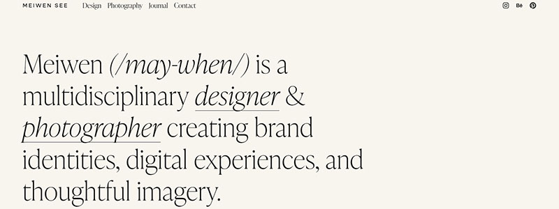
With its focused, unambiguous style that prioritizes usability and clean aesthetics, Meiwen See’s website is a perfect example of minimalist website design. The website opens to visitors with a straightforward yet elegant introduction to Meiwen’s extensive portfolio of photography and design.
Important sections of the Meiwen See website consist of:
- Meiwen’s artistic ability is evident in the clean, minimalist design that makes use of lots of whitespace to frame exquisitely crafted images.
- Visitors are guided without being overburdened by subtle font and little text, which guarantees the visual work takes front stage.
- A simple navigation structure that improves user experience and makes it easy for visitors to peruse the different facets of Meiwen’s portfolio.
Among the characteristics of minimalist design are:
- A gentle, constant color scheme that enhances the images without drawing attention to itself.
- Judicious application of grid-based galleries to present the material neatly and arranged.
- A concentration on visual storytelling, where every picture is chosen with care to represent a certain aspect of the story Meiwen wants to tell.
Through a seamless experience that encourages users to interact deeply with the material, this design approach makes the website both aesthetically pleasing and functionally efficient. The website of Meiwen See demonstrates excellently how to use minimalist style to emphasize the originality and expertise of a professional.
Explore Meiwen’s work and minimalist design approach further at Meiwen See’s website.
Peter McKinnon

One excellent example of minimalist website design is Peter McKinnon’s, which strikes a balance between useful simplicity and visual beauty. The spirit of simplicity is encapsulated in this website, which also highlights Peter’s diverse photographic and cinematic credentials.
Principal features of the design consist of:
- Visual Focus: Peter’s work is featured on the site in huge, excellent photos that draw the eye straight away. Without overpowering textual material, this graphic approach highlights his experience.
- Simplified Navigation: The site is easily navigated via by users using key links like “Shop,” “About,” and “Contact.” Through its reduction of clutter, this simple menu improves user experience.
- Clean Typography: The minimalist concept is enhanced by the use of nicely spaced, clean typeface. It guarantees readability of the text and avoids competing with the visuals.
Particulars of Peter McKinnon’s understated website design:
- The design establishes a professional yet approachable tone by prominently featuring a hero image with a vivid red truck.
- Cleanly divided sections for Lightroom Presets and Limited Edition Prints each feature a clear call-to-action and clearly highlight his offerings.
- Simple yet useful is the footer. It provides a newsletter signup and social media connections that are tastefully combined without going into great length.
With this strategy, the website is both aesthetically beautiful and usefully efficient, enabling users to move about and interact with the material without any trouble. The website of Peter McKinnon is a prime illustration of how a professional portfolio’s usability and visual appeal may be greatly improved by minimalist design.
Explore more of this minimalist design at Peter McKinnon’s official site: Peter McKinnon.
Synopsis
It is clear from looking at “14 Minimalist Website Design Examples,” that the main advantage of minimal design is its capacity to create a user-focused experience that stands out among the clutter. Every example demonstrates how, in digital design, simple lines, well-chosen color schemes, and an emphasis on the essentials may be more. What jumps out is this:
Consistent usage of negative space points attention to the intended message.
Typography that, with little work, says volumes.
Engaging interactive components without becoming overbearing.
These websites are strategic instruments that improve user involvement and simplify interactions, not only beautiful. Achieving increasingly complex and effective digital experiences may need adopting minimal design in website development going ahead. Recall that, in a world where everyone is yelling, a whisper can be tremendous.