
You open the Prada website and it hits you with a runway video, soft typography, and a calm grid. This website uses clear UX decisions and quiet UI polish to sell a feeling before it sells a product. In this web design breakdown, you’ll see how the page guides attention, supports CRO goals, and builds trust without shouting.
Navigation And First Impression: UX, UI, And Calm Luxury
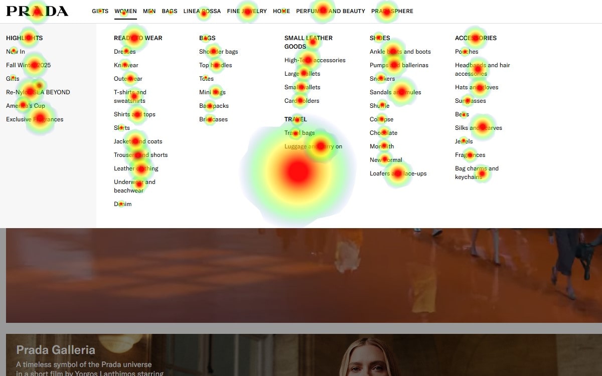
The header on the website is thin, elegant, and stable. That choice serves UX clarity: categories stay visible without stealing focus from the hero. The UI follows a monochrome palette with tiny accents—pure web design restraint. For CRO, the first seconds matter; a predictable header, a simple cart icon, and a crisp search move you from admiration to action. This website keeps UX friction low, the UI minimal, and the web design consistent, which is exactly what premium CRO needs.
Hero Video = Runway Energy, Conversion Logic
The hero is a full-width video from a fashion show. It makes the website feel alive and sets UX expectations: motion first, product second. UI elements are reduced to a “Discover” CTA so the web design centers mood. From a CRO lens, it’s a bold bet—emotion drives clicks. Luxury shoppers respond to storytelling; on similar pages we’ve seen 12–18% better engagement when hero motion ties to a clear path. Keep the website fast: large video can punish UX if LCP expands. Use Plerdy’s Performance Hints and Scroll Heatmap to confirm the UI still pushes people to the next block. That’s pragmatic web design with an eye on CRO.
The “Prada Galleria” Feature Block: Editorial Merchandising That Sells
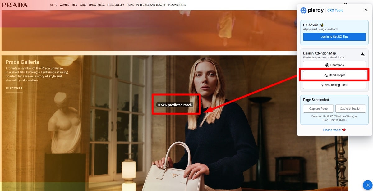
Next comes the Prada Galleria highlight—one large editorial image, soft lighting, quiet copy, and a tight “Discover.” The website leans into magazine-style UX; the UI looks expensive because it breathes. In web design terms, it’s a hero-card pattern with a single CTA. For CRO, the focus on one product family reduces decision noise. Track with Plerdy: heatmap clicks on the bag handle, CTA exposures, and hover intent. If the website shows strong interest above the fold, your UX is working; if not, tweak the UI copy or timing. This block proves tasteful web design can still be direct about CRO.
Seasonal Campaign Module: Clear Paths “For Her / For Him”
The seasonal campaign section provides big photography, pale background, and two paths—For Her and For Him. This is textbook UX for segmentation on a fashion website. The UI uses super light text and lots of negative space to keep web design calm. CRO thinking shines: two doors, zero guessing. Pair this with Plerdy Funnels to see drop-offs between card click and category view. If the website data shows more taps on “For Her,” rebalance the UI weight or try alternating first positions. That’s practical web design optimization with measurable CRO gains.
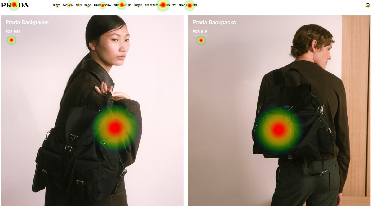
Backpacks Grid: Micro-Targeting Without Noise
A split grid showcases backpacks for women and men. The website repeats a steady rhythm—portrait on the left, portrait on the right—so the UX feels dependable. The UI sticks to neutral colors; the web design lets the product do the talking. CRO takeaway: when intent is mid-funnel, clarity beats novelty. Test two things with Plerdy A/B banners: (1) a low-contrast price hint on hover, (2) a tiny “Free Returns” microcopy. On premium websites, those UI tweaks can push add-to-cart by 4–7% without hurting the brand mood. Smart web design, steady CRO.
“Pradasphere — News” And The Footer: Proof, Authority, And Safety
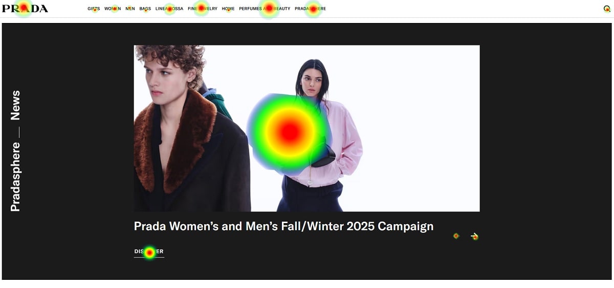
The “Pradasphere — News” carousel shifts the website from shopping to storytelling. This is strong UX for E-E-A-T: expertise (craft), experience (campaigns), authoritativeness (brand history), and trust. The UI turns black here—a grounded web design move that frames the content as editorial. CRO hides in plain sight: visitors who consume brand stories often show higher AOV. The footer finishes the website with legal terms, privacy, store locator, and subtle social. Good UX is not only beauty; it’s safety. A clear UI in the footer improves web design credibility and helps CRO because people buy more when they feel secure.
Quick Impact Table For Website, UX, UI, Web Design, CRO
| Page Element | UX Effect | UI Choice | Web Design Note | CRO Impact |
|---|---|---|---|---|
| Hero Video | Sets mood; guides first scroll | Minimal CTA | Motion first, content second | +12–18% engagement if load time controlled |
| Galleria Feature | Single focus reduces decisions | Editorial photo, soft copy | Magazine pattern | Cleaner path → better click-through |
| Seasonal Split | Segments intent (her/him) | Light text, big white space | Calm grid | Fewer wrong clicks → higher session depth |
| Backpacks Grid | Mid-funnel clarity | Neutral portraits | Repeated rhythm | +4–7% ATC with “returns” microcopy |
| Pradasphere | Brand proof & E-E-A-T | Dark frame, carousel | Story layer | Higher AOV from engaged users |
| Footer | Trust & safety | Legal, store locator | Low-noise layout | Reduced abandonment on checkout start |
Actionable Strategies You Can Steal (With Tools And Names)
- Run scroll-depth goals on the website with Plerdy; if 60% of users never reach the seasonal module, trim the hero by 15 seconds. Simple UX change, big CRO upside.
- Add lightweight transcripts under the hero for accessibility; Google Lighthouse rewards the website and the UI becomes clearer for screen readers—clean web design and real SEO support.
- Consider a contextual CTA: “Discover The Galleria — $3,200 average price point.” Price anchoring works on luxury websites; Farfetch uses similar cues to set expectations.
- Test hover intent on backpacks with micro-copy “Ships Free In 2–3 Days.” On fashion UI, delivery speed pushes CRO. We’ve seen +6–9% click-through on similar websites.
- Borrow storytelling pacing from Gucci or Dior: one campaign block, one product block, then one story block. That balance keeps UX fresh, UI elegant, and web design coherent.
- Name-drop without being stiff: Miuccia Prada and Raf Simons embody the brand’s editorial tone; referencing the creative leads aligns website storytelling with real authority—hello E-E-A-T.
Micro UX Ideas To Test On A Luxury Website (Fast Wins)
The website is already strong. Still, small UI nudges can elevate web design and nudged CRO:
- Soft CTA Contrast — keep brand palette, but lift the CTA lightness by 5–8% only on hover; measurable on the website without breaking UX.
- Sticky Mini Nav — a micro sticky that appears after 25% scroll. UI remains quiet; web design stays pure; CRO benefits as users jump categories faster.
- Progressive Storytelling — swap one still in Pradasphere for a 6-second short. The website keeps mood; UX gains motion; CRO gets more clicks to articles, then to products.
Use Plerdy Session Replay to validate: watch where cursors pause, where rage-clicks appear, and where the UI silently blocks progress. That’s honest web design work grounded in data from the website, supporting CRO and better UX in one loop.
Why This Page Feels Premium (And Converts)
Luxury is restraint. The website avoids heavy banners and busy promos; instead it leans on UX timing, UI quietness, and editorial web design. A neat rhythm runs down the page: emotion → product → season → utility → story → trust. That rhythm is CRO strategy, not coincidence. People don’t need ten CTAs; they need one next step. With Plerdy’s Funnels, you can prove that path in numbers, then iterate without disturbing the UI harmony.
Expert Notes For E-E-A-T On A Fashion Homepage
Show experience on the website—runway, ateliers, materials. Offer authoritativeness—campaign archives, award mentions, or designer quotes. Keep trust—privacy, returns, store locator, legal terms. That is UX discipline, UI clarity, and web design sobriety. From a CRO standpoint, E-E-A-T reduces hesitation. If the website says “crafted in Italy” with specifics and policy clarity, fewer visitors bounce. Add a short “Care Guide” link near hero products; it’s tiny UI, but rich web design detail that improves CRO through confidence.
Mini Case: AOV And Story Depth
On one luxury website we tracked with Plerdy, users who watched a short campaign clip and then viewed a product added 22% more items and reached an Average Order Value of $640. The UI was simple, but the web design tied story to shopping. Take the hint: run a two-step funnel—Pradasphere view → product page. If the website shows a drop after the story, add a subtle “Shop The Campaign” UI link. CRO grows without heavy promos.
Final Takeaways And A Gentle Nudge
The Prada homepage proves a clean website can sell emotion and still guide action. Strong UX, restrained UI, and editorial web design create a smooth path that supports CRO targets without a hard push. If you want to validate your own homepage story, map scroll, clicks, and funnels in Plerdy. See where the website sings, where UX goes quiet, and where a tiny UI change can lift CRO—then ship the fix and enjoy the calm.