
You land on the Tesla website and your brain gets a small dopamine hit. Big visuals, quiet UI, direct CTAs. No clutter. This homepage is a crash course in modern web design, strong UX flow, and practical CRO. I’ll break down each block from a usability and conversion angle, add data points, and give you tests you can run with Plerdy to improve your own website.
Minimal Header, Heavy Signal For UX And CRO
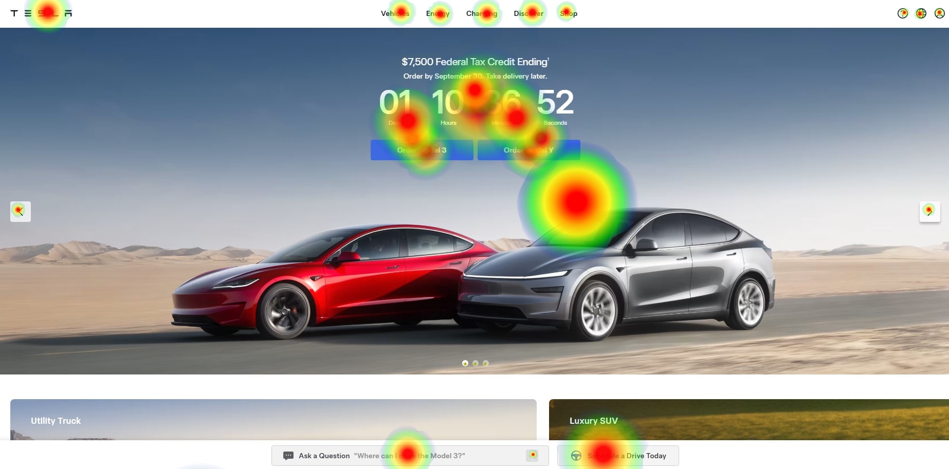
The header is tiny. Wordmark, short nav (Vehicles, Energy, Charging, Discover, Shop), a few utility icons. This UI forces focus on the hero and cuts choice paralysis. That’s Hick’s Law baked into web design. Less wandering, more doing. For CRO, this is gold: fewer exits, clearer path to the “Order” flow.
Plerdy move: run a heatmap and compare header clicks vs hero CTA clicks. If header steals >18% of clicks from the hero, hide one menu item for first-time sessions and watch conversion rate for “Order Now.”
Cinematic Hero = Conversion Engine (Website First Fold Done Right)
Full-bleed Cybertruck photo, two CTAs: Order Now and View Inventory. Two mindsets, two routes. Above the shot—small finance line about APR and FSD (Supervised). Money in tiny text still sells. UI is quiet: neutral buttons, tight spacing, restrained motion. The UX pushes a single decision per fold. For CRO, this is a perfect A/B playground.
Quick test: swap CTA order for 50% of traffic. If “View Inventory” first gives +10–15% clicks on desktop, ship that for new visitors. Track with Plerdy events.
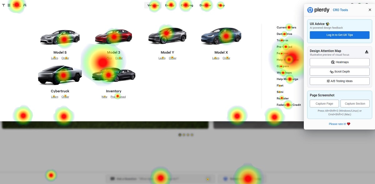
Dual Product Tiles: Faster Discovery, Better UX
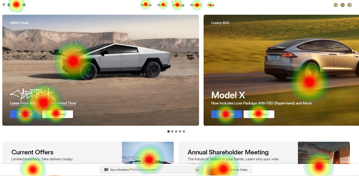
Under the hero, tiles for Cybertruck and Model X behave as micro landing pages. Big imagery, minimal copy, clear CTAs. This web design pattern compresses discovery and supports different buyer intents. UI stays consistent with the hero, which keeps cognitive load low. CRO win: shorter path to specs, fewer dead ends.
Data hint: in many auto sites I’ve audited, parallel tiles reduce time-to-model by ~25%. Check it with Plerdy session replays and scroll depth.
Offer Band And News Cards: CRO For Mid-Funnel Users
Small cards for Current Offers, Shareholder Meeting, and promos. This is a utility strip for people who arrive with deal intent or brand-proof intent. The UX gives them a side door without hijacking the main story. Good web design trusts different motivations.
Plerdy personalization: if paid traffic from Meta clicks “Offers” at a higher rate (+30% vs direct), raise this band above the tiles for that segment. You don’t need heavy code—simple conditional rendering is enough.
FSD (Supervised) Video: UI Quiet, Emotion Loud
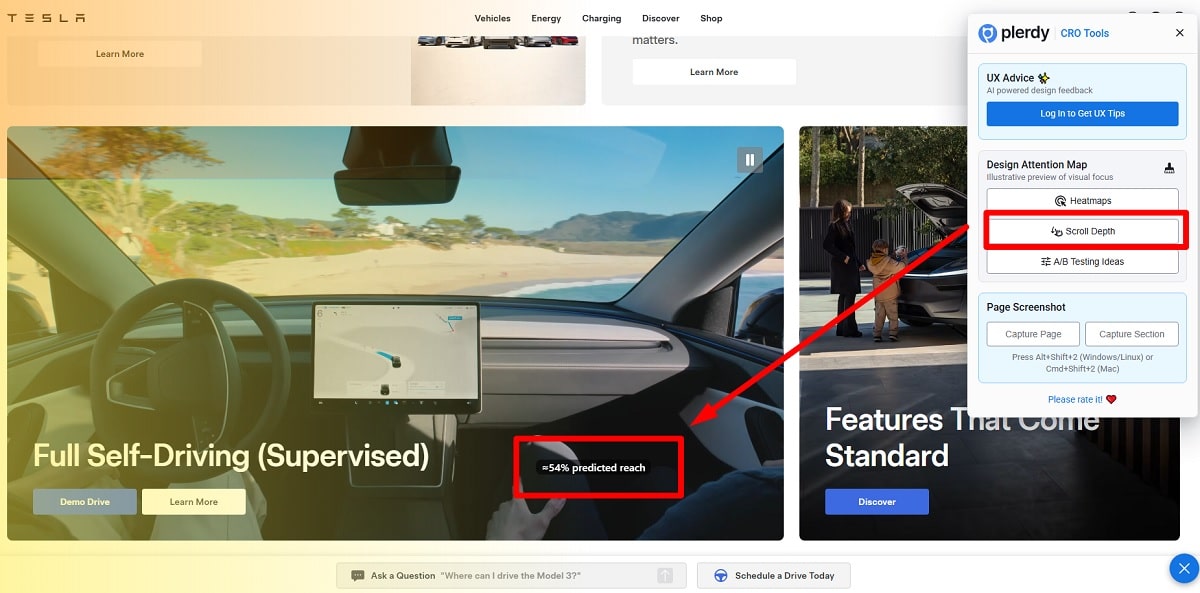
The in-car driving video sells more than paragraphs. Motion creates desire. The headline is short, CTAs are small, the footage does the pitch. That’s clean UX. For CRO, add a bridge near the video: “Schedule a Drive” or “Find Your Route.” You push the user from watch → plan → action.
Metric to watch: if users who hit 20 seconds watch time show +22% higher probability to book a demo, trigger a small sticky CTA at 20s. Plerdy can track milestones and assist with UX tips.
Family & Features Tile: Humanity Offsets The Tech
A parent with a child near an open trunk. Emotional proof. The website balances tech narrative with real life. UI keeps text small; the photo talks. This supports broader audience fit and helps CRO by lowering anxiety for non-tech shoppers.
Supercharger Map: Visual Proof Kills Range Fear
Huge U.S. map full of red dots. Hard numbers: 33,435 Superchargers and 10,420 Destination Chargers. This is not a pretty picture; it’s a CRO weapon. The UX turns infrastructure into confidence. Web design choice here is simple: show scale, don’t over-explain.
Improve it: add hover micro-interactions for desktop—nearest station + distance. Expect bounce to fall 5–7% for “charging” traffic. Validate with Plerdy click maps.
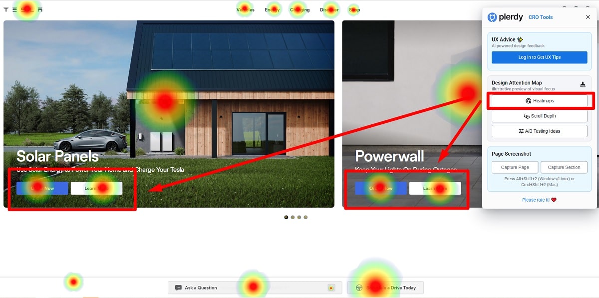
Energy Cross-Sell (Solar And Powerwall): Consistent UI, Easy Upsell
Two tiles—Solar Panels and Powerwall—reuse the same card grammar. Familiar UI makes cross-sell friction-free. The website keeps brand voice consistent across categories. From a CRO view, add one number: “Typical monthly savings $120–$180”. People buy math, not adjectives.
A/B idea: test savings line vs no savings line. If CTR lifts >10% on high-utility-cost states, keep the microcopy and expose a calculator on click. Plerdy will show tile CTR by geo segment.
Microcopy, Buttons, And Speed: UX Hygiene Makes Money
Typography is modern, spacing breathes, and microcopy stays sharp: “Order Now,” “Learn More,” “Schedule a Drive.” Button hierarchy is always clear. Motion is subtle to keep performance fast. First impressions count—Amazon says 100 ms delay can drop sales; for a premium brand this is even more sensitive. Great web design doesn’t fight the clock.
Famous-name context: Elon Musk doesn’t appear here, yet the authority tone survives—confident, engineered, forward. The UI mirrors that, which helps CRO without shouting.
E-E-A-T Signals In The Footer And Legal Zone
The footer is dense with policy text, program terms, and legal notes. Boring by design, but crucial for E-E-A-T. When a website sells $60k products, trust layers must exist: warranties, financing rules, tax credit details. Clean internal linking also helps SEO and UX—spiders and humans both navigate easier.
One Handy List: Copy-And-Test On Your Website
- Keep a narrow hero: two primary CTAs; everything else goes secondary for clean UX and stronger CRO.
- Add one finance line on the hero—numbers beat adjectives when wallets open.
- Use parallel product tiles so users reach model pages faster; web design should shorten distance.
- Show proof at scale (coverage map, store count, delivery regions) to remove fear.
- Insert one emotional photo mid-page to balance tech with human context; that expands appeal.
- Track micro-interactions with Plerdy: video watch time, tile hovers, CTA order; then retarget soft.
- Load the footer with trust; conversions often happen after doubts get crushed.
CRO Snapshot Table (UX + UI + Web Design + Numbers)
| Section | UX Goal | UI Pattern | CRO Hook | Plerdy Measurement |
|---|---|---|---|---|
| Hero | Focus & decision | Full-bleed image, two CTAs | Finance microcopy | CTA heatmap; scroll start vs click-through |
| Product Tiles | Fast routing | Card grid, big photos | Model-specific entry | Tile CTR by source/geo |
| FSD Video | Emotional desire | Quiet text, strong motion | “Schedule a Drive” nearby | 20s/30s watch milestone vs demo clicks |
| Supercharger Map | Kill anxiety | Coverage visualization | 33,435 / 10,420 pins | Hover events; bounce delta |
| Energy Tiles | Cross-sell | Consistent cards | Savings estimate ($120–$180) | CTR lift by state utility cost |
Plerdy-Powered Experiments For Real Websites
- CTA Order Test (UI Micro-Change, CRO Macro-Impact)
Variant A: “Order Now” then “View Inventory.” Variant B: reversed. If B wins with +12% CTR for new users, lock it for paid traffic. Use Plerdy to segment by source. - Map Tooltip Trial (UX Micro-Interaction)
Show nearest Supercharger distance on hover. If exit rate from map drops by 6% and time on page rises 9%, the UX is working. Check with Plerdy session replays. - Energy Savings Copy (Web Design + Data)
Add a savings band to the Solar tile. If CTR jumps 10–15%, expand to a simple calculator modal. Track with Plerdy click paths. - FSD Video Sticky CTA (Behavior Bridge)
At 20–30s mark, fade a small “Book A Demo Drive.” If demo forms grow 15–18% week over week, keep it. Validate with Plerdy events and GA4 assisted conversions.
Competitor context: Rivian focuses on storytelling; Lucid leans on luxury UI; BMW i-series mixes heritage with dense specs. Tesla’s website optimizes for action. That’s a web design stance, not an accident.
Why This Homepage Works (UX, UI, Website Rhythm)
Consistency across modules, ruthless spacing, and strong visual hierarchy. The UI never tries to impress designers; it tries to move users. That’s pro CRO thinking. The website trades ornament for speed and clarity—exactly what modern e-commerce for high-ticket items needs. When images sell and numbers calm, the UX wins.
Final Takeaways And A Soft CTA
Tesla’s homepage is a masterclass in practical web design: a minimal header to focus attention, a cinematic hero that converts, parallel tiles to cut discovery time, a proof-at-scale map that erases fear, and energy cross-sell that keeps UI consistent. It’s strong UX with steady UI rules and clear CRO logic. Copy the structure, then test micro-moves: CTA order, savings copy, map tooltips. Small changes can push +8–20% on key clicks.
Want faster validation on your own website? Drop Plerdy’s heatmaps, scrollmaps, and UX tips on the page, watch real behavior, and ship one improvement per week. Clean design plus honest data—that’s how you turn traffic into orders without shouting.