
One of the basic tools of an Internet marketer is the Google Keyword Planner. It is a valuable source of information on simproving campaigns for experienced marketers and newbies.
It is a service that helps select keywords. Therefore, using it can form a semantic core suitable for promoting your business. But, of course, if one has enough knowledge of how to use Google Planner correctly. In our article, we consider in detail the operation of the service and its most useful functions.
So, Google Planner was launched as an advertising tool in 2013. The service helps advertisers find relevant keywords right inside the Google Ads interface.
Some data are available in Google Planner. The most important ones are new keyword variations and a monthly summary of search volume. Based on the data, one can easily select “working” words for ads when setting up contextual advertising.
Most often, Google Planner is used when selecting the semantic core of campaigns. Data from it can also be used for search engine optimization and other tasks:
- content planning;
- compiling a list of negative keywords;
- evaluation of query statistics;
- collecting data to analyze the position of competitors in search results;
- Estimated CPC forecast.
How to use Google Keyword Planner? Let’s try to make it clear.
How to Choose Keywords Using Google Keyword Planner
So, it is one of the most popular tools for finding and analyzing keywords. It is worth adding that Google Planner provides important information about phrases from the point of view of SEO promotion:
- average monthly number of impressions for a given keyword;
- seasonality;
- competitiveness;
- estimated cost per click.
Why collect a semantic core? How to use google planner to get more keyword ideas? The semantic core for contextual advertising is a set of key phrases for which ads are displayed. Correctly selected keywords bring the advertiser targeted traffic – clicks and conversions of potential buyers. On the other hand, errors in the collection of semantics can cause garbage traffic and drain the budget.
Let’s say you own a flower shop. You want to advertise in New York using the keyword “buy flowers.” You need to add the key phrase “buy flowers” to the ad to do it. And if a person enters such a search query, Google shows them your ad.
How to choose the right words? Here are several tips:
- choose both more and less competitive options;
- use variations and try other tools. Choose other keywords related to the topic;
- even if keywords do not have an impressive search volume, don’t give them up. Organic traffic is not the only option.
Using Google Keyword Planner for SEO
So, how to use Keyword Planner Google? With its help, one can search for relevant words with little effort and retrieve their search volumes. It makes the tool interesting not only in terms of ad placement but also for search engine optimization.
A prerequisite for using the planner is an active ads account for advanced users. Its use and also that of the planner is free of charge. If your Google Ads account is in smart mode, you can convert it to an advanced account in settings to use the keyword planner.
For beginners with no idea how to use Google Keyword Planner for keyword research, let’s take a look at the procedure step by step.
Access the Google Keyword Planner
The first step is understandable: if one has no Google account, he won’t be allowed to utilize Google Planner. The procedure of registration does not take long. Having done it, one can get started.
Choose Your Tool
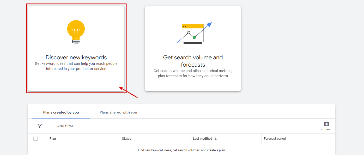
One can choose two options: Discover New Keywords (ideal for finding new keywords) and Get search volume and forecasts for your keywords (the feature helps if your list of keywords is long). No matter which tool a person utilizes, he sees the keywords results page in the final.
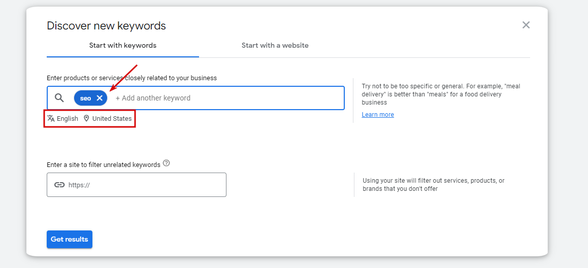
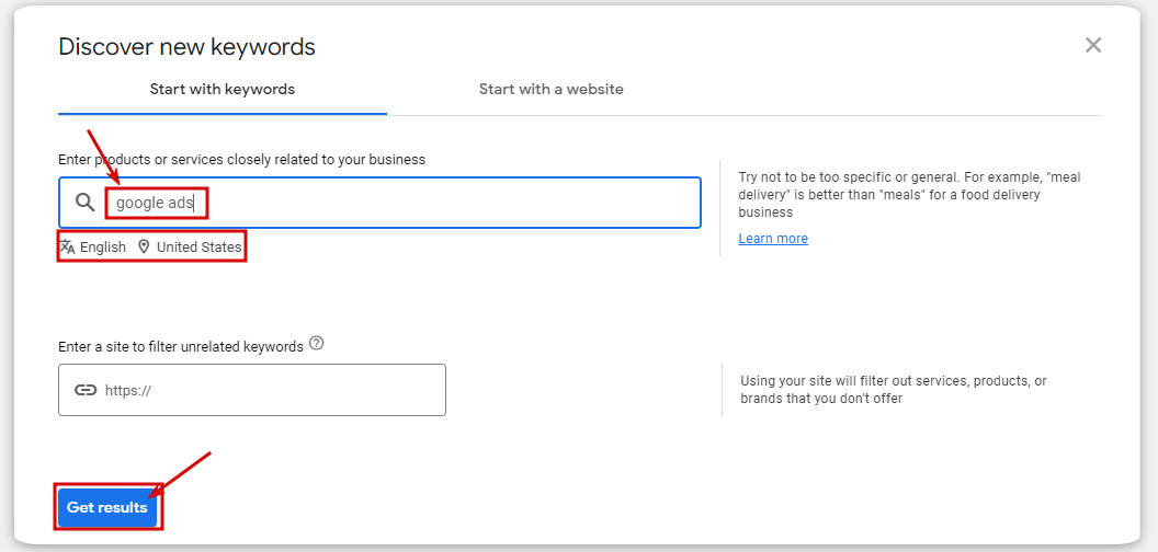
You should enter products or services closely linked to your company at this step. Here you also get the opportunity to choose the language and location and decide whether you want to include brand names in the results or not. If necessary, you can also enter your website’s domain to filter out services, products, or brands you do not offer. Normally, it is best not to filter results at this stage.
You can separate search terms using commas if you want to enter several of them. You can enter up to ten different keywords at once.
Filter and Sort the Results
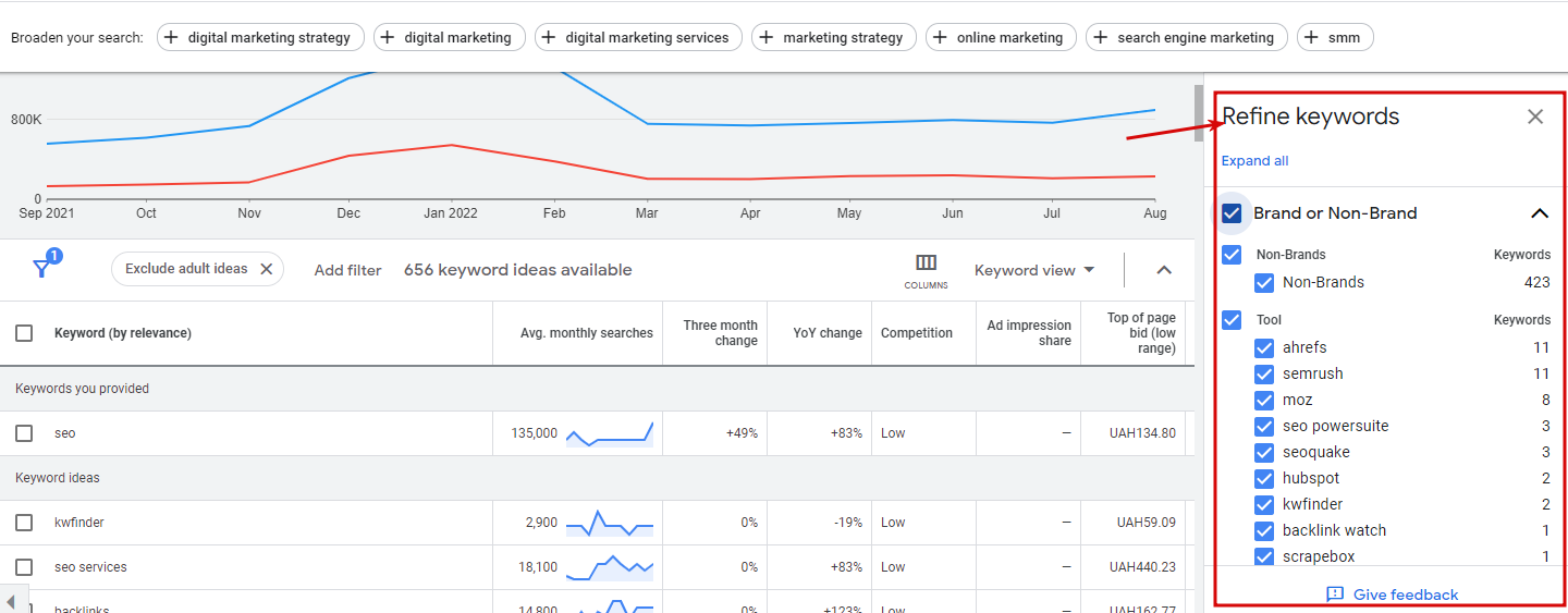
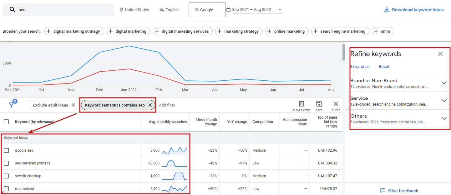
Usually, the service issues several hundred keywords, and to quickly filter them, this tool is equipped with a special function – “Refine keywords.” You need to select it and set the necessary parameters to do this. After this, the Google Planner removes irrelevant queries. Parameters one can choose from include:
- location (countries you are marketing to);
- language (it is understandable – the language of keywords you are interested in);
- search networks (this parameter shows whether you want to advertise on Google only or wish to choose search partners as well);
- date range (an annual parameter is 12 months, and it is recommended to leave it like this).
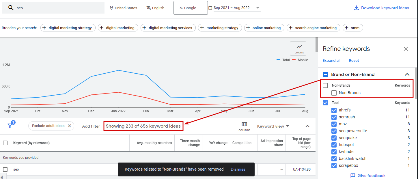
Another important feature one finds on this page is called an additional filter. Those include such features as:
- average monthly searches;
- keyword text;
- excluding keywords in one’s account;
- excluding adult ideas;
- top of page bid;
- broaden your search option, etc.
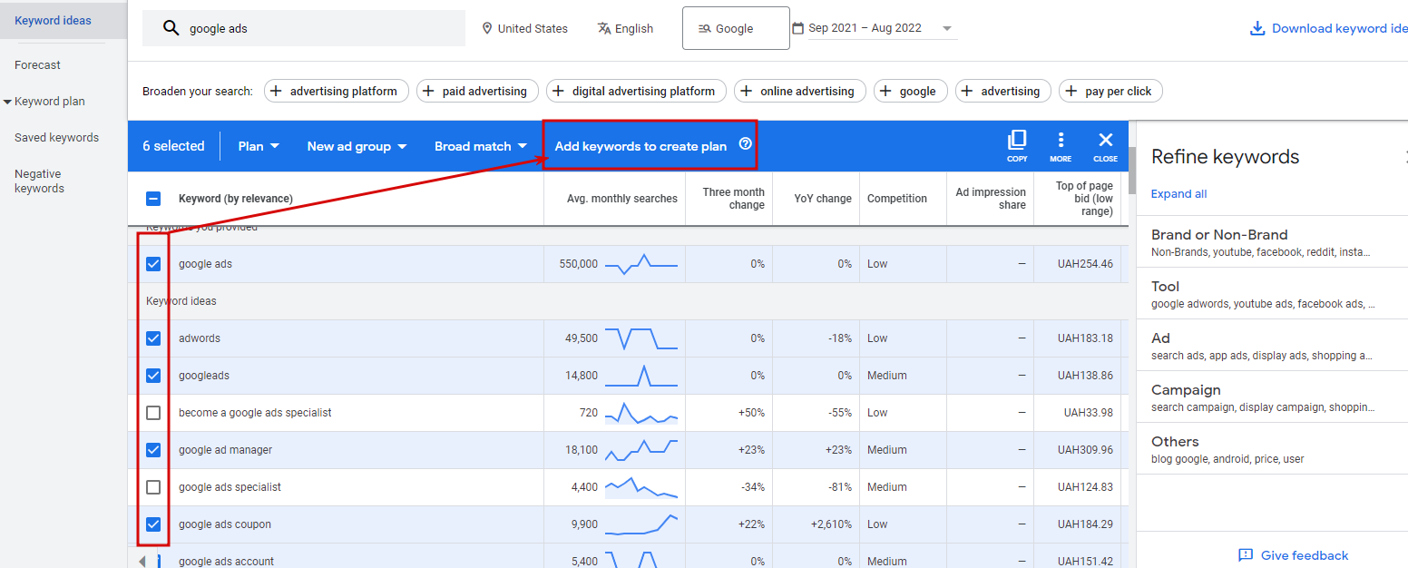
Analyze the Keyword Ideas Section
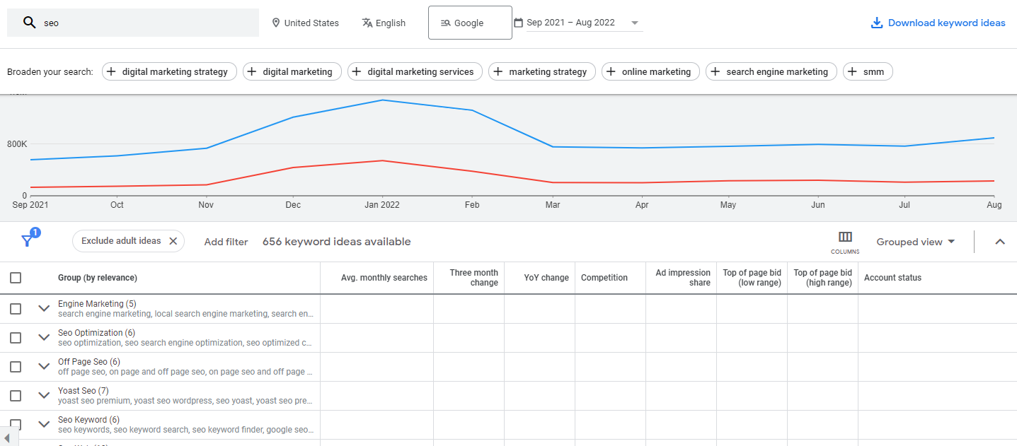
To fully understand how to use Google Keyword Planner SEO, one needs to internalize the importance of the next step. First, analyzing keywords offered is important: your goal is to select the best ones. Customers are given competitiveness and monthly searches, so choosing based on those ensures good results. As you see, this way, you can quickly identify opportunities and see what people want to find. Next, try entering different keywords to find more specific keyword ideas.
Choose a Keyword
After all the previous steps are finished, you come up with a list of the most suitable keywords and are allowed to start using those. It may be nnot bey, so here is what you should pay attention to:
- Search volume. This is understandable: the higher it is, the better results you get;
- commercial intent. The higher the competition, the more successful you are;
- organic SEO competition. Look at the platforms ranked first and try to improve SEO.
That’s it! Now you know how to use Google Keyword Planner for free!
Using Google Keyword Planner for PPC
If you plan to start or build a PPC campaign on Google Ads, it’s understandable that the keyword planner offers a wealth of data to help you plan and forecast campaign performance. No need to start a campaign blindly: you get access to a toolset that helps you make great decisions. So, let’s look at how to use Google Ads Keyword planner.
Sign in to your Google Ads account
The first step is similar – to start working, you must sign in to your Google Ads account.
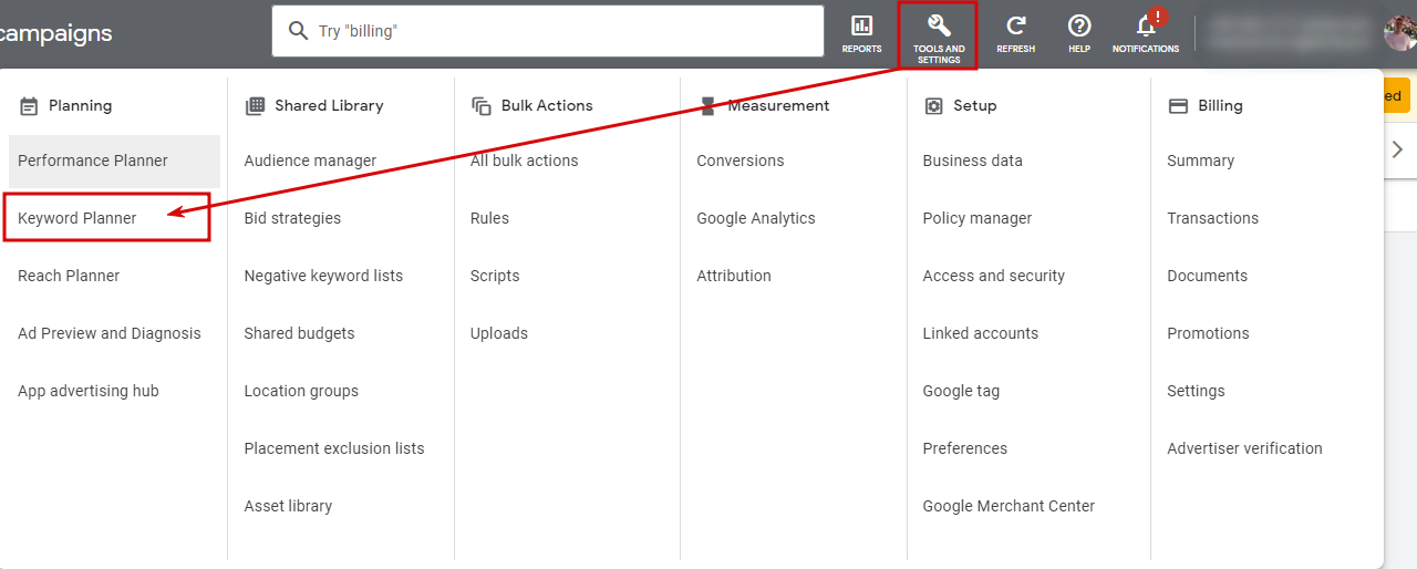
Click on the “Tools & Settings”
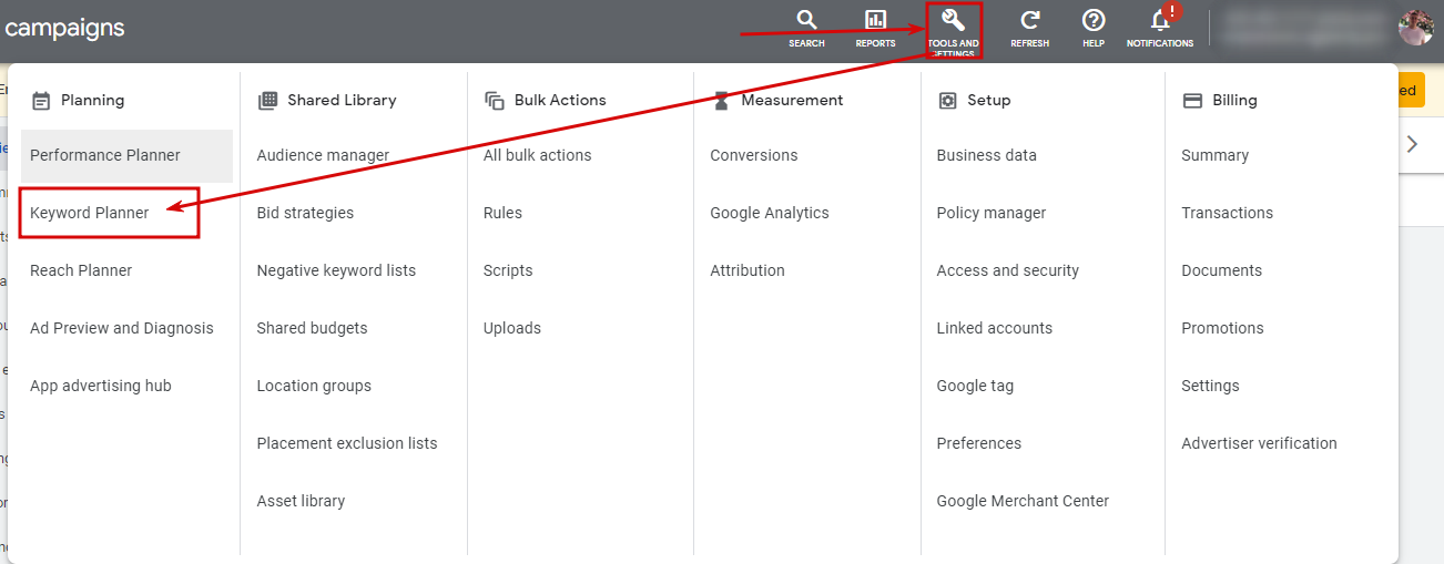
At the top of your account, you see several buttons: choose one that offers tools and settings. There is a wrench icon – you can notice it easily. Several categories help you solve different tasks, for example, planning, shared library, bulk actions, measurement, etc. We need one of them for now – a keyword planner.
Click on the “Keyword Planner”
A person has chosen a keyword planner. What to do next? You can discover new keywords, get search volume and forecasts (similarly to the procedure we already described), etc. Discovering is your goal here!
Click on “Discover New Keywords”
You can now proceed to discover keywords! By clicking on the option, you start utilizing the tool. You can enter up to ten diverse words and get keyword ideas based on those. You can get a huge number of keywords this way. Filtering also helps here: you can use such filters as avg monthly searches, competition, relevancy, Ad impression share, top of page bids. It is also possible to update languages and locations.
Also, you can select a “Grouped ideas” function here.
Choose “Start With Keywords” or “Start With a Website”
Another thing one should know is that you are offered two options: start with keywords or use an entire site! The best options to suit your needs will be offered if one enters a site. As a rule, keywords that Google likes are offered here.
Create a Campaign to Unlock All the Data Available
One of the peculiarities of the solution many users appreciate is that it is possible to create a campaign that offers a lot. Using the campaign, one can solve several tasks at once:
- select keyword match types;
- create Ad groups;
- add search keywords and more.
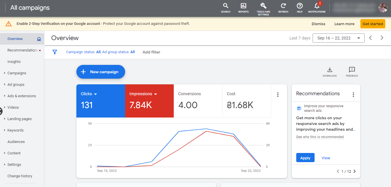
Moreover, you can get a data forecast for the next month. Another great thing is that you can access your data (ad groups, etc.) later. Once you access the tool, you will see your campaigns.
Conclusion
So, now you know how to use Google Keyword Planner for free. Overall, given the possibilities, Google Keyword Planner is a decent alternative to its expensive counterparts. Using Keyword Planner, you can search for keywords and ad groups to see how they could perform. It can also help you identify areas you want to target and ensure they suit your budget, so you don’t have to worry about spending too much money to succeed.
As already mentioned, an essential feature of the service is free of charge for users. The disadvantage is that it does not provide you with the most accurate data but only estimates and rough guidelines. However, other services cannot suggest unique keywords you can’t find here. Therefore, it can give you an advantage over other companies that have failed to use the solution. Enjoy your experience!