

UX metrics turn a vague judgment—“this experience feels better”—into evidence a product team can use. The right user experience metrics show whether people can complete a task, how much effort it takes, what frustrates them, how they feel afterward, and whether the experience supports retention or conversion. The trick is not tracking everything. It is choosing the smallest set of metrics that explains one important user journey.
UX Metrics at a Glance
UX metrics, also called user experience metrics or usability metrics, are quantitative measures of the quality of a person’s interaction with a digital product. They usually cover four questions:
- Effectiveness: Can users complete the intended task?
- Efficiency: How much time and effort does completion require?
- Satisfaction: How do users perceive the experience?
- Outcome: Does the experience support adoption, retention, or conversion?
A strong starter scorecard contains one outcome metric, two diagnostic behavioral metrics, one attitudinal metric, and one guardrail. For checkout, that could be purchase completion, field-error rate, time from cart to order, post-purchase ease score, and refund rate.
What Are UX Metrics?
UX metrics are numbers that describe user performance, behavior, or perception during an interaction with a product, service, website, or app. A metric is useful only when it is tied to a defined user, task, context, and decision. “Average time on page” is merely a number. “Median time for a new mobile user to complete checkout” is a usable metric because the team knows what was measured and what it can improve.
This distinction follows the practical idea behind usability standards: experience must be evaluated in a specified context of use, not in the abstract. It also explains why a single metric cannot represent all of UX. A user may complete a bank transfer quickly but feel uncertain about whether it succeeded. The completion rate looks healthy; the confidence and clarity do not.
UX metrics versus product and business metrics
UX, product, and business measures overlap, but they answer different questions. Task success reveals whether users can accomplish their goal. Activation shows whether they reach a product-defined milestone. Revenue shows whether the organization captures value. The healthiest measurement plan connects all three without pretending they are interchangeable.
| Layer | Primary question | Examples | Main limitation |
|---|---|---|---|
| UX | Can people use the experience successfully and comfortably? | Task success, errors, SEQ, SUS, rage-click rate | May not show commercial impact alone |
| Product | Do users adopt and repeatedly use valuable capabilities? | Activation, feature adoption, retention | Usage does not automatically mean good UX |
| Business | Does the experience produce organizational value? | Conversion, revenue, churn, support cost | Many non-UX factors affect the result |
Use the layers as a causal chain, not a scoreboard contest. A confusing pricing page may increase task time and errors, reduce trial starts, and eventually reduce revenue. Each layer helps confirm a different part of that story.
The Four Types of UX Metrics

1. Task-performance metrics
These measure what happens while a person attempts a defined task in usability testing or instrumented product data. Task success, time on task, error rate, and efficiency belong here. They are especially useful for comparing a flow before and after a redesign.
2. Behavioral metrics
Behavioral UX metrics describe what real visitors do: which element they click, how far they scroll, where they abandon a funnel, whether they repeatedly click an unresponsive control, or how often they return. They are excellent at locating friction, although behavior alone does not explain motivation.
3. Attitudinal metrics
Attitudinal measures capture what users say or feel. Examples include the Single Ease Question (SEQ), System Usability Scale (SUS), Customer Effort Score (CES), customer satisfaction, and perceived confidence. Survey wording, timing, and scale direction must remain consistent for comparisons to be meaningful.
4. Outcome and guardrail metrics
Outcome metrics show whether the journey produced value: checkout completion, activation, retention, or lead submission. Guardrails catch harmful side effects. A shortened signup flow might lift activation but also increase failed onboarding or support contacts. Tracking both prevents a local UX win from becoming a product loss.
18 UX Metrics, Formulas, and When to Use Them
| # | Metric | Formula or method | Best use | Important caution |
|---|---|---|---|---|
| 1 | Task success rate | Successful attempts ÷ all valid attempts × 100 | Core task effectiveness | Define partial success before testing |
| 2 | Time on task | Median completion time for successful attempts | Efficiency and comparison | Shorter is not always better |
| 3 | Error rate | Observed errors ÷ opportunities for error × 100 | Forms and structured workflows | Define error severity |
| 4 | Efficiency | Successful tasks ÷ total task time | Comparing workflow productivity | Use the same task definition |
| 5 | Misclick rate | Non-progress clicks ÷ all relevant clicks × 100 | Navigation and control clarity | Not every extra click is an error |
| 6 | Rage-click rate | Sessions with rage clicks ÷ eligible sessions × 100 | Broken or misleading elements | Validate thresholds with replay |
| 7 | Form completion rate | Completed forms ÷ form starts × 100 | Lead and checkout forms | Separate validation from abandonment |
| 8 | Funnel completion rate | Final-step users ÷ first-step users × 100 | Multi-page journeys | Segment by intent and device |
| 9 | Scroll reach | Users reaching a section ÷ page viewers × 100 | Long pages and content hierarchy | Reaching is not reading |
| 10 | Interaction rate | Users performing target action ÷ exposed users × 100 | CTA and feature discoverability | Confirm true exposure |
| 11 | SEQ | Post-task ease rating, usually one item | Immediate task perception | Keep the scale and wording fixed |
| 12 | SUS | Standard 10-item questionnaire scored 0–100 | Perceived system usability | 100 is a score, not a percentage |
| 13 | Customer Effort Score | Mean response or disclosed top-box method | Ease of a recent interaction | Scale direction varies |
| 14 | CSAT | Satisfied responses ÷ valid responses × 100 | Touchpoint satisfaction | Define which responses count |
| 15 | Activation rate | Users reaching activation milestone ÷ eligible users × 100 | Onboarding UX | Milestone must represent real value |
| 16 | Feature adoption | Active feature users ÷ eligible active users × 100 | Feature discoverability and value | Usage frequency matters |
| 17 | Retention rate | Returning cohort users ÷ starting cohort × 100 | Longitudinal experience | Choose a meaningful interval |
| 18 | Conversion rate | Completed desired actions ÷ eligible users or sessions × 100 | Journey outcome | It diagnoses little by itself |
The table is a menu, not a mandate. Choose metrics that can change a decision. If no one knows what action a number will trigger, it is probably dashboard decoration.
Task-Performance UX Metrics
Task success rate
Task success rate is the clearest measure of effectiveness. Define success before collecting data. For a password reset, success might mean that the participant reaches the confirmation screen and can sign in with the new password without moderator help.
Task success rate = successful attempts ÷ all valid attempts × 100
Time on task
Time on task measures efficiency. Use the median when a few stalled sessions create extreme values, and state whether failed attempts are excluded or reported separately. Compare the same task, audience, device, and start/end rules. A faster task is not necessarily better when the process requires careful consideration, such as accepting a loan or reviewing medical information.
Error rate and recovery
An error is an action that prevents progress, produces an incorrect result, or creates a significant detour. Separate slips from critical failures and track recovery. A form validation message that helps a user recover in five seconds is a different problem from a payment failure that loses the cart.
Error rate = observed errors ÷ defined opportunities for error × 100
Single Ease Question
SEQ is asked immediately after a task, making it useful for comparing perceived difficulty across tasks or versions. Keep the question, scale, labels, and timing unchanged. An ease score becomes more valuable when paired with success and time: a task can be completed yet still feel unnecessarily difficult.
Behavioral UX Metrics From Real Website Sessions
Funnel completion and step drop-off
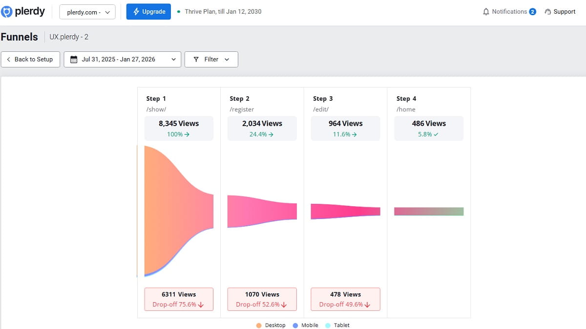
A funnel reveals where progress stops. Calculate completion from the same eligible population and inspect each transition. If 70% move from category to product, 40% from product to cart, and 80% from checkout to purchase, the product-to-cart transition deserves investigation first.
Step conversion = users reaching next step ÷ users at current step × 100
Clicks, misclicks, and rage clicks
Click data shows whether controls are discoverable and whether visual elements create false affordances. Repeated rapid clicks may indicate a broken button, latency, or unclear feedback. Treat a rage-click flag as a lead, not a verdict: inspect the relevant session replay and page state before prioritizing a fix.
Scroll reach and content exposure
A scroll map measures how many users reach a vertical point or section. It can show that a comparison table, proof block, or primary CTA is placed below the point where most visitors leave. Scroll reach does not prove reading or understanding, so pair it with interactions, time, and the journey outcome.
Engagement and bounce rate
Google Analytics 4 defines an engaged session using duration, key-event, or page/screen-view conditions; its bounce rate is the inverse of engagement rate. That makes GA4 engagement a platform-defined metric, not a universal UX score. Use it for consistent trend analysis, then investigate the experience with page-level behavior. See Google’s current engagement and bounce-rate documentation.
Attitudinal UX Metrics: What Users Say and Feel
System Usability Scale (SUS)
SUS is a standardized ten-item questionnaire that produces a score from 0 to 100. It measures perceived usability at the system level and is useful for benchmarking versions or products when administered consistently. The result is not “the percentage of users satisfied,” and changing the items destroys comparability.
Customer Effort Score and CSAT
CES asks how easy or difficult a recent interaction was; CSAT asks about satisfaction. Both are touchpoint measures, but they are not interchangeable. Always publish the exact question and response scale beside the result. A score of 6 can be excellent on a 1–7 ease scale and poor on a 1–7 effort scale.
Confidence and perceived clarity
For consequential tasks, ask whether users believe they succeeded and understand what happens next. Confidence exposes silent failures: a user may technically complete checkout but remain unsure whether the order was placed. A short post-task question can catch this gap before it appears as duplicate orders or support tickets.
Connecting UX Metrics to Product and Business Outcomes
UX work earns organizational support when the measurement chain is explicit. Start with a user problem, identify its behavioral signal, connect that signal to a journey outcome, and protect the result with a guardrail.
| User problem | UX signal | Primary metric | Outcome | Guardrail |
|---|---|---|---|---|
| Shoppers cannot estimate total cost | Backtracking between cart and shipping | Cart-to-checkout progression | Purchase conversion | Refund/cancellation rate |
| New users do not discover the core feature | Low interaction with feature entry point | Activation rate | Four-week retention | Support contacts |
| Lead form feels too demanding | Field errors and abandonment | Form completion | Qualified leads | Lead quality |
| Pricing is hard to compare | Repeated plan switching and long hesitation | Plan-selection success | Trial starts | Early churn |
Conversion rate can therefore be a UX KPI, but it should not stand alone. Price, traffic quality, inventory, promotions, seasonality, and tracking changes can move conversion without any interface change. Diagnostic UX metrics help distinguish an experience problem from everything else.
How to Use Google’s HEART Framework for UX Metrics
Google researchers Kerry Rodden, Hilary Hutchinson, and Xin Fu developed HEART to measure user experience at scale. The categories are Happiness, Engagement, Adoption, Retention, and Task Success. The framework becomes practical through a goals–signals–metrics process: define the desired experience, identify observable evidence, and then choose a calculation. Read the original Google research paper.
| Category | Goal | Signal | Possible metric |
|---|---|---|---|
| Happiness | New users feel setup is clear | High post-setup ease rating | Median SEQ; negative-feedback rate |
| Engagement | Users interact with the configured project | Meaningful actions after setup | Active days or core actions per user |
| Adoption | Users reach first value | Project created and tracking verified | Activation rate within 24 hours |
| Retention | Activated users return | Core workflow used in later weeks | Week-four cohort retention |
| Task Success | Users complete setup without friction | Few errors and unassisted completion | Success rate, time, error rate |
Do not force all five categories onto every feature. HEART is a prompt for choosing metrics, not a requirement to create five dashboards. For a password reset, task success and happiness may be enough. For an established subscription product, retention may matter more than raw engagement.
How to Choose UX Metrics That Drive Decisions
- Name one user and one journey. “Improve UX” is not measurable. “Help first-time mobile shoppers complete checkout” is.
- Write the user and business goals separately. The user’s goal may be to buy confidently; the business goal may be profitable completed orders.
- Choose one primary outcome. Select the number that determines whether the change helped, such as unassisted checkout completion.
- Add two diagnostic metrics. Choose measures that can explain movement, such as field-error rate and time between checkout steps.
- Add one perception metric. Ask a short, relevant post-task question rather than a broad relationship survey.
- Add one guardrail. Monitor an outcome you refuse to damage, such as refund rate, accessibility, or lead quality.
- Define the metric contract. Record numerator, denominator, eligibility, event names, time window, segments, exclusions, and owner.
- Establish a baseline. Preserve the same instrumentation and study protocol before and after the change.
- Set a decision rule. Decide in advance what improvement, harm, or uncertainty will lead to shipping, iterating, or stopping.
A one-page UX measurement plan
| Field | Example |
|---|---|
| Journey | First-time mobile checkout |
| User goal | Understand total cost and purchase successfully |
| Primary metric | Unassisted checkout completion rate |
| Diagnostics | Validation-error rate; product-to-order time |
| Perception | Post-purchase ease rating |
| Guardrail | Refund and duplicate-order rates |
| Segments | New/returning, iOS/Android, traffic source |
| Owner and review | Product analyst; weekly for six weeks |
UX Measurement Examples

Ecommerce checkout scorecard
Suppose an ecommerce team sees a checkout completion decline on mobile. The team should not begin by changing button colors. It defines the eligible population as mobile sessions that added an in-stock item to cart, then compares new and returning shoppers separately.
- Primary: purchase completions ÷ eligible checkout starts.
- Diagnostics: field-error rate, step drop-off, time to complete, sessions with repeated clicks.
- Perception: “How easy was it to complete your purchase?”
- Guardrails: payment failures, duplicate orders, refunds, average order value.
The team uses a funnel to locate the failing step, watches relevant sessions, and checks click and scroll maps. If mobile users repeatedly tap an obscured payment button, the evidence supports a focused hypothesis. After the fix, the same scorecard tests whether behavior and the business outcome improve together.
SaaS onboarding scorecard
A SaaS team may define activation as creating a project, installing the tracking code, and receiving the first valid event. Signup alone is not activation because the user has not experienced the product’s core value.
- Primary: eligible signups reaching activation within 24 hours.
- Diagnostics: step success, setup time, error messages, documentation detours.
- Perception: post-setup ease and confidence.
- Outcome: week-four retention among activated users.
- Guardrail: setup-related support requests and incorrectly configured projects.
This measurement chain stops the team from optimizing onboarding for superficial speed. Removing a verification step might raise apparent activation while producing broken configurations; the guardrail would expose the false win.
How to Measure Website UX With Plerdy
No single analytics tool provides every UX metric. Moderated usability tests and surveys capture task perception; product analytics records events and cohorts; behavioral analytics shows how real visitors interact with the interface. Plerdy helps connect page-level behavior with conversion journeys.
- Define the journey. Build the important sequence in Website Funnel Analysis and compare device and traffic segments.
- Find the weak transition. Do not review random recordings. Start with the page or step where progress falls.
- Inspect interaction patterns. Use website heatmaps to examine clicks, ignored elements, cursor behavior, and scroll reach.
- Watch evidence in context. Filter session recordings to the affected URL, device, source, or event. Look for hesitation, repeated clicks, errors, and recovery.
- Capture the user’s explanation. Collect a short ease or feedback question near the completed interaction instead of relying on behavior alone.
- Form a testable hypothesis. Describe the observed problem, proposed change, primary metric, and guardrail.
- Validate the change. Use an A/B test when traffic and risk justify it, or compare a controlled pre/post benchmark when they do not.
Common UX Metrics Mistakes
Tracking vanity metrics without a decision
Page views and session duration may describe traffic without revealing whether users succeeded. Ask what decision changes when the number moves. If the answer is unclear, demote it from the primary scorecard.
Treating a proxy as the experience
Bounce rate, scroll depth, and time can signal a problem, but context determines meaning. A support answer may satisfy a user in one short page view; a long session may represent engagement or confusion.
Changing definitions midstream
A dashboard becomes unreliable when event names, denominators, success rules, survey scales, or eligibility change silently. Maintain a metric dictionary and annotate releases and tracking changes.
Averaging away important users
An overall improvement can hide harm to mobile visitors, new users, assistive-technology users, or a high-value traffic source. Choose segments before analysis and avoid slicing data until a convenient answer appears.
Confusing correlation with causation
Users who engage more may convert more because they already have stronger intent. Heatmaps and replays generate hypotheses; controlled experiments, careful usability studies, or stronger research designs test causal claims.
Using universal UX benchmarks
Benchmarks can provide context, but study design, task difficulty, audience, product maturity, and scale wording make direct comparison risky. Your most defensible benchmark is usually the same journey measured consistently over time. For a dedicated methodology, see Plerdy’s UX benchmarking guide.
A 30-Day UX Metrics Implementation Plan
| Period | Actions | Deliverable |
|---|---|---|
| Days 1–5 | Select one journey; interview stakeholders; define user and business goals | Measurement question and owner |
| Days 6–10 | Choose primary, diagnostic, perception, and guardrail metrics | Metric contract and event map |
| Days 11–15 | QA events, funnels, survey wording, consent, and device coverage | Validated instrumentation |
| Days 16–23 | Collect baseline; inspect anomalies with heatmaps and replays | Baseline with segments and caveats |
| Days 24–27 | Prioritize one evidence-backed hypothesis | Change and validation plan |
| Days 28–30 | Schedule reviews and document decision thresholds | Living UX scorecard |
UX Metrics FAQ
What are UX metrics?
UX metrics are quantitative measures used to evaluate how effectively, efficiently, and satisfactorily people use a product or complete a task. They cover task performance, observed behavior, perception, adoption, retention, and relevant business outcomes.
What are the most important UX metrics?
The answer depends on the decision. A practical starter set is task success rate, time on task, error rate, a task-level ease score, and the relevant journey outcome, such as checkout completion or product activation.
How do you measure UX success?
Define a user and task, select an observable signal and metric, establish a baseline, segment the result, implement a change, and compare the outcome while monitoring uncertainty and guardrails. Combine behavioral and attitudinal evidence.
Is conversion rate a UX metric?
It can be a UX outcome metric when conversion represents the user’s goal, but it is not a diagnostic measure by itself. Pair conversion with task success, errors, funnel exits, feedback, heatmaps, and session evidence.
What is the HEART framework?
HEART is a UX measurement framework created by researchers at Google. Its categories are Happiness, Engagement, Adoption, Retention, and Task Success. Teams link goals to observable signals and measurable metrics.
What is a good task success rate?
There is no universal threshold. The acceptable rate depends on the task’s criticality, audience, and study protocol. Compare the same task over time, report uncertainty, and investigate the severity and causes of failures.
How often should UX metrics be reviewed?
Review operational behavior weekly, product scorecards monthly, and formal usability benchmarks quarterly or around major releases. Match the cadence to how quickly the team can make and evaluate changes.
How many UX metrics should a team track?
Use the smallest set that supports a decision. Three to five primary measures for one journey are usually more actionable than dozens of unrelated KPIs. Add diagnostics when the main result changes.
Conclusion: Measure the Journey, Not the Dashboard
The best UX metrics do not attempt to compress an entire experience into one score. They describe a chain: whether users completed the task, how much effort it required, where they struggled, how they perceived the result, and whether the journey created lasting value.
Start with one consequential flow. Choose one primary outcome, two diagnostics, one perception measure, and one guardrail. Define every calculation before collecting data. Then use funnels, heatmaps, session evidence, feedback, and controlled validation to turn the numbers into a better experience. A smaller measurement system that changes decisions will outperform a beautiful dashboard nobody uses.