
Many product pages do not look broken. That is the annoying part. The photos are nice, the price is there, the add to cart button exists, and still people leave. Not with anger. More often with doubt.
In 2026, product page UX is not just about clean product page design. It is about reducing delay, doubt, and invisible friction before the buyer reaches checkout. A small missing delivery note, a hidden size option, weak reviews, or a confusing mobile product page can quietly reduce add to cart rate every day.
This product page UX checklist shows 25 product page mistakes that often kill sales without looking dramatic. Use it as a practical product page audit, not as a theory lesson. The goal is simple: find what blocks buying, fix it first, and make the decision easier.
Why Product Page UX Quietly Decides The Sale
Most visitors do not abandon a product page because they hate the product. They leave because the page makes the decision feel heavier than it should. A buyer wants to know a few simple things: what it looks like, whether it fits, when it arrives, whether returns are safe, and if other people trust it. When those answers are scattered or hidden, product page conversion drops.
Good ecommerce product page UX removes tiny moments of uncertainty. Bad UX adds them. A dropdown hides size options. Delivery information sits below several scrolls. Reviews exist but are far away from the buy box. On mobile, the add to cart button disappears right when the user is ready to act. None of this feels like a big failure. Together, though, these UX mistakes that kill sales can become expensive.
Behavior data usually exposes the problem faster than opinions. Scroll map data can show that users never reach shipping details. A click map can reveal taps on non-clickable product photos or labels. Video sessions and session replay can show hesitation before the add to cart button.
- Users scroll back and forth before choosing a variant.
- The add to cart rate is weak even on high-traffic products.
- Mobile users leave faster than desktop users.
- Reviews, delivery, or returns get very little attention.
The 25-Point Product Page UX Checklist
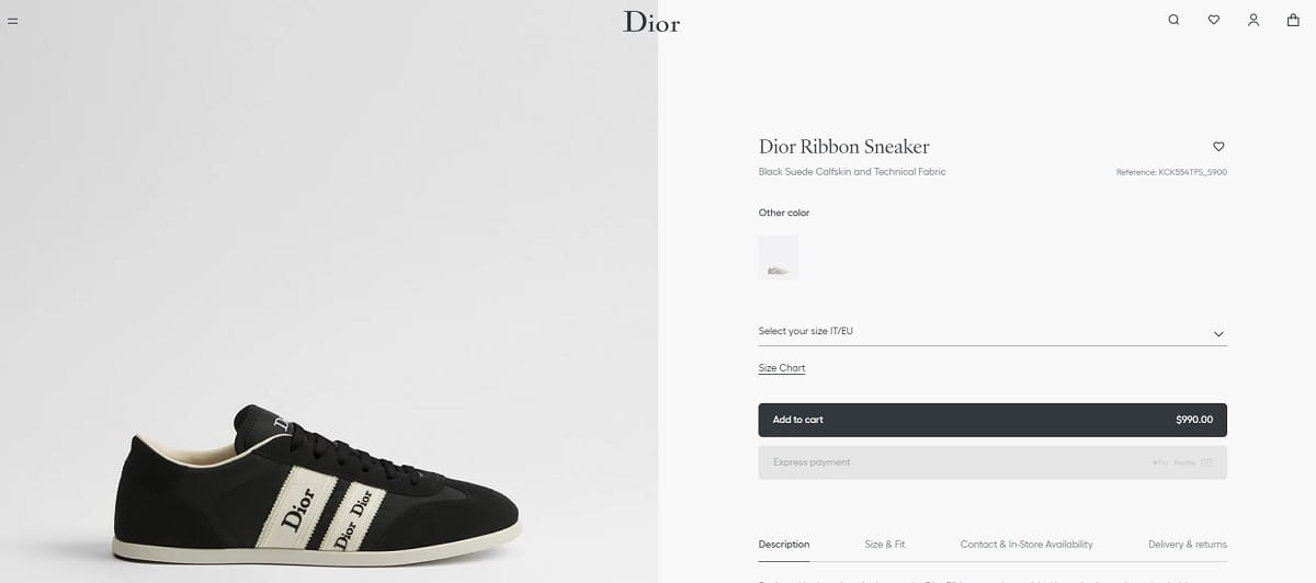
1. Product Photos Look Good But Do Not Answer Buyer Questions

Pretty product photos are not always useful product photos. A dress may look beautiful on a model, but buyers still need fabric close-ups, length, fit, texture, and real color. Poor product photos increase doubt because users must imagine too much. Fix this with photos that answer buying questions, not just brand questions. Use heatmap prediction to check whether users are likely to notice key product image areas.
2. The Image Gallery Hides Important Details
A product image gallery can fail quietly when important images are buried after lifestyle shots. Buyers may never reach the size chart image, back view, packaging photo, or material close-up. Move practical images earlier. On a product page audit, check click map data to see which gallery images receive attention and which are skipped. If users tap the gallery but do not convert, the order may be wrong.
3. Color Options Are Too Low On The Page
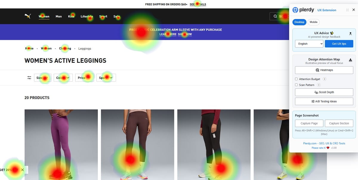
Color options influence the buying decision fast, especially in fashion, furniture, cosmetics, and accessories. When colors appear too low, users may think only one version exists. That hurts product page conversion before the CTA is even considered. Place color options near the product title, price, and add to cart button. Plerdy heatmap can help check whether visitors are likely to notice those color choices quickly.
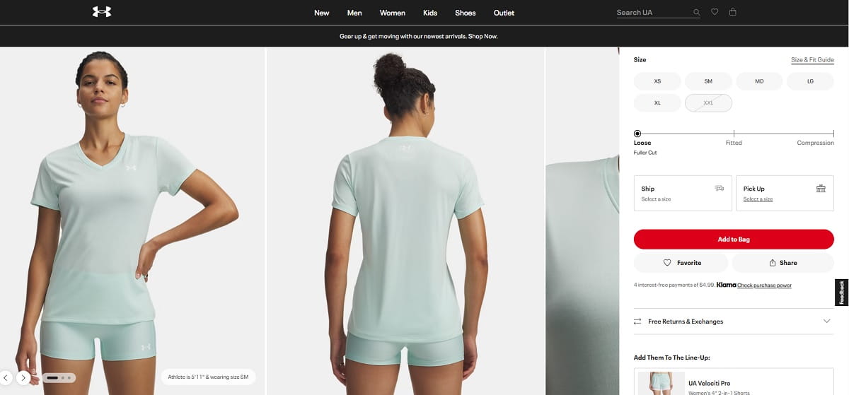
4. Size Options Are Hidden In A Dropdown
A dropdown saves space, but it can hide choice. For size-based products, visible size options usually feel faster and clearer. Hidden size options can also cause wrong orders, returns, and hesitation. Show common sizes as buttons, add a clear size guide, and mark unavailable sizes honestly. Use video sessions to see whether users open the dropdown, pause, close it, and leave without adding to cart.
5. The CTA Button Does Not Stand Out

The CTA button should not fight for attention. Some product pages make the add to cart button look almost the same as wishlist, size guide, or payment buttons. This creates visual noise in the buy box. Fix it by giving the main CTA a clear position, strong contrast, and simple wording. Use heatmap prediction to check whether the add to cart button is visually obvious above the fold.
6. Too Many CTAs Compete With Each Other
More buttons do not always mean more action. Buy now, add to cart, wishlist, compare, pay later, subscribe, and share can create a messy decision area. Buyers need one main next step. Keep the primary CTA dominant and push secondary actions lower or quieter. In a click map, watch whether users scatter clicks across competing actions instead of moving cleanly toward the add to cart button.
7. Delivery Information Appears Below The Fold
Delivery information is not a boring detail. It is part of the purchase decision. If shipping details appear far below the fold, users may hesitate because the final effort is unclear. Put delivery timing, cost hints, or location-based shipping near the buy area. A scroll map is useful here. If most visitors never reach delivery information, the page is asking them to buy with incomplete confidence.
8. Return Policy Is Hard To Find
Returns are a trust signal, especially for clothes, shoes, electronics, and expensive products. When the return policy is hidden in the footer, buyers may assume the store has something to hide. Add a short return note near the CTA, then link to the full policy. Keep it plain. “30-day returns” is easier than a legal paragraph. This small product page UX fix often reduces last-second doubt.
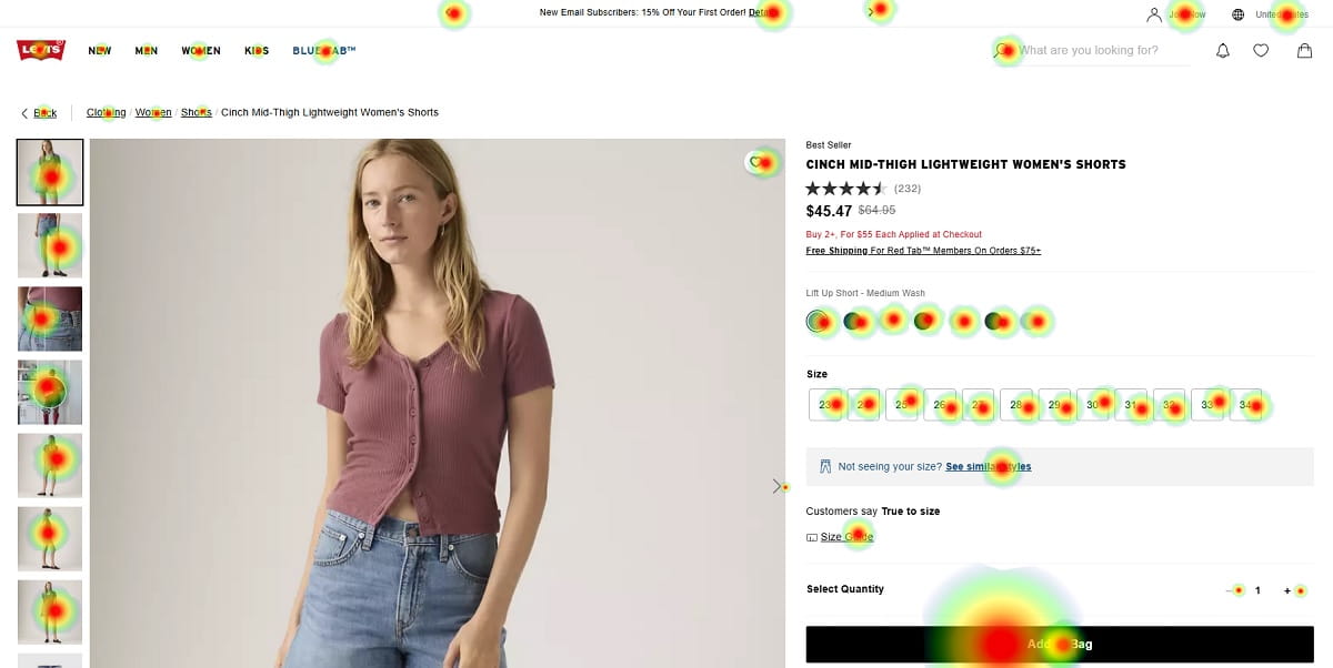
9. Reviews Are Not Visible Near The Buy Area
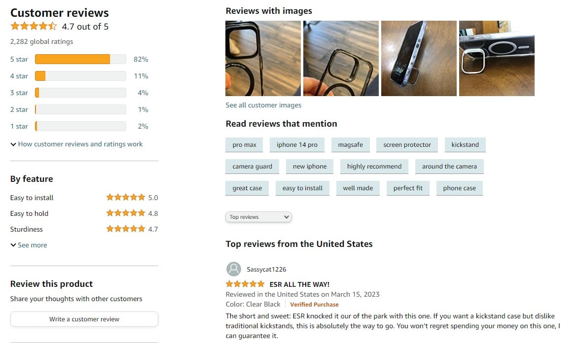
Product reviews work best when they support the decision at the right moment. If reviews are buried after long SEO text or cross-sells, they arrive too late. Show rating summary, review count, and a review anchor near the product title or price. Use scroll map data to check whether users actually reach the full review section. Invisible social proof is almost the same as no social proof.
10. Ratings Exist But Do Not Feel Trustworthy
A perfect rating with three vague reviews can feel weaker than a 4.6 rating with detailed feedback. Buyers notice patterns. They want photos, dates, verified buyer labels, size comments, and honest negatives. Make product reviews feel real. Do not hide all critical feedback. It can damage trust. For ecommerce product page UX, believable ratings usually beat polished ratings that feel too clean.
11. Sticky Add-To-Cart Is Missing On Mobile
Mobile users scroll a lot. When the add to cart button disappears, the product page forces them to hunt for it again. A sticky add to cart can reduce that friction, but it must not cover size options, reviews, or important content. Test it carefully. Watch session replay to see whether users scroll deep, show buying intent, and then struggle to return to the CTA.
12. Mobile Product Page Feels Too Long
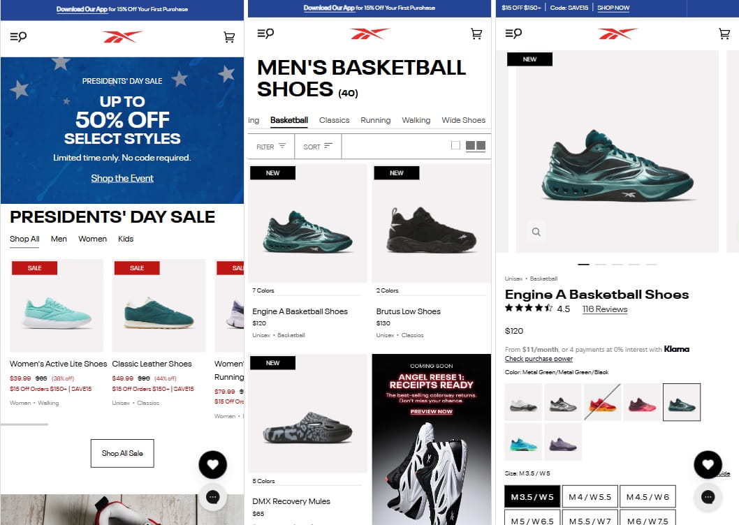
A mobile product page can feel endless when images, variant controls, description, reviews, shipping, and recommendations are stacked without priority. The problem is not length alone. The problem is unclear order. Put buying essentials first: images, price, variants, CTA, delivery, returns, reviews. Then add deeper content. A scroll map can show where attention drops and which blocks make users disappear.
13. Product Description Talks Too Much And Helps Too Little
Many product descriptions sound like catalog copy. Nice words, low usefulness. Buyers need practical details: fit, use case, material, care, compatibility, what is included, and what is not. Rewrite the product description around buying questions. Keep paragraphs short. Add bullets where they help. For product page optimization, clear copy often does more than another design change.
14. Benefits Are Buried Under Technical Details
Technical details matter, but they should not hide the reason to buy. A backpack page may list fabric density before explaining laptop fit, rain protection, and daily comfort. Lead with benefits, then support them with specs. This is especially important for complex products. The buyer needs meaning before measurements. Good product page CRO connects features to real use, not just internal product data.
15. Price, Discount, And Final Cost Are Not Clear
Confusing price logic kills trust fast. If the product has a discount, subscription price, tax issue, or shipping threshold, explain it clearly. Buyers should not need math to understand the final cost. Show original price, current price, savings, and key conditions near each other. When users hesitate around price in video sessions, the problem may not be price itself. It may be unclear pricing.
16. Product Variants Reset Or Confuse The User
Variant UX can break the buying flow. A user picks black, chooses medium, then the page resets after selecting another image. Or the URL changes and selected options vanish. That feels broken. Keep product variants stable and obvious. Show selected state clearly. Use click map data to find repeated clicks on color options, size labels, or variant images that suggest confusion.
17. Stock Status Creates Doubt Instead Of Urgency
Stock messages can help, but fake urgency feels cheap. “Only 2 left” on every product is not trust-building. Clear stock status should tell users whether they can buy now and when it ships. If an item is low stock, say it plainly. If unavailable, offer restock alerts. Do not let stock messaging create anxiety without helping the buyer make a decision.
18. Trust Signals Are Too Far From The CTA
Trust signals should support the action, not sit in a lonely footer. Secure payment, warranty, return window, delivery promise, and support options belong near the buy area. Small icons can help, but only when the words are specific. “Secure checkout” is weaker than “Pay safely by card, PayPal, or Apple Pay.” Ecommerce product page mistakes often happen when trust exists, but appears too late.
19. Shipping, Payment, And Warranty Blocks Look Generic
Generic blocks feel like decoration. Buyers ignore them because they have seen the same icons everywhere. Make shipping, payment, and warranty information specific to your store and product. Mention delivery range, payment methods, warranty length, and support contact. Use heatmap prediction to check if these blocks are visible. Use click map data to see whether users interact with them or skip them completely.
20. Product Videos Are Missing Or Placed Too Late
Product videos help when the product needs motion, scale, setup, texture, or proof. A short video can answer questions that ten images cannot. Place video inside the product image gallery or near the top, not after several unrelated sections. For product page UX, video should reduce uncertainty. Watch session replay to see whether users search through images as if they are looking for more proof.
21. Cross-Sells Distract Before The Main Decision
Cross-sells can increase order value, but timing matters. Showing too many related products before the main decision can pull users away from the product they came to buy. Keep cross-sells lower or after add to cart. On a product page audit, check whether users click recommended products before selecting size, color, or delivery details. That may look like engagement, but it can be a conversion leak.
22. Page Speed Makes The Product Feel Less Reliable
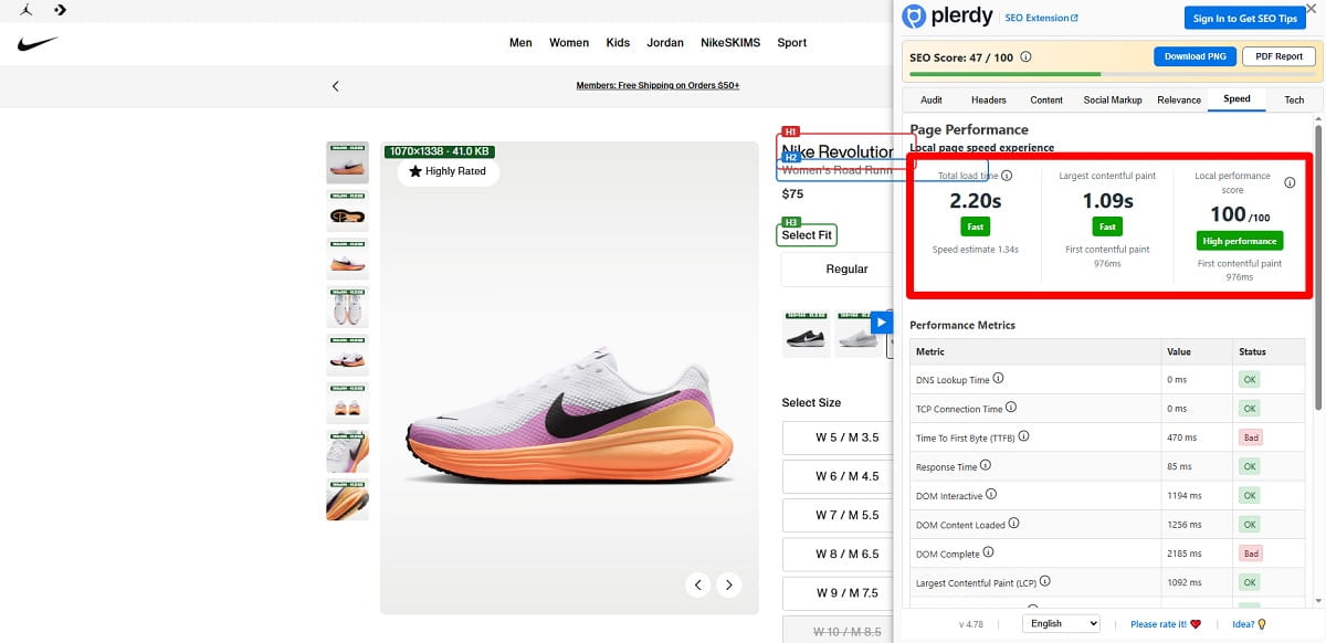
A slow product page does more than annoy users. It makes the store feel less reliable. Heavy images, review widgets, scripts, and video embeds can slow the exact page where trust matters most. Compress product photos, delay non-critical scripts, and test mobile speed. Slow loading can damage product page conversion before users even evaluate the product page design.
23. The Above-The-Fold Area Has No Clear Priority
The first screen should answer the first buying questions. Product name, photo, price, rating, key variant choices, and CTA need a clear hierarchy. Some pages waste above the fold space on banners, breadcrumbs, empty margins, or oversized brand copy. Use heatmap prediction to see whether the CTA, reviews, and product variants get attention. If everything is important, the buyer has to organize the page alone.
24. SEO Text Pushes Real Buying Content Down
SEO matters, but product page SEO should not damage buying flow. Long keyword-heavy text above reviews, delivery, or variant details can push useful content too low. Keep commercial information close to the buy box. Put deeper SEO copy lower, where it supports search without interrupting action. Product page best practices should serve both Google and the human trying to decide right now.
25. The Page Is Never Checked With Real User Behavior
The biggest product page mistake is trusting opinions only. A designer may like the layout. A marketer may like the copy. The buyer may still hesitate. Use Plerdy UX analysis, heatmap, scroll map, click map, and session replay to see real behavior. Watch where users stop, skip, click, and struggle. Product page CRO improves faster when the team studies evidence, not guesses.
How To Prioritize Product Page Fixes In 2026
Trying to fix all 25 ecommerce product page mistakes at once is usually a mess. Teams change the CTA, rewrite the product description, add reviews, move shipping details, install a sticky add to cart, and then nobody knows what helped. A better 2026 product page optimization process starts with priority.
First, fix anything that blocks buying. Broken variant selection, unclear size options, hidden add to cart button, or confusing price logic should come before cosmetic changes. These are not “nice to have” improvements. They stop users from completing the basic buying path.
Second, fix anything that hides trust. Reviews, delivery information, return policy, payment safety, and warranty details reduce doubt. If those signals are too low, too vague, or too generic, the product page asks users to take a risk without enough proof.
Third, look at mobile UX. Many stores still design on desktop and then patch mobile later. That is dangerous because a mobile product page often has less space, more scrolling, and more accidental taps. Small issues become bigger there.
- Fix anything that blocks buying.
- Fix anything that hides trust.
- Fix anything that creates mobile friction.
- Fix anything users ignore or misunderstand.
- Test design changes before rolling them across all product pages.
Finally, combine UX judgment, CRO testing, and behavior analytics. Plerdy can help show whether users notice the CTA, reach delivery information, click confusing elements, or hesitate before adding to cart. That does not replace human thinking. It gives the team better evidence, which is usually what ecommerce sales need.
A Simple Product Page UX Audit Workflow
Start with one important product page. Not the whole store. Pick a page with traffic, sales potential, and enough behavior data to study. Open it on mobile first because mobile usually exposes friction faster. Look at the first screen without scrolling. Can the buyer understand the product, price, variant choices, review score, and next action?
Then check the product image gallery. Are there close-ups, scale photos, variant photos, and practical details? Tap through the gallery like a real buyer. Next, test color options and size options. Watch whether selection is obvious, whether unavailable variants are clear, and whether the add to cart button stays easy to use.
Now look for delivery information, return policy, and product reviews. They should not feel like hidden legal content. These elements support trust near the buying moment. Check whether sticky add to cart works on mobile without covering useful content.
After the manual review, open behavior data. In Plerdy, use scroll map to see how far users go, click map to see what they tap, and video sessions or session replay to watch hesitation. Heatmap prediction can help estimate whether users are likely to notice key elements before enough traffic arrives.
Write down only the first three fixes. That limit matters. A product page audit becomes useful when it turns into action, not when it becomes a giant document nobody opens again.
FAQ
What Is A Product Page UX Checklist?
A product page UX checklist is a practical list of things to review on an ecommerce product page before blaming ads, price, or traffic quality. It covers photos, variants, CTA button, delivery information, reviews, mobile UX, trust signals, product description, and behavior data. The point is to find friction that makes buying harder and fix the most expensive problems first.
Why Do Product Page Mistakes Kill Sales?
Product page mistakes kill sales because they add doubt at the exact moment when the user is close to buying. Hidden delivery details, unclear size options, weak social proof, or a poor mobile product page can make the product feel risky. The user may still like the product, but the page makes the decision feel too uncertain or too much work.
What Is The Most Common Product Page UX Mistake?
One common product page UX mistake is hiding important buying information too low on the page. Delivery, returns, reviews, size help, and trust signals often appear after long descriptions or promotional blocks. That hurts product page conversion because many users never scroll far enough. The fix is not always a redesign. Often it is better ordering and clearer visual priority.
Should Every Ecommerce Store Use Sticky Add-To-Cart?
Not every store needs sticky add to cart, but many mobile product pages should test it. It helps when users scroll through images, reviews, or details and then need an easy way to act. The sticky bar must stay clean and should not block size options or important content. Check session replay and mobile click data before deciding.
How Can I Check If Users See My Product Reviews?
You can check review visibility with scroll map data, click map data, and video sessions. A scroll map shows whether users reach the review section. A click map shows whether they tap review stars or review links. In Plerdy, session replay can show whether users pause near reviews or skip them. If reviews are ignored, move summary proof closer to the buy box.
How Often Should I Audit Product Page UX?
Audit product page UX at least once per quarter, and also after major design changes, traffic changes, new product launches, or theme updates. Ecommerce UX checklist work is not a one-time task. User behavior changes, mobile layouts break, apps add extra scripts, and new product page mistakes appear quietly. Review your best-selling and highest-traffic pages first.
Conclusion
A product page UX checklist is useful because it makes invisible friction visible. It forces the team to stop saying “the page looks fine” and start asking better questions. Can users see the CTA? Do they trust delivery? Are reviews close enough? Does mobile buying feel easy?
Most sales leaks are not dramatic. They are small doubts repeated across thousands of visits. Plerdy can help you see what users notice, skip, click, and struggle with, so product page UX improvements are based on behavior instead of opinions.