
Roughly 70% of ecommerce carts still get abandoned, and no, it is not always because the price is too high. Many buyers already want the product. They have picked the size, checked the photos, maybe compared shipping. Then the checkout process adds one small doubt, then another. A forced account. A surprise fee. A phone field that rejects their number. A payment button hidden under a sticky bar.
Baymard Institute has studied cart abandonment and checkout usability for years, and its research keeps pointing to the same uncomfortable truth: many checkout problems are fixable. Not with magic. With better checkout UX, clearer trust, cleaner forms, and fewer moments where the buyer thinks, “Wait, why is this hard?”
Why Cart Abandonment Still Happens In Modern Ecommerce
Most ecommerce teams already know the basic advice. Offer guest checkout. Show shipping costs. Make forms shorter. Add payment options. Yet shopping cart abandonment still stays painfully high because checkout UX does not fail in one dramatic moment. It usually fails through a stack of tiny issues.
A store may have a beautiful homepage, polished product page, strong reviews, and solid ads. Then the ecommerce checkout feels like it was last touched three redesigns ago. I see this often in audits. Product pages get attention because they are visible and fun to redesign. Checkout pages feel technical, locked by Shopify, WooCommerce, payment providers, plugins, scripts, and internal rules. So teams leave them alone.
But buyers do not care about your internal setup. They only feel the checkout user experience. If the delivery promise is vague, they hesitate. If the coupon field screams for attention, they leave to search for a code. If the address form keeps changing their input, they get annoyed. If payment redirects to a strange-looking page, trust drops. None of these issues looks huge in isolation. Together, they create drop-off.
Checkout Friction Usually Comes From Small Doubts
A buyer does not always abandon because they decided against the product. Sometimes they abandon because checkout timing is fragile. They are on mobile. They are between tasks. Their card is nearby, but patience is not. Your checkout process has to keep momentum alive.
Good checkout optimization is not about making everything minimal. It is about removing the wrong work from the buyer. The buyer should not have to guess delivery cost, decode field labels, hunt for return terms, or understand why a payment failed. That is the store’s job.
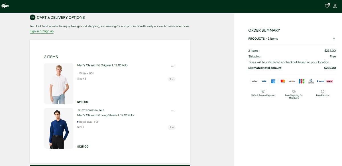
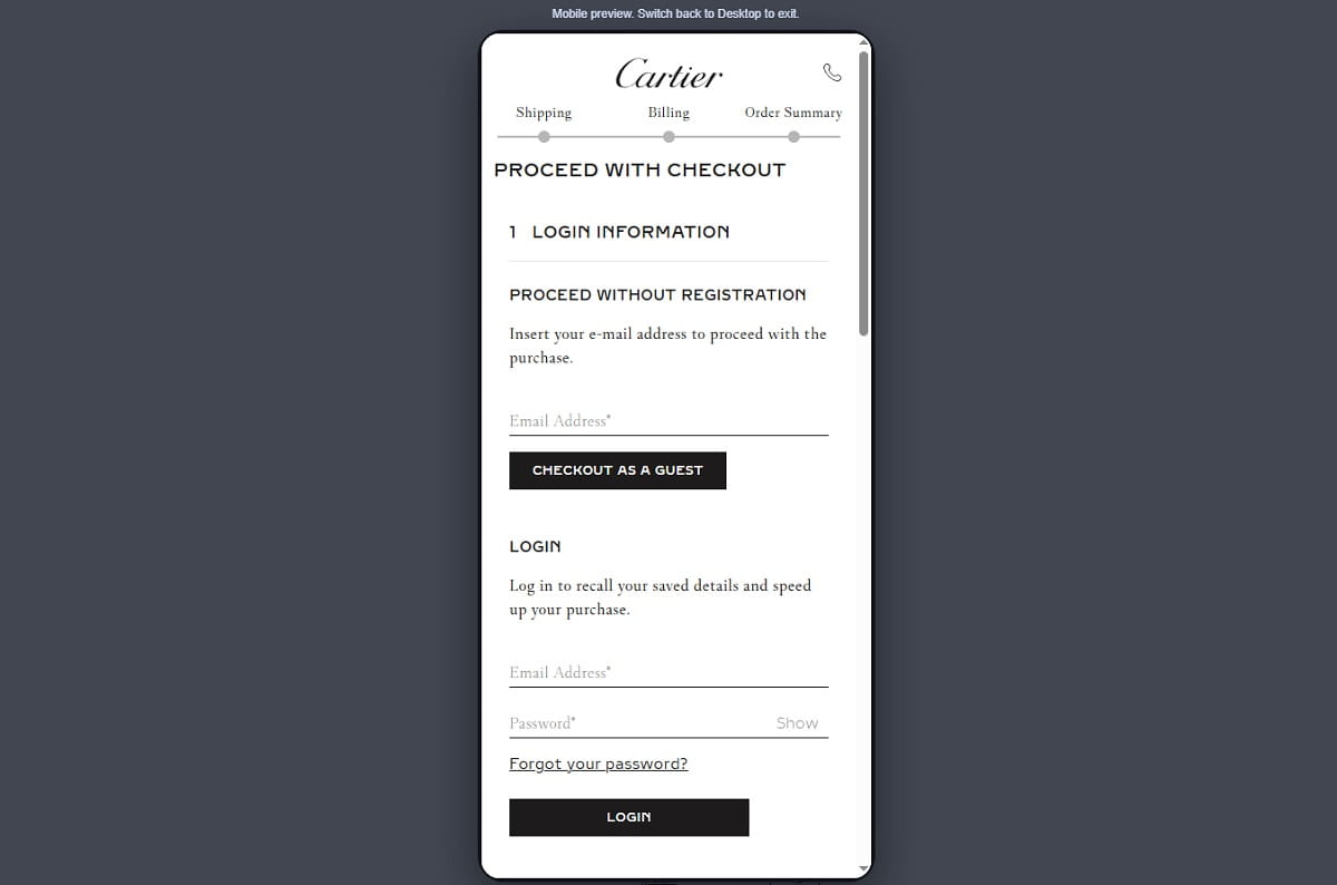
Mandatory Registration Still Pushes Buyers Away
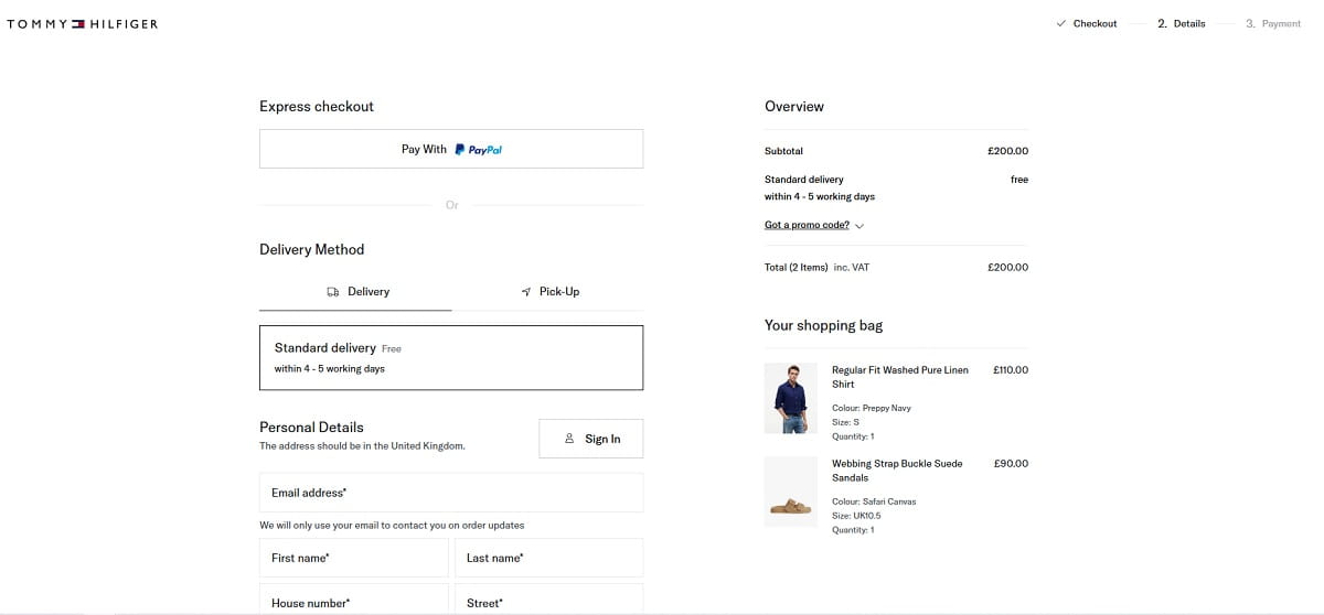
Mandatory registration is one of those checkout UX mistakes that often comes from business logic, not user logic. The store wants customer accounts for retention, loyalty, email marketing, support history, and cleaner data. Fair. But forcing account creation before purchase asks the buyer to do extra work before they get the thing they came for.
That timing matters. At checkout, the buyer is trying to finish a transaction. When a site says “Create an account to continue,” it changes the task. Now the buyer has to think about passwords, privacy, future emails, and whether this store deserves a long-term relationship. For a first-time buyer, that can feel too early.
Guest checkout protects momentum. It lets people buy first. Optional account creation after purchase still gives the business a path to registration, but at a better moment, when the buyer already trusts the store a little more.
Forced Registration Versus Guest Checkout
Forced registration says: “Give us your data before we let you pay.”
Guest checkout says: “Finish your order now. You can save details later.”
Optional post-purchase registration says: “Your order is placed. Want to save time next time?”
That last version feels different because it comes after the win. The buyer has completed the purchase. The account is now a convenience, not a gate.
Better Checkout Microcopy For Account Creation
Bad checkout copy:
“You must create an account before placing your order.”
Better checkout copy:
“Continue as guest. After payment, you can create an account to track this order faster next time.”
Another good option after purchase:
“Want to save your delivery details for next time? Create a password in 10 seconds. Your order is already confirmed.”
Notice the difference. The better version removes pressure. It explains the benefit. It does not block the sale.
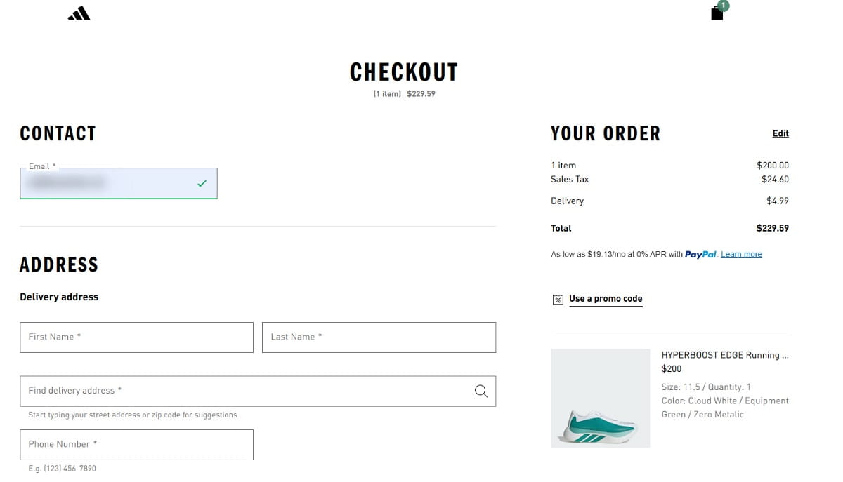
Unexpected Costs Break Trust At The Worst Moment
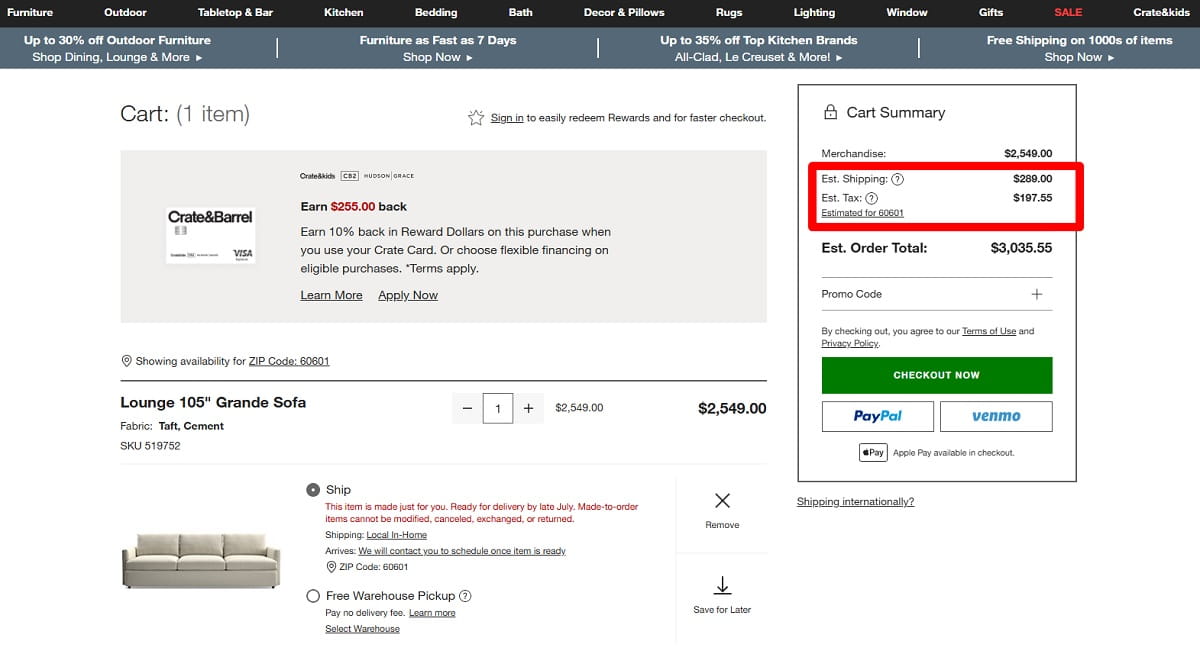
Unexpected costs are brutal because they appear when the buyer is already emotionally close to buying. Shipping costs, taxes, service fees, payment fees, packaging fees, delivery surcharges, and unclear customs costs can all feel like a small betrayal if they appear too late.
The issue is not only the amount. Sometimes the fee is reasonable. The problem is surprise. A buyer who sees $79 on the product page and $96.40 at the final step may start wondering what else is hidden. That thought is dangerous near payment.
Checkout optimization should make cost visibility earlier, not necessarily cheaper. Stores often fear showing shipping too soon because it may reduce add-to-cart clicks. But hiding the real total until the final step usually moves the pain deeper into the funnel. It does not remove it.
How To Show Costs Earlier Without Killing Conversion
You do not need to show a perfect total on the product page if tax and shipping depend on address. But you can reduce anxiety with clear ranges and rules.
- Show “Free shipping over $75” close to the add-to-cart button.
- Show a shipping estimator in the cart before checkout.
- Use “Taxes calculated after address” instead of leaving the buyer guessing.
- Explain delivery fees before asking for payment details.
- Keep the order summary visible during checkout, especially on mobile.
- Separate product total, shipping, tax, discount, and final total clearly.
A small warning here: do not use fake transparency. “Shipping calculated at checkout” is technically clear, but it is not very helpful. A better version is: “Standard shipping is usually $4.95 to $7.95. Exact cost appears after postcode.” That gives the buyer a mental range. It lowers the fear of a nasty surprise.
Weak Trust Signals Make Payment Feel Risky
Trust becomes more sensitive near payment. On a product page, buyers may enjoy browsing. At checkout, they are about to share personal details, delivery address, and payment information. The same design that felt fine earlier can suddenly feel thin.
Weak trust does not always mean the site looks fake. Sometimes the checkout simply loses brand consistency. The header changes. The URL looks different. Payment redirects to a page that does not match the store. The return policy disappears. Contact information is nowhere nearby. Reviews were visible on the product page, but now the buyer is alone with a card form and a total.
Security badges can help, but badges alone do not solve trust. Buyers need a complete trust environment. They need to understand what happens if the product does not fit, when the order arrives, how payment is protected, and how to contact someone if something goes wrong.
Trust Signals That Matter Near The Decision Point
- Clear return policy link close to the order summary.
- Delivery estimate visible before payment.
- Recognizable payment icons such as Visa, Mastercard, PayPal, Apple Pay, or Google Pay.
- Short security reassurance near the payment form, not hidden in the footer.
- Support contact, live chat, or email link near checkout questions.
- Consistent logo, colors, button style, and tone across checkout steps.
- Small reminder of product reviews or store rating, used carefully.
One small detail I like in checkout audits: place reassurance where the doubt happens. If buyers hesitate near shipping, show delivery clarity there. If they hesitate near payment, show secure payment and accepted methods there. Trust signals work best when they answer the exact fear in front of the user.
Checkout Forms Are Still Too Hard To Complete
Checkout forms are where many “small” UX mistakes become expensive. A checkout form is not just data collection. It is the main bridge between intent and revenue. If the form feels long, unclear, strict, or unstable, buyers slow down.
Baymard’s checkout research has often shown that form design affects completion. That sounds obvious, but the details are where stores lose money. Too many fields are only one part of the problem. Bad validation, unclear labels, mobile keyboard issues, weak autofill support, hidden errors, and address fields that fight the user can hurt just as much.
Common Checkout Form Problems
- Too many required fields, especially company name, second address line, or phone number.
- Labels that disappear after typing, leaving users unsure what they entered.
- Validation that appears only after submit, forcing users to hunt for errors.
- Error messages like “Invalid input” with no explanation.
- Mobile fields that show the wrong keyboard, such as text keyboard for phone or postcode.
- No autofill support for name, email, address, or card details.
- Address lookup that overwrites correct user input.
- Phone fields that do not explain why the phone number is needed.
Poor Field Examples And Better Alternatives
Poor label:
“Address 1”
Better label:
“Street address and house number”
Poor phone field copy:
“Phone number required”
Better phone field copy:
“Phone number for delivery updates only”
Poor error message:
“Payment failed”
Better error message:
“Payment was not approved. Please check your card details or try another payment method.”
The improved versions do not sound clever. They sound useful. That is the point. Checkout UX should reduce thinking, not show off copywriting.
Mobile Checkout Mistakes Hurt Serious Buyers
Mobile checkout often fails buyers who are actually serious. That is what makes it frustrating. The user wants to buy, but the interface keeps interrupting them. A small tap target. A sticky discount bar covering the button. A slow payment step. A keyboard that hides the field. A long checkout form that feels endless on a narrow screen.
Mobile checkout is not just desktop checkout squeezed smaller. Mobile users have less screen space, less patience, more interruptions, and more physical friction. Typing a delivery address on a phone is already work. The UX should not make it worse.
Mobile Checkout Issues That Quietly Create Drop-Off
- Small tap targets that cause wrong clicks or missed taps.
- Sticky headers, cookie bars, or promo bars covering checkout buttons.
- Payment buttons pushed below the fold with no visual cue.
- Long forms with no progress indicator or step clarity.
- Coupon fields placed too prominently, sending users away to search for discounts.
- Slow loading between shipping and payment steps.
- Keyboard covering the active field or submit button.
- Dropdowns for country, date, or region that are painful to use on mobile.
- Order summary hidden in an accordion with unclear final price.
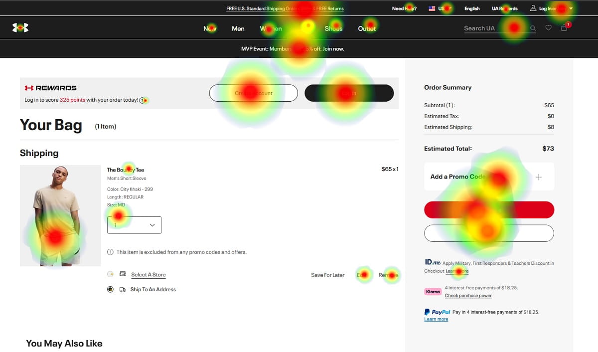
Coupon fields deserve special attention. I have seen checkout heatmaps where the coupon box gets more clicks than the payment button. That is not always a good sign. It may mean buyers feel they are missing a deal. A better pattern is to make the coupon field available but visually quiet, for example “Have a promo code?” as a small expandable link.
Mobile payment buttons also need direct visibility. If Apple Pay, Google Pay, PayPal, or card payment is available, do not bury the main action below three blocks of legal text and collapsed shipping details. The buyer should always know the next step.
Payment Friction Turns Ready Buyers Into Abandoned Carts
Payment friction is painful because it happens after the buyer has done most of the work. They selected the item, completed the checkout form, accepted the total, and reached the final step. Then the payment experience asks for too much effort or creates uncertainty.
Limited payment methods are one issue. Some audiences expect PayPal. Others prefer Apple Pay or Google Pay on mobile. In some markets, local payment options matter more than international cards. For higher-ticket products, Klarna or other buy now, pay later options may reduce hesitation. The right mix depends on country, device, price, and buyer habits.
Forced card entry can hurt mobile checkout, especially when wallet payments are common. Redirects can also reduce confidence if they feel sudden or visually disconnected from the store. A redirect is not always bad, but it should be explained. “You’ll be redirected to PayPal to complete payment securely” feels better than a sudden jump to a different page.
Payment Errors Need Human Explanations
One of the worst checkout errors is a vague failed payment message. Buyers do not know whether the card was charged, whether the order exists, or whether trying again will create a duplicate purchase.
Poor payment error:
“Transaction declined.”
Better payment error:
“Your payment was not completed, and your card was not charged. Please check your details or choose another payment method.”
That one sentence can save support tickets and abandoned carts. It gives control back to the buyer.
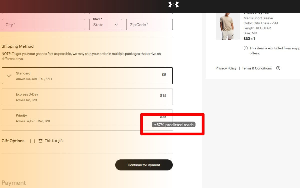
How To Use Plerdy Website Heatmap Tool To Find Checkout Drop-Off
You can guess where checkout UX fails, but guessing gets expensive. This is where the Plerdy Website Heatmap Tool fits naturally into checkout optimization. It helps teams see user behavior inside the checkout process instead of arguing from opinions.
A standard analytics report may show that users drop off between shipping and payment. Useful, yes. But it does not always show what happened on the page. A website heatmap can reveal whether users clicked the coupon field, missed the delivery information, rage-clicked a disabled button, or stopped scrolling before reaching payment options.
Checkout Behavior Plerdy Can Help You Analyze
- Clicks on checkout elements, including buttons, fields, links, accordions, and payment options.
- Rage clicks near broken buttons, unclear fields, or blocked payment steps.
- Dead clicks on elements users think are clickable but are not.
- Scroll depth on mobile checkout pages.
- Form interaction patterns, including fields users revisit or skip.
- Drop-off between checkout steps, such as cart to shipping or shipping to payment.
- Hesitation near payment buttons or trust information.
- Users clicking coupon fields before leaving checkout.
- Users missing return policy, delivery estimate, or contact information.
Practical Discoveries A Store Owner Might Find
A Shopify store may notice that mobile users scroll past the order summary but never open the delivery details accordion. The fix might be simple: show estimated delivery directly under shipping methods.
A WooCommerce store may see repeated dead clicks on a greyed-out “Place order” button. The issue might be hidden validation. Users did not understand that one required checkbox was still missing.
Another store may find rage clicks on the coupon field because the “Apply” button is too small or covered by a sticky footer. In a normal design review, that issue can be missed. In a heatmap tool, it becomes visible.
This is the real value of checkout analytics for CRO. You move from “conversion rate is down” to “buyers are stuck on this specific element.” That makes checkout optimization faster and much less political.
Checkout UX Checklist For Reducing Cart Abandonment
This checklist is not meant to make checkout pretty. It is meant to remove the small points of friction that create abandoned carts.
- Offer guest checkout as the default path for first-time buyers.
- Move account creation after purchase, and explain the benefit clearly.
- Show shipping thresholds and delivery cost ranges before checkout.
- Display tax, shipping, discounts, and final total in a clear order summary.
- Keep return policy and delivery estimate visible near payment decisions.
- Use payment icons that match the methods available at checkout.
- Make support contact easy to find without leaving checkout.
- Remove unnecessary checkout form fields, especially optional business fields for B2C orders.
- Use clear field labels that remain understandable after typing.
- Show validation errors near the field, not only at the top of the page.
- Explain why phone number is required, especially for delivery updates.
- Enable autofill for name, email, address, and payment details.
- Use the correct mobile keyboard for email, phone, postcode, and card fields.
- Check that sticky bars, chat widgets, and cookie banners do not cover checkout buttons.
- Make coupon fields available but visually quiet to avoid discount-code hunting.
- Show express payment buttons high enough on mobile to be noticed.
- Explain payment redirects before they happen.
- Use Plerdy Website Heatmap Tool to check rage clicks, dead clicks, scroll depth, and checkout-step drop-off before making redesign decisions.
Final Thoughts On Checkout UX And Abandoned Carts
Checkout optimization is rarely one big fix. It is usually a series of small friction reductions: fewer forced decisions, clearer costs, better form behavior, stronger trust, smoother mobile checkout, and payment options that match buyer habits. That is why checkout UX deserves regular review, not a one-time redesign. Tools like Plerdy help reveal where users struggle, hesitate, rage-click, or drop off, so ecommerce teams can fix the checkout process with evidence instead of guesswork.
FAQ
What Is Checkout UX?
Checkout UX is the user experience of the checkout process, including cart review, delivery details, checkout form fields, payment options, order summary, trust signals, error handling, and confirmation. Good checkout UX helps buyers complete a purchase with less friction, less doubt, and fewer unnecessary steps.
Why Do Customers Abandon Carts During Checkout?
Customers abandon carts during checkout because of unexpected costs, mandatory registration, weak trust, long forms, unclear delivery details, limited payment methods, slow mobile checkout, and confusing errors. Price can matter, but many abandoned carts happen because the checkout process creates hesitation at the wrong moment.
How Can Ecommerce Stores Reduce Cart Abandonment?
Ecommerce stores can reduce cart abandonment by offering guest checkout, showing costs earlier, simplifying the checkout form, improving mobile checkout, making payment options clear, showing return and delivery information near the order summary, and using checkout analytics to find real drop-off points.
Is Guest Checkout Better Than Account Registration?
Guest checkout is usually better for first-time buyers because it removes a major barrier before payment. Account creation can still be useful, but it works better as an optional post-purchase step. After the order is confirmed, the buyer is more likely to see an account as a convenience instead of a demand.
What Checkout Form Fields Cause The Most Friction?
Fields that often cause friction include required phone number, company name, second address line, strict postcode formats, unclear address fields, card fields with poor validation, and any field that rejects correct input without explaining why. Hidden errors and weak mobile autofill also make checkout forms harder to complete.
How Does Mobile Checkout Affect Cart Abandonment?
Mobile checkout affects cart abandonment because buyers deal with smaller screens, harder typing, keyboard issues, slower page changes, and more distractions. Small tap targets, hidden payment buttons, sticky elements covering actions, and long checkout forms can quickly turn serious mobile buyers into abandoned carts.
How Can Heatmaps Help Improve Checkout UX?
Heatmaps help improve checkout UX by showing where users click, scroll, hesitate, misclick, or rage-click. A website heatmap can reveal if buyers miss payment buttons, click coupon fields too often, ignore delivery information, or struggle with checkout form elements. This makes CRO decisions more practical.
What Is The Best Way To Find Checkout Drop-Off Points?
The best way to find checkout drop-off points is to combine funnel analytics with behavior tools. Analytics shows where users leave, while a heatmap tool and session replay help explain what users did before leaving. For example, Plerdy can help analyze checkout clicks, scroll depth, rage clicks, dead clicks, and step-by-step drop-off.