
Paid ads can burn money very quietly. A campaign looks active, clicks arrive, dashboards update, and everyone keeps adjusting bids, audiences, or creatives. But sometimes the real problem is not the ad. It is the page waiting after the click.
A weak landing page can make good paid traffic look useless. People click, land, hesitate, scroll a little, miss the CTA, distrust the offer, fight with a form, or leave on mobile because the page feels messy. A UX audit before paid ads helps catch these conversion blockers before traffic becomes expensive. It protects ad spend, improves conversion rate, and shows what users actually experience before you ask Google Ads, Meta Ads, TikTok Ads, or LinkedIn Ads to send more people there.
Why Paid Ads Do Not Fix A Bad Landing Page
Paid ads create attention. That is all. They do not create trust, explain the offer, clean up a confusing mobile layout, or make a slow page feel faster. After the click, the landing page has to do the harder work. It has to prove that the ad promise was real, explain why the visitor should care, and make the next step easy enough that a busy person can complete it without thinking too much.
This is where many paid campaigns start to leak money. The ad says one thing, but the landing page says something softer, broader, or slightly different. The headline does not repeat the offer. The hero section looks nice but says little. The CTA is below a large image. The pricing is hidden. The form asks for too much. The page loads slowly because five tracking scripts, a chatbot, and a video all fight for attention.
A landing page audit before a paid campaign is not just a design review. It is a business check. You are asking a simple question: if a person clicks this ad with real interest, does the page help them move forward, or does it create doubt?
More Traffic Makes Bad UX More Expensive
Bad UX is annoying with organic traffic. With paid traffic, it becomes expensive. Every unclear headline, hidden CTA, broken mobile block, or overloaded form is attached to a cost per click. When the paid campaign scales, the same UX problems scale too.
Imagine a landing page with weak form UX. At 100 clicks, the damage may look small. At 10,000 clicks, the same issue can quietly raise cost per lead, reduce ROAS, and make the campaign look like a targeting problem. The PPC team may lower bids, test new audiences, or rewrite ad copy, but the conversion rate stays flat because users are stuck after the click.
More traffic does not repair a weak user experience. It just sends more people into the same friction. That is why a UX audit before paid ads often saves more money than another round of campaign tweaks.
The Ad May Be Fine, But The Page May Be Blocking Sales
Marketers often look first at targeting, bidding, audiences, keywords, creative angles, and placements. That makes sense, of course. These things matter. But a paid campaign can bring the right people to the wrong experience.
A user may click because the ad promise is relevant, then leave because the landing page makes the next step unclear. Another user may want the product, but the form feels too long. Someone else may tap a mobile CTA, only to hit a sticky banner or a slow-loading section. The ad did its job. The page did not.
A proper UX audit separates traffic quality problems from page experience problems. It gives the CRO team, PPC specialist, and business owner a more honest view. Are users leaving because the wrong people clicked, or because the page is making the right people work too hard?
What A Pre-Ad UX Audit Should Check First
A pre-ad audit should be practical. Not a 60-page report full of vague opinions. Before spending more money on paid ads, you need to know whether the landing page can handle attention, explain the offer, build trust, and guide action.
The best audits usually mix expert review with user behavior data. A UX specialist can spot obvious issues quickly, but heatmaps, scroll maps, click maps, session replay, and form analysis show what real users do when nobody is watching them. Plerdy can help here because it brings behavioral data into the audit instead of relying only on opinions from the marketing team.
Message Match Between Ad And Landing Page
The first check is message match. A visitor should feel, almost instantly, that they landed in the right place. The ad promised something. The landing page must continue that promise without making the user mentally reconnect the dots.
Check the headline first. Does it repeat or clearly support the ad message? If a Google Ads campaign promotes “free UX audit for ecommerce stores,” the landing page should not open with a broad line like “Improve Your Digital Growth.” That may sound polished, but it creates a gap. Paid traffic is impatient. People click with a specific expectation.
Also check the offer, visuals, pricing expectations, product promise, and user intent. A Meta Ads creative showing one product should not send users to a general category page unless that is clearly expected. A LinkedIn Ads campaign for SaaS demo requests should not land on a homepage with six competing CTAs. The page should continue the path, not restart the conversation.
First Screen Clarity
The first screen is where paid traffic decides whether the page deserves more attention. It does not need to explain everything, but it should explain enough.
A strong first screen usually answers four questions fast: what is this, who is it for, why should I care, and what should I do next? If the user has to scroll just to understand the offer, the landing page UX is already weak. This becomes worse on mobile, where the hero section can easily be swallowed by a large image, a menu bar, a cookie banner, and a vague headline.
During a landing page audit, check whether the CTA is visible, the value proposition is specific, the hero visual supports the offer, and the page includes some early trust signal. It can be a review rating, client logo, result snippet, delivery promise, short testimonial, or guarantee. Cold paid traffic often needs reassurance earlier than returning visitors.
CTA Placement And Button Clarity

The CTA is not just a button. It is the main direction of the page. If users do not notice it, understand it, or trust what happens after clicking it, the paid campaign loses money.
Start with placement. Is the primary CTA visible on the first screen? Does it appear again after key explanation blocks, proof, pricing, and product details? On mobile, is there a sticky CTA when it helps, or does the user need to scroll back up like it is 2013?
Then review button text. “Learn More” may work for early research intent, but it is often too vague for commercial paid traffic. If the goal is a demo, say “Book A Demo.” If the goal is a quote, say “Get A Quote.” If the user is buying, say “Add To Cart” or “Start Checkout.” A call to action should reduce uncertainty, not add another tiny puzzle.
Also check contrast, spacing, competing buttons, and secondary CTAs. A page with five equally loud actions can feel active, but it often weakens decision-making. In CRO, clarity usually beats decoration.
Trust Blocks And Proof
Cold paid traffic does not know you yet. That sounds obvious, but many landing pages are written as if the visitor already trusts the brand. Organic users may arrive after research. Returning users may remember the company. Paid users often come from a single ad impression and a click.
A landing page UX audit should check where proof appears and whether it is close to decision points. Reviews at the very bottom may be fine for patient users, but paid traffic may need trust earlier. Client logos, ratings, case studies, certificates, return policy, guarantees, payment options, delivery details, security badges, transparent pricing, and real product photos can all reduce doubt.
For ecommerce, trust blocks near product details, delivery information, and checkout can matter more than a large brand story. For SaaS, proof near demo request sections can calm the “will this waste my time?” feeling. For lead generation, showing real outcomes, industries served, or process steps can help users understand what they are signing up for.
Form UX And Lead Friction
Forms are where many landing pages quietly lose users. The person was interested enough to start, but not comfortable enough to finish. That is a different problem from “bad traffic.” It is usually friction.
A pre-ad UX audit should check field count, field labels, validation, error messages, mobile keyboard behavior, dropdown usability, and whether the form asks for sensitive information too early. If a user only wants a price estimate, asking for company size, full address, phone, budget, industry, and a long message can feel like work.
Trust near forms matters too. A short privacy note, a clear expectation of what happens next, or a small reassurance can help. For example, “We reply within one business day” is not glamorous, but it removes doubt.
Plerdy session replay can be useful here because it shows where users hesitate, correct fields, scroll away, return, or abandon the form. This is the kind of detail standard analytics rarely explains. You may see that users start the form on desktop, but mobile users struggle with a dropdown. Or that everyone pauses at the phone number field. Small clue, big budget impact.
Page Speed And Technical Friction
Slow pages punish paid ads before users even read the offer. The campaign may show clicks, but some people never really experience the page. Others arrive irritated because the hero section shifts, the CTA appears late, or the mobile page freezes under heavy scripts.
A website audit before running ads should check loading speed, layout shifts, broken elements, delayed CTA rendering, image weight, video behavior, third-party scripts, chat widgets, popups, and tracking tags. This is not only a developer issue. It is a conversion optimization issue because technical friction changes how people behave.
One common audit finding is a page that looks fine after it fully loads, but feels clumsy during the first few seconds. Paid traffic does not always wait politely. If the CTA jumps, the menu covers content, or a popup appears before the page explains the offer, the user experience is already damaged.
Mobile Layout And Tap Experience
Mobile UX deserves its own review, not a quick resize of the desktop screen. Many paid clicks come from mobile devices, especially from Meta Ads, TikTok Ads, YouTube, and display placements. Even B2B buyers often click ads on mobile first, then decide whether the brand is worth revisiting later.
Check tap targets, sticky elements, hero height, image size, horizontal scroll, menu behavior, mobile forms, product cards, checkout steps, and keyboard behavior. A landing page may look premium on desktop but feel cramped on a phone. The CTA may be visible on desktop but buried after two full mobile screens. A product image may be beautiful but push the value proposition too low.
During a Plerdy UX audit, mobile heatmaps and session replay can show whether users tap the intended elements or fight with the layout. Watch for repeated taps, abandoned forms, scroll loops, and dead clicks. These small signals often explain why mobile paid traffic converts worse than expected.
Silent UX Blockers That Paid Ads Reports Do Not Show

Ad platforms are good at showing performance numbers. Clicks, impressions, CPC, conversions, cost per lead, and ROAS are useful. But they do not always show the reason behind user behavior. A paid ads report can tell you that conversion rate dropped. It rarely tells you that users kept clicking a non-clickable product image because it looked like a carousel.
That is why behavioral analysis matters. Heatmaps, click maps, scroll maps, and session replay reveal silent blockers. Not dramatic website crashes. More like tiny moments of confusion that repeat across many users until they become expensive.
Dead Clicks And Rage Clicks
Dead clicks happen when users click something that does nothing. Rage clicks happen when users click repeatedly because they expect a response and do not get one. Both can signal frustration or unclear design.
Examples are easy to find during audits. Users click product images that are not expandable. They tap icons that look interactive. They click a disabled button because the form error is unclear. They tap a pricing card expecting details, but nothing opens. On mobile, they may tap a sticky bar that blocks the real CTA.
Plerdy heatmaps and behavior tracking can help identify these UX problems before more paid traffic arrives. If many users click the wrong thing, the design is teaching them the wrong action. That is not a user problem. That is a page problem.
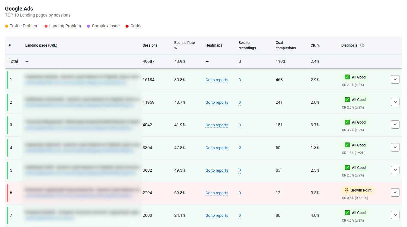
Scroll Depth Problems

Scroll maps show how far users go down the landing page. This matters because important content is often placed where most paid visitors never reach it.
A page may have strong testimonials, pricing, product benefits, comparison tables, FAQ answers, and a lead form, but if users drop before seeing them, those blocks are not doing their job. They exist, yes. They just do not influence enough decisions.
During a landing page audit, scroll maps help decide what should move higher. Maybe the pricing teaser needs to appear earlier. Maybe the CTA should repeat after the first proof block. Maybe the form should not sit below six sections of brand storytelling. Scroll depth data turns layout decisions into something more grounded than personal preference.
Session Replay Signals
Session replay is useful because it shows the messy reality of user behavior. People do not move through pages like neat funnel diagrams. They scroll up and down, hesitate, hover, open menus, close popups, start forms, erase fields, compare sections, and sometimes leave for reasons that become obvious only when you watch the session.
Before scaling paid ads, review session replays from key pages: landing pages, ecommerce product pages, checkout pages, demo request pages, and lead forms. Look for repeated scrolling, cursor confusion, form struggle, abandoned checkout steps, rage clicks, dead clicks, and moments where users seem to search for missing information.
Plerdy session replay helps a team see these issues without guessing. A PPC specialist may think the offer is clear. A founder may love the hero section. A UX designer may assume the form is simple. Then session replay shows real users missing the CTA, closing a popup, scrolling past the pricing, and leaving at the same field. That is uncomfortable, but useful.
Popup And Banner Friction
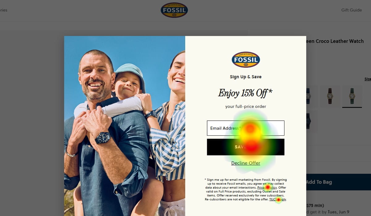
Popups can help conversion when timing, targeting, and context are controlled. They can also destroy paid traffic when they appear too early or block the main goal.
A common problem is a popup that appears before the visitor understands the offer. Another is a mobile banner that covers the CTA or form. Sometimes a discount popup distracts users from a higher-value conversion goal, like booking a demo or starting checkout. Cookie banners, newsletter boxes, chatbot prompts, and promo bars can all stack into a messy first impression.
A pre-ad audit should check whether popups support the paid campaign goal or interrupt it. With Plerdy, marketers can review popup behavior, user clicks, and session recordings to see whether overlays help users move forward or become another conversion blocker.
How To Use Plerdy As A Pre-Ad Audit Tool
Plerdy fits well into a pre-ad audit because it focuses on what users actually do. That matters before increasing ad spend. A landing page can pass a design review and still fail under real traffic. The layout may look clean. The copy may sound good. The CTA may seem obvious to the team that built it. User behavior can tell a different story.
The practical approach is simple: install tracking before launching or scaling the paid campaign, collect enough behavior data, then review patterns. Do not overreact to one strange session. Look for repeated signs across heatmaps, scroll maps, session replay, form analysis, and conversion events.
Heatmaps For CTA And Content Priority
Plerdy heatmaps show where users click, ignore, scroll, and lose interest. For a UX audit before paid ads, this is valuable because you can test whether the page guides attention toward the right elements.
Check whether users click the primary CTA or get pulled into low-value elements. Look at whether product images, pricing blocks, tabs, accordions, or menus attract useful attention. If users keep clicking decorative visuals, the design may be creating false affordances. If the main CTA gets little attention, it may be too low, too vague, too visually weak, or surrounded by noise.
Heatmaps also help with content priority. Paid traffic does not need every possible detail at once. It needs the right information in the right order: offer, proof, CTA, key benefits, pricing logic, objections, and next step. Plerdy heatmaps can show whether that order matches real behavior.
Session Replay For Real User Friction

Plerdy session replay adds context to the numbers. It helps reveal problems that standard analytics can hide.
On a landing page, session replay may show users scrolling back to the headline because the offer was unclear. On an ecommerce product page, it may show users checking photos, searching for delivery information, then leaving before the add-to-cart action. On checkout pages, it can reveal fields that slow people down or payment sections that cause hesitation. On SaaS demo pages, it may show users reading the form, pausing at the phone field, and leaving.
These are not always huge design failures. Often they are small UX issues repeated many times. That is exactly why they matter before paid ads. Paid traffic turns repeated small friction into repeated paid loss.
Form And Conversion Analysis
Form analysis should be part of any landing page audit when the conversion goal involves leads, demos, quotes, consultations, accounts, or checkout steps. A form is not finished just because it works technically. It has to feel easy, safe, and worth completing.
Review where users start, where they hesitate, which fields cause correction, and where they abandon. Too many required fields can reduce momentum. Unclear labels can create doubt. Validation errors that appear late can feel punishing. On mobile, the wrong keyboard type or awkward dropdown can turn a simple form into a small fight.
Plerdy helps connect form behavior with session replay and user behavior insights. That makes it easier to understand not only that users abandon the form, but how they behave before leaving. That difference matters for CRO decisions.
SEO And Technical Checks Before Paid Traffic
Paid traffic can still suffer from technical and structural problems. A page with weak metadata, messy headings, broken elements, poor page speed, duplicate sections, or confusing structure can create a worse user experience even if the traffic source is paid.
Plerdy SEO Checker and Plerdy SEO Analyzer can support a broader website audit before ads. The point is not to turn a PPC review into a full SEO project. The point is to catch issues that damage clarity, trust, performance, or page structure before more money enters the funnel.
For example, a page may have a weak H1, missing key information, broken links, heavy scripts, or technical errors that nobody noticed during campaign setup. These issues can make paid campaign performance look worse than it should. A pre-ad audit tool should help surface them early.
What To Fix Before Spending More On Ads

Not every UX issue deserves the same priority. A small alignment problem in a lower page section is not equal to a hidden CTA above the fold. A slightly imperfect testimonial layout is not equal to a broken mobile form. Before increasing ad spend, fix the blockers closest to the conversion path first.
A useful prioritization rule is simple: fix what affects understanding, trust, action, and access. If users do not understand the offer, they will not act. If they do not trust the page, they will not act. If they cannot find the CTA, they will not act. If the form or checkout does not work smoothly, they cannot act even if they want to.
Fix The Offer Clarity First
The offer must be clear before anything else. A visitor should understand what is being offered, who it is for, why it matters, and what to do next.
Weak offer clarity often looks like elegant but empty copy. “Grow smarter with innovative solutions” may sound safe in a meeting, but it does not help a paid visitor decide. A stronger landing page explains the product, service, result, or next step in plain language. It reduces thinking time.
During the UX audit, rewrite unclear headlines, remove vague hero text, and make the main value proposition specific. This can improve paid traffic performance without touching the campaign settings.
Fix The Main CTA And Form
The conversion path should be visible and easy to complete. If the CTA is hidden, vague, or visually weak, fix it before buying more clicks.
Review the primary CTA text, placement, repetition, and mobile visibility. Then review the form or checkout step connected to it. Remove unnecessary fields. Improve labels. Add helpful microcopy. Place trust near the action. Make error messages clear. Check the flow on a real phone, not only in a browser preview.
This is often one of the highest-impact areas in a pre-ad audit because it sits so close to conversion. A user who reaches the form is not cold anymore. Losing them there is painful.
Fix Mobile UX Before Scaling
Desktop review is not enough. A landing page can feel strong on a large monitor and weak on a phone. Paid traffic makes that gap dangerous.
Check the mobile layout section by section. Is the headline visible without too much scrolling? Is the CTA easy to tap? Do sticky elements block content? Are images too tall? Does the form behave properly when the keyboard opens? Can users complete checkout without zooming, pinching, or hunting for the next step?
Mobile UX should be tested with behavior data too. Plerdy heatmaps and session replay can reveal whether mobile users interact with the page as expected, or whether they get stuck in places the desktop review missed.
Fix Trust Gaps For Cold Traffic
Paid visitors often need proof earlier than warm visitors. They may not know the brand, and they may not be ready to believe a strong claim just because the page says it.
Add trust blocks near decision points. For ecommerce, place delivery, returns, payments, guarantees, and reviews close to product and checkout actions. For SaaS, show client logos, security notes, case results, ratings, or short testimonials near demo CTAs. For services, explain the process and show real proof that someone competent is behind the offer.
Trust is not decoration. It is part of conversion optimization, especially when ad spend brings unfamiliar users into the funnel.
Fix Speed And Blocking Elements
Page speed and blocking elements should be fixed before scaling. A slow page can waste paid clicks before the visitor even sees the offer. Intrusive overlays can do the same thing after the page loads.
Compress heavy images, reduce unnecessary scripts, check layout shifts, delay non-essential elements, and make sure the CTA renders quickly. Then review popups, cookie banners, chat widgets, promo bars, and sticky blocks. Ask whether each element helps the paid campaign goal or interrupts it.
This part can feel less exciting than rewriting copy, but it often protects budget faster. A cleaner, faster page gives every paid click a better chance.
A Simple UX Audit Checklist Before Paid Ads
Use this checklist before launching a new paid campaign or increasing ad spend on an existing one. It is simple on purpose. A checklist that nobody uses is just another nice document.
- Does the landing page match the ad promise? The headline, offer, visual, and CTA should continue the same message users clicked.
- Is the main CTA visible on the first screen? Users should not need to search for the next step.
- Is the value proposition clear in 5 seconds? A visitor should quickly understand what the page offers and why it matters.
- Are forms short and easy to complete? Remove unnecessary fields and check mobile form behavior.
- Are trust blocks close to decision points? Reviews, guarantees, client logos, delivery details, or security notes should appear where doubt may happen.
- Is the mobile layout clean and tap-friendly? Check CTA visibility, tap targets, sticky elements, images, forms, and checkout steps.
- Does the page load fast enough? Slow loading, layout shifts, and delayed CTA rendering can hurt conversion before users engage.
- Do heatmaps show users clicking the right elements? Clicks should support the conversion path, not collect on decorative or confusing elements.
- Do scroll maps show users reaching key content? Pricing, proof, benefits, and forms should not sit where most users never go.
- Do session replays show confusion or hesitation? Look for repeated scrolling, field corrections, rage clicks, dead clicks, and abandoned steps.
- Are popups helping or blocking the goal? Popups should support the paid campaign, not cover the CTA or interrupt the offer too early.
- Is the checkout or lead flow free from obvious friction? The final step should feel clear, safe, and easy to finish.
When To Pause Ads And Fix UX First
Sometimes the best PPC decision is to stop sending more traffic until the page is fixed. That can feel uncomfortable, especially when the campaign is already running. But continuing to buy clicks for a broken experience is not discipline. It is leakage.
Pause or reduce paid ads when the page shows clear UX issues that block conversion. For example, high clicks with almost no conversions may point to a page problem if traffic quality looks reasonable. Many form starts with few submissions can signal form friction. Strong mobile traffic with poor mobile conversion may mean the mobile layout is not ready. If users do not reach the CTA, scroll maps will show it. If session replay shows confusion, rage clicks, or repeated hesitation, the page needs attention.
Also pause when technical issues are obvious. Slow page speed, broken buttons, intrusive popups, checkout errors, hidden forms, or layout problems should be fixed before more budget goes in. Paid ads expose weak UX faster, but they do not excuse it.
When To Keep Ads Running While You Improve UX
Not every issue requires stopping campaigns. Sometimes paid traffic is useful because it gives you controlled behavior data. If the page works basically well, conversions are happening, and the issues are not severe, you can keep campaigns running while improving landing page UX.
This works best when you treat the traffic as research, not just acquisition. Segment users by campaign, device, source, and landing page. Watch Plerdy heatmaps and session replay for each segment. Compare mobile and desktop behavior. Check whether Meta Ads users behave differently from Google Ads users. Review whether cold users need more proof or whether high-intent users move straight to the CTA.
Small fixes can run in parallel: clearer CTA text, better trust placement, shorter form fields, improved mobile spacing, faster images, or adjusted popup timing. Bigger changes may need A/B testing or a separate landing page. The key is not to ignore behavior data while the campaign spends money. Paid traffic can teach you a lot, but only if you listen before scaling.
Final Thoughts
Paid ads magnify the landing page experience. If the page is clear, fast, trustworthy, and easy to act on, paid traffic has a fair chance. If the page is confusing, slow, weak on mobile, or full of silent blockers, more ad spend only makes the problem louder.
A UX audit before paid ads helps businesses spend smarter. It shows what to fix before traffic becomes expensive: message match, CTA clarity, form UX, trust blocks, mobile layout, page speed, and behavior issues. Tools like Plerdy help reveal what users actually do with heatmaps, scroll maps, session replay, form analysis, and website checks. That is much better than guessing and hoping the next campaign budget will somehow fix the page.
FAQ
What Is A UX Audit Before Paid Ads?
A UX audit before paid ads is a review of the landing page, mobile layout, CTA, forms, trust blocks, page speed, and user behavior before launching or scaling a paid campaign. The goal is to find UX issues and conversion blockers that could waste ad spend after users click.
Why Should I Audit A Landing Page Before Running Ads?
You should audit a landing page before running ads because paid traffic costs money from the first click. If the page has unclear copy, weak CTA placement, poor mobile UX, slow loading, or a hard form, the campaign may lose conversions even when the targeting is good.
What Are The Most Common UX Problems That Waste Ad Budget?
Common UX problems include poor message match between the ad and landing page, unclear value proposition, hidden CTA, long forms, missing trust blocks, slow page speed, intrusive popups, weak mobile layout, confusing checkout steps, and users not reaching important content.
How Can Heatmaps Help Before Paid Ads?
Heatmaps help before paid ads by showing where users click, what they ignore, and whether attention goes to the right elements. Plerdy heatmaps can reveal if users notice the CTA, interact with key content, or click confusing non-clickable elements before you increase ad spend.
How Does Session Replay Improve Landing Page Performance?
Session replay improves landing page performance by showing real user friction. You can see hesitation, repeated scrolling, rage clicks, dead clicks, form corrections, abandoned checkout steps, and mobile layout problems. This helps teams fix the reason behind poor conversion rate, not just the symptom.
Can Plerdy Help With A Pre-Ad UX Audit?
Yes, Plerdy can help with a pre-ad UX audit by providing heatmaps, scroll maps, click maps, session replay, form analysis, popup behavior insights, event tracking, and website analysis. These tools help marketers find silent blockers before spending more money on paid traffic.
Should I Pause Paid Ads If My Landing Page Has UX Issues?
You should pause or reduce paid ads if UX issues clearly block conversions, such as broken forms, poor mobile usability, slow loading, users not reaching the CTA, checkout errors, or repeated confusion in session replay. Smaller issues can often be fixed while campaigns keep running.