

Customer Effort Score tells you how hard customers must work to complete an action. Used well, CES is not just a support metric. It is a practical way to find checkout friction, confusing forms, onboarding blockers, poor self-service, and UX issues that quietly lower conversions.
What is Customer Effort Score?
Customer Effort Score (CES) is a customer experience metric that measures how easy or difficult it was for someone to complete a specific interaction with a company. That interaction can be resolving a support issue, buying a product, finding information, completing onboarding, submitting a lead form, returning an item, or using a feature. Qualtrics describes CES as a single-item metric for the effort required to get an issue resolved, a request fulfilled, or a product purchased or returned. The lower the friction, the more likely the customer is to continue.
Why Customer Effort Score matters
CES became popular because customers often do not want a dramatic service experience. They want the job done with minimal effort. The classic Harvard Business Review article “Stop Trying to Delight Your Customers” helped push this idea into CX practice: reducing friction can be more important than trying to create a spectacular support moment.
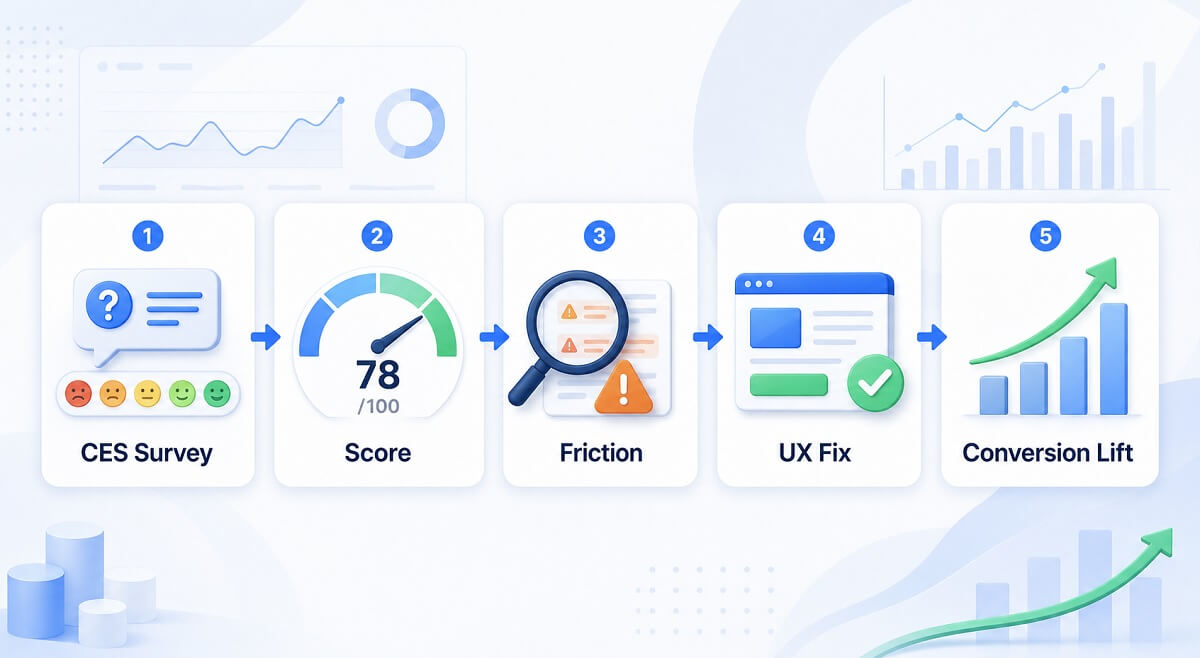
That makes Customer Effort Score especially useful for UX and CRO teams. If someone says checkout was hard, the business should not stop at the survey score. It should inspect the exact funnel step, replay sessions, heatmaps, form fields, error messages, device type, and traffic source. CES is the smoke alarm; behavioral analytics shows where the fire started.
Support
Measure whether customers can resolve issues without repeating themselves, switching channels, or reopening tickets.
Ecommerce
Find friction in checkout, delivery choices, promo code fields, product filtering, returns, and account creation.
SaaS
Measure onboarding, feature adoption, account setup, self-service docs, billing, and trial-to-paid steps.
Customer Effort Score formula
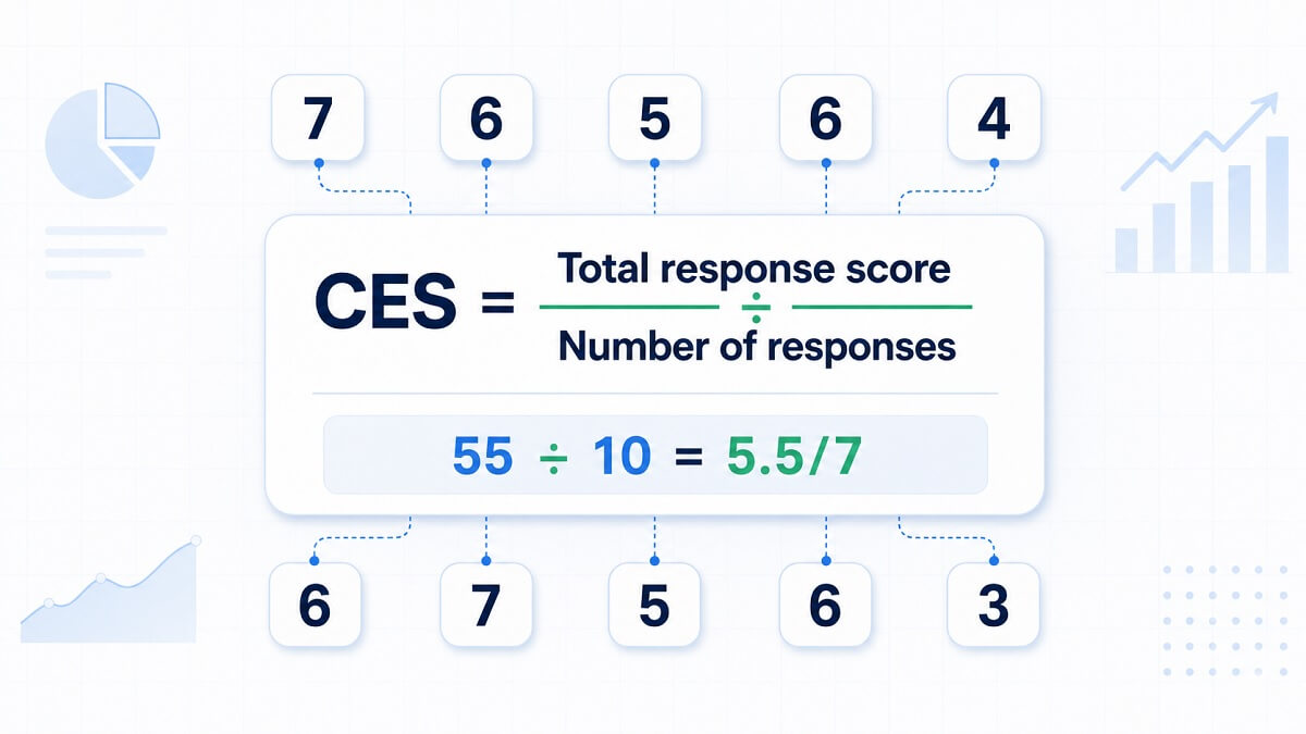
The most common Customer Effort Score formula is simple:
CES = Sum of all CES responses ÷ Number of responses
IBM explains CES as an average of responses: total response score divided by the number of responses. This average method is easy to understand, but it only works when you publish the exact question and scale direction beside the result.
Average CES calculation example
Suppose 10 customers answer “How easy was it to complete your purchase today?” on a 1–7 scale where 1 means very difficult and 7 means very easy. Their responses are: 7, 6, 5, 6, 4, 6, 7, 5, 6, 3.
| Step | Calculation | Result |
|---|---|---|
| Total score | 7 + 6 + 5 + 6 + 4 + 6 + 7 + 5 + 6 + 3 | 55 |
| Number of responses | 10 responses | 10 |
| Customer Effort Score | 55 ÷ 10 | 5.5 out of 7 |
On this scale, 5.5 is directionally positive because higher means easier. If the wording were inverted and 7 meant “very difficult,” the same number would be bad. This is where many articles and dashboards accidentally mislead teams.
Top-box or top-two-box CES
Some teams report CES as the percentage of customers who selected the most positive options. On a 1–7 ease scale, that could mean responses of 6 or 7. In a Qualtrics community answer about CES calculation, the top-box style is described as customers who agree the interaction was easy divided by all responses. This method is useful for executive dashboards because it answers a plain question: what share of customers found this easy?
| Method | Formula | Best for | Watch out for |
|---|---|---|---|
| Average CES | Total score ÷ responses | Tracking gradual changes over time. | Can hide polarization: many very easy and very hard experiences may average out. |
| Top-two-box CES | Responses in top 2 positive options ÷ all responses × 100 | Executive reporting and easy/not easy dashboards. | Depends heavily on which options are counted as “easy.” |
| Easy minus difficult | % Easy responses − % Difficult responses | Simple 3-option surveys: Easy, Neutral, Difficult. | Less granular than 5- or 7-point scales. |
Choose the right CES scale and wording
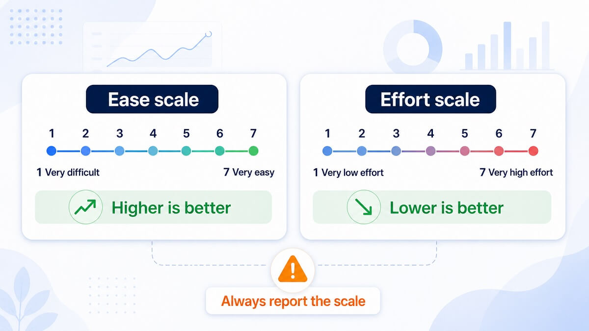
The scale is the trapdoor under CES. A score can look impressive or terrible depending on whether the survey asks about “ease” or “effort.” Before comparing results, freeze three things: the question, the scale, and the meaning of each endpoint.
| Scale | Example wording | Score direction | Best use |
|---|---|---|---|
| 1–5 effort scale | How much effort did it take to complete your purchase? | Lower is better if 1 = very low effort. | Short post-task surveys and mobile popups. |
| 1–7 ease scale | How easy was it to resolve your issue today? | Higher is better if 7 = very easy. | Support, SaaS onboarding, checkout, self-service. |
| Likert agreement | The company made it easy for me to handle my issue. | Higher is better if high = strongly agree. | Benchmarking service interactions over time. |
| 3-option scale | Easy / Neither / Difficult | Higher % easy is better. | Very simple website feedback widgets. |
Do not report CES without the scale
“Our CES is 5.8” is incomplete. Say: “CES is 5.8/7 on an ease scale where 7 = very easy.” Without that context, the number is a decorative statistic wearing a serious tie.
Kayako’s CES guide makes the same practical point: a higher score is good on a scale where 7 means easy, but bad on an inverted scale where 7 means difficult. This is why Plerdy’s article should be strict about scale direction from the first screen.
Customer Effort Score survey questions
The best CES questions are short, specific, and tied to one recent action. SurveyMonkey recommends clear questions such as asking how easy it was to resolve an issue or complete a purchase. The more specific the action, the easier it is to diagnose the answer.
| Touchpoint | CES question | Follow-up question | Use this when |
|---|---|---|---|
| Checkout | How easy was it to complete your purchase today? | What made checkout difficult? | You want to reduce cart abandonment. |
| Lead form | How easy was it to submit this request? | Which field or step caused friction? | You see form drop-offs or low lead quality. |
| Support | How easy was it to resolve your issue today? | What could have made the process easier? | A ticket is closed or chat session ends. |
| Onboarding | How easy was it to set up your account? | Which step was unclear? | Trial users abandon setup. |
| Feature use | How easy was it to use this feature? | What did you expect to happen? | Users try a feature but do not adopt it. |
| Self-service | How easy was it to find the information you needed? | What were you looking for? | Users search docs, FAQ, or help center. |
| Returns | How easy was it to request a return? | What part of the return process was confusing? | You want to reduce support tickets and frustration. |
Refiner advises keeping CES wording simple and often avoiding the word “effort” itself. “How easy was it to use this feature?” usually feels more natural than “How much effort did this feature require?”
CES question template
How easy was it to [complete a specific action] today?
Scale: 1 = Very difficult, 7 = Very easy
Optional follow-up: What made this experience difficult?
What is a good Customer Effort Score?
A good Customer Effort Score depends on the scale, question, touchpoint, audience, and product complexity. There is no universal number that works across ecommerce checkout, enterprise onboarding, technical support, and returns. Gartner’s 2024 research abstract frames high-effort service experiences as costly and damaging to loyalty, but the practical benchmark still needs to be built around your own historical baseline.
Use external benchmarks carefully. They can be useful for rough orientation, but your best comparison is usually: this month vs last month, mobile vs desktop, new vs returning users, paid traffic vs organic traffic, and before vs after a UX change.
| Signal | Likely meaning | What to do next |
|---|---|---|
| CES improves and conversion improves | Friction was probably reduced in a meaningful place. | Keep monitoring and document the UX change. |
| CES improves but conversion does not | The task feels easier, but the offer, price, traffic, or trust may still block action. | Check funnel data, traffic source, and objections. |
| CES drops on mobile only | Mobile UX may have layout, speed, keyboard, or form issues. | Review mobile heatmaps, recordings, and form errors. |
| CES drops after redesign | Users may be losing familiar paths or seeing new friction. | Compare old vs new flows and inspect session replays. |
| CES is stable but complaints rise | The survey may be shown in the wrong moment or to the wrong segment. | Audit targeting rules and add an open-text follow-up. |
CES vs CSAT vs NPS
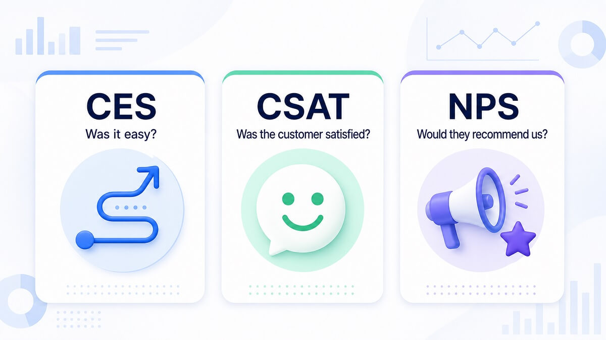
CES, CSAT, and NPS answer different questions. Treating them as substitutes creates messy dashboards and even messier decisions. Use CES when the business needs to know whether a task was easy. Use CSAT when the business needs to know whether a customer was satisfied with a moment. Use NPS when the business needs a broader loyalty or recommendation signal.
| Metric | Question it answers | Typical question | Best timing | Plerdy workflow |
|---|---|---|---|---|
| CES | Was this interaction easy? | How easy was it to complete your purchase? | Immediately after a task. | Survey → funnel → replay → heatmap → fix. |
| CSAT | Was the customer satisfied? | How satisfied are you with this experience? | After support, purchase, or feature use. | Survey → segment → feedback text → UX review. |
| NPS | Would the customer recommend us? | How likely are you to recommend us? | After enough product experience. | NPS campaign → user segment → retention/feedback analysis. |
Plerdy already has an educational base around NPS and CSAT, including CSAT vs NPS and how to create an NPS survey. The CES article should not duplicate those pages. It should become the owner of the “ease/friction” intent and link to CSAT/NPS only where comparison helps.
When to send a CES survey
Customer Effort Score works best when the experience is still fresh. Ask too early and the user has not completed the task. Ask too late and memory becomes fuzzy. The ideal moment is after a meaningful task ends.
| Moment | Trigger | Question | Avoid |
|---|---|---|---|
| Checkout | Order confirmation page. | How easy was it to complete your purchase? | Interrupting before payment is complete. |
| Lead generation | After form submit or booking request. | How easy was it to submit your request? | Showing the survey before the user knows success state. |
| Support | Ticket solved or chat ended. | How easy was it to resolve your issue? | Surveying every micro-message in a chat. |
| Onboarding | After activation step or first key action. | How easy was it to set up your account? | Asking before the user reaches value. |
| Help center | After article scroll or search result click. | How easy was it to find the answer? | Asking on every pageview. |
How to diagnose high customer effort
A CES score is not a diagnosis by itself. It tells you that an experience felt hard. To fix it, connect survey responses with behavioral evidence. Plerdy’s Website Feedback Tool supports CES, CSAT, and NPS-style feedback, which makes it a natural starting point for this workflow.
- Segment CES by page, device, traffic source, country, new/returning users, and customer stage.
- Find the step where low-CES users abandon: checkout step, form field, plan selector, onboarding step, help article, or support flow.
- Watch session replays for low-CES respondents or similar sessions.
- Review heatmaps, scroll depth, clicks, rage clicks, and form analytics.
- Write one friction hypothesis and test one fix at a time.
- Measure CES and conversion again after the change.
| Low-CES comment | Likely friction | Plerdy evidence to check | Possible fix |
|---|---|---|---|
| “The form was annoying.” | Too many fields, unclear validation, hidden error. | Form analytics, session replay, field drop-off. | Remove fields, improve inline errors, add examples. |
| “I could not find delivery price.” | Missing cost transparency before checkout. | Heatmap, scroll map, checkout funnel. | Show shipping estimate earlier. |
| “I had to contact support.” | Self-service content failed. | Search terms, help page behavior, exit survey. | Rewrite help content and add contextual links. |
| “Setup was confusing.” | Onboarding path lacks guidance. | Event tracking, replay, activation funnel. | Add checklist, defaults, tooltips, and progress state. |
| “Promo code did not work.” | Coupon field or pricing expectation problem. | Click map, form errors, checkout abandonment. | Clarify promo rules or remove distracting field. |
Customer Effort Score examples
Ecommerce CES example
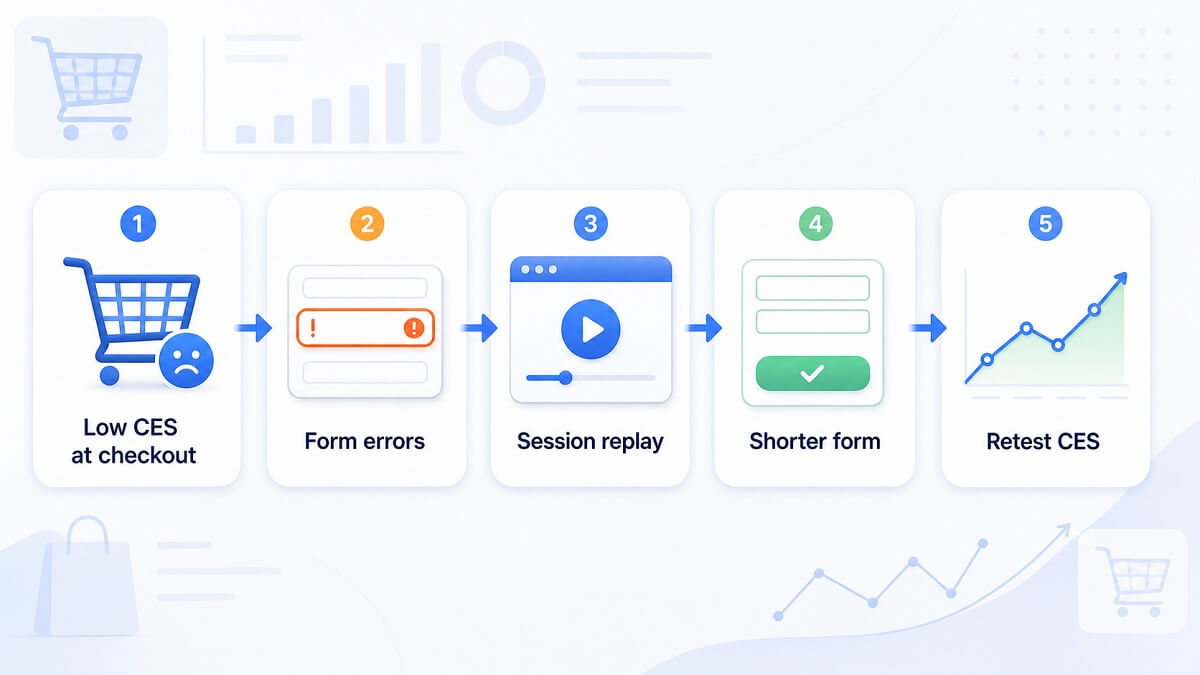
An online store shows a CES survey on the order confirmation page: “How easy was it to complete your purchase today?” The score drops from 6.1/7 to 4.8/7 on mobile after a checkout redesign. Low-CES comments mention “address,” “delivery,” and “payment error.”
The team checks Plerdy session replays and sees repeated field corrections in the shipping address step. Heatmaps show users clicking a delivery tooltip that opens too slowly on mobile. The fix: simplify address validation, show delivery cost earlier, and make the tooltip a visible helper text. After launch, the team compares CES, checkout completion, and support tickets for two weeks.
SaaS onboarding CES example
A SaaS company asks after the first project setup: “How easy was it to set up your first dashboard?” CES is 4.2/7 for new users from paid search but 5.9/7 for users invited by teammates. The survey comments say “not sure what to connect first.”
The team reviews activation events and replay sessions. New users pause on the integration screen, open docs, return, and abandon. The fix: add a setup wizard, preselect the most common integration, show a sample dashboard, and trigger a short CES survey after the first successful connection.
Common Customer Effort Score mistakes
Using CES as a brand metric
CES is strongest for specific interactions. If you ask “How easy is our company?” the answer becomes vague. Ask about checkout, support, onboarding, returns, or self-service.
Comparing scores with different scales
Never compare a 1–5 effort scale with a 1–7 ease scale as if they are the same. Store the question wording and endpoint labels with every report.
Only looking at the average
An average can hide a painful segment. Break CES down by device, page, product, plan, traffic source, and customer stage.
Not connecting CES to behavior
Survey answers tell you what customers felt. Behavioral analytics shows what happened. You need both to avoid fixing the wrong thing with great confidence.
FAQ about Customer Effort Score
What is Customer Effort Score?
Customer Effort Score (CES) measures how easy or difficult it was for a customer to complete a specific interaction, such as resolving a support issue, completing checkout, submitting a form, or setting up an account.
How do you calculate Customer Effort Score?
The common formula is: total CES response score divided by the number of responses. You can also report top-two-box CES, which is the percentage of respondents who selected the easiest options.
What is a good Customer Effort Score?
A good CES depends on the scale and touchpoint. On an ease scale where higher means easier, higher is better. On an effort scale where higher means harder, lower is better. Always compare against your own baseline.
What is the best CES question?
A strong CES question is specific: “How easy was it to complete your purchase today?” or “How easy was it to resolve your issue today?” Add an optional open-text follow-up to learn why.
When should you send a CES survey?
Send CES immediately after a meaningful task: order completion, form submission, support resolution, onboarding step, return request, or feature use. Avoid interrupting the user before the task is complete.
Is CES better than NPS?
CES is better for measuring friction in a specific interaction. NPS is better for broader recommendation intent. They answer different questions and work best together with clear ownership.
Can CES improve conversion rate?
CES can improve conversion work by identifying high-effort steps. The score itself does not raise conversion; the improvement comes from diagnosing the friction and fixing the UX or process.
How many CES responses are enough?
Start with enough responses to see patterns by touchpoint and segment. Avoid overreacting to tiny samples. For major decisions, compare trends over time and combine survey data with behavioral analytics.
Conclusion: CES is useful only when it leads to action
Customer Effort Score is valuable because it turns a vague complaint — “this was hard” — into a measurable signal. But the score is only the beginning. The best teams connect CES to funnels, replays, heatmaps, form analytics, and follow-up comments. That is how a survey becomes a UX and CRO improvement system instead of another dashboard number.
Start with one high-value touchpoint: checkout, lead form, support resolution, onboarding, or self-service. Ask one clear CES question, segment the answers, inspect the behavior behind low scores, and fix the friction that costs users the most effort.