
Finding the best user interface website design in 2025 exposes an amazing fusion of creativity and design. Imagine an interactive visual-enthralling fashion e-commerce website, a finance platform with smooth navigation, or a travel agency website that feels like a trip itself. These illustrations show how UI and design can revolutionize user experiences.
- Simple dashboards on fintech platforms
- Internet retailers using interactive product displays
- Websites dedicated to travel with rich, graphic narrative
- Interactive educational websites
- Artists’ dynamically displayed portfolios
These websites are design leaders, promoting interaction and usability. Plerdy’s CRO & UX solution provides user behaviour insights to enhance the user experience of your own website, hence raising conversion rates and usability. Explore how UI website design will develop in the future, when creativity and usefulness coexist peaceful.
UI Website Design Examples List
Explore our carefully chosen selection of the “10 Examples of the Best UI Websites Design in 2024” to witness historically unprecedented fusion of creativity and usability. These websites established the standard for what a contemporary website ought to be with their faultless design and simple user interface. Each example distinguishes itself in the digital world by showcasing different methods to creating aesthetically pleasing and intuitive interfaces.
Mailchimp
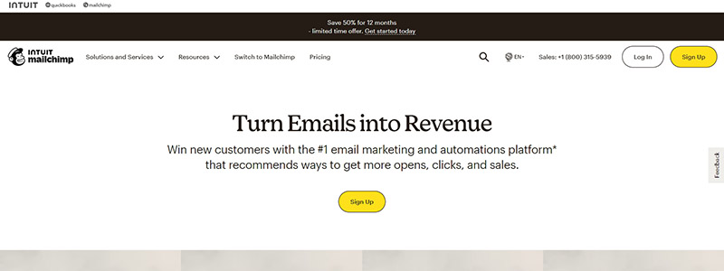
Examining Mailchimp’s homepage’s UI design, we find right away a dedication to a simple, intuitive design that makes sifting through the many options a pleasure. The website’s use of a harmonious color palette of grays and yellows not only captures the essence of the brand but also improves the design’s usefulness. The deliberate use of font and space embodies the ideas of good user interface design and leads users from one part to the next with ease.
Principal elements of the Mailchimp homepage design consist of:
- Simple and direct options make locating what you need easy and quick.
- Engaging Content Blocks: To differentiate between various sections of the website, each one is well defined with enough of white space and color.
- Responsive Design: The website looks great on all devices, so using it on a desktop or a smartphone will be consistent.
This strategy shows why Mailchimp is still a leader in UI design since it not only makes the website visually appealing but also maximizes user involvement. Carefully considered is the visual hierarchy, which enables users to absorb information in a logical flow—a necessary step for drawing in and keeping visitors. Through the conversion funnel—from learning about services to signing up or getting in touch—the design skillfully employs visual signals.
In the field of internet user interface design, where originality and clarity collide, Mailchimp’s design is a model of how to combine usability and beauty in online design.
Dropbox
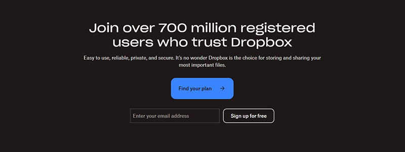
Enter the minimalistic universe of Dropbox’s homepage, where over 700 million users are easily guided by a UI design that combines simplicity and functionality. With a clean, contemporary design that puts the user experience first, every interaction on the website is both easy to use and effective.
Principal features of Dropbox’s user interface design consist of:
- Minimalistic Layout – The design avoids clutter and concentrates on important components by using a lot of white space and a soothing blue color scheme to create a tranquil user environment.
- Easy Accessibility of Features and a Visible Search Bar Make for Easy Navigation and Improve Website Usability Overall.
- Engaging Visuals: Superior photos and symbols not only improve appearance but also help to convey the features of the Dropbox service rapidly.
This website is a prime illustration of excellent user interface design since it skillfully combines visual appeal with usefulness. Whether a user is interested in professional or personal use, the well-segregated website sections offer fast access to information. Dropbox is still the market leader in cloud storage because every aspect of the user interface design functions in concert to deliver a smooth experience. Their website is proof positive of how good design can facilitate user happiness and navigation, simplifying difficult tasks and putting them at your fingers.
Pitch
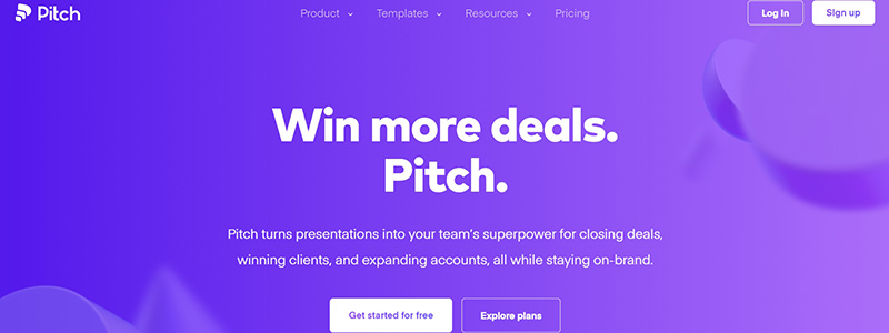
Using a striking purple tone that draws attention right away, Pitch’s homepage is a colorful display of contemporary user interface design. As a prime illustration of UI design for 2024, the website is designed to smoothly lead visitors through its features. What elevates the Pitch website over other UI design competitors is as follows:
- Simple and uncomplicated top menu access to different website areas is made possible.
- Engaging Visuals: Pitch’s presentation software’s capabilities are shown off in addition to drawing attention with the homepage’s usage of big, striking photos and videos.
- Clickable elements and interactive slide examples greet users and show off the tool’s flexibility without overpowering them.
Principal features of the homepage layout consist of:
- Generational, Editable Templates: Customization and efficiency are highlighted by the prominently displayed options to sort, find, and create templates.
- UI-enabled rapid editing and generation of presentations improves productivity.
- Integrative Features: Displays app compatibility, extending its usefulness in a range of professional settings.
The way Pitch’s website is designed, mixing style and utility, makes it more than just a tool but an experience that is difficult to ignore. This deliberate use of UI design makes sure that every user can easily browse the website, which promotes more in-depth interaction with the information. Visit their website to learn more about how Pitch creates captivating presentations.
Superlist
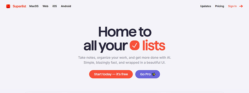
Enter Superlist’s colourful and well-structured universe, where comfort and efficiency are immediately communicated through the UI. The Superlist home page is an example of contemporary web design, fusing usefulness with visual appeal to produce a user-friendly experience that will be remembered in 2024.
This distinguishes the website of Superlist:
- Strong Color Blocks: Every part of the website is distinguished by a strong color that not only successfully divides content but also leads the visitor through various features and services.
- Clear, Concise Text: To improve readability and user interaction, the website communicates features in large fonts and simple language.
- Interactive Elements: Superlist lets visitors quickly see the tool’s simplicity and usefulness by including interactive lists and demo views right on the home page.
Important characteristics emphasized on the webpage consist of:
- Еasy connection with well-known programs to increase output.
- Options demonstrating flexibility for projects including teams as well as individuals.
- High security data handling standards.
Anyone trying to simplify their jobs and projects will find Superlist’s UI design, which puts speed and simplicity first. The website makes sure that handling your chores is as simple and quick as possible whether you are working alone or in a team thanks to its user-centric design. Visit Superlist to witness directly this fusion of simplicity and quickness.
Slite
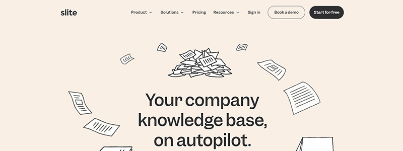
The primary page of Slite is a masterwork of user interface design, highlighting readability and simplicity of use that will be notable in 2024. With a simple and uncluttered design, the website successfully presents its platform as a flexible instrument for handling corporate information bases. Slite’s features and advantages are smoothly guided by the design, so even first-time users may readily understand its value offer.
Significant components of the Slite website design consist of:
- Structured Layout: Clear, educational language and succinct headlines in each clearly defined section make browsing easy.
- Interactive Previews: To help prospective customers see how Slite might integrate into their workflow, the homepage offers interactive previews of the tool in use.
- Consistent Color Scheme: The website balances professionalism with creativity with a serene palette of blues and grays, accentuated with vivid images.
By means of:
- Effective information architecture dividing knowledge into easily accessible parts.
- Quick access to videos illustrating the practical uses of Slite.
- Simple navigation that shows how dedicated the site is to raising productivity at work.
Slite’s goal to simplify information administration and collaboration in any company is reflected in the UI design in addition to the basic features of its software. Go to Slite to see the specifics.
Bumble

The colourful and interesting look of Bumble’s homepage aptly encapsulates the spirit of contemporary user interface design. Among internet dating sites, this one stands out for skillfully fusing eye-catching visuals with intuitive functioning.
What distinguishes the user interface design of Bumble is as follows:
- Strong Color Scheme: Throughout the website, the usage of a strong yellow motif not only draws attention but also strengthens the brand identity.
- Clear Navigation: Bumble Date, Bumble BFF, and Bumble Bizz are just a few of the services that consumers may easily explore thanks to the simple and intuitive navigation bars and well indicated categories.
- Engaging Content: To promote user interaction and exploration of the app, each component of the website communicates its main features and advantages with eye-catching images and succinct language.
Principal highlights from the homepage consist of:
- Encouraging users to “Make the Next Move,” a dynamic banner represents the app’s emphasis on enabling users to start relationships.
- References and success stories that give potential customers social proof and increase their confidence.
- Clearly stated calls to action that urge consumers to download the app or find out more about the provided services.
A model of UI design for 2024, Bumble’s website design not only improves user experience but also successfully conveys the brand’s message of empowerment and connection. See more about their creative methodology on the Bumble official website.
Monzo
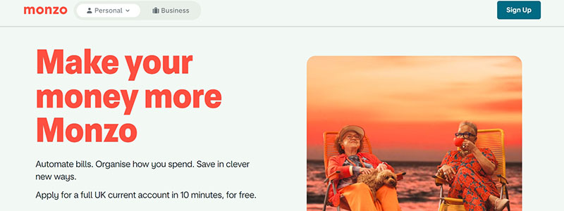
Modern user interface design ideas are embodied in Monzo’s website, which offers a smooth and intuitive experience that is in perfect harmony with the bank’s digital-first strategy. For those handling their money online, information access and convenience of use are emphasised in the simple and uncomplicated design.
What distinguishes the Monzo website in terms of user interface design is as follows:
- Bright Color Scheme: The entire user experience is energized by the website’s striking orange theme.
- Users may easily locate anything they need from account services to special features like loans or savings thanks to the intuitive navigation of the layout.
- Sections that Inform: Every aspect of the website is made to properly educate and inform visitors about Monzo’s services without overpowering them with technical speak.
Highlights of the webpage consist of:
- Financial Tools Display: Presents, in an understandable manner, budgeting and saving tools.
- Security Features: Users are assured about the security of their transactions by the obvious presentation of security information.
- Interactive Elements: The interactive experience of the website is improved by the ability of users to mimic various banking situations through interactive graphs and sliders.
The website of Monzo is a prime illustration of how good UI design can enhance the banking experience since it is not just useful but also beautiful. The way the website handles financial management is both user-friendly and interesting, which emphasizes its outstanding UI design. Go to Monzo’s official website for further information.
The New York Times
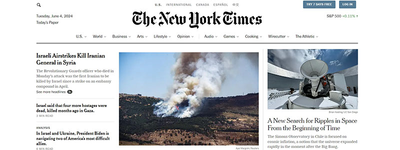
Twenty-four years from now, the New York Times website is still the best example of online design, fusing contemporary user interface concepts with classic journalism. This website is easy to use and skillfully handles a wide range of material, from breaking news to in-depth analysis, without overpowering its visitors.
Why does The New York Times’ design work so well?
- Simple, Organized Design: The homepage offers a tidy design that divides news into categories for easy user navigation across several subjects.
- Visual Hierarchy: Breaking news and unique features are prioritized as the design leads the reader’s eye around the page using a mix of various text and picture sizes.
- Responsive Design: Regardless of the device—desktop, tablet, or smartphone—the user interface (UI) adjusts smoothly.
Principal components of the website of The New York Times consist of:
- Minimalistic Color Scheme: The content is kept front and center by the use of black, white, and gray tones; interactive components are highlighted with a little amount of color.
- Interactive Features: Podcasts and videos are among the easily included material that improves the narrative without creating any distractions.
- Features of Accessibility: The website is made more widely accessible by the possibility to change the text size and contrast.
The New York Times website is a prime illustration of UI design in the news business because it not only provides content efficiently but also makes sure that the design improves readability and interaction. View their considered UI design approach on The New York Times website.
Stripe
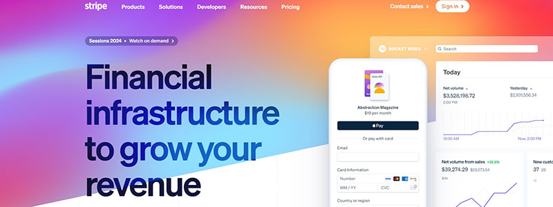
Leading financial technology company Stripe’s homepage is a display of cutting-edge user interface design. In the very competitive field of online payment systems, the website stands out for its slick, contemporary design and incredibly user-friendly layout.
These fundamental components are what set Stripe’s website apart:
- Using white space and a monochromatic color scheme with blue accents, the website is made more elegant and clear while drawing attention to its most important features.
- Logical and user-friendly, the design makes it easy to get information about a number of services, including billing, financial reporting, and payment processing.
- Interactive Elements: Potential customers can practically and interestingly grasp Stripe’s services with the help of dynamic elements like sliders and demos.
Highlights of note include:
- Rich Service Descriptions: Stripe’s services are all explained in brief, without overpowering the user.
- Visual Consistency: The same visual motif used throughout the website helps users navigate and supports the brand identity.
- Accessibility Features: The website is made widely accessible by the readability of the text size and contrast.
Stripe offers an all-encompassing digital experience that suits the requirements of its tech-savvy customer base through website design that goes beyond aesthetics to include functionality. See more about their UI design philosophy at Stripe’s official website.
Tesla
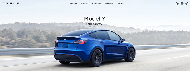
The website of Tesla captures the spirit of invention for which the company is renowned and is the pinnacle of contemporary user interface design. The homepage is an aesthetically spectacular display of Tesla’s current electric car portfolio as well as their Powerwalls and solar panels for sustainable energy.
Major elements of the Tesla homepage design consist of:
- Simplified Navigation: The site’s appearance is improved and user interaction is made easier by the incredibly clear top navigation bar.
- High-Quality Images: To entice viewers into the specifics of each offering, each product is presented with high-resolution, interesting photos.
- Interactive components: Through interactive components incorporated inside the website, customers can easily access various perspectives of Tesla goods, investigate color possibilities, and even make reservations straight from the homepage.
Features that accentuate Tesla’s user interface design’s efficacy:
- Keeping a single brand image, all pages have consistent design.
- a responsive design that guarantees the website appears excellent on PCs and mobiles.
- Presentation of information that is succinct and easy to understand for visitors to comprehend the characteristics and advantages of the product.
The website of Tesla is a prime illustration of how good user interface design can assist a brand’s goals since it not only acts as a buying platform but also informs its users about the advantages of sustainable energy. Visit the official website of Tesla to learn more about their creative approach to user interface design.
Synopsis
As we conclude our investigation of the “10 Examples of the Best UI Websites Design in 2024,” it is evident that excellent UI and cutting-edge design are essential to producing websites that stand out. Every website examined contributes something special, establishing standards for the best possible website design.
- An easy-to-use e-commerce website
- An interactive visual trip website
- Fintech platform with elegant design for smooth transactions
These cases show how a website may be elevated and user engagement and happiness increased by careful UI and creative design. The variety of methods emphasizes the originality and usefulness needed in excellent website design. Think on how these designs could motivate and direct your own efforts to improve your online presence. Recall that spending money on excellent UI and design enhances user experience generally in addition to increasing usability.