
You have visited there, right? You have a lovely website; it looks fantastic, performs reasonably, but conversions? Not anything. UX design and CRO tag-team help to save the day in this regard. Combined, they transform “meh” guests into “heck yeah!” consumers like peanut butter and jelly.
Consider it: how many times have you bounced off a website only because it seemed unclear? UX design is here to gently guide your user, hold their hand, and, quite honestly, simplify life for everyone. Also CRO? It’s the friend asking, “Hey, let’s get that click.”
Businesses akin to Airbnb or Amazon? They have perfected this. Their websites not only function but also benefit you.
So prepared to get in and learn how to make your consumers genuinely appreciate staying around? Stay on reading.
Recognizing UX Design and Its Effects on Conversion Rates

What is UX Design?
UX design is to make something work for people rather than only seem appealing. See it as construction of a house. Yes, a nice entrance is great, but nobody will stay if the rooms make no sense or if the stairs are overly steep.
UX design mostly serves to produce an experience that feels simple and understandable. Essential elements? Usability—how straightforward things are—accessibility—can everyone use it—and interaction design—is it pleasant to click? For designing these user-friendly interfaces, tools like Figma or Adobe XD transform everything. Done well, UX makes consumers feel smart and confident—two traits that always increase conversions.
How User Behavior Is Affected by UX
Ever stop visiting a website because it confused you or was too slow? You are not on your alone. According to research, 88% of users are less likely to visit a site once a negative encounter. UX excels there.
Good user experience opens the path. Imagine a grocery shop in which signs accurately indicate the aisle you require. UX does on the internet just that. It lessens “friction points,” the irritable bits like interminable forms or imprecise buttons.
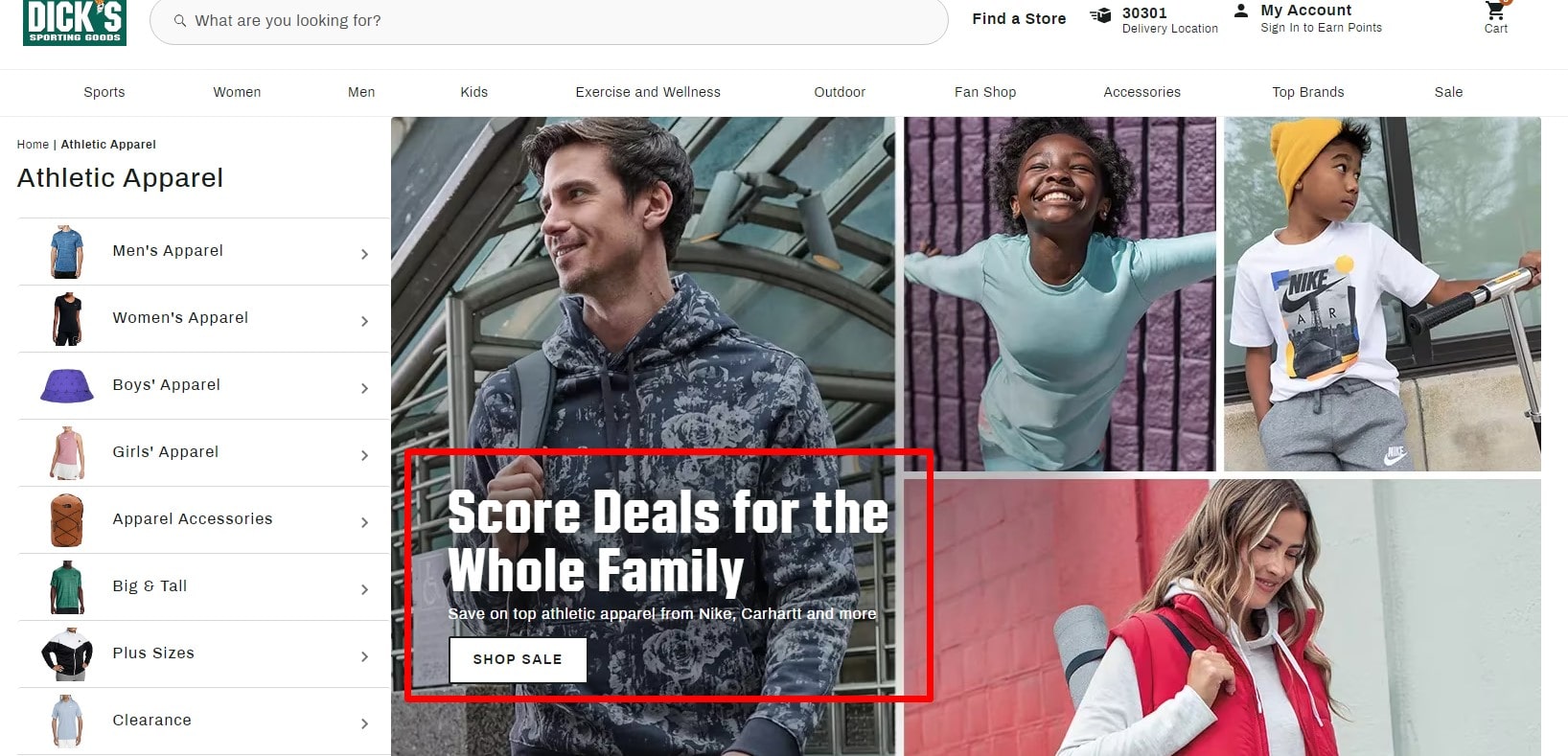
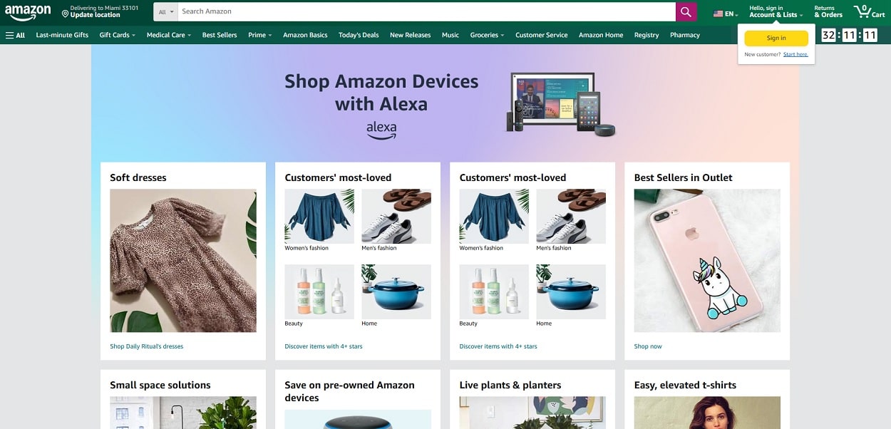
Consider Amazon as one example. Their one-click shopping? Genius. It eliminates any doubt, thereby making purchasing almost too simple. Alternatively Apple, where simple design helps you stay focused on items free from interruption. A smooth trip yields better conversions.
More sales are what you want? Make sure your website doesn’t cause people to overthink things.
Essential UX Design Principles for CRO

Design an Easy User Experience
Have you ever felt hopeless on a website, clicking everywhere but nowhere? That’s terrible UX design destroying conversion rates. a seamless path of user interface Your golden ticket to improve CRO (Conversion Rate Optimization).
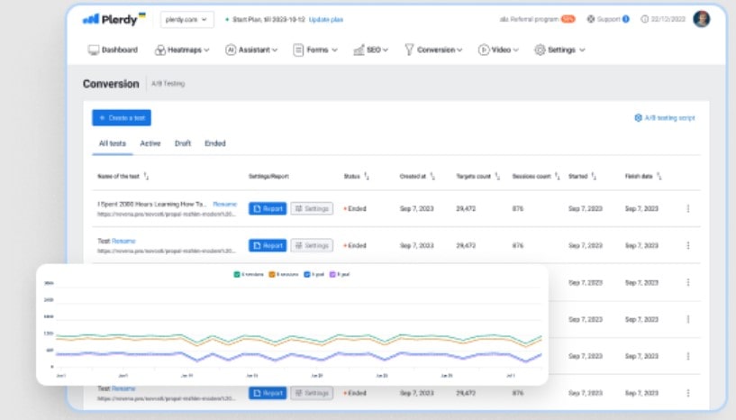
Start by charting the user path. Consider someone showing up on your homepage. What requirements do they have? A good, a service, or information? Cut their steps down to make sense. These tools—Plerdy, Google Analytics, or Crazy Egg—show where consumers find themselves caught—those are your friction areas to correct.
Like ordering pizza online, navigation should be equally simple. Amazon does this brilliantly. Their menus: Explicit and direct. Well labeled sections and clutter-free design help to streamline the process. Keep your user from being overwhelmed with choices, though. Not uncertainty but clarity is the secret to CRO. A/B testing is always useful. Sometimes the most minor change increases conversion rates by 10–20%.
Design visually and consider first impressions
First impressions really count, as you know. For websites, it’s much more severe; users evaluate your UX design in under 50 milliseconds.
Colors are emotive. Red shouts hurry (think of flash deals!), while blue whispers trust (maybe Facebook or PayPal). But keep in mind fonts as well. Never, ever does anyone take Comic Sans seriously. Choose readable, neat typeography for your brand. And kindly check the accessibility of your site. Users are kept around by high contrast, understandable sizes, and neat layouts.
Check Apple. Their website cries simplicity and originality. The design by itself makes consumers believe in their quality. Conversely, an antiquated design with bad user experience causes users to bounce faster than you could estimate “conversion rate.”
Mobile Optimization
Over fifty-five percent of all traffic worldwide originates from mobile devices. Ignoring mobile consumers means ignoring almost half of your audience as well as their dollars.
A responsive design exactly fits any screen size. Ever tried to purchase anything on a website where you have to enlarge buttons? irritating, right? That is a killer of conversion. For seamless mobile UX, use Foundation or Bootstrap frameworks.
Google doesn’t treat non-mobile friendly sites kindly. Traffic declines, rankings plummet, conversions go south. Correction it. You could test the mobile experience with tools like Plerdy or Hotjar. Recall that improved CRO and happy people follow from a user-friendly design on mobile.
Essential UX Techniques to Raise Conversion Rates
Streamlining Call-to- Action Plans
For CRO, good UX design is mostly dependent on call-to- actions (CTAs). Whether a user clicks on these little buttons or links determines most whether or not they act on your website. A well-design CTA draws attention and precisely states the next action. Consider Amazon’s “Add to Cart” button—simply yet remarkably powerful in generating conversions.
But design counts. Among your material, a bright, strong CTA jumps out. Colors psychologically direct user behavior, not only look good. Red, for instance, makes one urgent; green seems soothing. Plerdy’s Heatmap lets you see where users most interact and place CTAs for best effect.
According to CRO experts, maximizing CTAs by itself could result in a 25% boost in conversions. Remember also to keep the message action-oriented; words like “Grab Your Deal” or “Sign Me Up” give personality and increase conversion.
Minizing Friction Points
Every additional action your user takes runs the danger of losing a customer. Effective UX design thus gives eliminating friction points top priority. Nobody likes having to cope with awkward navigation or complete lengthy pointless forms.
Shorter your forms. Get the basics—name, email, payment method. Add progress bars if users must enter several detailed information points. These little design elements increase user experience and support retention of interest.
A further design focus for CRO is payment choices. Providing several options including Apple Pay, credit cards, or PayPal guarantees consumers avoid bouncing. Studies on websites that streamline checkout procedures show a 35% increase in conversion rates. Your design decisions could decide the sale or not.
Using Trust Elements and Social Proof
At CRO, trust is everything. Reviews, testimonials, and trust badges are among the components smart UX design combines to persuade users they are choosing a safe path. Consider Booking.com as an illustration. To build confidence, they often underline guest reviews and stress “verified stays.”
For your website, include case studies or actual testimonies. Emphasize reviews including authentic names and pictures. Including figures to demonstrate impact—”used by 1,000,000+ happy users”—helps to seal the bargain.
Also a quick win are trust badges. Users can feel more safely right away with a “100% Secure Checkout” emblem. CRO design is to make consumers confident at every level, not only with regard to usability.
Modern Methodologies: Combining UX and CRO
A/B Testing for Ongoing Development
Guesswork isn’t exactly what CRO calls for. Your friend when adjusting design for maximum conversion rates is A/B testing. Imagine running two CTAs, “Buy Now” in green against red. One gets more clicks which one? Spoilers—that will depend on your audience.
Big names like Netflix continually change their architecture using A/B testing. They check layouts, navigation, even thumbnails to grab users. Starting small will help your site. Try fonts, button positions, even form lengths. Plerdy and other tools track user behavior to demonstrate which design succeeds, therefore simplifying this procedure.
Fascinatingly, businesses implementing A/B testing claim 20–30% greater conversions. Why, when you know, should you guess?
Customizing the User Journey
Nobody wants to be another statistic. Customizing closes the distance between a generic website and one that speaks to your user. Netflix uses custom recommendations to do it. With product recommendations, Amazon gets it just. Then you? You are entitled to do the same.
Consider content recommendations or even something as simple as remembering a user’s name on the homepage. UX design for CRO—not rocket science here. Furthermore, the influence Industry studies show that tailored experiences boost sales by eighty percent.
Use Plerdy and other tools to examine user paths. Once you understand where users go, create a road that seems especially meant for them. That produces Happy consumers and better conversions.
Incorporating Micro-Interactions
Sometimes the little elements of UX design really make all the difference. Micro-interactions are those minute effects users encounter, such as a pleasant checkmark following form submission or a button lighting on hoved.
These little exchanges help to build feedback and progress, hence lowering frustration. Imagine yourself filling out a form and the page freezes at your “Submit.” Annoying, right? Imagine now a whirling loader or a success message flickering across. Feels better, then not at all
Experts in micro-interactions are companies like Airbnb and Spotify. Play button of Spotify? like butter, smooth. Load animation from Airbnb? polished and professionally competent. These little details not only look excellent but also keep people involved, hence improving CRO.
Micro-interactions call for a small budget. First start with hover effects on buttons or animated page transitions. basic but effective.
Real-World Examples of UX Design Enhancing Conversion Rates
Case Study: One-Click Ordering Policies of Amazon
Driven by UX design, Amazon is a master class in conversion rates. One-click ordering system: Absolute genius. It lets consumers bypass countless paperwork, therefore streamlining the buying process. Just one click will put the order. This little adjustment produced a 13% boost in conversions, demonstrating how important UX enhancements are for online buying.
But Amazon didn’t stop there. Furthermore greatly influencing conversion rates are their tailored recommendations. Analyzing user data helps them to highlight products depending on personal tastes. Their income comes from this focused strategy about 35%. It is strategic CRO in action, not only excellent design.
Case Study: Perfect Booking System Used by Airbnb
The design of Airbnb is a wonderful illustration of how seamless UX may change conversion optimization. Their easily navigable search filters help you to locate the ideal fast stay. From opulent houses to comfortable flats, their approach guarantees no time is lost.
Still another essential for their success is openness. Clear prices and no hidden costs help Airbnb lower uncertainty and boost bookings. Their finished bookings shot 25% higher following these adjustments.
Airbnb is unique mostly because of their meticulous attention to detail. A good user experience results from interactive maps, interesting graphics, and easy navigation. These little but significant elements cooperate to create confidence and raise conversion rates.
If your objective is improved CRO, take their lead: simplify your procedures, give clarity top priority, and never undervalue the power of excellent design.
Measuring Success: Data-Driven UX Design
Using Analytics Tools for UX Insights
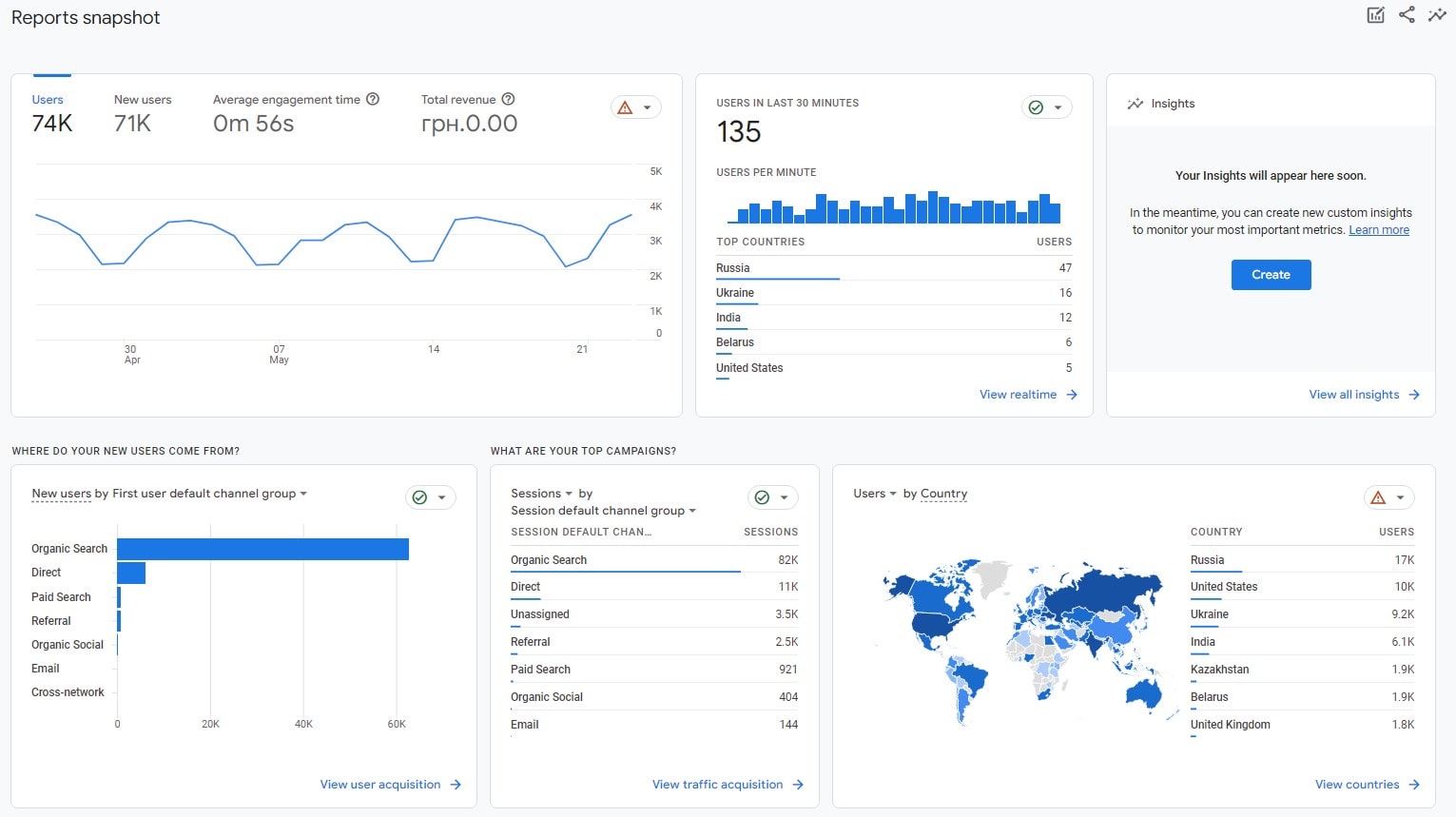
How confident are you that your UX design is actually increasing conversion? There is just data as the solution. Your hidden weapon is instruments designed to probe user behavior. Heatmaps, for example, show where users are clicking—or not at all clicking. Should your conversion funnel have a dead zone, your call-to- action design might need some overhauling.
Still more perceptive are session records. They let you almost like peering over their shoulder see how users navigate your website. Are they halfway away from the checkout procedure abandoned? They are bouncing off your landing page? For identifying these blockages, tools like Plerdy and Google Analytics are absolutely invaluable. These realizations can help you maximize your CRO initiatives and cease letting losses of conversions go on.
Tracking Key Metrics
Metrics chronicle your success or failure in converting. You have a problem if your bounce rate is absolutely outstanding. Usually indicating uncertainty or dissatisfaction with your design, a rate above 70% A low click-through rate (CTR) similarly cries out that your CRO plan isn’t functioning.
Still another element of the jigsaw is engagement. Do users just vanish, click, or scroll? Monitoring these actions helps you improve your UX to keep users engaged. A 10–15% increase in conversion rates can result from even minor changes as a more noticeable button or less steps to buy.
Data is the road map to become master of CRO; it is not only statistics. When every element of your design supports conversion objectives, you are transforming traffic into outcomes rather than only enhancing user experience.
Conclusion
Excellent UX design and CRO cooperate to get that ideal mix of user delight and explosive conversion rates. It’s about making your site work, genuinely work, for your users—not about making it “look nice.” From seamless checkouts to easy navigation, every design decision counts in determining outcomes.
You are wasting money if you are not always testing and adjusting. Plerdy and Google Analytics are among the tools that provide the information you need to identify areas needing development and correct issues. Did you know that simply changing your CTA location might increase conversions by twenty percent?
Ultimately, a user-centric approach transforms the game; it is not optional. Give your users first priority; the conversions will follow. Always maximize; always get better; then, see the outcomes flow.