
For years, website UX was built around one simple idea: a human lands on a page, looks around, clicks, scrolls, hesitates, compares, and maybe converts. That is still true. But it is no longer the whole picture.
AI agents are becoming a strange new type of visitor. They may scan a product page, compare pricing, summarize a service, fill out a form, click a button, or help a person decide which website deserves attention. Some will arrive through AI search. Some will work inside browsers. Some will use crawled content, structured content, screenshots, browser automation, accessibility data, or a mix of all these signals.
This creates a new UX problem. A website can look beautiful to a person and still be hard for a machine visitor to understand. A button may look clickable but not behave like a real button. A form field may have a placeholder but no label. A menu may work only on hover. A cookie banner may cover the main CTA. A price card may move after loading. Humans get annoyed by this. AI browsing agents may simply misread it.
That is why AI agents and UX now belong in the same conversation. Not because websites should be designed for robots instead of people. The better idea is simpler: make the website clear for humans first, and the same clarity often helps machine visitors too.
Why AI Agents Create A New UX Problem For Websites
Most website teams already think about SEO, CRO, accessibility, and performance. AI agent UX sits across all of them. It is not only a technical SEO task. It is not only a design task either. It asks a more uncomfortable question: can another system understand what your page is, what each element does, and what action should happen next?
A human can sometimes forgive messy UX. People use context, memory, patience, and guessing. They may understand that a blue rectangle is probably a button, even if it is built badly. They may guess that an icon opens filters. They may close a sticky bar if it blocks the form.
AI agents are less forgiving in a different way. Some agents may identify elements visually. Some may inspect the DOM. Some may rely on the accessibility tree. Some may read indexed text from search systems rather than visit the live page at all. Because of that, there is no single magic trick that makes an AI-friendly website. Still, there are strong basics that reduce confusion across many systems.
Clean structure matters. Stable layout matters. Real buttons matter. Clear labels matter. Descriptive links matter. Visible text matters. When these basics are missing, you do not only make life harder for AI crawlers or AI assistants. You also make the website harder for real buyers.
How AI Agents May Read, Scan, And Interact With Websites
It is tempting to talk about AI agents as if they all work the same way. They do not. One AI web browsing system may load the page in a browser and inspect interactive elements. Another may use screenshots and visual reasoning. Another may use the accessibility tree because it gives a cleaner map of roles, names, states, and form controls. Another may work from search-indexed summaries and never see your live page during the user’s session.
This is why a practical website ready for AI agents should not depend on one signal. The page should make sense in the HTML, in the visible design, in the accessibility layer, and in the text itself.
HTML Gives The First Layer Of Meaning
Semantic HTML tells browsers, assistive technologies, crawlers, and many automation tools what something is. A real button says, “I perform an action.” A real link says, “I navigate somewhere.” A heading says, “This is a section.” A label says, “This input asks for this specific information.”
When everything is built with generic containers and custom JavaScript, the meaning becomes weaker. A person may still see the design. A machine-readable website needs more than visual styling. It needs structure that does not force every visitor, human or machine, to guess.
Visual Context Still Matters
Some AI browsing agents use screenshots or visual snapshots. That means layout, contrast, spacing, sticky bars, popups, and visible text can affect interpretation. If a cookie banner covers the main CTA, a visual agent may see a blocked page. If a product filter jumps after loading, the agent may act on the wrong element. If three buttons look similar but only one matters, weak visual hierarchy can create noise.
This is the part UX designers already know well. The twist is that the “visitor” may now be a person helped by software, not just a person moving a mouse.
The Accessibility Tree Can Become A Practical Map
The accessibility tree is not only for screen readers. It can also give browser-based AI agents a structured view of the page. It exposes useful information such as element roles, accessible names, states, relationships, and hierarchy. A properly labeled form field is easier to understand. A button with a clear accessible name is easier to choose. A menu with real navigation links is less mysterious.
This does not mean accessibility automatically guarantees AI search optimization or perfect agent behavior. Nothing is that neat. But accessible, semantic, well-labeled interfaces usually remove a lot of unnecessary ambiguity.
Semantic HTML Is The Boring Fix That Suddenly Looks Strategic
Semantic HTML can sound basic, almost too basic. Yet it is one of the strongest foundations for UX for AI agents. It gives meaning before styling, before animation, before clever scripts, and before marketing copy tries to rescue the page.
A website ready for AI agents should use real HTML elements where possible. That means headings for page structure, buttons for actions, links for navigation, lists for grouped items, forms for form flows, labels for fields, and tables only when data is truly tabular.
- Use <button> for actions such as opening a modal, submitting a form, applying a filter, or starting a checkout step.
- Use <a> for navigation to another URL or page section.
- Use one clear <h1>, then logical <h2> and <h3> headings.
- Use visible form labels, not only placeholder text inside fields.
- Use descriptive link text instead of vague labels like “click here” or “learn more” repeated everywhere.
This helps human visitors too. Clear page structure makes scanning easier. Real controls work better with keyboards. Labels reduce form mistakes. Descriptive links help people decide where to go. AI agent UX is not some separate futuristic layer. In many cases, it is old-fashioned usability done properly.
Why A Div Button Can Break UX For Humans And Machine Visitors
One of the most common UX mistakes is the fake button. It looks like a button. It may even behave like a button when clicked with a mouse. But underneath, it is a <div> with JavaScript attached.
This can create several problems. The element may not be keyboard-focusable. It may not announce itself as a button to assistive technology. It may not expose a clear role to browser automation. Its disabled or expanded state may be invisible outside the visual design. And if the JavaScript fails, the “button” becomes decoration.
A Simple Example Of A Fragile Fake Button
Imagine a pricing page with three cards. Each card has a “Start trial” control. Visually, it looks fine. But the control is built as a styled <div>. There is no button role, no keyboard support, no accessible name, and no clear form or link relationship.
A human using a mouse may click it. A keyboard user may miss it. An AI browsing agent may not treat it as a reliable action. A crawler may not understand that this is the main conversion path. The design says “CTA.” The code whispers “random box.”
The fix is not dramatic. Use a real <button> when the control performs an action. Use a real link when it navigates. If a custom element is unavoidable, then it needs the correct role, keyboard behavior, focus state, and accessible name. But most of the time, native HTML is cleaner.
Unstable Layout Makes AI Web Browsing Harder Than It Should Be
Layout shift is already bad for human visitors. You try to click one thing, the page moves, and your finger lands somewhere else. It feels cheap. On mobile, it feels even worse. For AI web browsing, unstable layout can be a bigger issue because the agent may plan an action based on one view and execute it after the page changes.
Core Web Vitals already pushed teams to care about CLS, or Cumulative Layout Shift. The same thinking applies here. A stable layout gives both people and machine visitors a more predictable environment.
Common Layout Problems That Confuse Visitors
Many websites create confusion without meaning to. A product filter loads late and pushes results down. A newsletter popup appears right after the user starts reading. A cookie banner covers the checkout button. A sticky discount bar hides the mobile navigation. A chat widget sits on top of the “Continue” button.
None of these details seem huge in a design file. On a real page, they can break the flow.
- Reserve space for images, banners, embeds, and product modules before they load.
- Avoid popups that cover essential navigation or conversion buttons.
- Make sticky bars easy to close and test them on mobile screens.
- Do not move filters, CTAs, or form buttons after the visitor begins interacting.
- Check whether overlays block forms, search boxes, or checkout steps.
A machine visitor does not get irritated in the human sense. But it can still be blocked, redirected, or forced to interpret the page from a messy state. That is enough to lose the action.
Accessibility Signals Help AI Agents Understand What Actions Mean

Accessibility is often treated as a compliance task. That is too small. Accessibility is also a clarity system. It explains what controls are, what they are called, what state they are in, and how they relate to the content around them.
For AI agents website readiness, the most useful accessibility work is usually practical and visible: clear labels, proper headings, readable alt text, obvious navigation, and form fields that explain what they need.
Labels Should Not Disappear When The User Types
A form field with only placeholder text is a small trap. The label vanishes once someone starts typing. A human may forget what the field asked for. An AI assistant may have less stable context. A screen reader may not get a proper field name if the field is not coded correctly.
A better pattern is simple: use a visible label and connect it to the input. “Business email” is clearer than a field that only says “Email” in light gray. “Company website URL” is clearer than “Website.” Specific labels reduce mistakes.
ARIA Labels Should Clarify, Not Decorate
ARIA labels can help when native HTML is not enough. But ARIA is not a shortcut for messy structure. A badly coded fake button with a rushed ARIA label is still fragile. Use native elements first, then add ARIA only when it improves meaning.
Icon-only buttons are a common case. A magnifying glass icon may be obvious to some users, but it should still have an accessible name like “Search.” A trash icon should say “Remove item,” not just “button.” A hamburger menu should say “Open main menu.” Small details like this help both accessibility and AI agent UX.
Alt Text And Visible Text Should Match The Real Task
Alt text should not be stuffed with keywords. It should explain the useful meaning of the image. If the image is decorative, it can be treated as decorative. If it shows a dashboard, product feature, chart, or workflow, the description should help someone understand the point.
The same is true for visible text. A website full of vague CTAs like “Get started,” “Submit,” and “More” gives weak signals. “Start free UX audit,” “Send demo request,” or “Compare pricing plans” gives people and machines a better idea of the next step.
Clickable-Looking Elements That Do Nothing Are A Bigger Problem Now
Many websites have elements that look clickable but are not. Cards change color on hover but do not open. Icons look like filters but only decorate a heading. Product images look tappable but do nothing. Underlined text is not a link. A disabled button looks active. A search box accepts an empty search without explaining whether it will show all results or return an error.
Humans notice these issues quickly. They click, nothing happens, and trust drops a little. AI browsing agents may also waste steps on unclear controls or fail to find the real action.
Hover-Only UX Is Especially Weak
Hover-only menus may work on desktop with a mouse, but they are not reliable across touch devices, keyboards, assistive technology, or machine visitors. If important content appears only on hover, it may be invisible to many interaction models.
A product category menu should open with click or keyboard focus, not only hover. A tooltip that explains pricing should not contain critical purchase information if it disappears too easily. A comparison table should not hide key differences behind tiny icons that only reveal text on hover.
Weak Microcopy Creates Guesswork
Microcopy is not decoration. It tells the visitor what will happen. “Continue” is often weaker than “Continue to payment.” “Apply” is weaker than “Apply filters.” “Submit” is weaker than “Send quote request.”
For AI search optimization and conversion rate optimization, this matters because unclear action names reduce confidence. A machine visitor trying to complete a task needs clear action boundaries. A human visitor does too.
A Practical Checklist For AI Agents And Human Visitors
The fastest way to improve UX for AI agents is to audit the website as if every important action must be understandable without guessing. Not beautiful. Understandable. Beauty can stay, but clarity has to lead.
Check Page Structure First
- Use one clear H1 that explains the page topic.
- Organize sections with logical H2 and H3 headings.
- Keep important content in visible HTML, not only inside images or hidden scripts.
- Use descriptive product, service, pricing, and feature copy.
- Make navigation labels specific enough to understand out of context.
Check Interactive Elements
- Replace fake div buttons with real buttons where possible.
- Use real links for navigation.
- Give icon buttons clear accessible names.
- Make disabled states visually and programmatically clear.
- Make hover-only actions available by click, tap, and keyboard.
Check Forms And Conversion Paths
- Add visible labels to every important form field.
- Connect labels properly to inputs.
- Write clear error messages near the field that caused the error.
- Explain what happens after submitting a form.
- Test empty searches, empty filters, and partially completed forms.
Check Layout Stability
- Reduce CLS by reserving space for images, ads, embeds, and banners.
- Test cookie banners, popups, sticky bars, and chat widgets on mobile.
- Make sure overlays do not cover the main CTA or form submit button.
- Avoid changing button positions after the user starts interacting.
- Keep product filters and checkout steps predictable after loading.
This checklist is not glamorous, I know. But it catches the kind of UX mistakes that quietly damage both website usability and machine-readable website quality.
How Plerdy Helps Find UX Problems That Machines And Humans Notice
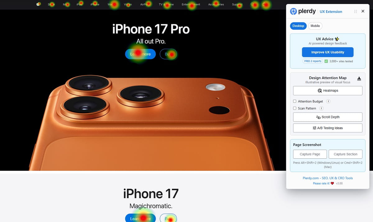
A website UX audit should not be based only on opinions from a meeting. Someone may say the CTA is obvious. Another person may say the form is fine. Real visitor behavior usually tells a less polite story.
Plerdy can help website owners, SEO specialists, UX designers, and CRO teams see where people actually click, where they hesitate, how far they scroll, and which parts of the interface create confusion. That is useful for normal UX work, and it also connects naturally to AI agent UX readiness.
If users repeatedly click on an element that is not clickable, that is a signal. If people hover over a product card but do not continue, something may be unclear. If many visitors reach a form but drop off after one field, the label, validation, or trust message may need work. If scroll tracking shows that users never reach the main CTA, the page structure may be fighting the conversion path.
What A Plerdy UX Audit Can Reveal
- Buttons that receive clicks but do not move users forward.
- Elements that look clickable but are not working as expected.
- Hover zones where users pause because the interface feels unclear.
- Forms where users hesitate, abandon, or trigger errors.
- Scroll behavior showing whether important content appears too late.
- Popups, overlays, or sticky elements that may interrupt the main task.
This does not mean Plerdy “tests AI agents” in some magical way. The stronger point is more practical. If real humans struggle to understand what is clickable, what a form asks for, or where the next step is, machine visitors may struggle with the same messy signals. Clean UX creates cleaner interpretation.
Plerdy UX audit data gives teams a place to start. Fix the confusing buttons. Rewrite weak microcopy. Move the CTA higher if scroll behavior demands it. Improve form labels. Remove fake clickable elements. Reduce layout interruptions. These are small fixes, but they make the website easier to use and easier to read.
AI Search Optimization Starts With A Website That Makes Sense
AI search optimization often gets pulled into big ideas: brand mentions, entity signals, structured data, authority, and content depth. Those things matter. But a page still needs to make sense at the interface level.
If an AI assistant summarizes your pricing page, can it understand the plan names and differences? If an AI browsing agent tries to book a demo, can it find the form, read the labels, and submit the correct fields? If an AI crawler scans your service page, does the HTML structure support the visible story, or is everything hidden behind scripts and vague components?
The best answer is not to design for machines instead of humans. That path leads to ugly, stiff pages. The better answer is to remove ambiguity. Use semantic HTML. Keep layouts stable. Write clear labels. Make actions honest. Show important content in readable text. Test the real behavior, not only the design mockup.
AI agents and UX are connected because both depend on clarity. The machine visitor is new. The fix is not that new.
Conclusion: Your Website Does Not Need To Be Perfect, But It Must Be Understandable
AI agents are changing how websites may be read, compared, summarized, and used. Some will rely on HTML. Some will use screenshots. Some will use the accessibility tree. Some will work through search results and indexed summaries. No website owner can control every agent or every model.
But you can control the basics. Real buttons. Real links. Clear headings. Visible labels. Stable layouts. Accessible forms. Useful alt text. Honest CTAs. Fewer fake clickable elements. Fewer popups blocking the task. Better website UX audit habits.
That is the practical side of AI agents and UX. A website ready for AI agents is usually a website that is easier for people too. Maybe that is the most useful way to think about it. Do not chase the robot. Fix the page until the next step is obvious.
FAQ
What Are Machine Visitors On A Website?
Machine visitors are non-human systems that read, scan, index, summarize, compare, or interact with website content. They can include AI agents, AI assistants, AI crawlers, LLM crawlers, browser automation tools, search bots, and other systems that process a page for a human user or for an index.
How Do AI Agents See A Website?
AI agents may see a website in different ways. Some inspect HTML and the DOM. Some use screenshots. Some use the accessibility tree. Some rely on browser automation, visible text, structured content, indexed summaries, or a combination of signals. That is why clear structure, stable layout, and accessible elements matter.
Why Is Semantic HTML Important For AI Agents?
Semantic HTML gives meaning to page elements. It helps show which parts are headings, buttons, links, forms, labels, lists, and navigation areas. This can make a machine-readable website easier for AI browsing agents, accessibility tools, crawlers, and human visitors to understand.
Can A Div Button Hurt UX?
Yes. A fake button built with a div can hurt UX if it lacks native button behavior, keyboard support, proper focus states, roles, or accessible names. It may work for mouse users but fail for keyboard users, assistive technology, browser automation, and some AI agents website interactions.
Do AI Agents Use The Accessibility Tree?
Some AI agents and browser-based systems may use accessibility data because it gives a structured view of roles, labels, states, and relationships. Not every AI agent works this way, so accessibility is not a guarantee of AI visibility. Still, a clear accessibility tree usually supports better UX for both people and machines.
How Can I Check Whether My Website Is Ready For AI Agents?
Start with a practical website UX audit. Check semantic HTML, real buttons and links, visible form labels, ARIA labels, alt text, navigation clarity, layout shift, popups, overlays, hover-only actions, and unclear CTAs. Then test real user behavior to see where people click, hesitate, scroll, or abandon forms.
Can Plerdy Help With AI Agent UX Readiness?
Plerdy can help with the human behavior side of AI agent UX readiness. It shows clicks, scroll depth, hover behavior, form issues, and confusing interface areas. If users click elements that do nothing or hesitate near forms and CTAs, those same areas may also create unclear signals for machine visitors.
Is This Only An SEO Issue Or Also A UX Issue?
It is both. AI search optimization depends partly on clear, structured, useful content. But AI agent UX also depends on whether the interface can be understood and used. Semantic HTML, accessibility, clear labels, stable layouts, and good microcopy support SEO, UX, CRO, and machine visitors at the same time.