
Find out which nonprofit websites of 2025 will enthrall you with their influence and style. From environmental protection to community health programs, these websites are models of user interaction and aesthetic appeal. Here are some motivating instances:
- Charity: Water – Stunning, visually arresting design that narrates fascinating tales.
- Heifer International – Clear calls-to-action and interactive components.
- World Wildlife Fund: Exceptionally beautiful graphics and easy navigation.
Every website does a fantastic job at making the user experience easy and interesting. Their creations draw tourists and also move interest into action.
With Plerdy’s tool, improve the web presence of your charity by examining user behavior. Raising conversion rates, enhancing usability, and performance-optimizing your design. Plerdy’s observations can direct you in creating a website that your visitors will actually find meaningful.
Best Examples of Nonprofit Websites
Explore our analysis of the “11 Best Nonprofit Websites Examples in 2024” and get motivated by the creative design approaches used by each. These charities demonstrate how a well-designed website may increase interaction and further the goals of the organization. Find out how excellent design may change the digital influence of your company.
Yamca
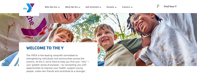
By 2024, the YMCA website will be a shining example of good nonprofit website design. Vibrant, captivating photos of community people actively involved in a variety of initiatives captivate visitors to its homepage right away. In addition to highlighting the YMCA’s commitment to building a robust, inclusive community, this graphically rich design emphasizes its goal of promoting young development and healthy living.
Important features of the YMCA website design include:
- Strong Images: Images of actual individuals participating in YMCA events strengthen the bond between the organization and website users.
- Easily found sections on youth programs, health services, and social responsibility projects make the website accessible and user-friendly.
- Community Focus: The design consistently highlights how the YMCA improves people’s lives and communities, therefore highlighting the nonprofit’s contribution to improving society.
The website’s layout skillfully makes use of space and contemporary design components to convey key information and draw in users. Bold colors and succinct language highlight important details on the nonprofit’s influence, such as program reach and community involvement figures. All things considered, the YMCA website provides nonprofits wishing to establish a powerful online presence that genuinely embodies their purpose and attracts support with a great model. Top competitor in debates of excellent nonprofit website design, the YMCA’s website effectively illustrates how committed it is to bettering lives and enhancing communities.
Samaritan’s Purse
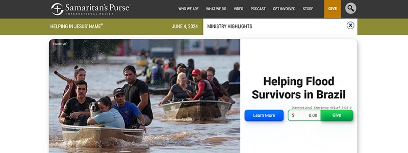
A nonprofit website can be made to stand out in 2024 with strategic design, as demonstrated by Samaritan’s Purse. You are immediately taken through their mission and efforts by the visually striking images and well-organized layout that meet you on the homepage.
Principal elements of the website design for Samaritan’s Purse include:
- Dynamic Content: The homepage features powerful accounts of optimism and recovery from around the world mixed with urgent pleas, such the one for help following the devastating floods in Southern Brazil.
- Visual Engagement: The design is dominated by interesting photos, which make the story real and urgent. These photos range from those of the volunteers in action to those of the relief beneficiaries.
- Clear Calls to Action: Donation buttons placed strategically next to each big story highlight ways that readers may help, making sure that these calls to action are never ignored.
Modern web design concepts are used by this nonprofit’s website to clearly convey the importance of their job and offer simple user involvement paths. Beyond only being beautiful, design is a potent mobilization tool:
- With a direct link to their most recent podcast, the top banner encourages participation right now.
- A condensed navigation bar below provides easy access to several areas while emphasizing the charity’s openness and breadth of activities.
Samaritan’s Purse’s website is unique overall because it skillfully blends interesting material with useful design to make sure users not only understand their purpose but also feel driven to support it. In 2024, this combination makes it a definitive example of nonprofit website design done correctly.
Doctors Without Borders (MSF)
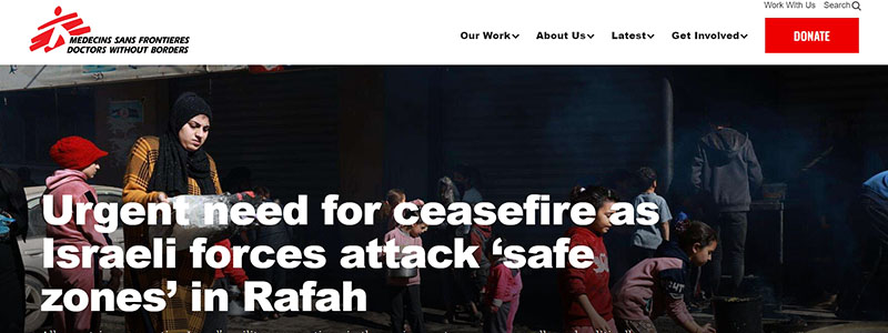
A shining illustration of great nonprofit web design is the website of Doctors Without Borders (MSF), which deftly combines usefulness with striking style. More than simply dispensing information, this website fully immerses users in the vital humanitarian work that MSF does throughout the world.
Highlights of the MSF Website:
- Current Events Focus: To show how attentive the foundation is to international events, the homepage promptly addresses pressing global topics, such the Gaza War.
- Educational Breakdowns: The important numbers, which highlight the nonprofit’s broad reach and influence, are prominently shown, including the number of countries serviced and medical consultations given.
- Visual Storytelling: Visitors to the website are made to feel relevant and urgent by the use of striking images that help to portray the seriousness of the circumstances MSF is engaged in.
Key Components of Strategic Design
- Simple Navigation: Users may quickly browse through several sections including “Our Work,” “About Us,” and “How You Can Help” thanks to the well-structured main menu.
- Educational Sections: Visitors are informed of the fundamental ethics and working practices of MSF by thorough explanations of its principles and activities.
- Engagement Opportunities: Whether through donations, event attendance, or becoming a sustaining contributor, the website skillfully employs its design to promote user engagement.
The design of this website is a tactical instrument that advances MSF’s goal, not merely an aesthetic one. Setting a high bar for nonprofit site design in 2024, it makes the work of the organization easy to comprehend and offers obvious channels for involvement.
Save the Children Action Network
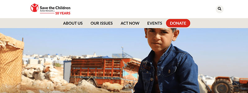
The Save the Children Action Network website is an excellent illustration of a nonprofit website that effectively advocates for children’s issues. Here are the reasons it shines in both design and functionality:
- Visual Impact: The organization’s goal to make sure every child has a good start is succinctly communicated to users of the website by the eye-catching pictures of kids participating in activities. In addition to being endearing, these images purposefully direct viewers farther into the website.
- Clear Navigation: The website is designed with tabs like “About Us,” “Our Issues,” and “Act Now” prominently displayed. This simple navigation makes sure that people may quickly locate additional information or become involved.
- Engagement Tools: Putting prominent calls to action, like “Sign Up Today” and “Donate,” at the top of the homepage makes it easy for visitors to interact with the nonprofit’s goals right now.
- Using well-structured sections and easily readable material formats, the website performs a fantastic job of informing visitors about its main projects and the value of political activism for children.
- Interactive Elements: One special element is the interactive map that encourages users to “Take Action in Your State,” therefore promoting user engagement and offering regionalized chances for participation.
- Performance Measures: The design deftly includes data that demonstrate the nonprofit’s influence, such the proportion of people who would feel less positive about Congress if they decided to cut SNAP or other programs. Their lobbying effort is made more urgent and pertinent by this utilization of actual data.
In general, the Save the Children Action Network website is a shining example of how nonprofit websites ought to operate in 2024 because it leverages its design to successfully convey its message, enlist supporters, and promote children’s rights. Its potent instrument in the nonprofit sector is its blend of emotional appeal, intuitive design, and useful information.
Child Development Services of Fremont County
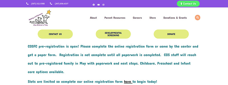
Among nonprofit websites, the Child Development Services of Fremont County website is particularly noteworthy for its user-friendly, intuitive design. That shines because of:
- Visual Appeal: The organization’s attention on child development is quickly communicated to users of the website by the bright, dynamic images of youngsters playing. Families and educators will find the lively and enjoyable design to be a direct appeal to the core of the services provided.
- Headers like “About Us,” “Our Services,” and “Donate” make it simple and straightforward for visitors to locate what they need on the website. This user-friendly design makes sure that crucial details about the initiatives of the charity and how to become involved are easily available.
- Content Layout: The homepage skillfully leverages available space to draw attention to important details, such the start of new session pre-registration, along with obvious calls to action. Significant announcements and updates are made clear to draw in visitors.
- Interactive Features: Providing localized information at a glance and increasing engagement, the interactive map allows visitors to explore services by state.
- Mission Statement: To support the nonprofit’s dedication to early childhood education, the website succinctly states its goal of working with families to meet developmental requirements from birth to five.
The Child Development Services of Fremont County website is unique in the nonprofit industry overall because of its design. Its goal to promote children’s growth and development is fully aligned with the user experience it provides, which is made joyful and educational by the mix of child-friendly images, simple navigation, and well-placed material. The organization is really committed to accessibility and community involvement, as this website reflects.
Marine Toys for Tots
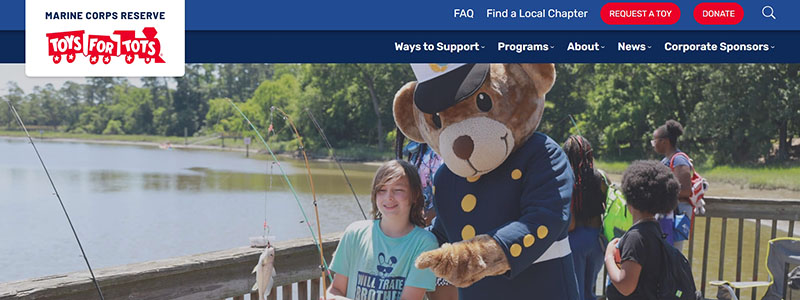
With its ability to convey hope both around Christmas and beyond, the Marine Toys for Tots website is a prime illustration of good charitable website design. This is why, in 2024, it will be among the top nonprofit websites:
- Stunning Visual Design: The webpage combines striking photos of a variety of people, from kids getting toys to the professionals and volunteers helping with the distribution. The nonprofit’s broad influence is made clearer by this visual storytelling.
- Simple Navigation: The website makes finding the information you need simple with tabs like “Ways to Support,” “Programs,” and “About Us.” Deeper involvement is encouraged and the experience is improved by this user-friendly navigation.
- Impactful Content: By showcasing current information like the millions of toys given out and the amount of children serviced, the website skillfully conveys the breadth of their work.
- Call to Action: Whether through cash gifts or event sponsorship, visitors can easily locate methods to participate by clicking on donation buttons and links to become a corporate sponsor strategically placed.
- Educational Resources: Via compelling movies and stories, the website offers visitors a greater grasp of the organization’s history and purpose through sections like “The Toys for Tots Story.”
- Community Interaction: Features that promote a feeling of community and continuous involvement include a mailing list sign-up option and a toy request application status checker.
All things considered, the Marine Toys for Tots website’s layout and operation are prime examples of how a nonprofit website may successfully advance and support an organization’s goals while making it simple for users to comprehend, interact with, and back the cause. The website offers useful functions together with visual appeal to provide visitors a friendly and educational environment.
Orion Magazine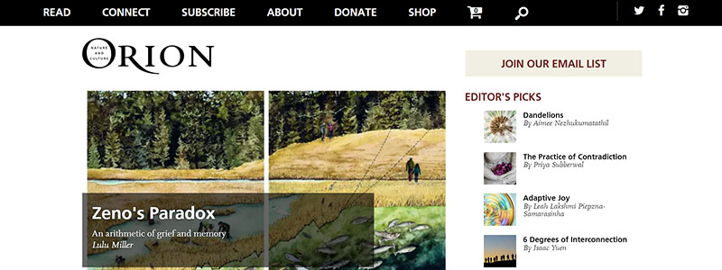
One of the top selections in our 2024 list of the best nonprofit websites is the Orion Magazine website, which serves as a paradigm of how nonprofit websites may elegantly combine design and functionality. This distinguishes the Orion Magazine website:
- Interactive Design: Orion’s emphasis on nature and culture is encapsulated in the website’s aesthetically pleasing design. Bright photos used at the top of the page entice readers right away and provide access to the magazine’s extensive content.
- Easily navigable, the website has tabs including “Read,” “Connect,” “About,” and “Donate.” Visitor exploration of the magazine’s wide range of subjects, which include literary arts and environmental protection, is made simple by its user-friendly layout.
- Richness of Content: A range of essays, articles, and multimedia pieces are included on the homepage, many of which have compelling headlines and thumbnails that entice further interaction.
- User Interaction: Interactive components like these are included into the website design:
- A conspicuous “Join Our Email List” link
- Links to editor’s selections and highlighted articles,
- Parts including interviews and videos.
- Mission Driven: Orion’s goal of educating, inspiring, and involving readers about important environmental and cultural concerns is perfectly aligned with its online presence, as seen by every element on the page.
- Accessibility and Inclusion: Any organization hoping to increase its influence must make sure that its information is interesting and accessible to a wide range of people. This is another area where the website places a high priority.
All things considered, the Orion Magazine website is a priceless tool for nonprofits because of its exquisite design as well as its dedication to provide insightful and easily available information. Rich material, an intuitive interface, and a striking visual appeal make it a model of charitable website design.
Bay Nature
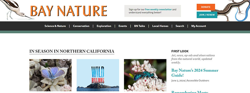
Among the greatest nonprofit websites of 2024, the Bay Nature website is a prime illustration of how nonprofit design can be both useful and aesthetically appealing. Which distinguishes it is as follows:
- Visually Appealing Design: High-quality photos on the site highlight the varied and stunning scenery of Northern California. Not only is the magazine’s dedication to environmental concerns reinforced by the outstanding use of natural photos.
- Simple Navigation: The website has well identified sections like “Science & Nature,” “Conservation,” and “Exploration.” This well-considered design makes it easy for users to locate material that relates to their interests.
- Rich Content Offering: Deep dives into regional environmental phenomena and conservation initiatives are offered by a range of highlighted articles, blogs, and multimedia material on the site. Because of the rich and easily understandable material, readers may easily interact with difficult environmental subjects.
- Interactive Elements: To promote community participation and support, the website has interactive elements including a donation button and a newsletter sign-up form that are both obviously located.
- Consistent Branding: By using fonts, colors, and design components consistently throughout the website, the Bay Nature brand is successfully reflected and kept looking professional and unified.
All things considered, the Bay Nature website offers an appealing platform for enlightening and motivating action among nature lovers because of its carefully designed and effective layout. The website supports the nonprofit’s goal of using captivating storytelling and photography to connect people with the natural environment and acts as a digital entry point to the magazine’s extensive editorial content.
Upstream International
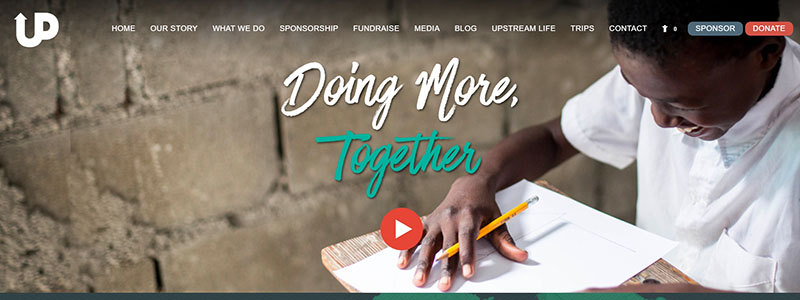
A shining illustration of excellent nonprofit website design is the Upstream International website, which shows how strong images and well-considered layout can successfully convey a purpose and captivate users. The main components are broken down here:
- Strong Images and Theme: The website makes use of visually arresting photos and a color scheme that is in line with its corporate branding. Images of the nonprofit’s influence are readily conveyed and draw attention, as do stories of human involvement in the neighborhood.
- Clear and Concise Messaging: The website clearly states its objectives and mission statement right on the homepage. Emphasizing the collaborative aspect of their work, “Doing More, Together” is clearly displayed.
- Structured Navigation: Visitors may quickly and simply find the information they need thanks to the website’s well named sections, such as “What We Do,” “Sponsorship,” “Fundraise,” and “Media.”
- Engagement Opportunities: The homepage features several calls-to-action positioned thoughtfully:
- “Educate” invites guests to learn about their offerings.
- They fight hunger, and “Feed” centers on that.
- Users can easily and simply get engaged by clicking “Spread” or “Give” to disseminate their message or make a donation.
- Social Proof and Credibility: Near the bottom of the website are accolades and accolades that support the credibility and efficacy of the company.
In 2024, the Upstream International website will stand out among nonprofit websites because of its overall design and functionality, which not only make it visually beautiful but also guarantee that it is an efficient instrument for storytelling and mobilizing support. The deliberate blending of design components with concise, powerful text produces an engaging online presence that reflects their goal of enabling local leaders and communities.
OneTable
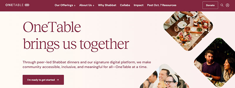
Among the best examples of charitable website design is the OneTable website, which skillfully combines attractive design with practical simplicity. Why it’s included in our “11 Best Nonprofit Websites Examples in 2024”
- Dynamic Images of People of Different Ages and Backgrounds Participating in Community Dinners provide a striking backdrop for the homepage’s opening message, “OneTable builds community.” In keeping with the organization’s goal of making community events important and approachable, this creates a friendly atmosphere.
- Clean and Accessible Design: The user’s eye is directed to important information by the design’s minimalist approach, which includes lots of white space and clean lines. Soft, friendly hues improve reading and produce a relaxing digital atmosphere.
- User-Friendly Navigation: The website’s simple navigation bar with sections like “Our Offerings,” “About Us,” and “Why Shabbat” makes it easy for visitors to locate more in-depth information about the group and its events.
- Interactive Elements: A number of interactive elements promote participation, including:
- A big “I’m ready to get started,” call-to-action button that welcomes new guests to become members.
- Impact figures are prominently shown on the homepage to emphasize the scope and power of the organization.
- Entertaining Content: The website skillfully explains its objectives and effects in sections that detail how OneTable promotes community through Shabbat dinners.
All things considered, the OneTable website is a model of nonprofit website operation since it is an extension of their goal to promote a feeling of community and belonging as well as an engagement tool. Every element of its design and content embodies the idea of community building, drawing visitors in and promoting involvement. For further details and ways to join involved, go straight to their OneTable website.
Charity: water
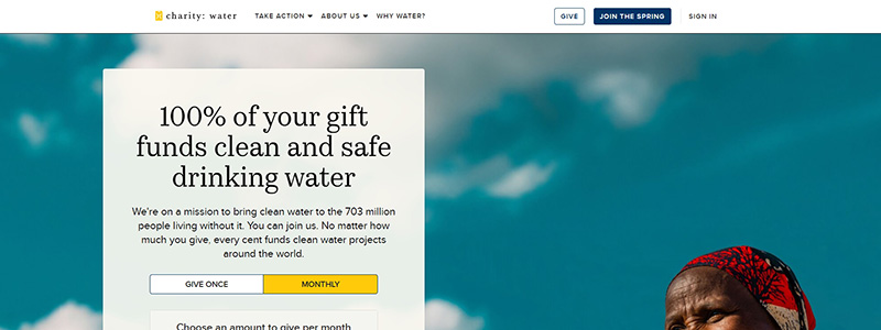
The Charity: Water website exemplifies good nonprofit web design and reflects the organization’s goal of providing safe and clean drinking water to people all around the world. For this reason, it is among the top nonprofit websites of 2024:
- Visual Impact: The homepage draws in visitors right away with a strong hero image. Strong visual storytelling, this one shows a happy person holding a clear, cool drink of water to represent the effect of the nonprofit’s efforts.
- Clear Mission Statement: Donors and stakeholders are moved by the website’s bold and open pledge that “100% of your gift funds clean and safe drinking water.”
- User Engagement: To convey the breadth of their work and the direct benefits of donations, the design prominently displays interactive components like donation options and real-time impact statistics like “152,665 water projects funded” and “18,438,574 people will be served,”
- Accessibility and Navigation: Users are guided through the site’s offers, which include everything from detailed reports about their projects to donation opportunities, by the clear and simple layout and easily accessible menus and information.
- Instructional Content: The website is a fundraising tool as well as an instructional platform with sections like “Our Work” and field updates that offer in-depth understanding of their projects and the communities they support.
All things considered, the Charity: Water website is remarkable for the way it combines a strong dedication to openness with attractive design. With their audience, this strategy not only improves user experience but also builds trust. See more about them and how they use website design to further their goal by going to Charity: Water.
Final Thought
Concluding our examination of the “11 Best Nonprofit Websites Examples in 2024,” it is evident that powerful online presence depends critically on excellent design. Every website demonstrates how well considered design can advance the goals of a nonprofit. From easy navigation to eye-catching graphics, these instances demonstrate the value of a well-designed website.
- Website Design: Stylish yet useful layouts.
- Aligning images with mission is one of the nonprofit goals.
- User Engagement: Features that engage visitors.
These NGOs show that good website design is about creating relationships and motivating action, not simply about appearances. Your nonprofit can learn lessons to improve the design of your website and increase interaction by examining these exceptional examples. See these industry leaders for inspiration, then use excellent design to change your online presence.