Website design that works is both a science and an art. Leading examples in 2025 demonstrate a smooth fusion of style and utility. These websites guarantee consumers locate what they need quickly and are not only aesthetically pleasing. Higher pleasure and engagement from good UX design make every click matter.
Important components consist on:
- Clearly marked Navigation: People need to have no trouble finding their path.
- Responsive Design: It is critical that all devices be compatible.
- Quick Loads: Retention of users depends on speed.
- All users gain from inclusive design.
- Coordinated images and text make up consistent branding.
Would like increase conversion rates or make your website more usable? Effective optimization of your UX design is possible using Plerdy’s user behavior analysis software.
List of the Finest UX-Design Websites
Analyzing our selection of “10 Examples of Websites With Great UX Design in 2024” reveals a variety of creative strategies that improve user encounter. Every website sets a standard in UX excellence with its distinctive design features and intuitive interfaces. These cases show how careful consideration of UX design can turn a website into a smooth, interesting digital space.
Mural
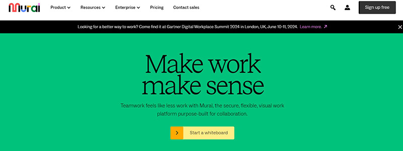
Mural’s homepage exemplifies simplified UX design by skillfully merging usefulness and visual appeal. The website engages visitors from the first with a lively color scheme and striking images. A couple noteworthy characteristics are as follows:
- The primary use is an interactive whiteboard that promotes teamwork, which makes it a great illustration of useful UX design.
- Clear Navigation: Thanks to an intuitive structure and well-organized menu, users may easily move between the several sections.
- Engagement Tools: Enhancing the entire experience, integrated tools for real-time collaboration encourage user participation.
Major features of Mural’s UX design consist of:
- User paths made simpler to improve discoverability and lower friction.
- Features of responsive design that adapt smoothly to different devices provide a constant user experience.
- Top-notch, useful images that lead visitors through their website experience.
Mural is a fantastic example of how good UX design can create a fun and productive atmosphere overall. For anyone trying to grasp how strong UX affects a digital platform, it’s a potent illustration.
Airbnb
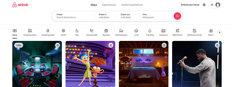
With a user-centric interface that easily leads users through a multitude of unusual travel experiences and lodgings, Airbnb’s website is a prime example of excellent UX design. A smooth user experience is guaranteed from the time a user lands on the page by the design’s clarity and ease of navigation. These distinguishing characteristics characterize the Airbnb website:
- Visual Appeal: A lively, interesting photo of each listing catches the spirit of the experience and invites visitors to learn more.
- Organize and clean grid design makes it simple for consumers to peruse alternatives without feeling overburdened.
- Responsive Search Filters: Providing customised options that improve browsing, the search bar at the top dynamically changes according to user inputs.
These components are essential to showing good UX design on a website:
- simple to use UI that makes searching easier.
- Superior pictures that raise the visual interest.
- A flexible yet ordered design that changes to suit the requirements of the user.
All things considered, Airbnb’s website is a shining illustration of how well-considered design can improve a platform’s usefulness and visual appeal, turning it from a mere website into a doorway to worldwide experiences. Key elements of good UX design, exploration and interaction, are encouraged by this method in addition to user retention.
Superlist
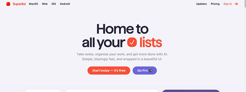
With its user-experience design that puts usefulness and simplicity first, Superlist’s homepage is a productivity platform of the future. The website uses a simple, modular design to break up material into readily readable chunks, each of which is visually guided through the page by a striking color block.
The features that best demonstrate its outstanding UX design are briefly listed here:
- Task Management Graphics: Providing visually stunning and educational app interface screenshots that show how users may efficiently manage their tasks.
- Easy Integrations: Stressing a simplified process, the page emphasizes its compatibility with other programs.
Basic components of Superlist’s design approach consist of:
- Easy Navigation: Information searching is made simple with succinct, clear menus.
- Interactive Elements: Interesting questions entice consumers to get more into features.
- Mobile responsiveness makes sure everything works together flawlessly on all devices.
These UX decisions improve usability so much that they are not only visually appealing:
- Easy adoption for new users is promoted via intuitive UI.
- Sections are distinguished from one another visually by use of strong, contrasting colors.
- Written succinctly, it provides the reader with just enough information.
All things considered, the Superlist website is proof positive that well-considered UX and design can turn a straightforward feature list into an engaging story that entices visitors to register and dig deeper.
Spotify Design
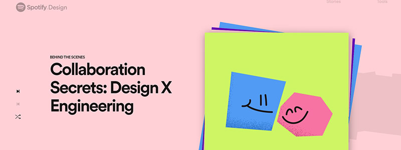
Its commitment to original and useful interface solutions is shown in the lively display of UX design innovation on its website. By use of vibrant images and dynamic information layouts, the homepage is designed to instantly captivate visitors into Spotify’s world of design, making browsing entertaining and educational. Among the notable things are:
- Interacting Visuals: The website reinforces the brand’s reputation as creative and user-focused by using vivid colors and strong graphic components to draw in visitors.
- Smooth and user-friendly navigation exemplifies good UX design concepts by providing simple access to different sections like stories, team, and tools.
- Inspirational Content Articles, interviews, and design stories on the site offer details about Spotify’s design process.
Significant components of the design and UX of the website consist of:
- User-Centric Layout: Users’ entire experience is improved by information presented in an understandable manner.
- Engaging users is increased by the website’s interactive components, which encourage deeper exploration.
- Brand Consistency: A smooth user experience is offered and brand identification is strengthened by using the same colors and typefaces throughout the website.
All things considered, Spotify Design’s website is a shining illustration of how aesthetics and usability can be combined to produce an engaging online presence that successfully conveys the brand’s values and draws people in at every touchpoint. To learn more about how Spotify shapes its design philosophy and user experience, go to their design page.
Frans Hals Museum
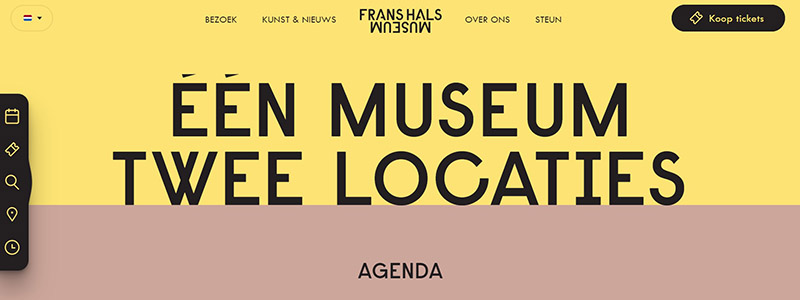
The website of the Frans Hals Museum has excellent UX design that skillfully blends beauty and usefulness to increase visitor interaction. The website adopts a warm colour scheme and a simple style that go well with the museum’s modern and classic art holdings. Here’s what distinguishes its design:
- Simple Navigation: With categories like “Visit,” “Art & News,” and “Support” available in the top menu, users can easily locate what they need.
- High-quality photos from current exhibitions are used in every element of the homepage to entice visitors into the world of the museum.
- Dynamic information Layout: To maintain the page clear and educational, the layout skillfully blends text and images while balancing white room and information.
Important elements of the design and user experience of the website consist of:
- Being responsive: Whether viewed on a desktop computer or a mobile, the website seamlessly adapts to multiple devices.
- Clickable news stories and the video play button are examples of interactive elements that entice more investigation.
- Accessibility Elements: Foreign visitors will find accessibility improved by language change options.
To sum up, the design of the Frans Hals Museum website skillfully combines visual beauty with utility to provide an intuitive interface that honors the museum’s dedication to accessibility and visitor involvement. In addition to making browsing more pleasurable, this strategy acts as a digital extension of the museum’s actual presence. Visit their official website to delve further into its features.
Wombat Invest
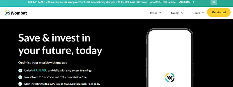
The Wombat Invest website is a prime example of excellent UX design intended for those who want to save and invest easily. The simple navigation of the website makes financial operations understandable even for novices. The main characteristics are enumerated here.
- Clearly arranged, the primary menu leads visitors easily through choices including goods, costs, and instructional materials.
- Interesting Images: The website’s usage of contemporary, eye-catching images and a single color scheme improves the visual experience without overpowering the visitor.
- Interactive features: The experience is enhanced by user engagement encouraged by dynamic features like sliders for investment returns and interest rates.
Significant design and UX components of the Wombat Invest website consist of:
- User-Centric Design: The user is the main consideration in every area, which emphasizes usability and succinctly and clearly conveys important information.
- The website’s responsive design guarantees a smooth experience on desktop, tablet, and mobile devices by operating smoothly across a range of devices and screen sizes.
- Content Education: Users may make educated selections by using integrated educational elements to grasp the fundamentals of investing.
In conclusion, Wombat Invest’s website is a paradigm for successful financial website design in 2024 because it offers a user experience that is both aesthetically beautiful and useful. For further information, go to their official website.
Roadmap Heroes
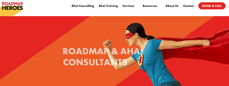
Clearly targeted at professionals looking for reliable project management solutions, the Roadmap Heroes website stands out with its dynamic and user-centric UX design. The webpage is well-organized, which encourages navigation and makes sure that visitors can grasp the services provided fast. These are the salient features:
- Hero Banner: A strong call-to-action that entices visitors to schedule a consultation opens the homepage together with a striking hero image that draws attention.
- Service Offerings: Aha! is among the services that the website succinctly lists. Through easily scanned portions, consulting, training, and roadmap coaching are offered.
Roadmap Heroes’ design and user experience key aspects include:
- Clarity and Conciseness: The website makes difficult material on project management tools understandable and accessible by using simple language and a well-structured design.
- Interactivity: Testimonials and case studies, two interactive components that improve interaction and demonstrate the company’s success and experience.
- An important component for today’s mobile-first audience is responsive design, which guarantees that the website looks fantastic and works flawlessly across all devices.
All things considered, the Roadmap Heroes website is a prime example of great UX design since it skillfully combines usefulness with visual appeal to produce a smooth user experience that successfully leads users through the decision-making process. To learn more in-depth, go to their official website.
Tick Tock Tea Times Trading
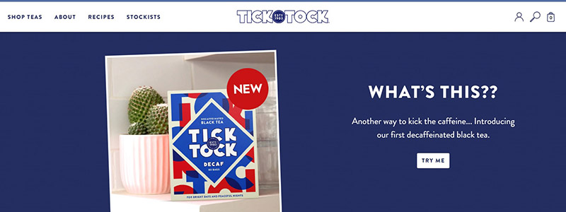
Tick Tock Tea Times Trading’s website has a crisp, new UX design that puts user interaction and clarity first. The way it’s set up makes it easy for guests to move around a vibrant selection of tea goods. The main elements of the homepage are examined in more depth here:
- Bright, eye-catching pictures of tea items and components are used in every part to not only draw attention but also successfully convey the brand’s emphasis on natural, delicious products.
- Clear Product Information: The website presents its tea selections simply and provides clearly readable details on the special advantages of each product, including being caffeine-free or biodegradable.
- Detailed product tales and recipes are among the site’s interesting features, which improve the user experience overall by introducing customers to original ways to enjoy their teas.
The UX and design of the website are mostly concerned with:
- The seamless viewing experience on desktops and mobile devices is guaranteed by responsive design.
- Ease of Navigation: Users may locate information fast and simply thanks to the navigation bar’s simplicity and organization.
- Encouraging a closer relationship with the brand, the website informs users about the advantages of each kind of tea.
Overall, the Tick Tock Tea Times Trading website is a prime illustration of great UX design since it combines visually appealing components with useful usability features. See more by going to their official website.
Starbucks
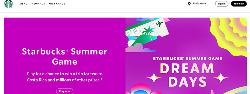
The user experience (UX) design on the Starbucks website is excellent; it skillfully combines usefulness with aesthetic appeal to improve customer interaction. One indication of Starbucks’ dedication to both product promotion and consumer interaction is its webpage. These are its key characteristics broken down:
- Promotional Content: Vibrant, excellent pictures of new and seasonal beverages that highlight special discounts and app-exclusive promotions grab attention right away on the site.
- Navigation Ease: Clear and user-friendly design is demonstrated by the way a well-organized menu at the top allows customers to easily explore different sections including menu items, rewards, gift cards, and shop locations.
- Mobile Optimization: For the primarily mobile user base, the website’s fully responsive design guarantees a smooth experience across all devices.
Important components enhancing the successful UX and design of the website include:
- Using interesting images, each section not only highlights the products but also creates a cozy, friendly environment.
- Interactive Elements: To increase user participation generally, the website has interactive elements like a store finder and simple access to the Starbucks app.
- Consistent Branding: Starbucks’ brand identification and a smooth user experience are maintained throughout the website by the consistent usage of brand colors and designs.
All things considered, the Starbucks website will be remembered in 2024 for its excellent UX design, which through its well-considered style and features geared toward the consumer effectively increases user engagement and sales conversions. See more details and the design in use by going to their official website.
Gamification Designs
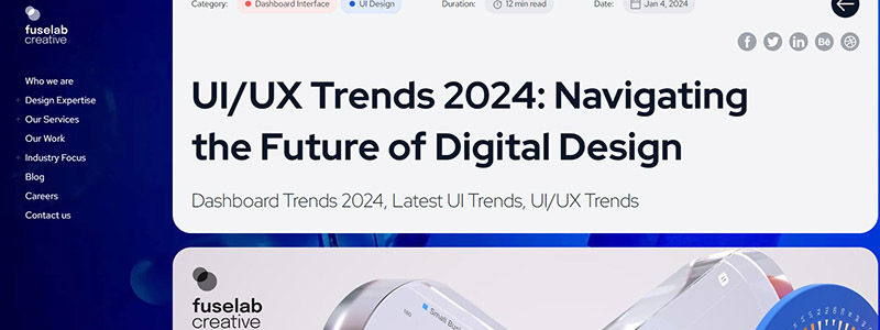
Leading UX design techniques in 2024 are best represented by the colorful and engaging “Gamification Designs” webpage. To engage visitors actively, this website uses gamification components throughout its design, demonstrating how powerful game mechanics may improve digital platform user experience. An examination of its salient characteristics follows:
- Using interactive components like achievement badges, progress bars, and interactive challenges, the website promotes user interaction and prolongs user stay.
- Bold hues and lively animations draw the eye of the user while the navigating process is made simple and fun.
- User-Centric Navigation: The design takes user navigation into consideration, making it simple to browse different parts without overpowering users with information at once.
Important features of the user experience and design of the website consist of:
- Clarity and Accessibility: Catering to a wide audience, material is made easy to read and engage with by use of accessible menus and clear typeface.
- The website’s responsive design ensures a consistent experience whether viewed on a desktop, tablet, or mobile device.
- Feedback Systems: Users are kept interested and motivated and feel accomplished by real-time feedback and prizes for their activities.
All things considered, “Gamification Designs” shows how to successfully include gamification into web design to produce interesting and intuitive digital spaces. This method not only increases user interaction but also works well as a means of creating enduring user relationships. Explore the nuances of these trends and additional examples on their official website.
Ending
Excellent UX design will make a website easy to use and interesting in 2024. The ten websites under consideration demonstrate how creative design can improve user pleasure. These websites are from different industries and are all excellent in UX design:
- E-commerce and checkout procedures are simplified.
- Education: Easily available, interactive learning environments.
- Entertainment: Adapted material and easy navigation.
These instances show how important good user experience design is to any successful website. These websites are very high standard since they use innovative design techniques and concentrate on user demands. Making UX design investments increases usability and encourages user loyalty.
Prepared to improve the user experience design of your website? Boost usability, increase conversions, and analyse user behavior with Plerdy’s tool.
