
Nowadays website heatmap analysis has become one of the most popular and effective web analytics tools. It can help you improve the overall performance of your web resource. In particular, it gives one an opportunity to keep track of the time users spend on the website, the pages they browse, and the objects they get interested in. So, such an analysis method i is invaluable in understanding your traffic and the way your clients make their choices.
What is a website heatmap?
Heatmaps employ several main strategies to demonstrate how the users interact with the website. They highlight the areas on the page attracting the most and the least attention of the visitors with the aim of giving a clear picture of the way they behave and eventually boosting the conversion rates.
There are several types of heatmaps:
- a click map – demonstrates how users interact with elements of each web page and where they came from;
- hot segments – these are the most clickable parts of the page;
- a scroll map – shows how far the users scroll the page down on different devices;
- a mousemove heatmap – has become a great alternative to video recording of the user’s’ actions as it shows all elements touched by the mouse cursor;
- the order of clicks will show which elements were clicked on first;
- events heatmaps provide all the information about clicks and mouse moves on the web page elements.
In this article we suggest an example of website usability analysis done with the help of a click map.
General analysis of clicks and website statistics
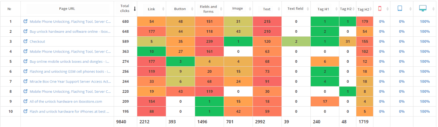
Let’s take a look at the TOP 10 pages of https://www.iboxstore.com/ website that received the biggest numbers of desktop clicks:
- TOP 10 pages having the most PC clicks. This makes 69% of the total number of clicks.
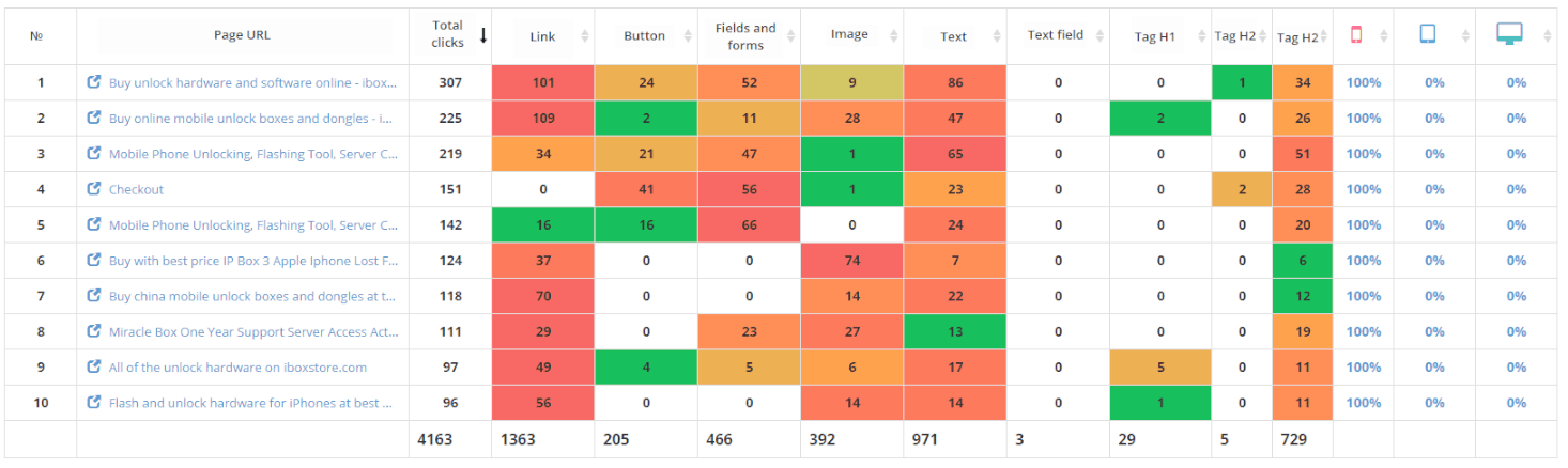
- Mobile traffic generates 29% of clicks.
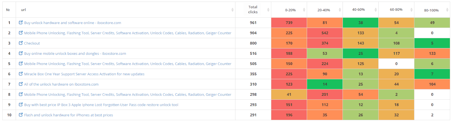
- The scroll map shows that on many pages effective interaction with the content takes place only on the first 20% of the screen space (red areas). For this reason, they should be studied more profoundly. Green areas should be double checked for useful content. If they do not get the expected clicks – apparently, the calls to action should be added or adjusted.
Home page https://www.iboxstore.com/
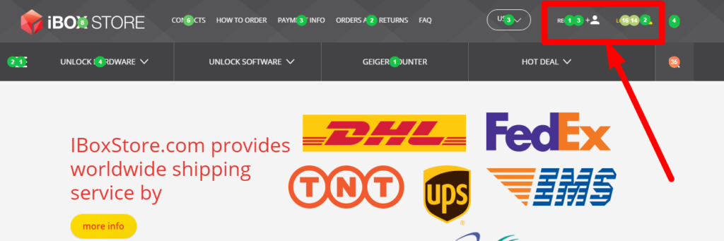
- Here we can observe that many website visitors click on the additional (second) menu, which gets highlighted when it is scrolled down, but further on it gets very few clicks.
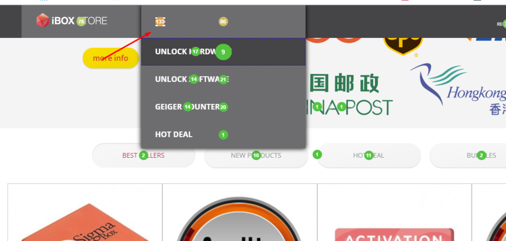 It would be a good idea to freeze the main menu and delete the one that appears later
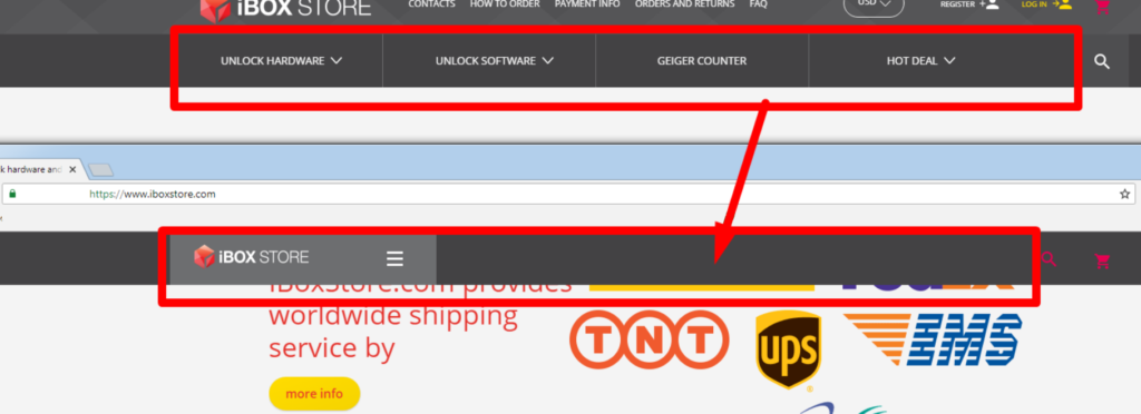
- The search bar covers the “Log in” button when the page is scrolled down.
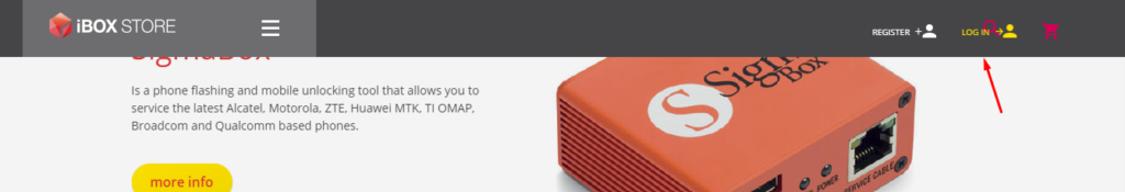
- Apparently, the visitors often use the website search. So, the website owner might want to change the header to make the search bar more noticeable, for example:
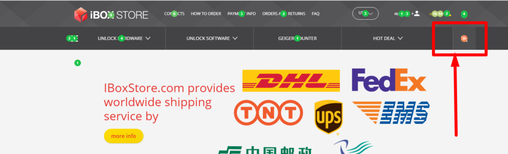
- We can see that users often register and log in to the web site. It might be useful to launch email campaigns notifying them about special offers, new arrivals, or discounts.
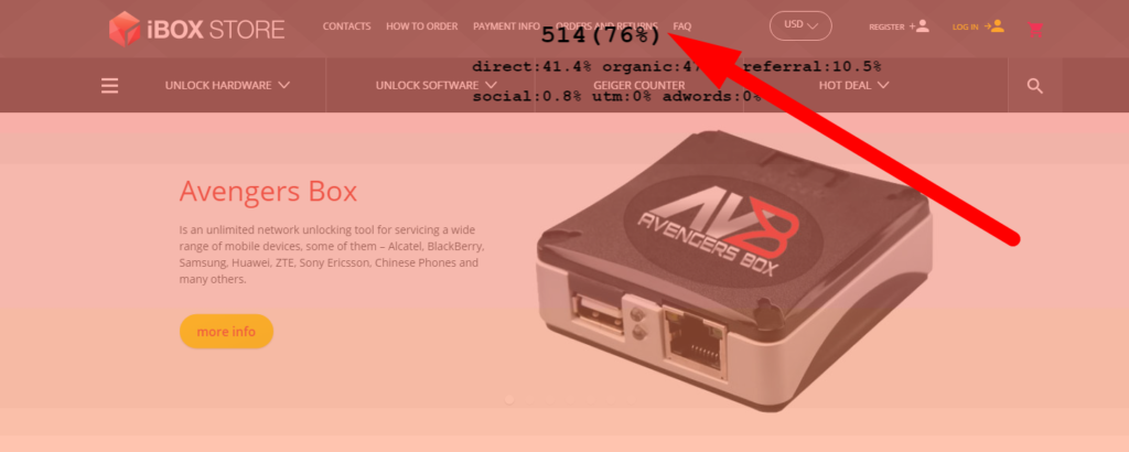
- The first screen gets 76% of all the clicks on the page, so it would be wise to reduce the number of products shown on the home page in “the best sellers” block and other sections.
SHOPPING CART page analysis
- According to the click map, the users often edit the number of products in their shopping carts. For their convenience, one might decide to add the “Increase and Decrease Quantity” buttons to the cart. Consider the example:
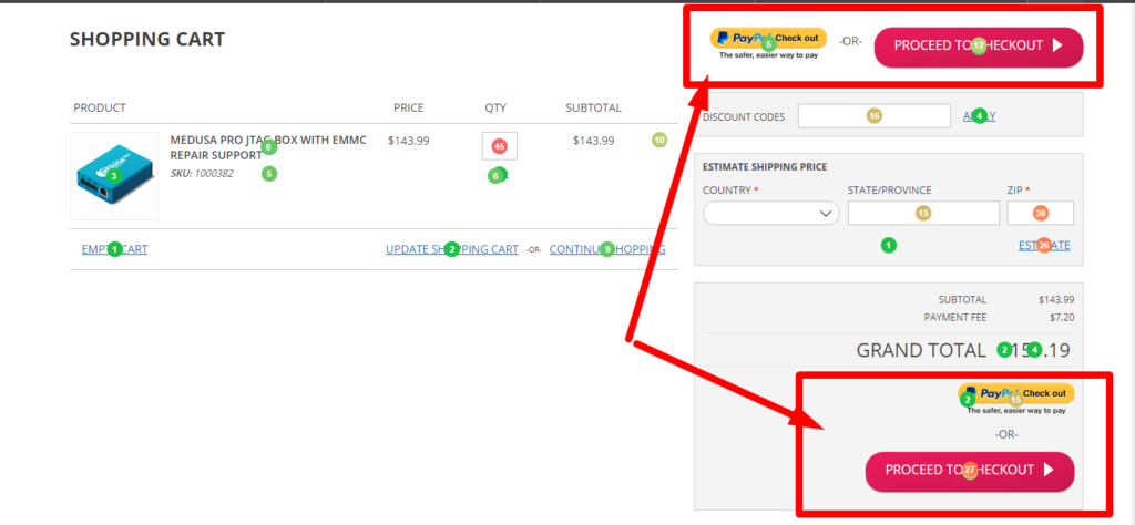
- The “Pay with Paypal” and “Proceed to Checkout” buttons are duplicated. All of them get clicks, but the upper pair is clicked on rather rarely, so it is better to delete those buttons and leave only the bottom ones not to confuse the customers.
- Users often click on the menu while on the shopping cart page, which can make them “lose” the product they were going to purchase. To prevent that, it’s better to remove the menu header from the shopping cart.
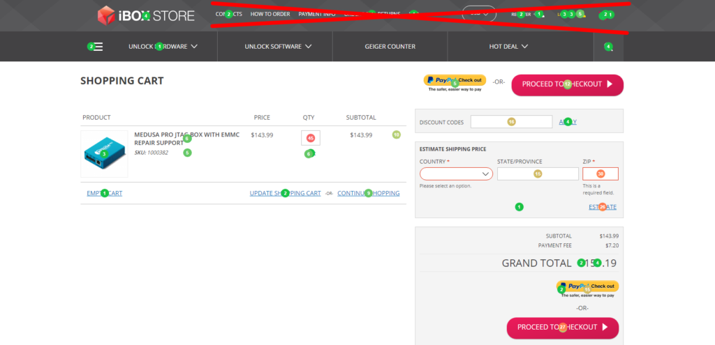
- It would be a good idea to delete these fields from the shopping cart page because they are almost never filled in and only make the page unnecessarily long.
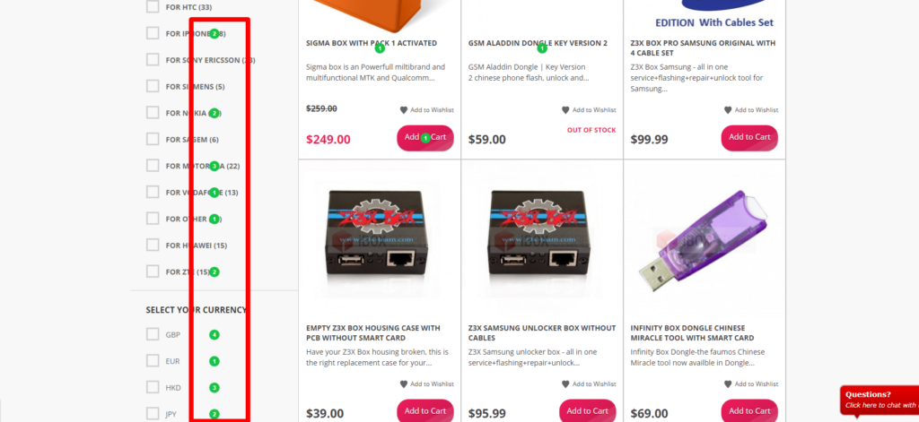
BOXES AND DONGLES FOR MOBILE PHONES UNLOCK category page analysis
- Smaller fonts and shorter intervals should be used for category and currency filters so that they could be displayed to the user all at once.
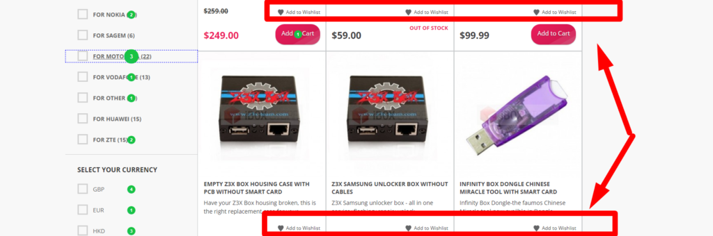
- Clients do not click the “Add to Wishlist” button, so this element can be removed from the product categories page.
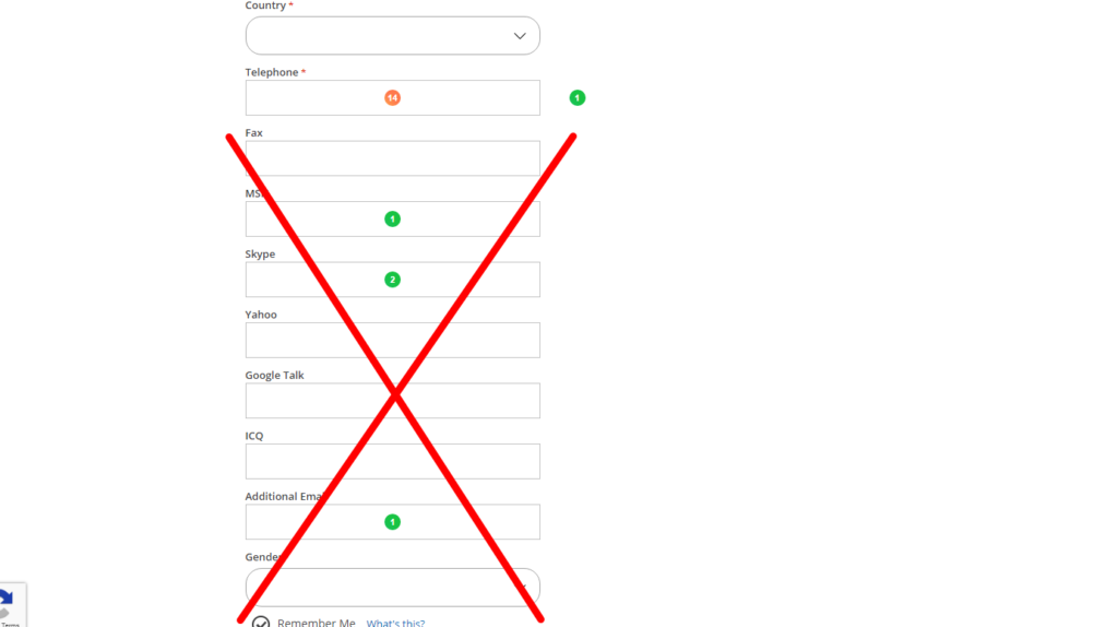
CREATE AN ACCOUNT page analysis
Users never indicate their gender during registration, so this field can be removed.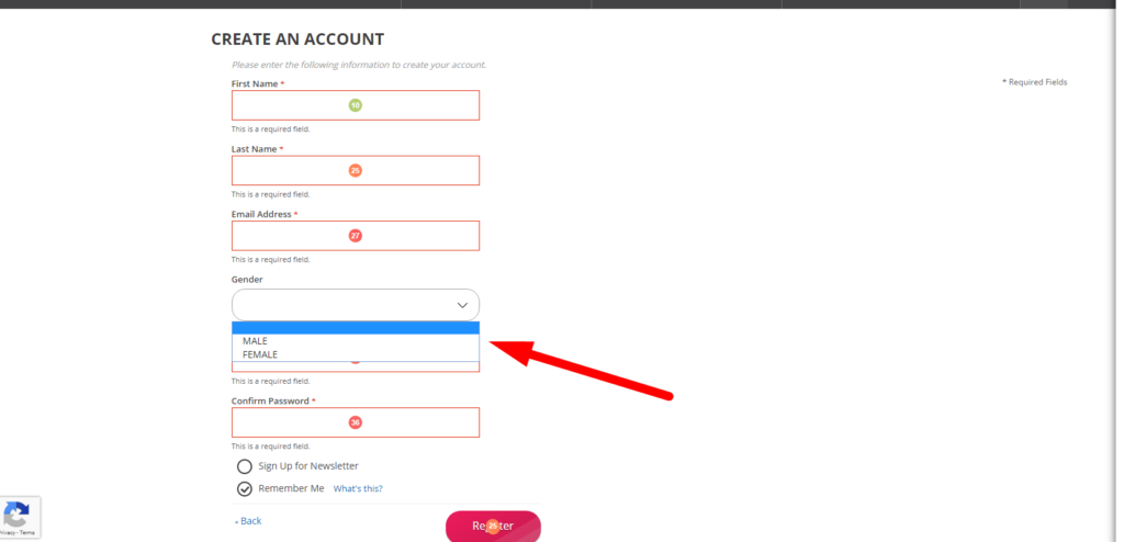
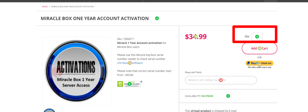
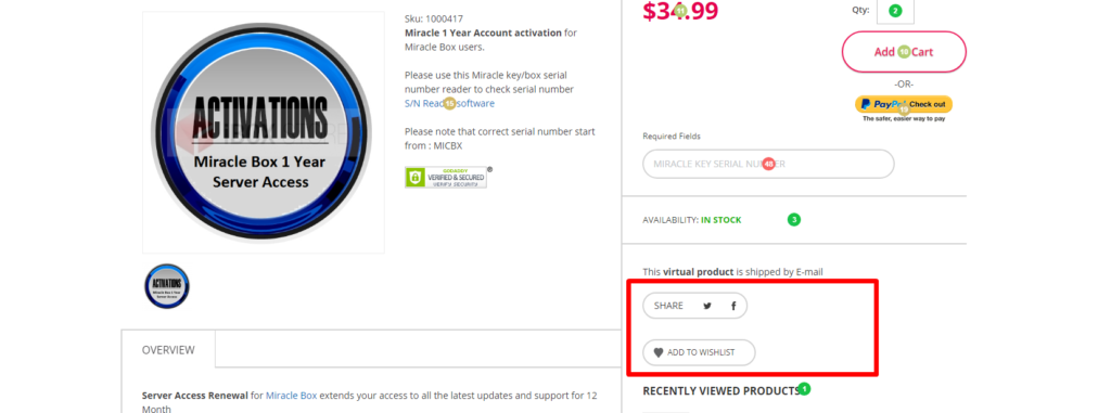
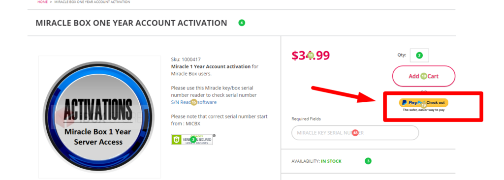
MIRACLE BOX ONE YEAR ACCOUNT ACTIVATION page analysis
- Users increase the number of products on the product cards, so one should add “Increase and Decrease Quantity” buttons so that the client does not have to fill in the numbers manually.
- Apparently, the users click on the images to zoom them in, but there are no popups, and, as a result, no chance to enlarge the pictures despite the clients’ desire to do so.
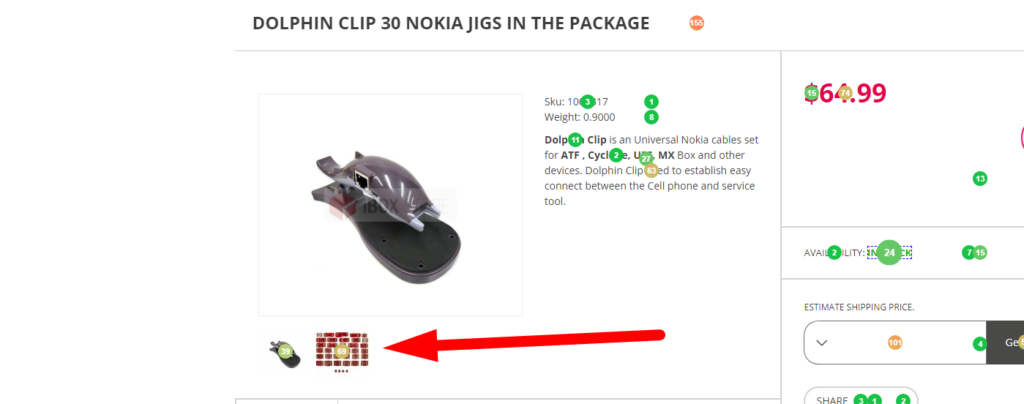
- The users do not share the information about the products in social media or add them to “Wishlist,” so these elements can be easily removed from the product cards.
- Since the clients make instant purchases via PayPal more often than via traditional shopping cart method, the “PayPal Checkout” button should be of the same size as the “Add to the Shopping Cart” element to attract more attention.
Conclusions
As you can see, a click map can help you identify the perspectives for the development of your web resource, the way users see it, and the changes that should be introduced to improve the user experience of each website visitor and turn them into a “full-fledged” client. These tools can help marketing professionals and SEO-specialists, as well as website owners, as the figures received in the course of the analysis will tell you a lot about the current situation in your business.
The most important aspect, however, is not the analysis of the website usability with the help of a click map itself, but the way you will employ the data received in the process. If you use the information correctly, you will definitely have all the chances to make your website more convenient to the users and significantly boost the conversion rates.