A click map will help you get a clear picture of the way visitors behave on your website. A heatmap uses various levels of color intensity to display the information. Different shades of green show areas receiving fewer clicks because they are perceived as “colder” elements than those highlighted in red, which are “hotter,” or more popular, respectively.
With the help of a click map, you can analyze the mobile version of a website. You will get an opportunity to track the users’ actions in the app from the aggregated records showing every single click on the buttons, swipe, scroll or any other action.
The click map will throw light on many important questions, including the reasons for lowered conversion rates both on separate web pages and the website at large. Indeed, the problem may lie in trivial things. For example, the users may have difficulty in finding the “Buy” button and click on other buttons.without any positive outcome. Such problems, however small they might seem, may divert a lot of website visitors who could otherwise be potential clients.
Users prefer websites which have all their steps and wishes predicted and carefully considered. If the mobile version of the website is too confusing and badly thought-out, it is highly likely that they will never come back. So, it’s time to stop second-guessing and get down to analyzing the data retrieved from click maps.
In this article we suggest an example of detailed usability analysis of the mobile version of https://www.iboxstore.com/ website done with the help of Plerdy click map.
Analysis of the mobile version of https://www.iboxstore.com/ website
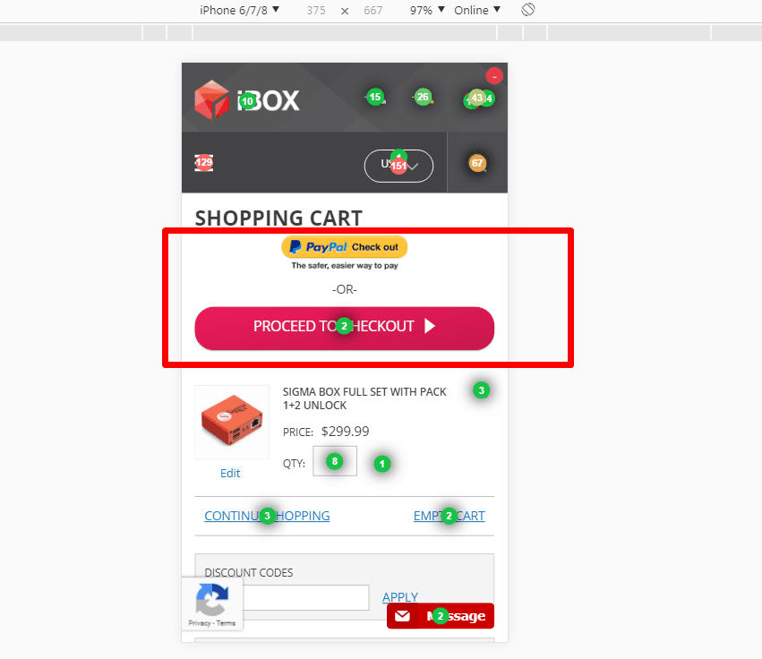
- The two checkout modules should be removed from the top because they also appear at the bottom of the page, where the client will get anyway after filling in the mandatory fields. This trick will help you shorten the shopping cart page, so the users will not have to scroll far.
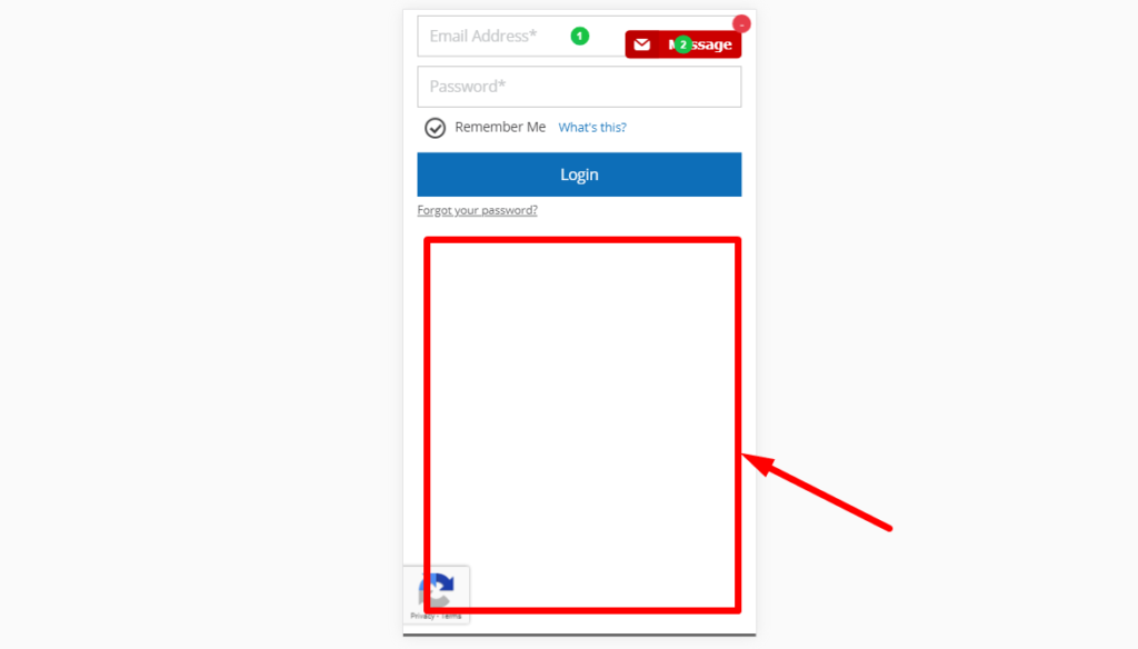
- The second step of the checkout procedure, the customer faces .a huge blank space.
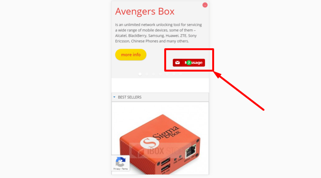
- When the page is scrolled, the form should stay at the bottom of the page rather than moving along with the scroll bar.
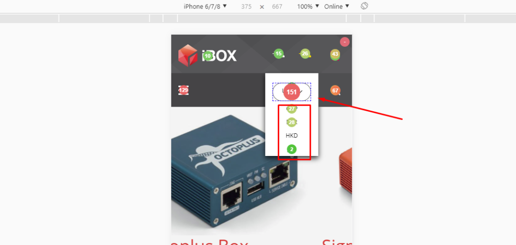
- The drop-down menu button is clicked on more often than are the currency options it offers. The users do not understand the purpose of the button, so it would be a good idea to add a description, for example, “Choose Currency.”
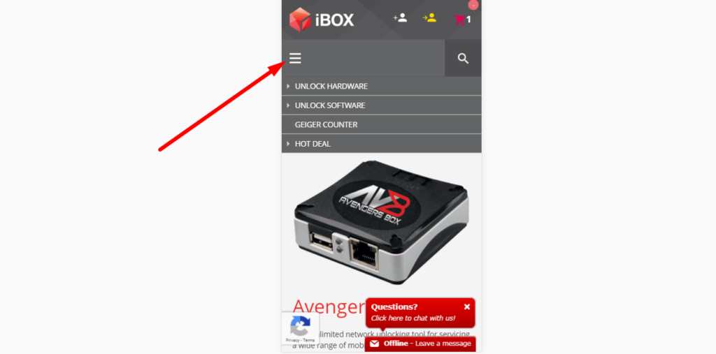
- When the menu is opened, the button should turn into a cross icon so that the users could understand how to close the menu.
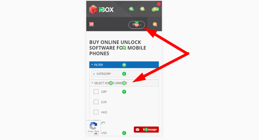
- The currency filter at the top of the page gets more clicks than the one located at the bottom, so the latter can be removed.
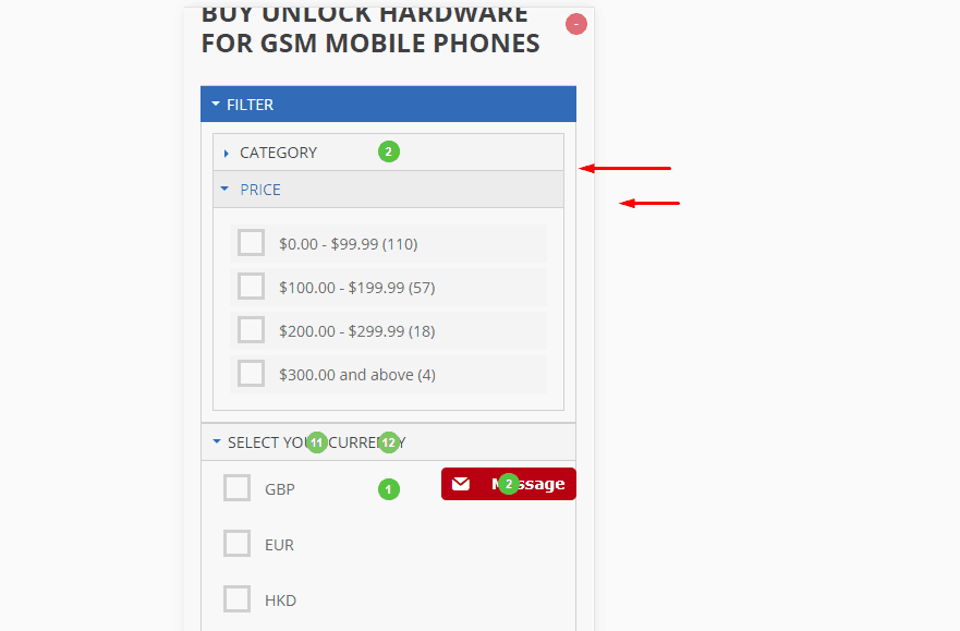
- These filters are rarely used in the mobile version of the website, so they can be deleted.
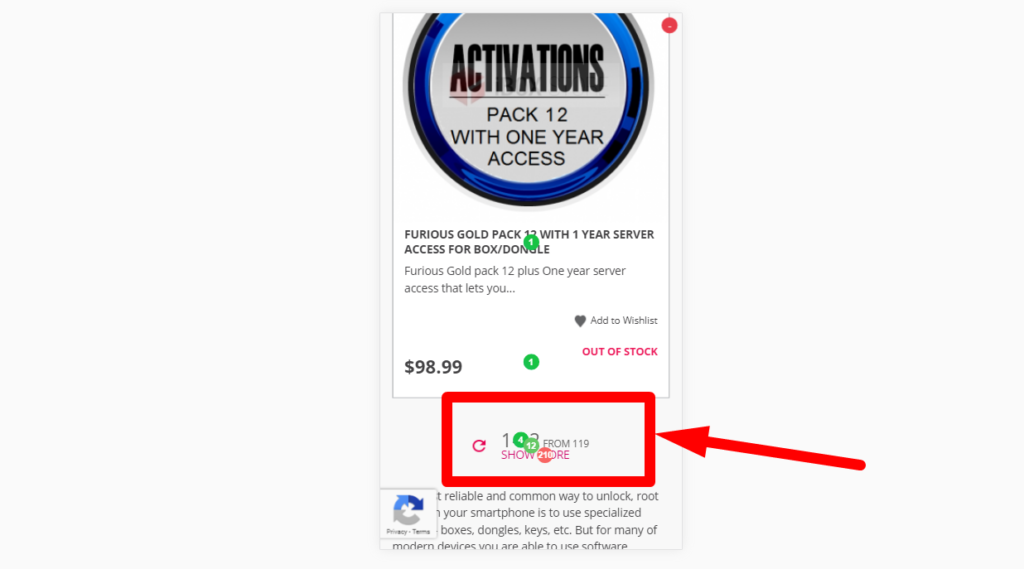
- The users often click «Show more» link in the mobile version, so it would be a good idea to apply the standard pagination format (“1,2,3”) to minimize the rejection rate and optimize user behavior.
Conclusions
As you have seen, the click map reflects users’ actions clearly and comprehensively. So, due to its simplicity, it can come in handy not only to marketing professionals and SEO-specialists but also website owners. It will give you a chance to see which sections of the website function effectively, which elements work well and which of them do not work at all. You will be able to track the users’ moves on the website as well as their pains and wants. With such an effective analysis method, you will be able to solve the most enduring problems, giving a healthy boost to your website’s conversion rate and the income it generates.
