When you’ve got a website, making people click that “Buy Now” or “Sign Up” button is the goal, right? But it’s not magic. It’s about knowing what works and testing everything. That’s where Conversion Rate Optimization (CRO) comes in. Think of CRO like tuning up an engine—small tweaks, big gains. You change your CTAs, polish up those landing pages, or maybe add some cool trust badges. And suddenly, visitors start doing what you want.
Big names like Amazon or Shopify? They didn’t just “wing it.” They tested, optimized, and tested again. So here, we’ll dig into what makes a website convert better. Ready? Let’s get those rates up! 🚀
Understand Your Target Audience
If you wanna boost your conversion rate, you gotta know who your visitors are. Like, really know them. To do that, it’s key to gather and analyze visitor data to make smart moves and improve your CRO efforts. Data is your goldmine for understanding what clicks with your audience.
Gather and Analyze Visitor Data
Collecting data sounds boring, but it’s the foundation for improving your conversion rate. Look at stuff like page views, session duration, bounce rate, and even heat maps to see where people click or just lose interest. It helps you spot gaps in your website and make better decisions. Use tools like Google Analytics or Plerdy to track visitor behaviors. Here’s what to focus on:
- Demographics: Age, location, and interests.
- Behavior: Click patterns, pages visited, session duration.
- Source of Traffic: Organic, social media, or paid ads.
- Conversions: How many visitors actually convert.
Create Customer Personas
Once you’ve got the data, time to build those customer personas. A persona is just a detailed description of your ideal customer, based on actual data. It’s like a profile of who’s most likely to convert. Include details like:
- Age & Gender
- Occupation
- Goals and Pain Points
- Preferred Communication Channels
Creating these personas helps you target your audience better and personalize your content. This way, you’re not just boosting your CRO but actually connecting with real people!
Craft Compelling Calls-to-Action (CTAs)
Experiment with CTA Placement
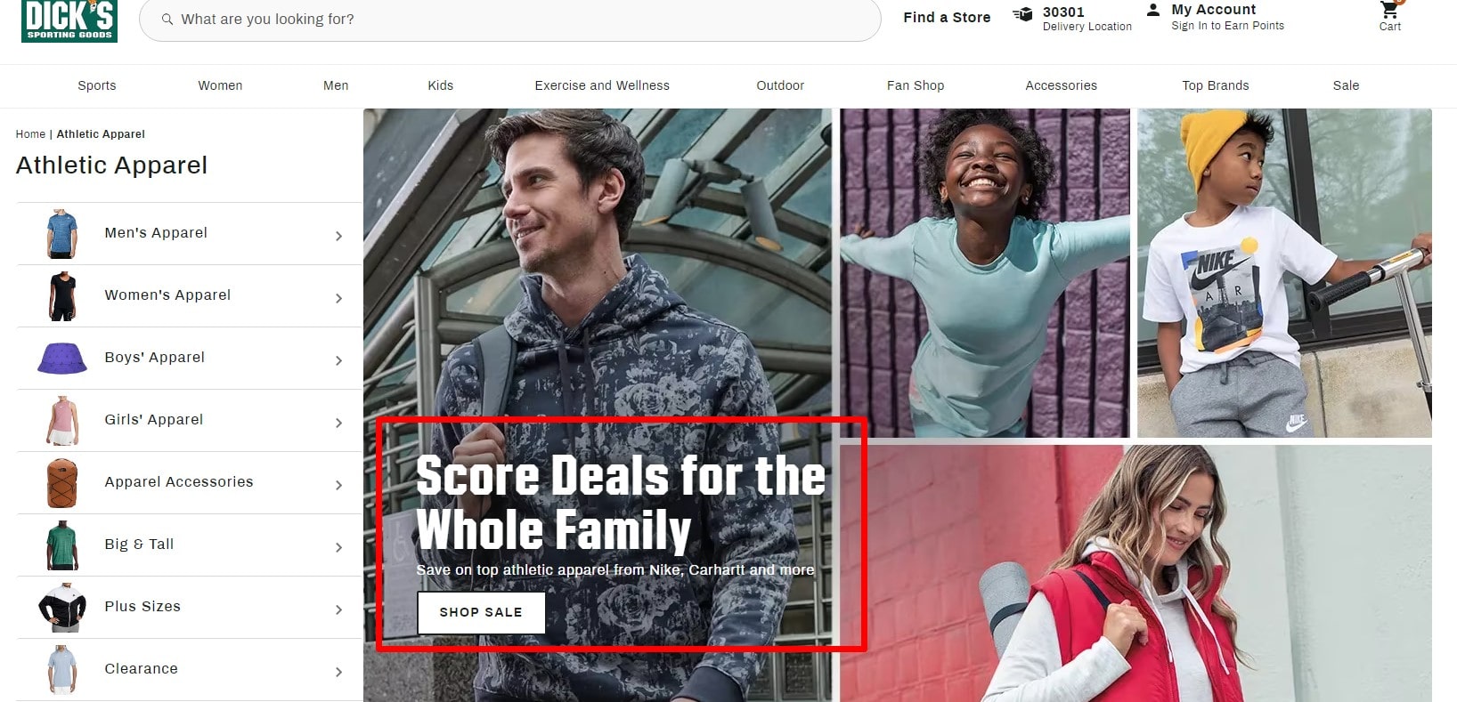
Finding the best placement for your CTA is like setting up a conversion funnel. Don’t just drop it at the page’s end and cross your fingers. To boost conversions, you gotta test different places—like the middle of your blog, top of landing pages, or even in eye-catching pop-ups. For instance, Neil Patel talks a lot about placing CTAs above the fold to improve conversion rates. And you know what? It works! Because a smartly placed CTA can guide visitors right into making that conversion—no more getting lost or wandering off.
Use Action-Oriented Language
The words on your CTA button can make or break conversions. No joke. Use action-driven language that feels inviting and direct—like “Start My Free Trial,” “Boost Your Conversion Rate,” or “Get Instant Access.” Imagine your CTA as that friend who gives you a gentle push toward a pool—it’s gotta be clear and make the next step feel easy. Tools like Plerdy help you A/B test these CTAs and see which language boosts your conversion rates most.
Examples of effective CTAs:
- “Grab My 10% Off Now”
- “Sign Up & Get Access”
- “See Conversion Insights”
- “Show Me the CRO Tips”
Play around with language and placement to drive up conversions—test, adjust, and get those numbers climbing!
Optimize Landing Pages for Conversions
Focus on Above-the-Fold Content
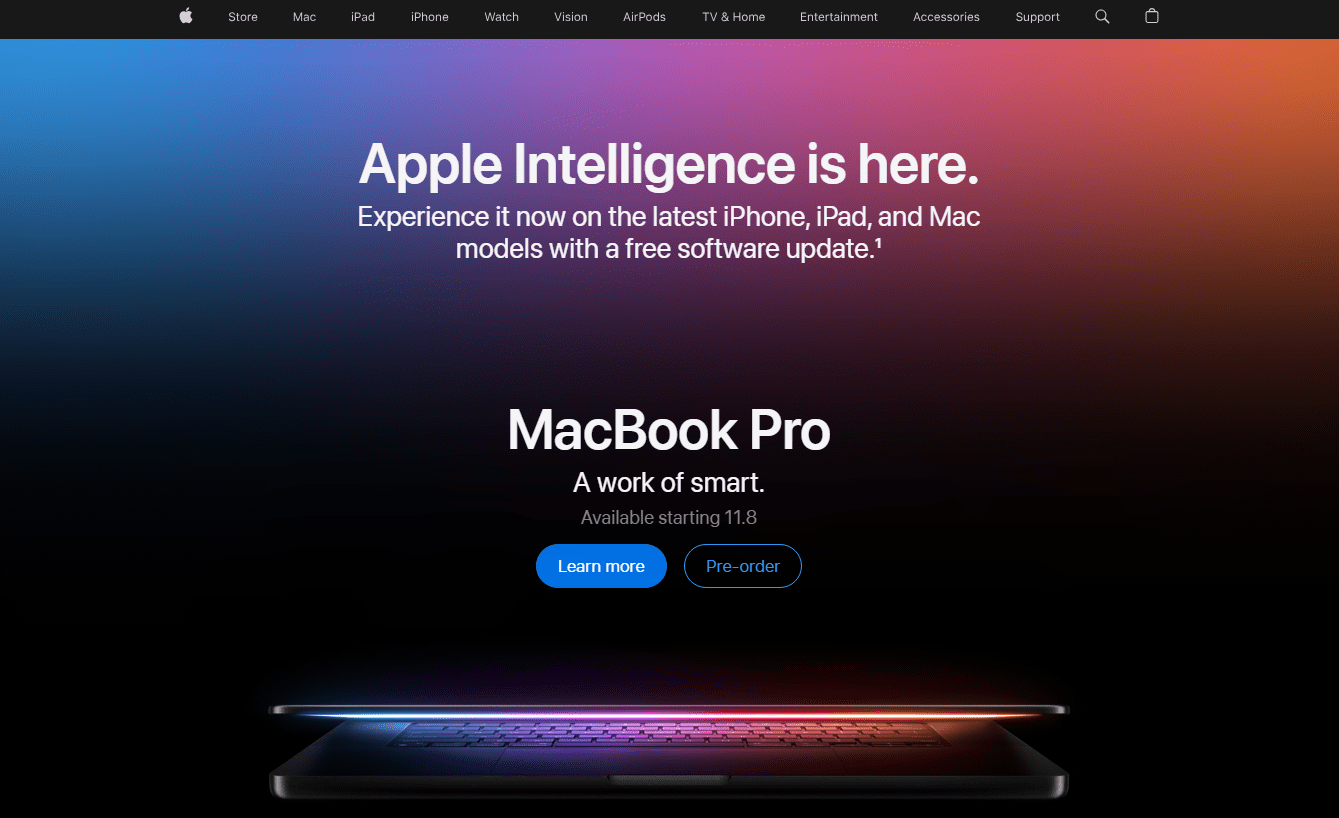
When it comes to boosting conversions, first impressions matter. What users see above the fold—the part of the page visible without scrolling—is crucial. You don’t have time to waste here. Think about it, visitors decide within seconds if they’re staying or bouncing. So, key stuff like your main value prop, CTA, and maybe even an eye-catching headline or image should be right there. Research shows that 80% of users focus their attention on this area! A solid example? HubSpot’s landing pages always have killer above-the-fold content, leading to higher conversion rates. The goal here is simple: grab attention and make your message loud and clear, quick.
Simplify Page Layout
A messy landing page is like an overpacked suitcase—you can’t find what you need! Simplicity is key for better conversion rates. Avoid information overload. Stick to one clear message and use white space to keep things tidy. Simple layouts make it easier for visitors to digest info and take action. Check out Plerdy’s heatmap tool to identify areas of clutter, so you can streamline your landing page and bump up those conversion rates.
Use Visual Hierarchy to Guide Users
Visual hierarchy is not just a fancy design term; it’s a conversion driver! You want to guide users’ eyes in a way that feels natural. Bigger elements like headlines should grab attention first, followed by subheadings, CTAs, and secondary info. Color contrast and font sizes play a big role here too. Websites like Shopify do this perfectly—leading the visitor’s gaze from the main headline down to the CTA, and voila! Conversions go up. Prioritizing elements by visual importance helps users navigate your page without confusion.
Visual hierarchy elements to prioritize:
- Main Headlines: Bigger font size and bold.
- CTAs: Contrasting colors, clear wording.
- Supporting Info: Smaller fonts or muted colors.
- Images: Relevant, not distracting.
Optimizing these visual cues keeps visitors engaged and increases the chances of conversions—making all your CRO efforts pay off big time!
Build Trust with Social Proof
Showcase Testimonials and Case Studies
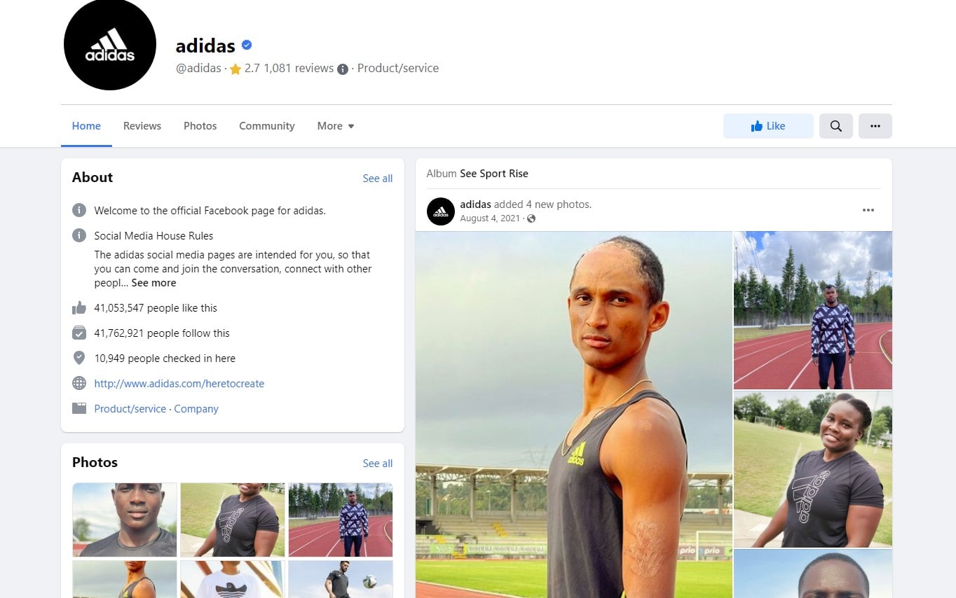
Trust is a big deal in online world, right? People won’t just take your word; they wanna see what others say. And that’s where testimonials and case studies come in to boost your conversion rate (CRO). You need to show real results and happy customers. Think about Plerdy’s case studies—they’re short, clear, and packed with facts. They tell how companies improved conversion rates or clicked their way to success. Use text-based testimonials, video reviews, or even quick quotes to keep it fresh. Data says that 92% of people trust recommendations from other users! So, give them proof that others already trust you.
Formats to try:
- Short quotes with names and company logos.
- Video reviews with customer stories (adds more human touch).
- Detailed case studies with results like “Boosted conversion by 20%”—people dig numbers!
Display Trust Signals
Let’s be honest—if your site doesn’t look legit, conversions drop. Fast. So, trust signals matter a lot. It can be stuff like security badges, SSL certificates, partnership logos, or awards. Even big brands like Amazon and eBay do it! The idea is simple: make your visitors feel safe and confident. Plerdy’s tools also help identify where you can place trust signals to make sure you keep the conversion rate high.
Utilize A/B Testing for Continuous Improvement
Run Split Tests on Key Elements
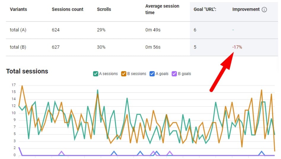
Wanna boost your conversion rate (CRO)? You gotta experiment! A/B testing is a game-changer. Imagine you have two versions of a button—one is red, another is green. Which one gets more clicks? Only way to find out is to run a split test. You pick key elements like headlines, images, CTAs, or even forms and create variations. It’s like putting them in a duel to see which one wins. Even small changes can make a big impact on conversion rates. Netflix tests everything from thumbnails to descriptions, and look where they are now!
Key elements to A/B test:
- Headlines: Try catchy vs. straightforward
- Buttons: Test color, size, and text
- Layouts: Experiment with different placements of sections
Analyze and Implement Findings
Okay, so you did your A/B test—now what? Don’t just sit there; look at your data! Focus on the conversion rate changes and decide which version wins. If the red button got 20% more clicks, stick with it! Keep in mind, results tell a story. Sometimes the difference is small, but it’s worth it if it improves the conversion rate even a bit. Use Plerdy or similar tools to track these changes, so you always know what’s working and what’s not.
Reduce On-Page Distractions
Remove Irrelevant Elements
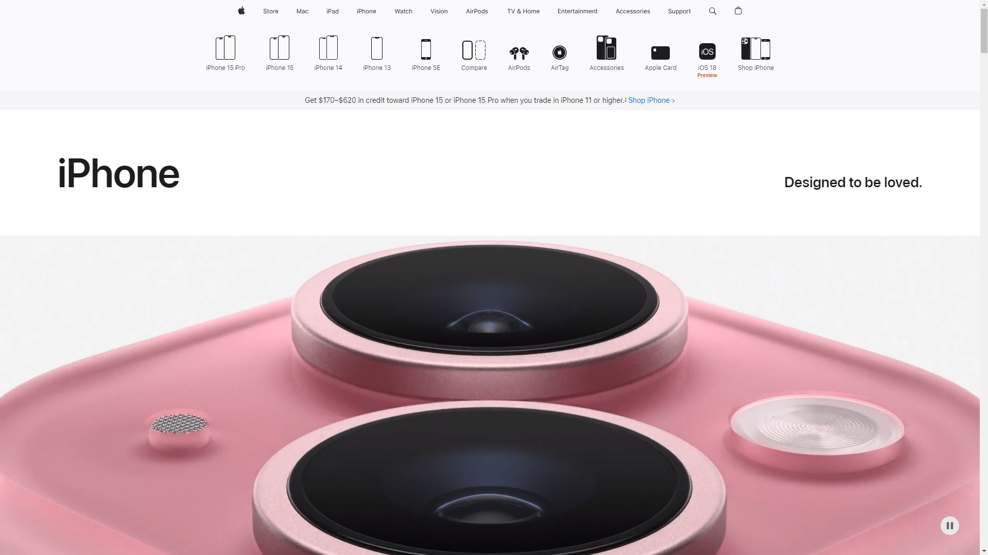
Let’s face it—too much clutter on your website hurts conversion rates. Users don’t wanna waste time figuring out where to click. Remove all the noise! Say goodbye to unnecessary pop-ups, random banners, and outdated info. Keep only what matters. If you’ve got too many CTAs fighting for attention, you’re gonna confuse your visitor, and confused visitors don’t convert. Imagine visiting an online store with ten different discount banners—yeah, it’s a mess. Clean it up!
Common distracting elements to avoid:
- Auto-playing videos
- Irrelevant sidebar ads
- Multiple flashing banners
Prioritize Key Actions
You gotta guide your visitors like a tour guide at a museum. Show them the key actions! Focus on one main CTA—whether it’s a “Sign Up Now” button or a “Buy Here” link. Highlight it visually and make it easy to find. Keep the page simple and to the point. For example, Plerdy does a great job by leading users towards trying out their free tools with clear CTAs on landing pages. Remember, the fewer the distractions, the better the conversion rate!
Leverage Visuals and Videos for Engagement

Use High-Quality Images
Hey, first impressions matter a lot! When visitors land on your page, they judge with their eyes before they read anything. So, using top-quality images can boost your conversion rate big time. Think of it like dressing up your website for a date—no pixelated or blurry photos! Show crisp product images that highlight features. Take a cue from e-commerce sites like Amazon, which use sharp and clear images for every single product. It makes people feel they can trust what they’re buying. Plus, add some emotion to visuals, and visitors will connect better with what you offer.
Incorporate Product Videos
Adding videos? Oh, that’s a game-changer! These days, people don’t just wanna read—they wanna see in action. For example, if you’re selling a software tool, show it in action. Give a mini-tour of the product’s features in a quick 1-minute video. Remember, data says that sites with videos can increase conversion rates by up to 80%! That’s huge, right? Even companies like Shopify include short demo videos to explain how their platform works, which helps customers decide faster. Keep it short, engaging, and to the point, and boom—your CRO improves!
Improve Page Load Speed
Identify Slow-Loading Pages
Page speed isn’t just a tech problem—it’s all about boosting your conversion rate. A slow site can mess up your conversions big time! Google says 53% of mobile users will ditch your site if it takes more than 3 seconds to load. That’s a conversion killer right there. So, you gotta find the pages that are lagging. Use tools like Google PageSpeed Insights or Plerdy to spot which pages have issues. Slow-loading pages can scare off visitors and lower your conversion rate, so it’s crucial to get them up to speed.
Implement Speed Optimization Techniques
Fixing slow pages? Piece of cake. Start by compressing images and switching to lazy loading to improve your site’s speed. Big images are like dead weight—they slow down load times and hurt your conversion rate. Also, think about moving to a faster hosting provider if your current one isn’t cutting it. Companies like Amazon have nailed this—they know that fast-loading pages mean higher conversion rates. Don’t forget to clean up and minify your CSS and JavaScript files to boost speed. Regularly check page load times—it’s key to keeping your conversion rates on the rise!
Personalize User Experience
Customize Offers Based on User Behavior
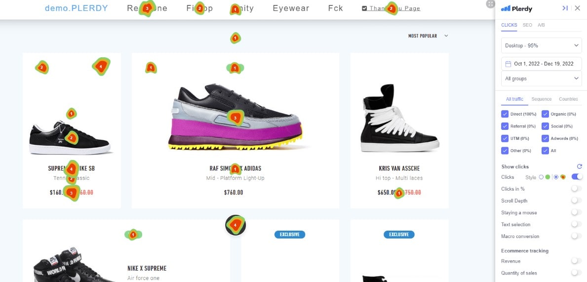
When you offer the same deal to everyone, you miss out on better conversions. People want to feel special, and personalized offers do just that. You can track user behavior with tools like Plerdy or Hotjar to see what’s grabbing attention. Did a visitor click on product X a lot? Show them a discount pop-up for that item next time. Netflix is king here—they recommend shows based on what you’ve watched. This targeted approach keeps users engaged and boosts conversion rates big time. A study from Salesforce shows that 72% of consumers only engage with personalized content. Worth trying, huh?
Use Dynamic Content
Static pages are boring, right? You gotta spice it up a bit! Dynamic content changes based on who’s viewing your page. It’s like having different versions of your site for each user, without extra work. Think dynamic banners or product recommendations—Amazon does this super well. If a user visited your pricing page twice, show them a special offer when they return. This helps drive conversions since you’re giving users exactly what they want—at the right time!
Optimize Checkout Process
Simplify Form Fields
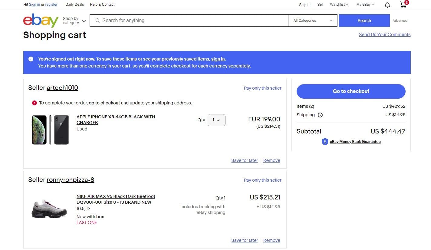
Let’s be real—nobody likes long forms, especially when it’s time to checkout, right? If your checkout asks for too much info, customers will bail fast. So, you gotta keep it short and sweet! Only ask for what’s essential. With tools like Plerdy, you can analyze where users are dropping off. That’s conversion gold right there! Studies by Baymard Institute show that 27% of customers abandon carts just because the checkout was too complicated. By cutting down the form, you boost conversion rates and make it easy for your customers to finish buying.
Provide Multiple Payment Options
Ever wanted to buy something but couldn’t because your favorite payment method wasn’t there? Yeah, that’s a deal-breaker. Offering multiple payment options can seriously bump up your conversion rate. Accepting credit cards, PayPal, Google Pay, and even Apple Pay keeps things smooth. Look at Shopify and Amazon—they offer a wide range, and it really helps their conversion rates. Having more payment choices means you reduce friction and give users no excuse to leave without buying.
Analyze Results and Iterate
Monitor Key CRO Metrics
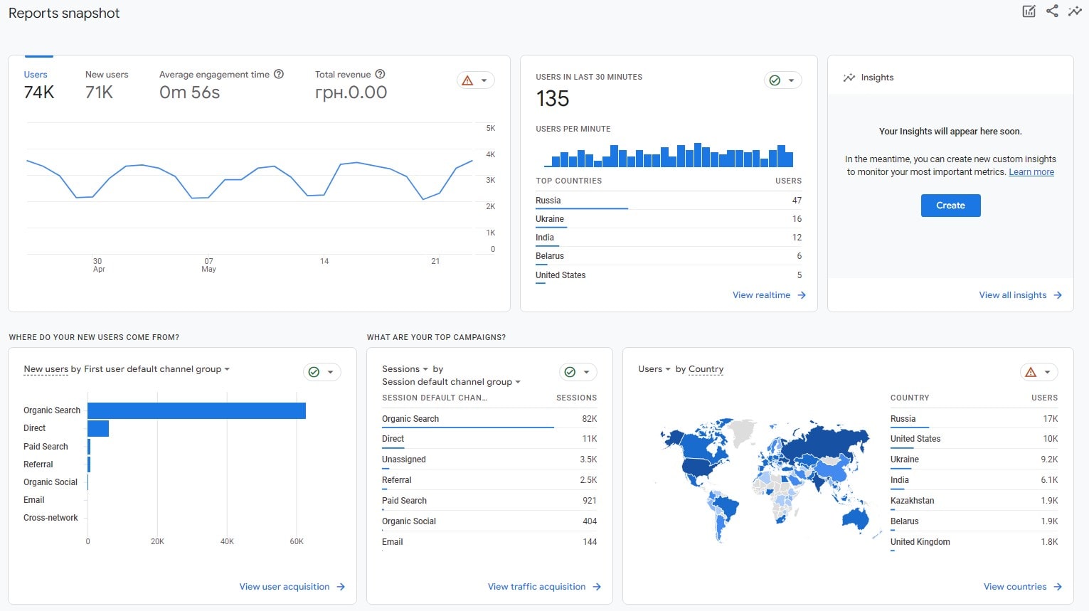
When you work on Conversion Rate Optimization (CRO), it’s not just a “do once and forget” kinda deal. You gotta keep an eye on key metrics like bounce rate, exit pages, and average session duration. These numbers tell you if your changes work or not. If bounce rate goes up, something’s fishy! Tools like Plerdy or Google Analytics make it easy to track these. Numbers don’t lie, right? A good conversion rate is around 2% to 5%, but always depends on industry. Look at your numbers regularly and adjust as needed. Don’t stress, just analyze!
Apply Data-Driven Changes
Once you got the data, don’t just sit there. Use it! Make those little tweaks based on what you learned. Maybe your CTA button isn’t big enough or your headline doesn’t grab attention? Change and test it again. Tools like Hotjar let you see where users click, so use that to make smart moves. CRO is all about experimenting, failing fast, and winning big in the end. Try things, see what works, and do more of it. No magic, just smart changes!
Conclusion
So, that’s the deal with CRO. It’s not a “set and forget” kinda thing. If you wanna boost that conversion rate, you gotta keep testing, tweaking, and learning. Remember, even small changes can make big differences! Don’t be afraid to experiment and fail—it’s all part of the game. Use Plerdy tools or Hotjar to stay on top of your numbers. And hey, always keep the user in mind, ‘cause at the end of the day, it’s all about them. Stay curious, stay flexible, and you’ll nail those conversions! Easy, right? Go crush it! 💪
