
People nowadays have the attention span of a fruit fly, especially when browsing websites overloaded with UX problems and poor performance. No offense. If we want users to stumble upon our page and actually STAY there, at least for a while, and pay attention, there are serious roadblocks to avoid when it comes to website traffic, user experience, and overall engagement.
That’s where usability research comes in handy. People don’t just browse. At least not in the traditional sense anymore. Rapid, binary decisions! Is the page worth their attention? Do they want to unsee this? Do they care even a little bit about what they saw? Are they looking at a video compressor or a subtitle generator? It only takes seconds (if that) to make the decision and your sales/reputation can be affected in the process of that one neuron firing back with “nah.”
NOTE: According to research by Nielsen Norman Group, users typically read only about 20-28% of the text on a webpage and instead rely on scanning patterns to determine relevance. Similarly, analytics data from Chartbeat shows that 55% of visitors spend less than 15 seconds actively engaging with a page, while HubSpot reports that over half of all website visitors leave within 15 seconds. If a page fails to communicate value immediately, it is effectively invisible.
Yes, we all know that if your website lags for any reason (human or otherwise, who cares), your potential clients can quickly become someone else’s potential clients. Poor website performance has become one of the fastest ways to lose users before they even meaningfully interact with a page. But other than that, what makes people leave the page? As mentioned, there are several culprits high up on the ‘most wanted’ list.
#1 Slow Loading Time
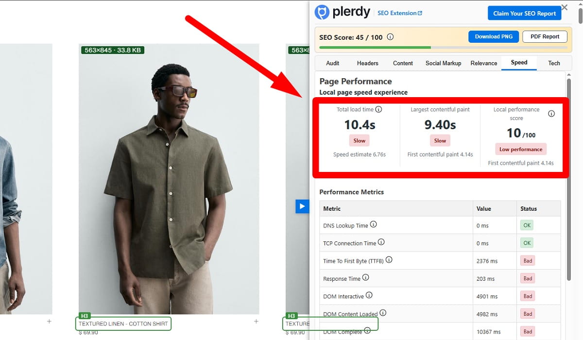
I couldn’t stay away and not describe it thoroughly. Oh, the mother of all online evil… Waiting. We’re no longer wired for that, forget it. People interpret waiting as an unnecessary hindrance to their lives and avoid it at all costs. Literally. A delay of even a couple of seconds can create the perception that a website is unreliable, outdated, and, frankly, not worth the effort.
NOTE: According to research by Google, as page load time increases from 1 second to 3 seconds, the probability of bounce increases by 32%. At 5 seconds, that probability jumps to 90%. Amazon and Walmart have both publicly reported measurable revenue gains from even minor speed improvements, reinforcing the connection between loading performance and user retention.
What makes loading speed particularly dangerous is that users often abandon a page before they consciously evaluate the content itself. They never even reach the value proposition. Large unoptimized images, excessive JavaScript, autoplay media, bloated plugins, and poor mobile optimization all contribute to delays that users increasingly refuse to tolerate.
#2 Unclear Value Proposition

The above-the-fold section of a page. That’s your gateway. It is also one of the most important elements affecting bounce rate reduction and visitor retention. If, within the first few seconds, users can’t answer the questions “What is this?” and “Why should I care?” they are not staying.
NOTE: The same Nielsen Norman Group has consistently shown that users rely heavily on headings, subheadings, and visual hierarchy to orient themselves. When these cues are vague or generic, comprehension drops sharply. Decoding ambiguity is your problem, not theirs. This behavior aligns with principles from information foraging theory, which suggests that users seek the highest information value for the lowest cognitive cost.
Hear me out. Generic, usually AI-generated phrases like “innovative solutions for growth” don’t fly. They perform poorly. They require interpretation. Can you imagine how motivated a person should be to dig deeper into what that phrase actually means??
#3 Visual Trust Judgment
Luckily we’re not conscious of this. This is one that our brain makes itself, and doesn’t really bother us with.
NOTE: A recent study by Lindgaard et al. (2006) showed that users judge the aesthetic appeal of a web page within 50 milliseconds. This is back by the Stanford Persuasive Technology Lab, which found that 75% of users assess a companies credibility by its website design.
So in essence, we can tune in or out before the idea gets to our lizard brain. So design is a trust factor. Poor typography, old-fashioned designs, too many stock photos, or loud, colorful designs can and likely will evoke an immediate sense of trust. Unless it’s intentional and involves brutalist design.
Now, this is not to be alarmist but once perceived as low credibility, it is unlikely to change in the same visit. Just some hard-wired risk avoidance. No one wants to spend time in a place that is not familiar or even potentially dangerous. Enter, bounce rates…
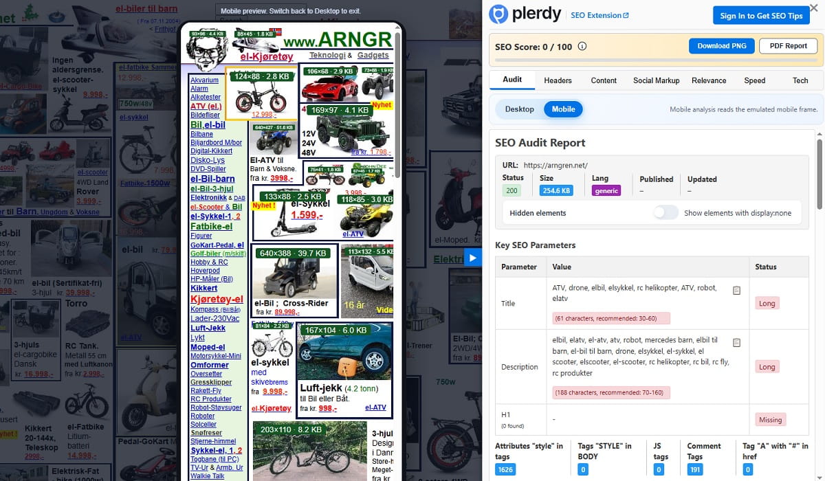
#4 Cognitive Overload
Put an average person in a supermarket without a grocery list, then just read it out loud to them once, then casually mention that guests will arrive in about an hour, and that several of their kids have different food allergies. Then watch them unravel and curl up on the supermarket floor in a fetal position. Why am I cruel? I’m not. Just an illustration of what cognitive overload does to people.
When the amount of information or the number of choices exceeds the user’s processing capacity, they shut down and dispatch the website with a click out.
NOTE: This phenomenon is well explained by Hick’s Law, which states that decision time increases as the number of options grows. In a web context, this translates into slower decision-making, increased hesitation, and ultimately abandonment. Nielsen Norman Group has repeatedly demonstrated that users prefer simple, structured interfaces and are more likely to disengage when faced with complexity. Conversion rate optimization studies show that reducing the number of choices or simplifying layouts can lead to measurable increases in conversions, often in the range of 10-30% or more, depending on the context.
#5 Intrusive Elements & interruptions
Pop-ups, interstitials and overlays that pop up BEFORE actually seeing the website. Interestingly, this topic has been brought up by Google, which has made it clear there are penalties for intrusive interstitials on mobile devices, due to user experience issues.
People wouldn’t mind so much, had it not been for the timing. Getting in the way before the value proposition. That’s what is frustrating and causing people to bounce.
NOTE: A/B test results from conversion rate optimization platforms indicate that delayed pop-ups (or pop-ups triggered by user behavior) do much better than immediate pop-ups, often doubling or tripling the conversion rate of badly timed pop-ups. On the other hand, immediate pop-ups tend to be associated with higher bounce rates, especially on smaller mobile devices.
As previously noted, users make an aesthetic assessment within about 50 milliseconds. After 3-5 seconds, they evaluate relevance and clarity. And within 15 seconds, most have either stayed or bounced. These time frames allow for the information processing and decision-making limits of the human mind.
#6 Lack of Mobile Optimization
This one sounds obvious until you realize how many websites still behave like desktop layouts awkwardly squeezed into a phone screen. Those tiny buttons, broken layouts, text walls, menus that require finger surgery, videos that refuse to scale properly… You think users don’t notice? They do.
NOTE: Mobile devices now account for well over half of global web traffic according to StatCounter and similar analytics providers. Google also shifted to mobile-first indexing years ago, meaning the mobile experience heavily influences search visibility itself. Poor mobile usability therefore damages both retention and discoverability.
Inconvenience is not even the first issue here. Mobile browsing happens in fragmented conditions. Let’s all remember public transport, queues, multitasking, noise, distractions, weak internet connections. People are already operating with reduced patience and attention. If a page forces me to zoom, reorient, or struggle with navigation, I will turn psycho very quickly, which is not helping anyone.
#7 Expectations Are A Great Evil
Ok, let’s not go evangelistic on the problem, but still, a mismatch of expectations is the first and one of the most critical drivers of instant abandonment, sometimes described in UX research as a breakdown in information scent.
Users, as gracious guests, don’t arrive at a party (meaning your page) empty-handed. Most already have expectations shaped by search engines, social media, or previous browsing experiences, which means website usability starts long before the page itself fully loads. But when the landing page does not align with that expectation, the brain registers a prediction error. Let’s refer to cognitive science for a second.
NOTE: The brain continuously anticipates incoming information and reacts negatively when those predictions fail. “Think with Google” research has repeatedly emphasized the importance of message continuity, noting that alignment between ad copy and landing page content significantly reduces bounce rates, while mismatches can increase abandonment by substantial margins depending on the industry.
In English that means the following. If a user clicks on ‘free tool’ and is smacked over the face with a paywall, or maybe they expected a beginner-friendly guide on ‘how to remove your appendicitis at home’ but find a guide to a mental institution, they won’t be bothered to reconcile the difference. They leave immediately and return to the search results. Simple cognitive contract.
Meeting all these thresholds is the key to a website that engages (or a website that is clicked away from) almost immediately. In many cases, small improvements in mobile optimization and clarity can dramatically improve whether users stay, interact, and return.
Otherwise, all hail the power of the exit button.