
![]()
In this case, we will review primary behavioral factors of users based on the data of click and scroll maps and present a list of recommendations on how to improve the web resource of our customer.
What makes a business customer-oriented? The focus on a consumer, the ability to hear them, but the most important is taking into account customers’ wishes. Companies that do everything possible to ensure this and are constantly developing have a strategic advantage over those that do nothing but promise and make claims.
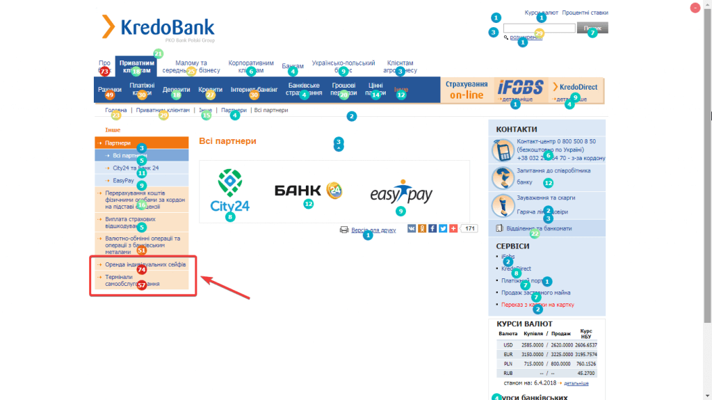
Over six months ago, the code of Plerdy was installed by the largest bank in Western Ukraine, Kredobank . In the previous year, this Ukrainian-Polish bank was named as one of the 5 most reliable banks of Ukraine.
They installed Plerdy click map to clarify whether their website for customers was really user-friendly and up-to-date.
As an experiment, we offered them to make a usability audit using Plerdy click maps. This way, we showed the benefits of Plerdy for website analysis. The collected data allowed us to assess the existing situation and prepare recommendations for further improvement of the web resource.
This case includes only the part of the audit that clearly showed how the click maps work and conclusions based on its data. In particular, let’s take a look at the main peculiarities of users’ behavior on a few key pages of the web resource.
Step 1. Usability audit of the home page
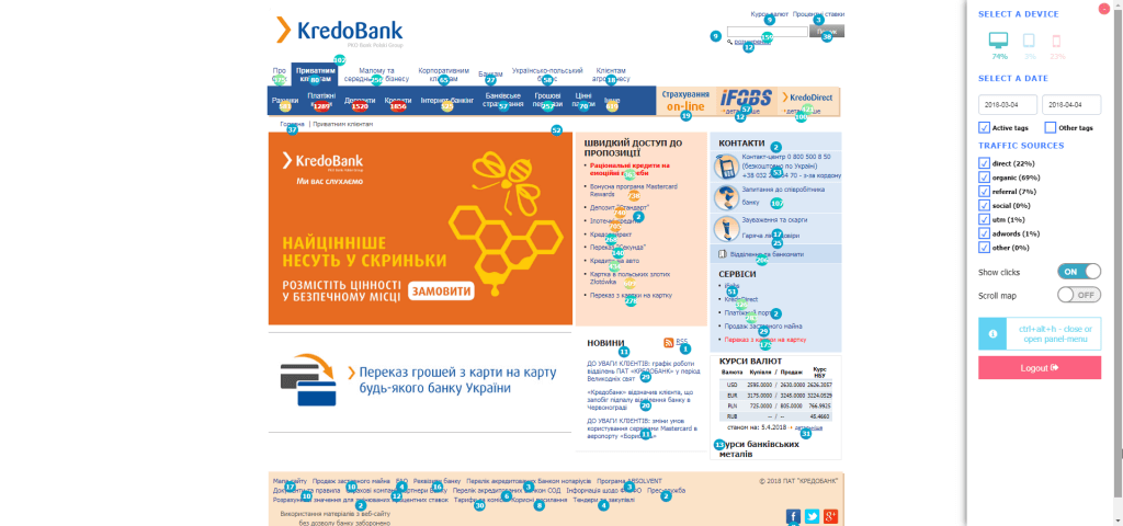
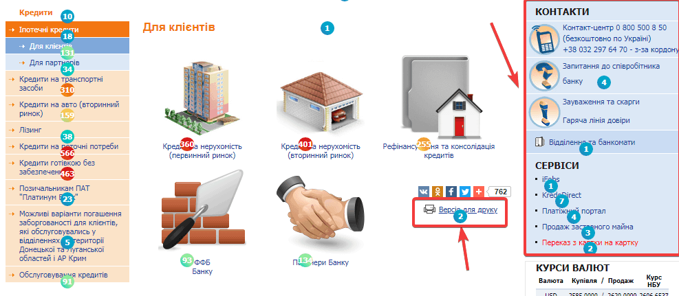
Our review starts with the usability audit of the home page, as it is the most clickable of all pages of the web resource.
We studied user behavior data collected during one month. This time is absolutely sufficient for the first testing. We managed to identify the main trends and create tips on further improvement of the web resource. Yet it is worth noting that for more deep research it’s better to take at least a three-month period.
The primary considerable flaw of the site is that it still doesn’t have a responsive version. Obviously, due to the current mobile traffic growth, this factor does nothing good for our customer.
To understand how visitors see the web resource, we prepared a screenshot with the most popular display resolution of modern smartphones:
As you see, the screen includes only a part of the page, so mobile device owners have to scroll the page both vertically and horizontally.
This is a considerable drawback and we hope that in the nearest future our customer will definitely take it into account.
Now, let’s view the same page on a desktop:
All main information is placed in a way to allow going to any section of the site from the home page. Probably, this solution was chosen with the best intentions, as according to the initial idea, visitors could quickly switch using the navigation menu.
Yet, actually, such approach also has a substantial drawback. The home page is overloaded with extra information which distracts from target actions and affects the conversion rate.
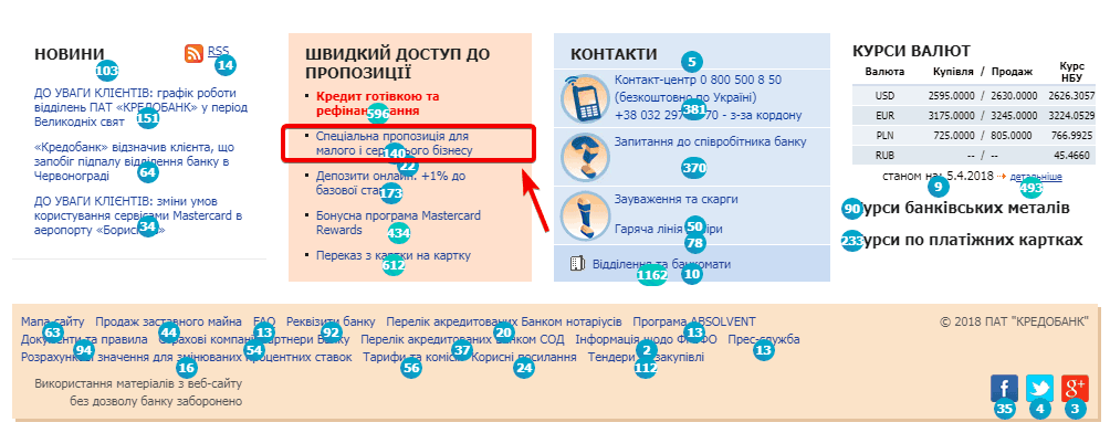
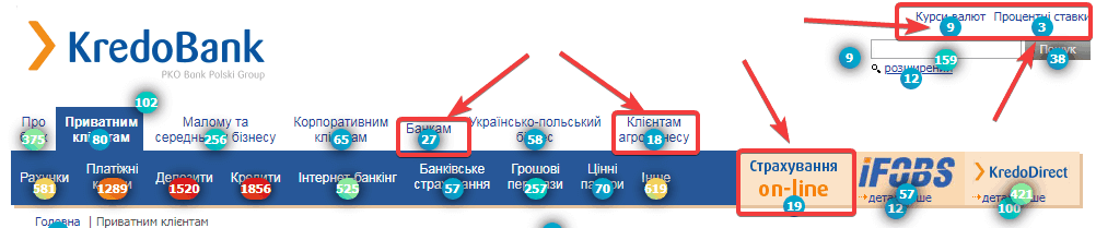
Let’s do the usability audit starting from the top of the page (which is often called a “header”). We will try to define both useful and unnecessary elements.
First, you notice the top left corner. Usually, here the company’s logo and name are placed, as this point is best remembered by users. In our case, here is an appeal.
Interestingly, but despite being unclickable, it was clicked 289 times for one month only.
You can only guess what the website visitors wanted to see, but these data help to understand that it’s better to use this place as intended and put here the logo with the name of the bank.
As experience shows, slogans and other appeals to the audience should be placed under the logo or as the main website banner.
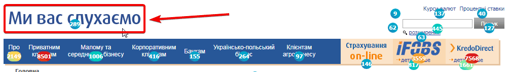
Another issue that cannot go unnoticed when you look at the web resource for the first time is the absence of contact info in the header. Usually, here companies indicate the phone numbers of their hotlines or other ways to get in touch with them.
In this design, such information is put as a separate block in the central part of the page. This makes the interaction with the web resource more difficult, as for customers who want to call or contact bank managers right away it’s important to notice the contact info as soon as possible.
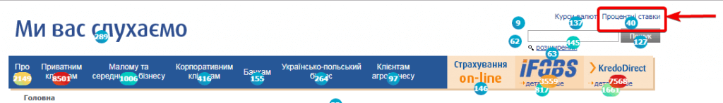
In the top right corner, there is a link to the “Interest rates” section which was followed only 40 times during the month. If to compare with clicks on other elements (including the sections of the navigation menu), it becomes clear that this link isn’t really important for the major part of the target audience:
Let’s look at the navigation menu.
Here 2 sections with minimum clicks can be easily noticed:
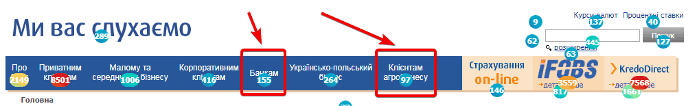
Such results show that the offered information either targets a small segment of visitors or doesn’t attract the attention of users for whom these sections were created at all. Probably, the “Agribusiness Customers” section becomes useless on the home page and considering its structure it could have been included in the SME section of the menu.
“Insurance online” is another interesting element of the navigation menu with the lowest number of clicks that attracts our attention.
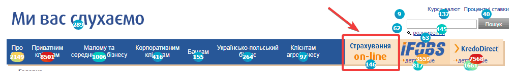
The low click-through rate means that the target audience doesn’t open this page of the website. At least, not from the home page. Most likely, the interested users start researching about insurance in a search engine and find this page without going to the home one.
To attract attention to this service, it’s better to promote it separately with the help of banners and SEO and remove the corresponding element from the navigation menu.
Now, let’s go to the central part.
Here the RSS feed function has a noticeably low click rate.
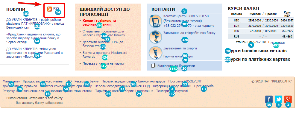
The thing is that this type of subscription to updates has already become outdated. The modern communication with customers is made with the help of email newsletters, push notifications, chats etc. Hence, this element has absolutely no value and can be removed.
Checking separate dynamic elements we noticed a quite unusual way of expanding a window. After you hover over the selected piece of news, the window with the “More details” link opens:
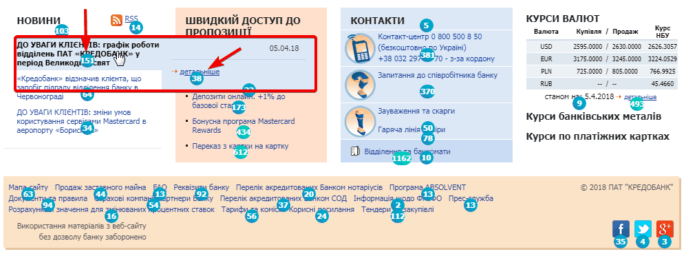
Most probably, this function has remained from the times when the site was built and has no practical value. Such elements should be removed as generally they also affect website usability.
As already noted above, the home page is overloaded with information which hinders visitors’ focusing and adversely affects the conversion rate of target actions.
A conspicuous example is one of the menu sections “Quick access to offers” which got the least clicks:
The problem is that interested users may just fail to notice such information in a whole mass of offers. It could have had a higher conversion rate if the elements were placed differently. By the way, if this function isn’t important for the target audience of the site, it’s better to put it in a separate section. Such seсtion will get a much higher percentage of conversions from search thanks to SEO.
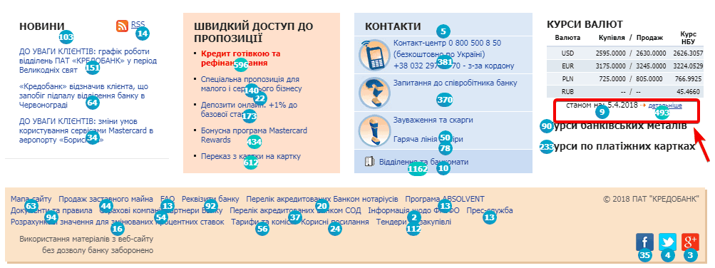
The usage statistics of the special currency rate widget in the bottom right corner is also interesting. Generally, this is one of the most clickable elements of the main part of the page. Yet, its place isn’t the best one.
As you see, visitors are really interested in the currency rate, so it would be great to improve the design of the widget and place it more properly:
The last block of the home page is a footer. It has links to other less important sections:
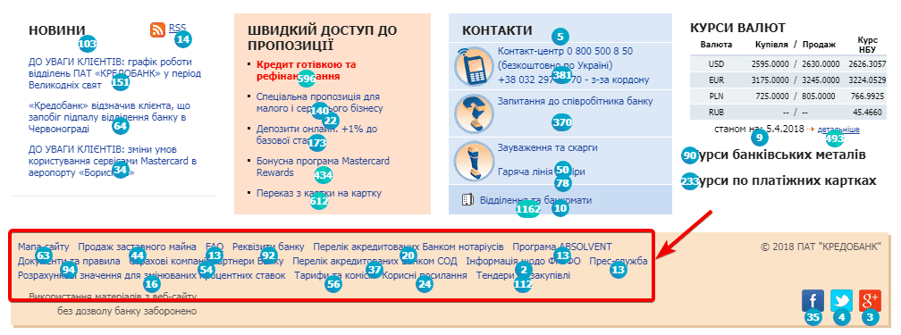
The footer is also overloaded with information. A part of the links has a low click-through rate and some haven’t got a single click in a month. This allows us to conclude that the footer should include only the links that can be important during the first visit to the site. The rest of the links should be distributed among other pages.
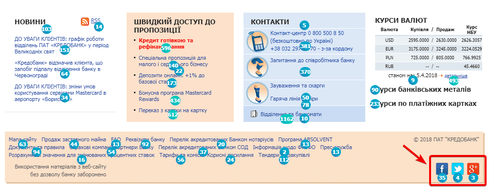
There used to be a tendency of adding as many social networks as possible, which made many website owners add different channels of communication with the target audience. Yet, based on experience and the click map, we can state that not all channels are popular with visitors:
So we reviewed the main elements of the home page and found out that some of them don’t fully perform their functions. Moving them to other parts of the website will allow us to improve the model of user behavior and reduce the volume of unnecessary information.
Let’s take a look at the results of other pages with the highest number of conversions from the home page. Additionally, we will try to trace the route the majority of visitors follow on this web resource.
Usability audit of popular pages
Another page with a high click-through rate is “Private Customers”:
Again, let’s analyze the structure starting from the header.
Here, we first notice a considerably lower click-through rate of the elements that also weren’t really popular even on the home page:
This allows us to state that the segment of the target audience that identifies itself as private customers skips the sections oriented towards other user segments. It is also worth mentioning the “Insurance online” block that could have had better results if it was promoted as a separate special service.
Other elements of this page are placed similarly to those on the home page, so the recommendations for them are the same.
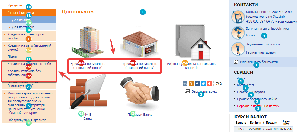
Let’s trace the further visitor’s route. The “Loans” section gets the most clicks.
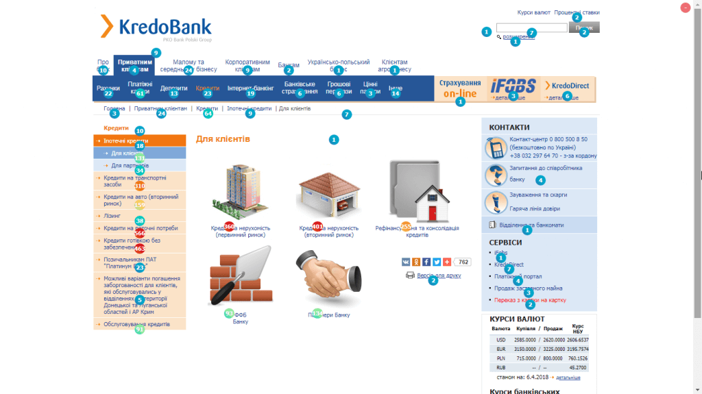
The structure of this page already has some characteristic features and differs from the previous two. Our attention is focused on big images with the names of the main subcategories.
Obviously, the website visitors that are interested in loans go to this page to find answers to some of their questions.
If you look at this section on a scroll map, you can notice in which portion the most clicks are focused:
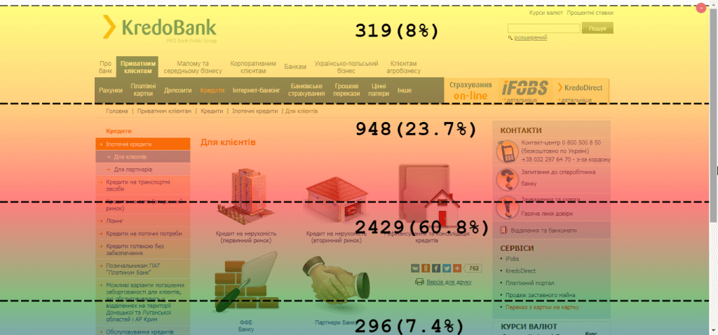
The third portion is the “hottest” part with over 2400 clicks per month.
However, we still have a few significant comments about this page.
Firstly, the Print version option. This is quite a strange choice as the page doesn’t have texts that hypothetically may be used in print.
Secondly, the “Contact info” block that takes a great portion of the page on the right but has almost no clicks. As already noted above, the contact information should be put in the top of the page:
Among very popular (clickable) sections there are two menu elements and two subcategories.
As you see, they have the highest rates. However, the structure of the menu can be modified based on the popularity of each element. The most clickable elements should be put higher on the list and less clickable – lower:
Let’s go to the next page with the largest number of conversions per month and see the choices of this segment of the website’s target audience. This is the “Consumer loans” page (Loans on current needs):
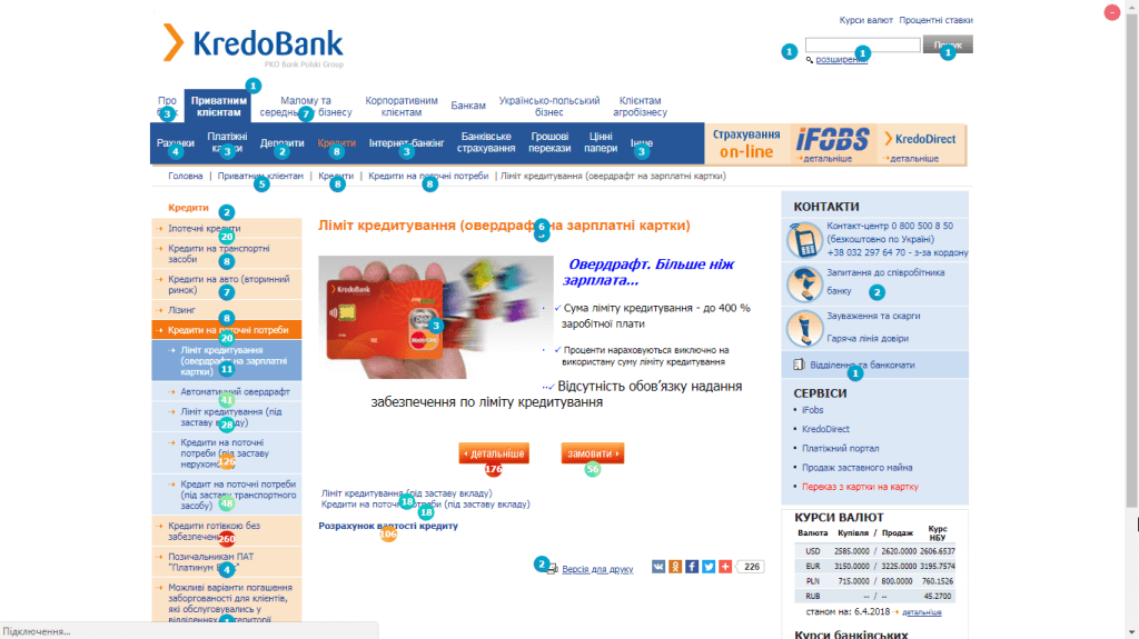
As you see, here there is a short description of the service with an offer to learn more or place an order. A big portion of users went to the page with additional details:
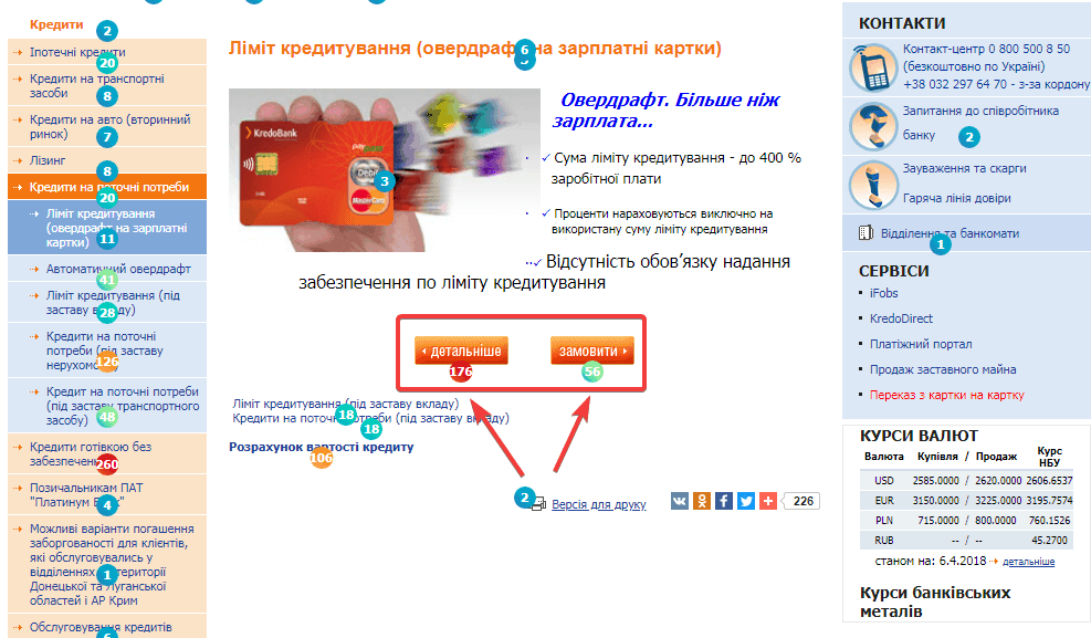
The experience of work with the usability of online stores shows that the use of two buttons of the same size and color is extremely unrecommended. The placement of two or more similar elements decreases the conversion rate, as users are forced to choose between several equally important actions.
That’s why there must be only one prioritized button on a page. All other buttons have a supporting role, so they necessarily must differ both in size and color.
Opening the page users first must see a good description of the service with the Order button. The second option (“More details”) should not distract the attention of those users who are already ready to order the service.
The following comment is about the “Other” section which got 619 clicks.
Below you can see what exactly the users were looking for:
The information the users were most interested in is at the bottom of the side menu.
Whereas the least interesting information is located in the center. This means that the elements on the page are distributed in a wrong way.
Conclusion
We reviewed several important pages of the bank’s website and noticed a set of peculiarities that must be corrected on the level of its structure.
Let’s sum up all the recommendations made, starting with the most significant ones, related to both website promotion and usability improvement:
- Adaptive version. This is Google’s mandatory requirement for better ranking. The number of users that browse on mobile devices will increase year by year. The absence of a responsive layout can result in a high bounce rate;
- No unnecessary information on the home page. The home page should include only the information important for visitors who start their acquaintance with the bank and want to learn more about its services or benefits;
- The number of the hotline must be in the header. The contact information is crucial to users as well as the opportunity to promptly get in touch with the bank;
- Navigation is for quick search. There is no point in using the navigation to promote certain services or features as this won’t give the desired effect;
- The page with an offer should have only one CTA button. The other buttons should differ from it and perform a supportive function. Otherwise, users will lose focus;
- Remove unimportant and outdated elements. The less extra steps, the better conversion within the site.
These are the main conclusions we drew having acquainted with the click map of the several pages of the website. We didn’t complete a deeper usability analysis which includes the review of different user groups segmented by a traffic type and a device.
To make a full audit, it’s not only necessary to analyze the design and structure of a site but also define the routes of every segment of the target audience.