
Improving the UX of a website is an ongoing process, ⚡ from the moment it’s created to during SEO and Google Ads campaigns. Analyzing micro and macro conversions and user behavior is important to ensure your website meets your goals. A UX audit can provide valuable insights and recommendations for optimizing your website’s design, functionality, and user flow. This article will explore some examples of UX audits and the tasks and goals involved. From heatmaps and user testing to accessibility and performance audits, you’ll discover ways to enhance your website’s UX and boost your business’s success.
What is a UX Audit?
A UX audit, a UX review, is a vital quality assurance process for a website and online store. It aims to pinpoint problematic website areas that cause users’ headaches and impede conversions. With empirical methods, auditors test and analyze various aspects of the product to identify user pain points and business value opportunities. The UX audit report generated at the end provides actionable recommendations for improvement, including fixing broken links, addressing design inconsistencies, identifying bottlenecks in the customer journey, ensuring legal compliance, and more. The ultimate goal is to make the website more user-centered, intuitive, and aligned with business goals. Such UX audits should be done based on heatmap data, video sessions, custom events, and more from Plerdy. Startups, in particular, can benefit from a UX audit to ensure their innovative products are usable and intuitive.
UX Audit Checklist
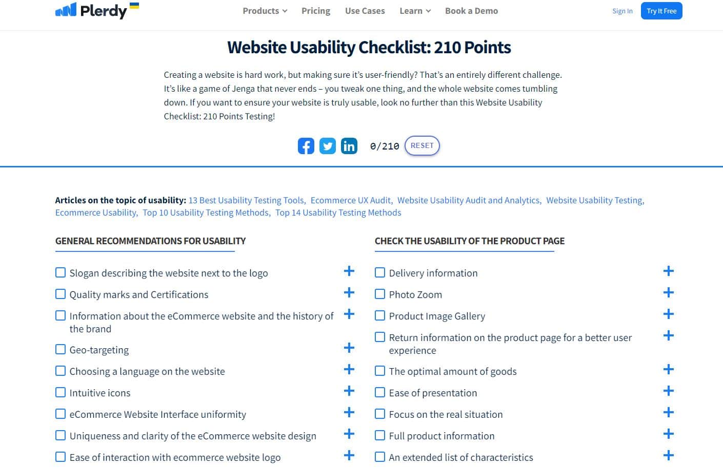
Creating a user-friendly website is crucial to the success of any online business, and conducting a UX audit is an essential step toward achieving that goal. A UX audit checklist is a comprehensive list of items that need to be checked to determine the usability of a website. This checklist is a powerful tool for identifying areas of improvement and making data-driven decisions to enhance the overall user experience. For example, some items that may be included on a UX audit checklist are slogan descriptions, quality marks and certifications, information about the website and brand, intuitive icons, user-friendly design, and honest buttons. By going through each item on the checklist, you gain clarity and actionable steps on what to do next with your product, design improvements based on data and feedback, and ultimately increase the profitability of your website.
How to Conduct Website UX Auditing?
Conducting a website UX audit is crucial to ensure your website meets user expectations and performs well in terms of business objectives. Before conducting a UX audit, it’s important to understand the parameters of usability and how they apply to your website. Typically, a UX audit is conducted as part of the QA process for significant updates or redesigns or periodically to ensure the website meets objectives. The audit can be performed in-house by design teams or external auditors.
To prepare for a UX audit, you must have user personas, clearly defined business goals, product data and analytics, previous audit results and changes, audit constraints, deliverables, deadlines, and stakeholders. It’s also essential to have a UX audit strategy in place before conducting the audit.
Usability testing ensures your website design meets effectiveness, usefulness, and relevance criteria. An effective website should exceed user expectations and help visitors quickly and easily complete tasks. A useful website should provide users with the necessary information promptly. At the same time, a relevant website should fully meet user needs and provide clear answers to search queries. By conducting a comprehensive website UX audit, you can optimize your website’s performance and ensure it meets user and business objectives.
Why do You Need UX Analysis?
Websites need UX audits. Today’s fast-paced world only tolerates a convenient website and rapidly moves to the more user-friendly competition. Visitors needing help discovering information will depart and find a website that openly delivers that information to them. A website that doesn’t answer visitors’ questions or provides useless information will lose customers. UX audits improve user experience and benefit customers and your staff.
UX audit benefits:
- Product direction and actionable steps
- Data-driven design, not assumptions
- Locating your product’s biggest pain points
- Understanding user behavior and customer values
- Improved design and interface reduce development expenses
- Retaining, activating, happy, and successful customers
- Boosting product profitability
Two consumer goods outlets with expert and bad salespeople illustrate the importance of UX and usability audits. Visitors who receive clear, detailed, and thorough product information will buy. But, the salesman who communicates well will win.
How to Prepare for a UX Audit?
Before starting a UX audit, do your research and prepare. UX audit preparation tips:
- Set company goals: Define your expectations and link them to conversions, income, and customer happiness to make the UX audit successful.
- User needs: User personas help you understand users’ backgrounds and habits. Check if your users match your intended audience.
- Update product data and analytics: Use click tracing or heatmaps to see how users explore your website and whether any adjustments are needed.
- Carry out heuristic evaluations: Test your website’s usability to measure whether your website is user-friendly.
- Compile findings in reports and make recommendations: Based on the results of the UX audit, compile a report of the findings and recommendations for your website improvement.
- Prioritize and apply recommendations: Prioritize and apply them to your quarterly roadmaps or as needed.
- Include previous UX audit and review results and changes: Include any previous UX assessment reports and changes made to your website in a report.
- You should also include deliverables, deadlines, audit constraints, and stakeholder information.
By following these tips, you will be better prepared to conduct a UX audit, improving user experience and increasing customer satisfaction.
How to Hire a UX Expert?
Hiring a UX audit expert can be daunting, but it’s critical to ensure the success of your project. To find the right UX designer for your team, follow these steps:
- Establish your website’s fundamental requirements and objectives and the key procedures in which the UX expert should be involved.
- Create a detailed list of needs to ensure you hire the finest person for your website. Examine the candidate’s backgrounds, talents, abilities, and personality traits, and remember to review their portfolios and cases.
- Choose the channels to use for candidate searches. For example, you may locate UX specialists on social media, freelance websites, and business directories.
- Create a well-structured contract that outlines the major terms of employment and the duties of the UX audit expert as soon as you’ve located the ideal applicant.
- Onboarding your new UX designer is crucial to their success. Introduce them to the team, explain the company’s vision and goals, and show them the website they’ll work on.
- Regularly assess and analyze your UX audit expert’s performance to ensure they meet your expectations.
Hiring the right UX designer for auditing can seriously affect your website, saving money, time, and effort. To minimize these risks, take the time to find the right candidate for your team.
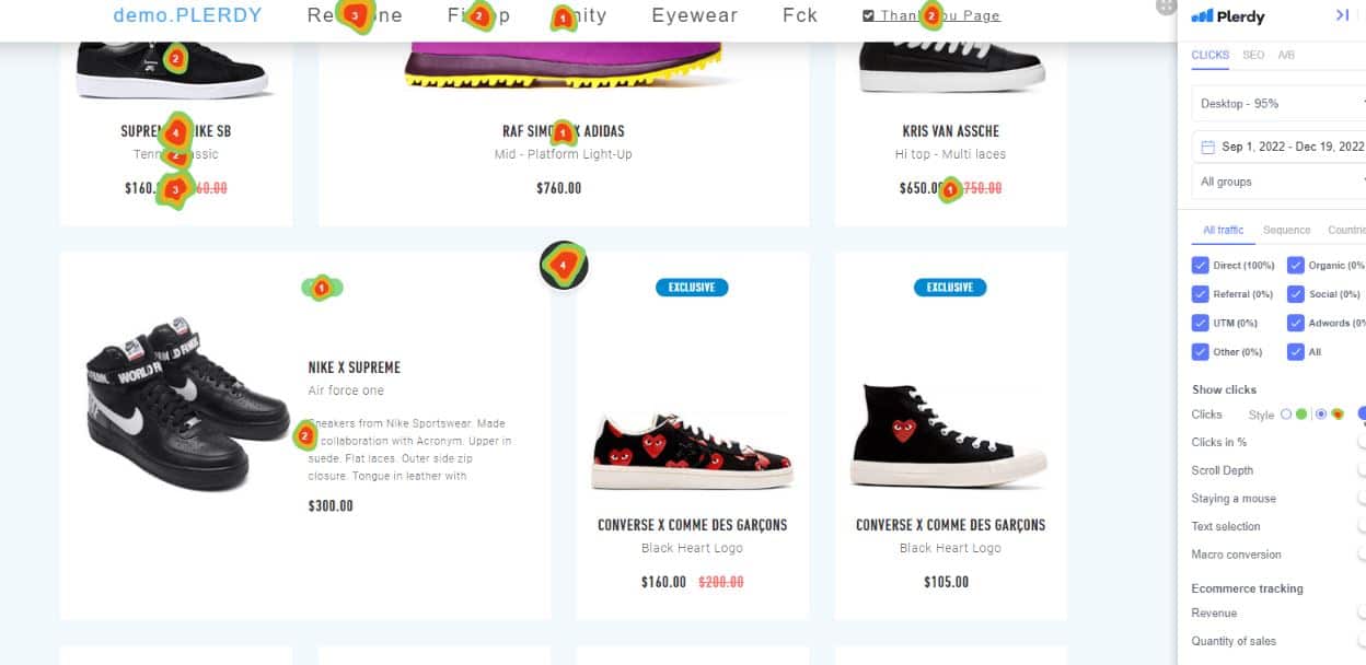
How to Analyze Heatmaps for a UX audit?
Analyzing heatmaps is crucial for improving UX on a website. It shows where users clicked, scrolled, and stayed, providing valuable insights for a UX audit. In this guide, I will go over the process of analyzing heatmaps using Plerdy as an example.
First, choose the time range for your UX audit. Having enough data to make meaningful decisions is important, so select bigger time ranges if your website has low traffic.
Next, check the overall UX audit statistics of your website user engagement, including the total amount of clicks, sessions without clicks, and sessions that were only on one page. High percentages of sessions without clicks or on a single page indicate poor website traffic quality.
The heatmap view displays a list of website pages, starting from the page with the most clicks and heatmap data. Clicking on the arrow displays the heatmap in a new tab, showing hot spots on website elements with varying sizes, depending on the number of clicks.
Additionally, you can switch to other views, such as click-in % view, scroll depth report, and mouse movements view, which provide information on the attribution of clicks, scrolling behavior, and mouse movements on website sections.
To effectively analyze UX by heatmaps, consider the following conclusions and actions:
- If users don’t click on an expected element, change the CTA or move it higher
- Move important blocks higher on the page to ensure users see them
- If users immediately find the necessary information on the first screen, there is no need to scroll
- If users click on a non-functional element, it isn’t very clear and needs improvement
By analyzing UX audits based on heatmaps and taking appropriate actions, you can significantly improve user experience on your website.
How to Analyze Session Replay for a UX Audit?
Analyzing session replays is essential to ensure your website’s top-notch user experience (UX). Plerdy Session Replays are an excellent tool to analyze user behavior (UX) and spot any problems, pain points, or bugs that users may encounter. To analyze the replays, navigate to the Session Replay tab and select List of video sessions. UX auditing starts by reviewing the three critical statistics:
- The average session duration;
- The number of sessions without any events;
- The number of sessions is shorter than 15 seconds.
If these metrics are unsatisfactory, you must dive deeper into the session replays to identify the pain points.
In the table below, you will find a list of the session recordings with detailed information such as pages visited, session date, length, location, and user ID. You can open the session replay by clicking the play button for the whole session or a specific page. The deselect function can audit UX by specific events separately during the session replay. Additionally, you can view unique user information such as location, session date, traffic channel, screen resolution, operating system, and browser. Lastly, you can add tags and comments to the session replay to similar group recordings and filter them later.
Analyzing session replays requires watching the sessions and observing interesting behaviors or problems. You can also view the heatmap for a specific page to get a bigger picture of the user interactions. Following these steps, you can identify and solve any UX issues on your website, ensuring a seamless user experience for all visitors.
An Example of a UX Audit of the apple.com Website
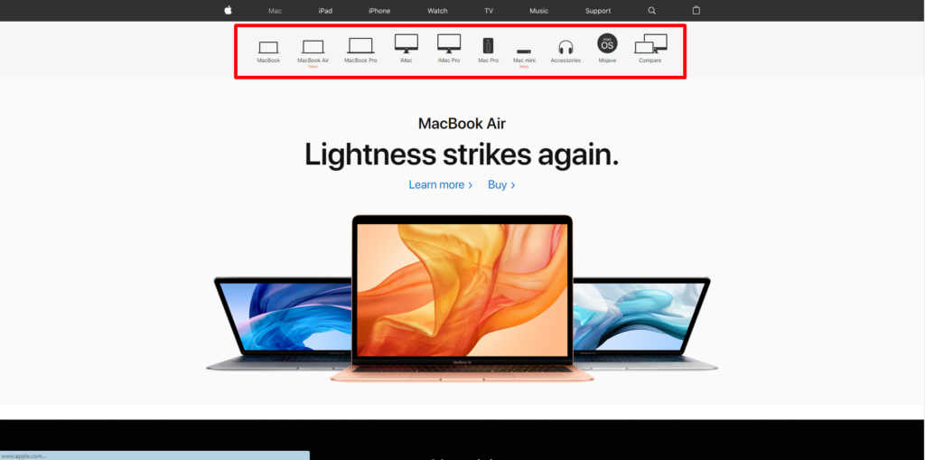
Let’s proceed to the practical part and see how UX auditing is conducted. I decided to take the Apple website as the UX auditing subject. Here is what I’ve discovered:
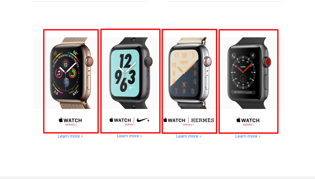
1. The menu highlighted in the image below should be pinned on the category pages since, after scrolling, it disappears.
2. For example, to enhance UX in the Mac category, the website owners need to create an Н1 relevant to the category.
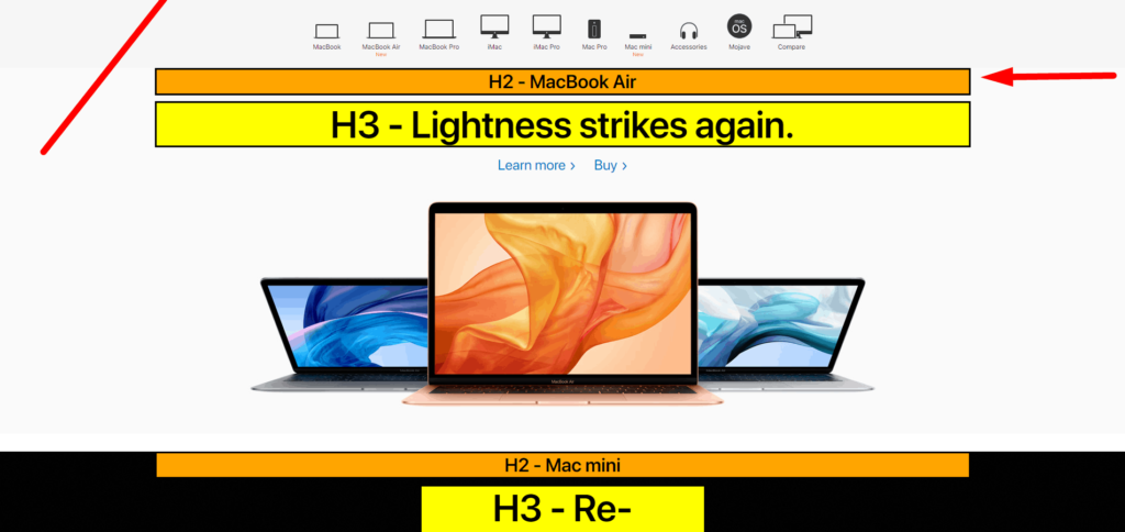
3. The product page needs to have the right order of headers. For example, the H1 much go first and then the others. Moreover, tags have the same content, which is a duplicate element.
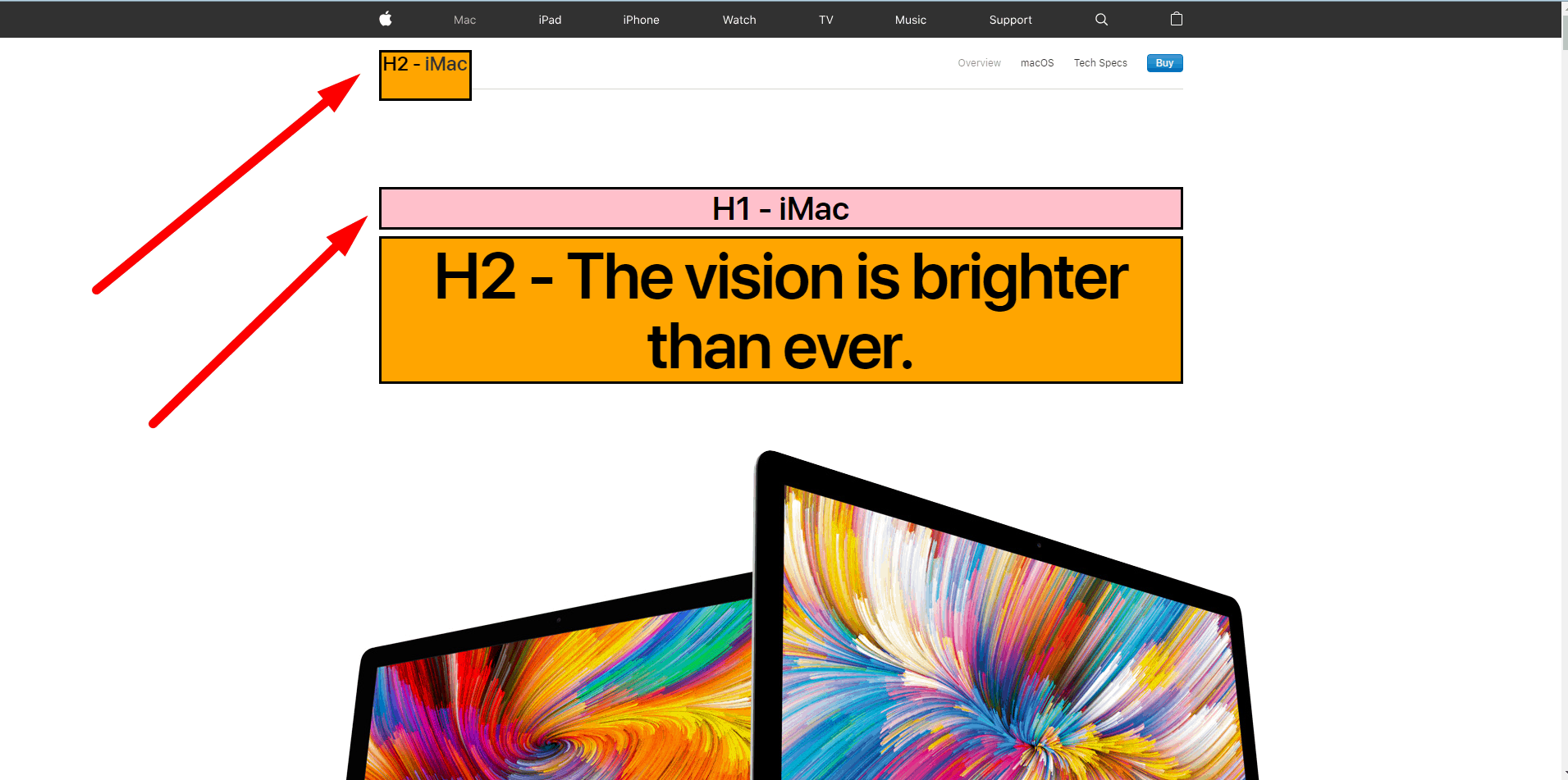
4. The header shouldn’t include icons.
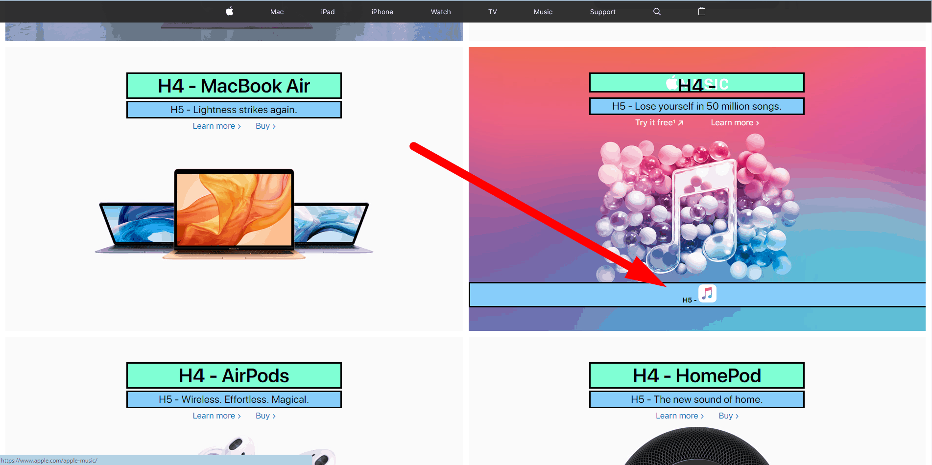
5. Each element of the block is active and has links.
Apple.com should remove this text for more effective SEO advertising.

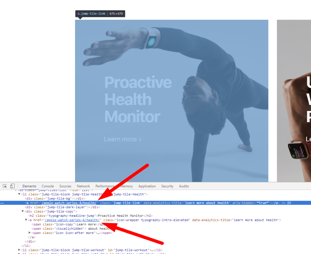
6. These elements should be converted to span, preserving the style.
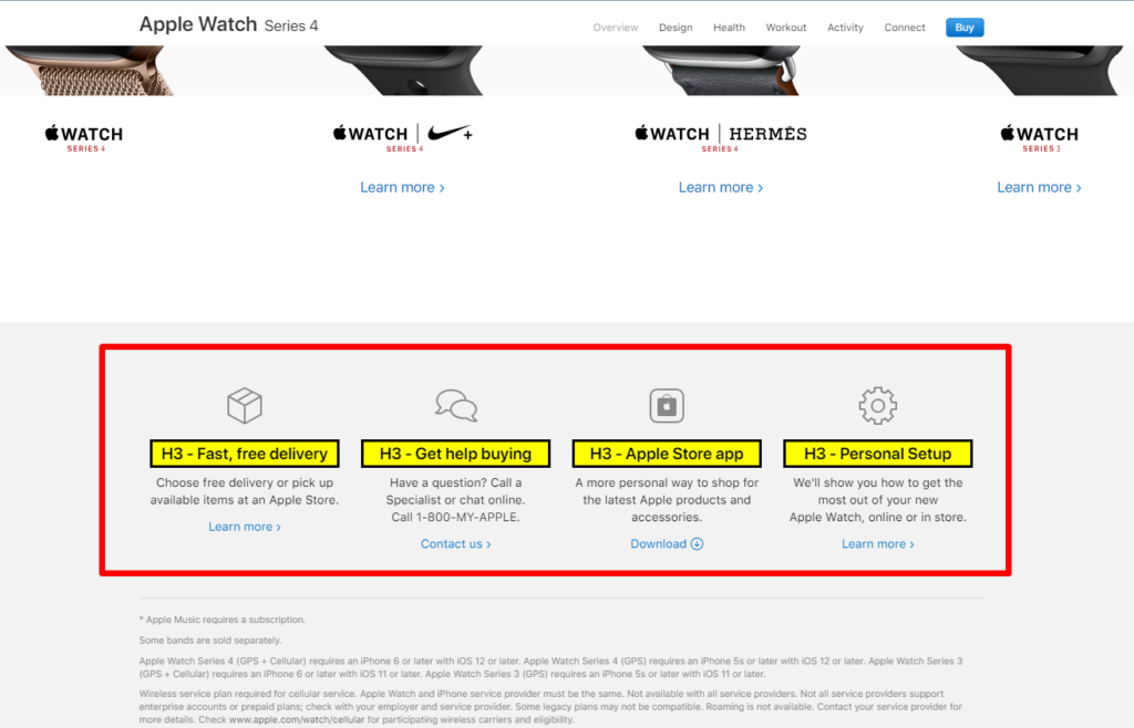
7. These blocks should be active.
8. Too large photos and excessive space between the blocks significantly increase the scroll length, so much hated by users. Apple.com must add the Up button, inevitable with such a scroll depth.

9. Since the scroll length on every page is quite big, users have to return to the top to go to another page, which is inconvenient.

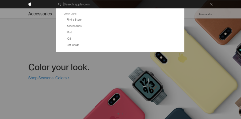
10. The search is also worth attention. It provides various search suggestions. After the SEO audit, I recommend adding ten phrases popular among users.
11. If you go to the cart without adding a product, you will see the message that the cart is empty and invited to Apple’s accessories store with a common online store design.
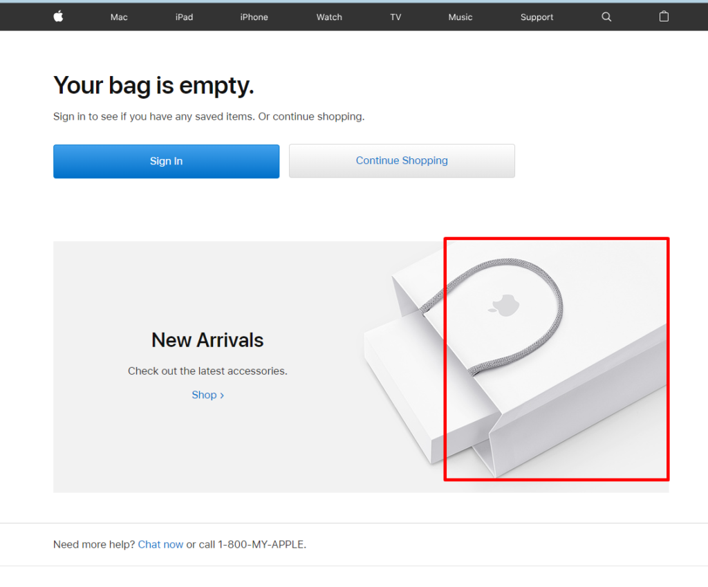
The cart should display the list of all categories.
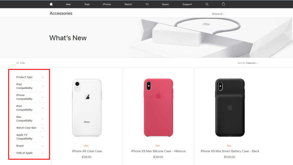
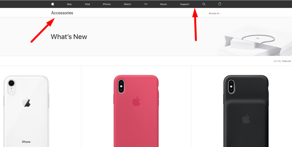
12. The H1 header should be added in the Accessories store.
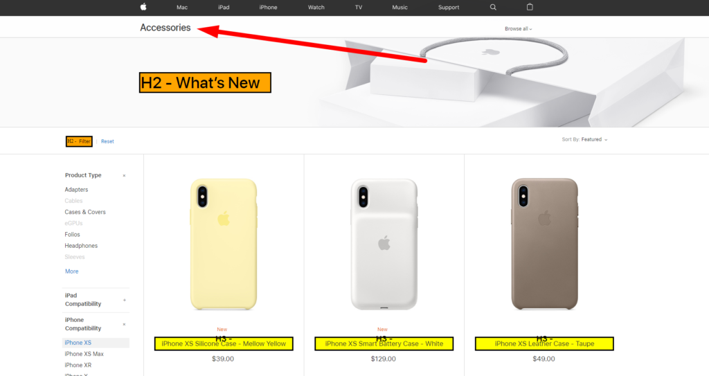
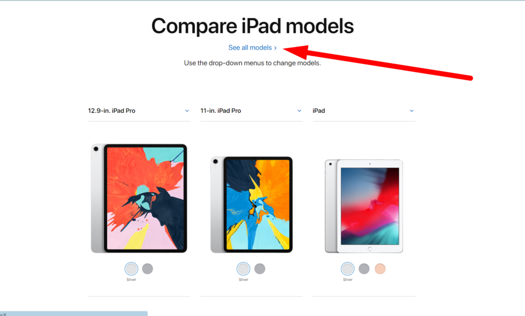
13. The iPad page should include all models, whereas the See All Models button must be removed. The thing is that there are only five models, three of which are immediately displayed.
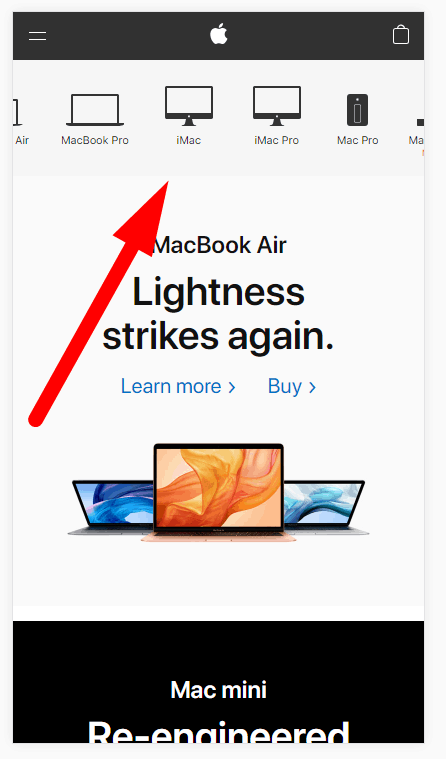
14. Adding the link to the Accessories store to the main menu would be great since the section can be accessed only from the cart. This is a thought-out solution based on the idea that users can buy the necessary accessories when they finish the order. However, users with Apple devices who need something additional may need help.
So, our UX audit has revealed weak points in the Apple website’s usability. Fixing them will ensure a greater user experience for Apple’s website users.
UX Audit of the Mobile Website Version
During UX auditing, the usability of the website’s mobile version should be considered separately. Below go the preferable adjustments:
1. The menu should be cropped.

2. The menu is scrolled right or left. It would be more convenient if the icons were smaller and didn’t require scrolling.
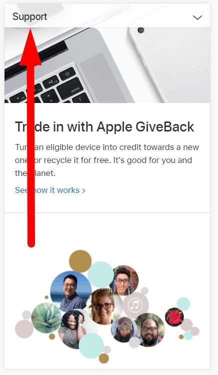
3. Again, the main menu is unpinned. Causes the same inconveniences as in the desktop version.
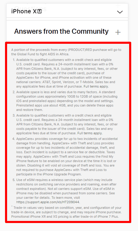
4. The text should be hidden with the help of a drop-down. It’s better to display the first paragraph and the rest after clicking the Read More button. This will significantly reduce the scroll length and positively impact the search engine advertising of the website.
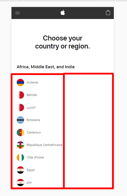
5. The county selection list should be divided into two columns.
That’s it for the mobile version UX audit. Making the suggested adjustments could significantly enhance the user experience on the Apple website.
Conclusion
UX auditing is a highly complex and essential task that digital marketers and companies should perform to keep their websites up-to-date with the latest design trends and satisfy their users. During the UX audit, you should use advanced tools to analyze and evaluate macro conversions, user behaviors, and pain points to gather the necessary information and suggest the best ideas for improvements.
Plerdy is a highly recommended service that can help with this task. So, take advantage of this tool to ensure the best results in terms of UX for your website.