
Every tool used by online marketers requires not only knowledge but skills. The same relates to Plerdy service. Hence, to demonstrate how to properly use this click heat map for website usability analysis, we have prepared the example of a user experience audit. It will help you to understand how to assess clicks on the pages of your project.
For this overview, we have taken the page of a travel agency.
First of all, we were interested in two questions:
- Which elements collect too little or no clicks?
- Are there any places on the site that get clicks but have no function?
To conduct the analysis, we turned on the simultaneous display of the “Active tags” and “Other tags” results.
This opened the click map of the page for the chosen period (06.06-06.07.2018):
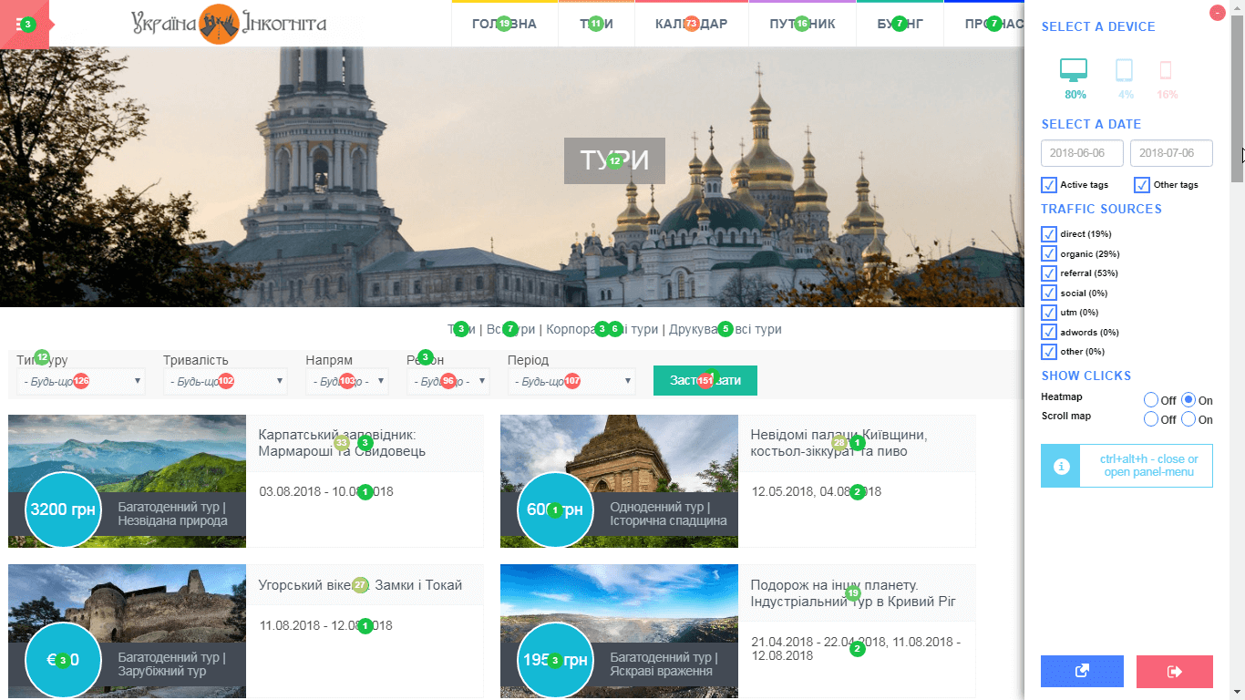
Let’s analyze the results of the user experience audit. We will go from top to bottom and from right to left.
The first element with a too low number of clicks is the menu button in the top left corner:
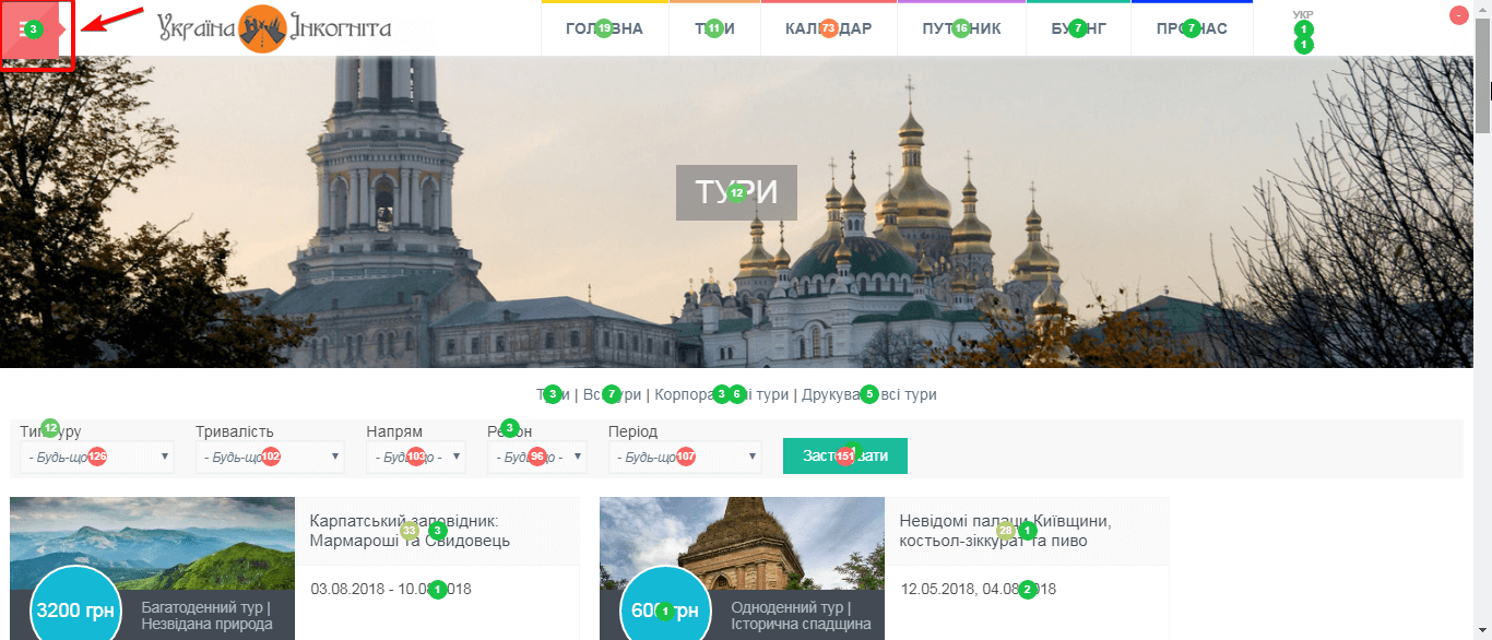
In one of our previous articles, we have already mentioned that users often ignore such navigation element (it’s called hamburger) if it has no label.
Since other elements of the navigation menu are in place and have typical rates, we go to the clicks on the central image:
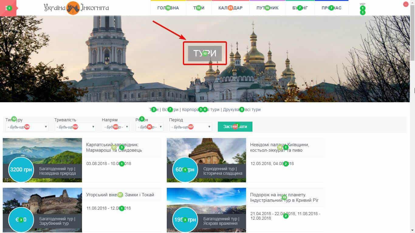
As you can see, during one month users tried to click the word “Tours” 12 times. But this isn’t a button…It’s just a caption. Obviously, users perceive it as one of the navigation elements.
There are two options in this case: you can place there an offer and make the banner clickable or remove the image at all since it takes too much space and has no practical use.
Next, let’s look at the elements of the small navigation menu:

As you see, they are not frequently clicked, and it’s not surprising. For example, the first element “Tours” links to this very page. Such button has little sense.
Another area with the list of filters has one of the highest numbers of clicks on the whole page:
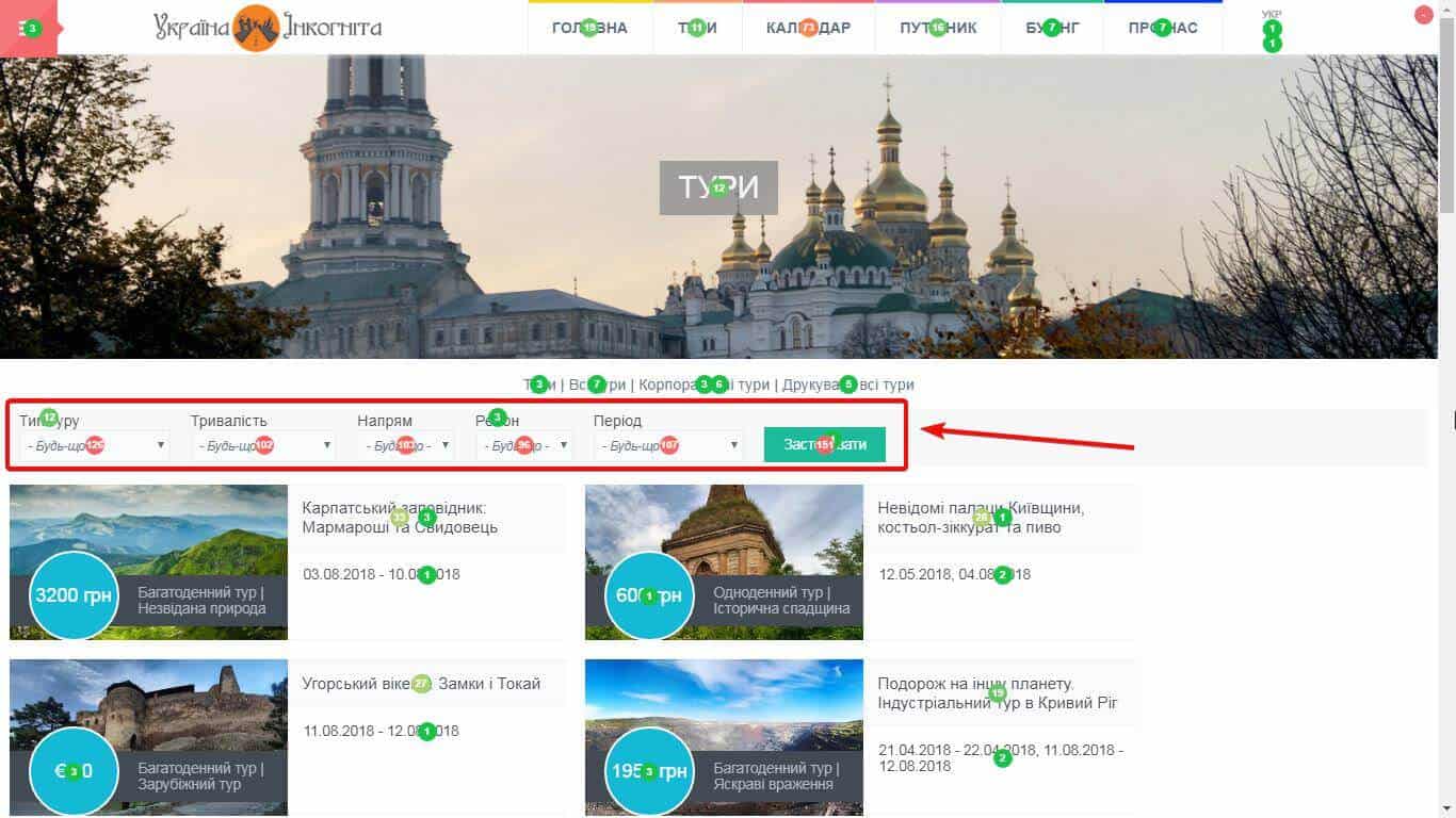
This means that these filters are actively used by visitors.
Now we will go to the catalog with tours that has two significant usability issues.
The clicks on the prices are the first thing that catches your attention:
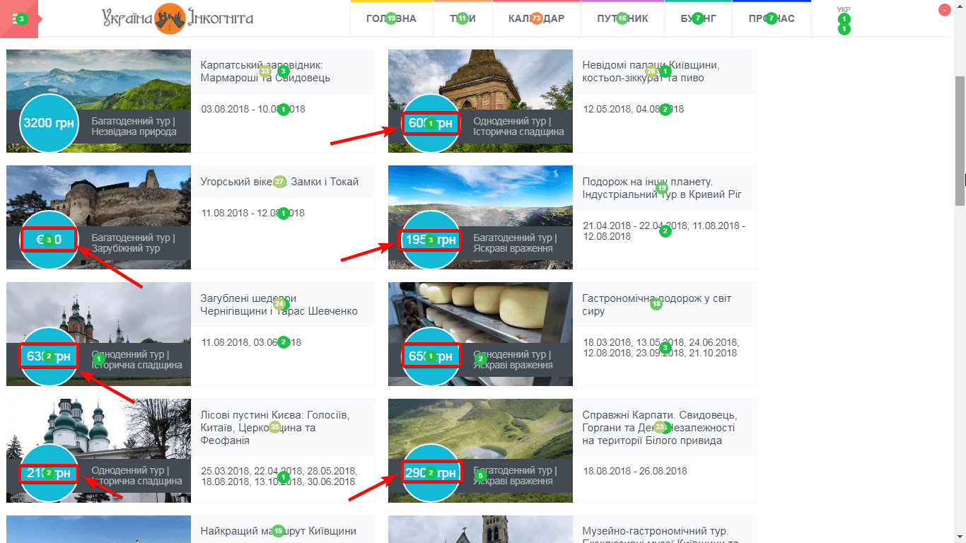
Yet the website design doesn’t have links here. After visitors click, nothing happens.
The second thing is the absence of calls to action:

The page has enough place to put some calls to action. For example, they could use the Learn more or View button. Right calls to action help to increase conversion and thus grow sales.
In the bottom of the page, there is pagination. It shows the number of pages and has two additional buttons:
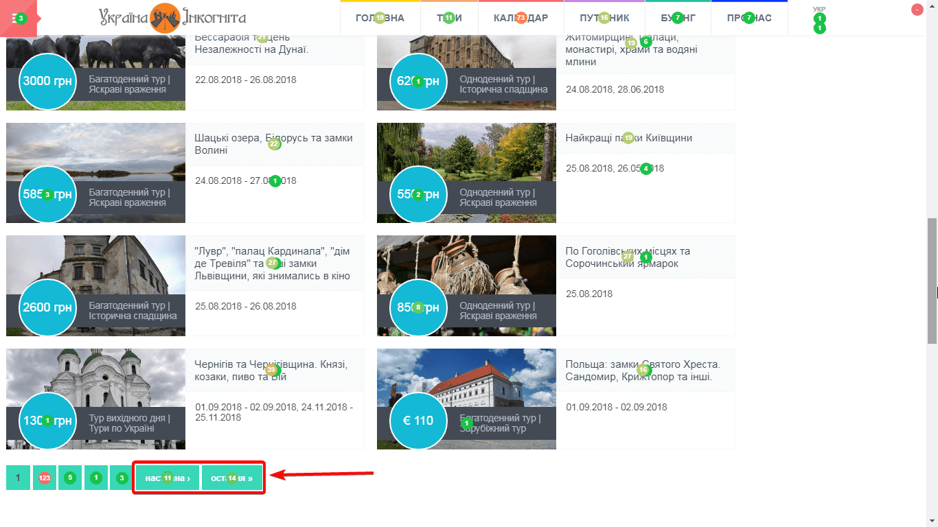
The low click-through rate means that these elements don’t perform their functions as expected.
Finally, let’s take a look at the website footer. In particular, the email collection form:
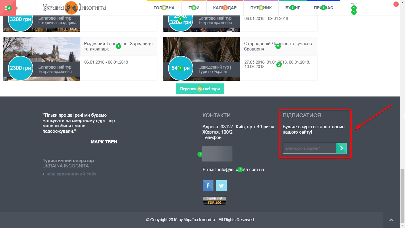
Generally, such method of collecting emails is gradually losing its popularity. To increase the number of people willing to share their contact information, it’s necessary to change the call to action (it should motivate users to leave their email address) or use smart forms. Display smart forms only on the pages where users may be more eager to provide their emails.
Based on the conducted analysis, we have developed a set of recommendations for SEO and usability optimization of the page:
- Add a label to the button that opens the navigation menu (the hamburger button);
- Add a clickable offer on the main image of the page (the header) or remove the photo;
- Delete or move to the footer a part of the elements from the small navigation menu;
- Make the prices of every tour clickable;
- Add button calls to action near every tour offer;
- Remove the extra elements near the pagination option
- Update the call to action in the subscription form or set smart forms to be displayed to interested users only.
There is also a similar example of the user experience audit that analyses the page of the electrical tools online store.
