Website heatmaps are one of the fastest ways to understand what people actually do on a page. You stop guessing, stop relying on internal opinions, and start seeing real user behavior. Good heatmaps for website analysis can show where visitors click, how far they scroll, what they ignore, and where friction quietly damages conversions.
That matters because a website heatmap is not just a pretty visual. It helps you spot missed CTAs, false affordances, weak page structure, hidden friction, and UX leaks that waste traffic. If you run a store, SaaS site, lead generation funnel, or content-heavy website, website heatmaps can help you find what blocks progress before you spend more money on traffic.
But there is one important catch: a heatmap is a diagnostic tool, not a magic button. It shows where something feels wrong. It does not automatically tell you what fix will improve conversions. That is why strong teams pair a website heat map with analytics, session replay, and testing instead of treating red spots like instant answers.
This guide is for business owners, marketers, UX designers, ecommerce teams, and growth-focused operators who want practical outcomes. You will learn what website heatmaps are, which types matter, how to read heatmaps without fooling yourself, how website heatmap software fits into real CRO work, and how to turn website heat mapping data into actual improvements.
What Website Heatmaps Are And What They’re Not
A website heatmap is a visual layer placed on top of a page that shows aggregated interaction data. Instead of reading rows of events, you see patterns: where people click, how far they scroll, where they hover, where they pause, and where frustration shows up through signals like dead clicks or rage clicks.
In plain language, website heatmaps help you see behavior at page level. A webpage heatmap can reveal whether visitors are missing the main CTA, clicking an image that is not clickable, stopping before your reviews, or getting stuck in a form. That is why heatmaps for website optimization are so useful in both UX and CRO work.
- Analytics tells you what happened, such as exits, bounce rate, conversion rate, or abandonment.
- Heatmaps tell you where it happened, so you can see which sections or elements attract attention or create confusion.
- Session replay helps explain why it happened by showing the real user journey in motion.
The distinction matters. A heat map for website analysis is not a replacement for analytics, and it is not the same as A/B testing. It is a fast way to diagnose friction and prioritize the next best action.
This is also where many teams go wrong. They open a map, notice a hot area, make one quick change, and assume they are doing CRO. Real website heat mapping work is more disciplined than that. You collect data, compare segments, validate the behavior, ship a fix, and then recheck what changed.
If a heatmap study ends with “interesting,” it is just entertainment. If it ends with “we found a leak, fixed it, and confirmed improvement,” that is useful CRO work.
Why Website Heatmaps Matter For UX And CRO
Website heatmaps matter because they reduce uncertainty. They help you see whether users notice key sections, whether they try to click the wrong thing, whether the layout supports action, and whether the page earns the scroll. In practical terms, they help you stop wasting traffic on pages that look acceptable in design reviews but fail in real usage.
For UX teams, website heatmaps make friction visible. You can spot poor visual hierarchy, confusing navigation, weak affordances, clutter, hidden trust signals, and small interaction issues that feel minor internally but create hesitation for visitors. For CRO teams, the same data helps prioritize fixes based on behavior instead of opinion.
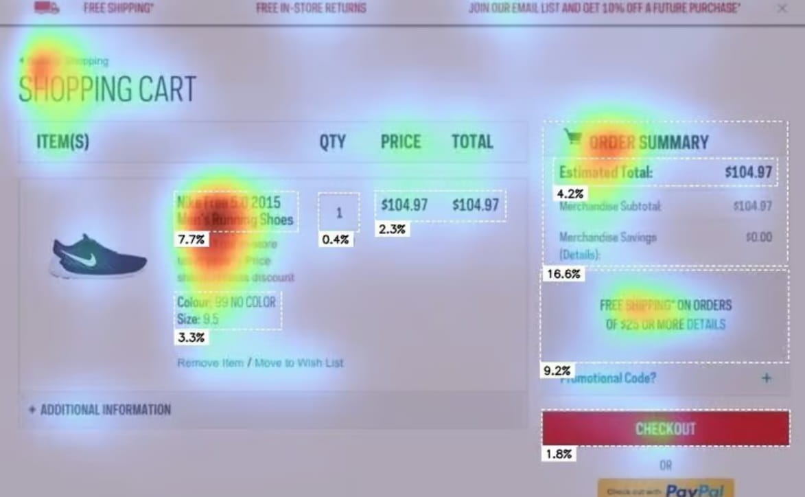
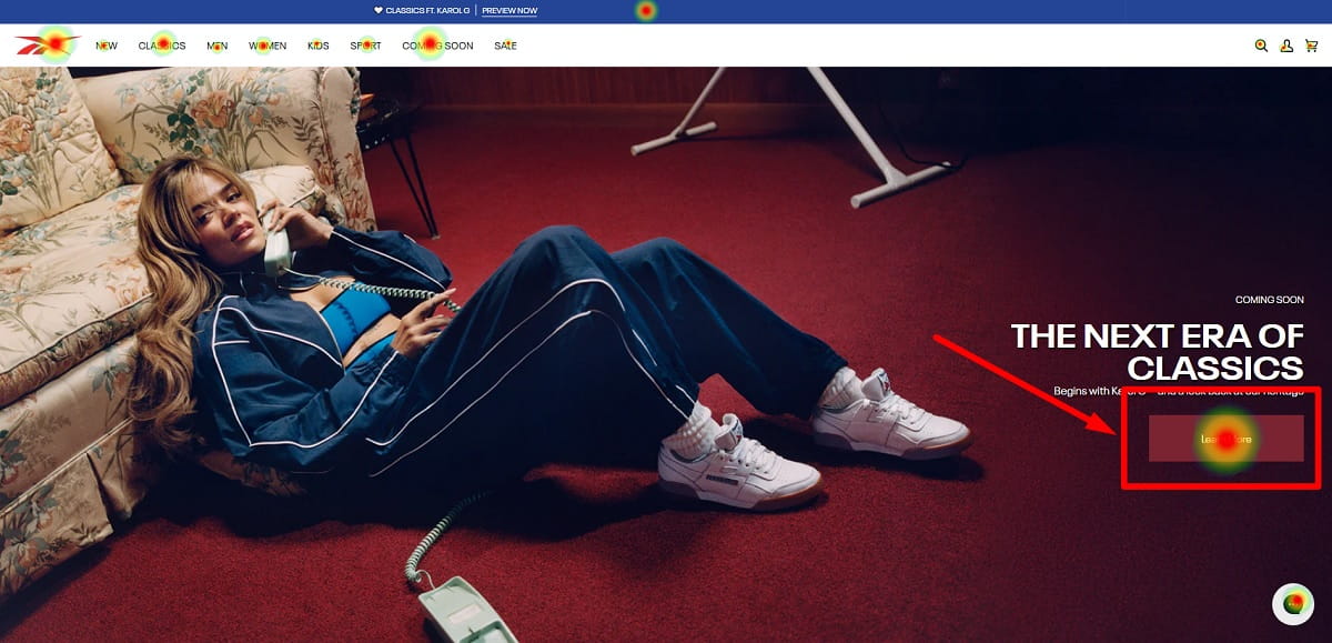
That is especially useful on money pages. A website heatmap on a product page can show that users click the gallery but ignore the CTA. A heatmap for website checkout analysis can show rage clicks around payment, coupon, or shipping fields. A scroll map on a landing page can show that most users never reach proof, pricing, or testimonials.
This is why website heatmaps work so well in audits. They give you context. You are no longer just looking at a KPI drop or a bad conversion rate. You are looking at the visible pattern behind it.
Types Of Website Heatmaps You’ll Actually Use
Most teams do not need ten exotic views. They need a small set of reliable heatmaps for website analysis, used consistently and interpreted with context. These are the types that show up in real UX and CRO work.
Click Heatmaps
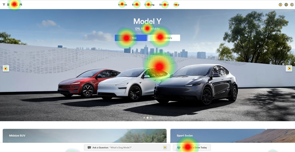
A click heatmap shows where users click or tap. It is one of the most practical website heatmaps because it quickly reveals the gap between what looks clickable and what is actually clickable.
- Dead clicks: clicks on elements that do nothing. These often come from misleading design, broken links, unclickable images, fake buttons, or poor affordance.
- Rage clicks: repeated rapid clicks in the same area. These often signal lag, broken interactions, weak feedback, or confusing UI.
If users keep clicking a non-clickable hero image, badge, icon, or headline, your page is teaching them the wrong behavior. A good website heat map helps you catch that fast.
Scroll Heatmaps
A scroll heatmap shows how far down the page visitors go. It answers a simple but important question: did they even see it?
This is why scroll-based heatmaps for website pages are so useful on long landing pages, blog posts, pricing pages, and product pages. You can see whether people reach reviews, FAQs, comparison tables, trust blocks, and other sections that support conversion.
One warning matters here: scroll does not mean read. A visitor can move quickly down the page without processing much. So use a scroll-based website heatmap to measure visibility, then pair it with recordings, engagement signals, or outcomes before drawing strong conclusions.
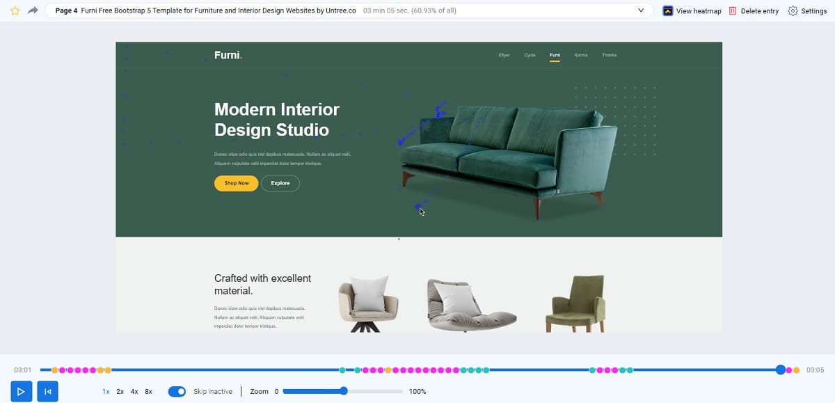
Move Or Hover Heatmaps
Move or hover heatmaps track cursor behavior on desktop. These maps can hint at attention, but they are not eye-tracking. People park their cursor, use trackpads differently, and scroll while the cursor sits still.
So treat this type of webpage heatmap as a clue, not proof. Hover data can be useful when paired with click behavior and recordings, but it should not drive major decisions by itself.
Attention Heatmaps
Some website heatmap software offers attention-style views based on time on section, pauses, or engagement signals. These can be useful, especially when you want to compare which areas are pulling attention and which areas are ignored.
Still, attention maps are easy to over-trust. Cookie banners, promo bars, sticky elements, live chat, or layout changes during collection can distort the story. If the page changed midway, the map may represent two versions of the page at once.
Zone, Element, Or Area Heatmaps
Zone heatmaps aggregate interactions by section or element rather than by scattered hot spots. This makes them useful in stakeholder conversations because it is easier to compare hero, navigation, pricing, reviews, or footer without arguing over tiny pixel details.
For many teams, this is the clearest form of website heat mapping because it turns visual noise into structured comparison. You can quickly see whether the footer gets more clicks than the main navigation, whether trust sections outperform the CTA area, or whether users are drifting into the wrong part of the page.
Website Heatmap Vs Webpage Heatmap: Is There A Difference?
In practice, people often use website heatmap and webpage heatmap interchangeably. A webpage heatmap usually refers to interaction data for one specific page or URL. Website heatmaps can describe either the broader method or a collection of maps across multiple pages on a site.
So when someone searches for a webpage heatmap, they usually still want the same core thing: a visual view of clicks, scroll depth, movement, or attention on a page. From an SEO point of view, it is smart to cover both phrases naturally because they reflect the same intent cluster.
What Website Heatmaps Are Good For In CRO And UX
Website heatmaps are best when you use them to reduce uncertainty and prioritize fixes. They are not there to decorate reports. They are there to help you stop guessing.
Finding UX Leaks Before You Spend More On Traffic
If you are running ads, pushing SEO content, or driving social traffic, a website heatmap helps you identify where users fail to progress. You may see missed CTAs, navigation confusion, false affordances, cold trust blocks, or dead clicks on design elements that look actionable but are not.
This matters because it is expensive to scale traffic into a page that quietly leaks intent.
Prioritizing Changes Without Endless Debate
Heatmaps turn subjective design conversations into evidence-based decisions. When you can show that users tap the wrong element hundreds of times, the discussion shifts from taste to outcome.
That is why heatmaps for website optimization are useful even for small teams. You do not always need a full redesign. Often you need one focused fix that removes one clear point of friction.
Generating Better Test Ideas
A website heat map can suggest a strong hypothesis. Maybe users do not see the CTA. Maybe they fixate on pricing details but ignore the signup button. Maybe they keep opening shipping info because the main offer feels unclear.
The map gives you the pattern. A test proves whether the proposed fix improves the result.
Diagnosing Funnel Drop-Offs With Page Context
Analytics may show drop-off between product page and cart, or between checkout and payment confirmation. But a website heatmap adds the missing layer of page context. You can see whether users are interacting with the wrong element, getting stuck on form fields, or hesitating around policy, shipping, or trust details.
How To Read Website Heatmaps Without Fooling Yourself
Reading website heatmaps well takes both pattern recognition and discipline. The pattern is easy. The discipline is what most teams skip.
Start With One Clear Question
If you open a heatmap without a question, everything looks interesting and nothing becomes actionable. Start with one decision-focused question:
- Are users finding the primary CTA?
- Are they trying to click non-clickable elements?
- Are they reaching the part of the page that justifies the offer?
- Are they getting stuck in forms, filters, or payment steps?
If you do not define the question, every red area feels urgent even when it is not.
Read In Layers: Visibility, Interaction, Then Intent
- Visibility: use scroll heatmaps to see if users reached the section at all.
- Interaction: use click heatmaps to see what they tried to do.
- Intent: use recordings, analytics, and outcomes to understand why they did it and whether it helped conversion.
This layered approach is what turns website heat mapping into a decision tool instead of a visual curiosity.
Watch For Common Interpretation Mistakes
- Scroll does not equal reading: users can reach the bottom without processing the content.
- Hover does not equal intent: cursor behavior varies by user and device.
- Hot clicks on a non-clickable item: often signal a design problem, not “bad users.”
- Cold CTA data: may mean weak message, poor placement, low contrast, or distracting competition.
- Weird patterns after changes: redesigns, promos, and overlays can create temporary novelty effects.
One website heatmap can show a real pattern and still lead you to the wrong decision if you ignore context, segmentation, or outcomes.
Use A Diagnostic Table Instead Of Guessing
| Heatmap Pattern | Likely Cause | What To Test Next |
|---|---|---|
| Hot clicks on a non-clickable image or headline | False affordance; users expect it to open details | Make it clickable; add a clear “View Details” link; improve visual cueing |
| Primary CTA is cold while secondary links are hot | CTA is buried, unclear, weak in contrast, or competing with distractions | Clarify CTA copy; reduce competing links; move CTA higher; test stronger button message |
| Heavy interaction with FAQ, shipping, returns, or trust elements | Users feel uncertainty before acting | Bring reassurance higher; simplify policies; add concise trust blocks near CTA |
| Scroll drop-off before reviews, pricing, or feature proof | Weak first screen; slow load; irrelevant opening section | Tighten hero; bring proof earlier; improve speed; test better structure |
| Rage clicks around tabs, filters, or payment options | Broken UI, lag, confusing interactions, or poor tap targets | Fix bugs; increase tap area; improve feedback states; simplify the interface |
| Heavy clicks on coupon field or promo area in checkout | Discount hunting or uncertainty around final price | Test hiding coupon behind a link; clarify best-price messaging; simplify checkout flow |
Segmentation Is The Difference Between Insight And Noise

If you do one thing after reading this guide, do this: Segment and compare. Website heatmaps without segmentation often tell only half the story.
Core Segments To Compare
- Mobile vs desktop: behavior changes dramatically, especially around tap targets, sticky elements, and layout.
- New vs returning users: returning visitors usually navigate faster, while new visitors need more reassurance and clarity.
- Paid vs organic traffic: traffic intent changes what users expect and how much patience they bring.
- Geography or language: trust, clarity, and content expectations are not always the same.
- Device type: small differences between browsers and devices can shift interaction patterns.
Most teams read the “average visitor.” But revenue does not come from averages. It comes from specific traffic types and specific money pages.
How Segmentation Changes The Story
A desktop website heatmap may show strong interaction with pricing tables and comparison details, while mobile users mostly tap the hamburger menu or scroll without engaging plan content. That does not mean mobile users do not care. It often means the page is harder to scan, harder to tap, or harder to trust on a smaller screen.
This is exactly why heat maps for websites should never be interpreted as one universal truth.
Heatmap Use Cases By Site Type And Page Type
Website heatmaps work across ecommerce, SaaS, lead generation, and content sites, but the questions change by page type.
Ecommerce Use Cases
Homepage: Are users moving into shopping paths, or are they stuck on the hero? If the hero image is hot and category paths are cold, the first screen may be teasing instead of guiding.
Category Page: Are filters being used? Are product images getting clicks while “Quick Add” stays cold? If filters are ignored, they may be hidden, confusing, or poorly prioritized.
Product Page: Do users reach reviews, shipping, size guides, and return details? If the size guide or shipping info is extremely hot, uncertainty may be blocking purchase confidence.
Cart And Checkout: Where do rage clicks happen? Are people clicking coupon, shipping, or payment details repeatedly? A website heatmap here can expose friction that standard analytics hides.
SaaS Use Cases
Pricing Page: Are users interacting with plan toggles, comparison rows, or FAQs? If the FAQ is hotter than the plans, users may still not understand the offer.
Landing Page: Do users reach proof and click the CTA? If testimonials are cold, they may be generic, weak, or too late on the page.
Signup Flow: Are users clustering on password rules, SSO buttons, or validation messages? These are common friction zones that heatmaps for website signup flows can reveal quickly.
Content Site Use Cases
Blog Posts: Are users reaching key sections, tables, or CTA blocks? If most users never reach the main offer, your CTA is too deep or the content structure is too dense.
Comparison Pages: Are visitors clicking tables, anchors, and “jump to” links? If they are scanning headings and tables, your page should support that behavior instead of fighting it.
Lead Magnet Pages: Are users clicking the image, the headline, the form, or the privacy note? Interaction patterns here can reveal trust gaps just as much as copy weaknesses.
A Step-By-Step Website Heatmap Workflow
This is the workflow teams can repeat without turning website heatmaps into a passive reporting habit. The point is not to collect more visuals. The point is to make better decisions and validate what changed.
Before You Start
- Pick one page type: product page, pricing page, landing page, checkout, or lead form.
- Write one question: what decision should this study help you make?
- Confirm tracking works: make sure the tool loads correctly and behaves normally on desktop and mobile.
- Freeze major changes: do not redesign the page mid-study.
- Define segments: at minimum compare mobile vs desktop; ideally compare new vs returning and paid vs organic.
- Choose success metrics: conversion rate, add-to-cart rate, form completion rate, signup rate, or CTA CTR.
Setup, Collect, Analyze, Ship, Retest
- Choose the highest-impact page. Start where money is made or lost.
- Install and validate tracking. Confirm page behavior is captured correctly.
- Collect until patterns stabilize. Do not overreact to tiny samples or one unusual day.
- Segment and compare. This step is non-negotiable.
- List the top friction points. Focus on the few issues you can actually fix.
- Validate with recordings and metrics. Confirm the behavior and connect it to business outcomes.
- Ship the smallest meaningful fix. Avoid big redesigns when one specific friction point is the real issue.
- Retest and compare. Review both interaction changes and KPI movement.
That is the difference between using website heatmaps as decoration and using them as part of a real optimization loop.
How To Choose Website Heatmap Software
Not all website heatmap software is equally useful. Some tools give you a beautiful visual but little operational value. Others make it easier to move from data to action. So if you are comparing website heatmap software, do not just ask whether it has click maps. Ask whether it helps you diagnose friction and make better decisions.
What Good Website Heatmap Software Should Include
- Click heatmaps: to show where users tap, click, misclick, or cluster around confusing elements.
- Scroll heatmaps: to show which sections are seen and which sections are missed.
- Mobile and desktop segmentation: because behavior differs too much to merge into one average.
- Session replay: because a website heatmap shows the pattern, while replay explains the journey behind it.
- Dead click and rage click visibility: these signals often surface friction faster than general click density alone.
- Page-level filtering: so you can isolate a single money page instead of drowning in broad site data.
- Privacy controls and masking: especially if you analyze forms, checkout, or other sensitive flows.
What To Avoid
Avoid tools that make website heat mapping look easy but do not help you work practically. If the tool makes segmentation hard, hides session-level context, or turns every page into one giant rainbow screenshot, it will slow you down instead of helping you prioritize.
The best website heatmap software is not the one with the most colorful interface. It is the one that helps your team find friction, confirm the cause, and act without confusion.
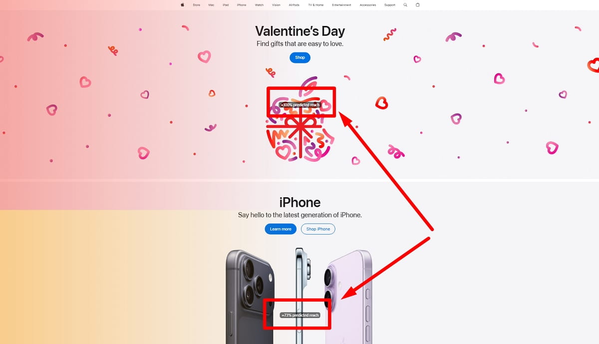
Predictive Heatmaps Vs Real Behavior Heatmaps
Predictive heatmaps estimate where users are likely to focus based on layout, visual hierarchy, and design patterns. They can be useful during design review, page planning, or before a page gets real traffic. That is why predictive heatmaps sometimes appear in UX workflows before launch.
But predictive heatmaps are not the same as real website heatmaps. A predictive model can guess likely attention. It cannot show actual click frustration, real scroll drop-off, actual hesitation, or real confusion around UI elements. Real heatmaps for website analysis are based on live user behavior, not forecasts.
The smart way to use both is simple. Use predictive heatmaps to review likely attention patterns before launch. Then use real website heatmaps after launch to verify what users actually do. Prediction is useful. Real interaction data is stronger.
KPIs And Metrics To Pair With Website Heatmaps
Website heatmaps show interaction patterns, but CRO is still judged by outcomes. Pair the visual data with the KPI that matters, or you risk optimizing for behavior that does not improve anything important.
Core Metrics That Work Well With Heatmaps
- Conversion rate: for purchases, leads, demos, or signups.
- CTA click-through rate: to see whether users choose the intended next step.
- Scroll depth: to measure visibility of key proof, pricing, forms, or trust elements.
- Bounce rate and exits: to show where users leave the flow.
- Form completion rate: to identify where submission intent breaks down.
- Add-to-cart rate: to connect interaction on product pages to shopping progress.
- Error rate: especially for validation, checkout, login, or payment steps.
Simple Pairings That Make Sense
- Product page click heatmap + add-to-cart rate: useful when the CTA stays cold or key product details attract more attention than purchase action.
- Pricing page heatmap + signup rate: useful when users interact heavily with FAQs or comparison rows but fail to move forward.
- Checkout heatmap + abandonment rate: useful when rage clicks or confusion cluster around payment, shipping, or coupon elements.
- Landing page scroll map + CTA CTR: useful when users do not reach the proof or support sections that justify the offer.
If the KPI does not improve, the change was not the fix, even if the website heat map looks better visually.
Common Website Heatmap Mistakes And How To Avoid Wrong Conclusions
Heatmaps are persuasive because they look like evidence at first glance. That is exactly why they can be dangerous when read too quickly.
Treating A Heatmap Like A Verdict
A hot area does not mean “change this immediately.” It means “investigate this.” Use recordings to confirm the behavior and analytics to judge the impact.
Ignoring Overlays And Page Context
Cookie banners, sticky bars, chat widgets, promo pop-ups, and live offers can distort website heatmaps badly. If an element changed during collection, your map may represent multiple page states at once.
Over-Reading Hover Data
Hover heatmaps can be directional on desktop, but they are not reliable enough to support big decisions by themselves.
Assuming No Scroll Means No Interest
Sometimes users do not scroll because the first screen already answers the question. Sometimes they do not scroll because the page loads slowly, looks weak, or fails to guide the next step. Pair a website heatmap with load performance and exits before blaming the content alone.
Mixing Traffic Types Into One Average Story
If paid traffic, brand traffic, email traffic, and returning users all behave differently, one merged heatmap hides the truth instead of revealing it.
Shipping Too Many Changes At Once
If you redesign the full page after one review, you will not know what actually caused the improvement or decline. Protect learning by shipping the smallest meaningful fix first.
Heatmaps Vs Session Replay Vs Analytics Vs A/B Testing
Each tool answers a different question. The mistake is not using the wrong tool entirely. The mistake is expecting one tool to answer everything.
If Your Question Is X, Use Y
- Where are people clicking or tapping? Use click heatmaps.
- Do users even see this section? Use scroll heatmaps and scroll depth.
- Why are users stuck or confused? Use session replay.
- Which step leaks users in the funnel? Use analytics funnels plus heatmaps on the leaking pages.
- Will this change increase conversions? Use an A/B test or controlled rollout.
- Is this a usability or accessibility issue? Use UX audit work plus recordings and behavioral evidence.
Strong teams combine these methods. Website heatmaps are fast and practical, but they are strongest when used with session replay, analytics, and controlled testing.
When Website Heatmaps Are Not The Best First Step
- Very low-traffic pages: you may need qualitative feedback or broader analytics first.
- Highly dynamic pages: if content changes heavily by user, recordings and event analytics may be clearer.
- Obvious bugs: if the main button is broken, fix it first. Do not run a study to “confirm” the obvious.
Privacy And Consent Basics
This is not legal advice, but heatmaps for website analysis still require basic discipline. Heatmap tools and replay tools often involve cookies or similar tracking, and depending on the setup and jurisdiction, the data may fall under privacy and consent requirements.
Practical Rules That Reduce Risk
- Be transparent: explain what is collected and why in your privacy policy and cookie notice.
- Respect consent logic: if your site requires opt-in for tracking, your website heatmap software should follow that flow.
- Mask sensitive data: do not capture fields that may include personal or financial information.
- Limit access internally: not everyone needs replay access or advanced tracking data.
- Do not over-collect: track the pages you need, for the time you need, then move on.
Accessibility And UX Factors That Change Heatmap Patterns
Website heatmaps show behavior, not true motivation. And behavior is shaped by usability and accessibility. If you ignore that, you may misread a weak pattern as low interest when the real issue is that users cannot comfortably interact with the page.
Common Factors That Shift Website Heatmaps
- Contrast and readability: low-contrast text changes scanning and scroll behavior.
- Tap targets: small buttons cause missed taps and frustration on mobile.
- Sticky elements: headers, cookie banners, and bars can hide important content.
- Load performance: slow pages reduce interaction depth and increase exits.
- Visual hierarchy: when everything looks equally important, users choose the wrong action.
If mobile users mis-tap repeatedly, it is usually your tap target or page layout, not their finger.
How Plerdy Fits Into A Practical Website Heatmap Program
Website heatmaps become much more useful when they are connected to a repeatable workflow. The goal is not to look at colorful reports. The goal is to identify friction, validate what users are trying to do, ship a fix, and check whether the page performs better.
Plerdy fits that workflow well because you can use website heatmaps alongside session replay and website analytics to spot where users hesitate, where they misclick, where they abandon, and where the funnel quietly breaks. That makes it easier to move from “the page looks fine” to “we found the leak, fixed it, and confirmed the change.”
- Start with one problem page: product page, pricing page, checkout, or lead form.
- Use heatmaps to surface friction: dead clicks, missed CTAs, scroll drop-off, confusion zones.
- Use session replay to confirm why: what the user expected, what blocked them, and what they tried next.
- Ship a small fix and retest: compare interaction patterns and KPI movement after the change.
If you want a practical start, use Plerdy on one high-traffic page for one week. Review website heatmaps by segment, watch a small batch of related sessions, fix one clear UX leak, and then recheck the result.
Practical Examples You Can Copy
The fastest way to get value from website heatmaps is to connect visible patterns to practical action. Here are simple “if you see X, do Y” examples across common page types.
Homepage Examples
- If the hero image is hot but the CTA is cold: make the hero clickable or place a stronger CTA directly in the hero.
- If users click the logo repeatedly: navigation may be weak or product paths may be hidden.
Product Page Examples
- If the size guide is extremely hot: users may feel uncertainty about fit, selection, or return risk.
- If users click review stars but nothing happens: make the rating anchor to reviews and show review proof earlier.
Category Page Examples
- If filters are cold: they may be hidden, confusing, or poorly prioritized.
- If product images are hot but “Quick Add” is cold: strengthen contrast, clarity, and trust around the button.
Pricing Page Examples
- If users keep interacting with the plan toggle: they may be highly price-sensitive or confused by the offer structure.
- If the FAQ is hotter than the plans: reassurance is doing too much work too late.
Landing Page Examples
- If scroll drop-off happens before proof: the first screen is not earning attention or trust.
- If users click trust badges but ignore the CTA: the main message may still feel weak or risky.
Blog Post Examples
- If TOC links are hot: users are scanning. Support that behavior with clearer headings and faster access.
- If outbound links get strong clicks early: your intro may not match intent strongly enough.
Cart And Checkout Examples
- If the coupon field dominates clicks: discount uncertainty may be distracting from purchase completion.
- If rage clicks cluster around payment: you may have lag, weak feedback, trust issues, or field validation problems.
Next Steps Checklist
Here is the simplest checklist that works for most teams. Keep it practical. Practical work ships faster.
- Pick one money page: product page, pricing page, checkout, or lead form.
- Write one question: what decision will this heatmap review help you make?
- Install heatmaps and verify tracking: test on both desktop and mobile.
- Collect until patterns stabilize: do not react to tiny samples.
- Segment and compare: mobile vs desktop, new vs returning, paid vs organic.
- Identify the top friction points: dead clicks, missed CTAs, rage clicks, form confusion, weak visibility.
- Validate with recordings and KPIs: confirm the behavior and tie it to outcomes.
- Ship one small fix: remove one clear UX leak.
- Retest: rerun the website heatmap and compare KPI movement.
- Repeat regularly: consistent small improvements beat one giant optimization project.
FAQ
What Are Website Heatmaps In Simple Terms?
Website heatmaps are visual reports that show how users interact with a page. They help you see where people click, how far they scroll, what they ignore, and where frustration or confusion appears.
Are Heatmaps For Website Analysis Better Than Google Analytics?
They are not better. They answer a different question. Analytics tells you what happened, while website heatmaps show where behavior happens on the page. The strongest analysis uses both together.
How Long Should I Collect Website Heatmap Data?
Collect data until the main patterns stabilize and do not change wildly day to day. On lower-traffic pages, that may take longer. Always compare segments before making a decision.
What Are Dead Clicks In A Website Heatmap?
Dead clicks are clicks on elements that do nothing. They often signal misleading design, broken interactions, weak affordance, or user confusion. Fixing dead clicks can remove friction quickly.
Do Scroll Heatmaps Show If People Read The Page?
No. Scroll heatmaps show visibility, not comprehension. Users can reach the bottom without really reading. Pair scroll data with recordings, engagement signals, or outcomes for stronger interpretation.
What Should I Look For In Website Heatmap Software?
Look for click heatmaps, scroll heatmaps, segmentation, session replay, rage click visibility, page-level filtering, and privacy controls. Good website heatmap software should help you move from visual patterns to real action.
How Do Website Heatmaps Improve Conversions?
Website heatmaps improve conversions by revealing missed CTAs, weak page structure, false affordances, friction in forms, and sections users never reach. They help you prioritize fixes based on real behavior instead of assumptions.
Can Predictive Heatmaps Replace Real User Heatmaps?
No. Predictive heatmaps estimate likely attention before launch, while real website heatmaps show actual user behavior after launch. Predictive views are useful, but real interaction data is stronger for decision-making.
What Pages Should I Start With First?
Start with your highest-impact page: checkout, product page, pricing page, signup flow, or lead form. If you are unsure, begin with the page that gets the most valuable traffic or shows the biggest leak in analytics.
Conclusion
Website heatmaps look simple, but the value comes from how you use them. They show where visitors click, scroll, hesitate, misclick, and drift away from the path you intended. That makes them one of the fastest ways to spot friction on a real page.
Still, a website heatmap is not the final answer. It is the visual starting point. Strong teams use website heatmaps to generate sharper hypotheses, then validate the pattern with analytics, session replay, and the KPI that matters. That is how you turn behavior data into real UX and CRO wins.
If you want a practical next move, do not start with your whole site. Start with one high-impact page. Run heatmaps for website analysis by segment, identify one meaningful leak, fix it, and measure the result. That is how website heat mapping becomes useful instead of just interesting.