
How do visitors behave on the website? Which elements of usability are convenient and which are not? At what point do most users leave the website? You can qualitatively improve any website by answering these questions with Google Analytics: increase sales, optimize behavioral metrics, and achieve high positions in search results. Standard Google Analytics reports are undoubtedly important; without them, you can’t have full-fledged web analytics. However, data on visits, depth of views, refusals, and conversions in Google Analytics are isolated heat map indicators that overlook how users interact with the site.
A heat map is a tool that shows which areas of the website attract visitors’ attention, and the main activity is concentrated on Google Analytics. The data on the Google Analytics heat map is visualized using a color gradient: warm colors show the places where users are most interested, and cold colors show the places with the least concentration of attention. Thus, this Google Analytics is as clear and simple as possible. Heat maps are a great way to look at the website through users’ eyes and assess weaknesses in optimization.
The data obtained with heat maps in Google Analytics are key to improving the website’s selling power, reducing the number of bounces, and increasing the duration of user sessions. In other words, such heat maps in Google Analytics contribute to the point optimization of behavioral metrics, which directly affects the site’s effectiveness and remains a key ranking factor in SEO.
What Is a Google Analytics Heat Map?
Google Analytics Heat Map is a tool that visually shows collected statistics about the site’s users, particularly their behavior. For example, popular links on the site – this is what you will see with Google Analytics Heat Map. SEO specialists and marketers better understand their users’ interests and optimize their engagement and site conversion rates faster with this Google Analytics Heat Map service. Google Analytics Heat Map is most popular in the USA, Canada, Germany, and France.
Google Analytics Heat Map is created using statistics that Google Analytics collects. Placing a small code on a site is enough to collect statistics. Due to the small size of this code, the site’s performance is not slowed down.
Website Heat Map Tools from Plerdy
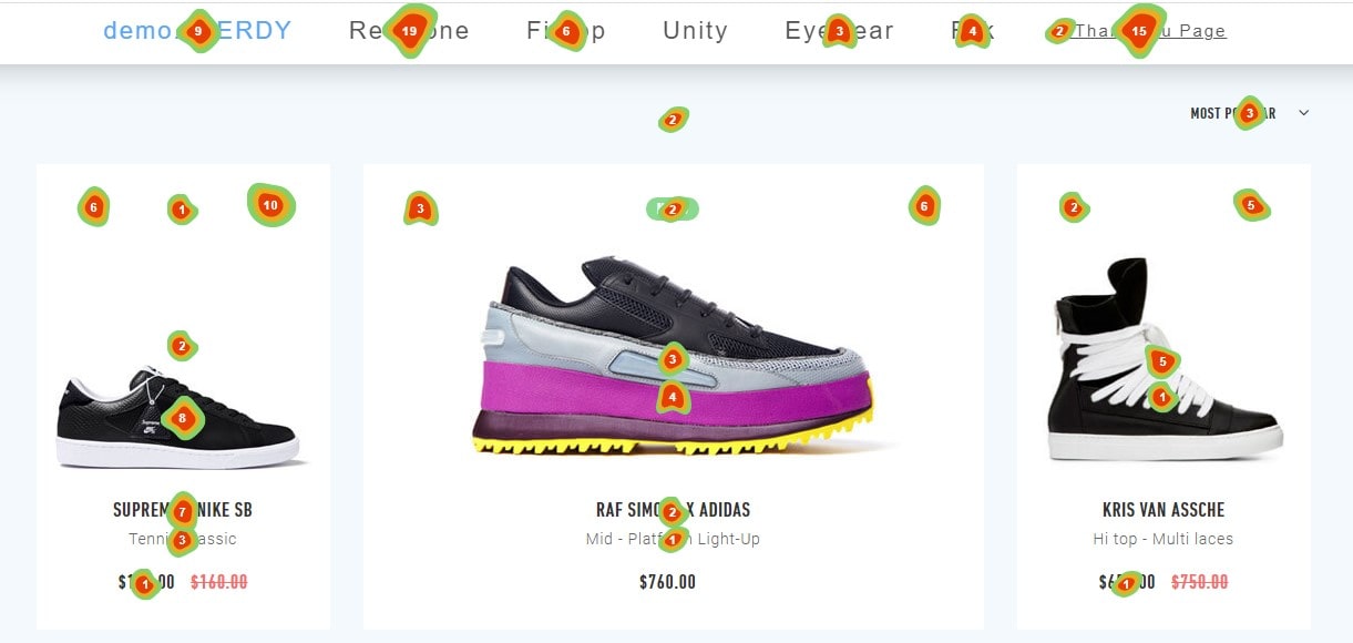
Plerdy is a multifunctional tool for website optimization and analytics that allows you to create heat maps. Its algorithm is characterized by great accuracy, which SEO specialists and marketers highly appreciate in heat analytics. With its help, you can create heat maps and visualize clicks for a certain period, like with Google Analytics. If you are doing A/B testing with Plerdy, all analytics are recorded for each test separately. Unlike most similar Google Analytics heat services, Plerdy can track web visitor activity even on dynamic site elements.
Plerdy analytic heat service is as useful as Google Analytics. Website Heat Map Tool from Plerdy helps:
- Find the first click on the page and view the sequence of clicks.
- Filter clicks by device type and traffic channel.
- Segment users into groups and analyze their behavior separately.
- Detect what website elements are the least effective.
- Find out from which part of the page users leave the most often.
Website Heat Map Tools from Plerdy allow you to better understand your website’s target audience. At the same time, Plerdy`s Website Scroll Map helps to understand:
- How appropriate it is to place long content.
- Whether your texts are read to the end and where to place links in them is better.
- Which content strategy is more effective: long reads or short articles?
- Which directory is better: with infinite scrolling or pagination pages?
Plerdy analytics heat map helps you understand what and how often people click on pages. This can be a simple click map and a more complex visualization with color gradation depending on the intensity of clicks, targeted actions, sources of conversions, etc.
How do you set up Google Analytics Heat Map?
Google Analytics Heat Map helps you reliably track what your visitors are doing. The website must have at least 2-3 thousand visitors for reliable heat map analytics. If the Google heatmap is built based on 50 visits, such data should not be trusted. To set up Google Analytics Heat Mapping, you need to:
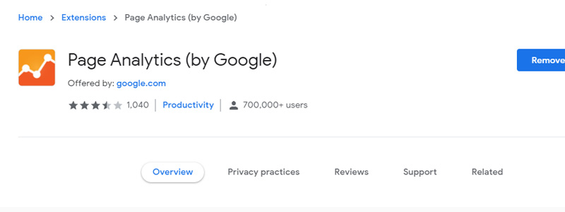
- Sign up with a Google Account (if you still do not have one).
- Install the Page Analytics Chrome Extension.
- Sign in with a Google Analytics account.
- Go to the website to which Google Analytics is connected and open the plugin.
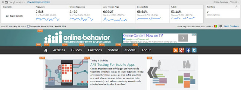
The Google Analytics Heat Map setup process is easy. With Google’s help, you can see page views, average time on page, exit rate, bounce rate, unique page views, and active users number in real-time. Google Analytics Heat Mapping is needed to:
- Improve the UX design of the most clickable elements.
- Make the text on popular buttons more readable or add a call to action.
- Move clickable elements to a more prominent location.
- See what non-clickable places users perceive as links and improve them.
- Identify the most popular tabs and improve their content. For example, visitors are actively interested in the “About” section of Google Analytics Heat service. You should check the popular page’s text quality, informativeness, and usefulness.
- See with Google Analytics what topics are of more interest to readers if the website has a tagging block.
Google Analytics Heat Mapping is a popular service, but it has one major competitor in terms of customization – Plerdy. So, is Google Analytics Heat Mapping better than Plerdy?
Disadvantages of Google Analytics Heat Mapping vs. Plerdy
The main advantage Plerdy has over Google Analytics Heat Mapping is that it provides more data and customization opportunities. So, Google Analytics Heat Map:
- Provides inaccurate visitors’ middle journey on the site.
- It isn’t useful to try to understand why visitors leave the website.
- Google doesn’t provide a great variety of filters.
- Google doesn’t allow you to customize the analytics.
- Google doesn’t allow you to use user groups.
Plerdy Heat service provides more customization opportunities than Google Analytics Heat Mapping. With it, you can change the collected statistics you view.
Frequently asked questions regarding Google Analytics Maps of Heat:
A heatmap—or heat map—is what?
A heatmap is a technique for displaying on a website areas of user activity in data visualization. It shows where people most interact using color gradients; warmer colors indicate more activity and cooler shades indicate less involvement. Heatmaps point up places that require development as well as popular sites.
Which free heatmaps are the finest ones available?
Among the finest free heat map applications are Crazy Egg, Mouseflow, and Hotjar. Often used for knowledge of user activity on websites, these tools provide simple heatmapping capabilities. More sophisticated capabilities, meanwhile, could call for paid editions.
Does Google Analytics provide a heat map?
There isn’t a built-in heat map capability in Google Analytics. To view heatmaps based on your Google Analytics data, you can combine it with outside tools like Hotjar or Plerdy however. Now defunct, the associated product the Page Analytics Chrome Extension had limited capability.
Why isn’t Google Page Analytics working?
Updates in Chrome or Google Analytics may cause the Page Analytics Chrome Extension by Google to not be supported or even malfunction. Think about outside solutions that could be connected with Google Analytics if you want to keep using comparable capability.
Can I see Google Analytics data on a heat map?
Although not straight from Google Analytics, you can see Google Analytics data in a heat map. You must employ outside tools like Plerdy or Hotjar. These instruments sync with your Google Analytics account to show user activities in a heatmap form.
Conclusion about Google Analytics Heat Map
There are several types of heat maps. Despite the similar logic of work of Google and Plerdy, each type of tool has its characteristics. For example, conducting a technical audit of the site, such as Google Heat Maps or other similar services, is used to solve its range of tasks.
Many tools for creating heat maps, such as Google and Plerdy. However, they differ in functionality and are designed to solve a certain range of tasks.
Unlike Google Analytics heat mapping, plerdy heatmaps (both clicks, scrolling, and pointing) are independent of the entire service team’s lineup. As a result, unlike Google Analytics, the Plerdy heat service user gets more accurate data and a much wider range of reports on user behavior on the site’s pages. You can find the list of features on the website.