Currently, banner ads have become very popular due to their new opportunities and flexibility. For example, various forms and sizes can be used. This allows for creating a product that suits the purposes of the company. For example, Google Ads uses banner ads to inform consumers about campaigns, offers, and services. As a result, it is easy and profitable to attract customers with a straightforward banner ad campaign.
Google Ads banners will be displayed in the large Google Display Network, with more than two million websites covering at least 90% of Internet users. So it’s a great chance to broadcast the ad on many different resources, including video and mobile apps. This article will show you the best sample of banner advertisements and award-winning banner ads that will save you from constant banner ad monitoring. You can even use them as banner ad copy later.
Why are Google Ads worth choosing?
Google Display Network is ideal for finding customers and expanding the business. It provides several targeting variants that make the ads appear in the right place at the right time.
Besides this, Google Ads banner ads have the following advantages:
- intended coverage: the target audience will see the banners.
- simple start and intuitive management;
- banners can be placed on any platform
- increased brand awareness and forecastable results.
There are two types of ad banners:
- static images
- animated images in GIF and HTML5 format that combine animation and action targets.
Please note that Google has different requirements for different banner formats. It would help if you considered that when creating effective banner ads. If you are going to use many images in your ads, it makes sense to improve them yourself or order professional product retouching services.
Tips for creating banner ads in Google Ads
1. Always use the most efficient banner sizes. Google Adsense recommends the following:
- 728×90 – medium-sized rectangle (top leader)
- 300×600 – half of the page
- 300×250 – integrated triangle
- 336×280 – big rectangle.
2. Please select the right place for publishing banner ads. They should be chosen very thoroughly. The best place is at the top of the page near the main content. This is because there are more chances that the visitors will see it in such a case.
3. Always follow a hierarchy. All ads should be balanced properly. This allows for increasing the efficiency of such banners and improving brand awareness. To provide this, the banner should have three components:
- company logo. Make sure that it is visually distinctive and fits into a bigger picture;
- the offer for attracting the consumer. It should be a price offer, e.g., discounts up to 30%, specials, or an attractive offer such as premium quality, long-term guarantee, etc.
- Call to action – it should be a text or a button that should attract the user and encourage them, E.g., “find out more,” “see now,” “Select,” etc.
4. Look simple – usually, the user sees the banner for a few seconds, so there is no need to make too complicated effects. However, everything should be as simple as possible and interesting at the same time.
5. Use the buttons properly. This can increase the click-through rate depending on the type of banners. They should be bright and noticeable but fit into the general idea and design.
6. Use different frames. The most successful banners have a distinct frame with directional graphical elements. E.g., a white ad will be perfectly suitable with a 1 px gray frame.
7. An easily readable text. Firstly, the text and header should have a different font sizes. Secondly, the banner text should not exceed four strings, the less, the better. A well-designed text gives the user more chances to read it and pay attention to it.
8. Use good fonts. Don’t use italics, too thin fonts, or font sizes below 10 pt. Small fonts can be used for copyright info only.
9. A feeling of urgency can be useful. Such designer solutions as bold and contrasting colors and the text itself can make the banner look urgent.
10. The right illustrations should be used where appropriate. For example, graphic elements and photos should intensify the text; they are directly related to your product or service—no way around it.
Don’t worry if you can’t afford professional photo sessions and cover girls at the cusp of developing your business. But, first, you can purchase cheap stock photos as there are many of them now.
Please note that working banners may not contain illustrations. However, a pleasant print and a proper text can gain this effect.
- Use images that refer to the location. Many users want to understand where they can get the products or services. E.g., if you have offices in two towns, it’s recommended to create two banners with location-specific images. Then your ads will be as relevant as possible.
- The importance of choosing the proper scheme can hardly be overestimated. Users have different associations with each color so choose the right colors depending on the emotions you wish to stir from your audience. Coloristics is an issue that is the first to catch the user’s eyes. Study this question more thoroughly, and you’ll see that your banner advertising has become more efficient.
When creating amazing banner ads, you should have banner ad inspiration. This is especially true for HTML ads, and you should analyze HTML banner ads examples to succeed. And if there is no inspiration, then you can use the banner generator. Now let`s look at the best banner ad designs for today.
The most popular banner sizes and examples of leading global brands.
Sizes of banners and their examples:
Leaderboard banner ad – 728×90
It is one of the most popular ad slots, aka Leaderboard Banners or Super Banners. It is 728 px wide and 90 px high. Such elements are placed on the upper page to catch the user’s eyes when s/he loads the page. It is the most expensive ad (it has the less favorable price appeal), but it has the highest efficiency, so reasonable. Such messages are used for expandable ads as they expand conveniently and look pleasant to the user. Below are examples of excellent banner ads 300×250.
Ad of Apple Music app in dark tones and a frame from the clip.


Microsoft has used its logo, pastel shade, and ad for a new laptop with the feature of ordering it by clicking on the banner.

A selection of the best books and ads for free Amazon books.


Coca-Cola banner ads involve brand red tones and creative mottoes.

Samsung has used a dark background, minimum text, and an action button without a description.

Ad of Disney store with a short motto.


An animated Mcdonald’s banner with a delicious photo.

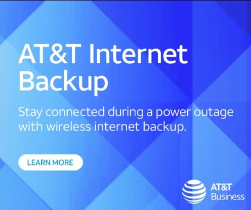
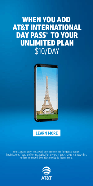
Banner with AT&T animation with the ad designed in a brand blue color.

A fine example of a laconic banner ad where the name of the Louis Vuitton brand is used only on a pretty light background.

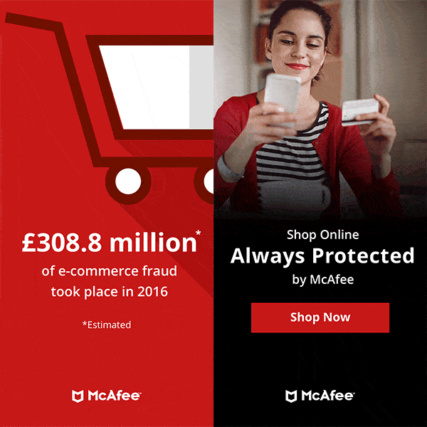
A rather simple ad of an online security problem in blue tones and a noticeable action button.

The NIKE brand is so recognizable that its logo is enough to advertise a new pair of trainers.

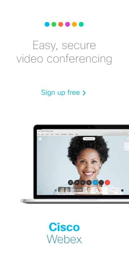
Animated ad of Cisco app used for easy and safe communication in a video chat.


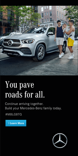
Animated banner ad of Mercedes-Benz with beautiful photos.


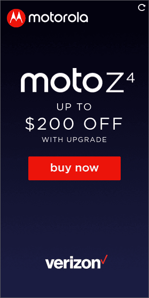
An offer from Verizon to open an account in an online bank with a properly selected photo.


BMW banner with special offers that can be clarified from the local dealers.

SAP banner ad is a bit fact-laden but is designed in a general style.


Visa animated banner advertising their features of swift payment for products and services.

Walmart – one of the most popular chain stores – advertises its rust remover.


Оriginal Honda animation presenting a new car model and discounts for previous variants.


Sometimes, only Gucci’s name backed by the sky is enough for advertising.


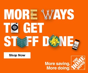
Brand orange color and simple offer to join Home Depot – a minimalist banner.

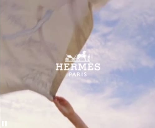
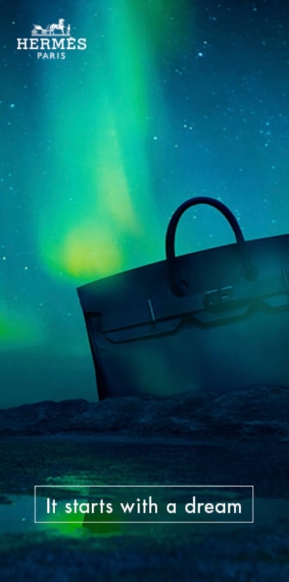
A noticeable button called “Try this for free” often works efficiently. Hermès uses it.

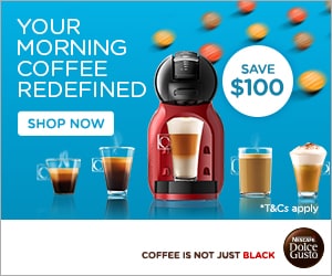
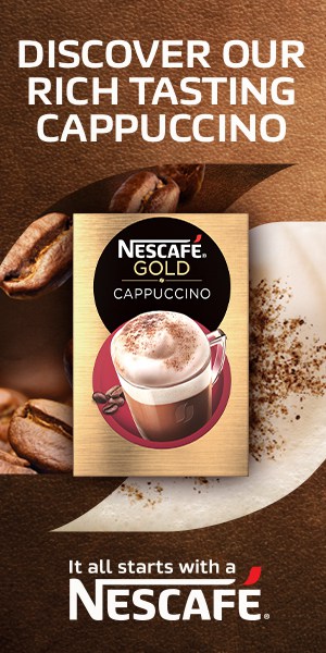
Ad of a new Nescafe cappuccino in coffee tones and a package photo.

“Find a perfect breakfast at Starbucks.”


This is a great example of the proper use of numbers in a Gillette banner ad.

Netflix advertises the third series offering to watch it by clicking on the banner.

IKEA banners include a good price offer.

Bright sunny colors for advertising new sunny Fritos.


Example of proper use of numbers and creative text in the banner ad of Wells Fargo.


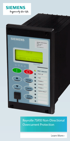
Siemens properly uses eye-catching texts and well-matched photos.

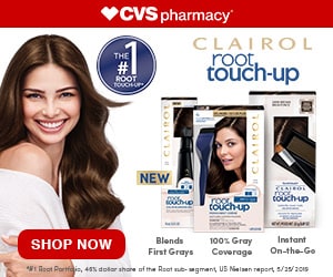
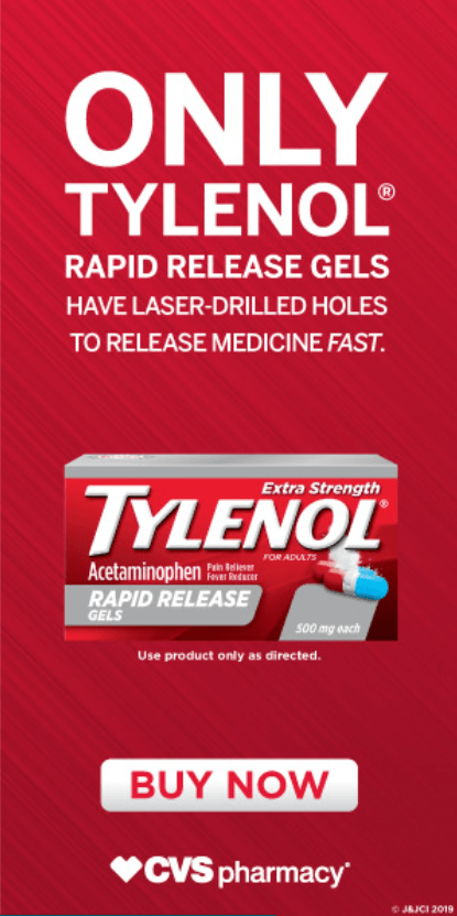
Banners of CVS pharmaceutical companies take much room for a logo and advertise vitamins.

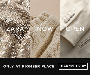
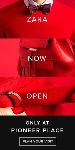
Sell-out in Zara is represented on a light banner with a photo of a pretty cover girl.

An animated banner for the ESPN sports channel encourages users to watch their favorite matches.

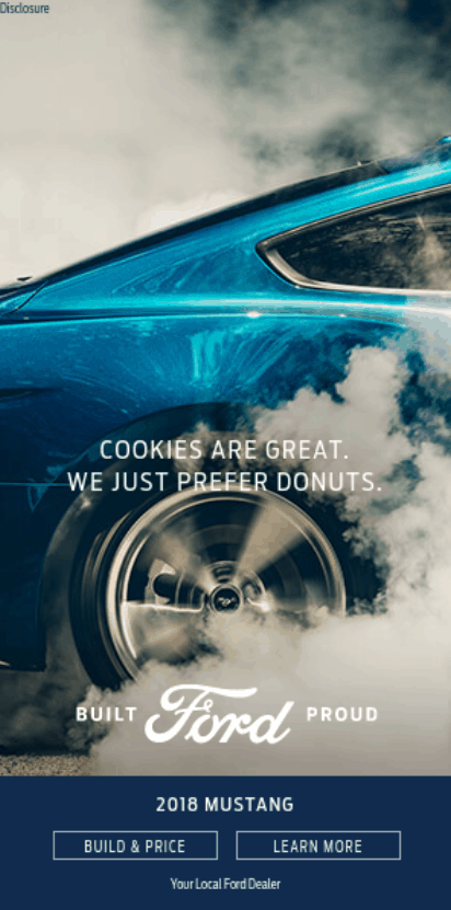
Banners of such carmakers as Ford include the best livery models only.

Nestle has a simple and appealing banner with an attractive offer.

A banner encourages using an attractive UPS promotional code; this always draws users’ attention.

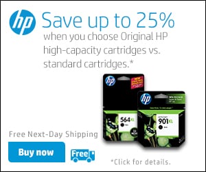
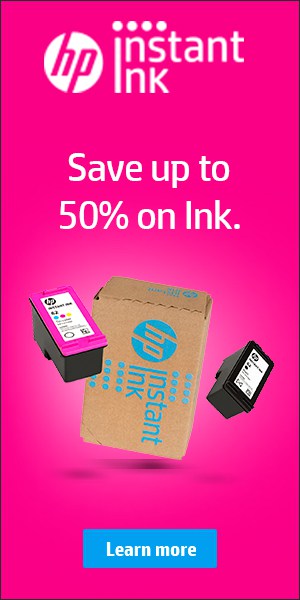
Try out the new printing quality right now together with HP printers.

Ad slot – 300×250
It is a standard advertising banner 300 px wide and 250 px high. It is also known as Inline Rectangle, Med Rec, MREC, or Medium Rectangle. Such banners are placed over the bend. Below are examples of excellent banner ads 300×250.
A well-designed light banner with a price offer and action button attracts customers. There are a lot of interactive banner ads on this topic.
A good example of minimalistic design and proper color use.
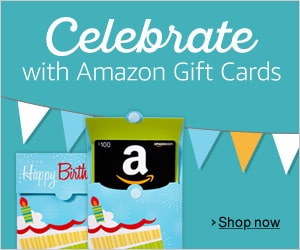
Celebrate with Amazon gift cards – a short-spoken offer in pleasant mint tones.
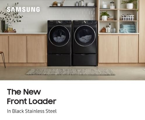
An animated banner demonstrates using a new washing machine as part of the interior.
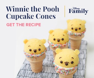
This bright banner offers a recipe for original Disney cupcakes in the form of Winnie-the-Pooh.
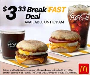
An offer of quick breakfasts in a bright banner with a photo of the meal and cost.
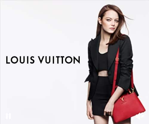
The advertising of Louis Vuitton clothes with a famous cover girl, in light tones.
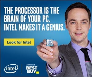
In this ad, Intel used the face of a famous comic actor and an attractive offer.
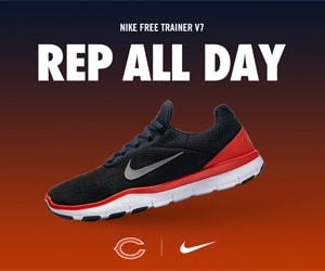
This is a good example of the proper use of full text in a Cisco animated banner ad.

A detailed drawn banner that attracts users due to a short motto.


Several techniques were used here to draw attention.

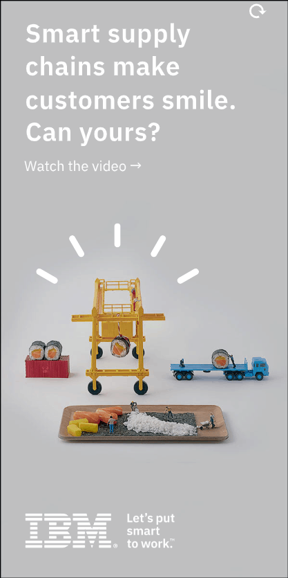
IBM designers fulfilled their task to attract customers with text.

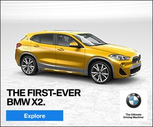
An attractive offer from SAP software combined with a pleasant image is a good banner ad.

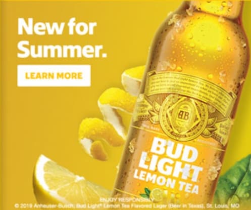
A banner ad of a summer Budweiser specialty with animation, rich colors, and an extremely live image.
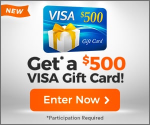
Visa ad banner with an attractive price offer of a gift certificate.
A banner ad with a special offer from Walmart involving bright colors.

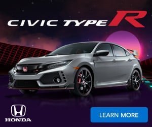
Like banners of other carmakers, the Honda banner includes a beautiful photo of a new car model.
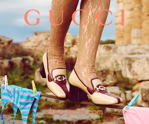
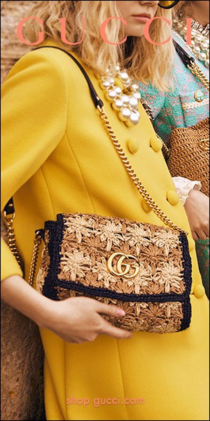
Ads of fashion houses always include the best fashion photos with a presentation of a new Gucci collection.
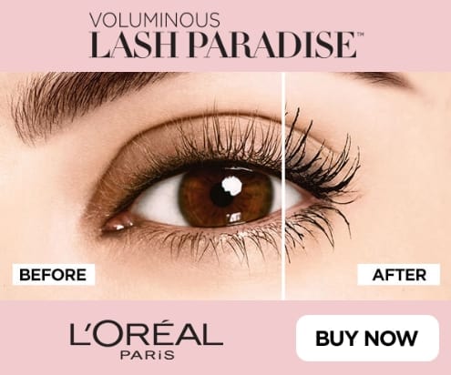
An ad for a new L’Oréal mascara with “Before/after” animation is a great solution.
A beautiful example of a short video banner.
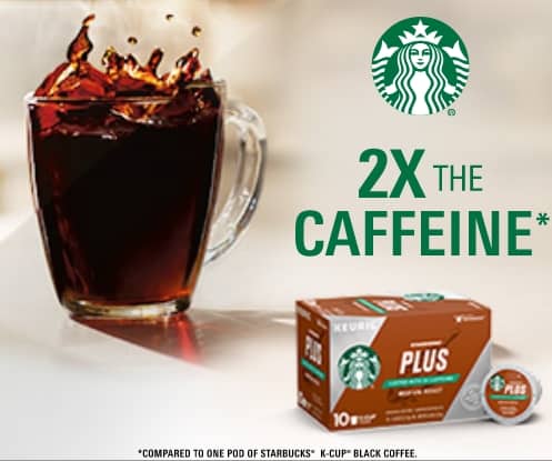
A great banner with animation and an ad for a new double offer from Starbucks.
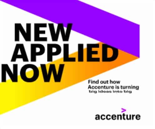
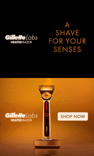
A bright flame-colored background and Gillette shaving stick always draw attention to the banner.

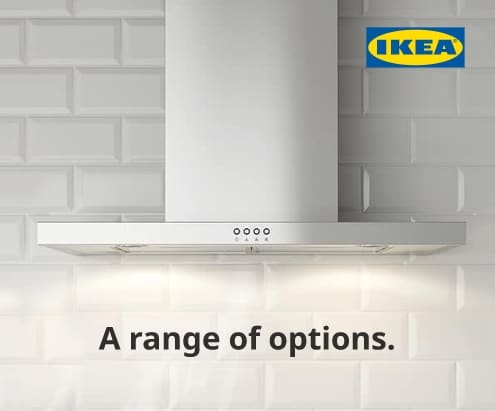
An animated banner with an ad for new kitchen ventilation and prices of IKEA.
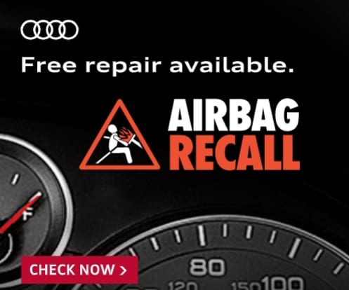
Animated banner warning about the need to control airbags as this is very important for everyone.

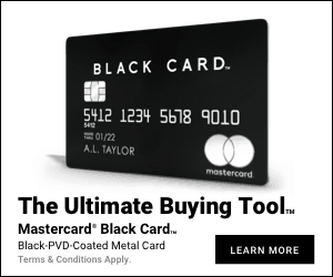
The black-and-white ad for Mastercard black card is an original and attractive solution.
May your ideas become true with Siemens.

“Plan your visit.”
This ad involves using numbers to attract customers.

Go further with Ford – a motto with a logo makes a perfect banner.
A cute photo and a pop-up perfectly suit an ad for Nestle baby food.


A chance to save money and get a free shipment to make HP banner customer-attractive.
Ad slot – 300×600
Ad slot 300 px wide and 600 px high. It is also known as Monster MPU, Half Page Unit (HPU), or Filmstrip. Such an ad can have its own advertising space or be set up as multi-size advertising space with 300х250 banners. Let`s look at 300×600 banner ad examples.
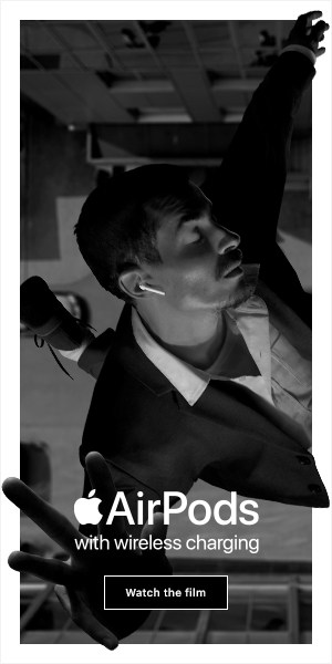
A creative black-and-white banner ad that attracts customers with interesting images. It is maybe the best example of a banner 300×600.
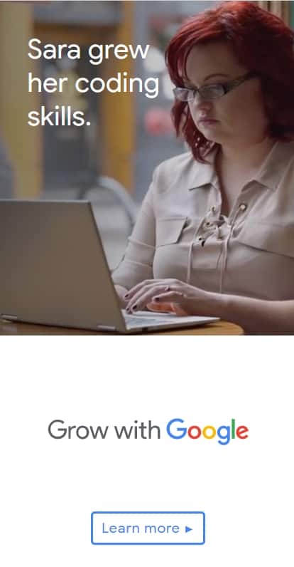
“Grow with Google.”
Advertising of new Microsoft educational programs with great photos and alluring text.

An original ad for free audiobooks in dark colors and bright covers.


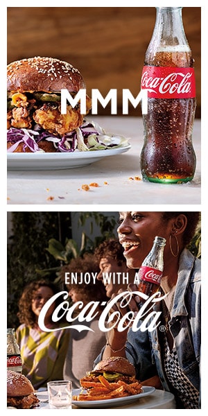
As usual, Coca-Cola brand photos make people feel hungry and thirsty.
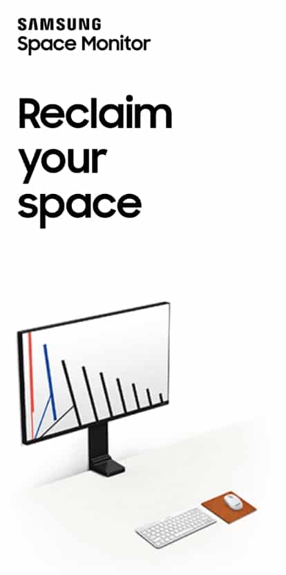
An animated banner ad that represents a new spatial monitor.
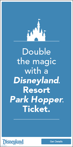
A multi-tone restrained banner with a Disney logo.
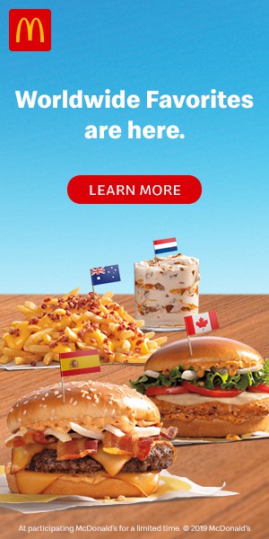
“Worldwide favorites are here” is the motto of the new Mcdonald’s banner with a photo of the best world meals.
Louis Vuitton relies on the best cover girls and the beauty of their products.

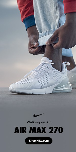
Walk on air with a new NIKE collection.
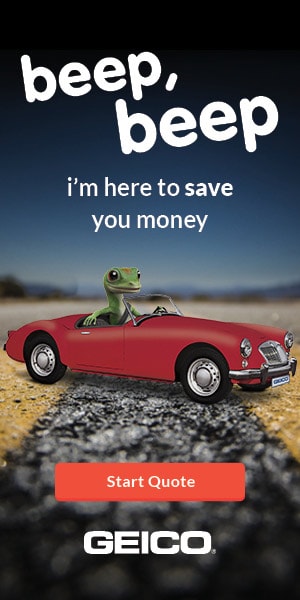
Famous GE frog says it arrived to save your money.
So as other Oracle banners, a perfect photo, pastel shades, and catchy text.

A minimalist banner with a special offer: logos and a favorable price.
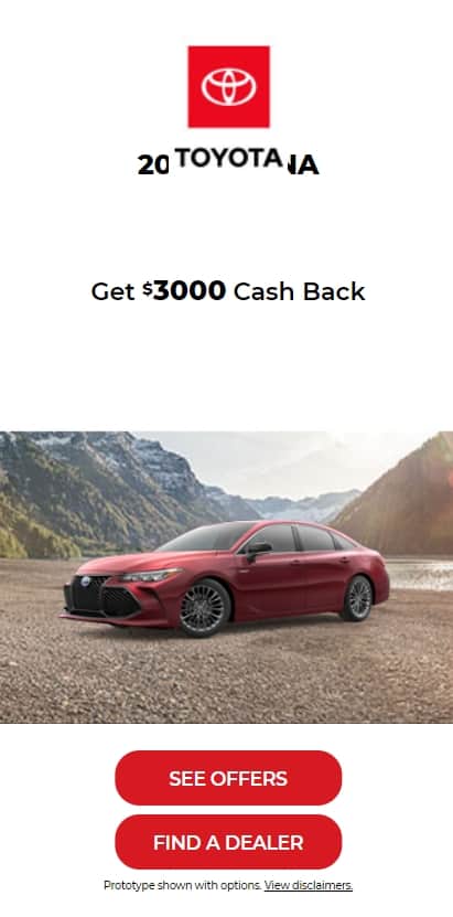
A great animated banner with an ad for a new BMW X7 became larger and more comfortable.


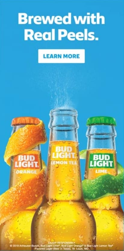
Budweiser has used creative text and a great frame with its product for creating a banner.
Walmart chain store has used a banner for advertising drugs with a short text.
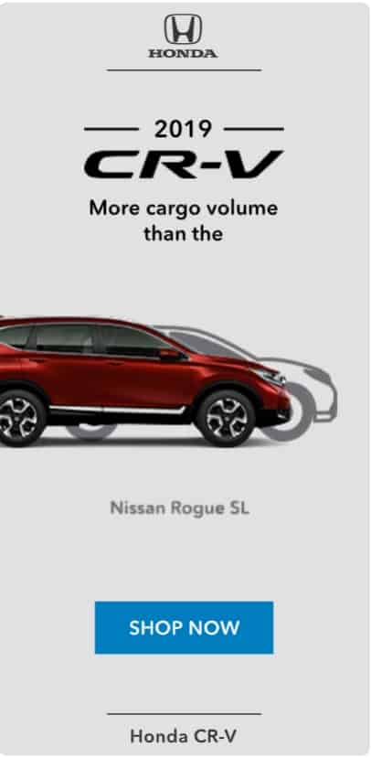
Red Honda became a biggie in this banner ad with a light background.
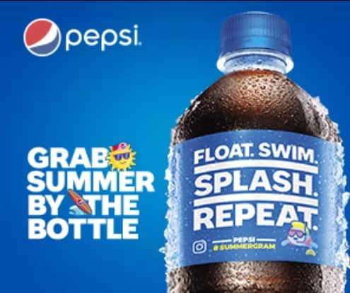
A classic bottle of Pepsi and their eye-catching brand logo became the biggie of this banner.

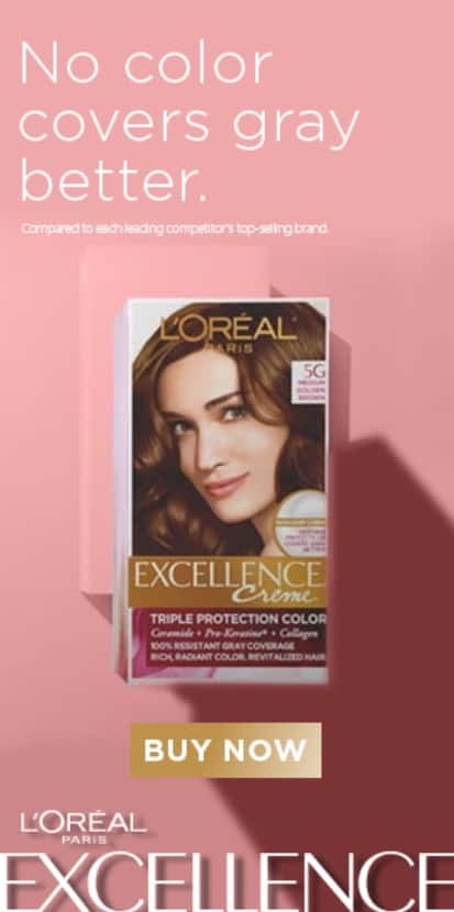
An animated banner with an ad for L’Oréal hair dye where the photos of a famous actress were used.
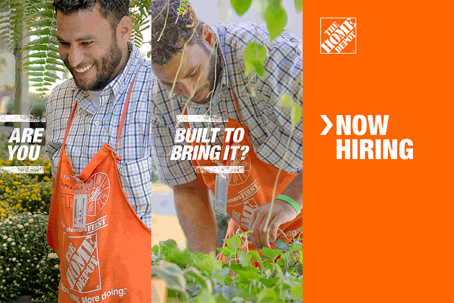
Another example of a very minimalist banner of Home Depot.
Everything starts with a dream.
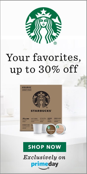
Starbucks banner that attracts users with a price offer.
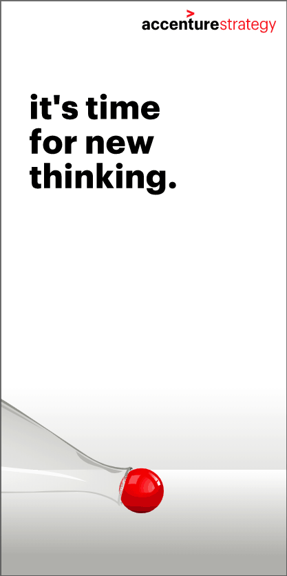
A beautiful photo played a significant role in this ad for a new Gillette shaving stick.

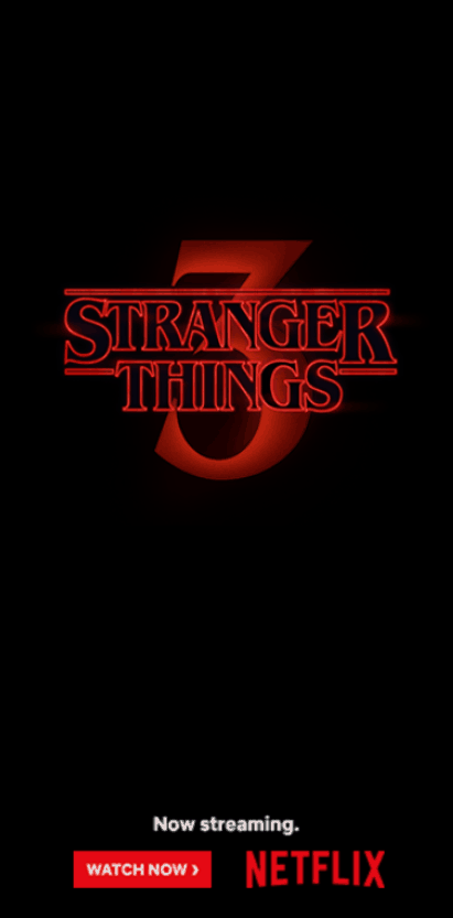
A fade-in pop-up logo of the new Netflix series on a dark background encourages fans to watch it right now.
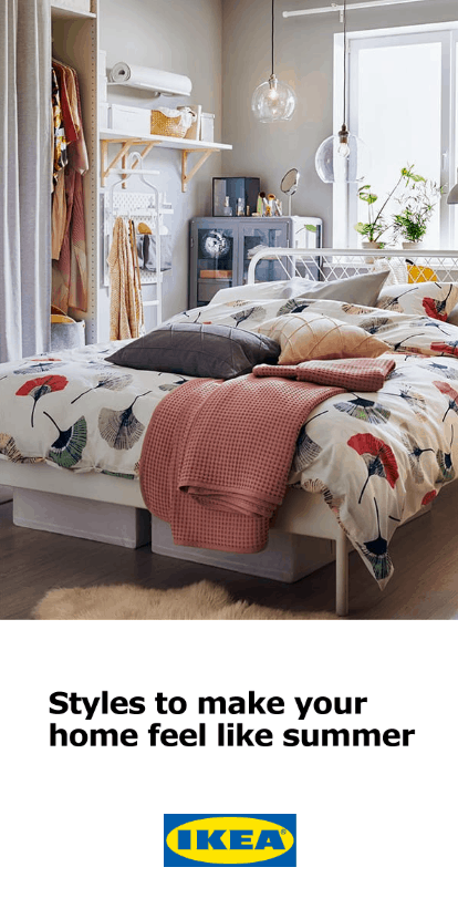
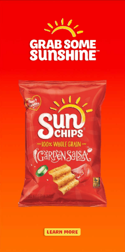
The user will notice a bright ad for new Fritos at once.
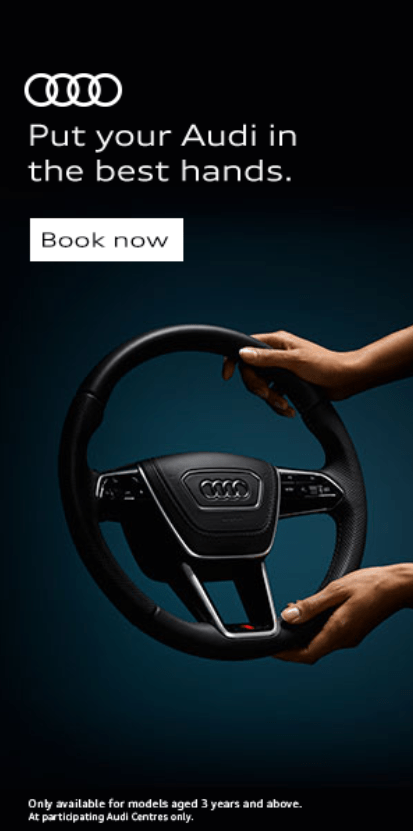
The motto of this banner is “Put your Audi in the best hands.”

Such Siemens banners will draw the attention of customers interested in the offer.
This banner involves bright red tones typical for the CVS pharmacy brand.
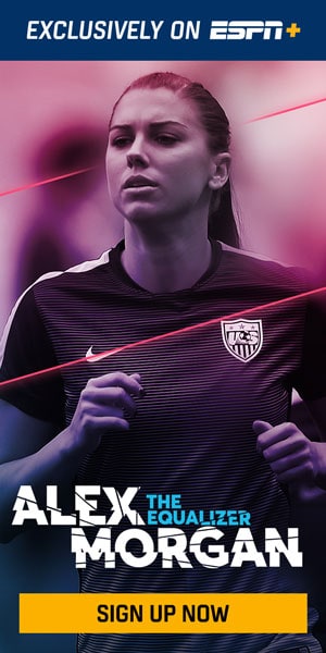
A banner with a famous sportswoman for the ESPN sports channel.
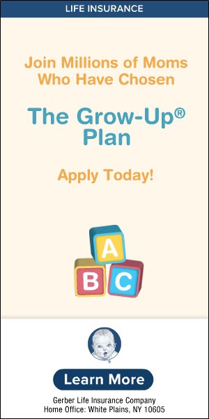
The Nestle ad always reminds us that millions of parents have chosen them so that the user would also get around to doing this.

Surely, a bright color, attractive offer.
Banner size – 160×600
It is a standard ad slot 160 px wide and 600 px high. It is aka “wide skyscraper,” “super skyscraper,” or “skyscraper ad.” Usually, it is placed on the side of the page so that the users would see the ad when scrolling down. So let`s inspire with these 160×600 banner ads samples.
Banner with a music listening app with a photo of an actress. There are a lot of similar cool banner ads about music apps.


Keep your data safe.

Picture the action button “Buy now” on other Amazon banner ads.


An animated banner ad for a series of Samsung smart gadgets with a dark background.


An ad for a new Mcdonald’s value meal.


A banner ad of a new Louis Vuitton perfume with a neat bottle photo backed by warm colors.


A creative banner for NIKE and an ad for a new model of athletic footwear.


A quote only takes minutes.


A banner with a photo of the founder and its Oracle business motto.

Need a new mattress, search here.


An ad for the BMW Mini product range.


Walmart uses a noticeable and user-friendly action button.


A football pitch is the best place for shooting sports cars.

New look, same taste.


A banner ad for a new L’Oréal hair conditioner.

A Home Depot logo and one sentence on orange background.


A bright and dynamic banner ad for coffee with caramel taste by Nescafe.

Presentation of new desserts with original taste from Starbucks with an opportunity to find out more.


A new Gillette shaving stick became the centerfold.

An ad for a new Netflix show with text techniques.


Banner ads for a new series of Fritos. Looks great.


An animated banner from Wells Fargo.


Siemens specialists propose to automatize any processes.

An ad for probiotics.

Exquisite black colors.

This banner ad offers to watch the best games in HQ with ESPN.


A photo of a happy man.


Conclusion
Google Ads banner is a way to attract customers. Two banner formats are the most common: 300х250 and 728×90. We recommend using at least such banners if you don’t plan to hire designers and invest much. You know where to get web banner examples and flash banner ads examples for inspiration.
