
In digital marketing, pop-ups fundamentally change everything. These modest tiny boxes can help to improve the performance of your website. We’re pulling back the curtains on the 15 different kinds of pop-ups that can increase your internet profile today.
From lightbox pop-ups that take front stage to sliding pop-ups that gently slide into your visitor’s view, every style has a different taste. They are the wizards behind the curtain, increasing user involvement, supporting lead generation, and sharply raising conversions.
Real magic comes from knowing and applying these pop-up kinds correctly. It’s not about dumping everything at the wall and hoping something sticks. It’s about selecting the correct instrument for a task.
Recall that in online marketing Plerdy is your reliable friend. Using its SEO tester and heat map capabilities, Plerdy offers the information required for wise selections. So let’s explore the pop-up procession and see how Plerdy can assist you to use their power. Welcome the pop-up revolution now; your website will thank you for it!
What are Popup Forms?
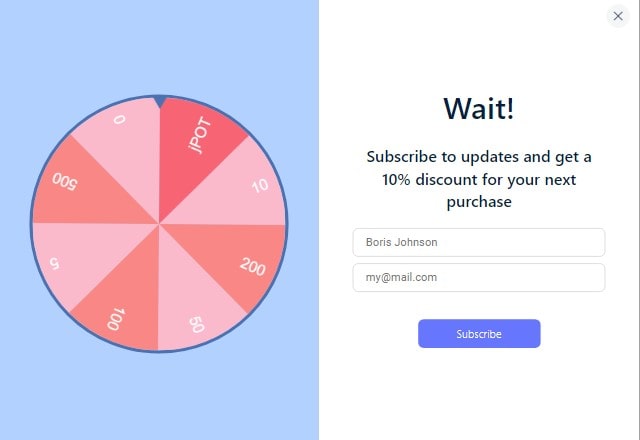
Explore the realm of popup forms, those clever, eye-catching designs that burst on your screen. If you play your cards well, they are marketing goldmines rather than just irritations. Let us break out their core.
Popup forms are dynamic, interactive objects dancing onto your digital platform. They are more than simply fixed chunks of code. They live, breathe, and react, matching their rhythm to the pulse of your visitor.
- First impact: A popup form steals the show right away. It grabs the visitor right away, is bold and unmissable.
- Data may be exchanged two-way thanks to these forms, which also provide a useful hub.
- Conversion Catalyst: Popups are strong triggers that encourage guests toward intended behavior.
Use these pop-up forms to boost your web profile. Each style of lightbox pop-up, floating bar pop-up, or fullscreen welcome mat has advantages and is meant to help with particular goals.
Pop-ups are not a panacea. They change their colors to fit the style of the webpage, just as chameleons would do. A well-designed popup form is a visual joy that harmonizes with the overall look and still stands out enough to draw interest.
Recall that the proper popup form will turn a flat digital brochure into an interactive, responsive platform. Therefore, the next time a popup form springs out at you, embrace it for its great utility rather than discount it.
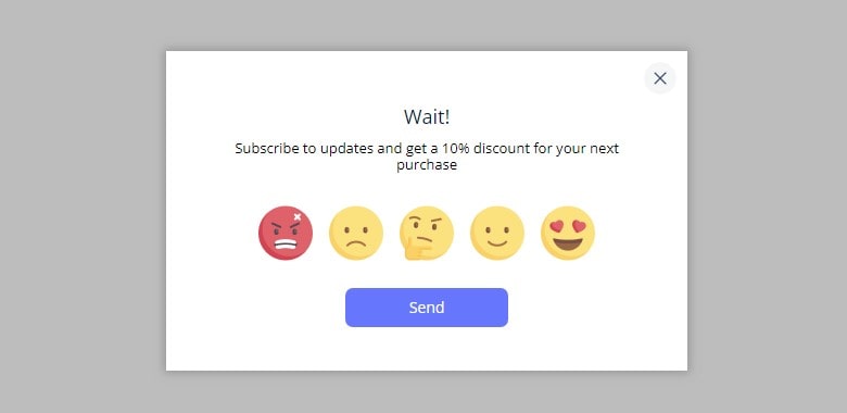
Why Do You Need a Pop-up?

The digital world’s jack-in–the-box, pop-ups, provide more than first looks. Strong tools for your marketing toolset, they are ready to be used. Here are the reasons you should have them.
In their several incarnations, pop-ups have a marketing power difficult to overlook. It’s past time to turn them from your enemy into your friend. Let’s highlight their noteworthy qualities:
- Pop-ups draw attention like magnets. They demand your visitor’s concentration and cut through the noise.
- Pop-ups are a treasure for ideas driven by data. They expose valuable information that helps you to better know your guests.
- They are the push reluctant guests sometimes need to get from reflection to action.
Various pop-ups have varied uses. While exit-intention pop-ups try last-ditch to hold the visitor’s attention, slide-in scroll boxes softly prod them. There then are the time-driven pop-ups, a test of your visitor’s engagement range.
The secret sauce for a blazing online presence is pop-ups. They are the digital equivalent of a shopkeeper urging a window visitor to enter and examine more closely. A well placed and aesthetically pleasing pop-up can flip the script and turn a passing visitor into a devoted customer.
Within the field of online marketing, pop-ups are the understated heroes. Working behind the scene to increase interaction, involvement, and conversion, they are the silent persuaders. So, don’t ignore these effective instruments; embrace them and see how well your digital strategy flies.
The Key Advantages of Pop-ups

A pop-up can gather leads using a technique to lower page bounce rates, boost conversion, and raise revenues.
Pop-ups offer four primary benefits here:
- Simple application is required. You can fast add them on your own to the website. Not necessary to pay numerous hours to hire programmers or designers. Furthermore, while testing you can always quickly alter the design and content without using any extra money from the marketing budget.
- Design and dynamism. Animation and effects that deviate from the simple and stationary approach of conventional flat design define the design trend of current years. Dynamic pop-ups with branded designs are more likely than fixed website components to grab visitors’ interest.
- The correct offer at the correct moment. Calls to action are part of pop-ups; if placed correctly, they show just when a user is ready to view a particular offer. Furthermore, such words as free, discount, gift, etc., set off the human mind. They affect consumers’ emotions and hence provide the foundation of subscribers, consumers, and devoted followers each company wants.
- Shortness of time The formula is clear call to action, one to two fields, no distracting items, up to two buttons. See a pop-up and you know just what to do. Two choices always exist: either leave without doing anything or finish the given tasks. This is known as “users’ path,” and pop-ups straight forward it. Every action is finished without spending time, accessing outside websites, or entering login information.
Perhaps the most users find them unpleasant. Still, pop-ups do have some value. One can manage their refusal with appropriate design and location.
Let’s examine the primary forms of pop-ups, which vary in action, placement, structure, and intent.
Types of pop-ups by format
Here there are two somewhat sizable groups:
- Hello-boards
- Page stops
Not in design or placement, but in navigation, size, and time of the display, they differ.
These kinds of pop-ups show right away or few seconds after a visitor visits a website. In certain circumstances, they may even show before a page loads completely.
More often than page pauses, hello-boards are utilized nowadays. Design has evolved as well. Smaller than their predecessors, modern hello-boards do not overlay page content and let users select whether to quit a website or keep on surfing.
On the other hand, page pauses usually draw attention to the contents of a window. They span the page and may show without navigation, therefore guiding consumers from browsing till a goal activity is finished.
While page-stops are only useful in few niches and specific circumstances (such as to sell time-limited goods or services, inspire people to subscribe, etc.), almost everyone utilizes hello-boards.
Though they are less annoying to users, hello-boards are not as successful as page-stops. Only big and well-known websites like Pinterest, Cosmopolitan, etc. today let themselves to utilize page-stops. Still, with appropriate time and targeted display, they reduce the pressure on visitors’ good attitude and loyalty.
Types of Pop-Ups by Action

Location, time, and type of activity help one classify pop-ups.
1. Entry pop-ups.
They might be positioned without content overlapping, pinned to the top or bottom website bar, or overlaid. Considered as one of the most underappreciated pop-up forms in web marketing are these ones. Maybe the trouble is that they can seriously divert consumers from what they intend to achieve and cause damage to conversion.
Such forms show up either virtually directly after the content is seen or before a page loads completely. The website does not yet feature any user interaction. The users lack knowledge of where they have landed and are unsure whether they wish to visit the website once more.
It sounds horrible and repulsive.
But if everything were so basic, pop-ups would have long ago disappeared. Still, based on surprising and natural displays, they have rather a good effect. Users have not time to consider when a pop-up abruptly shows up. Furthermore motivated to discover more about the material concealed behind the transparent pop-up, they are pushed into the fulfillment of a specific action. The users will presumably supply information or use an offer without thinking twice (or even grudgingly but still).
The message determines most of the effectiveness of such pop-ups. Give something worth and inspire desire in them. A 50% discount on all products, for instance, is a terrific trigger that would not harm to show to every user. Spice everything with a time limit, 1-2 fields, and a target action button to relax the pressure generated by entry pop-ups.
2. Click on pop-ups.
A user clicking a link, picture, or word sets them off. Click pop-ups are the least irritating to consumers since they depend on action. They show up when people wish to view them and operate gently without endangering the conversion of the website.
Click pop-ups often replace landings; they don’t push users, let them feel as though they still control the browsing, and foster a comfortable and safe environment.
3. Sidebar scroll pop-ups.
Thanks to its appropriate location and time, this kind of pop-up seems most natural. They show themselves when consumers already understand material well and most likely won’t stop looking about the website because of a pop-up.
4. Timed pop-ups.
Unlike entry pop-ups, they are not quite bothersome. They also only show to people interested in the related offer, not to every user.
We thus advise against employing timed pop-ups without testing.
Alternatively, a scrolling window will let you quickly replace a timed pop-up. Twenty to sixty seconds after a targeted user hits a website is the ideal display time.
A series of testing helps one to find the precise timing. The core of the success of such pop-ups still is the display’s timing.
5. Exit pop-ups.
Making a nice offer before a person leaves a website is the chore. Many times, website owners employ several freebies and guarantee discounts to do it. At the cart stage, these pop-ups also serve to inspire consumers to order.
Remarkably, this initially sightful handy instrument has many enemies. The trouble is that these pop-ups are really forceful. Convincing someone about ready to depart is difficult. Again, regarding entrance pop-ups, you must locate great inspiration. If there is no chance to employ kind encouragement, you would better refuse such pop-ups. They will cause more damage than gain otherwise.
Still, avoid overdoing it even if you provide a suitable offer—gift, attractive discount, etc.? Exit pop-ups shouldn’t show to the same users more than three times a week. Testing helps one to more precisely define the display’s specific parameters.
Timing, location, and degree of user involvement define the relevance of the specified pop-ups. Users of scroll and click pop-ups experience a neutral and mild effect. Exit-entry and timed pop-ups can greatly increase conversion even if they are a more insecure and more annoying choice.
Types of Pop-Ups by Placement
Another classification for pop-ups is based on their appearance location.
There are typically four sites:
- Top of the screen opens called header pop-ups. They can be either static or dynamic depending on the content of a page.
- Centre pop-ups. The most often used area on a screen to show pop-ups is its middle. Here they are far more likely to be observed.
- Sidebar pop-up windows. They show up as a user scrolls the matching page and resemble a little modest window on either left or right side. Often used instead of timed pop-ups (will be discussed), these pop-ups show with 5-30 second intervals. Users who have adequate time to check out most of the website see scroll pop-ups. They so relate to the user journey.
- Added similarly but pinned at the bottom of a website are footer (also opt-in) pop-ups. These windows give seasonal and time-limited deals, discounts, and bargains; they are also the best option for gathering subscribers. Thus, a bottom (or side) pop-up balances the page while people cannot be fully engaged and are annoyed with the content after spending five to thirty seconds on a website.
Types of Pop-Ups by Purpose
A complete alternative for landings, promo and product pages are pop-ups. The use has practically no restrictions.
- Subscription. One finds such pop-up windows on blogs. Usually they include a call-to- action, one to two field (name, email), and a button. Useful updates, original material, gift books, and podcasts might inspire people to sign-up.
- Promo offers discounts. Pop-ups can also show product recommendations, seasonal and time-limited discounts, etc. The main objective is to enhance sales—including recurring business. Usually, such pop-ups follow a call to action, one to three field (name, phone number, email), and button pattern. Clearly outlining the promo terms and stating the discount amount will help users to be motivated to act.
- Callback. This is yet another kind of pop-up that might significantly boost direct sales. Many times, users cannot determine whether or not to order. Professional guidance is like a tranquilizer, a means to postpone the very purchase and part from money later. Usually, the structure is a call to action, one to two fields (name, phone), and a button. It should be emphasized that the consultation is free to raise user inspiration.
- One-click order. Sales are raised with these pop-up windows. They let consumers trust everything to a service provider and cut the order process. The usual format is a call to action, one field—phone number—and a button.
Pop-Up Power: Learnings and Conclusions
We have thus conducted a whirl tour over the territory of 15 varieties of pop-ups, each with special ability to engage and convert. Each lightbox, slide-in, and exit-intent pop-up we have negotiated has unique beauty.
On your page, they are not only inert objects. They actively participate in your marketing plan, guiding guests to intended behavior. Whether it’s a tempting leadformly or an interesting poll, pop-ups are really vital for increasing interaction.
Their adaptability comes from their multi-pronged approach, which meets several audiences and goals. Pop-ups are the secret ingredient in your recipe for success whether it’s an eCommerce website fighting cart abandonment or a blog trying to boost email sign-ups.
Pop-ups, however, require proper treatment, much like any tool. You wish not to be that bothersome website where pop-ups cause undesired interruption. It’s about finding the correct mix; be tenacious but avoid pestering.
And Plerdy then comes in handy. Its broad features and easy-to-use interface help to streamline pop-up control. It’s your road map toward corporate success, not only software. Use Plerdy’s potential and let pop-ups to be the earnings magnet for your company. Try Plerdy right now; you’ll not regret it!