
Hi there, digital adventurers! Are you game to explore the realm of website pop-ups? Your road map across the terrain of successful pop-up design is this article, “10 Website Popup Examples.” Our task is To highlight ten outstanding cases of website pop-ups deftly negotiating the thin line between attention-grabbing and intrusive. Our objectives include Give your pop-up designs a platform so that they could inspire you. So get ready and get ready for a trip into the core of website interaction. Let’s reveal the secrets of pop-ups that delight, interact with, and convert guests. All set to embark? Let’s start!
What are website pop-ups?
Website pop-ups are like the unannounced visitors of the digital sphere. Often unwelcome, they crop up on your screen and occasionally provide useful offers or information. But just what exactly are they?
On a page, website pop-ups are interactive windows. They are meant to grab your interest and inspire activity. These are some typical instances:
- Usually featuring special offers or discounts, promotional pop-ups They are the digital version of a salesman luring you in a store.
- Subscription pop-ups ask you to join a newsletter or mailing list. It functions as an open invitation to a VIP club.
- Intent for Exit Pop-ups show when you’re about to leave a site. Think of them as furiously trying to drag you back in before giving up the chase.
Using pop-ups either help or hurt your website depending on what you intend. One may say they increase engagement and conversions. On the other hand, they can be considered as invasive and possibly deterring guests. It’s all about finding the proper balance: make good use of pop-ups without crossing the line.
Website pop-ups are ultimately tools from your digital toolkit. If you apply them wisely, you should have no issue accomplishing your goals online.
How do popups work?
Like jack-in- the-boxes, website pop-ups arrive unannounced. They vanished from view for one second, then abruptly took front stage. How then do they function? Allow us to draw back the curtains:
Pop-ups are tiny windows set to show over or inside the content of your website. They show up to transmit a message, much as digital billboards. Their operation is broken out here step-by-step:
- Specific triggers set pop-ups off. It may be page scroll, a time delay, or exit intent. It is like laying a digital trap and waiting for the right moment to spring it.
- Once set off, the pop-up shows on the screen. It’s like a spotlight suddenly shining a certain offer or message.
- Interacting: The visitor interacts with the pop-up either closing it or interacting with its content. The visitor chooses which road to follow, much like one would choose a fork in the road.
- The pop-up closes following the interaction, guiding the user back to the original material. It’s like the curtain closing following a show.
JavaScript or HTML5 powers pop-ups behind the scenes. They are like the puppeteers dragging the strings to create the pop-up dance on their melody.
Pop-ups are really a mix of strategic timing and intelligent programming. Their design is to grab your attention, transmit a message, and gently bow out. When applied properly, they can improve the user experience of your website.
Should you use pop-ups on your website?
On your website, pop-ups are like the taste sensation in a dish. Correct use of these can improve the experience. Overdo it and run the danger of ruining the meal. The advantages and drawbacks are briefly outlined here.
Pros of Using Pop-ups:
- Engagement Boost: Pop-ups can act as a call to action, prompting visitors to engage with your site. They’re like digital nudges, pushing them toward a desired action.
- Increased Conversions: A well-crafted pop-up can turn a casual visitor into a subscriber or customer. It’s the online equivalent of a persuasive sales pitch.
- Information Gathering: Pop-ups can collect valuable data, such as email addresses for newsletters. They’re like digital data miners, extracting nuggets of information.
Cons of Using Pop-ups:
- User Annoyance: Pop-ups can be seen as intrusive and potentially irritating visitors. They’re like a fly buzzing around—they might drive people away.
- Mobile Unfriendliness: Pop-ups can disrupt the mobile user experience, leading to higher bounce rates. They’re like roadblocks on the mobile highway.
- SEO Impact: Overuse of pop-ups can negatively impact SEO. They’re like excess baggage, potentially slowing down your site’s performance.
Using pop-ups on your website is a balancing act in the grand scheme. It’s about weighing the potential benefits against the possible drawbacks. Use them judiciously; pop-ups can be a powerful tool in your website arsenal.
10 Reasons Why this Virtual “Hook” Doesn’t Help to Catch Fish
Usually, ads tell users about the benefits of a product or service. Typical advertising suggests that the product (service) suits every potential customer.
The reality is different.
An ordinary pop-up example is similar to standard advertising. It offers, informs, and seduces, forgetting about a dialogue. Personalization is not just a temporary trend but a new marketing approach based on user communication.
If your “hook” doesn’t help to catch fish or maybe even repel them, this may be caused by one of the following reasons:
- There is no responsive layout. The mobile-first principle remains prevailing. The majority of users browse websites on their smartphones or tablets. If your page doesn’t have a responsive layout, the display of pop-up examples will be distorted, making them useless.
- Increased page load time. Users don’t like waiting. They will quickly leave a website if they don’t see its content within 5-7 seconds. Certain programming nuances are the main reason for increased loading time after an opt-in form is added. Nevertheless, today, there are technical solutions for graphics files of any size.
The period of the 90s when websites didn’t include pages because of the problems with load speed elapsed. If the page example has plenty of pop-ups, this, of course, affects its load speed. Yet, the impact isn’t critical if you connect pop-ups correctly using modern programming methods.
Does an opt-in form not display on the page?
A front-end developer must find and correct the possible reasons for such a problem, such as an issue with pop-up code loading, the Published status being missing, Javascript mistakes, a missing wp_footer, etc.
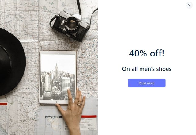
- Poor design. It’s not only about the design that doesn’t match the corporate style. It’s also about the wrong color combination, which doesn’t create the necessary mood, old-fashioned fonts, the window’s irritating size, and static composition.
For example, on this website, a small pop-up with blue text clearly but gently offers a free pizza for registration. It is hard to refuse such a nice offer:
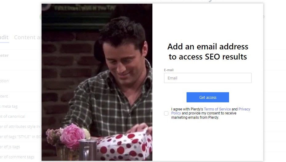
Estée Lauder offers to participate in a loyalty program using a screen pop-up with an elegant design: dark colors, colorful text, one field, a button in the right part of the form, and the large Close icon to close the window any time without an extra hassle:
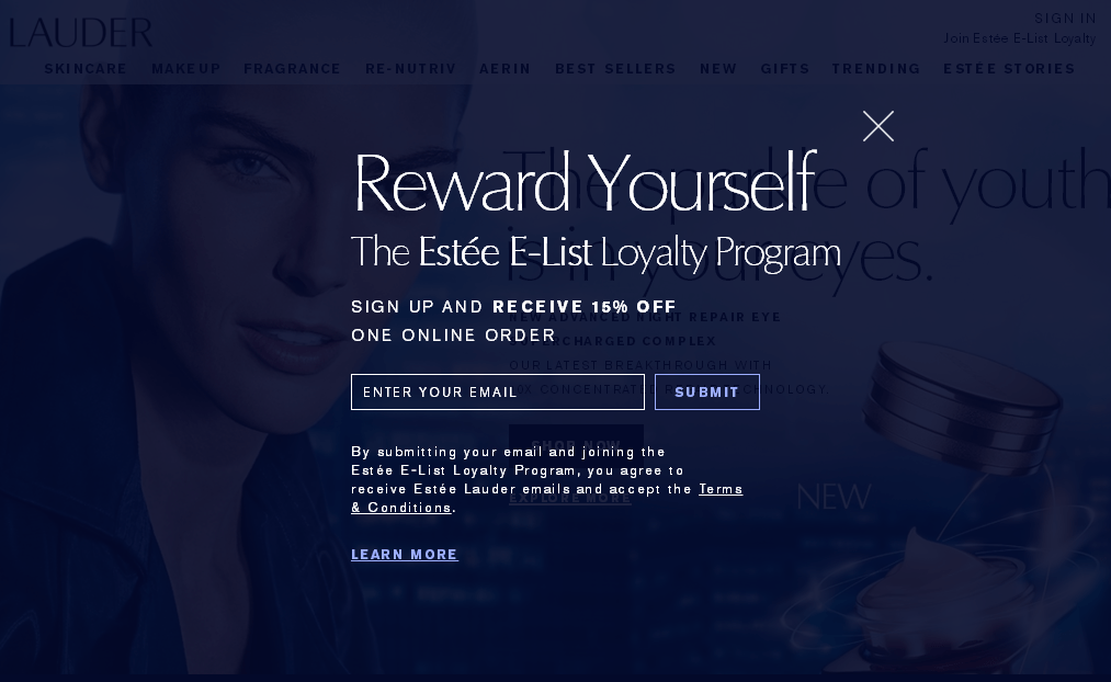
It is noticeable.
If you create an opt-in form with the promise of discounts and gifts, contrasting design, minimum fields and buttons, and good navigation, you will make users complete the target action in a few seconds.
- A weak call to action and the absence of triggers. Be the first to learn about new products, special offers, store events, and more – this is the conversion-triggering offer on Victoria’s Secret’s website.
“Sign up to receive beauty news, product samples, coupons and more.” – the offer from L’Oréal.
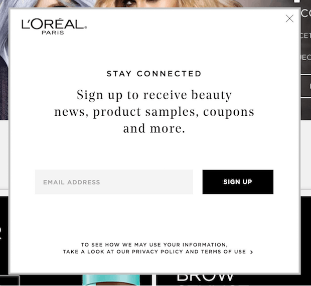
Both calls-to-action are great, but the pop-up example of L’Oréal generates higher conversion. It has maximum motivation for users offering not only news and advertising offers but also samples, coupons, etc. L’Oréal bets on simplicity, clarity, and the maximum number of triggers.
This is the path developing brands should take. They need to increase customer loyalty through discounts, gifts, coupons, and promotions. The call-to-action on the website of Victoria’s Secret works because millions of users know and love this brand.
Will they be interested in events and articles about new products from the company they have never heard about? It isn’t very certain.
- Irrelevant or untimely offer.
Time, place, and motivation are three pillars of effective content for any pop-up example. Don’t write too much and mention your advantages. You should either be noticed for your uniqueness or make an offer that will benefit users.
For example, you shouldn’t display a welcome window before the page loads. Also, the offer to subscribe or receive a coupon should appear on an article or blog page example. Show it no less than 10-15 seconds after users land on the main page example. In this case, it will be timely, relevant, and related to the content.
And a small pop-up requesting permission to define the user’s location in the right corner is a perfect way to set up personalization immediately.
- Numerous fields. The simpler the form, the more likely the target action is. The general rule of conversion suggests using 1-2 fields. However, in this respect, you should also evaluate the applicability of such a solution. For example, if you promote make-up, you can ask information about the user’s date of birth and name, offering gifts in exchange (like Prostor and Watsons).
- There is no A/B testing. Most forms that generate 100% conversion are created through experiments. A/B testing can be internal (when people within the company choose the most appealing design of the opt-in form) or standard (when different variants of pop-ups are placed and tracked using click heatmaps, Google Analytics, etc.).
It is hard to define the relevant USP and select the native design immediately. Conversion depends on the tiniest details, even one well-chosen word.
- Pushy display. For instance, on McDonald’s website, everything is perfectly thought out. They display a small location window on the left of the screen, which appears about 5 seconds after users land on the page. It is closed traditionally by clicking on the Close icon in the corner.
It is worth noting that after you close the form, it won’t appear when you visit the website again. Pushiness is evil, and you must avoid it interacting with your target audience.
So, place no more than five pop-ups and opt-in forms on your website. Based on the research, it is recommended to use three different forms: welcoming, subscription, and scroll or thematic). Don’t show them frequently. Ideally, they should be displayed occasionally, like on the website of one of the leading world’s fast-food providers.
- Hidden navigation. There is no way to get away. This could be a highly effective option, but it isn’t. Users want to know that they have a choice.
The missing Close icon or Unsubscribe button irritates me. With its intrusive pop-ups, Pinterest is probably the only example of a case when a resource can be popular with directive pop-ups.
Leave the Close icon and add the Unsubscribe button. At the same time, show users what they lose if they ignore the pop-up with the text near the Close/Unsubscribe button, such as “No, I don’t want to stay updated,” “No, I don’t like saving,” “Thanks, I’m not ready to get discounts,” etc.
Remember that users must have a choice, but excessive freedom will make the placed pop-ups useless. Implementing the navigation and Unsubscribe button can make the Сlose button less noticeable and vice versa.
- Wrong display condition. The page where the opt-in form is shown greatly affects its conversion.
For example, a welcome pop-up is only relevant on the main page example. A subscription window generates better conversion when placed on the page of the particular article in a blog.
In some cases (if there is no blog, the section of the article/news is rarely updated, but there is a regular newsletter), it can be effective on the main page.
Scroll opt-in forms are a universal type of hook. They don’t take a lot of space on a page example and distract too much from its content. Scroll pop-ups are great and relevant almost on every page.
A lead-generating pop-up is a clear call to action with motivation, corporate design, navigation, the Close or Unsubscribe button, spam protection and confidentiality information.
Conclusions
As we wrap up our exploration of “10 Website Popup Examples,” it’s clear that pop-ups can be a powerful tool in your website’s arsenal when used correctly. They’re not just about advertisements or annoying interruptions. They’re about engaging your visitors, guiding them on their journey, and ultimately, converting them into loyal customers.
Each example we’ve discussed serves a unique purpose, from the simple yet effective email sign-up pop-up to the more complex, behavior-triggered pop-ups. They’re like the various spices in a well-cooked meal, each adding a distinct flavor and enhancing the user experience.
But remember, the key to a successful pop-up strategy lies in its execution. Know when to display a pop-up, what information to include, and how to make it user-friendly. It’s about respecting visitors’ preferences, maintaining trust, and providing value.
Is your website ready for pop-ups? Why not start with Plerdy tools? They offer a range of features, from heatmaps to an SEO checker, that can help you optimize your website and create effective pop-ups. Give it a try today and see the difference it can make.