
Dive into the digital feast where your restaurant’s website serves as the main course! In 2025, website design is more than just visual appeal—creating an inviting digital space that mirrors your eatery’s unique flavors and atmosphere. Whether you’re showcasing a rustic restaurant, a chic urban café, or a sumptuous fine-dining establishment, each element of your website should enhance the visitor’s experience, encouraging them to book a table.
Here’s a glimpse of what’s cooking:
- Sleek user interfaces that blend functionality with aesthetic appeal
- Responsive designs that adapt seamlessly across devices
- Mouth-watering visuals that tell the culinary story of your restaurant
These top ten design examples are not merely trendy; they are strategic tools for boosting engagement and optimizing user journeys. To elevate your site’s performance, consider utilizing Plerdy’s suite of tools to analyze user behavior, optimize conversion rates, and enhance overall usability. Your website’s potential is vast—tap into it!
Why Does Your Restaurant Need a Website?
Why settle for a local footprint when your restaurant’s website can launch you into the culinary stratosphere? A website acts as your digital storefront, inviting diners to explore your menu, ambiance, and philosophy before they enter your establishment. In today’s fast-paced digital era, a well-designed restaurant website is not just a luxury; it’s an indispensable part of your business strategy.
Consider these essential benefits:
- Enhanced visibility: A website increases your restaurant’s discoverability, attracting locals and tourists.
- Streamlined reservations: With integrated booking systems, your website makes table reservations a breeze.
- Cultural showcase: Through thoughtful design, your website reflects your restaurant’s unique brand and dining experience.
These compelling advantages highlight why robust website design is crucial for any modern restaurant. Leveraging a website’s power boosts your visibility and is a direct channel to cultivate customer relationships and elevate their dining experience.
List of 10 Brilliant Restaurant Website Design Examples
Exploring the “10 Restaurant Website Design Examples in 2024” offers a treasure trove of inspiration for any restaurateur aiming to spruce up their online presence. Each design serves as a masterclass, blending functionality with aesthetic flair and setting the stage for what’s hot in the restaurant scene. These curated examples showcase innovative layouts and features and illustrate how a well-crafted website can turn a simple visit into a compelling dinner invitation.
Girl & the Goat
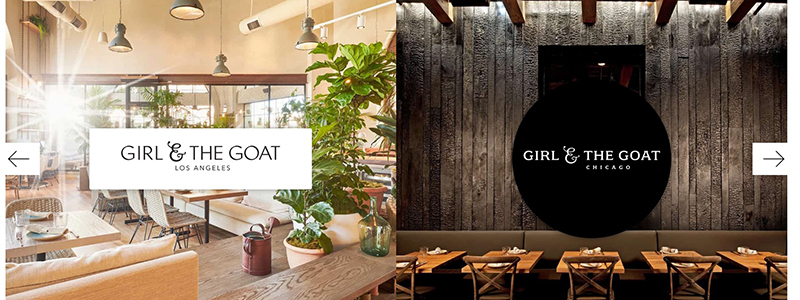
The Girl & the Goat restaurant’s website effectively showcases its ambiance and culinary philosophy through a clean and inviting design. As a standout example among restaurant website designs in 2024, it captures the essence of its Los Angeles and Chicago locations with crisp, high-quality images that speak volumes about their dining experience.
The website’s design visually blends modern aesthetics with a rustic charm, reflecting the restaurant’s innovative yet grounded approach to cuisine. Natural lighting in the photos enhances the welcoming atmosphere, making the virtual visit almost as appealing as dining in person. The navigation is intuitively structured, ensuring that information on menus, locations, and reservations is easily accessible, significantly enhancing the user experience.
The overall website design highlights the restaurant’s uniqueness and immediately grabs the visitor’s attention. This is crucial for converting website visits into dining reservations. The choice of a minimalist layout with sophisticated typography adds to the site’s professional appearance, making it a practical example for those looking to create an impactful restaurant website.
Key features of the Girl & the Goat’s website include:
- High-quality imagery of the interior settings
- Easy navigation with a clear, user-friendly layout
- Quick access to menu and reservation information
- Reflective of the restaurant’s stylish yet approachable atmosphere
Tiki Chick
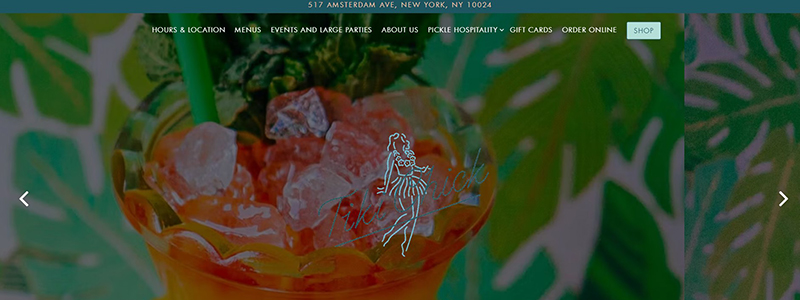
The Tiki Chick website brings a vibrant and playful approach to restaurant website design, embodying the fun and unique essence of the restaurant itself. The design utilizes bright colors and whimsical illustrations that immediately convey the tiki bar theme, creating an engaging user experience from when the homepage loads.
As one scrolls through the website, the consistent use of vivid yellows, greens, and graphical elements of dancing figures maintains a lively tropical vibe that mirrors the restaurant’s atmosphere. This coherence between the website and the restaurant’s physical ambiance is crucial in setting the right expectations for potential visitors.
Because of the site’s clean and uncluttered design, users will have no trouble navigating to the menu, location, hours, and contact information. The website also smartly incorporates interactive elements like scrolling effects, which enhance the playful character of the Tiki Chick restaurant.
The website is optimized for user engagement, with clear calls to action inviting visitors to explore the restaurant, book a table, or browse the merchandise. This functional yet stylish approach exemplifies modern restaurant website design that attracts and retains customer interest.
Key highlights of the Tiki Chick website include:
- Bright and engaging color scheme
- Fun, thematic illustrations integrated throughout the design
- User-friendly navigation
- Effective alignment of online and physical branding elements
Sona
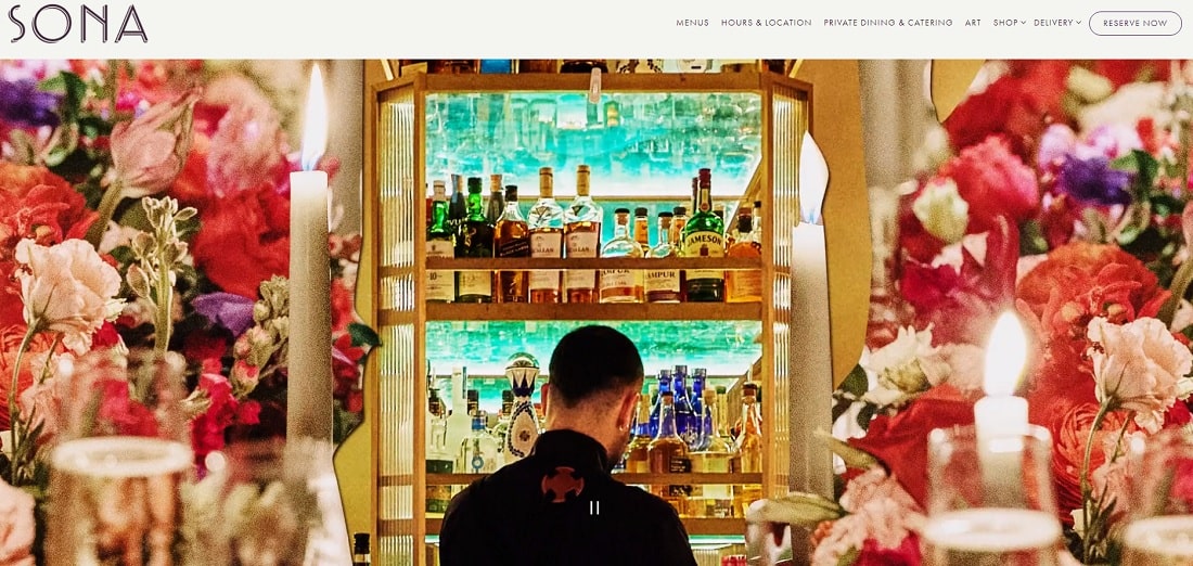
The Sona restaurant’s website, a rare gem in restaurant website design in 2024, offers a lavish visual and navigational experience that mirrors the exclusivity and refinement of the dining venue itself. The website’s design, with its opulent aesthetics and user-friendly interface, sets a high standard for the industry.
When visitors land on the main page, they are greeted with a visually striking slideshow featuring vivid images of the restaurant’s offerings and interior. These images highlight the restaurant’s commitment to quality and atmosphere, setting a luxurious tone that invites further exploration.
The website’s navigation is a breeze, with clearly labeled tabs for menus, hours & location, private dining & catering, art, shop, delivery, and reservations. This layout streamlines site navigation and makes all content readily available, enhancing user experience.
Carefully choosing the color palette and font to match the photos and content achieves a unified and beautiful design that enhances textual and visual material without overwhelming it.
Key features of the Sona website include:
- Luxurious and engaging visual design
- Easy-to-navigate layout
- High-quality images that showcase the restaurant’s ambiance and dishes
- Clear and accessible information on services offered
This website effectively communicates the unique identity of Sona, making it an exemplary model of restaurant website design in 2024.
Sunday in Brooklyn
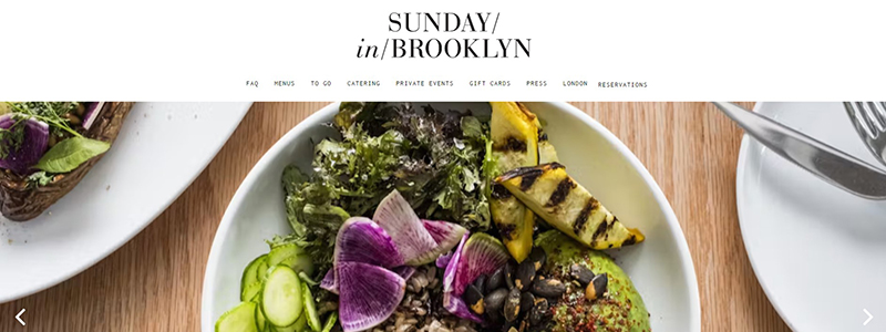
The Sunday in Brooklyn website masterfully captures the restaurant’s essence through a clean and elegant design emphasizing its warm and inviting atmosphere. This restaurant’s website stands out in 2024 as a prime example of how simplicity paired with high-quality visuals can effectively communicate a brand’s ethos.
At the heart of the website’s design is a focus on beautiful, high-resolution images of the restaurant’s dishes, prominently displayed to catch the visitor’s eye immediately. These images showcase the food’s quality and appeal and immerse users in the dining experience before they even step through the door.
The website employs a minimalistic layout that makes navigation effortless, reflecting the restaurant’s approach to offering a straightforward and enjoyable dining experience. Key information such as the location, menu, and hours is easily accessible, enhancing the user’s journey through the site.
Additionally, the website uses subtle design elements like custom typography and a consistent color scheme that aligns with the restaurant’s modern yet rustic charm, effectively mirroring the restaurant’s physical space.
Key features of the Sunday in Brooklyn website include:
- Minimalistic and user-friendly design
- High-quality food imagery
- Easy-to-navigate layout
- Consistent branding elements
Mizlala
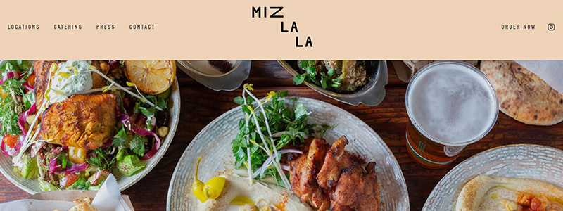
The Mizlala website is a beautiful example of a restaurant’s commitment to providing excellent service in an approachable and attractive format. This restaurant’s website showcases a fresh take on Mediterranean cuisine, emphasizing clean, modern design elements that highlight the vibrant and appealing food offerings.
The homepage is visually rich, featuring high-quality images that rotate to display the restaurant’s various dishes. These images tempt the viewer and communicate the quality of fresh, artisanal food quality. This is critical for a restaurant like Mizlala, where the visual presentation of dishes plays a key role in the dining experience.
Simple menus at the top provide quick access to frequently used sections, including locations, catering, press, and contact details. This design choice simplifies the user experience, making the website not just a promotional tool but a practical resource for potential customers.
Key information about each location is smartly integrated into the design, providing addresses and a visual snippet of each location’s ambiance, which helps to set expectations and build interest. The website also effectively incorporates a section for social media integration, keeping the content dynamic and connected to the daily happenings at the restaurant.
Key features of the Mizlala website include:
- Clean and modern design that reflects the restaurant’s branding
- High-quality imagery that showcases the cuisine
- Easy-to-navigate layout
- Effective use of social media links to enhance engagement
- Location-specific information that enhances visitor planning
Anton’s
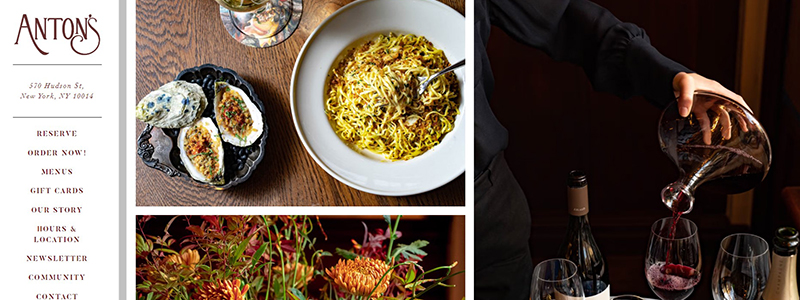
Anton’s restaurant website is a prime example of elegant and refined website design. It effectively captures the essence of the dining experience offered by the restaurant. The design is sophisticated, focusing on high-quality imagery that showcases the restaurant’s exquisite dishes, creating an inviting visual narrative for the site visitor.
As you browse the homepage, the website presents a well-organized layout, integrating beautiful photographs with subtle text describing the restaurant’s offerings. This blend enhances the aesthetic appeal and provides a seamless user experience. In keeping with Anton’s posh reputation, each picture is hand-picked to showcase the restaurant’s high-quality food and meticulous attention to detail.
The website’s navigation is intuitive and user-friendly, with clear categories such as About, Menus, and Reservations easily accessible. This design choice respects the visitor’s time, making it easy to access essential restaurant information. The color scheme and typography are also meticulously selected to reflect the restaurant’s ambiance, contributing to a cohesive online presence.
The design also includes integrated functional elements, such as a location map and contact information, to complement the overall visual theme. Balancing aesthetic appeal with practicality, the website enhances the customer’s journey from online visitor to dining guest.
Key features of the Anton’s website include:
- Elegant and sophisticated design
- High-quality, engaging imagery
- Intuitive and straightforward navigation
- Cohesive color scheme and typography
- Functional integration of essential restaurant information.
O-Ya
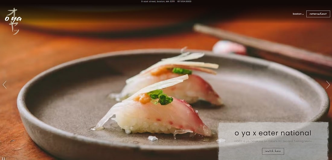
The O-Ya restaurant’s website serves as an elegant digital gateway to its contemporary Japanese-inspired dining experience, exemplifying excellent restaurant website design. With a focus on simplicity and visual richness, the website aligns perfectly with the upscale and refined atmosphere of the restaurant itself.
The website’s homepage impresses with a clean, minimalist design that allows vivid and meticulously presented food photography to take center stage. These images showcase the restaurant’s culinary artistry, highlighting O-Ya’s unique and intricate dishes. This visual approach captivates visitors and communicates the restaurant’s commitment to quality and innovation in Japanese cuisine.
The website’s navigation is intuitive, with clearly marked tabs for essential sections like the menu, reservations, and contact information. Users may discover what they need without too much complication, improving their experience.
The website’s color scheme and typography are carefully chosen to reflect O-Ya’s sophistication and modernity, contributing to a coherent brand identity that extends from the dining room to the digital space.
Key features of the O-Ya website include:
- Minimalist and sophisticated design.
- High-quality imagery that emphasizes the restaurant’s dishes.
- User-friendly navigation structure.
- Cohesive color scheme and typography.
- Focus on the restaurant’s unique culinary offerings.
This website effectively uses design elements to reflect the restaurant’s high standards and attention to detail, making it a prime example of effective restaurant website design in 2024.
Gazzo
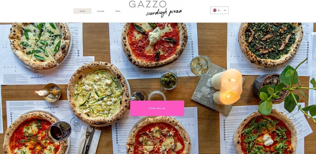
The Gazzo website is a standout example of how restaurant website design can effectively marry functionality with aesthetic appeal. The site boasts a clean, modern layout that accentuates Gazzo’s focus on artisanal sourdough pizza, capturing the essence of the restaurant’s culinary philosophy.
Upon visiting the homepage, users are immediately drawn to the vibrant, high-quality images of Gazzo’s pizzas that dominate the screen. These visually appealing images testify to the restaurant’s commitment to quality and freshness. The design cleverly uses these photos against a simple, clean background to keep the focus on the food.
The website’s navigation is streamlined and user-friendly, with clearly labeled tabs for the menu, about us, and order online sections, making it easy for visitors to find what they need quickly. The About Us section is particularly engaging, telling the story of the restaurant’s dedication to crafting the perfect sourdough pizza in a narrative that connects with the reader.
The website also includes practical information like opening hours and the location at the footer, which is easily accessible without cluttering the main aesthetic of the site.
Key features of the Gazzo website include:
- Clean and modern design that highlights the food
- High-quality images that showcase the restaurant’s offerings
- Easy navigation with essential information readily available
- Compelling content that narrates the restaurant’s story
This design effectively conveys Gazzo’s brand identity while enhancing the user’s experience, making it a prime example of effective restaurant website design in 2024.
Marlowe
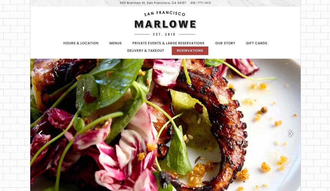
The Marlowe restaurant website is a sleek example of modern restaurant website design that superbly balances functionality with aesthetic appeal. The website’s design reflects this San Francisco eatery’s chic, urban vibe, making it a standout in 2024’s restaurant websites.
Visitors to the homepage are welcomed by stunning photos of Marlowe’s specialty meals, providing an engaging tone. The website’s clean and well-organized layout promotes an intuitive navigation experience. With clearly labeled tabs for the menu, hours and location, reservations, and private events, the site ensures that essential information is readily accessible, enhancing the user experience.
The color scheme and font match the restaurant’s décor, delivering a consistent brand image online and offline. This design strategy draws in visitors and keeps them engaged with smooth transitions and quick load times.
Key features of the Marlowe website include:
- Crisp, high-resolution images that showcase the restaurant’s offerings.
- Easy-to-navigate interface with well-organized sections.
- Aesthetic alignment with the restaurant’s physical ambiance.
- Quick access to reservations and contact information.
This website effectively uses design and functionality to reflect Marlowe’s commitment to quality and service, making it an excellent representation of effective restaurant website design.
Smith & Wollensky
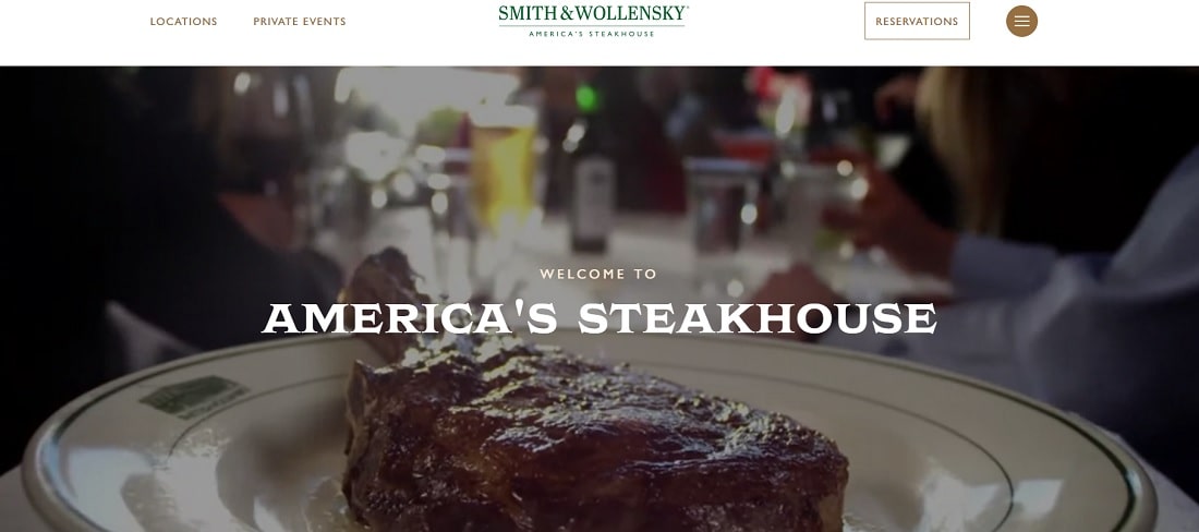
The Smith & Wollensky website perfectly embodies a sophisticated and elegant restaurant website design, aligning seamlessly with the restaurant’s reputation as a top-tier American steakhouse. The site’s layout is intuitive and visually striking, making it a prime example of effective website design in the restaurant industry for 2024.
Upon visiting the homepage, users are greeted with a stylish video showcasing the vibrant atmosphere and meticulous service that Smith & Wollensky is known for. This immediate visual engagement is welcoming and indicative of the restaurant’s high-quality experience. The website’s navigation is straightforward, with clear tabs for locations, private events, and reservations, making it easy for visitors to find what they need quickly.
The design utilizes a clean, classic color palette that reflects the restaurant’s upscale setting. High-quality images of signature dishes and the restaurant’s interior further communicate the luxury and quality Smith & Wollensky prides itself on. Each website section is carefully curated to provide essential information about the restaurant’s offerings, including detailed descriptions of its menu items and a section dedicated to showcasing its iconic locations.
Key features of the Smith & Wollensky website include:
- A clean and sophisticated design aesthetic.
- User-friendly navigation that enhances the customer experience.
- High-quality imagery that visually represents the restaurant’s offerings.
- Effective use of video to convey the restaurant’s ambiance.
This website is a stellar model for effectively blending design elements with functional needs, making it a standout in our 2024 roundup of restaurant website designs.
Conclusion
As we wrap up our tour of the “10 Restaurant Website Design Examples in 2024,” it’s clear that the landscape of restaurant web design is as vibrant and varied as the cuisines they represent. These websites serve as digital doorways and are pivotal in connecting the restaurant with its potential patrons. They stand out by balancing high visual appeal with user-friendly design, ensuring that each visitor can navigate with ease and intrigue.
Key takeaways from these stellar designs include:
- Personalized experiences: Customizable features that cater to visitors’ preferences, making them feel valued and understood.
- Integrated solutions: These websites streamline the customer journey from screen to table, from online reservations to mobile compatibility.
- Visual storytelling: Each restaurant’s website tells a unique story through immersive layouts and compelling visuals, engaging visitors by showcasing the restaurant’s atmosphere and philosophy.
Embracing these design strategies elevates the brand and drives customer engagement and loyalty, proving that a well-crafted website is essential to a restaurant’s success.