
We all like to feel good in every way, even when it comes to browsing the web. However, this comfort is commonly referred to as usability in the context of websites.
Users are far more irritated by poor usability and bad website layouts than by outdated design. You become irritated and leave when you don’t know how to navigate a bad UX website and waste a lot of time on mundane tasks. In this case, not only is the appearance of the website important, but so is the logic of its structure. The latter is the focus of this list of poorly designed websites. We gathered examples of websites with no or very poor structure, as well as examples of websites that are unresponsive.
You can also use the Website Usability Checklist to ensure that you are not providing poor website designs. Plerdy is used by thousands of businesses to analyze user behavior on website pages, with tools such as heat maps, video sessions, and eCommerce tracking.
What to look at if they don’t seem really ugly, bad or uncomfortable?
We want to stress right away that this overview of awful websites isn’t about tastes. We won’t define winners or talk about our personal preferences.
Here you will only find objective facts about why some websites are appealing and user-friendly while others repel visitors: nothing but real good and bad website examples.
Differences Between Good and Bad Website Design
Bad web design has been a concern since the internet’s birth. It’s like your grandfather attempting to join TikTok – it just doesn’t fit. Good web design tries to guarantee that users can discover what they need fast and effortlessly. Poor web design is more comparable to rickrolling people with endless pop-ups and videos that won’t stop playing no matter what!
A few crucial elements to look for in successful website design: ease of navigation, visually appealing graphics, clear calls to action, and optimized loading speeds. On the other side, terrible website designs lack all of these characteristics; they’re frequently overloaded with too many colors or graphics and take forever to load.
Navigating the Maze: The World’s Worst Website Designs
Imagine entering a website only to find yourself buried in a maze of poor design and confusing navigation. Welcome to the realm of the worst website designs.
In the digital age, a website is often the initial point of contact between a business and its potential clients. However, some websites seem to have missed the word on modern, user-friendly design. This year, we’ve found several extremely baffling examples of terrible website design that defy the fundamentals of excellent UX/UI. From problematic design to visually overpowering interfaces, these sites offer a tutorial in what not to do.
Key Examples of Poor Website Design:
- Overuse of Flashy visuals: Websites that bombard users with excessive animations and visuals can be overpowering and distract from the actual content.
- Cluttered Layouts: Some sites jam too much information into too little space, making it challenging for users to find what they need.
- Poor Color Contrast: Websites with poor contrast between text and backdrop can be a nightmare for readability.
- Non-Mobile-Friendly Design: In an era where mobile browsing is king, some websites still don’t cater to mobile consumers, resulting in a disappointing experience.
- Complex Navigation: Websites that make it hard to navigate with confusing menus and buried information lead to bad user experience.
These designs not only tax the patience of consumers but also reflect adversely on the brand’s image. A terrible website can be more than simply an eyesore; it can be a barrier to engaging potential clients. The next sections will go deeper into each case, dissecting and examining what makes these websites a maze of awful design choices. Stay tuned to learn how not to create a website.
What are the Main Problems with Poorly Made Websites
Before discussing examples of websites with bad accessibility, usability, and design, let’s talk about the reasons behind shitty websites. All worst-looking websites have something in common, like bad UI website design, unmatching colors, and other bad web mistakes listed here.
- Poorly constructed websites don’t follow the 4-second rule. Bad websites take four or more seconds to load, which harms the user experience and spoils the overall impression.
- Terrible websites have too many contrasting colors. Poor color combinations can harm users’ eyes and result in non-user-friendly websites. Websites with bad color schemes turn off customers instead of encouraging them to continue navigation.
- Crappy websites don’t get updates. Even if you had the best website at the end of the 2010s, it doesn’t mean it looks good now. Design rules continuously change, and you need to follow them.
- Too large or small fonts distract users. Bad typography websites have too many different fonts or are difficult to read. Hence, they also belong to websites that need improvement.
- Overly sophisticated websites are complicated websites. A bad homepage means users see lots of animation but don’t know what to do next. You should balance design standards and innovation to avoid the title of the worst website design ever.
- Excessive elements on one page look cluttered. A messy website has too many batters, ads, buttons, pictures, and other design elements. These are confusing websites that slow down navigation and cause high bounce rates.
Now that you’ve learned the characteristics of bad websites, it’s time to look at some bad website designs. Examples of unorganized websites, low-contrast websites, cluttered websites, and other common design flaws are provided below.
Learn from the mistakes of others and avoid poor usability when you create a news website, ensuring a user-friendly experience that keeps your audience engaged and informed.
These are not the ugliest websites, but they definitely need profound changes. Here are twenty bad websites to go on.
The Big Ugly Website
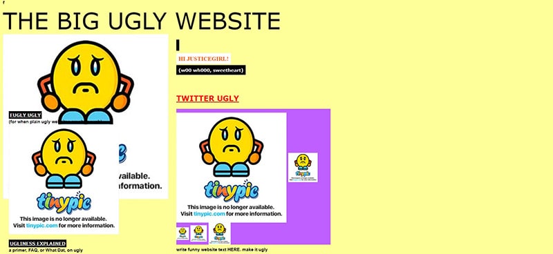
Designers deliberately created the Big Ugly Website to show all the horrors of obsolete design and lame websites. This is a powerful example for those who believe that the rest of the website needs to be more attractive and convenient to be included in this summary. There is no navigation here, but there are large and useful animations, unappealing fonts, underlined text, and banners everywhere. To make a long story short, this website is a shambles.
Craigslist
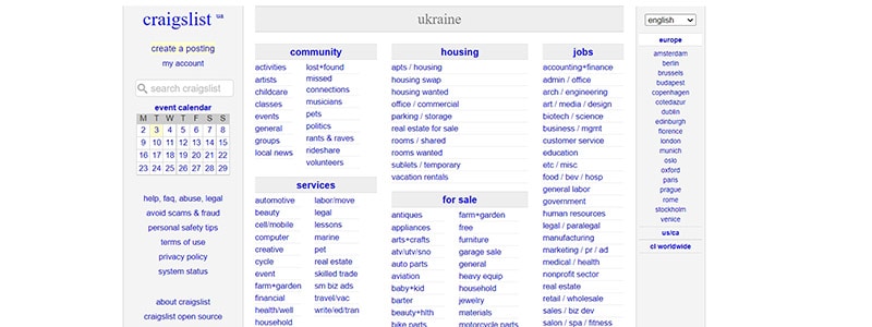
This is one of the most visited websites in the world. However, there are no images, logos, or banners. It is only made up of links that users can click on to get the necessary location-based information and perform various actions. The design and usability of the website haven’t changed much since 1995, but this doesn’t affect its current popularity among users. The only thing that may irritate users is the link-based structure, but it is the key to Craigslist’s long-term success.
Blinkee

This example of an ineffective website may scare you with its fonts, poorly selected color scheme, and abundance of animated images. Everything moves, and you can’t help but become annoyed. At the same time, there is absolutely no segmentation of products on the main page. Such blocks as New Arrivals, Top Sales, and Promo Offers are also missing. Moreover, a slider doesn’t have functional buttons and is only used as decoration. The buttons on product cards melt into the background and don’t motivate users to take action.
The World’s Worst Websitе
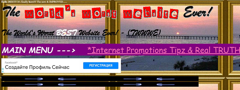
The World’s Worst Website is the name of a side project of designers who decided to highlight the most common design flaws to website owners and creators worldwide. Everything is obviously exaggerated here, and you will not find similar websites. This page compiles all possible and impossible errors in one place, which is extremely useful. This website is the worst in the world because of the combination of conflicting colors, incompatible fonts, unformatted and unstructured content, and underlined links, not to mention a navigator.
Lingscars
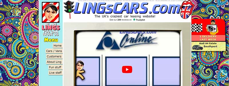
After landing on such a website page, it’s difficult to determine whether the design was chosen on purpose or if this is all a shambles. We can only hope that the website’s owners were attempting to recreate the atmosphere of the 2000s. The colors, textures, animations, and fonts are all over the place. Users are bombarded with banners, videos, and links, both in the sidebar and on the main page. The placement of common elements is completely arbitrary. For example, social media icons are in the center of the main page, there is a lot of empty space between the content and the footer, and the header is crammed with graphic and textual information.
Internet Archaeology
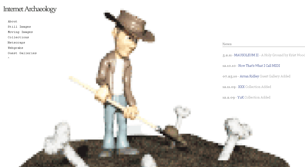
This website is quite original if to look only at a pixelated animation. Nevertheless, you are at a loss when you land on such a website. Nothing tells about the purpose of the website or its usefulness for visitors. The content is limited to the menu, full-screen animation, and News section. It would be nice at least to know what the news is about because no one will read it just for fun. In addition, there are no buttons and content blocks, including even contacts. No information about the purpose or location, no explanations…CIA would probably have a similar website.
Dom Perignon
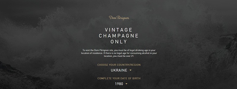
The iconic brand of luxury champagne also has flaws and a wrong website design. To be more precise, not the product itself (which has been adored for centuries) but the website that promotes the vintage beverages Dom Pérignon. This website has a stylish and elegant design, yet the main page only tells us about the face and creative director of the company, Lenny Kravitz. Users must indicate their age and location to check the information about vintage wines. A key mistake is a form that provides access to a part of the website page content. The general information about the champagne is available without the age confirmation, Yet it is very unlikely that after learning about the brand, users will return to the main page to fill out the mandatory form that gives access to products. This immensely complicates the user path.
Yale University School of Art
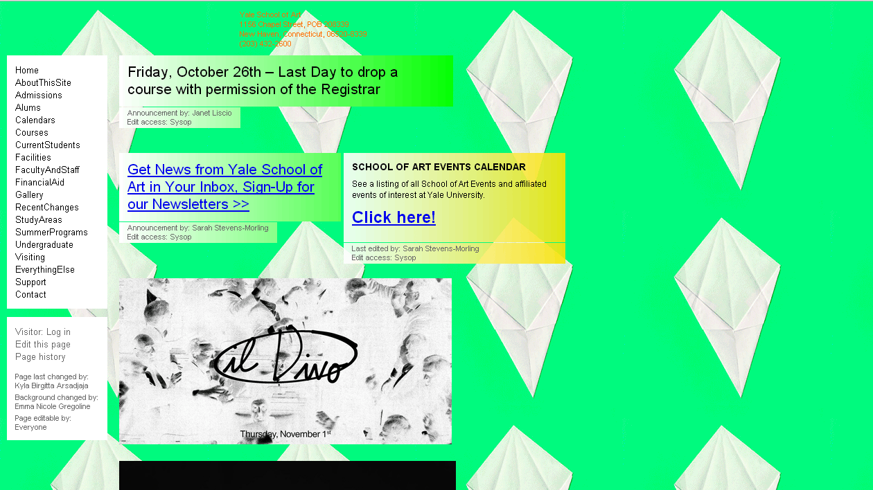
Expectation – a creative and convenient website of the Yale University School of Art. Reality – a weird website in the style of 00’s. The content has absolutely no structure, and the footer, header, and sidebar are poorly designed. There are also lots of blinking animations, underlined links, strange pictures, and low-quality photos. The website did not use post-production services for the images. True artists may find this website quite original in terms of an artistic approach, but its usability is extremely far from perfect.
Penny Juice of America
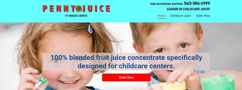
One of the leading juice manufacturers in the United States organized the navigation and considered usability, but completely overlooked color. The color scheme could be more appealing, with sharp, incompatible colors that are more irritating than the Comic Sans typeface, underlined links, and a cluttered sidebar.
Electrifying Times

This news website, which needs to be user-friendly, in reality looks like a scary reminder from the past. Its header, footer, and sidebar totally disobey the rules of usability. The unreadable text, which is key for promoting any website, repels users. Underlined links, low-quality photos, sidebar menu…this isn’t the extensive list of reasons why this design is disastrous.
Headhunter Hairstyling
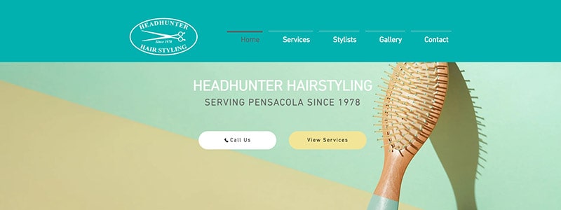
At first glance, this is a pleasant website with a menu on the main page and contact information in the footer. However, it contains an odd and irritating element – a flash video. It takes up the majority of the page and contains no message. The video does not affect on the loading time. As a result, using a mobile device to access this website is nearly impossible.
Serene-Naturist
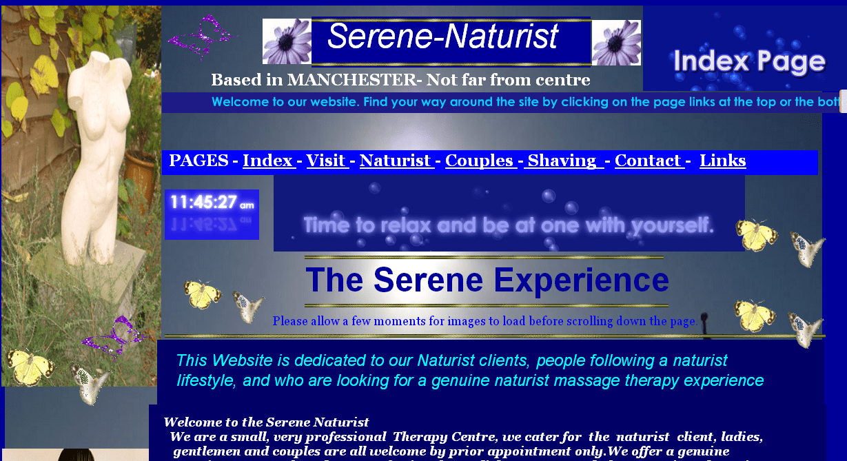
Let’s take a look at what we have here. It features flying butterflies, blue text on a blue background, mismatched typefaces, and an antique bust. It’s difficult to see how these elements relate to a spa, but designers, of course, know better. You can try your hardest to like the look of this website, but its usability will suffocate your efforts. Google’s website, for example, does not have such a design. Nonetheless, it is a model of minimalism and usability.
Where2Eat
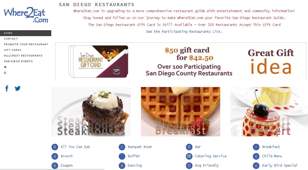
This website can tell you about the best restaurants in San Diego. Yet the page definitely deserves a more appealing and convenient design. The first thing that attracts your attention is a poorly thought-out structure. Except for two types of menu, a slider, and a map, there is practically nothing useful on the main page. The map has been moved to a sidebar, which is pretty unusual, and the fonts don’t match the design. In addition, the header absolutely violates the rules of usability. It’s just filled with some text, and that’s it.
Paradise Drinking Water
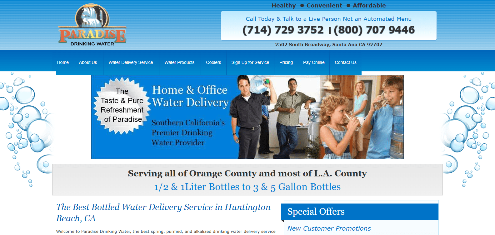
This page appears to be out of date and inconvenient. Users notice this right away and will most likely switch to another water delivery service. The main page is overloaded with information and doesn’t have a clear structure. In addition, the quality of images and photos is really bad, which will quickly repel any potential customer. Most importantly, Order buttons that could generate more sales are missing, so visitors have to make some extra effort to place an order.
Toronto Cupcake
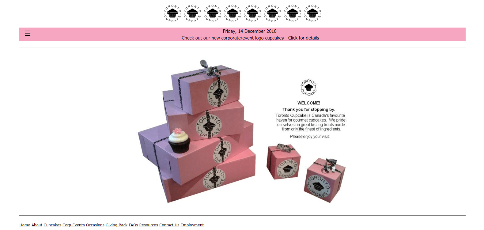
What do you expect to see on a website that sells cupcakes? Usually, such websites are full of nice images, bright colors, and vivid design elements that lure users into buying some extra sweets. However, the owners of this website have decided to neglect the opportunity to attract new customers through their website. The main page of Toronto Cupcake is too plain and simple. It lacks useful information about the company. The text in the footer is too small to read, and there is a large blank space at the bottom of the page. Users will undoubtedly be irritated by the website’s navigation and image quality. If Toronto Cupcake wants to increase the effectiveness of its website, it must first improve its design and usability.
Arvanitakis
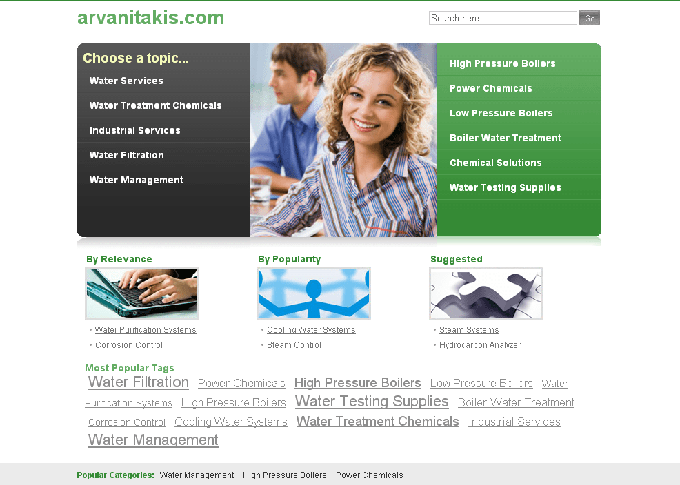
This website was already redesigned. Yet actually, this didn’t improve its look and usability. It has no information about the services or company and nothing about the advantages and characteristics of products. Only its creators will likely understand why the menu is split with a stock photo, with popular tags highlighted, and an additional catalog created without a proper footer and header.
Patimex
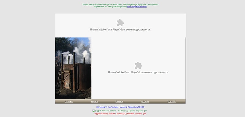
Take a look at the website of the Polish household fuel manufacturer. The design and usability are both abominable. Having a little devil grilling a sausage is right on target here. A navigation menu at the top and another under a strange image, three colored links, and even an animated logo aren’t enough to save this website.
University of Advancing Technology
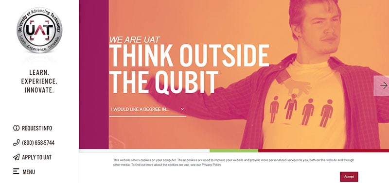
This design isn’t the worst case, but we included it in this list because of its bad usability. When the main page loads longer than 40 seconds, this indicates obvious technical problems that inevitably affect the user experience. Lots of animations, numerous high-resolution photos, and an outdated programming approach are the key reasons for the various issues this website has. Despite all this graphic splendor, the main page doesn’t include the necessary information. A well-thought-out navigation menu is probably its only advantage.
The Glove Club

The design of this website is truly stunning. Cinematographic elements in web design are a costly (and thus rare) occurrence. Unfortunately, abundant high-quality graphics slows loading, and users must wait to see the page’s content. Users frequently refuse to continue browsing due to slow download speeds. As it turns out, the use of expressive cinematographic elements is ineffective.
There are no websites with perfect design and usability. Pages of corporate behemoths and small businesses alike are prone to flaws. The problem is that everyone has a different definition of comfort. Some websites have an outdated design but clear usability that are popular and well-liked all over the world. Some use expensive graphics while still irritating users.
Here is the key rule: ease of use first, aesthetics second. We use many obsolete websites every day without even noticing this because they are very convenient.
FAQs:
What makes a bad website?
Here is the key rule: ease of use first, aesthetics second. Websites could even have a perfect design but still be inconvenient for users. The thing is that everyone has a different understanding of comfort. There are websites with an outdated designs but clear usability which are popular and loved all over the world. Some use costly graphics and still irritate users.
What is website usability?
Every detail matters to us. Even when it comes to browsing the web. However, in the context of websites, this comfort is commonly referred to as usability. When we talk about “usability,” we mean how comfortable and clear an interface is for users.
Why is website usability important?
Users are much more annoyed with bad usability than with outdated design. When you don’t know how to navigate a website and waste a lot of time on usual tasks, you become irritated and leave. In this case, not only the website’s look is important, but also the logic of its structure.
Conclusion
It is undeniable that many website designs out there are plain disastrous. The possibilities for bad design are endless, from garish colors and over-complicated navigation to simply outdated design. However, it’s important to remember that when creating any website, emphasis should always be placed on the user experience first and foremost. If a site doesn’t meet its needs, then it fails regardless of how pretty it looks.
A bad website is like a sidewalk or pavement that might look good but nobody uses to walk on. While the conversion and user will be on the “elephant trail / man made trail” the sidewalk won’t be used. This example is the same as a bad website design. It is missing a good navigation structure, responsive design and also the lack of user-centricity.
UX designer | Strategist at Positive NL