
Leap into the digital landscape of hospitality with “Best Hotel Websites of 2023: 20 Impressive Examples”. Uncover how remarkable design can transform a standard hotel website into a digital masterpiece. From compelling visual storytelling to intuitive navigation – the impact is palpable. ✨⚡
Delve into:
- Luxurious resorts that seduce visitors with immersive 360° virtual tours.
- Boutique hotels crafting a unique guest experience through interactive site elements.
- B&Bs who’ve mastered the art of simple elegance, making the booking process a breeze.
Each site showcases design elements that elevate the user experience, encapsulating the essence of the property. From effective color schemes that evoke emotions to subtle animations adding charm and depth. They all speak volumes about the potential of good design.
Turn your hotel website from generic to genius with insights from these examples. But don’t stop there! Use Plerdy, the powerful tool for Conversion Rate Optimization (CRO) and User Experience (UX), to evaluate and enhance your own site. As a Ukrainian copywriter, I can vouch for Plerdy’s transformative power. It’s high time your hotel website became an online masterpiece too. Unearth these 20 impressive examples now. Your journey into captivating hotel website design awaits. ⚡?
To track user clicks and their behavior, we suggest trying Website Heatmap Tools and Session Replay Software.
How to Create your Hotel Website Design?
Crafting an engaging hotel website design involves weaving together visual allure, intuitive navigation, and enticing content. A well-designed hotel website doesn’t merely showcase your property – it sells an experience, entices bookings, and creates lasting impressions. ⚡✨
Start with understanding your guests. Your design should resonate with your target audience. For example, a rustic lodge might incorporate earthy tones and natural imagery, while a luxury boutique hotel might opt for sleek lines and a monochromatic color scheme.
Key elements of a captivating hotel website design:
- High-quality visuals: Use professional photos and videos to highlight your property’s best features. Dynamic visuals lure in potential guests and transport them to your establishment.
- Engaging copy: Ditch the corporate jargon. Use enticing descriptions that paint a vivid picture of what guests can expect.
- User-friendly navigation: A simple, intuitive layout enables visitors to easily find information and make reservations.
- Mobile optimization: Ensure your website looks and works just as well on smartphones and tablets as it does on desktops.
- Social proof: Testimonials, reviews, and ratings foster trust among potential guests.
- Call-to-action (CTA): Clearly guide your visitors towards booking a room or reaching out for more information.
While creating your design, remember – simplicity is key. An overcomplicated design can confuse users and deter bookings. Simultaneously, ensure your website reflects your brand identity – from the color scheme and typography to the logo and images.
Once your site is live, keep track of its performance. Use analytics to understand visitor behavior and make necessary adjustments. Remember, website design is not a one-time process. It requires continuous tweaks and updates to stay fresh and appealing.
Embrace the journey of creating your hotel website design, it’s an opportunity to carve your unique digital identity and impress potential guests. Shine online, and let your website become a compelling preview of the experiences awaiting at your property.
How Should the Hotel’s Website Design Look Like?
When working out the design, the following considerations are taken into account:
- The individuality of the hotel, its beauty along with other advantages, including the restaurant’s cuisine specifics and excellent views from the rooms, should be emphasized;
- Prioritization set on the emotional component. Images, videos, and text boxes should impress the visitor with the design of the hotel’s website and tell them a whole story. Usually, flat text boxes with enumerated facts are avoided in design;
- Experiments with fonts are allowed. In design, the font not only affects the readability of the text;
- Asymmetry is great for the website design of new hotel brands. This emphasizes the readiness to go beyond the commonness;
- Unusual navigation works well in combination with a well-developed menu. This technique is mandatory in large hotels with an abundance of services offered. Even navigation through the restaurant menu can be arranged in such a way that the user is sure to remember it;
- The ultimate objective is convincing the user to make a reservation for a room. Developing the design ensures that a visitor can do this from any website page.
Don’t forget that mobile traffic is constantly growing, meaning the design of a hotel’s website must be adapted to this type of device. Load performance matters. Experiments with the design should not increase the waiting time for a visitor.
What Should a Hotel Website Include?
A successful hotel website paints a vibrant picture of the guest experience, provides essential information and facilitates a seamless booking process. Your digital property should be an inviting, intuitive space that mirrors your physical one, showcasing your hotel’s unique allure.
Here are indispensable elements that a hotel website must include:
- High-resolution design imagery: A picture is worth a thousand words – especially when selling an experience. Use professional, captivating images to give visitors a taste of what’s in store.
- A clear, compelling story: Tell the unique narrative of your hotel. Is it a historic inn, a modern urban retreat, or a countryside bed and breakfast? A compelling story hooks potential guests.
- Room design details: Provide exhaustive details about each room type. This should include amenities, room size, bed configuration, and unique features. Don’t forget captivating photos!
- Simple booking process: Simplify the reservation process as much as possible. Less friction means more bookings.
- Local Area Information: Guests want to know about local attractions, events, and restaurants. Providing this information positions you as a local expert.
- Testimonials and Reviews: Social proof builds trust. Showcase genuine reviews and ratings from previous guests.
- Clear Call-to-Action (CTA): A well-placed CTA can guide visitors towards making a booking or reaching out for more information.
Your hotel website design should weave these elements into a cohesive, visually appealing narrative that reflects your brand. Incorporating elements like easy-to-read typography, intuitive navigation, and a consistent color palette will further enhance the user experience.
Remember, your hotel website is the digital embodiment of your physical property. Make it count. Every pixel should work towards inviting potential guests to book their stay. Transform your website into an enticing digital portal that transports visitors right into the heart of your hotel’s experience. The perfect synthesis of utility and allure – that’s the power of thoughtful hotel website design.
List of 20 Best Hotel Website Design
Regarding our current Top, it is based on the reviews of Travel + Leisure readers. Each of the hotels mentioned below has managed to win the hearts of its guests with excellent service and a set of interesting additional options.
This is not a rating. Each hotel from the list below is among the best ones in the world.
Singita
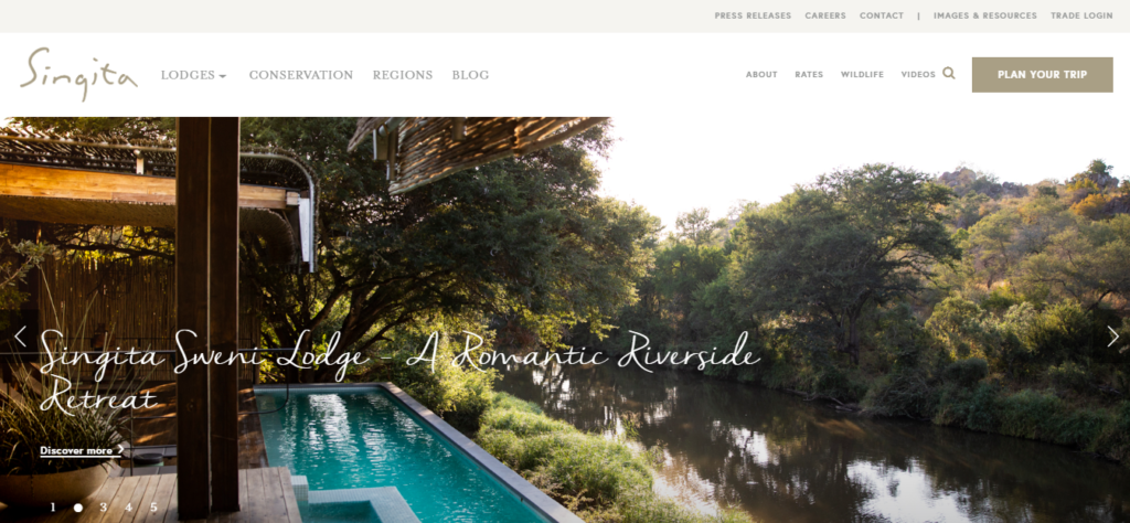
The hotel is located in Africa. The designers prioritized magnificent photos revealing the beauty of the local nature and its harmony with the hotel. Let’s give prominence to convenient navigation. Several hotels located in Africa (South Africa, Tanzania, Rwanda) operate under the brand. One can quickly navigate with the help of the map and menu. There’s a booking form right on the homepage.
The website design was created by the South African Studio PlusPlusMinus (based in Stellenbosch).
Elivi Skiathos
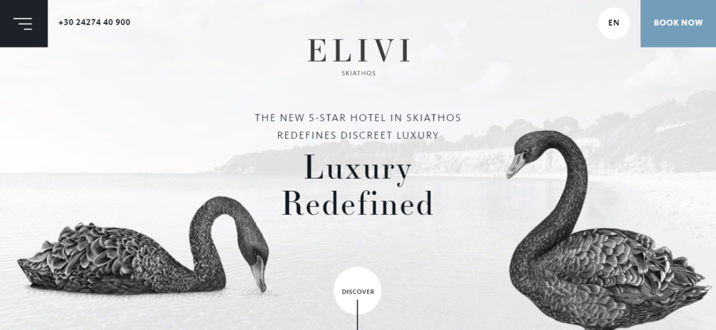
The hotel is located in the Greek town of Skiathos.
On the homepage, we see an image of 2 swans, stylized as a drawing. The image reacts to cursor movement. The animation while scrolling the page down is worth attention. There are traditional elements — info about rooms, restaurants, and recreational options – but the swans appear on the side when scrolling. They don’t interfere with the perception of information but do refresh the design.
The local time, temperature, and weather are displayed at the bottom of the page. However, they’d better be placed in the upper part of the page. This is because visitors are more likely to view the upper part of the page than scroll it to the end.
The website design was developed by Mozaik Hospitality with the offices located in Athens, Chania (Greece), Lausanne (Switzerland), Limassol (Cyprus).
NISEKO HAKUUNSO
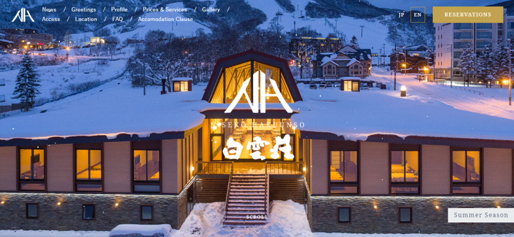
The hotel is located in Japan.
The key feature that distinguishes the website design from competitors is the so-called “weather adaptive” design. In winter, falling snowflakes set the right mood. This works great for the atmosphere. Besides, the name of the hotel is memorable.
The homepage is quite concise. It comprises a link to the Instagram profile with an abundance of photos, a little information about the possibility of skiing.
The main menu items are duplicated by corresponding blocks almost at the end of the page. Note that the photo reacts to rollover.
The Farm at Cape Kidnappers
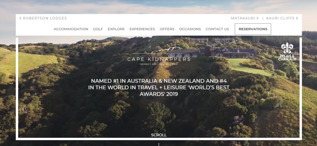
The hotel is based in Hawke’s Bay, New Zealand. In 2020, it was recognized as the best hotel in Australia and New Zealand and the fourth-best in the world by Travel + Leisure.
On the homepage, we are greeted by a video revealing the beauty of the local nature and the hotel’s interior. Below are photos and a detailed description of the unique offers from The Farm at Cape Kidnappers, such as horse riding, holding a festival in the hotel, helicopter touring, golfing.
The main menu items are pinned to the top of the page. But you can quickly switch to another menu item at any scroll depth. There’s a separate booking button.
The website was designed by the New Zealand Studio Tomahawk (Auckland). Tomahawk has an office in the United States (New Orleans).
The St. Regis Venice
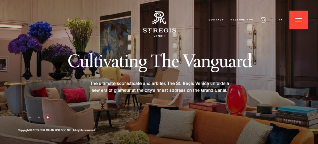
The hotel is located in Venice (Italy).
The website features a modern design. We should point out the competent implementation of the parallax effect and vertical and horizontal scrolling among the technical solutions. The color scheme is light; the background color is well combined with the photo with no sharp contrast. The interaction with the cursor is interesting, and the site navigation is not boring.
Instead of scrolling the homepage, you can go to the desired section (hotel history, the About us page, restaurant offers, etc.) through the menu. It is pinned, so it does not disappear when scrolling.
The website design was developed by Exo Ape, a Dutch company with an office in Roermond.
Le Mirabeau Hotel
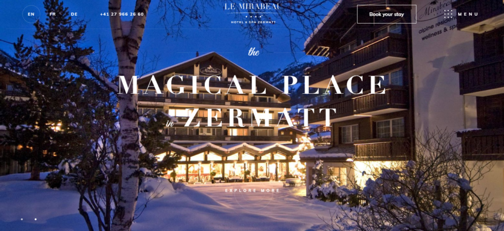
The hotel is located in Zermatt, Switzerland (the canton of Valais).
Among interesting design solutions, the animation and horizontal scrolling distinguish themselves.
The homepage provides general information about the hotel, the weather, and local time and links to the sections describing the SPA and rooms. The rest of the information (the hotel’s history, the restaurant and its menu, the wines offered) is given in the navigation menu.
The design was developed by the Swiss studio 8waysmedia, whose office is located in Geneva.
Canaves Oia Epitome
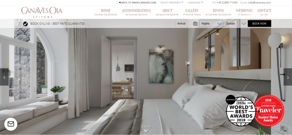
This Greek hotel, located in Santorini, was awarded by Travel + Leisure and Traveler. To ensure that the user doesn’t miss this information, the info about rewards is shown at the top of the homepage.
There’s a lot of information, but the homepage is not overloaded. It comprises only a few beautiful photos and brief information about the hotel. The rest of the content (photos and videos, descriptions of the restaurant’s advantages, weddings in Canaves Oia Epitome) is grouped in the corresponding menu items.
The successful solution with the booking form is worth highlighting. At the top of the page, a bar indicates the date of arrival, the number of nights, and people. Thus, you can make a reservation for a room in just 4 mouse clicks.
LifeThink developed the website design. It is a Cyprian company with offices in Kefalonia, Athens, and Mykonos.
J.K. Place Firenze
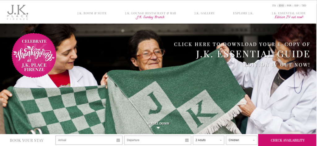
The hotel is situated in Florence, Italy.
The website is designed in the same style as the sites of the previous hotels. However, the focus is on photos (interior rooms, urban architecture, lounge bars, and restaurants). At the bottom of the screen, there’s a fixed bar through which one can check availability and make a reservation for a room in a couple of seconds.
Among the unusual features, we’d like to emphasize the offer to download a tourist guide to Florence for free. In return, the hotel only asks you to fill out a form with your contact information. As a result, the hotel gathers a lot of potential customer contacts.
There’s a great deal of information, but it is well structured and distributed by menu items. The navigation is very easy and simple.
The website design was developed by the dgnet studio (Florence, Italy).
Rabbit Hill Inn
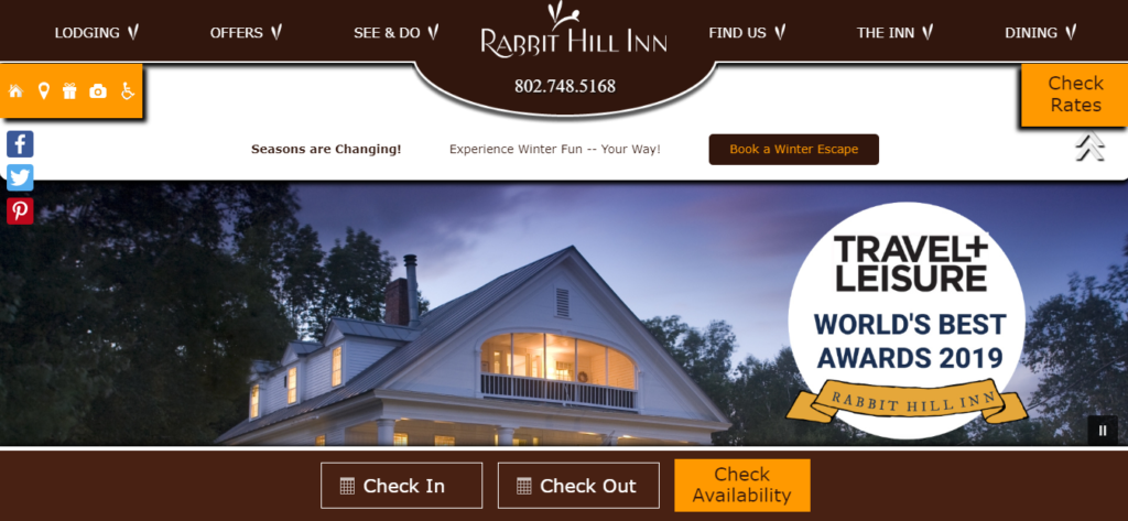
Rabbit Hill is a small and cozy hotel located in the USA (Vermont), awarded by Travel+Leisure. The hotel is notable for offering customers a break from the rat race of urban life.
The site design is symmetrical. The upper part encompasses the menu with basic information about the hotel (history, what is offered, the restaurant menu). At the bottom of the page, there are buttons to check the availability of rooms and make a reservation. There is no abundance of video and animation, only photos.
It is somewhat inconvenient that a lot of useful space above and below is “consumed.” There are no other comments.
The website was designed by Acorn Internet Services, an American company based in Colorado Springs.
El Moderne Hotel
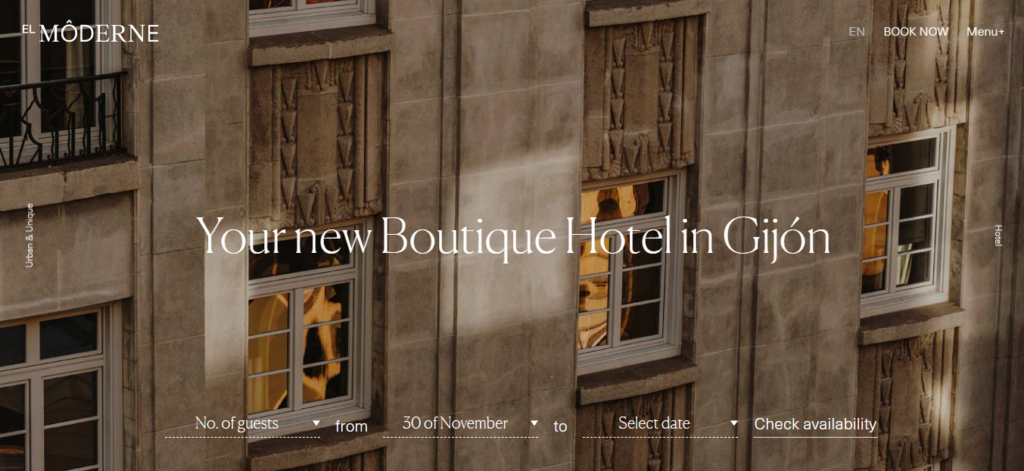
The hotel is located in Gijon, Spain.
The hotel building is called one of the best representatives of the Art Deco style. As soon as you go to the website, you’ll immediately see the photos of this construction.
The page contains a standard set of blocks, providing information on the restaurant’s work and the advantages of booking rooms in advance.
Pop-up forms are used. Thus, when you first open the website, a window highlights the advantages of room reservations.
The website design was developed by the Mandarina Brand Society studio, whose office is located in Palma (Spain).
The Bristol Hotel
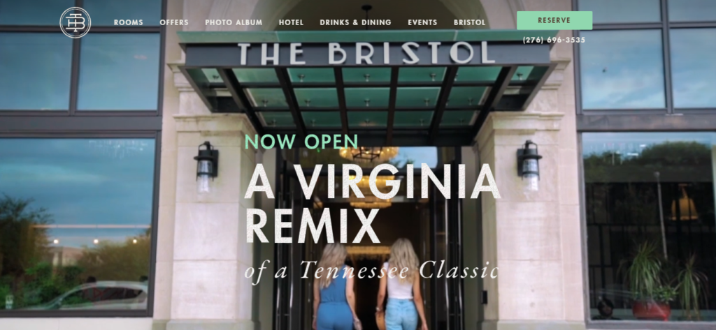
This is an American hotel located in Bristol.
When you log in to the site, you’ve immediately demonstrated a video showing the interior of rooms and urban architecture. At the top of the page, there’s a convenient and user-friendly menu (general information about the hotel, the events being held there, offers from the hotel, the restaurant, and its menu, to which a separate item is dedicated). The Reserve button is highlighted in color.
Below on the page, there’s a short review of the Bristol Hotel and its restaurant, a feedback form, and a map fragment demonstrating the hotel’s location.
The website was designed by specialists from Tambourine, whose offices are in New York, Bogota, Fort Lauderdale, and Carlsbad.
Deer Path Inn
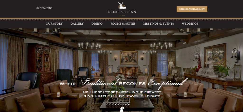
An American hotel situated in Lake Forest (Illinois).
The site is recognizable by its style. According to Travel+Leisure, the visitor is greeted with a photo of the hotel’s interior and a message that this is one of the best hotels, according to Travel+Leisure. The designers did not change the arrangement of key elements. The upper part was assigned to the menu and a button for checking the availability of rooms.
Below is a small greeting with a brief history of Deer Path Inn, links to sections describing the work of the restaurant, bar, pub, and exclusive service for each client.
One more thing worth mentioning is that when scrolling, the top stripe with the logo is getting slightly reduced in size. A trifle, but it enlarges the useful space on the page.
The American studio Tambourine is designed with offices in New York, Bogota, Fort Lauderdale, and Carlsbad.
Round Hill Hotel and Villas
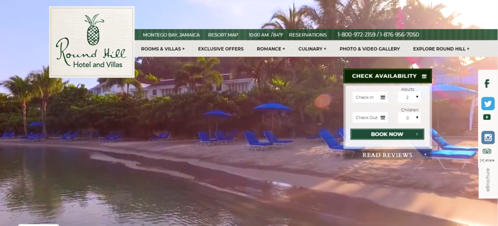
The hotel is located in Montego Bay (Jamaica).
The user immediately sees a beautiful video emphasizing local nature. Traditionally, there’s a menu with basic information about the hotel at the top of the page. The local time and air temperature are displayed above it. To the right, there are a booking bar and links to social networks, where you can subscribe to accounts of Round Hill. There is no abundance of photos on the homepage. Such materials are gathered in the gallery, and this hasn’t affected the design.
Let’s specify the fact that the hotel provides prices for the rooms at once. Thus, the user does not have to wander around the site to learn the price level. Contact information and a list of awards are given in the lower part of the page.
Travel Click developed the website design. It’s a large company with 17 offices worldwide, that is in Singapore, New York, Barcelona, Atlanta, Bucharest, Chicago, Dallas, Dubai, Melbourne, Hong Kong, Orlando, Ottawa, Paris, and Shanghai.
Post Ranch Inn
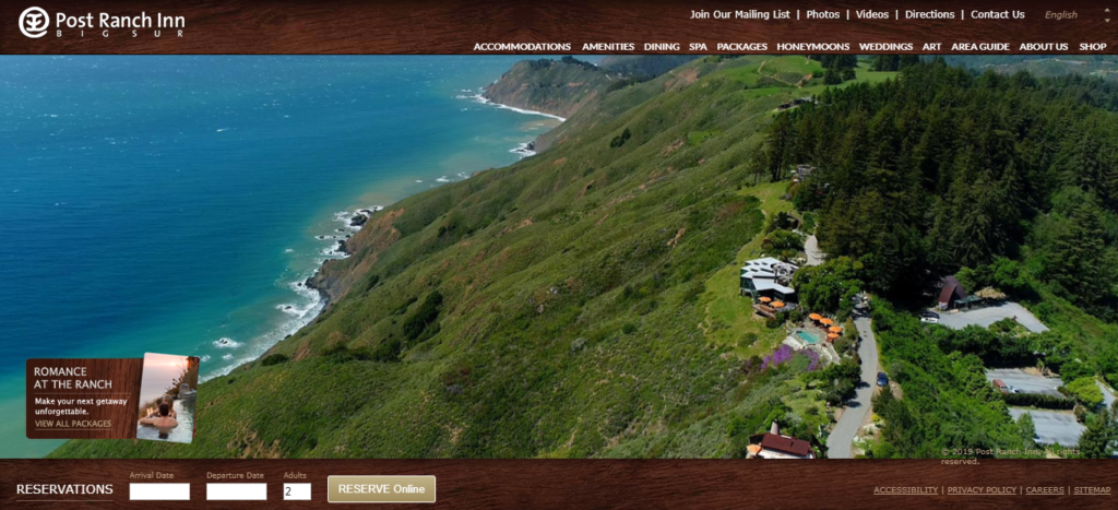
Another American hotel is located in Big Sur (California).
Complicated elements are abandoned in the design of the site. There is neither horizontal nor vertical scrolling and no complex animations, and an abundance of videos. The homepage shows the top view of the hotel—the menu items group all the necessary information. In the lower part of the page, one can reserve a room on the desired date.
What’s missing is the drop-down submenus appearing when hovering the cursor over a menu item. For instance, there is a lot of information about a restaurant (breakfasts, lunches, dinners, and wines offered), so you have to scroll and manually search for the desired item.
Matetsi Victoria Falls
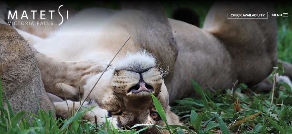
The hotel is located by the riverbank of Zambezi (not far from Victoria Falls) in Zimbabwe.
On the homepage, 3 photos interchange with a certain interval. Below is textual information about the hotel and links to the video. It is the visual component that is primarily focused on. The homepage contains only a little information. Through the menu, you can find answers to other questions the guests are interested in. The button for reserving a room on the desired date is next to the menu in the upper right corner. There is a small brochure in pdf format providing basic info on Matetsi Victoria Falls.
A serious design flaw is the color of the menu and the Check Availability button. They are white and, thus, merge with the background of light images. This is a drawback of the website’s design.
Curtain Bluff
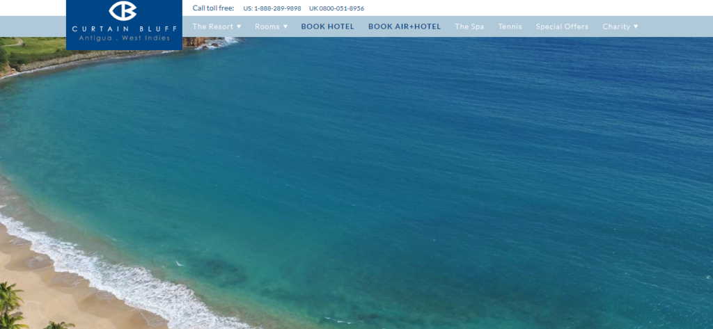
The hotel is located in Antigua.
It’s a photo of the ocean that the user will see after going to the site: no captures, buttons, or links, just menu items at the top. A form for reserving rooms on a specified date is placed below.
Lower on the page, there are blocks with standard information: a list of possible activities, restaurant offers, and a description of beaches. There is a place for video feedbacks from Instagram as well. Besides, there’s a map (Google maps) indicating the hotel’s location under the reviews.
It is inconvenient that you have to scroll quite a lot compared to the design of competitors’ sites. What’s more, the button for booking a room is not fixed.
Sol y Luna
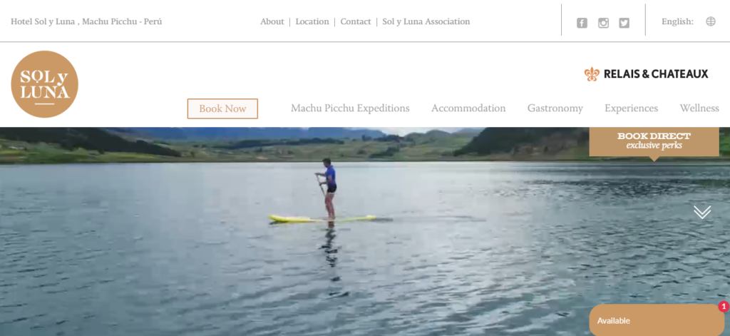
This is a Peruvian hotel located in Urubamba. The hotel “grabs” with a non-standard approach. When designing the website, the developers tried to disclose the Sol y Luna owners’ offer to the full.
The hotel’s key offers are placed at the top of the site. They include links to excursions to Machu Picchu, a description of the specifics of the local restaurant and cuisine in general, and the Book Now button. After opening the site, the video starts playing automatically, with the offscreen voice telling the visitors the hotel’s story.
Almost the whole page space is occupied by colorful photos. There are plenty of them, making it clear that guests will have an unforgettable vacation there. This is what the website’s design is focused on.
Fogo Island Inn
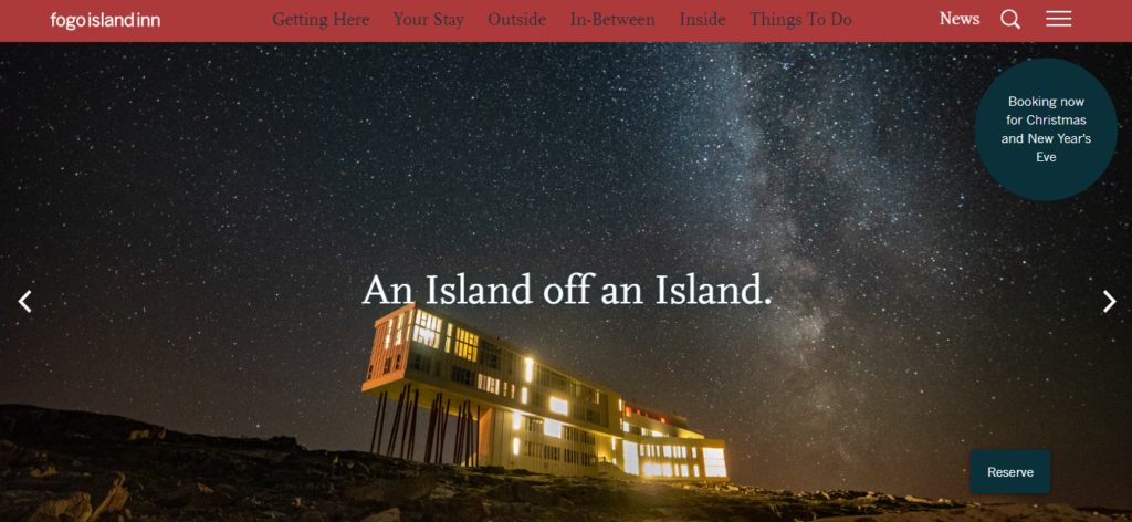
Canadian hotel located in Newfoundland.
A rather unusual hotel in the “an island on an island” format. The website features an asymmetrical design. They tried not to overload the homepage with redundant information and distributed it by the menu items. They comprise everything, including the history of the hotel, the ways of entertainment for guests, details about the restaurant and its menu, the design of the hotel from the inside. A good solution is that the Reserve button is fixed and does not disappear when switching between pages or scrolling.
An unusual solution is that details on the expenditure are specified in the site design. They show how much money of the total room go and on what.
Palazzo Avino
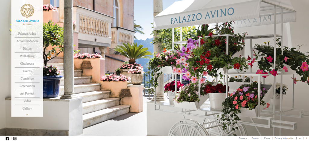
An Italian hotel located in Ravello.
The site’s design is distinguished from most others. A beautiful photo of the hotel and the menu on the left side (which can be hidden) is all we see on the homepage.
The menu has everything users are interested in — a menu item for dining in the hotel restaurant, a gallery with an abundance of photos and videos, the history of Palazzo Avino, an item for booking a room. The only controversial decision is that the booking button is not highlighted and is lost among other menu items. As for the rest, the website design looks fresh and stands out from the rest.
Koh Yao Noi Hotel
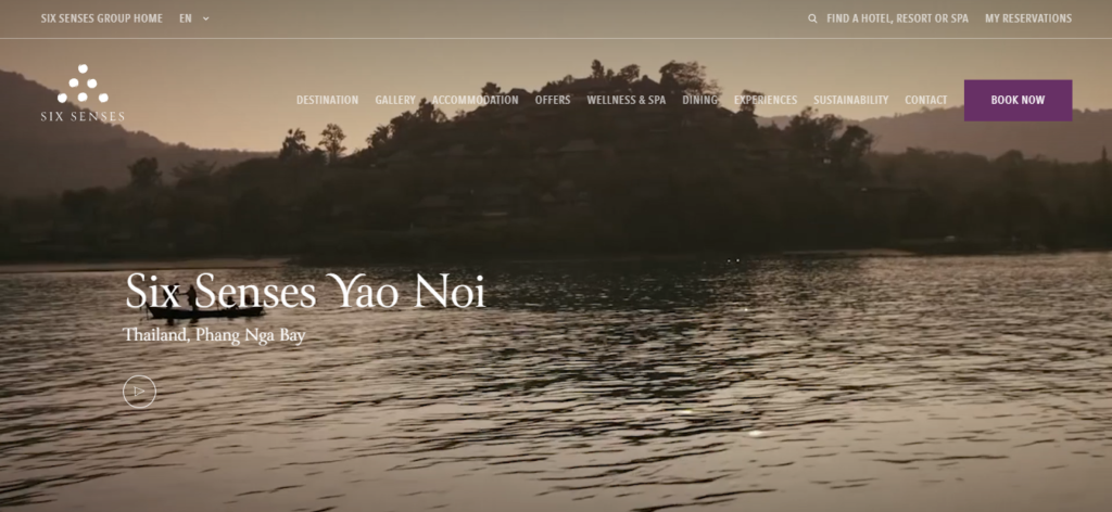
The hotel is located in the Phang Nga province of Thailand.
Considering the hotel’s location, it’s logical that the emphasis is put on the unity of man and nature.
Apart from photos and videos (playing immediately after opening the site), the design includes drawings, adding charm. The hotel is not positioned as a pretentious hotel, so such elements are quite appropriate.
The navigation is convenient. The menu is always fixed, and you don’t have to search for it when scrolling. In addition, the Book Now button is highlighted in color.
Conclusion
Immerse yourself in a tour-de-force of the most spectacular hotel websites of 2023. These 20 examples, each with a unique flair, have served up an inspiring mix of stunning visuals, smart UX designs, and personality-driven narratives. Websites that manage to combine practicality with beauty, minimalism with rich content, and functionality with style – are truly admirable ⚡
Some have beautifully captured the minimalist trend, like the Casa Cook Hotels with their earthy colors and clean, classy presentation. The Cloudbeds platform has become a preferred hosting solution, with many hoteliers drawn to its elegant templates and efficient booking engine. On the other end of the spectrum, the Vesper Hotel’s web design, bursting with vibrant colors and bold pictures, evokes a sense of playful luxury that is irresistible.
From iconic luxury motels like Badrutt’s Palace to quaint vacation rentals, each website on our list stands as a testament to the power of great design and the critical role it plays in shaping user perceptions.
In crafting your own standout hotel website, consider taking action with Plerdy, a fantastic tool for SEO & UX analysis. It will ultimately guide your design choices, ensuring they resonate with your target audience and inspire direct bookings. Remember, in the fast-paced world of online marketing, it’s not enough to have a stunning website; it needs to be functional, intuitive, and most importantly, it needs to convert ⚡?