
Web accessibility is often treated like a checkbox. Run a scanner, fix a few warnings, add alt text somewhere, and move on.
That is too shallow for a real business website.
Poor color contrast, missing alt text, weak focus states, unlabeled forms, unreadable CTAs, and broken keyboard navigation create friction long before they create compliance risk. A visitor may not know the page has WCAG issues. They only know the button is hard to read, the form does not explain the error, the menu is impossible to use, or checkout feels strangely painful.
That is where web accessibility and SEO start to overlap. Not because WCAG compliance is a simple Google ranking button. It is not. The connection is more practical. Accessible pages tend to have clearer structure, better content signals, easier navigation, more usable forms, stronger image context, and fewer moments where users abandon the task.
For SEO teams, CRO teams, ecommerce owners, SaaS marketers, and UX designers, accessibility is not only about doing the right thing. It is also about removing avoidable friction from organic traffic, landing pages, forms, product pages, and conversion paths.
What Web Accessibility Means For SEO, UX, And Conversions

Web accessibility means people can perceive, understand, navigate, and interact with a website, even when they use the web differently from the “average” visitor imagined during design.
Some users rely on screen readers. Some use keyboard navigation instead of a mouse. Some zoom the page. Some need captions. Some struggle with low contrast text. Some are on a phone in bright sunlight. Some are tired, distracted, older, injured, or trying to finish a purchase quickly between two meetings.
This is why website accessibility is not a narrow technical topic. It touches the whole experience:
- Can users read the content without effort?
- Can they understand the page structure?
- Can they move through menus, filters, accordions, tabs, and forms?
- Can they identify the main CTA?
- Can they complete a signup, checkout, quote request, or download?
- Can search engines understand the content, images, headings, and internal links?
Accessibility SEO works best when it is treated as a shared discipline. SEO accessibility is not only metadata and alt text. UX accessibility is not only contrast and labels. CRO is not only button color and form length. These areas meet on the same page, inside the same journey.
A page with clean semantic HTML, descriptive headings, useful image alt text, readable CTAs, clear link text, accessible forms, and logical internal links is usually easier for users to navigate and easier for search engines to interpret. That does not guarantee rankings. It does make the page less confusing.
Why WCAG Issues Are Business Problems, Not Only Compliance Problems
WCAG is the main standard teams use to understand digital accessibility. It gives designers, developers, content teams, and website managers a shared way to discuss issues like contrast ratio, keyboard access, labels, error messages, focus indicators, and screen reader accessibility.
Still, many teams only think about WCAG compliance when legal risk appears. That mindset usually leads to rushed fixes and weak priorities. A better approach is to ask how each accessibility issue affects real user behavior.
The same WCAG issues that block users with disabilities often frustrate many other users too:
- Low color contrast hurts users with low vision, but also mobile users in bright light.
- Small touch targets hurt users with motor impairments, but also anyone using a phone with one hand.
- Missing form labels hurt screen reader users, but also users who forget what a field means after the placeholder disappears.
- Weak focus states hurt keyboard users, but also power users who move fast through forms.
- Vague button labels hurt assistive technology users, but also busy visitors scanning a landing page.
- Unclear form errors hurt everyone who is trying to complete a checkout, signup, or lead form without guessing.
That is the business case. Accessibility issues become user friction. User friction becomes lost task completion. Lost task completion becomes fewer purchases, fewer demos, fewer leads, fewer subscriptions, and weaker trust.
ADA compliance and legal obligations matter, but this article is not legal advice. For marketing and website teams, the immediate concern is simpler: if a page is hard to use, people leave or fail. Organic traffic does not help much when the experience blocks the next step.
How Accessibility Problems Can Hurt SEO Performance
WCAG SEO needs careful wording. WCAG compliance itself is not something you should describe as a confirmed direct Google ranking factor. Accessibility can support SEO indirectly through better structure, better context, better usability, and better user experience.
That indirect effect still matters.
Missing or poor alt text weakens image context
Alt text exists first for accessibility. It helps users understand meaningful images when they cannot see them or when images do not load. But image alt text also gives search engines more context about visual content.
Missing alt text is especially painful on ecommerce and SaaS pages. A product image with no useful description gives less value to a screen reader user and less context for image SEO. A chart with vague alt text like “graph” does not explain the insight. An icon used as a button without an aria-label can leave the action unclear.
Good alt text is not keyword stuffing. It describes the purpose of the image in the context of the page.
Weak heading structure confuses users and search engines
Headings help people scan. They also help screen reader users move through a page quickly. For SEO, headings help communicate content hierarchy.
A page that jumps from H1 to H4 because of visual styling may still appear fine to a sighted user, but the structure becomes messy. A product category page with unclear headings can make filters, product groups, and content blocks harder to understand. A long SaaS landing page with repeated vague headings like “Powerful Features” and “Better Results” gives users and search engines less clarity.
Poor link text reduces navigation clarity
Link text should explain where the link goes or what action it supports. “Click here” is weak for accessibility and weak for internal links. It gives little context to users scanning links, and it gives search engines less useful anchor text.
Descriptive internal link text is a small fix that scales well. “Read the checkout UX checklist” is clearer than “Read more.” “Compare Shopify A/B testing tools” is clearer than “Learn more.”
Inaccessible menus can hide important pages from users
A menu can be visually polished and still fail. If it does not work with keyboard navigation, if focus states disappear, if submenus close unexpectedly, or if mobile navigation traps the user, important pages become harder to reach.
This can hurt conversion paths. It can also affect how users move from organic landing pages to pricing, product, category, support, demo, or checkout pages.
Broken forms reduce lead quality and conversion paths
Forms are where accessibility and conversions meet very directly. Missing form labels, unclear form errors, hidden required fields, poor validation, and confusing error messages can stop users who were ready to convert.
SEO brings organic traffic to the page. The form decides whether that traffic becomes a lead, account, quote request, order, or trial signup.
Mobile accessibility overlaps with mobile UX
Mobile accessibility problems often look like normal mobile usability problems. Small tap targets, sticky elements covering content, popups that are hard to close, buttons too close together, weak contrast, and layout shifts all create friction.
Mobile-first indexing makes the mobile version of a site especially important for search visibility. But even without thinking about indexability, a poor mobile experience can damage engagement, bounce rate, task completion, and conversion rate.
Accessibility Issues That Create UX Friction
Some accessibility errors are easy to ignore during design review because the page still “looks fine.” Then real users arrive, and the friction appears in heatmaps, session recordings, form analytics, and support messages.
Low color contrast
Low color contrast makes text, links, buttons, form states, price labels, and error messages harder to read. It often appears in light gray body text, pale CTA buttons, thin fonts, disabled-looking form fields, and promotional banners.
Contrast ratio is not only a design detail. If a user cannot read a CTA, trust badge, delivery note, discount rule, or form error, the page becomes harder to use.
Missing or useless alt text
Missing alt text creates a gap for screen reader users. Useless alt text creates noise. “Image,” “banner,” “photo,” or a stuffed keyword phrase does not help anyone.
Product images, charts, feature diagrams, comparison screenshots, and meaningful icons need useful descriptions. Decorative images can often use empty alt attributes so they do not distract assistive technology users.
Invisible or weak focus states
Focus states show where a keyboard user is on the page. Removing focus outlines because they look “ugly” is one of the fastest ways to make a site harder to use.
Focus indicators should be visible around links, buttons, form fields, menu items, filters, tabs, accordions, sliders, and popup controls. Without them, the user is navigating blind.
Poor keyboard navigation
A page should be usable with a keyboard only. Users should be able to move through menus, open filters, close popups, submit forms, reach CTAs, and continue checkout without a mouse.
Keyboard traps are severe blockers. If focus enters a popup, menu, calendar widget, or checkout step and cannot leave, the user may have no clean way to continue.
Missing form labels
Placeholders are not labels. They disappear when users type. They can be hard to read. They are often skipped or announced poorly depending on implementation.
Accessible forms need clear labels connected to each field. This helps screen reader accessibility, but it also helps every user understand what the form expects.
Unclear form errors
“Invalid input” is not enough. The user needs to know what went wrong and how to fix it.
Good error messages are specific, visible, and close to the relevant field. They should also be available to assistive technologies. For example, “Enter a phone number with 10 digits” is more useful than “Error.”
CTA text that is too vague or hard to read
A readable CTA is not only about font size. It is also about contrast, wording, placement, and context.
Button labels like “Submit,” “Continue,” or “Learn more” may be acceptable in some contexts, but they often become vague when repeated across a page. “Start free trial,” “Get pricing,” “Add to cart,” or “Book a demo” gives users clearer expectations.
Icons without labels
Icons can be efficient, but only when their meaning is obvious and accessible. A search icon, cart icon, account icon, close icon, or filter icon may need visible text, an aria-label, or both.
When icons act as buttons but have no accessible name, users relying on assistive technology may only hear “button.” That is not enough information to choose an action.
Confusing heading hierarchy
Headings should describe the structure of the page, not just match visual sizes. One H1, logical H2 sections, and useful H3 subsections make long pages easier to scan.
This helps blog articles, product pages, pricing pages, documentation pages, comparison pages, and landing pages. It also supports crawlability because the page topic and subtopics are easier to interpret.
Small touch targets
Small touch targets create mobile accessibility problems. Users may tap the wrong filter, miss the close button, open the wrong product, or struggle with pagination.
This issue is common in mobile menus, product filters, sliders, cookie banners, quantity selectors, calendar pickers, and checkout options.
Sliders, popups, and dynamic content that are hard to control
Dynamic content can create serious friction. Auto-rotating sliders may move before the user finishes reading. Popups may cover navigation. Accordions may open visually but not announce state changes. Filters may update results without clear feedback.
These elements need careful testing. They are often where accessibility problems, UX friction, and conversion loss meet.
How Poor Accessibility Can Reduce Conversions

Conversion optimization depends on the user completing a task. Accessibility problems interrupt that task.
In ecommerce, a user may not see the main “Add to cart” button because the contrast is weak. A keyboard user may reach the product options but not the checkout button. A product image may have missing alt text, so a screen reader user gets no useful detail about color, style, or variation. A popup may cover the page and be hard to close on mobile.
In SaaS, a pricing table may be visually attractive but hard to scan. Feature comparison icons may have no labels. A signup form may show an error without saying what to fix. A demo CTA may be repeated with different vague labels, so users are not sure which action matters.
In lead generation, accessible forms are critical. Every field needs a clear label. Every required field should be obvious. Every form error should explain the fix. If the form fails silently or resets after an error, trust drops quickly.
On content pages, accessibility also affects engagement. If headings are vague, link text is weak, contrast is low, or a newsletter popup blocks reading, users may leave before they reach the internal links, CTA, product mention, or next article.
None of this means every accessibility fix will increase conversion rate. Some fixes will protect users from failure rather than create an obvious lift in analytics. Still, blockers on high-intent pages are not cosmetic issues. They directly affect revenue opportunities.
| Accessibility issue | UX impact | SEO or CRO impact | What to check |
|---|---|---|---|
| Low contrast | Users struggle to read text, links, CTAs, prices, and errors. | Lower task completion and weaker trust on conversion pages. | Text, buttons, links, form states, banners, and mobile views. |
| Missing alt text | Meaningful images lose context for screen reader users. | Weaker image SEO and less useful product or content context. | Product images, charts, icons, screenshots, and decorative images. |
| Weak focus states | Keyboard users cannot clearly see where they are. | Failed navigation, failed checkout, and fewer completed actions. | Menus, filters, forms, tabs, sliders, popups, and CTAs. |
| Poor form labels and errors | Users do not know what to enter or how to fix mistakes. | Lower lead quality, fewer signups, and more checkout abandonment. | Labels, required fields, validation, error messages, and recovery paths. |
Web Accessibility Checklist For SEO And CRO Teams
A useful accessibility checklist should not live only with developers. SEO and CRO teams need a version they can use during audits, content reviews, landing page reviews, and conversion path analysis.
- Check color contrast for body text, headings, buttons, links, prices, badges, form fields, placeholder text, hover states, focus states, and error states.
- Review alt text for product images, charts, screenshots, icons, infographics, logos, and decorative images.
- Use empty alt attributes for decorative images that do not add meaning.
- Test important pages with keyboard only, including menus, filters, tabs, accordions, popups, forms, sliders, and checkout steps.
- Check visible focus states for links, buttons, inputs, dropdowns, radio buttons, checkboxes, and custom controls.
- Review labels for every form field. Do not rely only on placeholders.
- Make form errors specific, visible, easy to find, and connected to the relevant field.
- Use descriptive CTA copy that explains the action, especially on landing pages and pricing pages.
- Check heading order, starting with one clear H1 and logical H2 and H3 sections.
- Use descriptive internal link text instead of repeated “read more” or “click here” links.
- Check mobile tap targets for buttons, filters, quantity selectors, close icons, and pagination.
- Test popups, menus, accordions, tabs, filters, sliders, cookie banners, and dynamic content.
- Review important conversion paths from organic landing page to CTA, form, cart, checkout, signup, or demo request.
- Check crawlability and indexability basics, including metadata, canonical tags, internal links, headings, and image SEO signals.
- Review behavior data after fixes to see whether users interact with key elements more clearly.
This web accessibility checklist is not a full WCAG audit. It is a practical starting point for teams that care about website usability, organic traffic, and conversion optimization.
How To Audit Accessibility Issues With Plerdy
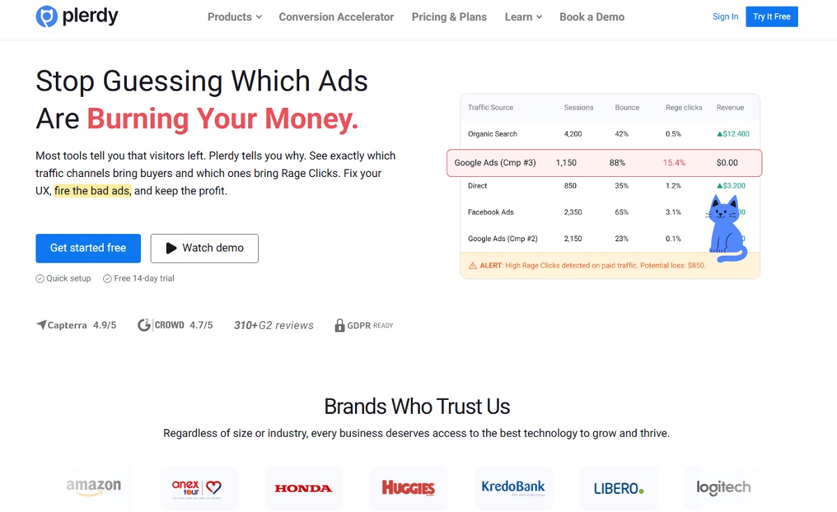
Plerdy should not be treated as a replacement for dedicated WCAG testing tools, manual accessibility testing, or expert review. Automated accessibility tools do not catch everything either. Real accessibility work still needs keyboard testing, manual checks, assistive technology review where possible, and practical judgment.
Where Plerdy fits well is diagnosis and prioritization. It helps teams see how accessibility-related UX issues affect real behavior on real pages.
- Start with high-value pages.Do not begin with random low-traffic pages. Start with the homepage, product pages, pricing pages, checkout, signup pages, lead forms, landing pages, and top organic pages. These pages carry traffic, revenue, and user intent.
- Use SEO Checker to review structure and on-page signals.
Plerdy SEO Checker can help review page structure, metadata, headings, image issues, and technical SEO signals. This is useful when accessibility SEO problems overlap with weak headings, missing image context, unclear metadata, or messy page structure.
- Use heatmaps to see whether users notice important elements.Heatmaps can show whether users interact with CTAs, forms, menus, filters, sliders, product blocks, and important page elements. If a key CTA gets little attention, the issue may be wording, placement, contrast, mobile layout, or competing visual noise.
- Use session recordings to detect friction.Session recordings can reveal rage clicks, dead clicks, scrolling problems, repeated attempts, form confusion, popup frustration, checkout hesitation, and failed interactions. These patterns do not prove a WCAG failure by themselves, but they help you find where the experience breaks down.
- Use event tracking to measure key actions.Track clicks on CTAs, form interactions, menu behavior, filter usage, tab changes, popup closes, checkout steps, and conversion elements. This turns accessibility-related UX problems into measurable behavior.
- Compare behavior before and after fixes.After improving contrast, focus states, form labels, CTA readability, heading structure, or mobile tap targets, compare clicks, scroll depth, form starts, form completions, checkout progress, and conversion rate.
- Prioritize issues that affect revenue, organic pages, and key journeys.A missing alt attribute on a decorative image is not equal to an inaccessible checkout button. A vague heading on a low-value archive page is not equal to broken keyboard navigation on a pricing page. Prioritization matters.
This workflow gives SEO, UX, and CRO teams a shared view. WCAG issues become easier to discuss when you can connect them to user friction, search visibility, and conversion paths.
What To Fix First: Prioritization Framework
Accessibility audits can produce long lists. Some items are critical. Some are template-wide. Some are content cleanup. Some are edge cases. Without prioritization, teams either freeze or spend time on low-impact fixes first.
Fix blockers first
Start with anything that stops users from completing a task. This includes keyboard traps, broken forms, inaccessible checkout steps, unreadable CTAs, impossible navigation, popups that cannot be closed, and form errors that do not explain the fix.
These are not “nice to have” issues. They block revenue and access.
Fix high-traffic organic pages
Pages that receive organic traffic deserve early attention. If SEO brings visitors to a page with poor accessibility and weak usability, the site wastes part of that traffic.
Review headings, internal links, image alt text, mobile accessibility, CTA readability, and content structure on these pages.
Fix high-intent conversion pages
Pricing pages, product pages, cart pages, checkout pages, signup pages, demo request pages, and lead forms should be near the top of the list.
These pages are where accessibility and conversions are most tightly connected. A small form issue or unreadable CTA can create a visible drop in task completion.
Fix repeated design system issues
Some accessibility problems repeat across the site because they live in components. Buttons with weak contrast. Inputs without proper labels. Icons without accessible names. Focus indicators removed from the global CSS. Dropdowns that do not work with a keyboard.
Fixing the component can improve hundreds or thousands of pages.
Fix scalable content issues
Content teams can improve accessibility and SEO at the same time by cleaning up headings, link labels, alt text, metadata, and form microcopy.
This is especially useful for ecommerce categories, product templates, blog articles, help centers, comparison pages, and landing page libraries.
Common Mistakes Teams Make When Fixing Accessibility
The goal is not to create a perfect audit document. The goal is to make important user journeys clearer, more usable, and more resilient.
- Treating accessibility as a one-time audit instead of an ongoing part of design, development, SEO, and CRO work.
- Relying only on automated scanners and missing issues that require manual review or real user behavior analysis.
- Adding alt text mechanically, with vague descriptions or keyword-stuffed text that does not help users.
- Removing visible focus outlines because they do not match the visual style.
- Using vague CTA text across important pages, then wondering why users hesitate.
- Designing pretty forms without persistent labels.
- Making error messages too general, too far from the field, or unavailable to assistive technologies.
- Ignoring mobile users when checking touch targets, popups, sticky bars, filters, and checkout steps.
- Fixing low-value pages before checkout, signup, pricing, product pages, and organic landing pages.
- Forgetting to measure user behavior and conversion impact after changes.
Another common mistake is treating accessibility as a design limitation. Usually, it is the opposite. Clear labels, readable CTAs, proper contrast, semantic HTML, useful headings, and accessible forms tend to make the interface calmer and more understandable.
Final Thoughts
Web accessibility and SEO are connected, but not in a simplistic way. WCAG compliance is not a magic ranking factor. Accessibility fixes do not automatically improve every ranking, every bounce rate, or every conversion rate.
The real value is more practical.
Accessible pages are easier to read, easier to navigate, easier to understand, and easier to complete. They give search engines cleaner structure and better context. They reduce user friction on the pages where organic traffic, trust, and conversion decisions happen.
For Plerdy users, the best approach is to combine accessibility review with behavior analytics. Use SEO Checker to find structure and on-page issues. Use heatmaps and session recordings to see where people hesitate, miss CTAs, struggle with forms, or fail to use important elements. Use event tracking to measure whether fixes change behavior on key conversion paths.
Accessibility should not sit in a forgotten report. It should become part of how SEO, UX, and CRO teams improve the website every month.
FAQ
Does web accessibility directly affect SEO rankings?
Web accessibility is not a confirmed direct Google ranking factor in the same simple way some teams imagine. It can support SEO indirectly by improving page structure, content clarity, image context, navigation, mobile usability, engagement, and task completion.
What WCAG issues are most important for SEO?
The strongest SEO overlap usually appears in heading structure, semantic HTML, alt text, descriptive link text, accessible navigation, readable content, mobile accessibility, and clear page structure. These issues help users and can also help search engines interpret the page more accurately.
How does poor accessibility hurt conversions?
Poor accessibility creates friction during important actions. Users may miss a CTA, fail to close a popup, struggle with a form error, tap the wrong mobile element, or be unable to reach checkout with a keyboard. Each failure can reduce signups, purchases, leads, or demo requests.
Is alt text only for SEO?
No. Alt text is primarily an accessibility feature. It helps users understand meaningful images when they cannot see them or when images fail to load. It can also support image SEO by giving search engines useful context, but it should be written for clarity, not keyword stuffing.
How can I test keyboard navigation on my website?
Open an important page and use only the keyboard. Use Tab and Shift plus Tab to move through links, buttons, fields, menus, filters, tabs, popups, and checkout steps. Check whether focus is visible, the order makes sense, every action is reachable, and no component traps the user.
Can Plerdy help find accessibility-related UX issues?
Yes, Plerdy can help identify and prioritize accessibility-related friction through heatmaps, session recordings, event tracking, and SEO Checker. It does not replace dedicated WCAG testing tools or manual accessibility review, but it helps teams see how issues affect real user behavior.
What accessibility fixes should ecommerce websites prioritize first?
Ecommerce websites should prioritize blockers in product pages, filters, cart, checkout, and forms. Fix unreadable CTAs, missing form labels, unclear errors, poor keyboard navigation, weak focus states, small mobile tap targets, popup issues, and missing alt text on meaningful product images.