
In the bustling digital marketplace, mastering the art of ‘above the fold’ content on your website is akin to capturing the front-page headline in traditional media. The term “front page” originates in newspaper parlance and refers to the content that appears on the top half of the page. In the context of a website, ‘above the fold’ signifies the content visible without scrolling, making it the first interaction point for your audience.
Here’s why this concept is crucial:
- It sets the initial tone and message of your website.
- Grabs attention and hooks the visitor.
- Directly impacts user engagement and SEO performance.
Imagine visiting an e-commerce site for outdoor gear. If the ‘above the fold’ area showcases enticing imagery and compelling calls-to-action, you’re more likely to explore further. Similarly, a legal services website benefits from clear, trust-building content above the fold, instantly establishing credibility.
However, the information that appears above the fold should also be in line with your SEO objectives. Your website will look fantastic and do well in search engine rankings if you utilize keywords strategically, create content with your users in mind, and employ a responsive design.
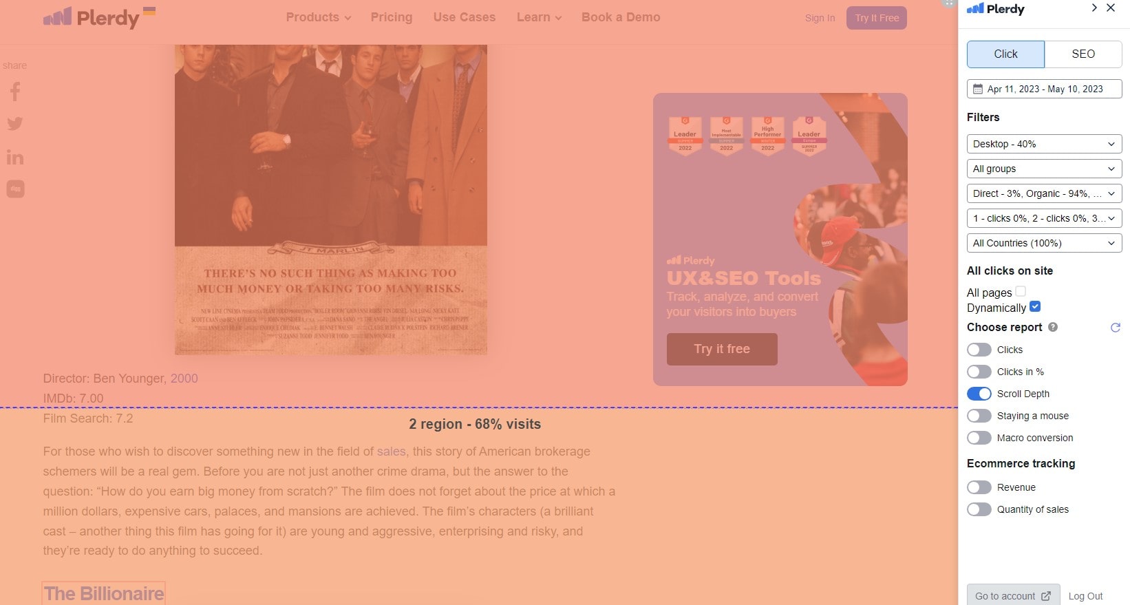
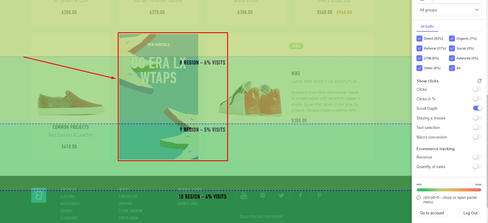
Plerdy helps you understand how ‘above the fold’ information affects user behavior, conversion rates, and usability. Through detailed analysis, A/B testing, and user behavior tracking, Plerdy helps optimize this critical website area, ensuring your content not only captivates but also converts.
Content above the fold is your digital handshake, so make it count!
Basic Definition and Importance of “Above the Fold”
In the digital world, “above-the-fold” stands out. Traditional in the newspaper industry, the “fold” was when a paper was folded in half, putting the major news pieces in view. Website “fold” refers to the visible part without scrolling.
Key points to note about “above-the-fold”:
- Immediate Visibility: It’s the first slice of your website a visitor sees. That initial glimpse can set the tone for the entire user experience.
- Priority Content: Think of above-the-fold as prime real estate. Placing vital content here guarantees immediate attention.
- Engagement Boost: Websites strategically utilizing above-the-fold spaces often witness higher user engagement and interaction rates.
- Optimal Design: With the rise of diverse screen sizes, designing for above-the-fold becomes a dynamic challenge, pushing web designers to innovate constantly.
Harnessing the power of above-the-fold is more than just placing random content there; it’s about strategically showcasing what matters most. For e-commerce sites, it might be a hot-selling product; for bloggers, a captivating lead story; for service-based businesses, a compelling call-to-action. In essence, it’s a digital handshake, inviting users to delve deeper. So, whether you’re crafting a personal blog or a massive e-commerce platform, understanding and optimizing the above-the-fold space is crucial in ensuring your website not only captures but also retains user attention.
The Relevance in Print Media
Before the digital age, print media prevailed, with “above the fold” being prized. In this context, “fold” refers to the crease dividing a newspaper, making the upper half, or the content “above the fold”, the most immediately visible to readers. This prime position acted as a magnet, drawing eyes to headline stories, vibrant photos, or groundbreaking news.
Here are some notable aspects of the fold in print:
- Visibility Kingpin: Content positioned above the fold snagged attention, influencing purchase decisions at newsstands.
- Storytelling Epicenter: Journalists vied for their stories to grace this space, ensuring widespread readership.
- Advertising Gold: Advertisers shelled out premium rates for above-the-fold placements, knowing it offered maximum exposure.
- Design Nucleus: Layout designers meticulously crafted content above the fold to balance aesthetics with information.
Ironically, with the transition to online platforms, websites adopted the same principle. Content “above the fold” on a website captures immediate attention, influencing user interaction and engagement. For example, in the realm of online magazines, the juiciest stories or breaking news often populate the above-the-fold space, echoing the practices of their print predecessors. Meanwhile, e-commerce platforms showcase hot deals or trending products in this prime digital real estate. As media continues to evolve, the tenets of the fold, whether in print or on a website, persistently underscore the importance of strategic content placement for maximum impact.
Above the Fold in Web Design
Going deep into digital design, “above the fold” for websites is crucial. The fold, a print media staple, has smoothly transferred to web design, emphasizing the top of a website without scrolling. The material above the fold is generally a user’s initial engagement with a website, a digital handshake.
Key takeaways about its relevance:
- Immediate Engagement: Websites with compelling above-the-fold content draw users in, fostering prolonged interaction.
- Strategic Positioning: Vital information or actions, like signing up or checking out, strategically placed above the fold, drive conversions.
- Adaptive Design: Given diverse device sizes, content above the fold demands fluid design to cater to every viewer.
- Niche Examples: E-commerce sites might spotlight trending products above the fold, while blogs could highlight captivating lead articles.
In essence, the above-the-fold space on a website isn’t just about aesthetics; it’s an essential tool in shaping user experience. By giving utmost priority to this space, websites can seamlessly guide users deeper into their content, creating an engaging journey from the get-go.
How to Determine the Fold on Different Devices
The term “fold” dominates the digital world, especially when considering various gadgets. The fold marks the juncture on a website where scrolling starts, and anything above this line falls into the “above-the-fold” category. It’s this above-the-fold content that becomes a user’s first brush with a website, setting the tone for their entire journey.
Steps to pinpoint the fold across devices:
- Device Emulation: Utilize web development tools to mimic various devices and screen sizes. By doing so, you can pinpoint where your website’s fold lies on tablets, smartphones, or desktops.
- Analytics Deep Dive: Many website analytics platforms spotlight data on average viewport sizes. This info helps discern the most common above-the-fold content dimensions for your audience.
- User Testing: Gather real-time feedback by running user experience tests. Observing how different users interact with your website on multiple devices can offer invaluable insights into where the fold naturally occurs.
- Niche Snapshots: For instance, online magazine platforms might employ specialized tools to ensure feature stories remain above the fold across devices, maintaining reader engagement.
In essence, determining the fold isn’t a one-size-fits-all endeavor. Given the vast device spectrum, ensuring your website’s above-the-fold content resonates across all platforms is paramount for a seamless user experience.
Elements Typically Positioned Above the Fold
In the web design landscape, positioning elements above the fold remains a pivotal strategy. As the first thing visitors see on a website, the content above the fold holds the power to captivate attention and guide further exploration. But what elements consistently find their way to this prime website real estate?
- Bold Headlines: Engaging titles that sum up the website’s essence or offer.
- High-Quality Imagery: Visually stunning photos or graphics that evoke emotions or highlight products.
- Call-to-Action Buttons: Directing visitors to take desired actions such as ‘Buy Now’ or ‘Learn More’.
- Navigation Menus: Streamlined and intuitive, ensuring hassle-free browsing.
- Trust Badges: Certifications or awards that boost website credibility.
The eCommerce specialty sometimes features a sneak look of best-selling products or limited-time bargains above the fold. Meanwhile, news websites prioritize breaking stories or headline news, ensuring immediate visibility. Digital portfolios, on the other hand, might showcase a piece of signature work or a brief introduction above the fold.
Crafting the perfect blend of content above the fold boils down to understanding the website’s core objectives. It can be tempting to include as many features as possible, but remember that harmony between form and function is essential. As the digital landscape keeps evolving, so does the approach to harnessing the power of the area above the fold – always aiming to leave a lasting impression.
The Psychology Behind “Above the Fold”
In digital design, “above the fold” is a psychological strategy used with precision. This coveted space on a website taps into the human psyche’s natural tendencies, creating immediate engagement.
Here’s the mental magic behind it:
- Instant Gratification: Our brains crave immediate rewards. When pivotal content pops up right above the fold, users feel an instant connection with the website.
- Decision Fatigue Reduction: With essential elements positioned above the fold, users don’t get overwhelmed with choices. This streamlined approach fosters a smoother user journey.
- Trust Building: First impressions matter. High-quality content above the fold establishes instant credibility, assuring users of the website’s authenticity.
- Focused Attention: In a world teeming with distractions, positioning the cream of the content crop above the fold ensures it captures undivided attention.
Take, for instance, a streaming service website. A captivating trailer or a list of trending shows placed strategically above the fold draws users in, compelling them to dive deeper into the site. Similarly, a travel blog might showcase breathtaking photos or must-visit destinations above the fold to ignite wanderlust instantly.
In essence, the “above the fold” realm is more than mere design. It’s a masterclass in psychology, understanding user behavior, and leveraging it to craft digital experiences that resonate, engage, and captivate from the very first scroll.
Common Misconceptions
In the digital design landscape, the term “above the fold” often rings familiar. But just as swiftly as websites load, misconceptions swirl around this pivotal space. Let’s debunk some widely held beliefs:
- Everything Vital Must Be Above: Many assume crucial content must sit above the fold to guarantee engagement. Yet, compelling designs and narratives can effectively draw users deeper into a website, regardless of initial placement.
- One-Size-Fits-All Fold: The fold varies across devices. A laptop might reveal more content initially than a smartphone, so assuming a uniform fold across all platforms is a misstep.
- Above-the-Fold Equals Instant Success: Merely placing elements above doesn’t guarantee success. It’s the synergy of compelling content, intuitive design, and user-centric approach that truly counts.
Consider an online boutique: just showcasing bestsellers above the fold doesn’t seal the deal. It’s the blend of appealing visuals, enticing product descriptions, and easy navigation that turns browsers into buyers.
While the area above the fold is important in website design, it’s important to see past the myths. The ultimate goal isn’t just to fill this space but to weave a narrative that resonates, engages, and guides the user on a seamless journey through the depths of a site. Remember, it’s the holistic experience, not just the initial snapshot, that leaves a lasting impact.
Best Practices for Utilizing Above the Fold Space
Maximizing the “above the fold” real estate on a website is both an art and a science. When users land on a page, this prime space sets the tone, influencing whether they’ll dive deeper into the content or bounce off the website. So, how do you optimize this crucial area?
- Lead with Strength: Position your most compelling content above the fold. Whether it’s a captivating headline for a blog or a must-see product for an e-commerce website, make sure it’s front and center.
- Keep It Clean: Avoid clutter. Prioritize clarity over cramming. A clean, intuitive design encourages users to engage more with the website.
- Engage with Visuals: Eye-catching visuals or interactive elements can pull users in. Imagine an art website showcasing a mesmerizing piece or a subtle animation — it instantly piques interest.
- Streamlined Navigation: Ensure that your website’s core navigation elements are accessible and clear, guiding users seamlessly deeper into your content.
- Clear Call to Action: Whether it’s “Shop Now” or “Read More”, a well-placed CTA above the fold can drive user engagement and action.
For instance, travel websites often showcase breathtaking destinations above the fold, coupled with enticing deals, to draw users in. It’s not merely about what’s placed above the fold, but how it’s presented. To truly captivate and engage, one must masterfully blend content and design, ensuring the website resonates with its audience right from the start.
The Evolution and Future Trends
In the dynamic digital landscape, the concept of “above the fold” has undergone a significant transformation. Originally a newspaper term referring to the content displayed before the paper’s fold, it soon became a pivotal aspect of web design. As screens diversified from desktops to smartphones, the fold adapted, impacting how content surfaces on a website.
- From Static to Fluid: Early websites had a static fold. Now, responsive designs ensure that the fold adjusts according to device type.
- Scroll Culture: With the rise of mobile browsing, users have grown accustomed to scrolling. This has shifted emphasis from focusing solely on above-the-fold content to creating an engaging scrolling experience.
- Rich Media Emergence: Video and interactive components dominate above-the-fold, delivering immersive experiences from the start.
- Personalization: AI and data analytics enable websites to tailor above-the-fold content to individual user preferences.
A notable shift can be observed in e-commerce platforms. They’ve moved from showcasing static product images above the fold to integrating dynamic visuals and personalized recommendations, ensuring visitors are instantly engaged.
Anticipating the road ahead, the convergence of augmented reality (AR) and website design promises to redefine the above-the-fold experience. Imagine landing on a travel website and being greeted with an AR window into a destination, making the exploration virtually tangible.
In essence, the fold’s evolution underscores the industry’s commitment to enhancing user engagement. As technologies advance, content placement and website design will undoubtedly continue to innovate, setting fresh benchmarks for digital excellence.
Conclusion
As we wrap up our exploration of ‘above the fold’ content, let’s distill the essence of what makes this website element a cornerstone of effective digital marketing. This upper section of a website serves as the launching pad for user engagement, making its optimization crucial for a successful online presence.
Key takeaways include:
- The ‘above the fold’ area is the first point of contact between your website and its visitors.
- It’s critical because it influences the user’s first impression and whether or not they want to stick around.
- This section must be a harmonious blend of appealing design, compelling content, and strategic SEO.
Consider a health and wellness website, where ‘above the fold’ content featuring reassuring imagery and straightforward navigation cues can significantly enhance user experience. Or take an online tech gadget store, where highlighting the latest products and deals above the fold can instantly capture customer interest.
In essence, the content above the fold acts as your website’s handshake – it needs to be strong, confident, and welcoming. Remember, this is not just about grabbing attention; it’s about holding it and guiding the visitor deeper into your website. Utilizing tools like Plerdy, you can fine-tune this area, ensuring it’s not only eye-catching but also functionally optimized for user experience and SEO.